In this first chapter, we'll start by establishing a common language for models and taking a deep view of the predictive modeling process. Much of predictive modeling involves the key concepts of statistics and machine learning, and this chapter will provide a brief tour of the core distinctions of these fields that are essential knowledge for a predictive modeler. In particular, we'll emphasize the importance of knowing how to evaluate a model that is appropriate to the type of problem we are trying to solve. Finally, we will showcase our first model, the k-nearest neighbors model, as well as caret, a very useful R package for predictive modelers.
Models are at the heart of predictive analytics and for this reason, we'll begin our journey by talking about models and what they look like. In simple terms, a model is a representation of a state, process, or system that we want to understand and reason about. We make models so that we can draw inferences from them and, more importantly for us in this book, make predictions about the world. Models come in a multitude of different formats and flavors, and we will explore some of this diversity in this book. Models can be equations linking quantities that we can observe or measure; they can also be a set of rules. A simple model with which most of us are familiar from school is Newton's Second Law of Motion. This states that the net sum of force acting on an object causes the object to accelerate in the direction of the force applied and at a rate proportional to the resulting magnitude of the force and inversely proportional to the object's mass.
We often summarize this information via an equation using the letters F, m, and a for the quantities involved. We also use the capital Greek letter sigma (Σ) to indicate that we are summing over the force and arrows above the letters that are vector quantities (that is, quantities that have both magnitude and direction):

This simple but powerful model allows us to make some predictions about the world. For example, if we apply a known force to an object with a known mass, we can use the model to predict how much it will accelerate. Like most models, this model makes some assumptions and generalizations. For example, it assumes that the color of the object, the temperature of the environment it is in, and its precise coordinates in space are all irrelevant to how the three quantities specified by the model interact with each other. Thus, models abstract away the myriad of details of a specific instance of a process or system in question, in this case the particular object in whose motion we are interested, and limit our focus only to properties that matter.
Newton's Second Law is not the only possible model to describe the motion of objects. Students of physics soon discover other more complex models, such as those taking into account relativistic mass. In general, models are considered more complex if they take a larger number of quantities into account or if their structure is more complex. Nonlinear models are generally more complex than linear models for example. Determining which model to use in practice isn't as simple as picking a more complex model over a simpler model. In fact, this is a central theme that we will revisit time and again as we progress through the many different models in this book. To build our intuition as to why this is so, consider the case where our instruments that measure the mass of the object and the applied force are very noisy. Under these circumstances, it might not make sense to invest in using a more complicated model, as we know that the additional accuracy in the prediction won't make a difference because of the noise in the inputs. Another situation where we may want to use the simpler model is if in our application we simply don't need the extra accuracy. A third situation arises where a more complex model involves a quantity that we have no way of measuring. Finally, we might not want to use a more complex model if it turns out that it takes too long to train or make a prediction because of its complexity.
In this book, the models we will study have two important and defining characteristics. The first of these is that we will not use mathematical reasoning or logical induction to produce a model from known facts, nor will we build models from technical specifications or business rules; instead, the field of predictive analytics builds models from data. More specifically, we will assume that for any given predictive task that we want to accomplish, we will start with some data that is in some way related to or derived from the task at hand. For example, if we want to build a model to predict annual rainfall in various parts of a country, we might have collected (or have the means to collect) data on rainfall at different locations, while measuring potential quantities of interest, such as the height above sea level, latitude, and longitude. The power of building a model to perform our predictive task stems from the fact that we will use examples of rainfall measurements at a finite list of locations to predict the rainfall in places where we did not collect any data.
The second important characteristic of the problems for which we will build models is that during the process of building a model from some data to describe a particular phenomenon, we are bound to encounter some source of randomness. We will refer to this as the stochastic or nondeterministic component of the model. It may be the case that the system itself that we are trying to model doesn't have any inherent randomness in it, but it is the data that contains a random component. A good example of a source of randomness in data is the measurement of the errors from the readings taken for quantities such as temperature. A model that contains no inherent stochastic component is known as a deterministic model, Newton's Second Law being a good example of this. A stochastic model is one that assumes that there is an intrinsic source of randomness to the process being modeled. Sometimes, the source of this randomness arises from the fact that it is impossible to measure all the variables that are most likely impacting a system, and we simply choose to model this using probability. A well-known example of a purely stochastic model is rolling an unbiased six-sided die. Recall that in probability, we use the term random variable to describe the value of a particular outcome of an experiment or of a random process. In our die example, we can define the random variable, Y, as the number of dots on the side that lands face up after a single roll of the die, resulting in the following model:
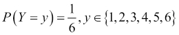
This model tells us that the probability of rolling a particular digit, say, three, is one in six. Notice that we are not making a definite prediction on the outcome of a particular roll of the die; instead, we are saying that each outcome is equally likely.
Note
Probability is a term that is commonly used in everyday speech, but at the same time, sometimes results in confusion with regard to its actual interpretation. It turns out that there are a number of different ways of interpreting probability. Two commonly cited interpretations are the Frequentist probability and the Bayesian probability. Frequentist probability is associated with repeatable experiments, such as rolling a one-sided die. In this case, the probability of seeing the digit three, is just the relative proportion of the digit three coming up if this experiment were to be repeated an infinite number of times. Bayesian probability is associated with a subjective degree of belief or surprise in seeing a particular outcome and can, therefore, be used to give meaning to one-off events, such as the probability of a presidential candidate winning an election. In our die rolling experiment, we are equally surprised to see the number three come up as with any other number. Note that in both cases, we are still talking about the same probability numerically (1/6), only the interpretation differs.
In the case of the die model, there aren't any variables that we have to measure. In most cases, however, we'll be looking at predictive models that involve a number of independent variables that are measured, and these will be used to predict a dependent variable. Predictive modeling draws on many diverse fields and as a result, depending on the particular literature you consult, you will often find different names for these. Let's load a data set into R before we expand on this point. R comes with a number of commonly cited data sets already loaded, and we'll pick what is probably the most famous of all, the iris data set:
Tip
To see what other data sets come bundled with R, we can use the data() command to obtain a list of data sets along with a short description of each. If we modify the data from a data set, we can reload it by providing the name of the data set in question as an input parameter to the data() command, for example, data(iris) reloads the iris data set.
> head(iris, n = 3)
  Sepal.Length Sepal.Width Petal.Length Petal.Width Species
1          5.1         3.5          1.4         0.2  setosa
2          4.9         3.0          1.4         0.2  setosa
3          4.7         3.2          1.3         0.2  setosa
The iris data set consists of measurements made on a total of 150 flower samples of three different species of iris. In the preceding code, we can see that there are four measurements made on each sample, namely the lengths and widths of the flower petals and sepals. The iris data set is often used as a typical benchmark for different models that can predict the species of an iris flower sample, given the four previously mentioned measurements. Collectively, the sepal length, sepal width, petal length, and petal width are referred to as features, attributes, predictors, dimensions, or independent variables in literature. In this book, we prefer to use the word feature, but other terms are equally valid. Similarly, the species column in the data frame is what we are trying to predict with our model, and so it is referred to as the dependent variable, output, or target. Again, in this book, we will prefer one form for consistency, and will use output. Each row in the data frame corresponding to a single data point is referred to as an observation, though it typically involves observing the values of a number of features.
As we will be using data sets, such as the iris data described earlier, to build our predictive models, it also helps to establish some symbol conventions. Here, the conventions are quite common in most of the literature. We'll use the capital letter, Y, to refer to the output variable, and subscripted capital letter, Xi, to denote the ith feature. For example, in our iris data set, we have four features that we could refer to as X1 through X4. We will use lower case letters for individual observations, so that x1 corresponds to the first observation. Note that x1 itself is a vector of feature components, xij, so that x12 refers to the value of the second feature in the first observation. We'll try to use double suffixes sparingly and we won't use arrows or any other form of vector notation for simplicity. Most often, we will be discussing either observations or features and so the case of the variable will make it clear to the reader which of these two is being referenced.
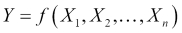
When thinking about a predictive model using a data set, we are generally making the assumption that for a model with n features, there is a true or ideal function, f, that maps the features to the output:
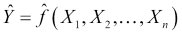
We'll refer to this function as our target function. In practice, as we train our model using the data available to us, we will produce our own function that we hope is a good estimate for the target function. We can represent this by using a caret on top of the symbol f to denote our predicted function, and also for the output, Y, since the output of our predicted function is the predicted output. Our predicted output will, unfortunately, not always agree with the actual output for all observations (in our data or in general):
Given this, we can essentially summarize the process of predictive modeling as a process that produces a function to predict a quantity, while minimizing the error it makes compared to the target function. A good question we can ask at this point is, where does the error come from? Put differently, why are we generally not able to exactly reproduce the underlying target function by analyzing a data set?
The answer to this question is that in reality there are several potential sources of error that we must deal with. Remember that each observation in our data set contains values for n features, and so we can think about our observations geometrically as points in an n-dimensional feature space. In this space, our underlying target function should pass through these points by the very definition of the target function. If we now think about this general problem of fitting a function to a finite set of points, we will quickly realize that there are actually infinite functions that could pass through the same set of points. The process of predictive modeling involves making a choice in the type of model that we will use for the data thereby constraining the range of possible target functions to which we can fit our data. At the same time, the data's inherent randomness cannot be removed no matter what model we select. These ideas lead us to an important distinction in the types of error that we encounter during modeling, namely the reducible error and the irreducible error respectively.
The reducible error essentially refers to the error that we as predictive modelers can minimize by selecting a model structure that makes valid assumptions about the process being modeled and whose predicted function takes the same form as the underlying target function. For example, as we shall see in the next chapter, a linear model imposes a linear relationship between the features in order to compose the output. This restrictive assumption means that no matter what training method we use, how much data we have, and how much computational power we throw in, if the features aren't linearly related in the real world, then our model will necessarily produce an error for at least some possible observations. By contrast, an example of an irreducible error arises when trying to build a model with an insufficient feature set. This is typically the norm and not the exception. Often, discovering what features to use is one of the most time consuming activities of building an accurate model.
Sometimes, we may not be able to directly measure a feature that we know is important. At other times, collecting the data for too many features may simply be impractical or too costly. Furthermore, the solution to this problem is not simply an issue of adding as many features as possible. Adding more features to a model makes it more complex and we run the risk of adding a feature that is unrelated to the output thus introducing noise in our model. This also means that our model function will have more inputs and will, therefore, be a function in a higher dimensional space. Some of the potential practical consequences of adding more features to a model include increasing the time it will take to train the model, making convergence on a final solution harder, and actually reducing model accuracy under certain circumstances, such as with highly correlated features. Finally, another source of an irreducible error that we must live with is the error in measuring our features so that the data itself may be noisy.
Reducible errors can be minimized not only through selecting the right model but also by ensuring that the model is trained correctly. Thus, reducible errors can also come from not finding the right specific function to use, given the model assumptions. For example, even when we have correctly chosen to train a linear model, there are infinitely many linear combinations of the features that we could use. Choosing the model parameters correctly, which in this case would be the coefficients of the linear model, is also an aspect of minimizing the reducible error. Of course, a large part of training a model correctly involves using a good optimization procedure to fit the model. In this book, we will at least give a high level intuition of how each model that we study is trained. We generally avoid delving deep into the mathematics of how optimization procedures work but we do give pointers to the relevant literature for the interested reader to find out more.
So far we've established some central notions behind models and a common language to talk about data. In this section, we'll look at what the core components of a statistical model are. The primary components are typically:
A set of equations with parameters that need to be tuned
Some data that are representative of a system or process that we are trying to model
A concept that describes the model's goodness of fit
A method to update the parameters to improve the model's goodness of fit
As we'll see in this book, most models, such as neural networks, linear regression, and support vector machines have certain parameterized equations that describe them. Let's look at a linear model attempting to predict the output, Y, from three input features, which we will call X1, X2, and X3:
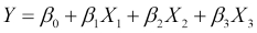
This model has exactly one equation describing it and this equation provides the linear structure of the model. The equation is parameterized by four parameters, known as coefficients in this case, and they are the four β parameters. In the next chapter, we will see exactly what roles these play, but for this discussion, it is important to note that a linear model is an example of a parameterized model. The set of parameters is typically much smaller than the amount of data available.
Given a set of equations and some data, we then talk about training the model. This involves assigning values to the model's parameters so that the model describes the data more accurately. We typically employ certain standard measures that describe a model's goodness of fit to the data, which is how well the model describes the training data. The training process is usually an iterative procedure that involves performing computations on the data so that new values for the parameters can be computed in order to increase the model's goodness of fit. For example, a model can have an objective or error function. By differentiating this and setting it to zero, we can find the combination of parameters that give us the minimum error. Once we finish this process, we refer to the model as a trained model and say that the model has learned from the data. These terms are derived from the machine learning literature, although there is often a parallel made with statistics, a field that has its own nomenclature for this process. We will mostly use the terms from machine learning in this book.
In order to put some of the ideas in this chapter into perspective, we will present our first model for this book, k-nearest neighbors, which is commonly abbreviated as kNN. In a nutshell, this simple approach actually avoids building an explicit model to describe how the features in our data combine to produce a target function. Instead, it relies on the notion that if we are trying to make a prediction on a data point that we have never seen before, we will look inside our original training data and find the k observations that are most similar to our new data point. We can then use some kind of averaging technique on the known value of the target function for these k neighbors to compute a prediction. Let's use our iris data set to understand this by way of an example. Suppose that we collect a new unidentified sample of an iris flower with the following measurements:
> new_sample
Sepal.Length  Sepal.Width Petal.Length  Petal.Width
4.8          2.9          3.7          1.7
We would like to use the kNN algorithm in order to predict which species of flower we should use to identify our new sample. The first step in using the kNN algorithm is to determine the k-nearest neighbors of our new sample. In order to do this, we will have to give a more precise definition of what it means for two observations to be similar to each other. A common approach is to compute a numerical distance between two observations in the feature space. The intuition is that two observations that are similar will be close to each other in the feature space and therefore, the distance between them will be small. To compute the distance between two observations in the feature space, we often use the Euclidean distance, which is the length of a straight line between two points. The Euclidean distance between two observations, x1 and x2, is computed as follows:
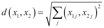
Recall that the second suffix, j, in the preceding formula corresponds to the jth feature. So, what this formula is essentially telling us is that for every feature, take the square of the difference in values of the two observations, sum up all these squared differences, and then take the square root of the result. There are many other possible definitions of distance, but this is one of the most frequently encountered in the kNN setting. We'll see more distance metrics in Chapter 11, Recommendation Systems.
In order to find the nearest neighbors of our new sample iris flower, we'll have to compute the distance to every point in the iris data set and then sort the results. First, we'll begin by subsetting the iris data frame to include only our features, thus excluding the species column, which is what we are trying to predict. We'll then define our own function to compute the Euclidean distance. Next, we'll use this to compute the distance to every iris observation in our data frame using the apply() function. Finally, we'll use the sort() function of R with the index.return parameter set to TRUE, so that we also get back the indexes of the row numbers in our iris data frame corresponding to each distance computed:
> iris_features <- iris[1:4]
> dist_eucl <- function(x1, x2) sqrt(sum((x1 - x2) ^ 2))
> distances <- apply(iris_features, 1,
                     function(x) dist_eucl(x, new_sample))
> distances_sorted <- sort(distances, index.return = T)


> str(distances_sorted)
List of 2
 $ x : num [1:150] 0.574 0.9 0.9 0.949 0.954 ...
 $ ix: int [1:150] 60 65 107 90 58 89 85 94 95 99 ...
The $x attribute contains the actual values of the distances computed between our sample iris flower and the observations in the iris data frame. The $ix attribute contains the row numbers of the corresponding observations. If we want to find the five nearest neighbors, we can subset our original iris data frame using the first five entries from the $ix attribute as the row numbers:
> nn_5 <- iris[distances_sorted$ix[1:5],]
> nn_5
    Sepal.Length Sepal.Width Petal.Length Petal.Width    Species
60           5.2         2.7          3.9         1.4 versicolor
65           5.6         2.9          3.6         1.3 versicolor
107          4.9         2.5          4.5         1.7 virginica
90           5.5         2.5          4.0         1.3 versicolor
58           4.9         2.4          3.3         1.0 versicolor
As we can see, four of the five nearest neighbors to our sample are the versicolor species, while the remaining one is the virginica species. For this type of problem where we are picking a class label, we can use a majority vote as our averaging technique to make our final prediction. Consequently, we would label our new sample as belonging to the versicolor species. Notice that setting the value of k to an odd number is a good idea, because it makes it less likely that we will have to contend with tie votes (and completely eliminates ties when the number of output labels is two). In the case of a tie, the convention is usually to just resolve it by randomly picking among the tied labels. Notice that nowhere in this process have we made any attempt to describe how our four features are related to our output. As a result, we often refer to the kNN model as a lazy learner because essentially, all it has done is memorize the training data and use it directly during a prediction. We'll have more to say about our kNN model, but first we'll return to our general discussion on models and discuss different ways to classify them.
With a broad idea of the basic components of a model, we are ready to explore some of the common distinctions that modelers use to categorize different models.
We've already looked at the iris data set, which consisted of four features and one output variable, namely the species variable. Having the output variable available for all the observations in the training data is the defining characteristic of the supervised learning setting, which represents the most frequent scenario encountered. In a nutshell, the advantage of training a model under the supervised learning setting is that we have the correct answer that we should be predicting for the data points in our training data. As we saw in the previous section, kNN is a model that uses supervised learning, because the model makes its prediction for an input point by combining the values of the output variable for a small number of neighbors to that point. In this book, we will primarily focus on supervised learning.
Using the availability of the value of the output variable as a way to discriminate between different models, we can also envisage a second scenario in which the output variable is not specified. This is known as the unsupervised learning setting. An unsupervised version of the iris data set would consist of only the four features. If we don't have the species output variable available to us, then we clearly have no idea as to which species each observation refers. Indeed, we won't know how many species of flower are represented in the data set, or how many observations belong to each species. At first glance, it would seem that without this information, no useful predictive task could be carried out. In fact, what we can do is examine the data and create groups of observations based on how similar they are to each other, using the four features available to us. This process is known as clustering. One benefit of clustering is that we can discover natural groups of data points in our data; for example, we might be able to discover that the flower samples in an unsupervised version of our iris set form three distinct groups which correspond to three different species.
Between unsupervised and supervised methods, which are two absolutes in terms of the availability of the output variable, reside the semi-supervised and reinforcement learning settings. Semi-supervised models are built using data for which a (typically quite small) fraction contains the values for the output variable, while the rest of the data is completely unlabeled. Many such models first use the labeled portion of the data set in order to train the model coarsely, then incorporate the unlabeled data by projecting labels predicted by the model trained up this point.
In a reinforcement learning setting the output variable is not available, but other information that is directly linked with the output variable is provided. One example is predicting the next best move to win a chess game, based on data from complete chess games. Individual chess moves do not have output values in the training data, but for every game, the collective sequence of moves for each player resulted in either a win or a loss. Due to space constraints, semi-supervised and reinforcement settings aren't covered in this book.
In a previous section, we noted how most of the models we will encounter are parametric models, and we saw an example of a simple linear model. Parametric models have the characteristic that they tend to define a functional form. This means that they reduce the problem of selecting between all possible functions for the target function to a particular family of functions that form a parameter set. Selecting the specific function that will define the model essentially involves selecting precise values for the parameters. So, returning to our example of a three feature linear model, we can see that we have the two following possible choices of parameters (the choices are infinite, of course; here we just demonstrate two specific ones):
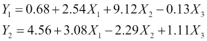
Here, we have used a subscript on the output Y variable to denote the two different possible models. Which of these might be a better choice? The answer is that it depends on the data. If we apply each of our models on the observations in our data set, we will get the predicted output for every observation. With supervised learning, every observation in our training data is labeled with the correct value of the output variable. To assess our model's goodness of fit, we can define an error function that measures the degree to which our predicted outputs differ from the correct outputs. We then use this to pick between our two candidate models in this case, but more generally to iteratively improve a model by moving through a sequence of progressively better candidate models.
Some parametric models are more flexible than linear models, meaning that they can be used to capture a greater variety of possible functions. Linear models, which require that the output be a linearly weighted combination of the input features, are considered strict. We can intuitively see that a more flexible model is more likely to allow us to approximate our input data with greater accuracy; however, when we look at overfitting, we'll see that this is not always a good thing. Models that are more flexible also tend to be more complex and, thus, training them often proves to be harder than training less flexible models.
Models are not necessarily parameterized, in fact, the class of models that have no parameters is known (unsurprisingly) as nonparametric models. Nonparametric models generally make no assumptions on the particular form of the output function. There are different ways of constructing a target function without parameters. Splines are a common example of a nonparametric model. The key idea behind splines is that we envisage the output function, whose form is unknown to us, as being defined exactly at the points that correspond to all the observations in our training data. Between the points, the function is locally interpolated using smooth polynomial functions. Essentially, the output function is built in a piecewise manner in the space between the points in our training data. Unlike most scenarios, splines will guarantee 100 percent accuracy on the training data, whereas, it is perfectly normal to have some errors in our training data. Another good example of a nonparametric model is the k-nearest neighbor algorithm that we've already seen.
The distinction between regression and classification models has to do with the type of output we are trying to predict, and is generally relevant to supervised learning. Regression models try to predict a numerical or quantitative value, such as the stock market index, the amount of rainfall, or the cost of a project. Classification models try to predict a value from a finite (though still possibly large) set of classes or categories. Examples of this include predicting the topic of a website, the next word that will be typed by a user, a person's gender, or whether a patient has a particular disease given a series of symptoms. The majority of models that we will study in this book fall quite neatly into one of these two categories, although a few, such as neural networks can be adapted to solve both types of problems. It is important to stress here that the distinction made is on the output only, and not on whether the feature values that are used to predict the output are quantitative or qualitative themselves. In general, features can be encoded in a way that allows both qualitative and quantitative features to be used in regression and classification models alike. Earlier, when we built a kNN model to predict the species of iris based on measurements of flower samples, we were solving a classification problem as our species output variable could take only one of three distinct labels. The kNN approach can also be used in a regression setting; in this case, the model combines the numerical values of the output variable for the selected nearest neighbors by taking the mean or median in order to make its final prediction. Thus, kNN is also a model that can be used in both regression and classification settings.
Predictive models can use real-time machine learning or they can involve batch learning. The term real-time machine learning can refer to two different scenarios, although it certainly does not refer to the idea that real-time machine learning involves making a prediction in real time, that is, within a predefined time limit which is typically small. For example, once trained, a neural network model can produce its prediction of the output using only a few computations (depending on the number of inputs and network layers). This is not, however, what we mean when we talk about real-time machine learning.
A good example of a model that uses real-time machine learning is a weather predictor that uses a stream of incoming readings from various meteorological instruments. Here, the real time aspect of the model refers to the fact that we are taking only a recent window of readings in order to predict the weather. The further we go back in time, the less relevant the readings will be and we can, thus, choose to use only the latest information in order to make our prediction. Of course, models that are to be used in a real-time setting must also be able to compute their predictions quickly—it is not of much use if it takes hours for a system taking measurements in the morning to compute a prediction for the evening, as by the time the computation ends, the prediction won't be of much value.
When talking about models that take into account information obtained over a recent time frame to make a prediction, we generally refer to models that have been trained on data that is assumed to be representative of all the data for which the model will be asked to make a prediction in the future. A second interpretation of real-time machine learning arises when we describe models that detect that the properties of the process being modeled have shifted in some way. We will focus on examples of the first kind in this book when we look at time series models.
By looking at some of the different characterizations of models, we've already hinted at various steps of the predictive modeling process. In this section, we will present these steps in a sequence and make sure we understand how each of these contributes to the overall success of the endeavor.
In a nutshell, the first step of every project is to figure out precisely what the desired outcome is, as this will help steer us to make good decisions throughout the course of the project. In a predictive analytics project, this question involves drilling into the type of prediction that we want to make and understanding the task in detail. For example, suppose we are trying to build a model that predicts employee churn for a company. We first need to define this task precisely, while trying to avoid making the problem overly broad or overly specific. We could measure churn as the percentage of new full time hires that defect from the company within their first six months. Notice that once we properly define the problem, we have already made some progress in thinking about what data we will have to work with. For example, we won't have to collect data from part-time contractors or interns. This task also means that we should collect data from our own company only, but at the same time recognize that our model might not necessarily be applicable to make predictions for the workforce of a different company. If we are only interested in churn, it also means that we won't need to make predictions about employee performance or sick days (although it wouldn't hurt to ask the person for whom we are building the model, to avoid surprises in the future).
Once we have a precise enough idea of the model we want to build, the next logical question to ask is what sort of performance we are interested in achieving, and how we will measure this. That is to say, we need to define a performance metric for our model and then a minimum threshold of acceptable performance. We will go into substantial detail on how to assess the performance of models in this book. For now, we want to emphasize that, although it is not unusual to talk about assessing the performance of a model after we have trained it on some data, in practice it is important to remember that defining the expectations and performance target for our model is something that a predictive modeler should discuss with the stakeholders of a project at the very beginning. Models are never perfect and it is easy to spiral into a mode of forever trying to improve performance. Clear performance goals are not only useful in guiding us to decide which methods to use, but also in knowing when our model is good enough.
Finally, we also need to think about the data that will be available to us when the time comes to collect it, and the context in which the model will be used. For example, suppose we know that our employee churn model will be used as one of the factors that determine whether a new applicant in our company will be hired. In this context, we should only collect data from our existing employees that were available before they were hired. We cannot use the result of their first performance review, as these data won't be available for a prospective applicant.
Training a model to make predictions is often a data-intensive venture, and if there is one thing that you can never have too much of in this business, it is data. Collecting the data can often be the most time and resource consuming part of the entire process, which is why it is so critical that the first step of defining the task and identifying the right data to be collected is done properly. When we learn about how a model, such as logistic regression works we often do this by way of an example data set and this is largely the approach we'll follow in this book. Unfortunately, we don't have a way to simulate the process of collecting the data, and it may seem that most of the effort is spent on training and refining a model. When learning about models using existing data sets, we should bear in mind that a lot of effort has usually gone into collecting, curating, and preprocessing the data. We will look at data preprocessing more closely in a subsequent section.
While we are collecting data, we should always keep in mind whether we are collecting the right kind of data. Many of the sanity checks that we perform on data during preprocessing also apply during collection, in order for us to spot whether we have made a mistake early on in the process. For example, we should always check that we measure features correctly and in the right units. We should also make sure that we collect data from sources that are sufficiently recent, reliable, and relevant to the task at hand. In the employee churn model we described in the previous section, as we collect information about past employees we should ensure that we are consistent in measuring our features. For example, when measuring how many days a person has been working in our company, we should consistently use either calendar days or business days. We must also check that when collecting dates, such as when a person joined or left the company, we invariably either use the US format (month followed by day) or the European format (day followed by month) and do not mix the two, otherwise a date like 03/05/2014 will be ambiguous. We should also try to get information from as broad a sample as possible and not introduce a hidden bias in our data collection. For example, if we wanted a general model for employee churn, we would not want to collect data from only female employees or employees from a single department.
How do we know when we have collected enough data? Early on when we are collecting the data and have not built and tested any model, it is impossible to tell how much data we will eventually need, and there aren't any simple rules of thumb that we can follow. We can, however, anticipate that certain characteristics of our problem will require more data. For example, when building a classifier that will learn to predict from one of three classes, we may want to check whether we have enough observations representative of each class.
The greater the number of output classes we have, the more data we will need to collect. Similarly, for regression models, it is also useful to check that the range of the output variable in the training data corresponds to the range that we would like to predict. If we are building a regression model that covers a large output range, we will also need to collect more data compared to a regression model that covers a smaller output range under the same accuracy requirements.
Another important factor to help us estimate how much data we will need, is the desired model performance. Intuitively, the higher the accuracy that we need for our model, the more data we should collect. We should also be aware that improving model performance is not a linear process. Getting from 90 to 95 percent accuracy can often require more effort and a lot more data, compared to making the leap from 70 to 90 percent. Models that have fewer parameters or are simpler in their design, such as linear regression models, often tend to need less data than more complex models such as neural networks. Finally, the greater the number of features that we want to incorporate into our model, the greater the amount of data we should collect. In addition, we should be aware of the fact that this requirement for additional data is also not going to be linear. That is to say, building a model with twice the number of features often requires much more than twice the amount of original data. This should be readily apparent, if we think of the number of different combinations of inputs our model will be required to handle. Adding twice the number of dimensions results in far more than twice the number of possible input combinations. To understand this, suppose we have a model with three input features, each of which takes ten possible values. We have 103 = 1000 possible input combinations. Adding a single extra feature that also takes ten values raises this to 10,000 possible combinations, which is much more than twice the number of our initial input combinations.
There have been attempts to obtain a more quantifiable view of whether we have enough data for a particular data set but we will not have time to cover them in this book. A good place to start learning more about this area of predictive modeling is to study learning curves. In a nutshell, with this approach we build consecutive models on the same data set by starting off with a small portion of the data and successively adding more. The idea is that if throughout this process the predictive accuracy on testing data always improves without tapering off, we probably could benefit from obtaining more data. As a final note for the data collection phase, even if we think we have enough data, we should always consider how much it would cost us (in terms of time and resources) in order to get more data, before making a choice to stop collecting and begin modeling.
Once we are clear on the prediction task, and we have the right kind data, the next step is to pick our first model. To being with, there is no best model overall, not even a best model using a few rules of thumb. In most cases, it makes sense to start off with a simple model, such as a Naïve Bayes model or a logistic regression in the case of a classification task, or a linear model in the case of regression. A simple model will give us a starting baseline performance, which we can then strive to improve. A simple model to start off with might also help in answering useful questions, such as how each feature contributes to the result, that is, how important is each feature and is the relationship with the output positively or negatively correlated. Sometimes, this kind of analysis itself warrants the production of a simple model first, followed by a more complex one, which will be used for the final prediction.
Sometimes a simple model might give us enough accuracy for the task at hand so that we won't need to invest more effort in order to give us a little bit extra. On the other hand, a simple model will often end up being inadequate for the task, requiring us to pick something more complicated. Choosing a more complex model over a simpler one is not always a straightforward decision, even if we can see that the accuracy of the complex model will be much better. Certain constraints, such as the number of features we have or the availability of data, may prevent us from moving to a more complex model. Knowing how to choose a model involves understanding the various strengths and limitations of the models in our toolkit. For every model we encounter in this book, we will pay particular attention to learning these points. In a real-world project, to help guide our decision, we often go back to the task requirements and ask a few questions, such as:
What type of task do we have? Some models are only suited for particular tasks such as regression, classification, or clustering.
Does the model need to explain its predictions? Some models, such as decision trees, are better at giving insights that are easily interpretable to explain why they made a particular prediction.
Do we have any constraints on prediction time?
Do we need to update the model frequently and is training time, therefore, important?
Does the model work well if we have highly correlated features?
Does the model scale well for the number of features and amount of data that we have available? If we have massive amounts of data, we may need a model whose training procedure can be parallelized to take advantage of parallel computer architectures, for example.
In practice, even if our first analysis points toward a particular model, we will most likely want to try out a number of options before making our final decision.
Before we can use our data to train our model, we typically need to preprocess them. In this section, we will discuss a number of common preprocessing steps that we usually perform. Some of these are necessary in order to detect and resolve problems in our data, while others are useful in order to transform our data and make them applicable to the model we have chosen.
Once we have some data and have decided to start working on a particular model, the very first thing we'll want to do is to look at the data itself. This is not necessarily a very structured part of the process; it mostly involves understanding what each feature measures and getting a sense of the data we have collected. It is really important to understand what each feature represents and the units in which it is measured. It is also a really good idea to check the consistent use of units. We sometimes call this investigative process of exploring and visualizing our data exploratory data analysis.
An excellent practice is to use the summary() function of R on our data frame to obtain some basic metrics for each feature, such as the mean and variance, as well as the largest and smallest values. Sometimes, it is easy to spot that a mistake has been made in data collection through inconsistencies in the data. For example, for a regression problem, multiple observations with identical feature values but wildly different outputs may (depending on the application) be a signal that there are erroneous measurements. Similarly, it is a good idea to know whether there are any features that have been measured in the presence of significant noise. This may sometimes lead to a different choice of model or it may mean that the feature should be ignored.
Tip
Another useful function used to summarize features in a data frame is the describe() function in the psych package. This returns information about how skewed each feature is, as well as the usual measures of a location (such as the mean and median) and dispersion (such as the standard deviation).
An essential part of exploratory data analysis is to use plots to visualize our data. There is a diverse array of plots that we can use depending on the context. For example, we might want to create box plots of our numerical features to visualize ranges and quartiles. Bar plots and mosaic plots are useful to visualize the proportions of our data under different combinations of values for categorical input features. We won't go into further detail on information visualization, as this is a field in its own right.
Tip
R is an excellent platform to create visualizations. The base R package provides a number of different functions to plot data. Two excellent packages to create more advanced plots are lattice and ggplot2. Good references for these two, which also cover principles used to make effective visualizations, are Lattice: Multivariate Data Visualization with R and ggplot2: Elegant Graphics for Data Analysis, both of which are published by Springer under the Use R! series.
Often, we'll find that our numerical features are measured on scales that are completely different to each other. For example, we might measure a person's body temperature in degrees Celsius, so the numerical values will typically be in the range of 36-38. At the same time, we might also measure a person's white blood cell count per microliter of blood. This feature generally takes values in the thousands. If we are to use these features as an input to an algorithm, such as kNN, we'd find that the large values of the white blood cell count feature dominate the Euclidean distance calculation. We could have several features in our input that are important and useful for classification, but if they were measured on scales that produce numerical values much smaller than one thousand, we'd essentially be picking our nearest neighbors mostly on the basis of a single feature, namely the white blood cell count. This problem comes up often and applies to many models, not just kNN. We handle this by transforming (also referred to as scaling) our input features before using them in our model.
We'll discuss three popular options for feature scaling. When we know that our input features are close to being normally distributed, one possible transformation to use is Z-score normalization, which works by subtracting the mean and dividing it by the standard deviation:
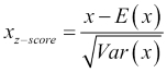
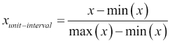
E(x) is the expectation or mean of x, and the standard deviation is the square root of the variance of x, written as Var(x). Notice that as a result of this transformation, the new feature will be centered on a mean of zero and will have unit variance. Another possible transformation, which is better when the input is uniformly distributed, is to scale all the features and outputs so that they lie within a single interval, typically the unit interval [0,1]:
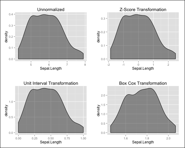
A third option is known as the Box-Cox transformation. This is often applied when our input features are highly skewed (asymmetric) and our model requires the input features to be normally distributed or symmetrical at the very least:
As λ is in the denominator, it must take a value other than zero. The transformation is actually defined for a zero-valued λ: in this case, it is given by the natural logarithm of the input feature, ln(x). Notice that this is a parameterized transform and so there is a need to specify a concrete value of λ. There are various ways to estimate an appropriate value for λ from the data itself. Indicatively, we'll mention a technique to do this, known as cross-validation, which we will encounter later on in this book in Chapter 5, Support Vector Machines.
Note
The original reference for the Box-Cox transformation is a paper published in 1964 by the Journal of the Royal Statistical Society, titled An analysis of Transformations and authored by G. E. P. Box and D. R. Cox.
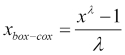
To get a feel for how these transformations work in practice, we'll try them out on the Sepal.Length feature from our iris data set. Before we do this, however, we'll introduce the first R package that we will be working with, caret.
The caret package is a very useful package that has a number of goals. It provides a number of helpful functions that are commonly used in the process of predictive modeling, from data preprocessing and visualization, to feature selection and resampling techniques. It also features a unified interface for many predictive modeling functions and provides functionalities for parallel processing.
Note
The definitive reference for predictive modeling using the caret package is a book called Applied Predictive Modeling, written by Max Kuhn and Kjell Johnson and published by Springer. Max Kuhn is the principal author of the caret package itself. The book also comes with a companion website at http://appliedpredictivemodeling.com.
When we transform our input features on the data we use to train our model, we must remember that we will need to apply the same transformation to the features of later inputs that we will use at prediction time. For this reason, transforming data using the caret package is done in two steps. In the first step, we use the preProcess() function that stores the parameters of the transformations to be applied to the data, and in the second step, we use the predict() function to actually compute the transformation. We tend to use the preProcess() function only once, and then the predict() function every time we need to apply the same transformation to some data. The preProcess() function takes a data frame with some numerical values as its first input, and we will also specify a vector containing the names of the transformations to be applied to the method parameter. The predict() function then takes the output of the previous function along with the data we want to transform, which in the case of the training data itself may well be the same data frame. Let's see all this in action:
> library("caret")
> iris_numeric <- iris[1:4]
> pp_unit <- preProcess(iris_numeric, method = c("range"))
> iris_numeric_unit <- predict(pp_unit, iris_numeric)
> pp_zscore <- preProcess(iris_numeric, method = c("center", "scale"))
> iris_numeric_zscore <- predict(pp_zscore, iris_numeric)
> pp_boxcox <- preProcess(iris_numeric, method = c("BoxCox"))
> iris_numeric_boxcox <- predict(pp_boxcox, iris_numeric)
Tip
Downloading the example code
You can download the example code files from your account at http://www.packtpub.com for all the Packt Publishing books you have purchased. If you purchased this book elsewhere, you can visit http://www.packtpub.com/support and register to have the files e-mailed directly to you.
We've created three new versions of the numerical features of the iris data, with the difference being that in each case we used a different transformation. We can visualize the effects of our transformations by plotting the density of the Sepal.Length feature for each scaled data frame using the density() function and plotting the results, as shown here:
Notice that the Z-score and unit interval transformations preserve the overall shape of the density while shifting and scaling the values, whereas the Box-Cox transformation also changes the overall shape, resulting in a density that is less skewed than the original.
Many models, from linear regression to neural networks, require all the inputs to be numerical, and so we often need a way to encode categorical fields on a numerical scale. For example, if we have a size feature that takes values in the set {small, medium, large}, we may want to represent this with the numerical values 1, 2, and 3, respectively. In the case of ordered categories, such as the size feature just described, this mapping probably makes sense.
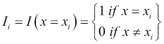
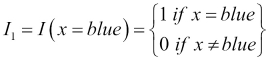
The number 3 is the largest on this scale and this corresponds to the large category, which is further away from the small category, represented by the number 1 than it is from the medium category, represented by the value 2. Using this scale is only one possible mapping, and in particular, it forces the medium category to be equidistant from the large and small categories, which may or may not be appropriate based on our knowledge about the specific feature. In the case of unordered categories, such as brands or colors, we generally avoid mapping them onto a single numerical scale. For example, if we mapped the set {blue, green, white, red, orange} to the numbers one through five, respectively, then this scale is arbitrary and there is no reason why red is closer to white and far from blue. To overcome this, we create a series of indicator features, Ii, which take the following form:
We need as many indicator features as we have categories, so for our color example, we would create five indicator features. In this case, I1, might be:
In this way, our original color feature will be mapped to five indicator features and for every observation, only one of these indicator features takes the value 1 and the rest will be 0 as each observation will involve one color value in our original feature. Indicator features are binary features as they only take on two values: 0 and 1.
Note
We may often encounter an alternative approach that uses only n-1 binary features to encode n levels of a factor. This is done by choosing one level to be the reference level and is indicated where each one of the n-1 binary features takes the value 0. This can be more economical on the number of features and avoids introducing a linear dependence between them, but it violates the property that all features are equidistant from each other.
Sometimes, data contain missing values, as for certain observations some features were unavailable or could not properly be measured. For example, suppose that in our iris data set, we lost the measurement for a particular observation's petal length. We would then have a missing value for this flower sample in the Petal.Length feature. Most models do not have an innate ability to handle missing data. Typically, a missing value appears in our data as a blank entry or the symbol NA. We should check whether missing values are actually present in our data but have been erroneously assigned a value, such as 0, which is often a very legitimate feature value.
Before deciding how to handle missing data, especially when our approach will be to simply throw away observations with missing values, we should recognize that the particular values that are missing might follow a pattern. Concretely, we often distinguish between different so-called mechanisms for missing values. In the ideal Missing Completely At Random (MCAR) scenario, missing values occur independently from the true values of the features in which they occur, as well as from all other features. In this scenario, if we are missing a value for the length of a particular iris flower petal, then this occurs independently from how long the flower petal actually was and the value of any other feature, such as whether the observation was from the versicolor species or the setosa species. The Missing At Random (MAR) scenario is a less ideal situation. Here, a missing value is independent of the true value of the feature in question, but may be correlated with another feature. An example of this scenario is when missing petal length values mostly occur in the setosa samples in our iris data set, as long as they still occur independently of the true petal length values. In the Missing Not At Random (MNAR) scenario, which is the most problematic case, there is some sort of a pattern that explains when values might be missing based on the true values of the feature itself. For example, if we had difficulty in measuring very small petal lengths and ended up with missing values as a result, simply removing the incomplete samples would result in a sample of observations with above average petal lengths, and so our data would be biased.
There are a number of ways to handle missing values but we will not dig deep into this problem in this book. In the rare cases where we have missing values, we will exclude them from our data sets, but be aware that in a real project, we would investigate the source of the missing values in order to be sure that we can do this safely. Another approach is to attempt to guess or impute the missing values. The kNN algorithm itself is one way to do this by finding the nearest neighbors of a sample with a missing value in one feature. This is done by using a distance computation that excludes the dimension which contains the missing value. The missing value is then computed as the mean of the values of the nearest neighbors in this dimension.
Outliers are also a problem that often needs to be addressed. An outlier is a particular observation that is very far from the rest of the data in one or more of its features. In some cases, this may represent an actual rare circumstance that is a legitimate behavior for the system we are trying to model. In other cases, it may be that there has been an error in measurement. For example, when reporting the ages of people, a value of 110 might be an outlier, which could happen because of a reporting error on an actual value of 11. It could also be the result of a valid, albeit extremely rare measurement. Often, the domain of our problem will give us a good indication of whether outliers are likely to be measurement errors or not, and if so, as part of preprocessing the data, we will often want to exclude outliers from our data completely. In Chapter 2, Linear Regression, we will look at outlier exclusion in more detail.
Preprocessing a data set can also involve the decision to drop some of the features if we know that they will cause us problems with our model. A common example is when two or more features are highly correlated with each other. In R, we can easily compute pairwise correlations on a data frame using the cor() function:
> cor(iris_numeric)
             Sepal.Length Sepal.Width Petal.Length Petal.Width
Sepal.Length    1.0000000  -0.1175698    0.8717538   0.8179411
Sepal.Width    -0.1175698   1.0000000   -0.4284401  -0.3661259
Petal.Length    0.8717538  -0.4284401    1.0000000   0.9628654
Petal.Width     0.8179411  -0.3661259    0.9628654   1.0000000
Here, we can see that the Petal.Length feature is very highly correlated with the Petal.Width feature, with the correlation exceeding 0.96. The caret package offers the findCorrelation() function, which takes a correlation matrix as an input, and the optional cutoff parameter, which specifies a threshold for the absolute value of a pairwise correlation. This then returns a (possibly zero length) vector which shows the columns to be removed from our data frame due to correlation. The default setting of cutoff is 0.9:
> iris_cor <- cor(iris_numeric)
> findCorrelation(iris_cor)
[1] 3
> findCorrelation(iris_cor, cutoff = 0.99)
integer(0)
> findCorrelation(iris_cor, cutoff = 0.80)
[1] 3 4
An alternative approach to removing correlation is a complete transformation of the entire feature space as is done in many methods for dimensionality reduction, such as Principal Component Analysis (PCA) and Singular Value Decomposition (SVD). We'll see the former shortly, and the latter we'll visit in Chapter 11, Recommendation Systems.
In a similar vein, we might want to remove features that are linear combinations of each other. By linear combination of features, we mean a sum of features where each feature is multiplied by a scalar constant. To see how caret deals with these, we will create a new iris data frame with two additional columns, which we will call Cmb and Cmb.N, as follows:
> new_iris <- iris_numeric
> new_iris$Cmb <- 6.7 * new_iris$Sepal.Length –
                  0.9 * new_iris$Petal.Width
> set.seed(68)
> new_iris$Cmb.N <- new_iris$Cmb +
                    rnorm(nrow(new_iris), sd = 0.1)
> options(digits = 4)
> head(new_iris,n = 3)
  Sepal.Length Sepal.Width Petal.Length Petal.Width   Cmb Cmb.N
1          5.1         3.5          1.4         0.2 33.99 34.13
2          4.9         3.0          1.4         0.2 32.65 32.63
3          4.7         3.2          1.3         0.2 31.31 31.27
As we can see, Cmb is a perfect linear combination of the Sepal.Length and Petal.Width features. Cmb.N is a feature that is the same as Cmb but with some added Gaussian noise with a mean of zero and a very small standard deviation (0.1), so that the values are very close to those of Cmb. The caret package can detect exact linear combinations of features, though not if the features are noisy, using the findLinearCombos() function:
> findLinearCombos(new_iris)
$linearCombos
$linearCombos[[1]]
[1] 5 1 4


$remove
[1] 5
As we can see, the function only suggests that we should remove the fifth feature (Cmb) from our data frame, because it is an exact linear combination of the first and fourth features. Exact linear combinations are rare, but can sometimes arise when we have a very large number of features and redundancy occurs between them. Both correlated features as well as linear combinations are an issue with linear regression models, as we shall soon see in Chapter 2, Linear Regression. In this chapter, we'll also see a method of detecting features that are very nearly linear combinations of each other.
A final issue that we'll look at for problematic features, is the issue of having features that do not vary at all in our data set, or that have near zero variance. For some models, having these types of features does not cause us problems. For others, it may create problems and we'll demonstrate why this is the case. As in the previous example, we'll create a new iris data frame, as follows:
> newer_iris <- iris_numeric
> newer_iris$ZV <- 6.5
> newer_iris$Yellow <- ifelse(rownames(newer_iris) == 1, T, F
> head(newer_iris, n = 3)
  Sepal.Length Sepal.Width Petal.Length Petal.Width  ZV Yellow
1          5.1         3.5          1.4         0.2 6.5   TRUE
2          4.9         3.0          1.4         0.2 6.5  FALSE
3          4.7         3.2          1.3         0.2 6.5  FALSE
The ZV column has the constant number of 6.5 for all observations. The Yellow column is a fictional column that records whether an observation had some yellow color on the petal. All the observations, except the first, are made to have this feature set to FALSE and so this is a near zero variance column. The caret package uses a definition of near zero variance that checks whether the number of unique values that a feature takes as compared to the overall number of observations is very small, or whether the ratio of the most common value to the second most common value (referred to as the frequency ratio) is very high. The nearZeroVar() function applied to a data frame returns a vector containing the features which have zero or near zero variance. By setting the saveMetrics parameter to TRUE, we can see more information about the features in our data frame:
> nearZeroVar(newer_iris)
[1] 5 6
> nearZeroVar(newer_iris, saveMetrics = T)
             freqRatio percentUnique zeroVar   nzv
Sepal.Length     1.111       23.3333   FALSE FALSE
Sepal.Width      1.857       15.3333   FALSE FALSE
Petal.Length     1.000       28.6667   FALSE FALSE
Petal.Width      2.231       14.6667   FALSE FALSE
ZV               0.000        0.6667    TRUE  TRUE
Yellow         149.000        1.3333   FALSE  TRUE
Here, we can see that the ZV column has been identified as a zero variance column (which is also by definition a near zero variance column). The Yellow column does have a nonzero variance, but its high frequency ratio and low unique value percentage make it a near zero variance column. In practice, we tend to remove zero variance columns, as they don't have any information to give to our model. Removing near zero variance columns, however, is tricky and should be done with care. To understand this, consider the fact that a model for species prediction, using our newer iris data set, might learn that if a sample has yellow in its petals, then regardless of all other predictors, we would predict the setosa species, as this is the species that corresponds to the only observation in our entire data set that had the color yellow in its petals. This might indeed be true in reality, in which case, the yellow feature is informative and we should keep it. On the other hand, the presence of the color yellow on iris petals may be completely random and non-indicative of species but also an extremely rare event. This would explain why only one observation in our data set had the yellow color in its petals. In this case, keeping the feature is dangerous because of the aforementioned conclusion. Another potential problem with keeping this feature will become apparent when we look at splitting our data into training and test sets, as well as other cases of data splitting, such as cross-validation, described in Chapter 5, Support Vector Machines. Here, the issue is that one split in our data may lead to unique values for a near zero variance column, for example, only FALSE values for our Yellow iris column.
The number and type of features that we use with a model is one of the most important decisions that we will make in the predictive modeling process. Having the right features for a model will ensure that we have sufficient evidence on which to base a prediction. On the flip side, the number of features that we work with is precisely the number of dimensions that the model has. A large number of dimensions can be the source of several complications. High dimensional problems often suffer from data sparsity, which means that because of the number of dimensions available, the range of possible combinations of values across all the features grows so large that it is unlikely that we will ever collect enough data in order to have enough representative examples for training. In a similar vein, we often talk about the curse of dimensionality. This describes the fact that because of the overwhelmingly large space of possible inputs, data points that we have collected are likely to be far away from each other in the feature space. As a result, local methods, such as k-nearest neighbors that make predictions using observations in the training data that are close to the point for which we are trying to make a prediction, will not work as well in high dimensions. A large feature set is also problematic in that it may significantly increase the time needed to train (and predict, in some cases) our model.
Consequently, there are two types of processes that feature engineering involves. The first of these, which grows the feature space, is the design of new features based on features within our data. Sometimes, a new feature that is a product or ratio of two original features might work better. There are many ways to combine existing features into new ones, and often it is expert knowledge from the problem's particular application domain that might help guide us. In general though, this process takes experience and a lot of trial and error. Note that there is no guarantee that adding a new feature will not degrade performance. Sometimes, adding a feature that is very noisy or highly correlated with an existing feature may actually cause us to lose accuracy.
The second process in feature engineering is feature reduction or shrinkage, which reduces the size of the feature space. In the previous section on data preprocessing, we looked at how we can detect individual features that may be problematic for our model in some way. Feature selection refers to the process in which the subset of features that are the most informative for our target output are selected from the original pool of features. Some methods, such as tree-based models, have built-in feature selection, as we shall see in Chapter 6, Tree-based Methods. In Chapter 2, Linear Regression, we'll also explore methods to perform feature selection for linear models. Another way to reduce the overall number of features, a concept known as dimensionality reduction, is to transform the entire set of features into a completely new set of features that are fewer in number. A classic example of this is Principal Component Analysis (PCA).
In a nutshell, PCA creates a new set of input features, known as principal components, all of which are linear combinations of the original input features. For the first principal component, the linear combination weights are chosen in order to capture the maximum amount of variation in the data. If we could visualize the first principal component as a line in the original feature space, this would be the line in which the data varies the most. It also happens to be the line that is closest to all the data points in the original feature space. Every subsequent principal component attempts to capture a line of maximum variation, but in a way that the new principal component is uncorrelated with the previous ones already computed. Thus, the second principal component selects the linear combination of original input features that have the highest degree of variation in the data, while being uncorrelated with the first principal component.
The principal components are ordered naturally in a descending order according to the amount of variation that they capture. This allows us to perform dimensionality reduction in a simple manner by keeping the first N components, where we choose N so that the components chosen incorporate a minimum amount of the variance from the original data set. We won't go into the details of the underlying linear algebra necessary to compute the principal components.
Instead, we'll direct our attention to the fact that this process is sensitive to the variance and scale of the original features. For this reason, we often scale our features before carrying out this process. To visualize how useful PCA can be, we'll once again turn to our faithful iris data set. We can use the caret package to carry out PCA. To do this, we specify pca in the method parameter of the preProcess() function. We can also use the thresh parameter, which specifies the minimum variance we must retain. We'll explicitly use the value 0.95 so that we retain 95 percent of the variance of the original data, but note that this is also the default value of this parameter:
> pp_pca <- preProcess(iris_numeric,  method = c("BoxCox", "center", "scale", "pca"), thresh = 0.95)
> iris_numeric_pca <- predict(pp_pca, iris_numeric)
> head(iris_numeric_pca, n = 3)
     PC1     PC2
1 -2.304 -0.4748
2 -2.151  0.6483
3 -2.461  0.3464
As a result of this transformation, we are now left with only two features, so we can conclude that the first two principal components of the numerical iris features incorporate over 95 percent of the variation in the data.
If we are interested in learning the weights that were used to compute the principal components, we can inspect the rotation attribute of the pp_pca object:
> options(digits = 2)
> pp_pca$rotation
               PC1    PC2
Sepal.Length  0.52 -0.386
Sepal.Width  -0.27 -0.920
Petal.Length  0.58 -0.049
Petal.Width   0.57 -0.037
This means that the first principal component, PC1, was computed as follows:

Sometimes, instead of directly specifying a threshold for the total variance captured by the principal components, we might want to examine a plot of each principal component and its variance. This is known as a scree plot, and we can build this by first performing PCA and indicating that we want to keep all the components. To do this, instead of specifying a variance threshold, we set the pcaComp parameter, which is the number of principal components we want to keep. We will set this to 4, which includes all of them, remembering that the total number of principal components is the same as the total number of original features or dimensions we started out with. We will then compute the variance and cumulative variance of these components and store it in a data frame. Finally, we will plot this in the figure that follows, noting that the numbers in brackets are cumulative percentages of variance captured:
> pp_pca_full <- preProcess(iris_numeric,  method = c("BoxCox", "center", "scale", "pca"), pcaComp = 4)
> iris_pca_full <- predict(pp_pca_full, iris_numeric)
> pp_pca_var <- apply(iris_pca_full, 2, var)
> iris_pca_var <- data.frame(Variance = round(100 * pp_pca_var / sum(pp_pca_var), 2), CumulativeVariance = round(100 * cumsum(pp_pca_var) / sum(pp_pca_var), 2))
> iris_pca_var
    Variance CumulativeVariance
PC1    73.45              73.45
PC2    22.82              96.27
PC3     3.20              99.47
PC4     0.53             100.00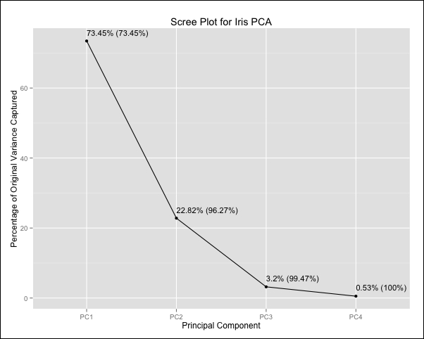
As we can see, the first principal component accounts for 73.45 percent of the total variance in the iris data set, while together with the second component, the total variance captured is 96.27 percent. PCA is an unsupervised method for dimensionality reduction that does not make use of the output variable even when it is available. Instead, it looks at the data geometrically in the feature space. This means that we cannot ensure that PCA will give us a new feature space that will perform well in our prediction problem, beyond the computational advantages of having fewer features. These advantages might make PCA a viable choice even when there is reduction in model accuracy as long as this reduction is small and acceptable for the specific task. As a final note, we should point out that we weights of the principal components, often referred to as loadings are unique within a sign flip as long as they have been normalized. In cases where we have perfectly correlated features or perfect linear combinations we will obtain a few principal components that are exactly zero.
In our earlier discussion of parametric models, we saw that they come with a procedure to train the model using a set of training data. Nonparametric models will typically either perform lazy learning, in which case there really isn't an actual training procedure at all beyond memorizing the training data, or as in the case of splines, will perform local computations on the training data.
Either way, if we are to assess the performance of our model, we need to split our data into a training set and a test set. The key idea is that we want to assess our model based on how we expect it to perform on unseen future data. We do this by using the test set, which is a portion (typically 15-30 percent) of the data we collected and set aside for this purpose and haven't used during training. For example, one possible divide is to have a training set with 80 percent of the observations in our original data, and a test set with the remaining 20 percent. The reason why we need a test set is that we cannot use the training set to fairly assess our model performance, since we fit our model to the training data and it does not represent data that we haven't seen before. From a prediction standpoint, if our goal was to maximize performance on our training data alone, then the best thing to do would be to simply memorize the input data along with the desired output values and our model would thus be a simple look-up table!
A good question to ask would be how we decide between how much data to use for training and testing. There is a trade-off that is involved here that makes the answer to this question nontrivial. On the one hand, we would like to use as much data as possible in our training set, so that the model has more examples from which to learn. On the other, we would like to have a large test set so that we can test our trained model using many examples in order to minimize the variance of our estimate of the model's predictive performance. If we only have a handful of observations in our test set, then we cannot really generalize about how our model performs on unseen data overall.
Another factor that comes into play is how much starting data we have collected. If we have very little data, we may have to use a larger amount in order to train our model, such as an 85-15 split. If we have enough data, then we might consider a 70-30 split so that we can get a more accurate prediction on our test set.
To split a data set using the caret package, we can use the createDataPartition() function to create a sampling vector containing the indices of the rows we will use in our training set. These are selected by randomly sampling the rows until a specified proportion of the rows have been sampled, using the p parameter:
> set.seed(2412)
> iris_sampling_vector <- createDataPartition(iris$Species, p = 0.8, list = FALSE)
Tip
It is good practice when reporting the results of a statistical analysis involving a random number generation, to apply the set.seed() function on a randomly chosen but fixed number. This function ensures that the random numbers that are generated from the next function call involving random number generation will be the same every time the code is run. This is done so that others who read the analysis are able to reproduce the results exactly. Note that if we have several functions in our code that perform random number generation, or the same function is called multiple times, we should ideally apply set.seed() before each one of them.
Using our sampling vector, which we created for the iris data set, we can construct our training and test sets. We'll do this for a few versions of the iris data set that we built earlier on when we experimented with different feature transformations.
> iris_train     <- iris_numeric[iris_sampling_vector,]
> iris_train_z   <- iris_numeric_zscore[iris_sampling_vector,]
> iris_train_pca <- iris_numeric_pca[iris_sampling_vector,]
> iris_train_labels <- iris$Species[iris_sampling_vector]
>
> iris_test        <- iris_numeric[-iris_sampling_vector,]
> iris_test_z      <- iris_numeric_zscore[-iris_sampling_vector,]
> iris_test_pca    <- iris_numeric_pca[-iris_sampling_vector,]
> iris_test_labels <- iris$Species[-iris_sampling_vector]
We are now in a position to build and test three different models for the iris data set. These are the in turn, the unnormalized model, a model where the input features have been centered and scaled with a Z-score transformation, and the PCA model with two principal components. We could use our test set in order to measure the predictive performance of each of these models after we build them; however, this would mean that in our final estimate of unseen accuracy, we will have used the test set in the model selection, thus producing a biased estimate. For this reason, we often maintain a separate split of the data, usually as large as the test set, known as the validation set. This is used to tune model parameters, such as k in kNN, and among different encodings and transformations of the input features before using the test set to predict unseen performance. In Chapter 5, Support Vector Machines, we'll discuss an alternative to this approach known as cross-validation.
Once we split our data, train our model by following the relevant training procedure that it requires, and tune our model parameters, we then have to assess its performance on the test set. Typically, we won't find the same performance on our test set as on our training set. Sometimes, we may even find that the performance we see when we deploy our model does not match what we expected to see, based on the performance on our training or test sets. There are a number of possible reasons for this disparity in performance. The first of these is that the data we may have collected may either not be representative of the process that we are modeling, or that there are certain combinations of feature inputs that we simply did not encounter in our training data. This could produce results that are inconsistent with our expectations. This situation can happen both in the real world, but also with our test set if it contains outliers, for example. Another common situation is the problem of model overfitting.
Overfitting is a problem in which some models, especially more flexible models, perform well on their training data set but perform significantly worse on an unseen test set. This occurs when a model matches the observations in the training data too closely and fails to generalize on unseen data. Put differently, the model is picking up on spurious details and variations in a training data set, which are not representative of the underlying population as a whole. Overfitting is one of the key reasons why we do not choose our model based on its performance on the training data. Other sources of discrepancy between training and test data performance are model bias and variance. Together, these actually form a well-known trade-off in statistical modeling known as the bias-variance tradeoff.
The variance of a statistical model refers to how much the model's predicted function would change, should a differently chosen training set (but generated from the exact same process or system that we are trying to predict as the original) be used to train the model. A low variance is desired because essentially, we don't want to predict a very different function with a different training set that is generated from the same process. Model bias refers to the errors inherently introduced in the predicted function, as a result of the limitation as to what functional forms the specific model can learn. For example, linear models introduce bias when trying to approximate nonlinear functions because they can only learn linear functions. The ideal scenario for a good predictive model is to have both a low variance and a low bias. It is important for a predictive modeler to be aware of the fact that there is a bias-variance trade-off that arises from the choice of models. Models that are typically more complex because of the fact that they make fewer assumptions on the target function are prone to less bias but higher variance than simpler but more restrictive models, such as linear models. This is because more complex models are able to approximate the training data more closely due to their flexibility, but as a result, they are more sensitive to changes in training data. This, of course, is also related to the problem of overfitting that complex models often exhibit.
We can actually see the effects of overfitting by first training some kNN models on our iris data sets. There are a number of packages that offer an implementation of the kNN algorithm, but we will use the knn3() function provided by the caret package with which we are familiar. To train a model using this function, all we have to do is provide it with a data frame that contains the numerical input features, a vector of output labels, and k, the number of nearest neighbors we want to use for the prediction:
> knn_model     <- knn3(iris_train, iris_train_labels, k = 5)
> knn_model_z   <- knn3(iris_train_z, iris_train_labels, k = 5)
> knn_model_pca <- knn3(iris_train_pca, iris_train_labels, k = 5)
To see the effect of different values of k, we will use the iris PCA model that is conveniently available in two dimensions for us to visualize and repeatedly train:
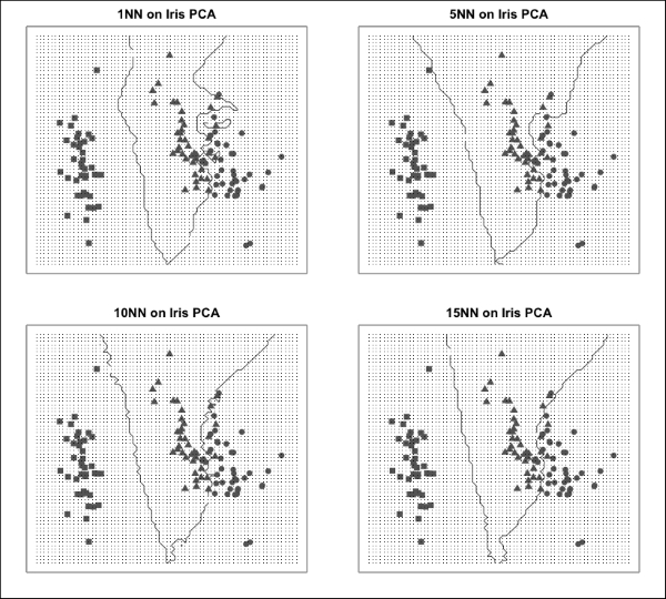
In the preceding plots, we have used different symbols to denote data points corresponding to different species. The lines shown in the plots correspond to the decision boundaries between the different species, which are the class labels of our output variable. Notice that using a low value of k, such as 1, captures local variation in the data very closely and as a result, the decision boundaries are very irregular. A higher value of k uses many neighbors to create a prediction, resulting in a smoothing effect and smoother decision boundaries. Tuning k in kNN is an example of tuning a model parameter to balance the effect of overfitting.
We haven't mentioned any specific performance metrics in this section. There are different measures of model quality relevant to regression and classification, and we will address these after we wrap up our discussion on the predictive modeling process.
During the first iteration of this process (and this is very much an iterative process!), we usually arrive at this stage, having trained and assessed a simple model. Simple models usually allow us to get to a quick and dirty solution with minimum effort, thus giving us an early sense of how far away we are from a model that will make predictions with reasonable accuracy. Simple models are also great at giving us a baseline level of performance against which we can benchmark the performance of future models. As modelers, we often acquire a preference toward one method over others, but it is important to remember that it is generally well worth the effort to try out different approaches to a problem and use the data to help us decide which one we should end up using.
Before picking the final model, it is worth considering whether it might be a good idea to use more than one model to solve our problem. In Chapter 7, Ensemble Methods, we spend an entire chapter on studying techniques that involve many models working together to boost the predictive accuracy of the overall system.
Once we have chosen the final model to use, we want to finalize its implementation so that the end users can use it reliably. Programmers refer to this process as deploying to production. This is where sound software engineering principles become extremely important. The following guidelines offer some useful advice:
The model should be optimized to improve the speed at which it computes predictions. For example, this means ensuring that any features that are computed at runtime are done so efficiently.
The model should be well documented. The final input features should be clearly defined, and the method and data used for training should be stored so that it can easily be retrained if changes need to be made. The original performance on the training and test set should also be stored as a reference for subsequent improvements.
The model's performance should be monitored over time. This is important, not only as a means of verifying that the model works as intended, but also in order to catch any potential data shifts. If the process that is being modeled changes over time, it is likely that our model performance will degrade and this will signal the need for a new model to be trained.
The software used to implement the model should be properly tested using standard unit and integration tests. Often, we will use a lot of existing R packages whose functions have already undergone testing, but the final deployment of a model may require us to write some additional code ourselves, such as for feature computation.
The deployed model should be able to handle errors in the input. For example, if some of the input features are missing, it should be made very clear to the user why the model is unable to make a prediction through appropriate error messages. Errors and warnings should also be logged, especially if the model is deployed for continuous predictions in real-time settings.
In the previous section where we talked about the predictive modeling process, we delved into the importance of assessing a trained model's performance using training and test data sets. In this section, we will look at specific measures of performance that we will frequently encounter when describing the predictive accuracy of different models. It turns out that depending on the class of the problem, we will need to use slightly different ways of assessing performance. As we focus on supervised models in this book, we will look at how to assess regression models and classification models. For classification models, we will also discuss some additional metrics used for the binary classification task, which is a very important and frequently encountered type of problem.
In a regression scenario, let's recall that through our model we are building a function  that is an estimate of a theoretical underlying target function f. The model's inputs are the values of our chosen input features. If we apply this function to every observation, xi, in our training data, which is labeled with the true value of the function, yi, we will obtain a set of
  pairs. To make sure we are clear on this last point, the first entry is the actual value of the output variable in our training data for the ith observation, and the second entry is the predicted value for this particular observation produced by using our model on the feature values for this observation.
If our model has fit the data well, both values will be very close to each other in the training set. If this is also true for our test set, then we consider that our model is likely to perform well for future unseen observations. To quantify the notion that the predicted and correct values are close to each other for all the observations in a data set, we define a measure known as the Mean Square Error (MSE), as follows:
Here, n is the total number of observations in the data set. Consequently, this equation tells us to first compute the squared difference between an output value and its predicted value for every observation, i, in the test set, and then take the average of all these values by summing them up and dividing by the number of observations. Thus, it should be clear why this measure is called the mean square error. The lower this number, the lower the average error between the actual value of the output variable in our observations and what we predict and therefore, the more accurate our model. We sometimes make reference to the Root Mean Square Error (RMSE), which is just the square root of the MSE and the Sum of Squared Error (SSE), which is similar to the MSE but without the normalization which results from dividing by the number of training examples, n. These quantities, when computed on the training data set, are valuable in the sense that a low number will indicate that we have trained a model sufficiently well. We know that we aren't expecting this to be zero in general, and we also cannot decide between models on the basis of these quantities because of the problem of overfitting. The key place to compute these measures is on the test data. In a majority of cases, a model's training data MSE (or equally, RMSE or SSE) will be lower than the corresponding measure computed on the test data. A model m1 that overfits the data compared to another model m2 can often be identified as such when the m1 model produces a lower training MSE but higher test MSE than model m2.
In regression models, the degree to which our predicted function incorrectly approximates an output, yi, for a particular observation, xi, is taken into account by the MSE. Specifically, large errors are squared and so a very large deviation on one data point can have a more significant impact than a few small deviations across more than one data point. It is precisely because we are dealing with a numerical output in regression that we can measure not only for which observations we aren't doing a good job at predicting, but also how far off we are.
For models that perform classification, we can again define an error rate, but here we can only talk about the number of misclassifications that were made by our model. Specifically, we have an error rate given by:
This measure uses the indicator function to return the value of 1 when the predicted class is not the same as the labeled class. Thus, the error rate is computed by counting the number of times the class of the output variable is incorrectly predicted, and dividing this count by the number of observations in the data set. In this way, we can see that the error rate is actually the percentage of misclassified observations made by our model. It should be noted that this measure treats all types of misclassifications as equal. If the cost of some misclassifications is higher than others, then this measure can be adjusted by adding in weights that multiply each misclassification by an amount proportional to its cost.
If we want to diagnose the greatest source of error in a regression problem, we tend to look at the points for which we have the largest error between our predicted value and the actual value. When doing classifications, it is often very useful to compute what is known as the confusion matrix. This is a matrix that shows all pairwise misclassifications that were made on our data. We shall now return to our iris species classification problem. In a previous section, we trained three kNN models. We'll now see how we can assess their performance. Like many classification models, kNN can return predictions either as final class labels or via a set of scores pertaining to each possible output class. Sometimes, as is the case here, these scores are actually probabilities that the model has assigned to every possible output. Regardless of whether the scores are actual probabilities, we can decide on which output label to pick on the basis of these scores, typically by simply choosing the label with the highest score. In R, the most common function to make model predictions is the predict() function, which we will use with our kNN models:
> knn_predictions_prob <- predict(knn_model, iris_test, type = "prob")
> tail(knn_predictions_prob, n = 3)
      setosa versicolor virginica
[28,]      0        0.0       1.0
[29,]      0        0.4       0.6
[30,]      0        0.0       1.0
In the kNN model, we can assign output scores as direct probabilities by computing the ratio of the nearest neighbors that belong to each output label. In the three test examples shown, the virginica species has unit probabilities in two of these, but only 60 percent probability for the remaining example. The other 40 percent belong to the versicolor species, so it seems that in the latter case, three out of five nearest neighbors were of the virginica species ,whereas the other two were of the versicolor species. It is clear that we should be more confident about the two former classifications than the latter. We'll now compute class predictions for the three models on the test data:
> knn_predictions <- predict(knn_model, iris_test, type = "class")
> knn_predictions_z <- predict(knn_model_z, iris_test_z, type = "class")
> knn_predictions_pca <- predict(knn_model_pca, iris_test_pca, type = "class")
We can use the postResample() function from the caret package to display test set accuracy metrics for our models:
> postResample(knn_predictions, iris_test_labels)
 Accuracy     Kappa
0.9333333 0.9000000
> postResample(knn_predictions_z, iris_test_labels)
 Accuracy     Kappa
0.9666667 0.9500000
> postResample(knn_predictions_pca, iris_test_labels)
Accuracy    Kappa
    0.90     0.85
Here, accuracy is one minus the error rate and is thus the percentage of correctly classified observations. We can see that all the models perform very closely in terms of accuracy, with the model that uses a Z-score normalization prevailing. This difference is not significant given the small size of the test set. The Kappa statistic is defined as follows:
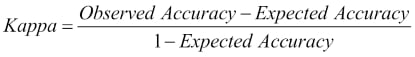
The Kappa statistic is designed to counterbalance the effect of random chance and takes values in the interval, [-1,1], where 1 indicates perfect accuracy, -1 indicates perfect inaccuracy, and 0 occurs when the accuracy is exactly what would be obtained by a random guesser. Note that a random guesser for a classification model guesses the most frequent class. In the case of our iris classification model, the three species are equally represented in the data, and so the expected accuracy is one third. The reader is encouraged to check that by using this value for the expected accuracy, we can obtain the observed values of Kappa statistic from the accuracy values.
We can also examine the specific misclassifications that our model makes, using a confusion matrix. This can simply be constructed by cross-tabulating the predictions with the correct output labels:
> table(knn_predictions, iris_test_labels)
               iris_test_labels
knn_predictions setosa versicolor virginica
     setosa         10          0         0
     versicolor      0          9         1
     virginica       0          1         9
Tip
The caret package also has the very useful confusionMatrix() function, which automatically computes this table as well as several other performance metrics, the explanation of which can be found at http://topepo.github.io/caret/other.html.
In the preceding confusion matrix, we can see that the total number of correctly classified observations is 28, which is the sum of the numbers 10, 9, and 9 on the leading diagonal. The table shows us that the setosa species seems to be easier to predict with our model, as it is never confused with other species. The versicolor and virginica species, however, can be confused with each other and the model has misclassified one instance of each. We can therefore surmise that computing the confusion matrix serves as a useful exercise. Spotting class pairs that are frequently confused will guide us to improve our model, for example by looking for features that might help distinguish these classes.
A special case of classification known as a binary classification occurs when we have two classes. Here are some typical binary classification scenarios:
We want to classify incoming e-mails as spam or not spam using the e-mail's content and header
We want to classify a patient as having a disease or not using their symptoms and medical history
We want to classify a document from a large database of documents as being relevant to a search query, based on the words in the query and the words in the document
We want to classify a product from an assembly line as faulty or not
We want to predict whether a customer applying for credit at a bank will default on their payments, based on their credit score and financial situation
In a binary classification task, we usually refer to our two classes as the positive class and the negative class. By convention, the positive class corresponds to a special case that our model is trying to predict, and is often rarer than the negative class. From the preceding examples, we would use the positive class label for our spam e-mails, faulty assembly line products, defaulting customers, and so on. Now consider an example in the medical diagnosis domain, where we are trying to train a model to diagnose a disease that we know is only present in 1 in 10,000 of the population. We would assign the positive class to patients that have this disease. Notice that in such a scenario, the error rate alone is not an adequate measure of a model. For example, we can design the simplest of classifiers that will have an error rate of only 0.01 percent by predicting that every patient will be healthy, but such a classifier would be useless. We can come up with more useful metrics by examining the confusion matrix. Suppose that we had built a model to diagnose our rare disease and on a test sample of 100,000 patients, we obtained the following confusion matrix:
> table(actual,predicted)
          predicted
actual     negative positive
  negative    99900       78
  positive        9       13
The binary classification problem is so common that the cells of the binary confusion matrix have their own names. On the leading diagonal, which contains the correctly classified entries, we refer to the elements as the true negatives and true positives. In our case, we had 99900 true negatives and 13 true positives. When we misclassify an observation as belonging to the positive class when it actually belongs to the negative class, then we have a false positive, also known as a Type I error. A false negative or Type II error occurs when we misclassify a positive observation as belonging to the negative class. In our case, our model had 78 false positives and 9 false negatives.
We'll now introduce two very important measures in the context of binary classification, which are precision and recall. Precision is defined as the ratio of number of correctly predicted instances of the positive class to the total number of predicted instances of the positive class. Using the labels from the preceding binary confusion matrix, precision is given by:
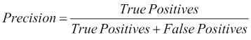
Precision, thus, essentially measures how accurate we are in making predictions for the positive class. By definition, we can achieve 100 percent precision by never making any predictions for the positive class, as this way we are guaranteed to never make any mistakes. Recall, by contrast, is defined as the number of correct predictions for the positive class over all the members of the positive class in our data set. Once again, using the labels from the binary confusion matrix, we can see the definition of recall as:
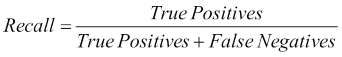
Recall measures our ability to identify all the positive class members from our data set. We can easily achieve maximum recall by always predicting the positive class for all our data points. We will make a lot of mistakes, but we will never have any false negatives. Notice that precision and recall form a tradeoff in our model performance. At one end, if we don't predict the positive class for any of our data points, we will have 0 recall but maximum precision. At the other end, if all our data points are predicted as belonging to the positive class (which, remember, is usually a rare class), we will have maximum recall but extremely low precision. Put differently, trying to reduce the Type I error leads to increasing the Type II error and vice-versa. This inverse relationship is often plotted for a particular problem on a precision-recall curve. By using an appropriate threshold parameter, we can often tune the performance of our model in such a way that we achieve a specific point on this precision-recall curve that is appropriate for our circumstances. For example, in some problem domains, we tend to be biased toward having a higher recall than a higher precision, because of the high cost of misclassifying an observation from the positive class into the negative class. As we often want to describe the performance of a model using a single number, we define a measure known as the F1 score, which combines precision and recall. Specifically, the F1 score is defined as the harmonic mean between precision and recall:
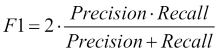
The reader should verify that in our example confusion matrix, precision is 14.3 percent, recall is 59.1 percent, and the F1 score is 0.23.
In this chapter, we explored the fundamental ideas surrounding predictive models. We saw that there are many ways to categorize models, learning important distinctions in the process, such as supervised versus unsupervised learning and regression versus classification. Next, we outlined the steps involved in building a predictive model, starting from the process of data collection all the way to model evaluation and deployment. Critically, this process is an iterative one, and most often we arrive at our final model after having tried out and trained a number of different models. In order to compare the performance of the different models that we create, we established some fundamental notions of model performance, such as the mean squared error for regression and the classification error rate for classification.
We also introduced our first model, the k-nearest neighbor model, which is useful in performing classification and regression alike. kNN is a very flexible model that doesn't make any explicit assumptions about the underlying data. Thus, it can fit a very complex decision boundary. It is a lazy learner, in that it doesn't construct a model to describe the relationship between the input features and the output variable. As a result, it doesn't require a long period of training. On the other hand, for data with many dimensions, it may take a long time to produce a prediction, and because the model needs to remember all the training data in order to find the nearest neighbors of a target point, it often also requires a lot of memory. kNN doesn't distinguish the importance of different features, and the fact that it uses a distance metric in its prediction means that, on the one hand, it does not have any built-in way to handle missing data and on the other, it often requires features to be transformed to similar scales. Finally, the model can be tuned by choosing an appropriate value of k, the number of nearest neighbors, so as to balance the degree of overfitting. With a firm grounding in the basics of the predictive modeling process, we will look at linear regression in the next chapter.