


 Download code from GitHub
Bootstrap is a web development framework that helps developers build web interfaces. Originally conceived at Twitter in 2011 by Mark Otto and Jacob Thornton, the framework is now open source and has grown to be one of the most popular web development frameworks to date. Being freely available for private, educational, and commercial use meant that Bootstrap quickly grew in popularity. Today, thousands of organizations rely on Bootstrap, including NASA, Walmart, and Bloomberg. According to BuiltWith.com , over 10% of the world's top 1 million websites are built using Bootstrap (http://trends.builtwith.com/docinfo/Twitter-Bootstrap). As such, knowing how to use Bootstrap will be an important skill and will serve as a powerful addition to any web developer's tool belt.
The framework itself consists of a mixture of JavaScript and CSS, and provides developers with all the essential components required to develop a fully functioning web user interface. Over the course of this book, we will be introducing you to all of the most essential features that Bootstrap has to offer by teaching you how to use the framework to build a complete website from scratch. As CSS and HTML alone are already the subject of entire books in themselves, we assume that you, the reader, has at least a basic knowledge of HTML, CSS, and JavaScript.
We begin this chapter by introducing you to our demo website, MyPhoto. This website will accompany us throughout this book, and serve as a practical point of reference. Therefore, all lessons learned will be taught within the context of MyPhoto.
We will then discuss the Bootstrap framework, listing its features and contrasting the current release to the last major release (Bootstrap 3).
Last but not least, this chapter will help you set up your development environment. To ensure equal footing, we will guide you towards installing the right build tools, and precisely detail the various ways in which you can integrate Bootstrap into a project. More advanced readers may safely skip this last part and continue to Chapter 2 , Making a Style Statement.
To summarize, this chapter will do the following:
Introduce you to what exactly we will be doing
Explain what is new in the latest version of Bootstrap, and how the latest version differs to the previous major release
Show you how to include Bootstrap in our web project
This book will teach you how to build a complete Bootstrap website from scratch. Starting with a simple layout in
Chapter 2
, Making a Style Statement and
Chapter 3
, Building the Layout, we will build and improve the website's various sections as we progress through each chapter. The concept behind our website is simple: to develop a landing page for photographers. Using this landing page, (hypothetical) users will be able to exhibit their wares and services. While building our website, we will be making use of the same third-party tools and libraries that you would if you were working as a professional software developer. We chose these tools and plugins specifically because of their widespread use. Learning how to use and integrate them will save you a lot of work when developing websites in the future. Specifically, the tools that we will use to assist us throughout the development of MyPhoto are Bower, node package manager (npm), and Grunt.
From a development perspective, the construction of MyPhoto will teach you how to use and apply all of the essential user interface concepts and components required to build a fully functioning website. Among other things, you will learn how to do the following:
Use the Bootstrap grid system to structure the information presented on your website
Create a fixed, branded, navigation bar with animated scroll effects
Use an image carousel for displaying different photographs, implemented using Bootstrap's
carousel.jsand jumbotron (jumbotron is a design principle for displaying important content). It should be noted that carousels are becoming an increasingly unpopular design choice; however, they are still heavily used and are an important feature of Bootstrap. As such, we do not argue for or against the use of carousels as their effectiveness depends very much on how they are used, rather than on whether they are used.Build custom tabs that allow users to navigate across different contents
Use and apply Bootstrap's modal dialogs
Apply a fixed page footer
Create forms for data entry using Bootstrap's input controls (text fields, text areas, and buttons) and apply Bootstrap's input validation styles
Make best use of Bootstrap's context classes
Create alert messages and learn how to customize them
Rapidly develop interactive data tables for displaying product information
Use drop-down menus, custom fonts, and icons
In addition to learning how to use Bootstrap 4, the development of MyPhoto will introduce you to a range of third-party libraries such as Scrollspy (for scroll animations), SalvattoreJS (a library for complementing our Bootstrap grid), Animate.css (for beautiful CSS animations, such as fade-in effects at
https://daneden.github.io/animate.css/
), and Bootstrap DataTables (for rapidly displaying data in tabular form).
The website itself will consist of different sections:
A Welcome section
An About section
A Services section
A Gallery section
A Contact Us section
The development of each section is intended to teach you how to use a distinct set of features found in third-party libraries. For example, by developing the Welcome section, you will learn how to use Bootstrap's jumbotron and alert dialogs along with different font and text styles, while the About section will show you how to use cards. The Services section of our project introduces you to Bootstrap's custom tabs. That is, you will learn how to use Bootstrap's tabs to display a range of different services offered by our website.
Following on from the Services section, you will need to use rich imagery to really show off the website's sample services. You will achieve this by really mastering Bootstrap's responsive core along with Bootstrap's carousel and third-party jQuery plugins. Last but not least, the Contact Us section will demonstrate how to use Bootstrap's form elements and helper functions. That is, you will learn how to use Bootstrap to create stylish HTML forms, how to use form fields and input groups, and how to perform data validation.
Finally, toward the end of the book, you will learn how to optimize your website, and integrate it with the popular JavaScript frameworks AngularJS (https://angularjs.org/) and React (http://facebook.github.io/react/). As entire books have been written on AngularJS alone, we will only cover the essentials required for the integration itself.
Now that you have glimpsed a brief overview of MyPhoto, let's examine Bootstrap 4 in more detail, and discuss what makes it so different to its predecessor. Take a look at the following screenshot:
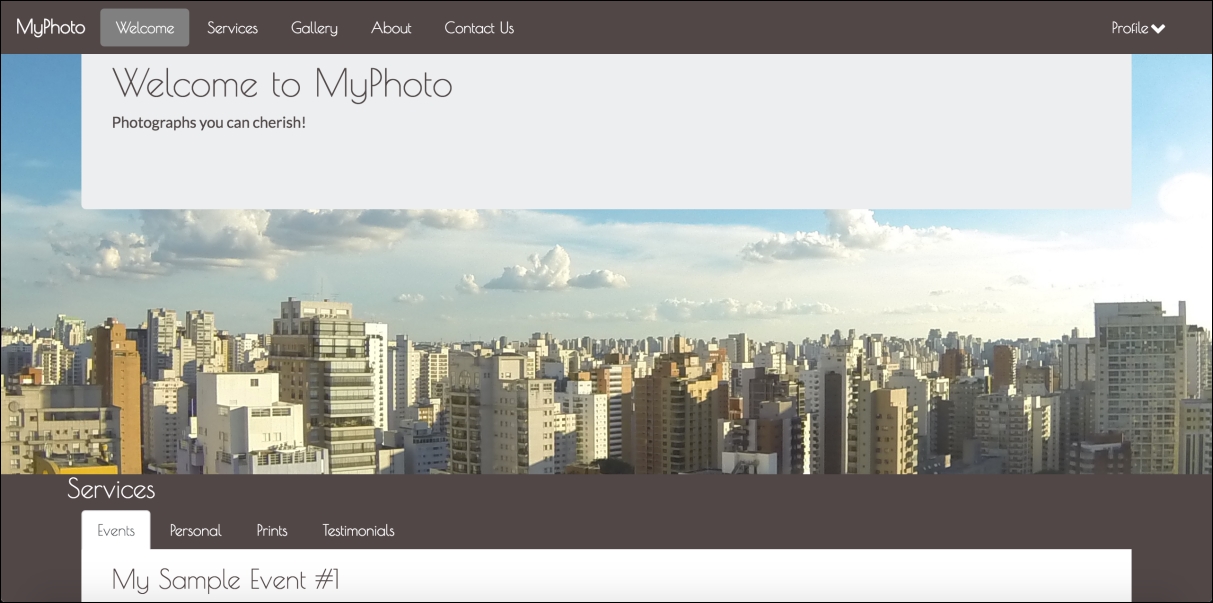
Figure 1.1: A taste of what is to come: the MyPhoto landing page
Much has changed since Twitter's Bootstrap was first released on August 19th, 2011. In essence, Bootstrap 1 was a collection of CSS rules offering developers the ability to lay out their website, create forms, buttons, and help with general appearance and site navigation. With respect to these core features, Bootstrap 4 Alpha 4 is still much the same as its predecessors. In other words, the framework's focus is still on allowing developers to create layouts, and helping to develop a consistent appearance by providing stylings for buttons, forms, and other user interface elements. How it helps developers achieve and use these features, however, has changed entirely. Bootstrap 4 is a complete rewrite of the entire project, and, as such, ships with many fundamental differences to its predecessors. Along with Bootstrap's major features, we will be discussing the most striking differences between Bootstrap 3 and Bootstrap 4 in the sub-sections that follow.
Possibly the most important and widely used feature is Bootstrap's ability to lay out and organize your page. Specifically, Bootstrap offers the following:
Responsive containers
Responsive breakpoints for adjusting page layout in response to differing screen sizes
A 12 column grid layout for flexibly arranging various elements on your page
Media objects that act as building blocks and allow you to build your own structural components
Utility classes that allow you to manipulate elements in a responsive manner. For example, you can use the layout utility classes to hide elements, depending on screen size
We will be discussing each of these features in detail in Chapter 2 , Making a Style Statement and Chapter 3 , Building the Layout.
Just like its predecessor, Bootstrap 4 overrides the default browser styles. This means that many elements, such as lists or headings, are padded and spaced differently. The majority of overridden styles only affect spacing and positioning; however, some elements may also have their border removed. The reason behind this is simple: to provide users with a clean slate upon which they can build their site.
Building on this clean slate, Bootstrap 4 provides styles for almost every aspect of your web page such as buttons (Figure 1.2), input fields, headings, paragraphs, special inline texts, such as keyboard input (Figure 1.3), figures, tables, and navigation controls. Aside from this, Bootstrap offers state styles for all input controls, for example, styles for disabled buttons or toggled buttons. Take a look at the following screenshot:

Figure 1.2: The six button styles that come with Bootstrap 4 are btn-primary, btn-secondary, btn-success, btn-danger, btn-link, btn-info, and btn-warning
Take a look at the following screenshot:

Figure 1.3: Bootstrap's content styles. In the preceding example, we see inline styling for denoting keyboard input
Aside from layout and content styling, Bootstrap offers a large variety of reusable components that allow you to quickly construct your website's most fundamental features. Bootstrap's UI components encompass all of the fundamental building blocks that you would expect a web development toolkit to offer: modal dialogs, progress bars, navigation bars, tooltips, popovers, a carousel, alerts, drop-down menus, input groups, tabs, pagination, and components for emphasizing certain contents.
Let's have a look at the following modal dialog screenshot:

Figure 1.4: Various Bootstrap 4 components in action. In the preceding screenshot we see a sample modal dialog, containing an info alert, some sample text, and an animated progress bar.
Similar to its predecessor, Bootstrap 4 allows you to create mobile-friendly websites without too much additional development work. By default, Bootstrap is designed to work across all resolutions and screen sizes, from mobile, to tablet, to desktop. In fact, Bootstrap's mobile-first design philosophy implies that its components must display and function correctly at the smallest screen size possible. The reasoning behind this is simple. Think about developing a website without consideration for small mobile screens. In this case, you are likely to pack your website full of buttons, labels, and tables. You will probably only discover any usability issues when a user attempts to visit your website using a mobile device only to find a small web page that is crowded with buttons and forms. At this stage, you will be required to rework the entire user interface to allow it to render on smaller screens. For precisely this reason, Bootstrap promotes a bottom-up approach, forcing developers to get the user interface to render correctly on the smallest possible screen size, before expanding upwards.
Aside from ready-to-go components, Bootstrap offers a large selection of utility classes that encapsulate the most commonly needed style rules. For example, rules for aligning text, hiding an element, or providing contextual colors for warning text.
Bootstrap 4 supports the vast majority of modern browsers, including Chrome, Firefox, Opera, Safari, Internet Explorer (version 9 and onwards; Internet Explorer 8 and below are not supported), and Microsoft Edge.
Both Less and Sass (Syntactically Awesome Stylesheets) are CSS extension languages. That is, they are languages that extend the CSS vocabulary with the objective of making the development of many, large, and complex style sheets easier. Although Less and Sass are fundamentally different languages, the general manner in which they extend CSS is the same, both rely on a preprocessor. As you produce your build, the preprocessor is run, parsing the Less/Sass script and turning your Less or Sass instructions into plain CSS.
Less is the official Bootstrap 3 build, while Bootstrap 4 has been developed from scratch, and is written entirely in Sass. Both Less and Sass are compiled into CSS to produce a single file, bootstrap.css. It is this CSS file that we will be primarily referencing throughout this book (with the exception of
Chapter 3
, Building the Layout). Consequently, you will not be required to know Sass in order to follow this book. However, we do recommend that you take a 20 minute introductory course on Sass if you are completely new to the language. Rest assured, if you already know CSS, you will not need more time than this. The language's syntax is very close to normal CSS, and its elementary concepts are similar to those contained within any other programming language.
Unlike its predecessor, Bootstrap 4 no longer uses pixel (px) as its unit of typographic measurement. Instead, it primarily uses root em (rem). The reasoning behind choosing rem is based on a well known problem with px; websites using px may render incorrectly, or not as originally intended, as users change the size of the browser's base font. Using a unit of measurement that is relative to the page's root element helps address this problem, as the root element will be scaled relative to the browser's base font. In turn, a page will be scaled relative to this root element.
Note
Typographic units of measurement
Simply put, typographic units of measurement determine the size of your font and elements. The most commonly used units of measurement are px and em. The former is an abbreviation for pixel, and uses a reference pixel to determine a font's exact size. This means that, for displays of 96 dots per inch (dpi), 1 px will equal an actual pixel on the screen. For higher resolution displays, the reference pixel will result in the px being scaled to match the display's resolution. For example, specifying a font size of 100 px will mean that the font is exactly 100 pixels in size (on a display with 96 dpi), irrespective of any other element on the page.
Em is a unit of measurement that is relative to the parent of the element to which it is applied. So, for example, if we were to have two nested div elements, the outer element with a font size of 100 px and the inner element with a font size of 2 em, then the inner element's font size would translate to 200 px (as in this case 1 em = 100 px). The problem with using a unit of measurement that is relative to parent elements is that it increases your code's complexity, as the nesting of elements makes size calculations more difficult.
The recently introduced rem measurement aims to address both em's and px's shortcomings by combining their two strengths; instead of being relative to a parent element, rem is relative to the page's root element.
As was already implicit in the preceding feature summary, the latest version of Bootstrap no longer supports Internet Explorer 8. As such, the decision to only support newer versions of Internet Explorer was a reasonable one, as not even Microsoft itself provides technical support and updates for Internet Explorer 8 anymore (as of January 2016). Furthermore, Internet Explorer 8 does not support rem, meaning that Bootstrap 4 would have been required to provide a workaround. This in turn would most likely have implied a large amount of additional development work, with the potential for inconsistencies. Lastly, responsive website development for Internet Explorer 8 is difficult, as the browser does not support CSS media queries. Given these three factors, dropping support for this version of Internet Explorer was the most sensible path of action.
Bootstrap's grid system consists of a series of CSS classes and media queries that help you lay out your page. Specifically, the grid system helps alleviate the pain points associated with horizontal and vertical positioning of a page's contents and the structure of the page across multiple displays. With Bootstrap 4, the grid system has been completely overhauled, and a new grid tier has been added with a breakpoint of 480 px and below. We will be talking about tiers, breakpoints, and Bootstrap's grid system extensively in Chapter 2 , Making a Style Statement.
Bootstrap 3 shipped with a nice collection of over 250 font icons, free of use. In an effort to make the framework more lightweight (and because font icons are considered bad practice), the GLYPHICON set is no longer available in Bootstrap 4.
The default font size in Bootstrap 4 is 2 px bigger than in its predecessor, increasing from 14 px to 16 px. Furthermore, Bootstrap 4 replaced panels, wells, and thumbnails with a new concept: cards. To readers unfamiliar with the concept of wells, a well is a UI component that allows developers to highlight text content by applying an inset shadow effect to the element to which it is applied. A panel also serves to highlight information, but by applying padding and rounded borders. Cards serve the same purpose as their predecessors, but are less restrictive as they are flexible enough to support different types of content, such as images, lists, or text. They can also be customized to use footers and headers. Take a look at the following screenshot:

Figure 1.5: The Bootstrap 4 card component replaces existing wells, thumbnails, and panels
Bootstrap 4 introduces new form input controls: a color chooser, a date picker, and a time picker. In addition, new classes have been introduced, improving the existing form input controls. For example, Bootstrap 4 now allows for input control sizing, as well as classes for denoting block and inline level input controls. However, one of the most anticipated new additions is Bootstrap's input validation styles, which used to require third-party libraries or a manual implementation, but are now shipped with Bootstrap 4 (see Figure 1.6). Take a look at the following screenshot:

Figure 1.6: The new Bootstrap 4 input validation styles, indicating the successful processing of input
Last but not least, Bootstrap 4 also offers custom forms in order to provide even more cross-browser UI consistency across input elements (Figure 1.7). As noted in the Bootstrap 4 Alpha 4 documentation, the input controls are "built on top of semantic and accessible markup, so they're solid replacements for any default form control" (source: http://v4-alpha.getbootstrap.com/components/forms/). Take a look at the following screenshot:

Figure 1.7: Custom Bootstrap input controls that replace the browser defaults in order to ensure cross-browser UI consistency
The developers behind Bootstrap 4 have put specific emphasis on customization throughout the development of Bootstrap 4. As such, many new variables have been introduced that allow for the easy customization of Bootstrap. Using the $enabled-*- Sass variables, one can now enable or disable specific global CSS preferences.
Now that we know what Bootstrap has to offer, let us set up our project:
Create a new project directory named
MyPhoto. This will become our project root directory.Create a blank
index.htmlfile and insert the following HTML code:<!DOCTYPE html> <html lang="en"> <head> <meta charset="utf-8"> <meta name="viewport" content="width=device-width, initial-scale=1, shrink-to-fit=no"> <meta http-equiv="x-ua-compatible" content="ie=edge"> <title>MyPhoto</title> </head> <body> <div class="alert alert-success"> Hello World! </div> </body> </html>Note the three
metatags. The first tag tells the browser that the document in question isutf-8encoded. Since Bootstrap optimizes its content for mobile devices, the subsequentmetatag is required to help with viewport scaling. The lastmetatag forces the document to be rendered using the latest document rendering mode available if viewed in Internet Explorer.Open the
index.htmlin your browser. You should see just a blank page with the words Hello World.
Now it is time to include Bootstrap. At its core, Bootstrap is a glorified CSS style sheet. Within that style sheet, Bootstrap exposes very powerful features of CSS with an easy-to-use syntax. It being a style sheet, you include it in your project as you would with any other style sheet that you might develop yourself. That is, open the index.html and directly link it to the style sheet.
Note
Viewport scaling
The term "viewport" refers to the available display size to render the contents of a page. The viewport meta tag allows you to define this available size. Viewport scaling using meta tags was first introduced by Apple and, at the time of writing, is supported by all major browsers.
Using the width parameter, we can define the exact width of the user's viewport. For example, <meta name="viewport" content="width=320px"> will instruct the browser to set the viewport's width to 320px. The ability to control the viewport's width is useful when developing mobile-friendly websites; by default, mobile browsers will attempt to fit the entire page onto their viewports by zooming out as far as possible. This allows users to view and interact with websites that have not been designed to be viewed on mobile devices. However, as Bootstrap embraces a mobile-first design philosophy, a zoom out will, in fact, result in undesired side-effects. For example, breakpoints (which we will discuss in
Chapter 2
, Making a Style Statement) will no longer work as intended, as they now deal with the zoomed-out equivalent of the page in question. This is why explicitly setting the viewport width is so important. By writing content="width=device-width, initial-scale=1, shrink-to-fit=no", we are telling the browser the following:
We want to set the viewport's width equal to the actual device's screen width.
We do not want any zoom, initially.
We do not wish to shrink the content to fit the viewport.
For now, we will use the Bootstrap builds hosted on Bootstrap's official Content Delivery Network (CDN). This is done by including the following HTML tag into the head of your HTML document (the head of your HTML document refers to the contents between the <head> opening tag and the </head> closing tag):
    <link rel="stylesheet" href="https://maxcdn.bootstrapcdn.com/
    bootstrap/4.0.0-alpha.4/css/bootstrap.min.css">
Bootstrap relies on jQuery, a JavaScript framework that provides a layer of abstraction in an effort to simplify the most common JavaScript operations (such as element selection and event handling). Therefore, before we include the Bootstrap JavaScript file, we must first include jQuery. Both inclusions should occur just before the </body> closing tag:
    <script src="https://ajax.googleapis.com/ajax/libs/jquery/2.1.4
    /jquery.min.js">
    </script>
    <script src="https://maxcdn.bootstrapcdn.com/bootstrap/4.0.0-alpha.4
    /js/bootstrap.min.js"></script>
Note that, while these scripts could, of course, be loaded at the top of the page, loading scripts at the end of the document is considered best practice to speed up page loading times and to avoid JavaScript issues preventing the page from being rendered. The reason behind this is that browsers do not download all dependencies in parallel (although a certain number of requests are made asynchronously, depending on the browser and the domain). Consequently, forcing the browser to download dependencies early on will block page rendering until these assets have been downloaded. Furthermore, ensuring that your scripts are loaded last will ensure that once you invoke Document Object Model (DOM) operations in your scripts, you can be sure that your page's elements have already been rendered. As a result, you can avoid checks that ensure the existence of given elements.
Note
What is a Content Delivery Network?
The objective behind any Content Delivery Network (CDN) is to provide users with content that is highly available. This means that a CDN aims to provide you with content, without this content ever (or rarely) becoming unavailable. To this end, the content is often hosted using a large, distributed set of servers. The BootstrapCDN basically allows you to link to the Bootstrap style sheet so that you do not have to host it yourself.
Save your changes and reload the index.html in your browser. The Hello World string should now contain a green background:

Figure 1.8: Our "Hello World" styled using Bootstrap 4
Now that the Bootstrap framework has been included in our project, open your browser's developer console (if using Chrome on Microsoft Windows, press Ctrl + Shift + I; on Mac OS X you can press cmd + alt + I). As Bootstrap requires another third-party library Tether, for displaying popovers and tooltips, the developer console will display an error (Figure 1.6). Take a look at the following screenshot:

Figure 1.9: Chrome's Developer Tools can be opened by going to View, selecting Developer, and then clicking on Developer Tools. At the bottom of the page, a new view will appear. Under the Console tab, an error will indicate an unmet dependency.
Tether is available via the CloudFare CDN, and consists of both a CSS file and a JavaScript file. As before, we should include the JavaScript file at the bottom of our document while we reference Tether's style sheet from inside our document head:
    <!DOCTYPE html>
    <html lang="en">
    <head>
        <meta charset="utf-8">
        <meta name="viewport" content="width=device-width, initial-
        scale=1, shrink-to-fit=no">
        <meta http-equiv="x-ua-compatible" content="ie=edge">
        <title>MyPhoto</title>
        <link rel="stylesheet" href="https://maxcdn.bootstrapcdn.com/
        bootstrap/4.0.0-alpha.4/css/bootstrap.min.css">
        <link rel="stylesheet" href="https://cdnjs.cloudflare.com/ajax/
        libs/tether/1.3.1/css/tether.min.css">
    </head>
    <body>
        <div class="alert alert-success">
            Hello World!
        </div>
        <script src="https://ajax.googleapis.com/ajax/libs/jquery/
        2.1.4/jquery.min.js"></script>
        <script src="https://cdnjs.cloudflare.com/ajax/libs/tether/
        1.3.1/js/tether.min.js"></script>
        <script src="https://maxcdn.bootstrapcdn.com/bootstrap/4.0.0-
        alpha.4/js/bootstrap.min.js"></script>
    </body>
    </html>
While CDNs are an important resource, there are several reasons why, at times, using a third-party CDN may not be desirable:
CDNs introduce an additional point of failure, as you now rely on third-party servers.
The privacy and security of users may be compromised, as there is no guarantee that the CDN provider does not inject malicious code into the libraries that are being hosted. Nor can one be certain that the CDN does not attempt to track its users.
Certain CDNs may be blocked by the Internet Service Providers of users in different geographical locations.
Offline development will not be possible when relying on a remote CDN.
You will not be able to optimize the files hosted by your CDN. This loss of control may affect your website's performance (although typically you are more often than not offered an optimized version of the library through the CDN).
Instead of relying on a CDN, we could manually download the jQuery, Tether, and Bootstrap project files. We could then copy these builds into our project root and link them to the distribution files. The disadvantage of this approach is the fact that maintaining a manual collection of dependencies can quickly become very cumbersome, and next to impossible as your website grows in size and complexity. As such, we will not manually download the Bootstrap build. Instead, we will let Bower do it for us. Bower is a package management system, that is, a tool that you can use to manage your website's dependencies. It automatically downloads, organizes, and (upon command) updates your website's dependencies. To install Bower, head over to http://bower.io/.
Note
How do I install Bower?
Before you can install Bower, you will need two other tools: Node.js and Git. The latter is a version control tool, in essence; it allows you to manage different versions of your software. To install Git, head over to http://git-scm.com/ and select the installer appropriate for your operating system. NodeJS is a JavaScript runtime environment needed for Bower to run. To install it, simply download the installer from the official NodeJS website: https://nodejs.org/Once you have successfully installed Git and NodeJS, you are ready to install Bower. Simply type the following command into your terminal:
npm install -g bower
This will install Bower for you, using the JavaScript package manager npm, which happens to be used by, and is installed with, NodeJS.
Once Bower has been installed, open up your terminal, navigate to the project root folder you created earlier, and fetch the bootstrap build:
bower install bootstrap#v4.0.0-alpha.4
This will create a new folder structure in our project root:
|__bower_components
  |__bootstrap
    |__Gruntfile.js
    |__LICENSE
    |__README.md
    |__bower.json
    |__dist
    |__fonts
    |__grunt
    |__js
    |__less
    |__package.js
    |__package.json
We will explain all of these various files and directories later on in this book. For now, you can safely ignore everything except for the dist directory inside bower_components/bootstrap/. Go ahead and open the dist directory. You should see three sub directories:
cssfontsjs
The name dist stands for distribution. Typically, the distribution directory contains the production-ready code that users can deploy. As its name implies, the css directory inside dist includes the ready-for-use style sheets. Likewise, the js directory contains the JavaScript files that compose Bootstrap. Lastly, the fonts directory holds the font assets that come with Bootstrap.
To reference the local Bootstrap CSS file in our index.html, modify the href attribute of the link tag that points to the bootstrap.min.css:
    <link rel="stylesheet" href="bower_components/bootstrap/dist/css
    /bootstrap.min.css">
Let's do the same for the Bootstrap JavaScript file:
<script src="bower_components/bootstrap/dist/js/bootstrap.min.js"></script>
Repeat this process for both jQuery and Tether. To install jQuery using Bower, use the following command:
bower install jquery
Just as before, a new directory will be created inside the bower_components directory:
|__bower_components
  |__jquery
    |__AUTHORS.txt
    |__LICENSE.txt
    |__bower.json
    |__dist
    |__sizzle
    |__src
Again, we are only interested in the contents of the dist directory, which, among other files, will contain the compressed jQuery build jquery.min.js.
Reference this file by modifying the src attribute of the script tag that currently points to Google's jquery.min.js by replacing the URL with the path to our local copy of jQuery:
<script src="bower_components/jquery/dist/jquery.min.js"></script>
Last but not least, repeat the steps already outlined for Tether:
bower install tether
Once the installation completes, a similar folder structure than the ones for Bootstrap and jQuery will have been created. Verify the contents of bower_components/tether/dist and replace the CDN Tether references in our document with their local equivalent.
The final index.html should now look as follows:
    <!DOCTYPE html>
    <html lang="en">
    <head>
        <meta charset="utf-8">
        <meta name="viewport" content="width=device-width, initial-scale=1,
        shrink-to-fit=no">
        <meta http-equiv="x-ua-compatible" content="ie=edge">
        <title>MyPhoto</title>
        <link rel="stylesheet" href="bower_components/bootstrap/dist/css
        /bootstrap.min.css">
        <link rel="stylesheet" href="bower_components/tether/dist/css
        /tether.min.css">
    </head>
    <body>
        <div class="alert alert-success">
            Hello World!
        </div>
        <script src="bower_components/jquery/dist/jquery.min.js"></script>
        <script src="bower_components/tether/dist/js/tether.min.js">
        </script>
        <script src="bower_components/bootstrap/dist/js/bootstrap.min.js">
        </script>
    </body>
    </html>
Refresh the index.html in your browser to make sure that everything works.
What IDE and browser should I be using when following the examples in this book?
While we recommend a JetBrains IDE or Sublime Text along with Google Chrome, you are free to use whatever tools and browser you like. Our taste in IDE and browser is subjective on this matter. However, keep in mind that Bootstrap 4 does not support Internet Explorer 8 or below. As such, if you do happen to use Internet Explorer 8, you should upgrade it to the latest version.
Aside from introducing you to our sample project MyPhoto, this chapter was concerned with outlining Bootstrap 4, highlighting its features, and discussing how this new version of Bootstrap differs to the last major release (Bootstrap 3). The chapter provided an overview of how Bootstrap can assist developers in the layout, structuring, and styling of pages. Furthermore, we noted how Bootstrap provides access to the most important and widely used user interface controls through the form of components that can be integrated into a page with minimal effort. By providing an outline of Bootstrap, we hope that the framework's intrinsic value in assisting in the development of modern websites has become apparent to the reader. Furthermore, during the course of the wider discussion, we highlighted and explained some important concepts in web development, such as typographic units of measurement or the definition, purpose, and justification of the use of Content Delivery Networks. Last but not least, we detailed how to include Bootstrap and its dependencies inside an HTML document. This sets the scene for
Chapter 2
, Making a Style Statement in which we will introduce you to the Bootstrap grid system by building a general layout for the first page of our sample project.