


 Download code from GitHub
Chapter 1: Creating a Modern UI with Jetpack Compose
Jetpack libraries enable you to build and design high-quality, robust Android apps that have a reliable architecture and work consistently across different versions and devices. At the same time, the Jetpack suite allows you to eliminate boilerplate code and ultimately focus on what matters – building the necessary features.
In this chapter, we will tackle one of the most popular Jetpack libraries for building user interfaces (UIs), called Compose. Simply put, Jetpack Compose is a powerful modern toolkit that allows you to build a native UI in Android directly with Kotlin functions and APIs.
Compose accelerates and greatly simplifies UI development as it harnesses the power of declarative programming, combined with the ease of use of the Kotlin programming language. The new toolkit solely relies on Kotlin APIs when allowing you to construct UIs through declarative functions.
By the end of this chapter, you will know how building UIs on Android can be done with less code, powerful tools, intuitive APIs, and without the need for additional languages such as XML.
In the first section, Understanding the core concepts of Compose, we will explore the fundamental concepts behind Compose and understand how they are beneficial in helping us write better and cleaner UIs. We will see how UIs can be described with composable functions while also understanding how the new declarative way of building UIs on Android works. We will also explore how composition is favored over inheritance and how the data flow works in Compose. Finally, we will cover what recomposition is and see how essential it is to our declarative UI.
In the second section, Exploring the building blocks of Compose UIs, we will study the most important composable functions that Compose provides out of the box. Afterward, we will see how we can preview our Compose UI and how activities render it.
We will then put our knowledge to good use by creating our first Compose project about restaurants in the Building a Compose-based screen section. In the last section, entitled Exploring lists with Compose, we will learn how to correctly show more content in Compose with the help of lists.
To summarize, in this chapter, we're going to cover the following main topics:
- Understanding the core concepts of Compose
- Exploring the building blocks of Compose UIs
- Building a Compose-based screen
- Exploring lists with Compose
Note
As Compose is a dedicated native UI framework, we will only briefly cover the core concepts, common components, and usages of the toolkit without going into advanced topics.
Technical requirements
When building Compose-based Android projects, you usually require your day-to-day tools for Android development. However, to follow along smoothly, make sure you have the following:
- The Arctic Fox 2020.3.1 version of Android Studio. You can also use a newer Android Studio version or even Canary builds but note that the IDE interface and other generated code files might differ from the ones used throughout this book.
- The Kotlin 1.6.10 or newer plugin must be installed in Android Studio.
- Jetpack Compose 1.1.1 or greater. You should follow this chapter and use the projects with this version. You can explore newer versions if you wish, though API differences might arise.
You can find the GitHub repository containing the source code for this book here: https://github.com/PacktPublishing/Kickstart-Modern-Android-Development-with-Jetpack-and-Kotlin/.
To access the code presented in this chapter, navigate to the Chapter_01 directory. The code snippets presented in the first two sections can be found in the ExamplesActivity.kt file, which is located in the root directory. The project coding solution for the Restaurants app, which we will develop in the last few sections of this chapter, can be found in the chapter_1_restaurants_app Android project directory.
Understanding the core concepts of Compose
Jetpack Compose dramatically changes the way we write UIs on Android. UIs are now developed with Kotlin, which enables a new declarative paradigm of writing layouts with widgets called composables.
In this section, we will understand what composable functions are and how they are used to write UIs. We will learn how the programming paradigm has shifted and how composition is now enforced, thereby increasing flexibility in the way we define UIs. We will also discuss the flow of data within UIs and what recomposition is while trying to understand the benefits that are brought by these new concepts.
To summarize, we will be covering the following topics:
- Describing UIs with composable functions
- The paradigm shift in creating UIs on Android
- Favoring composition over inheritance
- Unidirectional flow of data
- Recomposition
So, let's get started.
Describing UIs with composable functions
Compose allows you to build UIs by defining and calling composable functions. Composable functions are regular functions annotated with the @Composable annotation that represent widgets on the screen.
Compose works with the help of a Kotlin compiler plugin in the type checking and code generation phase of Kotlin. The Compose compiler plugin makes sure that you can create composables.
For example, a composable that displays a piece of text may look like this:
@Composable
fun FriendlyMessage(name: String) {
   Text(text = "Greetings $name!")
}
In the preceding code block, we've defined the FriendlyMessage composable function by annotating it with the @Composable annotation. Looking at the function definition and body, we can easily deduce that it displays a greeting message.
It's important to note that any function annotated with @Composable can be rendered on the screen as it will produce a piece of UI hierarchy that displays content. In their true sense, composable functions emit UI widgets based on their definition.
In our case, the previous function should display a greeting message by concatenating the String value it receives as a parameter with a predefined message. As the function relies on its input parameters to show different messages on every usage, it's correct to say that composable functions are functions of data (presented as F(data) in the following diagram) that are converted into pieces of UI or widgets:
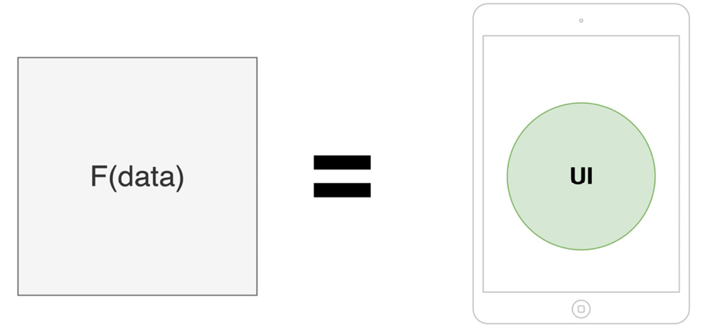
Figure 1.1 – In Compose, UI is a function of data
Later, in the Unidirectional flow of data subsection, we will understand why having functions to describe UI widgets is beneficial to our projects as it leads to a less bug-prone UI layer.
Getting back to our example, you might be wondering what the Text functional call represents. As with every other framework, Compose provides composable functions such as Text out of the box that we can use.
As its name suggests, the Text composable allows you to display some text on the screen. We will cover other composable functions provided by Compose in the Exploring the building blocks of Compose UIs section.
Until then, let's have another look at the previous code example and highlight the most important rules when it comes to defining a composable function:
- It should be a regular function marked with the
@Composableannotation. - Its UI output is defined by the data that's received through its input parameters. Composable functions should return
Unitas they emit UI elements and do not return data as regular functions do. Most of the time, we omit defining theUnitreturn type or even returningUnit– as Kotlin marks it as redundant – just like in the previous example. - It can contain other composable functions or regular Kotlin code. In the previous example, the
FriendlyMessagecomposable function makes use of another composable, calledText, but it could also call regular Kotlin code (we will tackle that in the upcoming sections). - It should be named as a noun or a noun preceded by a suggestive adjective (but never a verb). This way, composable functions envision widgets and not actions. Additionally, its name should respect the PascalCase naming convention, meaning that the first letter of each compound word in a variable is capitalized.
- It's recommended that the function is public and not defined within a class but directly within a Kotlin file. This way, Compose promotes the reuse of composable functions.
Now that we understand what a composable function is and how one is defined, let's move on and explore the paradigm shift that Compose brings to Android UI development.
The paradigm shift in creating UIs on Android
Compose brings a new approach to Android UI development and that is providing a declarative way of describing your UI. Before trying to understand how the declarative approach works, we will learn how the traditional View System relies on a different paradigm – the imperative one.
The imperative paradigm
When describing your UI with XML, you represent the view hierarchy as a tree of widgets that are commonly known as views. Views, in the context of the traditional View System, are all the components that inherit from the android.view.View class, from TextView, Button, or ImageView to LinearLayout, RelativeLayout, and so on.
Yet what's essential for the View System is the imperative paradigm that it relies on. Because your application must know how to react to user interactions and change the state of the UI accordingly, you can mutate the state of your views by referencing them through findViewById calls and then update their values through calls such as setText(), setBackgroundResource(), and so on.
Since views maintain their internal state and expose setters and getters, you must imperatively set new states for each component, as the following diagram suggests:
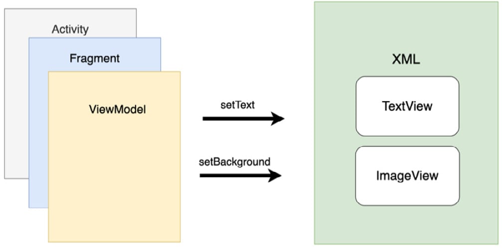
Figure 1.2 – The Android View System features in the imperative paradigm
Manually manipulating views' states increases the chance of bugs and errors in your UI. Because you end up treating multiple possible states and because chunks of data are displayed in several such states, it's relatively easy to mess up the outcome of your UI. Illegal states or conflicts between states can also arise relatively easily when your UI grows in complexity.
Moreover, since the layouts are defined in an additional component – that is, an XML file – the coupling between Activity, Fragment, or ViewModel and the XML-based UI increases. This means that changing something on the UI in the XML file will often lead to changes in Activity, Fragment, or ViewModel classes, which is where state handling happens. Not only that but cohesion is reduced because of language differences: one component is in Java/Kotlin, while the other one is in XML. This means that for the UI to function, it needs not only an Activity or Fragment but also XML.
The declarative paradigm
To address some of the issues within the standard View System, Compose relies on a modern declarative UI model, which drastically simplifies the process of building, updating, and maintaining UIs on Android.
If, in the traditional View System, the imperative paradigm described how the UI should change, in Compose, the declarative paradigm describes what the UI should render at a certain point in time.
Compose does that by defining the screen as a tree of composables. As in the following examples, each composable passes data to its nested composables, just like the FriendlyMessage composable passed a name to the Text composable in our code example from the previous section:
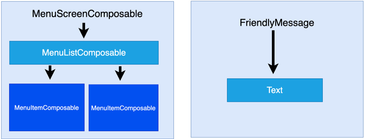
Figure 1.3 – Visualizing a tree of composable widgets and how data is passed downwards
When the input arguments change, Compose regenerates the entire widget tree from scratch. It applies the necessary changes and eliminates the need and the associated complexity of manually updating each widget.
This means that in Compose, composables are relatively stateless and because of that, they don't expose getter and setter methods. This allows the caller to react to interactions and handle the process of creating new states separately. It does that by calling the same composables but with different argument values. As we discussed in the Describing UIs with composable functions section, the UI in Compose is a function of data. From this, we can conclude that if new data is passed to composables, new UI states can be produced.
Lastly, compared to the View System, Compose only relies on Kotlin APIs, which means that UIs can now be defined with a single technology, in a single component, thereby increasing cohesion and reducing coupling.
Now, let's look at another shift in design brought by Compose and discuss how composition yields more flexible ways of defining UIs than inheritance does.
Favoring composition over inheritance
In the Android View System, every view inherits functionality from the parent View class. As the system relies solely on inheritance, the task of creating custom views can only be done through defining elaborate hierarchies.
Let's take the Button view as an example. It inherits functionality from TextView, which, in turn, inherits from View:

Figure 1.4 – The class inheritance hierarchy for the Button view
This strategy is great for reusing functionality, but inheritance becomes difficult to scale and has little flexibility when trying to have multiple variations of one view.
Say you want the Button view to render an image instead of text. In the View System, you would have to create an entirely new inheritance hierarchy, as shown in the following hierarchy diagram:
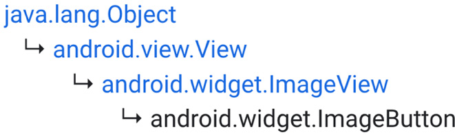
Figure 1.5 – The class inheritance hierarchy for the ImageButton view
But what if you need a button that accommodates both a TextView and an ImageView? This task would be extremely challenging, so it's easy to conclude that having separate inheritance hierarchies for each custom view is neither flexible nor scalable.
These examples are real, and they show the limitations of the View System. As we've previously seen, one of the biggest reasons for the lack of flexibility is the inheritance model of the View System.
To address this issue, Compose favors composition over inheritance. As shown in the following diagram, this means that Compose builds more complex UIs by using smaller pieces and not by inheriting functionality from one single parent:
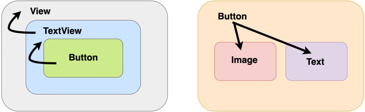
Figure 1.6 – Inheritance versus composition
Let's try to briefly explain our previous comparison between inheritance and composition:
- With inheritance, you are limited to inheriting your parent, just like
Buttoninherits only fromTextView. - With composition, you can compose multiple other components, just like the
Buttoncomposable contains both anImagecomposable and aTextcomposable, thereby giving you much more flexibility in building UIs.
Let's try to build a composable that features a button with an image and text. This was a huge challenge with inheritance, but Compose simplifies this by allowing you to compose an Image composable and a Text composable inside a Button composable:
@Composable
fun SuggestiveButton() {
    Button(onClick = { }) {
        Row() {
            Image(painter =
                     painterResource(R.drawable.drawable),
                  contentDescription = "")
            Text(text = "Press me")
        }
    }
}
Now, our SuggestiveButton composable contains both Image and Text composables. The beauty of this is that it could contain anything else. A Button composable can accept other composables that it renders as part of its button's body. Don't worry about this aspect or about that weird composable called Row for now. The Exploring the building blocks of Compose UIs section will cover both of these aspects in more detail.
What's important to remember from this example is that Compose gives us the flexibility of building a custom UI with ease. Next, let's cover how data and events flow in Compose.
Unidirectional flow of data
Knowing that each composable passes data down to its children composables, we can deduct that the internal state is no longer needed. This also translates into a unidirectional flow of data because composables only expect data as input and never care about their state:
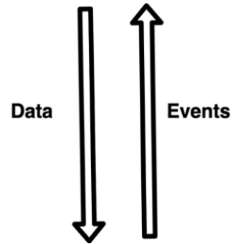
Figure 1.7 – Visualizing the unidirectional flow of data and events
Similarly, with data, each composable passes down callback functions to its children composables. Yet this time, the callback functions are caused by user interactions, and they create an upstream of callbacks that goes from each nested composable to its parent and so on. This means that not only the data is unidirectional but also events, just in opposite ways.
From this, it's clear that data and events travel only in one direction, and that's a good thing because only one source of truth – ideally, ViewModel – is in charge of handling them, resulting in fewer bugs and easier maintenance as the UI scales.
Let's consider a case with another composable provided by Jetpack Compose called Button. As its name suggests, it emits a button widget on the screen, and it exposes a callback function called onClick that notifies us whenever the user clicks the button.
In the following example, our MailButton composable receives data as an email identifier, mailId, and an event callback as a mailPressedCallback function:
@Composable
fun MailButton(
    mailId: Int,
    mailPressedCallback: (Int) -> Unit
) {
    Button(onClick = { mailPressedCallback(mailId) }) {
        Text(text = "Expand mail $mailId")
    }
}
While it consumes the data it receives via mailId, it also sets the mailPressedCallback function to be called every time its button is clicked, thereby sending the event back up to its parent. This way, data flows downwards and the callback flows upwards.
Note
It is ideal to construct your Compose UI in such a way that data provided by the ViewModel flows from parent composables to children composables and events flow from each composable back up to the ViewModel. If you're not familiar with the ViewModel component, don't worry as will cover it in the upcoming Chapter 2, Handling UI State with Jetpack ViewModel.
Recomposition
We have already covered how composable functions are defined by their input data and stated that whenever the data changes, composables are rebuilt as they render a new UI state corresponding to the newly received data.
The process of calling your composable functions again when inputs change is called recomposition. When inputs change, Compose automatically triggers the recomposition process for us and rebuilds the UI widget tree, redrawing the widgets emitted by the composables so that they display the newly received data.
Yet recomposing the entire UI hierarchy is computationally expensive, which is why Compose only calls the functions that have new input while skipping the ones whose input hasn't changed. Optimizing the process of rebuilding the composable tree is a complex job and is usually referred to as intelligent recomposition.
Note
In the traditional View System, we would manually call the setters and getters of views, but with Compose, it's enough to provide new arguments to our composables. This will allow Compose to initiate the recomposition process for parts of the UI so that the updated values are displayed.
Before jumping into an actual example of recomposition, let's have a quick look at the lifecycle of a composable function. Its lifecycle is defined by the composition lifecycle, as shown here:
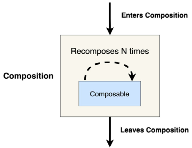
Figure 1.8 – The composition lifecycle of a composable function
This means that a composable first enters composition, and before leaving this process, it can recompose as many times as needed – that is, before it disappears from the screen, it can be recomposed and rebuilt many times, each time possibly displaying a different value.
Recomposition is often triggered by changes within State objects, so let's look at an example to explore how seamlessly this happens with little intervention from our side. Say you have a TimerText composable that expects a certain number of elapsed seconds that it displays in a Text composable. The timer starts from 0 and updates every 1 second (or 1,000 ms), displaying the number of seconds that have elapsed:
var seconds by mutableStateOf(0)
val stopWatchTimer = timer(period = 1000) { seconds++ }
   ...
@Composable
fun TimerText(seconds: Int) {
   Text(text = "Elapsed: $seconds")
}
In the Defining and handling state with Compose section of Chapter 2, Handling UI State with Jetpack ViewModel, we will define the state in Compose in more detail, but until then, let's think of seconds as a simple state object (instantiated with mutableStateOf()) that has an initial value of 0 and that its value changes over time, triggering a recomposition each time.
Every time stopWatchTimer increases the value of the seconds state object, Compose triggers a recomposition that rebuilds the widget tree and redraws the composables with new arguments.
In our case, TimerText will be recomposed or rebuilt because it receives different arguments – the first time, it will receive 0, then 1, 2, and so on. This, in turn, triggers the Text composable to also recompose and that's why Compose redraws it on the screen to display the updated message.
Recomposition is a complex topic. As we will not be able to go into too much depth on it now, it's important to also cover more advanced concepts, as described in the documentation: https://developer.android.com/jetpack/compose/mental-model#any-order.
Now that we've covered what recomposition is and the core concepts behind Compose, it's time to have a better look at the composables that are used to build a Compose UI.
Exploring the building blocks of Compose UIs
We've only had a brief look at the Text and Button composables so far. That's why, in this section, we will not only understand how activities can render composables instead of XML and how we can preview them, but we will also have a better look at the most important and commonly used composable functions: from the ones we've seen, such as Text and Button, to new ones such as TextField, Image, Row, Column, and Box.
To summarize, this section will cover the following topics:
- Setting content and previewing composables
- Exploring core composables
- Customizing composables with modifiers
- Layouts in Compose
Let's jump in and understand how to render composable functions on the screen.
Setting content and previewing composables
We had a quick look at some composable functions, but we didn't quite touch on the aspect of making the application display Compose UIs.
Setting the composable content can easily be achieved and is encouraged to be done in your Activity class by simply replacing the traditional setContentView(R.layout.XML) call with setContent() and passing a composable function to it:
import androidx.activity.compose.setContent
class MainActivity : ComponentActivity() {
   override fun onCreate(savedInstanceState: Bundle?) {
       super.onCreate(savedInstanceState)
       setContent {
           Text("Hello world")
       }
   }
}
Because Compose no longer needs the AppCompat API for backward compatibility, we made our MainActivity inherit the base ComponentActivity class.
In the previous example, we called the setContent method in the onCreate callback of MainActivity and passed a Text composable function to it. If we run the app, we will see the "Hello world" message.
The setContent method is an extension function for ComponentActivity that composes the given composable into the given activity. It only accepts a @Composable function as a trailing lambda. The input composable function will become the root view of the activity and act as a container for your Compose hierarchy.
Note
You can add composable functions into fragments or activities that have an XML UI already defined with the help of the ComposeView class, but we will not go into too much detail as far as interoperability goes.
As XML provided us with a preview tool, a good question would be whether Compose also has one. Compose brings an even more powerful preview tool that allows us to skip running the application on the emulator or real devices every time we want to see how our UI evolves.
Previewing your composable is easy; just add the @Preview annotation to it:
@Preview(showBackground = true)
@Composable
fun FriendlyMessage() {
   Text(text = "Greetings!")
}
The IDE will automatically pick up that you want to preview this composable and show it on the right-hand side of the screen. Make sure that you rebuild your project and have the Split option enabled:
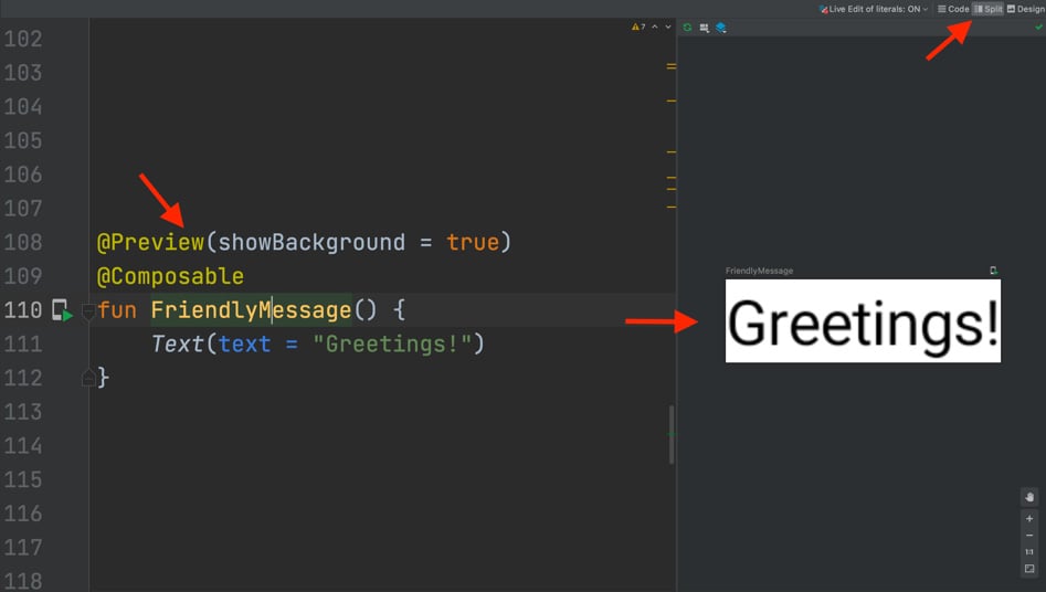
Figure 1.9 – Previewing composable functions in Android Studio
Optionally, you can specify for the preview to show a background for better visibility by passing the showBackground parameter with a value of true.
Note
Make sure that the composable function you are trying to preview has no input parameters. If it has, supply the default values for them so that the preview tools can work.
Yet this preview tool is much more powerful than this as it supports Interactive mode, which allows you to interact with the UI, and Live Edit of literals, which, if enabled, causes the preview to reload every time you change widths, heights, or others, just like a real UI would. You can see these two options in the following screenshot:
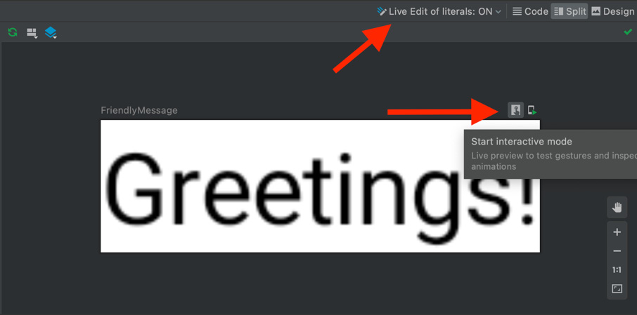
Figure 1.10 – Using the Preview feature in Compose
Note
To enable Interactive mode on Android Studio Arctic Fox, go to File | Settings | Experimental (Windows) or Android Studio | Preferences | Experimental (macOS).
Additionally, you can have multiple previews simultaneously if you annotate each function with the @Preview annotation. You can add names for each preview through the name parameter and even tell the preview tool which device it should display it on through the device argument:
@Preview(
    name = "Greeting preview",
    showSystemUi = true,
    device = Devices.PIXEL_2_XL
)
@Composable
fun FriendlyMessagePreview() { Text(text = "Greetings!") }
@Preview(
        showSystemUi = true,
        device = Devices.NEXUS_5)
@Composable
fun FriendlyMessagePreview2() { Text(text = "Goodbye!") }
Make sure that you also set showSystemUi to true to see the entire device.
Note
@Preview functions should have different names to avoid preview conflicts.
Now that we have learned how to set and preview Compose UI, it's time to explore new composables.
Exploring core composables
We've already had a quick look at some of the most basic composable functions: Text, Button, and Image. In this subsection, we will spend a bit more time exploring not only those composables but also new ones such as TextField.
Text
Text is the Compose version of our old and beloved TextView. Text is provided by Compose and achieves the most basic and yet important functionality in any application: the ability to display a piece of text. We've already used this composable in several examples:
Text(text = "Greetings $name!")
You might be wondering how we can customize it. Let's check out the source code or the documentation for Text to find the most basic and commonly used arguments for it:
textis the only required argument. It expects aStringand sets the output text.colorspecifies the color of the output text and expects aColorobject.fontSizeof typeTextUnit,fontStyleof typeFontStyle,fontFamilyof typeFontFamily, andfontWeightof typeFontWeightall allow you to customize the look and appearance of your text.textAlignspecifies the horizontal alignment of the text. It expects aTextAlignobject.maxLinesexpects anIntvalue that sets the maximum number of lines in the output text.styleexpects aTextStyleobject and allows you to define and reuse styles through themes.
Instead of going through all the arguments for Text, let's check out an example where we can customize the look of our Text composable function:
@Composable
fun MyAppText() {
   Text(
       text = stringResource(id = R.string.app_name),
       fontStyle = FontStyle.Italic,
       textAlign = TextAlign.Center,
       color = Color.Magenta,
       fontSize = 24.sp,
       fontWeight = FontWeight.ExtraBold)
}
Instead of passing some hardcoded text, we passed a string resource with the help of the built-in stringResource function and obtained the following result:

Figure 1.11 – Exploring a customized Text composable
Now that we've learned how to display text with the Text composable, let's move on to buttons.
Button
Displaying text is essential in any application, yet having clickable buttons allows it to be interactive. We've used the Button composable (previously known in the View System as Button too) before and its main characteristic was the onClick callback function, which notified us when the user pressed the button.
While Button features plenty of customizing arguments, let's check out the most used parameters:
onClickis a mandatory parameter and it expects a function that will be called whenever the user presses the button.colorsexpects aButtonColorsobject that defines the content/background colors.shapeexpects a custom/Material themeShapeobject that sets the shape of the button.contentis a mandatory parameter that expects a composable function that displays the content inside thisButton. We can add any composables here, includingText,Image, and more.
Let's try to build a Button function that makes use of these core arguments:
@Composable
fun ClickableButton() {
   Button(
       onClick = { /* callback */ },
       colors = ButtonDefaults.buttonColors(
           backgroundColor = Color.Blue,
           contentColor = Color.Red),
       shape = MaterialTheme.shapes.medium
   ) { Text("Press me") }
}
We've also passed a predefined MaterialTheme shape. Let's preview the resulting composable:

Figure 1.12 – Exploring a customized Button composable
With that, we've seen how easy it is to create a custom button with the Button composable. Next up, let's try to play around with another composable function – TextField.
TextField
Adding buttons is the first step toward having an interactive UI, but the most important element in this area is the TextField composable, previously known in the View System as EditText. Just like EditText did, the TextField composable allows the user to enter and modify text.
While TextField has many arguments, the most important ones that it features are as follows:
valueis a mandatoryStringargument as it's the displayed text. This value should change as we type inside it by holding it in aStateobject; more on that soon.onValueChangeis a mandatory function that triggers every time the user inputs new characters or deletes existing ones.labelexpects a composable function that allows us to add a descriptive label.
Let's have a look at a simple usage of a TextField that also handles its own state:
@Composable
fun NameInput() {
   val textState = remember { mutableStateOf("") }
   TextField(
        value = textState.value,
        onValueChange = { newValue ->
            textState.value = newValue
        },
        label = { Text("Your name") })
}
It achieves this by defining a MutableState that holds the text displayed by TextField. This means that textState doesn't change across recompositions, so every time the UI updates because of other composables, textState should be retained. Moreover, we've wrapped the MutableState object in a remember block, which tells Compose that across recompositions, it should not revert the value to its initial value; that is, "".
To get or set the value of a State or MutableState object, our NameInput composable uses the value accessor. Because TextField accesses a MutableState object through the value accessor, Compose knows to retrigger a recomposition every time the textState value changes – in our case, in the onValueChange callback. By doing so, we ensure that as we input text in our TextField, the UI also updates with the new characters that have been added or removed from the keyboard.
Don't worry if these concepts about state in Compose don't make too much sense right now – we will cover how state is defined in Compose in more detail in Chapter 2, Handling UI State with Jetpack ViewModel.
Note:
Unlike EditText, TextField has no internal state. That's why we've created and handled it; otherwise, as we would type in, the UI would not update accordingly.
The resulting NameInput composable updates the UI correctly and looks like this:
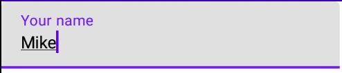
Figure 1.13 – Exploring a TextField composable
Now that we've learned how to add input fields within a Compose-based app, it's time to explore one of the most common elements in any UI.
Image
Displaying graphical information in our application is essential and Compose provides us with a handy composable called Image, which is the composable version of the ImageView from the View System.
While Image features plenty of customizing arguments, let's check out the most used parameters:
painterexpects aPainterobject. This argument is mandatory as it sets the image resource. Alternatively, you can use the overloaded version ofImageto directly pass anImageBitmapobject to itsbitmapparameter.contentDescriptionis a mandatoryStringthat's used by accessibility services.contentScaleexpects aContentScaleobject that specifies the scaling of the picture.
Let's add an Image composable that displays the application icon using painterResource:
@Composable
fun BeautifulImage() {
    Image(
        painter =
           painterResource(R.drawable.ic_launcher_foreground),
        contentDescription = "My app icon",
        contentScale = ContentScale.Fit
    )
}
Finally, let's preview the BeautifulImage function and then move on to the next section:

Figure 1.14 – Exploring the Image composable
We've also tried displaying images with Compose, yet you may still be wondering, how can we customize all these composable functions?
Customizing composables with modifiers
All the composables we've covered so far feature an argument that we haven't covered yet: modifier. This expects a Modifier object. In simple terms, modifiers tell a composable how to display, arrange, or behave within its parent composable. By passing a modifier, we can specify many configurations for a composable: from size, padding, or shape to background color or border.
Let's start with an example by using a Box composable and specifying a size modifier for it:
@Composable
fun ColoredBox() {
   Box(modifier = Modifier.size(120.dp))
}
We will cover the Box composable later but until then, you can think of it like a container that we will use to draw several shapes on the screen. What's important here is that we passed the Modifier.size() modifier, which sets the size of the box. It accepts a dp value that represents both the width and the height of the composable. You can also pass the width and height as parameters within the size() modifier or separately with the help of the height() and width() modifiers.
Specifying only one modifier for composables is usually not enough. That's why modifiers can be chained. Let's chain multiple modifiers by adding several other configurations to our Box:
@Composable
fun ColoredBox() {
   Box(modifier = Modifier
           .size(120.dp)
           .background(Color.Green)
           .padding(16.dp)
           .clip(RoundedCornerShape(size = 20.dp))
           .background(Color.Red))
}
As we mentioned previously, chaining modifiers is simple: start with an empty Modifier object and then chain new modifiers one after the other. We've chained several new modifiers, starting with background, then padding, clip, and finally another background. The modifiers, when combined, produce an output consisting of a green rectangle that contains a nested rounded corner rectangle that's red:
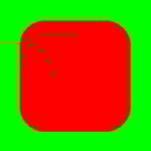
Figure 1.15 – Exploring chained modifiers
Note
The order of the modifiers in the chain matters because modifiers are applied from the outer layer to the inner layer. Each modifier modifies the composable and then prepares it for the upcoming modifier in the chain. Different modifier orders yield different results.
In the previous example, because modifiers are applied from the outermost layer to the innermost layer, the entire rectangular box is green because green is the first color modifier that's applied. Going inner, we applied a padding of 16 dp. Afterward, still going inner, the RoundedCornerShape modifier is applied. Finally, in the innermost layer, we applied another color modifier – this time, of the color red – and we got our final result.
Now that we've played around with the most common composables, it's time to start building actual layouts that make use of multiple composable functions.
Layouts in Compose
Often, building even a simple screen cannot be achieved by following the previous examples since most of them feature only one composable. For simple use cases, composable functions contain only one composable child.
To build more complex pieces of UI, layout components in Compose give you the option to add as many children composables as you need.
In this section, we will cover those composable functions that allow you to place children composables in a linear or overlayed fashion, such as the following:
Rowfor arranging children composables in a horizontal fashionColumnfor arranging children composables verticallyBoxfor arranging children composables on top of each other
Following these definitions, let's envision the layout composables with the following diagram:
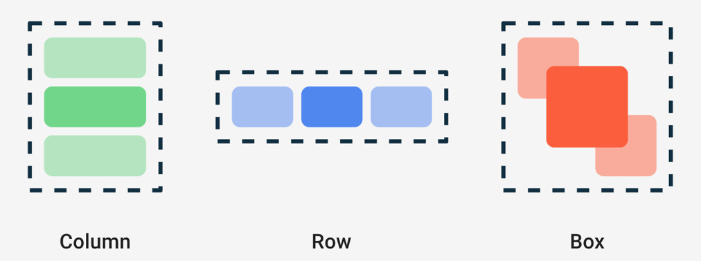
Figure 1.16 – Exploring Column, Row, and Box
It's clear now that arranging children composables in different ways can easily be achieved with Column, Row, and Box, so it's time to look at them in more detail.
Row
Displaying multiple widgets on the screen is achieved by using a Row composable that arranges its children composables horizontally, just like the old LinearLayout with horizontal orientation did:
@Composable
fun HorizontalNumbersList() {
   Row(
       horizontalArrangement = Arrangement.Start,
       verticalAlignment = Alignment.CenterVertically,
       modifier = Modifier.fillMaxWidth()
   ) {
       Text("1", fontSize = 36.sp)
       Text("2", fontSize = 36.sp)
       Text("3", fontSize = 36.sp)
       Text("4", fontSize = 36.sp)
   }
}
We've set Row to only take the available width and added several Text functions as children composables. We specified a horizontalArrangement of Start so that they start from the left of the parent but also made sure that they are centered vertically by passing a CenterVertically alignment for the verticalAlignment argument. The result is straightforward:
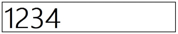
Figure 1.17 – Exploring the Row composable
Largely, the essential arguments for a Row composable are related to how children are arranged or aligned:
horizontalArrangementdefines how the children are positioned horizontally both relative to each other and within the parentRow. Apart fromArragement.Start, you can also passCenterorEndorSpaceBetween,SpaceEvenly, orSpaceAround.verticalAlignmentsets how the children are positioned vertically within the parentRow. Apart fromAlignment.CenterVertically, you can passToporBottom.
Now that we've arranged the children composables horizontally, let's try to arrange them vertically.
Column
Displaying a vertical list on the screen can be achieved by using a Column composable that arranges its children composables vertically, just like the old LinearLayout with vertical orientation did:
@Composable
fun NamesVerticalList() {
   Column(verticalArrangement = Arrangement.SpaceEvenly,
       horizontalAlignment = Alignment.CenterHorizontally,
       modifier = Modifier.fillMaxSize()
   ) {
       Text("John", fontSize = 36.sp)
       Text("Amanda", fontSize = 36.sp)
       Text("Mike", fontSize = 36.sp)
       Text("Alma", fontSize = 36.sp)
   }
}
We've set Column to take all the available space and added several Text functions as children composables. This time, we specified a verticalArrangement of SpaceEvenly so that children are spread out equally within the parent, but we also made sure they are centered horizontally by passing a CenterHorizontally alignment as horizontalAlignment:
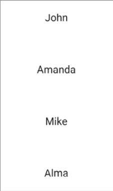
Figure 1.18 – Exploring the Column composable
Similar to Row, the essential arguments for a Column are also related to how children are arranged or aligned. This time, though, the arrangement is vertical instead of horizontal, and the alignment is horizontal instead of vertical:
verticalArrangementdefines how the children are vertically positioned within the parentColumn. The values are the same as the row'shorizontalArrangement.horizontalAlignmentdefines how the children are aligned within the parentColumn. Apart fromAlignment.CenterHorizontally, you can passStartorEnd.Note
If you're feeling brave, this is a great time for you to explore different alignments and arrangements and see how the UI changes. Make sure that you preview your composable functions with the
@Previewannotation.
Box
So far, we've learned how to arrange children horizontally and vertically, but what if we want to place them on top of each other? The Box composable comes to our rescue as it allows us to stack children composables. Box also allows us to position the children relatively to it.
Let's try to build our own Floating Action Button (FAB) with the help of Box. We will stack two composables inside Box:
- One green circle, which will be created with the help of
Surface. TheSurfacecomposable allows you to easily define a material surface with a certain shape, background, or elevation. - One plus sign (
+) added as text inside theTextcomposable, which is aligned in the center of its parentBox.
This is what the code will look like:
@Composable
fun MyFloatingActionButton() {
   Box {
       Surface(
           modifier = Modifier.size(32.dp),
           color = Color.Green,
           shape = CircleShape,
           content = { })
       Text(text = "+",
            modifier = Modifier.align(Alignment.Center))
   }
}
The Surface composable is defined with a mandatory content parameter that accepts another composable as its inner content. We don't want to add a composable inside of it. Instead, we want to stack a Text composable on top of it, so we passed an empty function to the content parameter.
The result is similar to the FAB we are all used to:
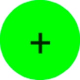
Figure 1.19 – Exploring the Box composable
To take advantage of Box, you must keep the following in mind:
- The order in which composables are added within
Boxdefines the order in which they are painted and stacked on top of each other. If you switch the order ofSurfaceandText, the+icon will be painted beneath the green circle making it invisible. - You can align the children composables relative to the
Boxparent by passing different values for each of the child's alignment modifiers. That's why, apart fromAlignment.Center, you can also position children composables withCenterStart,CenterEnd,TopStart,TopCenter,TopEnd,BottomStart,BottomEnd, orBottomCenter.
Now that we covered the basics, it's time to roll up our sleeves and create our first Compose project!
Building a Compose-based screen
Let's say we want to build an application that showcases some restaurants. We will build the UI with Compose and go through the steps of creating a new Compose project. We will then build a list item for such a restaurant and finally display a dummy list of such items.
To summarize, in this section, we will build our first Compose-based application: a restaurant explorer app! To achieve that, we must display some restaurants, which we will do by covering the following topics:
- Creating your first Compose project
- Building a restaurant element layout
- Displaying a list of restaurants with Compose
Now that we have a clear path, let's get started.
Creating your first Compose project
To build a restaurant app, we have to create a new Compose-based project:
- Open Android Studio and select the New Project option:
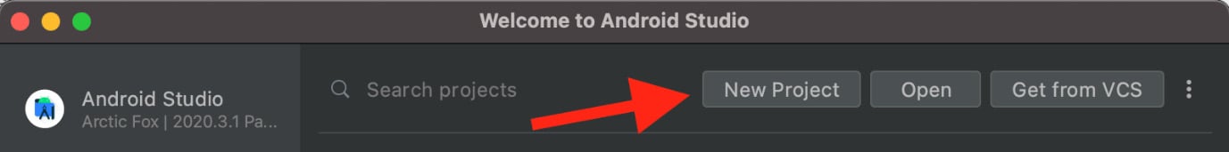
Figure 1.20 – Starting a new project with Android Studio
If you already have Android Studio open, go to File, then New, and finally New Project.
Note
Make sure that you have Android Studio version Arctic Fox 2020.3.1 or newer. If you're using a newer version though, some files might have differences in the generated code.
- In the Phone and tablet template section, select Empty Compose Activity and then choose Next:
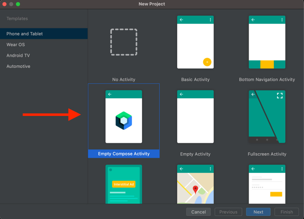
Figure 1.21 – Starting a new project with Android Studio
- Next, enter some details about your application. In the Name field, enter
Restaurants app. Leave Kotlin as-is for Language and set Minimum SDK to API 21. Then, click Finish.Important note
The upcoming step is an essential configuration step. It makes sure that the project Android Studio has configured for you the same versions of dependencies (from Compose, to Kotlin and other dependencies) that we use throughout the book. By doing so, you will be able to follow the code snippets and inspect the code source without any API differences.
- Inside the newly generated project, before inspecting the code, make sure that the generated project uses the versions of dependencies that are used throughout the book.
To do so, first go to the project-level build.gradle file and inside the dependencies block, make sure that the Kotlin version is set to 1.6.10:
buildscript {
    […]
    dependencies {
        classpath "com.android.tools.build:gradle:7.0.2"
        classpath "org.jetbrains.kotlin:kotlin-gradle-
            plugin:1.6.10"
      […]
    }
}
Alternatively, if you're using a newer version of Android Studio, you might find the Kotlin version used in this project inside the plugins block, like so:
plugins {
    […]
    id 'org.jetbrains.kotlin.android' version '1.6.10'
        apply false
}
If you haven't already, you might need to install the 1.6.10 plugin version of Kotlin in Android Studio. To do that, click on the Tools option of Android Studio on the Kotlin and on the Configure Kotlin Plugin Updates options. In the newly opened window, you can update your Kotlin version to 1.6.10.
Still in the project-level build.gradle file, because Compose is tied to the Kotlin version used in our project, make sure that the Compose version is set to 1.1.1 inside the ext { } block:
buildscript {
    ext {
        compose_version = '1.1.1'
    }
    repositories {…}
    dependencies {…}
}
Then, move into the app-level build.gradle file. First check that the composeOptions { } block looks like this:
plugins { ... }
android {
    [...]
    buildFeatures { compose true }
    composeOptions {
        kotlinCompilerExtensionVersion compose_version
    }
    packagingOptions { ... }
}
In some versions of Android Studio, the composeOptions { } block would add an outdated kotlinCompilerVersion '1.x.xx' line that should be removed.
Finally, make sure that the dependencies block of the app-level build.gradle file includes the following versions for its dependencies:
dependencies {
    implementation 'androidx.core:core-ktx:1.7.0'
    implementation 'androidx.appcompat:appcompat:1.4.1'
    implementation 'com.google.android.material:
        material:1.5.0'
    implementation "androidx.compose.ui:ui:
        $compose_version"
    implementation "androidx.compose.material:
        material:$compose_version"
    implementation "androidx.compose.ui:ui-tooling-
        preview:$compose_version"
    implementation 'androidx.lifecycle:lifecycle-
        runtime-ktx:2.4.1'
    implementation 'androidx.activity:activity-
        compose:1.4.0'
    testImplementation 'junit:junit:4.+'
    androidTestImplementation
        'androidx.test.ext:junit:1.1.3'
    androidTestImplementation
        'androidx.test.espresso:espresso-core:3.4.0'
    androidTestImplementation "androidx.compose.ui:ui-
        test-junit4:$compose_version"
    debugImplementation "androidx.compose.ui:ui-
        tooling:$compose_version"
}
If you had to make any changes, synchronize your project with its Gradle files by clicking on the Sync your project with Gradle files button in Android Studio or by pressing on the File menu option and then by selecting Sync Project with Gradle Files.
Now we're set. Let's return to the source code generated by Android Studio.
And here we are – our first Compose project has been set up! Let's check out the source code by navigating to the MainActivity.kt file. We can conclude that it consists of three main parts:
- The
MainActivityclass - The
Greetingcomposable function - The
DefaultPreviewcomposable function
The MainActivity class is where content is passed to the setContent method in the onCreate callback. As we know by now, we need to call setContent to set up a Compose UI and pass composable functions as our UI:
setContent {
   RestaurantsAppTheme {
       Surface(color = MaterialTheme.colors.background) {
           Greeting("Android")
       }
   }
}
The IDE template has already implemented a Greeting composable that is wrapped into a Surface that uses the theme's background color. But what is that RestaurantsAppTheme function that was passed as the parent composable to the setContent method?
If you press Ctrl + B or Command + B on the function name, you will be taken to the Theme.kt file, which is where our theme is generated. RestaurantsAppTheme is a composable function that was auto-generated by the IDE as it holds the app's name:
@Composable
fun RestaurantsAppTheme(
   darkTheme: Boolean = isSystemInDarkTheme(),
   content: @Composable() -> Unit
) {
   ...
   MaterialTheme(
       colors = colors,
       typography = Typography,
       shapes = Shapes,
       content = content)
}
The app's theme is a wrapper over MaterialTheme and if we pass it to the setContent call, it allows us to reuse custom styles and color schemes defined within the app's theme. For it to take effect and reuse custom styles, we must pass our composables functions to the content parameter of our theme composable – in our case, in MainActivity, the Greeting composable wrapped in the Surface composable is passed to the RestaurantsAppTheme composable.
Let's go back inside the MainActivity.kt file to have a look at the other parts generated by Android studio. We can see that the Greeting composable displays text through Text, similar to our composable functions from the previous examples.
To preview the Greeting composable, the IDE also generated a preview composable for us called DefaultPreview, which allows us to preview the content that MainActivity displays; that is, Greeting. It also makes use of the theme composable to get the consistently themed UI.
Now that we've achieved a big milestone in that we've created a Compose-based application, it's time to start working on our Restaurants App!
Building a restaurant element layout
It's time to get our hands dirty and start building the layout for a restaurant within the app:
- Create a new file by left-clicking the application package and selecting New and then Kotlin Class/File. Enter
RestaurantsScreenfor the name and select the type as File. - Inside this file, let's create a
RestaurantsScreencomposable function for our first Compose screen:@Composable fun RestaurantsScreen() { RestaurantItem() }
- Next, inside the
RestaurantsScreen.ktfile, let's define theRestaurantItemcomposable, which features aCardcomposable with elevation and padding:@Composable fun RestaurantItem() { Card(elevation = 4.dp, modifier = Modifier.padding(8.dp) ) { Row(verticalAlignment = Alignment.CenterVertically, modifier = Modifier.padding(8.dp)) { RestaurantIcon( Icons.Filled.Place, Modifier.weight(0.15f)) RestaurantDetails(Modifier.weight(0.85f)) } } }
Make sure that every import you include is part of the androidx.compose.* package. If you're unsure what imports to include, check out the source code for the RestaurantsScreen.kt file at the following URL:
Getting back to the previous code snippet, we could say that the Card composable is similar to Cardview from the old View System as it allows us to beautify the UI piece that represents a restaurant with border or elevation.
In our case, Card contains a Row composable whose children composables are centered vertically and are surrounded by some padding. We used Row since we will show some details about the restaurant in a horizontal fashion: an icon and some text details.
We passed the RestaurantIcon and RestaurantDetails composables as children of the Row composable but these functions are not defined so we have compilation errors. For now, don't worry about the weight modifiers. Let's define the RestaurantIcon composable first!
- Still inside the
RestaurantsScreen.ktfile, create another composable function entitledRestaurantIconwith the following code:@Composable private fun RestaurantIcon(icon: ImageVector, modifier: Modifier) { Image(imageVector = icon, contentDescription = "Restaurant icon", modifier = modifier.padding(8.dp)) }
The RestaurantIcon composable sets an ImageVector icon to an Image composable – in our case, a predefined Material Theme icon called Icons.Filled.Place. It also sets a contentDescription value and adds padding on top of the modifier it receives.
However, the most interesting part is the fact that RestaurantIcon receives a Modifier as an argument from its parent Row. The argument it receives is Modifier.weight(0.15f), which means that our Row assigns weights to each of its horizontally positioned children. The value – in this case, 0.15f – means that this child RestaurantIcon will take 15% of the horizontal space from its parent Row.
- Now, still inside the
RestaurantsScreen.ktfile, create aRestaurantDetailsfunction that displays the restaurant's details:@Composable private fun RestaurantDetails(modifier: Modifier) { Column(modifier = modifier) { Text(text = "Alfredo's dishes", style = MaterialTheme.typography.h6) CompositionLocalProvider( LocalContentAlpha provides ContentAlpha.medium) { Text(text = "At Alfredo's … seafood dishes.", style = MaterialTheme.typography.body2) } } }
Similarly, RestaurantDetails receives a Modifier.weight(0.85f) modifier as an argument from Row, which will make it occupy the remaining 85% of the horizontal space.
The RestaurantDetails composable is a simple Column that arranges two Text composables vertically, with one being the title of the restaurant, and the other being its description.
But what's up with CompositionLocalProvider? To display the description that's faded out in contrast to the title, we applied a LocalContentAlpha of ContentAlpha.medium. This way, the child Text with the restaurant description will be faded or grayed out.
CompositionLocalProvider allows us to pass data down to the composable hierarchy. In this case, we want the child Text to be grayed out, so we passed a LocalContentAlpha object with a ContentAlpha.medium value using the infix provides method.
- For a moment, go to
MainActivity.ktand remove theDefaultPreviewcomposable function as we will define our own a@Previewcomposable up next. - Go back inside the
RestaurantsScreen.ktfile, define a@Previewcomposable:@Preview(showBackground = true) @Composable fun DefaultPreview() { RestaurantsAppTheme { RestaurantsScreen() } }
If you have chosen a different name for your app, you might need to update the previous snippet with the theme composable defined in the Theme.kt file.
- Rebuild the project and let's inspect the
RestaurantsScreen()composable by previewing the newly createdDefaultPreviewcomposable, which should display a restaurant item:

Figure 1.22 – Previewing a restaurant item
- Finally, go back to
MainActivity.ktand remove theGreetingcomposable. Also, remove theSurfaceandGreetingfunction calls in thesetContentmethod and replace them withRestaurantScreen:setContent { RestaurantsAppTheme { RestaurantsScreen() } }
By passing RestaurantScreen to our MainActivity's setContent method, we ensure that the application will render the desired UI when built and run.
Now that we have built a layout for a restaurant, it's time to learn how to display more of them!
Displaying a list of restaurants with Compose
So far, we've displayed a restaurant item, so it's time to display an entire list of them:
- First, create a new class in the root package, next to
MainActivity.kt, calledRestaurant.kt. Here, we will add adata classcalledRestaurantand add the fields that we expect a restaurant to have:data class Restaurant(val id: Int, val title: String, val description: String)
- In the same
Restaurant.ktfile, create a dummy list ofRestaurantitems, preferably at least 10 to fill up the entire screen:data class Restaurant(val id: Int, val title: String, val description: String) val dummyRestaurants = listOf( Restaurant(0, "Alfredo foods", "At Alfredo's …"), [...], Restaurant(13, "Mike and Ben's food pub", "") )
You can find the pre-populated list in this book's GitHub repository, inside the Restaurant.kt file:
- Go back inside the
RestaurantsScreen.ktfile and update yourRestaurantItemso that it receives aRestaurantobject as an argument, while also passing the restaurant'stitleanddescriptionto theRestaurantDetailscomposable as parameters:@Composable fun RestaurantItem(item: Restaurant) { Card(...) { Row(...) { RestaurantIcon(...) RestaurantDetails( item.title, item.description, Modifier.weight(0.85f) ) } } } - We have passed the restaurant's
titleanddescriptionto theRestaurantDetailscomposable as parameters. Propagate these changes in theRestaurantDetailscomposable and pass thetitleinto the firstTextcomposable and thedescriptioninto the secondTextcomposable:@Composable fun RestaurantDetails(title: String, description: String, modifier: Modifier){ Column(modifier = modifier) { Text(text = title, ...) CompositionLocalProvider( … ) { Text(text = description, ...) } } } - Go back to the
RestaurantsScreencomposable and update it to display a vertical list ofRestaurantobjects. We already know that we can use aColumnto achieve this. Then, iterate over each restaurant indummyRestaurantsand bind it to aRestaurantItem:@Composable fun RestaurantsScreen() { Column { dummyRestaurants.forEach { restaurant -> RestaurantItem(restaurant) } } }
This will create a beautiful vertical list that we can preview through our DefaultPreview composable.

Figure 1.23 – Previewing RestaurantsScreen with the Column composable
Alternatively, you can Run the app to see the restaurants directly on your device or emulator.
We've finally created our first list with Compose! It looks very nice and beautiful, yet it has one huge issue – it doesn't scroll! We'll address this together in the next section.
Exploring lists with Compose
In the previous section, we built a Compose-based screen that features a list of restaurants. However, if you run the application or preview the screen in interactive mode, you will notice that the list doesn't scroll. This is a huge inconvenience that we will address in this section by adding scroll capabilities to our Column composable.
Next, we will specify why Column is suited for static content, whereas if the list is large and its size is dynamic or dictated by the server's response, we should use lazy composables. We will explore a variety of lazy composables and understand why they are better suited for large lists.
To summarize, this section will cover the following topics:
- Adding scrolling to the
Columncomposable - Introducing lazy composables
- Using
LazyColumnto display restaurants
Let's start by adding scrolling capabilities to our RestaurantsScreen composable.
Adding scrolling to the Column composable
Our list of restaurants is long, and it can't scroll. This is a bad user experience, so let's fix it.
Let's make the Column scrollable by passing a Modifier.verticalScroll modifier that receives a ScrollState:
@Composable
fun RestaurantsScreen() {
   Column(Modifier.verticalScroll(rememberScrollState())) {
       ...
   }
}
We want the scrolling position to be retained across recompositions. That's why, by passing rememberScrollState to the verticalScroll modifier, we ensure that every time the UI recomposes, the scroll state is remembered and retained. The rememberScrollState persistence mechanism is similar to the remember { } block, which we used previously to retain the TextField's state across recompositions.
Now, you can Run the app or preview it in Interactive mode and check out the scrolling effect.
However, we have one final issue with our Column that is related to how Column lays and composes its elements. Let's dive into that now and try to find a better alternative.
Introducing lazy composables
Let's take a short break from our restaurant app and try to think of a better way of handling large lists. Using Row or Column for displaying long lists of items, or maybe a list of unknown size, can prove detrimental to your UI and impact your app's performance. This happens because Row and Column render or lay all their children out, whether they are visible or not. They are good for displaying static content, yet passing a large list can cause your UI to become laggy or even unusable.
Two lazy composables called LazyColumn and LazyRow come to your rescue since they only compose or output those items that are currently visible on the screen, hence the term lazy. So, as you can see, they are somehow similar to the old RecyclerView.
As the only difference between Row and Column was the way children were laid out on the screen – horizontally or vertically – the same thing applies with LazyRow and LazyColumn. These lazy composables lay their children out horizontally or vertically and provide scrolling capabilities out of the box. As they only render the visible items, lazy composables are a much better fit for large lists.
Yet, lazy composables are different than the regular composables that we've used so far. That's mainly because instead of accepting @Composable content, they expose a domain-specific language (DSL) defined by a LazyListScope block:
@Composable
fun LazyColumn(
   ...
   content: LazyListScope.() -> Unit
) { … }
The LazyListScope DSL allows us to describe the item contents that we want to be displayed as part of the list. The most commonly used ones are item() and items(). Such example usage of LazyColumn that makes use of DSL is as follows:
LazyColumn {
   item() {
       Text(text = "Custom header item")
   }
   items(myLongList) { myItem ->
       MyComposable(myItem)
   }
   item(2) {
       Text(text = "Custom footer item")
   }
}
item() adds a single composable element to the list, while items() can receive not only a standalone list of content such as myLongList but also an Int, which will add the same item multiple times.
The code that we featured previously should render a vertical list that contains the following:
- A header
Textcomposable - A list of
MyComposablecomposables that are the same size asmyLongList - Two
Textfooter composables
Returning from the DSL world, a noteworthy argument for the lazy composables is contentPadding, which allows you to define horizontal/vertical padding surrounding your list. This argument expects a PaddingValues object – we will use it soon; don't worry!
Now, we will soon receive the restaurants from a remote server, which means we don't know the size of the list, so it's time to implement such a lazy composable in our Restaurants application as well.
Using LazyColumn to display restaurants
We are currently using Column to display our dummyRestaurants list. We know why that's not the best practice, so to optimize our UI for dynamic content, we will replace it with LazyColumn so that we can continue displaying the restaurants vertically.
Go back to the RestaurantsScreen.kt file and, inside of the RestaurantScreen composable, replace the Column composable with LazyColumn:
@Composable
fun RestaurantsScreen() {
   LazyColumn(
       contentPadding = PaddingValues(
           vertical = 8.dp,
           horizontal = 8.dp)) {
       items(dummyRestaurants) { restaurant ->
           RestaurantItem(restaurant)
       }
   }
}
We've used its DSL and specified the items properties that should populate our LazyColumn by passing the dummyRestaurants list. We obtained access to each item as a restaurant of type Restaurant and rendered it through a RestaurantItem composable.
We also added additional padding through the contentPadding argument to our LazyColumn by passing a PaddingValues object where we configured the vertical and horizontal padding.
You can now Run the app and check out the scrolling effect. In our case, the output is the same, yet if we were to test the app with a very long list of restaurants, we would have a much smoother scroll effect and a better UI experience with LazyColumn than with Column.
We've done it! We've built our first Compose-based app from scratch while exploring tons of composable functions. We've added a list that scrolls beautifully, and we can now be proud of the result!
Summary
In this chapter, we learned how to build modern UIs on Android directly in Kotlin by using the Jetpack Compose toolkit. You learned how, in Compose, everything is a composable function and how this new declarative way of defining UIs improves and makes the way we build UIs much easier and less prone to bugs.
We learned that Compose accelerates and greatly simplifies UI development with the help of concise Kotlin APIs and without the need for XML or other additional languages. We then covered the basic concepts behind Compose and the core components that allow you to build UIs.
Finally, we saw how easy it is to build UI with Compose by creating a Compose-based screen that displays a list of restaurants.
In Chapter 2, Handling UI State with Jetpack ViewModel, we will use the fundamentals we've learned in this chapter to revisit the concept of state in Compose and learn how it is represented, as well as how we can correctly manage it with the help of another Jetpack component: ViewModel.
First, we will understand what ViewModel is and why such a component is needed. Then, by continuing working on the Restaurants application that we started in this chapter, we will learn how to define and lift the UI's state in our own ViewModel class.
Further reading
Exploring a library with the magnitude of Compose is nearly impossible in a single chapter. That's why you should also explore other topics that are of great importance when building your UI with Compose:
- We've briefly mentioned how Compose works with the help of a Kotlin compiler plugin. To better how this compiler plugin helps us define composable functions, check out this great article written by the official Android developer team: https://medium.com/androiddevelopers/under-the-hood-of-jetpack-compose-part-2-of-2-37b2c20c6cdd.
This article also covers the internals of Compose, so if you are curious about the execution model of Compose or what the compiler plugin does behind the scenes, make sure to check it out.
- Building UIs with Compose is simple, yet Compose is a very powerful framework that enables you to write highly reusable UIs. To take advantage of that, every Composable should receive a
Modifierobject that defines how it is arranged inside its caller parent. See what this means by checking out this great article, and then try to practice a bit: https://chris.banes.dev/always-provide-a-modifier/. - Your layout should be adaptive and flexible for devices with different screen sizes or forms. You can learn more about this and try experimenting a bit by looking at the official documentation: https://developer.android.com/jetpack/compose/layouts/adaptive.