


The components and examples covered in this chapter have been selected to introduce a number of important concepts for developing JSF user interfaces. It is necessary to understand the basic JSF components because they are the building blocks from which other components and component libraries are derived.
We will begin by looking at a number of common web application development tasks and how they can be implemented using standard JSF components. In the process, we will learn how to use other JSF artifacts, such as managed beans, converters, validators, and more.
While the main focus of this book is learning how to use JSF UI components, and not to cover the JSF framework in complete detail, a basic understanding of fundamental JSF concepts is required before we can proceed. Therefore, by way of introduction, let's look at a few of the building blocks of JSF applications: the Model-View-Controller architecture, managed beans, EL expressions, converters, and validators.
JSF is based on the Model-View-Controller (MVC) architecture. The Model in MVC represents the data of the application, and is typically implemented using Plain Old Java Objects (POJOs) based on the JavaBeans API. The View in MVC represents the user interface of the application and is responsible for rendering data and user interface controls to the user. The Controller in MVC represents an object that responds to user interface events and deals with querying or modifying the Model.
Managed beans are the Controllers of a JSF application, handling events in the user interface and updating the Model in response to user interaction. A managed bean is simply a Java class with instance variables and methods that are coupled to the application's domain model and to JSF's event handling API.
The JSF Expression Language (JSF EL) is a simple, powerful, object-oriented, and typesafe scripting language used to bind UI components to managed bean properties and methods. The following example shows how to display a customized welcome message that references a backing bean property using the JSF EL:
<h:outputText value="Hello, #{backingBean.username}" />
JSF includes standard converters for common data types such as numbers, Boolean values, and dates, and also supports custom converters for handling user-defined data types. Additionally, JSF includes standard validators for typical input validation scenarios such as checking required fields and numbers, and also supports custom validators. We will see a number of both, standard converters and validators and custom convertors and validators, throughout this book.
Now that we have introduced the Model-View-Controller pattern, managed beans, the JSF Expression Language, and converters and validators, we are ready for a more in-depth discussion on how to use JSF UI components effectively to perform common web development tasks. Specifically, we will look at the following use cases:
Getting input from the user
Form submission
Rendering text
Making selections
Laying out components
Displaying tabular data
Accepting input from a user is one of the most common scenarios for web application developers. User input is typically character data that represents different types of information, such as dates, numbers, and text. JSF includes a number of standard components that represent HTML form elements that can be used to collect this information from users.
The HtmlInputText component, for example, is a good choice for accepting short textual input from the user. For use cases that require more text, such as a memo field or comment box, the HtmlInputTextarea component is a better choice as it can accommodate multiline text entry more easily.
The following example demonstrates how to accept text input from the user:
<f:view>
<h:form>
<div>
<h:outputLabel for="name" value="Enter your name: " />
<h:inputText id="name" value="#{backingBean.name}" />
<h:commandButton value="Submit" />
</div>
<div>
<h:outputText value="Hello, #{backingBean.name}" rendered="#{backingBean.name ne null and backingBean.name ne ''}" />
</div>
</h:form>
</f:view>
Notice the value attribute of the<h:inputText> tag. The text field is bound to a backing bean String property using the JSF Expression Language (JSF EL). When the form is submitted, the property is set to the value of the text entered by the user.
This example also demonstrates conditional rendering of JSF components. Most JSF tags support the rendered attribute. This attribute allows us to control when a JSF component should be displayed on the page. In this case, the<h:outputText> tag is conditionally rendered when the backing bean's name property is not null and is not equal to an empty string.

In the next example we will use a text field to receive a date value from the user. First we register the standard JSF date time converter on the UI component by nesting the<f:convertDateTime> tag inside the<h:inputText> tag. This converter will attempt to convert the text entered by the user to a date by using the conversion pattern specified in the pattern attribute. Next we register a custom date validator to make sure that the converted date value represents a valid birth date. The error message rendered below the text field was produced by our validator class.
<f:view>
<h:form>
<div>
<h:outputLabel for="name" value="Enter your birthdate (M/d/yyyy): " />
<h:inputText id="name" value="#{backingBean.date}">
<f:convertDateTime type="date" pattern="M/d/yyyy" />
<f:validator validatorId="customDateValidator" />
</h:inputText>
<h:commandButton value="Submit" />
</div>
<h:message for="name" style="display:block" errorStyle="color:red" />
<div>
<h:outputText value="You were born on " rendered="#{backingBean.date ne null}" />
<h:outputText value="#{backingBean.date}">
<f:convertDateTime type="date" dateStyle="full" />
</h:outputText>
</div>
</h:form>
</f:view>
The following screenshots demonstrate a custom date validator class that determines if a date represents a valid birth date. The error message rendered below the text field was produced by our validator class.

When the validation is successful, our backing bean property is updated and the view is rendered again in the browser. This time, our conditionally rendered message is displayed to the user.

The next example shows how to accept numeric input from the user. JSF includes built-in converter classes that handle conversions between character data (strings) and Java data types, such as Integer, Boolean, Float, Long, and so on. In this example, we specify that the text field component can only accept a whole number between 20 and 50 by using the<f:validateLongRange> tag to register a standard validator on the component.
<h:inputText id="number" value="#{backingBean.number}">
<f:validateLongRange minimum="20" maximum="50" />
</h:inputText>
Note that the error message below the text field was produced by the built-in JSF NumberConverter class and is the default text for this particular error. We can override the default JSF conversion and validation error messages by declaring messages with the same keys in our resource bundle.
If we enter a non-numeric value, we will receive an appropriate error message:

If the number is not in the specified range, we will also get an error:

Note
JSF validation messages
The JSF framework includes predefined validation messages for different validation scenarios. These messages are defined in a message bundle (properties file) including the JSF implementation JAR file. Many of these messages are parameterized, meaning that as of JSF 1.2, a UI component's label attribute value can be inserted into these messages; the default JSF validation messages can be overridden by specifying the same message bundle keys in the application's message bundle.
Finally, the value is accepted by the converter and our view is updated, displaying another conditionally rendered HtmlOutputText component.

When the user clicks on a button or a link with JavaScript enabled, the browser collects the HTML form data and submits it to the web server for processing. It is important to note that web pages may contain multiple forms, provided that the forms are not nested. Also, typically the browser can only submit one form at a time. (We will look at how to use Ajax to submit multiple forms at the same time, later in this book.) Therefore, any UI components that should have their values included in the JSF lifecycle for a particular request should be contained within the same form. In this section, we will look at common ways to submit an HTML form using JSF components.
The standard JSF HTML component library includes components that can be used to render and submit an HTML form. Any components within the form are included in the form submission and will have their user input values sent to the server, converted, and validated during the JSF request processing lifecycle.
To display a form on a JSF page, you can use the<h:form> tag. This tag renders a UIForm component as an HTML form using the default HTML RenderKit. This produces an HTML form tag at request time. In JSF, we should always use the<h:form> tag and not the actual HTML form tag to render a form because the JSF<h:form> tag renders additional hidden form fields containing important information about the UI component tree for the current view.
The<h:form> tag component is very common in JSF views, as almost all components need to be included in a form in order to be functional. A JSF view may contain several forms, and in general it is a good idea to divide your user interface into separate forms when it can accept different types of unrelated information from the user.
A good example is a JSF view that has a page header with a user sign-in form, and a content area with a user feedback form. The UI components and bindings involved in authentication have nothing to do with the components and bindings involved in gathering feedback from the user, so these two groups of components should be organized into separate forms. In JSF, all the components in a form are updated when that form is submitted. Therefore, we want to group related controls together and isolate them from groups of other, unrelated controls.
Before an HTML form can be submitted, the user must click on or invoke a user interface component that has been designated as a form submission component. Typically, this is an HTML input element of the type submit or image rendered as a button or an image in the browser, but using JavaScript it can also be a hyperlink, checkbox, radio button, select menu, or any other visible or non-visible element on the page.
To begin with a simple example, let's look at how to submit a form using a button or a link component. The standard JSF component library includes two components that are commonly used to submit a form. The HtmlCommandButton component is rendered as a submit button by the<h:commandButton> tag, and the HtmlCommandLink component is rendered as a hyperlink by the<h:commandLink> tag.
The<h:commandButton> tag should have at least a label value. In this example, the component simply submits the form when it is invoked, and nothing else.
<h:commandButton value="Submit" />
The HtmlCommandButton component can also invoke our application logic when it is pressed. The component in this example now submits the form and, if conversion and validation are successful, it then calls a method in our backing bean. This is achieved by specifying a method expression for the button using the JSF EL. We can "wire" several HtmlCommandButton components to different methods in our backing bean.
<h:commandButton value="Add" actionListener="#{backingBean.addWord}" />
<h:commandButton value="Remove" actionListener="#{backingBean.removeWord}" />
The Java method in our BackingBean class would be implemented as follows:
public void removeWord(ActionEvent event) {
words.remove(word);
}
In this example, we can add to or remove words from a collection of words that is stored in our backing bean using a simple JSF user interface.

The<h:commandLink> tag is similar to the<h:commandButton> tag. The value attribute also specifies the label, and both the tags have an actionListener attribute that registers a backing bean method on the component using a JSF EL method expression.
<h:commandLink value="Add" actionListener="#{backingBean.addWord}" />
<h:outputText value=" | " />
<h:commandLink value="Remove" actionListener="#{backingBean.removeWord}" />
The same screen continues to function in exactly the same way after we replace our command buttons with command links.

Another common task for web applications is to render text in the browser. The HTML markup language includes a number of elements that can be used to render text. JSF includes standard components that represent these HTML elements and extend their capabilities to include support for internationalization, conditional rendering, formatted text, validation messages, and more.
Many elements in HTML, such as<p>, <div>, <span>, and<label> for example, can be used to render text. The JSF<h:outputText> tag renders the HtmlOutputText component as an arbitrary text value or as a<span> element that contains text if CSS attributes on the tag are set. The<h:outputText> can be used to render plain text or HTML that originates from the backing bean.
The value attribute of the tag specifies the text to be rendered. If we are rendering HTML, we should make sure to set the escape attribute to false so that the HTML is rendered properly in the browser. The<h:outputText> tag can also be used to render arbitrary Java objects, such as Date, Integer, Float, and other types. When the value attribute contains an EL expression that evaluates to a Java type other than String, the component attempts to render the value as a string. If a converter is registered on the component, the converter is responsible for converting the object to a string.
One of the uses of the HtmlOutputText component is to display localized messages. Let's look at a few examples of how to use this component to internationalize our JSF pages. In the process, we will have the opportunity to look at the JSF framework's internationalization support in more detail.
One of the many benefits of the JSF framework is the ability to easily internationalize our applications. As the format of date and time, numbers, and currency values can change significantly from one locale to another, JSF conveniently extends Java's internationalization (I18N) support to our user interface.
For demonstration, our JSF application will support three locales: English (our default locale), French, and Spanish. Localized messages will be stored in three message bundles named "messages_en.properties", "messages_fr.properties", and "messages_es.properties".
Since JSF 1.2, there are two ways to make message bundles available to web pages in our JSF applications.
Registering a message bundle in JSF 1.1 requires adding the following XML to the faces-config.xml file:
<application>
<message-bundle>messages</message-bundle>
<locale-config>
<default-locale>en</default-locale>
<supported-locale>fr</supported-locale>
<supported-locale>es</supported-locale>
</locale-config>
</application>
Notice that we specify the name of the message bundle properties file (without the locale information and without the .properties file extension) for the<message-bundle> element. Next, we specify the locales supported by our JSF application in the<locale-config> element, indicating that English (en) is our default locale. To use our message bundles, we need to declare the<f:loadBundle> tag in our JSF pages:
<f:view>
<f:loadBundle var="bundle" basename="messages" />
<h:outputText value="#{bundle.welcomeMessage}" />
</f:view>
Since JSF 1.2, there is a more efficient way to use message bundles in our JSF pages. Instead of loading our message bundle on each page using the<f:loadBundle> tag, we can simply declare our message bundle once in faces-config.xml and use it from any page in our JSF application. The following XML must be added to faces-config.xml to enable this feature:
<application>
<resource-bundle>
<base-name>messages</base-name>
<var>bundle</var>
</resource-bundle>
</application>
The following example demonstrates how we can render our localized text in a JSF page using the<h:outputText> tag. In this example, the text is rendered from our default message bundle for the English locale.
<f:view> <f:loadBundle basename="messages" var="bundle" />
<h:outputText value="#{bundle.welcomeMessage} (#{view.locale.displayName})" />
</f:view>
Note
Developer tip: Message bundle keys and the JSF EL
Due to the syntax of the JSF expression language, if we use the "dot" notation as in the expression #{bundle.welcomeMessage}, then we must take care to choose valid key names for our message bundle. This means avoiding periods and spaces and using only letters and numbers for any message bundle keys we want to use in our JSF pages. Alternately, we can use the "map" notation as in the expression #{bundle['another.message.key']} to specify any arbitrary message bundle key containing any acceptable key characters supported by the Java properties file format.
Our message bundle contains the following key/value pair:
welcomeMessage=Welcome!

In the next example, we hardcoded the locale of our view by setting the locale attribute of the<f:view> tag to the French locale in a separate view, and the JSF framework loaded the messages from our French message bundle.
<f:view locale="fr">
<f:loadBundle basename="messages" var="bundle" />
<h:outputText value="#{bundle.welcomeMessage} (#{view.locale.displayName})" />
</f:view>

We created a third view for the Spanish locale. As we also configured a message bundle for this locale, JSF was able to render localized messages for this locale.
<f:view locale="es">
<f:loadBundle basename="messages" var="bundle" />
<h:outputText value="#{bundle.welcomeMessage} (#{view.locale.displayName})" />
</f:view>

Creating separate pages for each locale is one approach to implement internationalization in JSF. Another approach that we can use is to create a single view without specifying the locale and let the JSF framework determine the appropriate message bundle to use, based on the locale sent by the user's browser. As users can configure their browsers to specify their preferred languages, our JSF application can rely on this information to identify the user's locale.

Detecting the browser's locale in a single view can be a more efficient approach, as we no longer have to maintain a different copy of the view for each supported locale.

If the user's locale is not supported, they will see messages for our application's default locale.
Another use of the<h:outputText> tag is to render text conditionally. For example, we may want to display a message to the user only if he/she is currently logged into our web application. For this purpose, we can use the rendered attribute of the<h:outputText> tag. This attribute accepts a Boolean value, and we can use an EL expression to determine if the component should be visible or not.
Web applications often have to display dates, currencies, numbers, and other types of information to the user in a variety of ways. For example, you may want to display the date January 1, 2009 in the short format "01/01/09", in the medium format "Jan 1, 2009", or in the long format (including time information) "Thursday, January 1, 2006 5:30:15 PM".
Conveniently, the JSF Core tag<f:convertDateTime> can be nested inside an<h:outputText> tag to control date/time formatting. The following example demonstrates date/time formatting using the<f:convertDateTime> tag. In this case, we display the date using the "full" date/time style.
<h:outputText value="You were born on " rendered="#{backingBean.date ne null}" />
<h:outputText value="#{backingBean.date}">
<f:convertDateTime type="date" dateStyle="full" />
</h:outputText>
The<h:outputText> tag is also locale aware, so it renders the date according to the formatting conventions of the current locale.

The<h:outputText> tag is a very flexible JSF component that supports a wide range of text rendering situations.
Sometimes we want to render formatted text that contains parameters to be specified later. JSF includes the<h:outputFormat> tag for this purpose. It is able to render messages that contain special placeholders that can be filled in at runtime. Let's look at how to render parameterized messages using the HtmlOutputFormat component.
In this example, we render a parameterized string from our message bundle and replace the parameters with values obtained from the query string, the current view, and our backing bean. The process of replacing parameters with values in a parameterized string is called interpolation. This example also demonstrates the flexibility of the JSF expression language. We are literally able to plug in values from just about any source of information available to our web page.
<h:outputFormat value="#{bundle.welcomeMessage2}">
<f:param value="#{param.username}" />
<f:param value="#{view.locale}" />
<f:param value="#{backingBean.today}" />
</h:outputFormat>
The parameterized message is defined in our message bundle. We will have a similar definition for each locale.
welcomeMessage2=Welcome {0}, your locale is {1}. The current date is {2}.
First, we configure our browser to use English as our preferred language.

Next, we set French as our preferred language.

On our third try, we set Spanish as our preferred language.

When marking up our JSF pages, we should take care to provide proper labels for components to give them a clear purpose in our user interface. This way, users will have an easier time learning how to use our JSF applications.
When rendering labels, it is more appropriate to use the HTML<label> element than to use a<span> element. For this purpose, we can use the JSF<h:outputLabel> tag. This tag renders an HtmlOutputLabel component as an HTML<label> element and has a special for attribute that identifies the input component represented by the label.
A nice feature about this component is that it improves the usability of forms in web browsers by providing additional information about the relationship between text labels and form controls. One enhancement in particular is that users can now click on a radio button or checkbox label to change the selection state of the control. This makes a web page more intuitive to the user and also provides accessibility information for screen readers and assistive devices.
To set the text displayed by an<h:outputLabel> tag, you can specify a string literal or a JSF EL value expression for the value attribute of the tag. You can also nest an<h:outputText> tag inside an<h:outputLabel> tag, in which case the text will be provided by the child component. The<h:outputLabel> tag has the same internationalization support as the<h:outputText> tag.
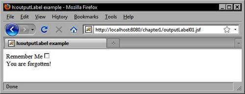
This example shows how to use the<h:outputLabel> tag in conjunction with another JSF tag. The important thing to notice is the use of the for attribute. It expects the ID of another component on the page and informs the browser that the label is intended for that particular component.
<h:outputLabel value="Remember Me" for="remember" />
<h:selectBooleanCheckbox id="remember" value="#{backingBean.rememberMe}" onclick="submit()" />

For our final example of text rendering JSF components, we can examine the<h:outputFormat> tag. This tag renders an HtmlOutputFormat component as formatted text within the JSF page. Formatted text can include a localized message from the application's message bundle for the current locale, or it can include a string pattern that is evaluated at request time. Interestingly, this string pattern can have placeholders that are substituted by any nested<f:param> tags.
So for example, if we wanted to render the message "Welcome, username", we could use an<h:outputFormat> tag that contains a parameter for the user's name. The value substituted for this parameter would be defined by a child<f:param> tag, so the actual name of the user could come from a database, an LDAP directory, or another source. The important point is that this tag simplifies a very common task for web applications, namely rendering localized, parameterized text messages conveniently and easily.
The<h:message> tag renders an HtmlMessage component and is useful for displaying validation messages in a JSF page. It is important to include this tag on our JSF pages so that users will be informed when a JSF validation message occurs. Typically, the tag is placed immediately after a JSF component tag to display the validation messages for the associated component.
In this example, we render an HtmlInputText component and specify through the<h:inputText> tag's required attribute that the user is expected to enter a value into to the first name text field. If the user submits the form without entering a value, an error message will be rendered by the<h:message> tag beside the component. The for attribute is required and is used to associate the message with a particular UI component on the page. It expects the ID of the component that the message is for.
The<h:messages> tag is similar to the<h:message> tag except that it renders an HtmlMessages component that displays all validation messages for any components in the view in an unordered list. This is useful when our user interface requirements call for presenting all error messages in one place, for example, above any form fields on the page. The globalOnly attribute is false by default, but if we set it to true, then the component only displays messages generated by the application that are not associated with a particular component.
<h:messages errorClass="error" globalOnly="false" />
Presenting the user with a choice from a list of available values is a common scenario for web-based applications. The HTML markup language includes a number of form elements that can be used to provide users with a list of options from which a selection can be made. Choosing the right HTML element or set of elements for a particular form depends on a number of criteria and is a common stumbling block for developers who are new to HTML. Fortunately, the standard set of JSF HTML components greatly simplifies the correct use of HTML selection elements. In later chapters, we will discover how other JSF component libraries introduce a rich and innovative set of user interface controls that can significantly extend the capabilities of HTML as a GUI toolkit.
Before we discuss JSF HTML selection components, let's consider the HTML elements that they represent. The HTML markup language includes a limited set of selection components such as checkboxes, radio buttons, and select menus. Both checkboxes and radio buttons are represented by the<input> element with different type attributes. A checkbox is rendered using the<input> element with the type attribute set to "checkbox", while a radio button is rendered using the<input> element with the type attribute set to "radio".
Both checkboxes and radio buttons can be grouped together to present the user with a range of inclusive or exclusive options. The HTML 4.01 specification explains that checkboxes are grouped together by users to represent several mutually inclusive options, while radio buttons are grouped together to represent mutually exclusive options.
Note
For more details, refer W3C to Forms in the W3C HTML 4.01 Specification: 13 July 2009http://www.w3.org/TR/html401/interact/forms.html.
Checkboxes can also be rendered individually, representing a Boolean choice of true or false. A radio button should not be rendered individually because to the user that represents a mutually exclusive choice from a set of only one possible option! In addition, once the user selects a radio button it can only be deselected by choosing another radio button in the set, or by using JavaScript to override the default behavior of this control.
The standard JSF HTML component library includes several components for rendering radio buttons and checkboxes in our JSF pages. Depending on our needs, we might use the<h:selectBooleanCheckbox> tag, the<h:selectManyCheckbox> tag, or the<h:selectOneRadio> tag.
The<h:selectBooleanCheckbox> tag renders a single checkbox and is useful for presenting a Boolean option, such as a "remember me" checkbox in a login dialog. The<h:selectManyCheckbox> tag renders a set of checkboxes that can be used to display multiple of Boolean options to the user, for example, a list of interests for a newsletter subscription form. The<h:selectOneRadio> tag renders a set of radio buttons that can be used to present a set of mutually exclusive options such as a level of satisfaction on a scale from "very unsatisfied" to "very satisfied" in a customer feedback survey.
Recall from the<h:outputLabel> example that a label references another component's ID attribute in the label's for attribute. One of the benefits of the correct use of this component is that for certain components, browsers will recognize the label as an extension of the component itself and will allow users to click the label to toggle the component state. In this example, we use JavaScript to submit the form when the user clicks the checkbox.
<h:outputLabel value="Remember Me" for="remember" />
<h:selectBooleanCheckbox id="remember" value="#{backingBean.rememberMe}" onclick="submit()" />
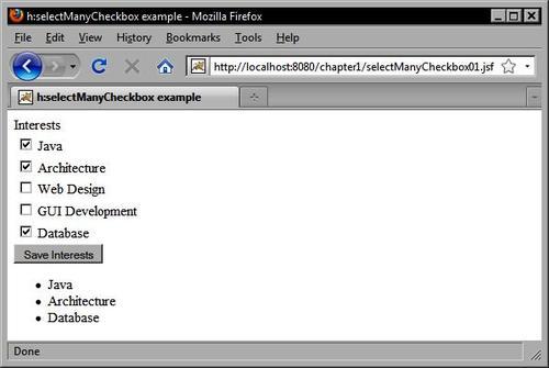
This example demonstrates how to use the<h:selectManyCheckbox> tag. Notice that the options are defined using nested<f:selectItem> tags. The itemLabel attribute is what is displayed to the user, while the itemValue attribute is what is submitted to the server when the form is posted.
<h:selectManyCheckbox id="interests" value="#{customerBean.interests}" layout="lineDirection">
<f:selectItem itemLabel="Java" itemValue="Java" />
<f:selectItem itemLabel="Architecture" itemValue="Architecture" />
<f:selectItem itemLabel="Web Design" itemValue="Web Design" />
<f:selectItem itemLabel="GUI Development" itemValue="GUI Development" />
<f:selectItem itemLabel="Database" itemValue="Database" />
</h:selectManyCheckbox>
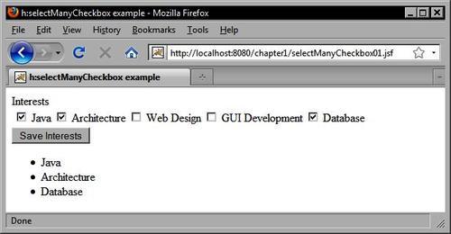
The same example can be rewritten to display the options horizontally instead of vertically by setting the layout attribute of the<h:selectManyCheckox> tag to pageDirection as follows:
<h:selectManyCheckbox id="interests" value="#{customerBean.interests}" layout="pageDirection">
<f:selectItem itemLabel="Java" itemValue="Java" />
<f:selectItem itemLabel="Architecture" itemValue="Architecture" />
<f:selectItem itemLabel="Web Design" itemValue="Web Design" />
<f:selectItem itemLabel="GUI Development" itemValue="GUI Development" />
<f:selectItem itemLabel="Database" itemValue="Database" />
</h:selectManyCheckbox>
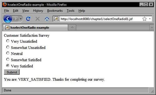
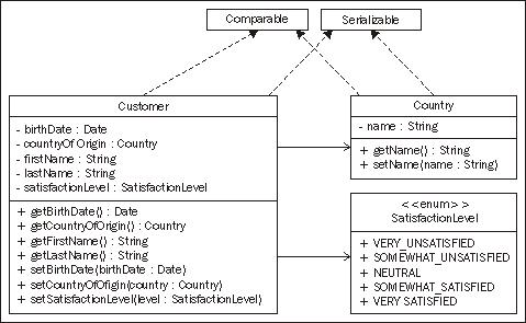
The following example for the<h:selectOneRadio> tag is interesting because it demonstrates a useful technique. The<h:selectOneRadio> tag renders a set of radio buttons in the view. These radio buttons represent mutually exclusive options within a set of predefined values. The Java enum type is a good choice for a data type here because it also represents a set of predefined values. JSF also includes a built-in converter class that specifically handles Java enum types. Therefore, we can define our enum as follows:
public enum SatisfactionLevel {
VERY_UNSATISFIED, SOMEWHAT_UNSATISFIED, NEUTRAL, SOMEWHAT_SATISFIED, VERY_SATISFIED
}
Next, in our Customer class we define a new property of type SatisfactionLevel.
public class Customer implements Comparable<Customer>, Serializable {
...
private SatisfactionLevel satisfactionLevel;
...
}
In our JSF page, we can now declare an<h:selectOneRadio> tag that is bound to this property. When the user submits the form, the selected value will be converted automatically to one of our enumerated values and stored in our model class.
<h:selectOneRadio id="survey" value="#{customerBean.customer.satisfactionLevel}" layout="pageDirection">
<f:selectItem itemLabel="Very Unsatisfied" itemValue="VERY_UNSATISFIED" />
<f:selectItem itemLabel="Somewhat Unsatisfied" itemValue="SOMEWHAT_UNSATISFIED" />
<f:selectItem itemLabel="Neutral" itemValue="NEUTRAL" />
<f:selectItem itemLabel="Somewhat Satisfied" itemValue="SOMEWHAT_SATISFIED" />
<f:selectItem itemLabel="Very Satisfied" itemValue="VERY_SATISFIED" />
</h:selectOneRadio>
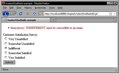
As we used a typesafe enum as our data type, only the values we defined in our Java code are acceptable. If we entered a new option value for the<h:selectOneRadio> tag, a conversion error would result when the form is submitted.
<h:selectOneRadio id="survey" value="#{customerBean.customer.satisfactionLevel}" layout="pageDirection">
<f:selectItem itemLabel="Very Unsatisfied" itemValue="VERY_UNSATISFIED" />
<f:selectItem itemLabel="Somewhat Unsatisfied" itemValue="SOMEWHAT_UNSATISFIED" /> <f:selectItem itemLabel="Indifferent" itemValue="INDIFFERENT" /> <f:selectItem itemLabel="Somewhat Satisfied" itemValue="SOMEWHAT_SATISFIED" />
<f:selectItem itemLabel="Very Satisfied" itemValue="VERY_SATISFIED" /> </h:selectOneRadio>
In addition to checkboxes and radio buttons, the HTML markup language includes another important selection control: the<select> element. The<select> element is useful because it can produce a number of different selection menus. Depending on the values of the multiple and size attributes, this element might display the following:
A single selection menu with only one item visible
A single selection menu with multiple items visible
A multiple selection menu with only one item visible
A multiple selection menu with many items visible
The menu items contained by the<select> element are specified by child<option> elements. The<option> element can have a selected state, and can declare a label and a value. The label attribute or the body of the<option> element is what is displayed to the user, while the value attribute is what is sent to the server during form submission. Multiple options can be grouped together using the<optgroup> element. The value of the<optgroup> element's label attribute is displayed as a header above the indented list of options. Grouping options together is an easy way to enhance the readability and usability of<select> elements in your forms.
JSF includes a number of components that represent the different states of the<select> element. The<h:selectOneMenu> tag renders the HtmlSelectOneMenu component as a single selection menu that displays only one item at a time. The<h:selectManyMenu> tag renders the HtmlSelectManyMenu component as a multiple selection menu that displays only one item at a time. The<h:selectOneListbox> tag renders the HtmlSelectOneListbox component as a single selection menu that displays multiple items at a time. The<h:selectManyListbox> tag renders the HtmlSelectManyListbox component as a multiple selection menu that displays multiple items at a time.
When would we use the<h:selectOneMenu> and<h:selectManyMenu> tags? The<h:selectOneMenu> tag is a good choice for a selection situation where the user may only choose one item from a long list of items, such as his or her country of origin. The<h:selectManyMenu> tag is intended for situations where it is preferable to display only one item at a time in the selection component, but where the user is allowed to make more than one selection.
Both of these menu components have an inherent size of one, meaning they will only display one item at a time. Unfortunately, the<h:selectManyMenu> tag produces a control that is not rendered consistently across browsers. In Internet Explorer, the component is rendered with a scrollbar allowing the user to scroll through the items in the list. In Firefox, however, the control is rendered without scrollbars, making it impossible for the user to make a selection. Therefore, it is not recommended to use the<h:selectManyMenu> tag at this time.
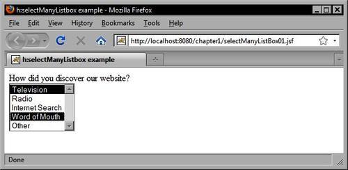
When should we use the<h:selectOneListbox> and<h:selectManyListbox> tags? If the user is only allowed to select one item and the list of options is greater than two but is still relatively short, then it may be preferable to use the<h:selectOneListbox> tag and to set the size attribute to the number of items in the list to ensure they will all be displayed without scrolling.
For example, if we were asking the user how they discovered our website, and the available options were "Television, Radio, Internet Search, Word of Mouth, Other", then displaying these options in a fully expanded single selection menu would actually increase the efficiency of our user interface by saving the user from having to click twice to make a selection (once to scroll, and once to select an option).
Choosing between the<h:selectOneListbox> and<h:selectManyListbox> tag is more straightforward than choosing between menu and list box components. It comes down to whether our application allows the user to select multiple options, or whether they must select only one option for a particular field. In the previous example, users may be allowed to select more than one source of information, in which case replacing the single selection component with its multiple selection variant is the obvious choice.
On the other hand, the decision to use the menu or list box selection components is a little more involved and ultimately depends on how well these components "fit" into our user interface as a whole. If there are several selection menus on the same screen, and all but one have long lists of items and are therefore rendered using the<h:selectOneMenu> tag, then it might look awkward to have a single<h:selectOneListbox> tag on the page. In this case, we may have to trade the user interface efficiency for consistency and use the<h:selectOneMenu> tag to render a component that makes our UI more aesthetically pleasing to user.
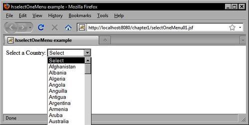
This example shows how to use the<h:selectOneMenu> tag to display a list of Country objects in the form. It obtains the country list from the backing bean and renders a blank item to prompt the user to make a selection. A custom converter is also registered on the HtmlSelectOneMenu component. The JSF framework calls our converter twice: once to convert each Country object to a string when the view is rendered, and once to convert the selected string back to a Country object when the form is submitted.
The following UML class diagram shows the design of our model classes:
In this example, we rely on a custom JSF converter to convert Country objects to String objects and vice versa. In later chapters, we will see that many popular JSF component libraries include reusable converters that can eliminate the need for us to write our own. When the view is rendered, our Country objects are rendered as strings in an HTML<select> element.
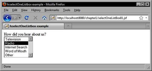
In this example, we use the<h:selectOneListbox> tag to render a single-selection list of items to the user.
<h:selectOneListbox id="option" value="#{customerBean.informationSource}"> <f:selectItem itemLabel="Television" itemValue="Television" />
<f:selectItem itemLabel="Radio" itemValue="Radio" />
<f:selectItem itemLabel="Internet Search" itemValue="Internet Search" />
<f:selectItem itemLabel="Word of Mouth" itemValue="Word of Mouth" />
<f:selectItem itemLabel="Other" itemValue="Other" />
</h:selectOneListbox>
We can render the same set of options in a multiple selection mode using the<h:selectManyListbox> tag.
<h:selectManyListbox id="option" value="#{customerBean.informationSources}">
<f:selectItem itemLabel="Television" itemValue="Television" />
<f:selectItem itemLabel="Radio" itemValue="Radio" />
<f:selectItem itemLabel="Internet Search" itemValue="Internet Search" />
<f:selectItem itemLabel="Word of Mouth" itemValue="Word of Mouth" />
<f:selectItem itemLabel="Other" itemValue="Other" />
</h:selectManyListbox>
The standard JSF HTML components that we have covered so far represent the basic building blocks of a JSF user interface. In GUI development terminology, the basic set of controls supported by HTML represents what can be described as base-level components, in the sense that buttons, checkboxes, and radio buttons cannot have other visible components nested inside them.
The organization of elements on the form is an essential step in the development of a JSF user interface. Determining the optimal arrangement, alignment, and distribution of user interface controls is an important decision-making process for UI designers that can have an impact on the usability of our application. Do we place labels to the left of controls or above them? Do we group components of the same type together on the screen, or do we group components together on the basis of their relationship to the data they are collecting?
One of the more powerful components in the JSF HTML component library is the HtmlPanelGrid component. This component is rendered by the<h:panelGrid> tag as an HTML<table> element. Java GUI programmers will recognize similarities between the HtmlPanelGrid component and the GridLayout layout manager class from the Java Swing/AWT toolkit. As the<h:panelGrid> tag renders an HTML table, let's start by taking a look at how to use a table-based approach to organize the components in our user interface.
The<h:panelGrid> tag has a columns attribute that specifies how many columns the component should render while it is laying out components on the screen. Understanding how to use this component is simple. Any child components that are nested within this component are arranged from left to right, then from top to bottom. The HtmlPanelGrid component iterates its children, rendering each one as a table cell. Once the desired number of columns is reached, the component begins a new table row and repeats the process until all child components have been rendered. The result is a grid of components rendered on the screen as an HTML layout table.
Let's consider an example that uses all the components we have seen so far, to demonstrate how to lay out components on the screen using the JSF<h:panelGrid> tag. Suppose we wanted to gather information from the user as part of a customer registration form. We need to collect the following information: the customer' s first and last names, date of birth, gender, phone number, e-mail address, country of origin, and relevant interests.
In this example, we use the<h:panelGrid> tag to render a complex layout table that organizes other components into an attractive grid of controls on the screen.
<h:panelGrid columns="3">
<h:outputLabel for="firstName" value="#{bundle.firstNameLabel}" />
<h:inputText id="firstName" value="#{customerBean.customer. firstName}" required="true" />
<h:message for="firstName" errorClass="error" showSummary="true" showDetail="false" />
<h:outputLabel value="#{bundle.lastNameLabel}" for="lastName" />
<h:inputText id="lastName" value="#{customerBean.customer.lastName}" required="true" />
<h:message for="lastName" errorClass="error" showSummary="true" showDetail="false" />
<h:outputLabel for="dateOfBirth" value="#{bundle.dateOfBirthLabel}" />
<h:inputText id="dateOfBirth" value="#{customerBean.customer. birthDate}" required="true">
<f:convertDateTime pattern="M/d/yyyy" />
<f:validator validatorId="customDateValidator" />
</h:inputText>
<h:message for="dateOfBirth" errorClass="error" showSummary="true" showDetail="false" />
<h:outputLabel for="gender" value="#{bundle.genderLabel}" />
<h:selectOneRadio id="gender" value="#{customerBean.customer.male}" required="true">
<f:selectItem itemLabel="Male" itemValue="true" />
<f:selectItem itemLabel="Female" itemValue="false" />
</h:selectOneRadio>
<h:message for="gender" errorClass="error" showSummary="true" showDetail="false" />
<h:outputLabel for="phoneNumber" value="#{bundle.phoneNumberLabel}" />
<h:inputText id="phoneNumber" value="#{customerBean.customer. phoneNumber}" />
<h:message for="phoneNumber" errorClass="error" showSummary="true" showDetail="false" />
<h:outputLabel for="emailAddress" value="#{bundle. emailAddressLabel}" />
<h:inputText id="emailAddress" value="#{customerBean.customer. emailAddress}" required="true" />
<h:message for="emailAddress" errorClass="error" showSummary="true" showDetail="false" />
<h:outputLabel value="#{bundle.countryLabel}" for="country" required="true" />
<h:selectOneMenu id="country" value="#{customerBean.customer. countryOfOrigin}" required="true">
<f:selectItem itemLabel="Select" itemValue="" />
<f:selectItems value="#{customerBean.countrySelectItems}" />
<f:converter converterId="countryConverter" />
</h:selectOneMenu>
<h:message for="country" errorClass="error" showSummary="true" showDetail="false" />
<h:outputLabel for="interests" value="#{bundle.interestsLabel}" />
<h:selectManyCheckbox id="interests" value="#{customerBean. interests}" layout="pageDirection">
<f:selectItem itemLabel="Java" itemValue="Java" />
<f:selectItem itemLabel="Architecture" itemValue="Architecture" />
<f:selectItem itemLabel="Web Design" itemValue="Web Design" />
<f:selectItem itemLabel="GUI Development" itemValue="GUI Development" />
<f:selectItem itemLabel="Database" itemValue="Database" />
</h:selectManyCheckbox>
<h:message for="interests" errorClass="error" showSummary="true" showDetail="false" />
</h:panelGrid>

Sometimes, we may want to display more than one component in a particular table cell within the grid. For example, a common scenario is to render two or more buttons in a single column. We know the behavior of the HtmlPanelGrid component is to render each child component in a separate cell, so how do we render more than one component per column?
The standard JSF HTML component library includes the HtmlPanelGroup component for just this purpose. This component is rendered by the<h:panelGroup> tag and allows us to group two or more components together. By grouping components together, we can then treat them as a single component. Therefore, if we nest two<h:commandButton> tags within an<h:panelGroup> tag, we can then place the<h:panelGroup> inside the<h:panelGrid> tag and our two controls will be rendered within a single table cell.
This example shows how to use the<h:panelGroup> tag to group two buttons together in the same column in an<h:panelGrid> tag.
<h:panelGrid columns="3">
<h:outputLabel for="firstName" value="#{bundle.firstNameLabel}" />
<h:inputText id="firstName" value="#{customerBean.customer.firstName}" required="true" />
<h:message for="firstName" errorClass="error" showSummary="true" showDetail="false" />
<h:panelGroup>
<h:commandButton value="Save" actionListener="#{customerBean.saveCustomer}" style="margin-right:5px" />
<h:commandButton type="reset" value="Reset" />
</h:panelGroup>
</h:panelGrid>

The JSF framework makes it easy to display tabular data to the user. The HtmlDataTable component abstracts many of the details involved in rendering a data set as HTML. For this reason, it is perhaps the most powerful standard JSF component.
As JSF is based on the Model-View-Controller pattern, it mandates a clear separation of concerns: the data structures and entities of our application are the "Models", the backing beans of our application are the "Controllers", and the UI components and JSF pages that constitute our presentation layer are the "Views".
The HtmlDataTable component is a good example of how JSF implements the MVC pattern. The<h:dataTable> tag renders this component as an HTML table and provides a nice adapter between the presentation and business tiers of our application. The JSF expression language in our JSF page is the glue that binds these two layers together.
The JSF HtmlDataTable component is a very basic data table component. We will see in later chapters a number of more specialized versions of this component included in third-party JSF component libraries that provide more full-featured data grid implementations, enabling advanced features such as column sorting, pagination, drag-and-drop, and more. For now, let's examine the basic functionality of the standard JSF HTML data table component.
The<h:dataTable> tag adopts a column-based approach to define the HTML table structure. This example shows how to render a list of customers as an HTML table using the<h:dataTable> tag.
<h:dataTable value="#{customerBean.customerList}" var="customer" rowClasses="row-even,row-odd" columnClasses="left-aligned,left-aligned,centered, left-aligned" border="2" cellpadding="5" cellspacing="2" rows="8">
<h:column>
<f:facet name="header">
<h:outputText value="Full Name" />
</f:facet>
<h:outputText value="#{customer.fullName}" />
</h:column>
<h:column>
<f:facet name="header">
<h:outputText value="Birth Date" />
</f:facet>
<h:outputText value="#{customer.birthDate}">
<f:convertDateTime type="date" dateStyle="medium" />
</h:outputText>
</h:column>
<h:column>
<f:facet name="header">
<h:outputText value="Phone Number" />
</f:facet>
<h:outputText value="#{customer.phoneNumber}" />
</h:column>
<h:column>
<f:facet name="header">
<h:outputText value="Country of Origin" />
</f:facet>
<h:outputText value="#{customer.countryOfOrigin.name}" />
</h:column>
</h:dataTable>

This chapter provided an introduction to the key concepts of the JavaServer Faces framework, and demonstrated how a number of common web development tasks can be implemented using JSF.
We introduced the Model-View-Controller (MVC) architecture that provides the conceptual framework of a JSF application. We also discussed the role of managed beans in JSF as event handlers that implement application logic and perform model updates in response to user gestures. We introduced the JSF Expression Language (EL) and JSF converters and validators.
Next, we looked at how to implement common web development tasks using JSF components. We examined a number of standard JSF components, and looked at several use cases such as gathering input from users using text fields and submitting HTML forms with buttons and links.
We also looked at how to display localized text and validation messages, and how to render field labels. We saw examples of how to make selections with menus, radio buttons, and checkboxes, and we discussed laying out components with panel grids. Finally, we studied an example of how to render tabular data using the JSF data table component.
Now that we have introduced JSF and covered standard JSF components, we can move on to more advanced topics such as Facelets and third-party JSF component libraries.