


Welcome to Instant Highcharts. This book has been especially created to provide you with all the information that you need to get set up with Highcharts. You will learn the basics of Highcharts, get started with building your first charts, and discover some tips and tricks for using Highcharts.
This book contains the following sections:
So what is Highcharts? finds out what Highcharts actually is, what you can do with it, and why it's so great.
Installation enables you to learn how to download and install Highcharts with a minimum fuss, and then set it up so that you can use it as soon as possible.
Quick start – setting up main sections of Highcharts gives you an overview of how to perform one of the core tasks of Highcharts: creating charts. Follow the steps to create your own chart, which will be the basis of most of your work with Highcharts.
Top 4 features you need to know about will help you in learning how to perform the four tasks with the most important features of Highcharts. By the end of this section you will be able to create a line chart with a time axis and two Y-axes, a stacked column chart, a pie chart, and create dynamic charts with your own data.
People and places you should get to know will inform you about the people associated with this book. Every open source project is centered on a community. This section provides you with many useful links to the project page and forums, as well as a number of helpful articles, tutorials, blogs, and the Twitter feeds of Highcharts super-contributors.
Highcharts is a JavaScript library that will allow you to implement interactive and dynamic charts inside your web application. Highcharts has been written in pure HTML5 and JavaScript, which will allow you to display charts made with Highcharts natively in your web browser without using any plugins such as Adobe Flash or Microsoft Silverlight. Another strength of Highcharts is that Highcharts' charts are created with SVG or VML (for Internet Explorer), which are vector image formats. Compared to the image format that are using pixels, such as JPEG, PNG or GIF, the vector image formats doesn't lose quality if the image is displayed bigger. Therefore, with Highcharts, you will be able to display your charts on any size of screen without any difference in terms of chart quality. Nevertheless, it is possible to export your chart in JPEG, PNG, or GIF by using the export module.
With Version 3.0 of Highcharts, you can create a large variety of charts including not only line, column, bar, pie charts, but also angular gauges and polar charts. The main benefit of Highcharts is the ability to combine different charts, and also the possibility of customization. With Highcharts, there are a lot of possibilities, such as adding multiple axes, customizing the tool tip according to your data, adding several plot bands and plot lines to your graph, and changing the legend position.

Line and column charts combined with two Y-Axes (Source: Highcharts)
With Highcharts, you can implement some interactive features, such as the ability to zoom into some parts of your chart (for example, refer to the following chart), add a point to your chart dynamically, and refresh the data at runtime.

Zoom inside some parts of the chart (Source: Highcharts)
Finally, with Highcharts, it is also possible to draw your own shape inside your web application. This feature will allow you to create your own chart, if the large variety of charts already provided by Highcharts doesn't answer your needs.

Customized drawing with Highcharts (Source: Highcharts)
In four easy steps, you can install Highcharts and get it set up on your web application.
Before you install Highcharts, you will need to check that you have all of the required elements, as shown in the following list:
Web browser: In order to work properly, you need to use at least the following versions or higher of these web browsers, Internet Explorer 6, Firefox 2, Chrome 1, Safari 4, Opera 9, iOS 3.0, Android 2 (Limited support).
IDE or Text Editor: You can use any text editor or Integrated Development Environment (IDE) in order to create your Highcharts charts, but it is recommended to have syntax highlighting for JavaScript. You can use Notepad++ for Windows or Fraise on Mac OS X, which are good free tools that include this feature.
JavaScript framework: It is recommended to use at least one the following versions or higher; jQuery 1.3, Mootools 1.2, Prototype 1.7, Ext-JS 3.
The easiest way to download Highcharts is in a compressed package from the website at http://www.highcharts.com/download.
Download the most current stable build. The Version 3.0.2 of Highcharts has been used in book samples. After downloading and unpacking the archive, you will be left with a directory called Highcharts with the version number, containing a number of files and folders.
In the js directory, you will find two versions of Highcharts library, highcharts.js and highcharts.src.js. highcharts.js (131 Ko) is the minified version of highcharts.src.js (416 Ko).
In order to use Highcharts, you need to include your Highcharts code in the head section of your HTML. You can put your JavaScript code directly into your web server, and use the path of your JavaScript files or include the code using an external URL. For each of the JavaScript frameworks, we will show you how to integrate Highcharts inside your application by using an external URL. For Mootools and Prototype libraries, an adapter script has to be included as well in order to work properly.
jQuery framework
<script src="http://ajax.googleapis.com/ajax/libs/jquery/1.8.2/jquery.min.js"></script>
<script src="http://code.highcharts.com/highcharts.js"></script>
Mootools framework
<script src="https://ajax.googleapis.com/ajax/libs/mootools/1.4.5/mootools-yui-compressed.js"></script>
<script src="http://code.highcharts.com/adapters/mootools-adapter.js"></script>
<script src="http://code.highcharts.com/highcharts.js"></script>
Prototype framework
<script src="https://ajax.googleapis.com/ajax/libs/prototype/1.7/prototype.js"></script>
<script src="http://code.highcharts.com/adapters/prototype-
  adapter.js"></script>
<script src="http://code.highcharts.com/highcharts.js"></script>
If you want to use the optional export module, you will also need to include the following code inside the head section of your HTML.
<script src="http://code.highcharts.com/modules/exporting.js"></script>
If you want to render your printable images on your own web server, please follow the instructions available at http://www.highcharts.com/component/content/article/2-news/52-serverside-generated-chart.
Now that you have imported Highcharts into your web application, we will create our first chart. Nevertheless, before creating any JavaScript code, you will have to create an HTML div element identified by a chosen HTML ID with a defined size.
<div id="myFirstChartContainer" style="width:600px; height:400px;"></div>
Then, you can create your chart in JavaScript inside the script element in the head section of your HTML. You need to include your own code after the inclusion of your framework and Highchart library as indicated in the previous step. For each of the previous frameworks, we will show you how to create your first chart.
jQuery framework
$(function () {
   var chart = new Highcharts.Chart({({
       chart: {
           type: 'column'
       },
       title: {
           text: 'Sales by city'
       },
       xAxis: {
           categories: ['London', 'Paris', 'Madrid']
       },
       yAxis: {
           title: {
               text: 'Sales'
           }
       },
       series: [{
           name: 'Cities',
           data: [1000, 2500, 1500]
       }]
   });
});
Mootools framework
window.addEvent('domready', function() {
    var chart = new Highcharts.Chart({
        chart: {
            renderTo: 'myFirstChartContainer',
            type: 'column'
        },
        title: {
            text: 'Sales by city'
        },
        xAxis: {
            categories: ['London', 'Paris', 'Madrid']
        },
        yAxis: {
            title: {
                text: 'Sales'
            }
        },
        series: [{
            name: 'Cities',
            data: [1000, 2500, 1500]
        }]
    });
});
Prototype framework
document.observe("dom:loaded", function() {
   var chart = new Highcharts.Chart({
       chart: {
           renderTo: 'myFirstChartContainer',
           type: 'column'
       },
       title: {
           text: 'Sales by city'
       },
       xAxis: {
           categories: ['London', 'Paris', 'Madrid']
       },
       yAxis: {
           title: {
              text: 'Sales'
           }
       },
       series: [{
            name: 'Cities',
            data: [1000, 2500, 1500]
       }]
   });
});
Tip
Downloading the example code
You can download the example code files for all Packt books you have purchased from your account at http://www.packtpub.com. If you purchased this book elsewhere, you can visit http://www.packtpub.com/support and register to have the files e-mailed directly to you.
Each of the JavaScript frameworks has its own constructor, and their own way to link to div element. For jQuery, the div ID will be included directly in the constructor, but you will have to use the renderTo element for Prototype and Mootools. Nevertheless, the code inside the constructor will be the same whatever framework you use. The code in the following sections will use jQuery, but you can easily reuse the code with other JavaScript frameworks.

A Highcharts' chart is composed of several parts, which could be mandatory or optional parts depending on the chart that you will create. In this section, we will show you the main elements that are composing a Highcharts' chart, and we will reuse the chart, previously created in order to illustrate these different core concepts.
For each Highcharts' chart, you can set a title and a subtitle. In the previous section, we have already declared the chart with the title Sales by city. We will now add a subtitle section with the text Statistics of 2012.
Add the subtitle section and set the text to Statistics of 2012:
subtitle: {
   text: 'Statistics of 2012'
}
You should have the expected result as shown in the following chart:

In the credits parts, you will be able to set the source or the copyright of your chart. By default, it is set to Highcharts.com. We will change this default value to Packt Publishing. The URL of the credit by default is http://www.highcharts.com, but you can change it by setting the href parameter with your own URL. We will change this value with http://www.packtpub.com.
Add the credit section and set the text to
Packt Publishingand set thehrefsection withhttp://www.packtpub.com:credits: { text: 'Packt Publishing', href: 'http://www.packtpub.com' }You should have the expected result as shown in the following chart:

The series section is a mandatory one of Highcharts, which you will have to include for every chart, that you will create. A series is simply a set of data that will be defined with a name and an array of data. We will now modify the previous series section by adding another section that will represent the sales of two different years for the three cities already defined:
Rename the previous
serieswith the name2011and add anotherserieswith the name2012and a new set of data:series: [{ name: '2011', data: [1000, 2500, 1500] }, { name: '2012', data: [1200, 2200, 1700] }]You should have the expected result as shown in the following chart:

The axes sections will be set for some charts, such as line and column charts, but will not be included for charts, such as pie charts or donut charts. Axes are divided into two types: Y Axes and X Axes. Then, each axis is divided into four categories:
Linear Axis: This category of axis will use a linear scale like our Y Axis.
Logarithmic Axis: This category of axis will follow a logarithmic scale.
Category Axis: This axis will display different categories of data. Our X-Axis is a category axis.
Time Axis: You will have to use this category of axis when you want to represent your data along a time axis.
By default, the axis is calculated automatically, but you can set a minimum or maximum value if you set the 'min' and 'max' parameters of your axis. Then, you can add plot lines and plot bands for each of your axes. Plot lines and plot bands can be used when you want to display a limit or when you want to point out some parts of your axis.
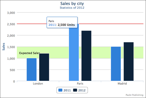
For our chart, we will add a plot line, which will represent the best sales of the company and a plot band, which will represent the expected sales:
For the plot line, we add our element inside the
plotLinessection of our Y Axis with a red color set in hexadecimal format with a width of2pixels and a value set to2500.plotLines: [{ color: '#FF0000', width: 2, value: 2500 }]Then, for the plot band, we add our element inside the
plotBandssection of our Y Axis with a green color set in RGBA format from the values1000to1500. The fourth parameter of ourrgbafunction will allow us to have a bit of transparency. This parameter has to be set between zero (Transparent) and one (Opaque). We will also add a label with a text set toExpected Sales.plotBands: [{ color: 'rgba(124,252,0, 0.3)', from: 1000, to: 1500, label: { text: 'Expected Sales' } }]For your
yAxis, you should have the following code:yAxis: { title: { text: 'Sales' }, plotLines: [{ color: '#FF0000', width: 2, value: 2500 }], plotBands: [{ color: 'rgba(124,252,0, 0.3)', from: 1000, to: 1500, label: { text: 'Expected Sales' } }] }You should have the expected result as shown in the following chart:

The tool tip element appears when you are pointing your mouse over an element. Highcharts sets a default tool tip, but you can override it by setting a new template. In our example, we will modify the tool tip by adding a measurement unit, which will simply be Units in our case.
Add the
tooltipsection and set the parametervalueSuffixwith the valueUnits. This parameter defines the text that will be added at the end of the number.tooltip: { valueSuffix: 'Units' }You should have the expected result as shown in the following chart:
The chart legend can be displayed by default on some Highcharts' charts. Nevertheless, you can hide or customize the legend. In order to retrieve some space in our chart, we will change the legend position to the top right side of the chart.
Add the
legendsection. Set thealignparameter to the right andverticalAlignto the top, in order to move the legend to the top right side. Then, set thefloatingparameter totrue. This parameter will be used in order to have the legend over our chart.legend: { align: 'right', verticalAlign: 'top', floating: true }You should have the expected result as shown in the following chart:

The final code looks like:
$(function () {
var chart = $('#myFirstChartContainer').highcharts({
chart: {
type: 'column'
},
title: {
text: 'Sales by city'
},
subtitle: {
text: 'Statistics of 2012'
},
credits: {
   text: 'Packt Publishing',
   href: 'http://www.packtpub.com'
},
xAxis: {
categories: ['London', 'Paris', 'Madrid']
},
yAxis: {
title: {
text: 'Sales'
},
plotLines: [{
color: '#FF0000',
width: 2,
value: 2500
}],
plotBands: [{
color: 'rgba(124,252,0, 0.3)',
from: 1000,
to: 1500,
label: {
text: 'Expected Sales'
}
}]
},
tooltip: {
valueSuffix: ' Units'
},
legend: {
align: 'right',
verticalAlign: 'top',
floating: true
},
series: [{
       name: '2011',
       data: [1000, 2500, 1500]
   },
   {
       name: '2012',
       data: [1200, 2200, 1700]
}]
});
});At the end of this section, you have created the main elements that comprise a chart, and you will now be able to reuse it to any charts that you would want to create.
As you start to use Highcharts, you will realize that there are a wide variety of things that you can do with it. This section will teach you all about the most commonly performed tasks and most commonly used features in Highcharts.
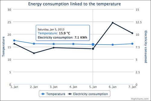
In this section, we will create a line chart with a time axis and two Y axes. We will also customize the chart by customizing the tool tip and by adding the possibility to zoom inside the chart.
We will now create the code for this chart:
You start the creation of your chart by implementing the constructor of your Highcharts' chart:
var chart = $('#myFirstChartContainer').highcharts({
});
We will now set the different sections inside the constructor. We start by the chart section. Since we'll be creating a line chart, we define the
typeelement with the valueline. Then, we implement the zoom feature by setting thezoomTypeelement. You can set the value tox,y,orxydepending on which axes you want to be able to zoom. For our chart, we will implement the possibility to zoom on the x-axis:chart: { type: 'line', zoomType: 'x' },We define the title of our chart:
title: {
   text: 'Energy consumption linked to the temperature'
},
Now, we create the x axis. We set the type to
datetimebecause we are using time data, and we remove thetitleby setting thetexttonull. You need to set a null value in order to disable the title of thexAxis:xAxis: { type: 'datetime', title: { text: null } },We then configure the Y axes. As defined, we add two Y axes with the titles
TemperatureandElectricity consumed (in KWh), which we override with a minimum value of0. We set theoppositeparameter totruefor the second axis in order to have the second y axis on the right side:yAxis: [ { title: { text: 'Temperature' }, min:0 }, { title: { text: 'Energy consumed (in KWh)' }, opposite:true, min:0 } ],We will now customize the
tooltipsection. We use thecrosshairsoption in order to have a line for ourtooltipthat we will use to follow values of both series. Then, we set the shared value totruein order to have values of both series on the sametooltip.tooltip: { crosshairs: true, shared: true },Further, we set the series section. For the datetime axes, you can set your series section by using two different ways. You can use the first way when your data follow a regular time interval and the second way when your data don't necessarily follow a regular time interval. We will use both the ways by setting the two series with two different options. The first series follows a regular interval. For this series, we set the
pointIntervalparameter where we define the data interval in milliseconds. For our chart, we set an interval of one day. We set thepointStartparameter with the date of the first value. We then set the data section with our values. Thetooltipsection is set with thevalueSuffixelement, where we define the suffix to be added after the value inside our tool tip. We set ouryAxiselement with the axis we want to associate with our series. Because we want to set this series to the first axis, we set the value to0(zero). For the second series, we will use the second way because our data is not necessarily following the regular intervals. But you can also use this way, even if your data follows a regular interval. We set our data by couple, where the first element represents the date and the second element represents the value. We also override thetooltipsection of the second series. We then set theyAxiselement with the value1because we want to associate this series to the second axis. For your chart, you can also set your date values with a timestamp value instead of using the JavaScript functionDate.UTC.series: [ { name: 'Temperature', pointInterval: 24 * 3600 * 1000, pointStart: Date.UTC(2013, 0, 01), data: [17.5, 16.2, 16.1, 16.1, 15.9, 15.8, 16.2], tooltip: { valueSuffix: ' °C' }, yAxis: 0 }, { name: 'Electricity consumption', data: [ [Date.UTC(2013, 0, 01), 8.1], [Date.UTC(2013, 0, 02), 6.2], [Date.UTC(2013, 0, 03), 7.3], [Date.UTC(2013, 0, 05), 7.1], [Date.UTC(2013, 0, 06), 12.3], [Date.UTC(2013, 0, 07), 10.2] ], tooltip: { valueSuffix: ' KWh' }, yAxis: 1 } ]You should have this as the final code:
$(function () {
    var chart = $(‘#myFirstChartContainer’).highcharts({
        chart: {
            type: ‘line’,
            zoomType: ‘x’
        },
        title: {
            text: ‘Energy consumption linked to the temperature’
        },
        xAxis: {
            type: ‘datetime’,
            title: {
                text: null
            }
        },
        yAxis: [
            {
                title: {
                    text: ‘Temperature’
                },
                min:0
            },
            {
                title: {
                    text: ‘Electricity consumed’
                },
                opposite:true,
                min:0
            }
        ],
        tooltip: {
            crosshairs: true,
            shared: true
        },
        series: [
            {
                name: ‘Temperature’,
                pointInterval: 24 * 3600 * 1000,
                pointStart: Date.UTC(2013, 0, 01),
                data: [17.5, 16.2, 16.1, 16.1, 15.9, 15.8, 16.2],
                tooltip: {
                    valueSuffix: ‘ °C’
                },
                yAxis: 0
            },
            {
                name: ‘Electricity consumption’,
                data: [
                     [Date.UTC(2013, 0, 01), 8.1],
                     [Date.UTC(2013, 0, 02), 6.2],
                     [Date.UTC(2013, 0, 03), 7.3],
                     [Date.UTC(2013, 0, 05), 7.1],
                     [Date.UTC(2013, 0, 06), 12.3],
                     [Date.UTC(2013, 0, 07), 10.2]
                ],
                tooltip: {
                    valueSuffix: ‘ KWh’
                },
                yAxis: 1
            }
        ]
    });
});
You should have the expected result as shown in the following screenshot:
In this section, we will create a stacked bar chart, where we will define the color of the different series.
We will now create the code for this chart:
You start the creation of your chart by implementing the constructor of your Highcharts' chart:
var chart = $('#myFirstChartContainer').highcharts({
});
We now set the different sections inside the constructor. We start by the
chartsection. Because we are creating a bar chart, we define thetypeelement with the valuebar:chart: { type: 'bar' },We define the title of our chart:
title: {
   text: 'Age pyramid of employees'
},
We create the
xAxissection. In this section, we set the three categories of our chart:xAxis: { categories: ['40-55', '25-40', '18-25'] },We configure the
yAxissection. We set the title of this axis with the valueNumber of employees:yAxis: { title: { text: 'Number of employees' } },We now set the
plotOptionssection. Inside this section, you will be able to customize some parameters for your chart or for your series. For our chart, we customize theserieselement by setting the stacking option tonormal. You can also set this value topercent, if you prefer to stack by using percentages instead of values.plotOptions: { series: { stacking: 'normal' } },Further, we configure the series section of our chart. We set two series with the name
MaleandFemaleand a set of data. Then, we set thestackparameter. Thestackparameter defines the stacking groups. You can set this value with a number, a string, or other types of data. If you want to stack several series together, your different series will have to match the same value. For our chart, we set this element for our two series with the value1. Finally, we define the color of our series by overriding the color element in the hexadecimal format.series: [ { name: 'Male', data: [835, 2635, 1437], stack: 1, color: '#6495ED' }, { name: 'Female', data: [785, 2435, 1657], stack: 1, color: '#DC143C' } ]You should have the expected code as follows:
$(function () {
    var chart = $('#myFirstChartContainer').highcharts({
        chart: {
            type: 'bar'
        },
        title: {
            text: 'Age pyramid of employees'
        },
        xAxis: {
            categories: ['40-55', '25-40', '18-25']
        },
        yAxis: {
            title: {
                text: 'Number of employees'
            }
        },
        plotOptions: {
            series: {
                stacking: 'normal'
            }
        },
        series: [
            {
                name: 'Male',
                data: [835, 2635, 1437],
                stack: 1,
                color: '#6495ED'
            },
            {
                name: 'Female',
                data: [785, 2435, 1657],
                stack: 1,
                color: '#DC143C'
            }
        ]
    });
});
You should have the expected result:

In this section, we will create a pie chart. Compared to charts that we have created in the previous section, this type of chart doesn't contain any axes.
We will now create the code of this chart:
You start the creation of your chart by implementing the constructor of your Highcharts' chart:
var chart = $('#myFirstChartContainer').highcharts({
});
We now set the different sections inside the constructor. We start with the
chartsection. Since we are creating a pie chart, we define thetypeelement with the valuepie:chart: { type: 'pie' },We define the title of our chart:
title: {
   text: 'Operating Systems used in a company'
},
We customize the display of the chart by overriding the
plotOptionssection. Because we are creating a pie chart, we override the parameters of the subsectionpie. We set theallowPointSelectattribute totruein order to have an interactive chart when a user clicks on some part of the pie chart. For the pie chart, the legend is not displayed by default. In order to display the legend, we set theshowInLegendattribute totrue. Then, we override thetooltipsection in order to add the percentage suffix inside our tool tip. Finally, we create labels around the chart by implementing thedataLabelsattribute. Inside this attribute, we setenabledtotruein order to activate this feature. Then, thecolorattribute defines the color of the label and theconnectorColorattribute defines the color of the line between the pie chart and the label. The formatter option defines a function that is used in order to format our label. When you implement the formatter parameter for any type of chart, you can use the following data for your template:this.percentage: It is the percentage of your selection (For stacked and pie charts only).this.point: It is the point object. You can access to some information of the point object, such as the point name withthis.pointname. If you use a JavaScript debugger, such as Firebug, you will be able to know all data available for this object.this.series: It is the series object. You can access to some information concerning the selected series, such as the series name with this.series.name. If you use a JavaScript debugger, such as Firebug, you will be able to know all data available for this object.this.total: It is the total of all your values for stacked series only.this.x: It is the x value.this.y: It is the y value.
For our chart, the label will display the point name in bold with the percentage of the data
plotOptions: {
   pie: {
      allowPointSelect: true,
      showInLegend: true,
      tooltip: {
         valueSuffix: ' %'
      },
      dataLabels: {
          enabled: true,
          color: '#000000',
          connectorColor: '#888888',
          formatter: function() {
              return '<b>'+ this.point.name +'</b>: '+
                this.percentage +' %';
          }
       }
   }
},
We then set the
seriessection. For pie charts, you only need to create one series with anameand yourdata. You can set your data in two different ways. The first way consists of using couple of data, with the name of your element in the first parameter and your value in the second parameter. The second way consists of using an array of objects with several attributes, such asnamewhich defines the name of the object,colorwhich defines the color your data, andywhich defines the data value. The second way can be used when you want to manually set the color of your data. For our series, we will use both ways,but for your own chart, you may choose the best option for your project.series: [{ name: 'Operating Systems', data: [ ['Windows 7', 45], ['Windows XP', 35], //First way { name: 'Mac OS X', color: '#CC0033',' y: 20 } //Second way ] }]You should get the following code:
$(function () {
    var chart = $(‘#myFirstChartContainer’).highcharts({
       chart: {
          type: ‘pie’
       },
       title: {
          text: ‘Operating Systems used in a company’
       },
       plotOptions: {
          pie: {
             allowPointSelect: true,
             showInLegend: true,
             tooltip: {
                valueSuffix: ‘ %’
             },
             dataLabels: {
                enabled: true,
                color: ‘#000000’,
                connectorColor: ‘#888888’,
                formatter: function() {
                   return ‘<b>‘+ this.point.name +’</b>: ‘+
                          this.percentage +’ %’;
                }
             }
          }
       },
       series: [{
          name: ‘Operating Systems’,
          data: [
             [‘Windows 7’, 45],
             [‘Windows XP’, 35], //First way
             {
                name: ‘Mac OS X’,
                color: ‘#CC0033’,
                y: 20
             } //Second way
          ]
       }]
    });
});
You should have the expected result as follows:

In the previous sections, we have created static charts. In this section, we will create a dynamic area chart by using Ajax technology. Highcharts charts are set with the JavaScript Object Notation (JSON) notation, which is used in JavaScript in order to represent objects by using couple of attributes and values, such as in the following code:
{
   attribute1: "value1",
   attribute2: 2,
   attributeArray: [0,1,2],
   subcategory:
   {
       attribute3: "value3"
   }
}
For the creation of our dynamic chart, we will firstly create our JSON string on the server side. For our example we will use PHP language, but you can use any programming language. Then, this JSON string will be retrieved on the client side by sending an Ajax request, and will be converted into a JSON object. This JSON object will be reused inside our Highcharts constructor.
We begin by creating our server side script server_side.php. You can create your JSON string directly by using your programming language or use some libraries, such as json_encode for PHP or JSON library in Java. In our case, we will use the json_encode function, which transforms associative arrays into JSON objects. In order to have a more readable code, we will create PHP variables for each section of our Highcharts' chart, which we will gather into a single array. Then, this array will be encoded into a JSON string at the end of our script.
We start our JSON string by creating the chart section. Because we are creating an area chart, we create an associative array with the key
typeand the valuearea:$chartSection = array('type' => 'area');We set the title section of our chart. We create an associative array with the key
textand the valueSales evolution:$titleSection = array('text' => 'Sales evolution');We set the category section of our chart. We create an associative array with the key
categoriesand the value with an array of categories:$xAxisSection = array('categories' => array('Jan', 'Feb', 'Mar', 'Apr'));We set the
yAxisSectionof our chart. We create an associative array with the keytitleand the value with another associative array with a keytextand a valueSales:$yAxisSection = array('title' => array('text' => 'Sales'));We set the
seriesSectionof our chart. We create an array with an associative array with the keynameand a valueCitiesand the keydataand an array of data as values:$seriesSection = array(array('name' => 'Cities', 'data' => array(1250, 1500, 1300, 1450)))We regroup all our variables already created inside an associative array with the keys
chart,title,xAxis,yAxisandseries,which correspond to our main Highcharts sections:$highchartChart = array('chart' => $chartSection, 'title' => $titleSection, 'xAxis' => $xAxisSection, 'yAxis' => $yAxisSection, 'series' => $seriesSection);We transform our final array into a JSON string by using the function
json_encode,which will be displayed in output:echo json_encode($highchartChart);
You should have the following code:
<?php
   $chartSection = array('type' => 'area');

   $titleSection = array('text' => 'Sales evolution');

   $xAxisSection = array('categories' => array('Jan',
     'Feb','Mar', 'Apr'));

   $yAxisSection = array('title' => array('text' =>
     'Sales'));

   $seriesSection = array(array('name' => 'Sales', 'data'
     => array(1250, 1500, 1300, 1450)));

   $highchartChart = array('chart' => $chartSection,'title'
     => $titleSection, 'xAxis' => $xAxisSection, 'yAxis' =>
       $yAxisSection, 'series' => $seriesSection);

   echo json_encode($highchartChart);
?>
You should obtain the following output. It has been formatted to make it more readable.
{
       “chart”:{
             “type”:”area”
       },
       “title”:{
             “text”:”Sales evolution”
       },
       “xAxis”:{
             “categories”:[“Jan”,”Feb”,”Mar”,”Apr”]
       },
       “yAxis”:{
             “title”:{
                    “text”:”Sales”
             }
       },
       “series”:[
             {
                    “name”:”Sales”,
                    “data”:[1250,1500,1300,1450]
             }
       ]
}
You can also create your JSON string with your own logic and with your own data retrieved within a database or other data sources.
Now that we have created our JSON string, we will create our script on the client side:
We start the creation of our script by creating the Ajax request. We use the
ajaxfunction of jQuery with the URL of our server side script in parameter. We override thesuccessfunction in order to retrieve the result of ourajaxrequest.$.ajax("http://localhost:8080/server_side.php", { success: function (result) { } });Inside the
successfunction, we transform our JSON string into ajson object:var jsonObject = jQuery.parseJSON(result);
Then, we create our Highcharts' chart by using our
jsonObjectinside our constructor:var chart = $('#myFirstChartContainer').highcharts(jsonObject);You should have the following code on the client side:
$(function () {
   $.ajax("http://localhost:8080/server_side.php", {
      success: function (result) {
        var jsonObject = jQuery.parseJSON(result)
        var chart =
$('#myFirstChartContainer').highcharts(jsonObject);
       }
   });

});
You should have the following result:

If you need help with Highcharts, this section will be an invaluable reference.
Highcharts homepage: http://www.highcharts.com
General documentation: http://docs.highcharts.com
API documentation: http://api.highcharts.com/highcharts
When you will start to explore the Highcharts API documentation, you will find several links that will allow you to try some parts of Highcharts' API by using the JSFiddle tool (http://jsfiddle.net). These links will allow you to discover the meanings of each parameter in order to choose whether you want to implement it in your chart.

Highcharts API documentation
When you click on these links, you will be redirected to the JSFiddle website with some example code loaded. With this online tool, you will be able to modify some parameters of your chart for testing, and to see the results directly in your browser by clicking on the Run button.

JSFiddle online tool
By exploring these different links, and by trying yourself to modify a few options of Highcharts, you will be able to customize your chart according to your needs.
Some screencasts display how to use Highcharts with the jQuery library, as well as other ways to create your chart with your data: http://www.youtube.com/playlist?list=PLUpnKy5Si8zBCzuNydm4FUEHtwEQkgUqR.
Official mailing list: http://www.highcharts.com/download (At the bottom of the page)
Official forums: http://highslide.com/forum/
Support: http://www.highcharts.com/support
User FAQ: http://docs.highcharts.com/#faq
The blog of Joe Kuan, author of the book Learning Highcharts, Packt Publishing can be found at http://joekuan.wordpress.com.
Follow Highcharts on Twitter: https://twitter.com/Highcharts
For more Open Source information, follow Packt at http://twitter.com/#!/packtopensource.