


 Download code from GitHub
In this chapter, we will cover the following topics:
Responsive web design is one of the most discussed topics in the web design and development community. So, I believe many of you have heard about it to a certain extent.
Ethan Marcotte was the one who coined the term "responsive web design". He suggests in his article Responsive Web Design (http://alistapart.com/article/responsive-web-design/), that the Web should seamlessly adjust and adapt to the environment where the users view the website rather than addressing it exclusively for a specific platform. In other words, the website should be responsive, it should be presentable on any screen size, regardless of the platform on which it is viewed.
Take the Time website (http://time.com/) as an example. The web page fits nicely on a desktop browser with a large screen size and also on a mobile browser with a limited viewable area. The layout shifts and adapts as the viewport size changes. As you can see in the following screenshot, on the mobile browser, the background color of the header is dark grey, the image is scaled down proportionally, and the Tap bar appears where Time hides the latest news, magazine, and videos sections:

There are two components to build responsive websites, namely, viewport meta tag and media queries.
Before smartphones, such as the iPhone, became mainstream, every website was built to be around 1000 px in width or 980 px wide and it was zoomed out to fit into the mobile phone screen, which eventually made the website unreadable. Hence, the <meta name="viewport"> was created.
In favor of comprehending how the viewport meta tag would affect a web page layout, I have created two web pages for comparison; one with the viewport meta tag added in and the other one without it. You can see the difference in the following screenshot:

You may have found on many web design forums or blogs that viewport and screen size are mentioned interchangeably quite often. But, as a matter of fact, they are two different things.
Screen size refers to the device's actual screen size. A 13-inch laptop, for example, commonly has a screen size of 1280*800 pixels. The viewport, on the other hand, describes the viewable area in the browser where it displays websites. The following diagram illustrates this:

The media types module in CSS enables us to target style rules to specific media. If you have created a print style sheet before, you certainly are familiar with the concept of media types. CSS3 introduced a new media type called media queries, which allow us to apply styles within the specified range of the viewport width, also known as breakpoints.
The following diagram illustrates the preceding code:

We can also combine multiple ranges of viewport widths by using the and operator. Following our preceding example, we can set the p font size to 14px when the viewport size is between 480px and 320px in the following manner:
Note
We will be dealing with viewport meta tag and media queries while building responsive websites in Module 2, Responsive Web Design with HTML5 and CSS3, which covers these two in greater detail.
Building a responsive website can be very tedious work. There are many measurements to be considered while building a responsive website, one of which would be creating the responsive grid.
The grid helps us build websites with proper alignment. If you have ever used 960.gs (http://960.gs/), which is one of the popular CSS frameworks, you would have experienced how easy it is to organize the web page layout by adding preset classes, such as grid_1 or push_1, in the elements.
A responsive framework provides the building blocks to build responsive websites. Generally, it includes the classes to assemble a responsive grid, the basic styles for typography and form inputs, and a few styles to address various browser quirks. Some frameworks even go further with a series of styles to create common design patterns and web user interfaces such as buttons, navigation bars, and image slider. These predefined styles allow us to develop responsive websites faster with less hassle. The following are a few other reasons why using a responsive framework is a favorable option to build responsive websites:
- Browser compatibility: Assuring the consistency of a web page on different browsers is really painful and more distressing than developing the website itself. However, with a framework, we can minimize the work to address browser compatibility issues. The framework developers have most likely tested the framework on various desktop browsers and mobile browsers with the most constrained environment prior to releasing it publicly.
- Documentation: A framework, in general, also comes with comprehensive documentation that records the bits and pieces on using the framework. The documentation will be very helpful for entry users to begin studying the framework. It is also a great advantage when we are working with a team. We can refer to the documentation to get everyone on the same page and follow the standard code of writing conventions.
- Community and extensions: Some popular frameworks such as Bootstrap and Foundation have an active community that helps address the bugs in the framework and extends the functionality. The jQuery UI Bootstrap (http://jquery-ui-bootstrap.github.io/jquery-ui-bootstrap/) is perhaps a good example in this case. The jQuery UI Bootstrap is a collection styles for jQuery UI widgets to match the feel and look of Bootstrap's original theme. It's now common to find free WordPress and Joomla themes that are based on these frameworks.
Responsive.gs (http://responsive.gs/) is a lightweight, responsive framework, which is merely 1 KB in size when compressed. Responsive.gs is based on a width of 940 px, and made in three variants of grids, that is, 12, 16, and 24 columns. What's more, Responsive.gs is shipped with box-sizing polyfill, which enables CSS3 box-sizing in Internet Explorer 6, 7, and 8, and makes it decently presentable in those browsers.
Note
Polyfill is a piece of code that enables certain web features and capabilities that are not built in the browser natively. Usually, it addresses the older versions of Internet Explorer. For example, you can use HTML5Shiv (https://github.com/aFarkas/html5shiv) so that new HTML5 elements, such as <header>, <footer>, and <nav>, are recognized in Internet Explorer 6, 7, and 8.
HTML elements, which are categorized as block-level elements, are essentially boxes drawn with the content width, height, margin, padding, and border through CSS. Prior to CSS3, we were facing constraints when specifying a box. For instance, when we specify a <div> tag with a width and height of 100px, as follows:
The browser will render div as a 100px square box, as shown in the next diagram:


While it takes up space on the page, the element's margin space is reserved outside the element rather than as part of the element itself; thus, if we give an element a background color, the margin area will not take that color.
CSS3 introduced a new property called box-sizing, which lets us specify how the browser should calculate the CSS box model. There are a couple of values that we can apply within the box-sizing property.
|
Value |
Description |
|---|---|
|
| |
|
|
This value will do the opposite of what the content-box does; it includes the padding and the border box as the width and height of the box. |
|
|
At the time of writing this module, this value is experimental and has just been added recently. This value specifies the box dimensions. |
In each of the projects in this module, we will be using the border-box value so that we can determine the box dimensions with ease for the websites. Let's take our preceding example to understand this, but this time we will set the box-sizing model to border-box. As mentioned in the preceding table, the border-box value will retain the box's width and the height as 100px, regardless of the padding and border addition. The following illustration shows a comparison between the outputs of the two different values, content-box (the default value) and border-box:

Bootstrap (http://getbootstrap.com/) was originally built by Mark Otto (http://markdotto.com/) and initially intended only for internal use on Twitter. In short, Bootstrap was then launched for free for public consumption.
If you refer to the initial development, the responsive feature was not yet added. It was then added in Version 2 due to the increasing demand for creating responsive websites.
Bootstrap also comes with many more added features as compared to Responsive.gs. It is packed with preset user interface styles, which comprise common user interfaces used on websites such as buttons, navigation bars, pagination, and forms, so you don't have to create them from scratch again when starting a new project. On top of that, Bootstrap is also powered with some custom jQuery plugins such as image slider, carousel, popover, and modal box.
You can use and customize Bootstrap in many ways. You can directly customize the Bootstrap theme and its components directly through the CSS style sheets, the Bootstrap customize and download page (http://getbootstrap.com/customize/), or the Bootstrap LESS variables and mixins, which are used to generate the style sheets.
In this module, we will go into Bootstrap in Chapter 5, Developing a Portfolio Website with Bootstrap, and Chapter 6, Polishing the Responsive Portfolio Website with LESS, to build a responsive portfolio website.
Foundation (http://foundation.zurb.com/) is a framework created by ZURB, a design agency based in California. Similar to Bootstrap, Foundation is not just a responsive CSS framework; it is shipped with a preset grid, components, and a number of jQuery plugins to present interactive features.
Some high-profile brands, such as McAfee (http://www.mcafee.com/common/privacy/english/slide.html), which is one of the most respectable brands for computer antivirus, have built their websites using Foundation.
The Foundation style sheet is powered by Sass, a Ruby-based CSS preprocessor. We will be discussing more about Sass, along with the Foundation features in the last two chapters of this module; therein, we will be developing a responsive website for a startup company.
Tip
Frankly, there isn't a perfect solution; and using a framework certainly isn't for everyone. It all comes down to your needs, your website's needs, and in particular, your client's needs and budgets. In reality, you will have to weigh these factors to decide whether you will go with a responsive framework or not. Jem Kremer has an extensive discussion in this regard in her article Responsive Design Frameworks: Just Because You Can, Should You? (http://www.smashingmagazine.com/2014/02/19/responsive-design-frameworks-just-because-you-can-should-you/)
Both Bootstrap and Foundation use CSS preprocessors to generate their style sheets. Bootstrap uses LESS (http://lesscss.org/)—though the official support for Sass has just been released recently. Foundation, on the contrary, uses Sass as the only way to generate its style sheets (http://sass-lang.com/).
CSS preprocessor is not an entirely new language. If you have known CSS, you should be accustomed to the CSS preprocessor immediately. The CSS preprocessor simply extends CSS by allowing the use of programming features such as variables, functions, and operations.
The following is an example of how we write CSS with the LESS syntax:
We are going to use and explore CSS preprocessors, LESS, and Sass further during the course of building responsive websites with Bootstrap (Chapter 5, Developing a Portfolio Website with Bootstrap and Chapter 6, Polishing the Portfolio Website with LESS) and Foundation (Chapter 7, A Responsive Website for Business with Foundation, and Chapter 8, Extending Foundation).
The following are some of the best recommendations for references:
- The Responsive Web Design article by Ethan Martcotte (http://alistapart.com/article/responsive-web-design), is where it all begins
- Also a good place to start is Responsive Web Design by Rachel Shillcock (http://webdesign.tutsplus.com/articles/responsive-web-design--webdesign-15155)
- Don't Forget the Viewport Meta Tag by Ian Yates (http://webdesign.tutsplus.com/articles/quick-tip-dont-forget-the-viewport-meta-tag--webdesign-5972)
- How To Use CSS3 Media Queries To Create a Mobile Version of Your Website by Rachel Andrew (http://www.smashingmagazine.com/2010/07/19/how-to-use-css3-media-queries-to-create-a-mobile-version-of-your-website/)
- Read about the future standards on responsive image using HTML5 Picture Element Responsive Images Done Right: A Guide To <picture> And srcset by Eric Portis (http://www.smashingmagazine.com/2014/05/14/responsive-images-done-right-guide-picture-srcset/)
- A roundup of methods to make data table responsive (http://css-tricks.com/responsive-data-table-roundup/)
http://responsive.gs/) is a lightweight, responsive framework, which is merely 1 KB in size when compressed. Responsive.gs is based on a width of 940 px, and made in three variants of grids, that is, 12, 16, and 24 columns. What's more, Responsive.gs is shipped with box-sizing polyfill, which enables CSS3 box-sizing in Internet Explorer 6, 7, and 8, and makes it decently presentable in those browsers.
Note
Polyfill is a piece of code that enables certain web features and capabilities that are not built in the browser natively. Usually, it addresses the older versions of Internet Explorer. For example, you can use HTML5Shiv (https://github.com/aFarkas/html5shiv) so that new HTML5 elements, such as <header>, <footer>, and <nav>, are recognized in Internet Explorer 6, 7, and 8.
HTML elements, which are categorized as block-level elements, are essentially boxes drawn with the content width, height, margin, padding, and border through CSS. Prior to CSS3, we were facing constraints when specifying a box. For instance, when we specify a <div> tag with a width and height of 100px, as follows:
The browser will render div as a 100px square box, as shown in the next diagram:
While it takes up space on the page, the element's margin space is reserved outside the element rather than as part of the element itself; thus, if we give an element a background color, the margin area will not take that color.
CSS3 introduced a new property called box-sizing, which lets us specify how the browser should calculate the CSS box model. There are a couple of values that we can apply within the box-sizing property.
|
Value |
Description |
|---|---|
|
| |
|
|
This value will do the opposite of what the content-box does; it includes the padding and the border box as the width and height of the box. |
|
|
At the time of writing this module, this value is experimental and has just been added recently. This value specifies the box dimensions. |
In each of the projects in this module, we will be using the border-box value so that we can determine the box dimensions with ease for the websites. Let's take our preceding example to understand this, but this time we will set the box-sizing model to border-box. As mentioned in the preceding table, the border-box value will retain the box's width and the height as 100px, regardless of the padding and border addition. The following illustration shows a comparison between the outputs of the two different values, content-box (the default value) and border-box:
Bootstrap (http://getbootstrap.com/) was originally built by Mark Otto (http://markdotto.com/) and initially intended only for internal use on Twitter. In short, Bootstrap was then launched for free for public consumption.
If you refer to the initial development, the responsive feature was not yet added. It was then added in Version 2 due to the increasing demand for creating responsive websites.
Bootstrap also comes with many more added features as compared to Responsive.gs. It is packed with preset user interface styles, which comprise common user interfaces used on websites such as buttons, navigation bars, pagination, and forms, so you don't have to create them from scratch again when starting a new project. On top of that, Bootstrap is also powered with some custom jQuery plugins such as image slider, carousel, popover, and modal box.
You can use and customize Bootstrap in many ways. You can directly customize the Bootstrap theme and its components directly through the CSS style sheets, the Bootstrap customize and download page (http://getbootstrap.com/customize/), or the Bootstrap LESS variables and mixins, which are used to generate the style sheets.
In this module, we will go into Bootstrap in Chapter 5, Developing a Portfolio Website with Bootstrap, and Chapter 6, Polishing the Responsive Portfolio Website with LESS, to build a responsive portfolio website.
Foundation (http://foundation.zurb.com/) is a framework created by ZURB, a design agency based in California. Similar to Bootstrap, Foundation is not just a responsive CSS framework; it is shipped with a preset grid, components, and a number of jQuery plugins to present interactive features.
Some high-profile brands, such as McAfee (http://www.mcafee.com/common/privacy/english/slide.html), which is one of the most respectable brands for computer antivirus, have built their websites using Foundation.
The Foundation style sheet is powered by Sass, a Ruby-based CSS preprocessor. We will be discussing more about Sass, along with the Foundation features in the last two chapters of this module; therein, we will be developing a responsive website for a startup company.
Tip
Frankly, there isn't a perfect solution; and using a framework certainly isn't for everyone. It all comes down to your needs, your website's needs, and in particular, your client's needs and budgets. In reality, you will have to weigh these factors to decide whether you will go with a responsive framework or not. Jem Kremer has an extensive discussion in this regard in her article Responsive Design Frameworks: Just Because You Can, Should You? (http://www.smashingmagazine.com/2014/02/19/responsive-design-frameworks-just-because-you-can-should-you/)
Both Bootstrap and Foundation use CSS preprocessors to generate their style sheets. Bootstrap uses LESS (http://lesscss.org/)—though the official support for Sass has just been released recently. Foundation, on the contrary, uses Sass as the only way to generate its style sheets (http://sass-lang.com/).
CSS preprocessor is not an entirely new language. If you have known CSS, you should be accustomed to the CSS preprocessor immediately. The CSS preprocessor simply extends CSS by allowing the use of programming features such as variables, functions, and operations.
The following is an example of how we write CSS with the LESS syntax:
We are going to use and explore CSS preprocessors, LESS, and Sass further during the course of building responsive websites with Bootstrap (Chapter 5, Developing a Portfolio Website with Bootstrap and Chapter 6, Polishing the Portfolio Website with LESS) and Foundation (Chapter 7, A Responsive Website for Business with Foundation, and Chapter 8, Extending Foundation).
The following are some of the best recommendations for references:
- The Responsive Web Design article by Ethan Martcotte (http://alistapart.com/article/responsive-web-design), is where it all begins
- Also a good place to start is Responsive Web Design by Rachel Shillcock (http://webdesign.tutsplus.com/articles/responsive-web-design--webdesign-15155)
- Don't Forget the Viewport Meta Tag by Ian Yates (http://webdesign.tutsplus.com/articles/quick-tip-dont-forget-the-viewport-meta-tag--webdesign-5972)
- How To Use CSS3 Media Queries To Create a Mobile Version of Your Website by Rachel Andrew (http://www.smashingmagazine.com/2010/07/19/how-to-use-css3-media-queries-to-create-a-mobile-version-of-your-website/)
- Read about the future standards on responsive image using HTML5 Picture Element Responsive Images Done Right: A Guide To <picture> And srcset by Eric Portis (http://www.smashingmagazine.com/2014/05/14/responsive-images-done-right-guide-picture-srcset/)
- A roundup of methods to make data table responsive (http://css-tricks.com/responsive-data-table-roundup/)
constraints when specifying a box. For instance, when we specify a <div> tag with a width and height of 100px, as follows:
The browser will render div as a 100px square box, as shown in the next diagram:
While it takes up space on the page, the element's margin space is reserved outside the element rather than as part of the element itself; thus, if we give an element a background color, the margin area will not take that color.
CSS3 introduced a new property called box-sizing, which lets us specify how the browser should calculate the CSS box model. There are a couple of values that we can apply within the box-sizing property.
|
Value |
Description |
|---|---|
|
| |
|
|
This value will do the opposite of what the content-box does; it includes the padding and the border box as the width and height of the box. |
|
|
At the time of writing this module, this value is experimental and has just been added recently. This value specifies the box dimensions. |
In each of the projects in this module, we will be using the border-box value so that we can determine the box dimensions with ease for the websites. Let's take our preceding example to understand this, but this time we will set the box-sizing model to border-box. As mentioned in the preceding table, the border-box value will retain the box's width and the height as 100px, regardless of the padding and border addition. The following illustration shows a comparison between the outputs of the two different values, content-box (the default value) and border-box:
Bootstrap (http://getbootstrap.com/) was originally built by Mark Otto (http://markdotto.com/) and initially intended only for internal use on Twitter. In short, Bootstrap was then launched for free for public consumption.
If you refer to the initial development, the responsive feature was not yet added. It was then added in Version 2 due to the increasing demand for creating responsive websites.
Bootstrap also comes with many more added features as compared to Responsive.gs. It is packed with preset user interface styles, which comprise common user interfaces used on websites such as buttons, navigation bars, pagination, and forms, so you don't have to create them from scratch again when starting a new project. On top of that, Bootstrap is also powered with some custom jQuery plugins such as image slider, carousel, popover, and modal box.
You can use and customize Bootstrap in many ways. You can directly customize the Bootstrap theme and its components directly through the CSS style sheets, the Bootstrap customize and download page (http://getbootstrap.com/customize/), or the Bootstrap LESS variables and mixins, which are used to generate the style sheets.
In this module, we will go into Bootstrap in Chapter 5, Developing a Portfolio Website with Bootstrap, and Chapter 6, Polishing the Responsive Portfolio Website with LESS, to build a responsive portfolio website.
Foundation (http://foundation.zurb.com/) is a framework created by ZURB, a design agency based in California. Similar to Bootstrap, Foundation is not just a responsive CSS framework; it is shipped with a preset grid, components, and a number of jQuery plugins to present interactive features.
Some high-profile brands, such as McAfee (http://www.mcafee.com/common/privacy/english/slide.html), which is one of the most respectable brands for computer antivirus, have built their websites using Foundation.
The Foundation style sheet is powered by Sass, a Ruby-based CSS preprocessor. We will be discussing more about Sass, along with the Foundation features in the last two chapters of this module; therein, we will be developing a responsive website for a startup company.
Tip
Frankly, there isn't a perfect solution; and using a framework certainly isn't for everyone. It all comes down to your needs, your website's needs, and in particular, your client's needs and budgets. In reality, you will have to weigh these factors to decide whether you will go with a responsive framework or not. Jem Kremer has an extensive discussion in this regard in her article Responsive Design Frameworks: Just Because You Can, Should You? (http://www.smashingmagazine.com/2014/02/19/responsive-design-frameworks-just-because-you-can-should-you/)
Both Bootstrap and Foundation use CSS preprocessors to generate their style sheets. Bootstrap uses LESS (http://lesscss.org/)—though the official support for Sass has just been released recently. Foundation, on the contrary, uses Sass as the only way to generate its style sheets (http://sass-lang.com/).
CSS preprocessor is not an entirely new language. If you have known CSS, you should be accustomed to the CSS preprocessor immediately. The CSS preprocessor simply extends CSS by allowing the use of programming features such as variables, functions, and operations.
The following is an example of how we write CSS with the LESS syntax:
We are going to use and explore CSS preprocessors, LESS, and Sass further during the course of building responsive websites with Bootstrap (Chapter 5, Developing a Portfolio Website with Bootstrap and Chapter 6, Polishing the Portfolio Website with LESS) and Foundation (Chapter 7, A Responsive Website for Business with Foundation, and Chapter 8, Extending Foundation).
The following are some of the best recommendations for references:
- The Responsive Web Design article by Ethan Martcotte (http://alistapart.com/article/responsive-web-design), is where it all begins
- Also a good place to start is Responsive Web Design by Rachel Shillcock (http://webdesign.tutsplus.com/articles/responsive-web-design--webdesign-15155)
- Don't Forget the Viewport Meta Tag by Ian Yates (http://webdesign.tutsplus.com/articles/quick-tip-dont-forget-the-viewport-meta-tag--webdesign-5972)
- How To Use CSS3 Media Queries To Create a Mobile Version of Your Website by Rachel Andrew (http://www.smashingmagazine.com/2010/07/19/how-to-use-css3-media-queries-to-create-a-mobile-version-of-your-website/)
- Read about the future standards on responsive image using HTML5 Picture Element Responsive Images Done Right: A Guide To <picture> And srcset by Eric Portis (http://www.smashingmagazine.com/2014/05/14/responsive-images-done-right-guide-picture-srcset/)
- A roundup of methods to make data table responsive (http://css-tricks.com/responsive-data-table-roundup/)
property called box-sizing, which lets us specify how the browser should calculate the CSS box model. There are a couple of values that we can apply within the box-sizing property.
|
Value |
Description |
|---|---|
|
| |
|
|
This value will do the opposite of what the content-box does; it includes the padding and the border box as the width and height of the box. |
|
|
At the time of writing this module, this value is experimental and has just been added recently. This value specifies the box dimensions. |
In each of the projects in this module, we will be using the border-box value so that we can determine the box dimensions with ease for the websites. Let's take our preceding example to understand this, but this time we will set the box-sizing model to border-box. As mentioned in the preceding table, the border-box value will retain the box's width and the height as 100px, regardless of the padding and border addition. The following illustration shows a comparison between the outputs of the two different values, content-box (the default value) and border-box:
Bootstrap (http://getbootstrap.com/) was originally built by Mark Otto (http://markdotto.com/) and initially intended only for internal use on Twitter. In short, Bootstrap was then launched for free for public consumption.
If you refer to the initial development, the responsive feature was not yet added. It was then added in Version 2 due to the increasing demand for creating responsive websites.
Bootstrap also comes with many more added features as compared to Responsive.gs. It is packed with preset user interface styles, which comprise common user interfaces used on websites such as buttons, navigation bars, pagination, and forms, so you don't have to create them from scratch again when starting a new project. On top of that, Bootstrap is also powered with some custom jQuery plugins such as image slider, carousel, popover, and modal box.
You can use and customize Bootstrap in many ways. You can directly customize the Bootstrap theme and its components directly through the CSS style sheets, the Bootstrap customize and download page (http://getbootstrap.com/customize/), or the Bootstrap LESS variables and mixins, which are used to generate the style sheets.
In this module, we will go into Bootstrap in Chapter 5, Developing a Portfolio Website with Bootstrap, and Chapter 6, Polishing the Responsive Portfolio Website with LESS, to build a responsive portfolio website.
Foundation (http://foundation.zurb.com/) is a framework created by ZURB, a design agency based in California. Similar to Bootstrap, Foundation is not just a responsive CSS framework; it is shipped with a preset grid, components, and a number of jQuery plugins to present interactive features.
Some high-profile brands, such as McAfee (http://www.mcafee.com/common/privacy/english/slide.html), which is one of the most respectable brands for computer antivirus, have built their websites using Foundation.
The Foundation style sheet is powered by Sass, a Ruby-based CSS preprocessor. We will be discussing more about Sass, along with the Foundation features in the last two chapters of this module; therein, we will be developing a responsive website for a startup company.
Tip
Frankly, there isn't a perfect solution; and using a framework certainly isn't for everyone. It all comes down to your needs, your website's needs, and in particular, your client's needs and budgets. In reality, you will have to weigh these factors to decide whether you will go with a responsive framework or not. Jem Kremer has an extensive discussion in this regard in her article Responsive Design Frameworks: Just Because You Can, Should You? (http://www.smashingmagazine.com/2014/02/19/responsive-design-frameworks-just-because-you-can-should-you/)
Both Bootstrap and Foundation use CSS preprocessors to generate their style sheets. Bootstrap uses LESS (http://lesscss.org/)—though the official support for Sass has just been released recently. Foundation, on the contrary, uses Sass as the only way to generate its style sheets (http://sass-lang.com/).
CSS preprocessor is not an entirely new language. If you have known CSS, you should be accustomed to the CSS preprocessor immediately. The CSS preprocessor simply extends CSS by allowing the use of programming features such as variables, functions, and operations.
The following is an example of how we write CSS with the LESS syntax:
We are going to use and explore CSS preprocessors, LESS, and Sass further during the course of building responsive websites with Bootstrap (Chapter 5, Developing a Portfolio Website with Bootstrap and Chapter 6, Polishing the Portfolio Website with LESS) and Foundation (Chapter 7, A Responsive Website for Business with Foundation, and Chapter 8, Extending Foundation).
The following are some of the best recommendations for references:
- The Responsive Web Design article by Ethan Martcotte (http://alistapart.com/article/responsive-web-design), is where it all begins
- Also a good place to start is Responsive Web Design by Rachel Shillcock (http://webdesign.tutsplus.com/articles/responsive-web-design--webdesign-15155)
- Don't Forget the Viewport Meta Tag by Ian Yates (http://webdesign.tutsplus.com/articles/quick-tip-dont-forget-the-viewport-meta-tag--webdesign-5972)
- How To Use CSS3 Media Queries To Create a Mobile Version of Your Website by Rachel Andrew (http://www.smashingmagazine.com/2010/07/19/how-to-use-css3-media-queries-to-create-a-mobile-version-of-your-website/)
- Read about the future standards on responsive image using HTML5 Picture Element Responsive Images Done Right: A Guide To <picture> And srcset by Eric Portis (http://www.smashingmagazine.com/2014/05/14/responsive-images-done-right-guide-picture-srcset/)
- A roundup of methods to make data table responsive (http://css-tricks.com/responsive-data-table-roundup/)
http://getbootstrap.com/) was originally built by Mark Otto (http://markdotto.com/) and initially intended only for internal use on Twitter. In short, Bootstrap was then launched for free for public consumption.
If you refer to the initial development, the responsive feature was not yet added. It was then added in Version 2 due to the increasing demand for creating responsive websites.
Bootstrap also comes with many more added features as compared to Responsive.gs. It is packed with preset user interface styles, which comprise common user interfaces used on websites such as buttons, navigation bars, pagination, and forms, so you don't have to create them from scratch again when starting a new project. On top of that, Bootstrap is also powered with some custom jQuery plugins such as image slider, carousel, popover, and modal box.
You can use and customize Bootstrap in many ways. You can directly customize the Bootstrap theme and its components directly through the CSS style sheets, the Bootstrap customize and download page (http://getbootstrap.com/customize/), or the Bootstrap LESS variables and mixins, which are used to generate the style sheets.
In this module, we will go into Bootstrap in Chapter 5, Developing a Portfolio Website with Bootstrap, and Chapter 6, Polishing the Responsive Portfolio Website with LESS, to build a responsive portfolio website.
Foundation (http://foundation.zurb.com/) is a framework created by ZURB, a design agency based in California. Similar to Bootstrap, Foundation is not just a responsive CSS framework; it is shipped with a preset grid, components, and a number of jQuery plugins to present interactive features.
Some high-profile brands, such as McAfee (http://www.mcafee.com/common/privacy/english/slide.html), which is one of the most respectable brands for computer antivirus, have built their websites using Foundation.
The Foundation style sheet is powered by Sass, a Ruby-based CSS preprocessor. We will be discussing more about Sass, along with the Foundation features in the last two chapters of this module; therein, we will be developing a responsive website for a startup company.
Tip
Frankly, there isn't a perfect solution; and using a framework certainly isn't for everyone. It all comes down to your needs, your website's needs, and in particular, your client's needs and budgets. In reality, you will have to weigh these factors to decide whether you will go with a responsive framework or not. Jem Kremer has an extensive discussion in this regard in her article Responsive Design Frameworks: Just Because You Can, Should You? (http://www.smashingmagazine.com/2014/02/19/responsive-design-frameworks-just-because-you-can-should-you/)
Both Bootstrap and Foundation use CSS preprocessors to generate their style sheets. Bootstrap uses LESS (http://lesscss.org/)—though the official support for Sass has just been released recently. Foundation, on the contrary, uses Sass as the only way to generate its style sheets (http://sass-lang.com/).
CSS preprocessor is not an entirely new language. If you have known CSS, you should be accustomed to the CSS preprocessor immediately. The CSS preprocessor simply extends CSS by allowing the use of programming features such as variables, functions, and operations.
The following is an example of how we write CSS with the LESS syntax:
We are going to use and explore CSS preprocessors, LESS, and Sass further during the course of building responsive websites with Bootstrap (Chapter 5, Developing a Portfolio Website with Bootstrap and Chapter 6, Polishing the Portfolio Website with LESS) and Foundation (Chapter 7, A Responsive Website for Business with Foundation, and Chapter 8, Extending Foundation).
The following are some of the best recommendations for references:
- The Responsive Web Design article by Ethan Martcotte (http://alistapart.com/article/responsive-web-design), is where it all begins
- Also a good place to start is Responsive Web Design by Rachel Shillcock (http://webdesign.tutsplus.com/articles/responsive-web-design--webdesign-15155)
- Don't Forget the Viewport Meta Tag by Ian Yates (http://webdesign.tutsplus.com/articles/quick-tip-dont-forget-the-viewport-meta-tag--webdesign-5972)
- How To Use CSS3 Media Queries To Create a Mobile Version of Your Website by Rachel Andrew (http://www.smashingmagazine.com/2010/07/19/how-to-use-css3-media-queries-to-create-a-mobile-version-of-your-website/)
- Read about the future standards on responsive image using HTML5 Picture Element Responsive Images Done Right: A Guide To <picture> And srcset by Eric Portis (http://www.smashingmagazine.com/2014/05/14/responsive-images-done-right-guide-picture-srcset/)
- A roundup of methods to make data table responsive (http://css-tricks.com/responsive-data-table-roundup/)
http://foundation.zurb.com/) is a framework created by ZURB, a design agency based in California. Similar to Bootstrap, Foundation is not just a responsive CSS framework; it is shipped with a preset grid, components, and a number of jQuery plugins to present interactive features.
Some high-profile brands, such as McAfee (http://www.mcafee.com/common/privacy/english/slide.html), which is one of the most respectable brands for computer antivirus, have built their websites using Foundation.
The Foundation style sheet is powered by Sass, a Ruby-based CSS preprocessor. We will be discussing more about Sass, along with the Foundation features in the last two chapters of this module; therein, we will be developing a responsive website for a startup company.
Tip
Frankly, there isn't a perfect solution; and using a framework certainly isn't for everyone. It all comes down to your needs, your website's needs, and in particular, your client's needs and budgets. In reality, you will have to weigh these factors to decide whether you will go with a responsive framework or not. Jem Kremer has an extensive discussion in this regard in her article Responsive Design Frameworks: Just Because You Can, Should You? (http://www.smashingmagazine.com/2014/02/19/responsive-design-frameworks-just-because-you-can-should-you/)
Both Bootstrap and Foundation use CSS preprocessors to generate their style sheets. Bootstrap uses LESS (http://lesscss.org/)—though the official support for Sass has just been released recently. Foundation, on the contrary, uses Sass as the only way to generate its style sheets (http://sass-lang.com/).
CSS preprocessor is not an entirely new language. If you have known CSS, you should be accustomed to the CSS preprocessor immediately. The CSS preprocessor simply extends CSS by allowing the use of programming features such as variables, functions, and operations.
The following is an example of how we write CSS with the LESS syntax:
We are going to use and explore CSS preprocessors, LESS, and Sass further during the course of building responsive websites with Bootstrap (Chapter 5, Developing a Portfolio Website with Bootstrap and Chapter 6, Polishing the Portfolio Website with LESS) and Foundation (Chapter 7, A Responsive Website for Business with Foundation, and Chapter 8, Extending Foundation).
The following are some of the best recommendations for references:
- The Responsive Web Design article by Ethan Martcotte (http://alistapart.com/article/responsive-web-design), is where it all begins
- Also a good place to start is Responsive Web Design by Rachel Shillcock (http://webdesign.tutsplus.com/articles/responsive-web-design--webdesign-15155)
- Don't Forget the Viewport Meta Tag by Ian Yates (http://webdesign.tutsplus.com/articles/quick-tip-dont-forget-the-viewport-meta-tag--webdesign-5972)
- How To Use CSS3 Media Queries To Create a Mobile Version of Your Website by Rachel Andrew (http://www.smashingmagazine.com/2010/07/19/how-to-use-css3-media-queries-to-create-a-mobile-version-of-your-website/)
- Read about the future standards on responsive image using HTML5 Picture Element Responsive Images Done Right: A Guide To <picture> And srcset by Eric Portis (http://www.smashingmagazine.com/2014/05/14/responsive-images-done-right-guide-picture-srcset/)
- A roundup of methods to make data table responsive (http://css-tricks.com/responsive-data-table-roundup/)
and Foundation use CSS preprocessors to generate their style sheets. Bootstrap uses LESS (http://lesscss.org/)—though the official support for Sass has just been released recently. Foundation, on the contrary, uses Sass as the only way to generate its style sheets (http://sass-lang.com/).
CSS preprocessor is not an entirely new language. If you have known CSS, you should be accustomed to the CSS preprocessor immediately. The CSS preprocessor simply extends CSS by allowing the use of programming features such as variables, functions, and operations.
The following is an example of how we write CSS with the LESS syntax:
We are going to use and explore CSS preprocessors, LESS, and Sass further during the course of building responsive websites with Bootstrap (Chapter 5, Developing a Portfolio Website with Bootstrap and Chapter 6, Polishing the Portfolio Website with LESS) and Foundation (Chapter 7, A Responsive Website for Business with Foundation, and Chapter 8, Extending Foundation).
The following are some of the best recommendations for references:
- The Responsive Web Design article by Ethan Martcotte (http://alistapart.com/article/responsive-web-design), is where it all begins
- Also a good place to start is Responsive Web Design by Rachel Shillcock (http://webdesign.tutsplus.com/articles/responsive-web-design--webdesign-15155)
- Don't Forget the Viewport Meta Tag by Ian Yates (http://webdesign.tutsplus.com/articles/quick-tip-dont-forget-the-viewport-meta-tag--webdesign-5972)
- How To Use CSS3 Media Queries To Create a Mobile Version of Your Website by Rachel Andrew (http://www.smashingmagazine.com/2010/07/19/how-to-use-css3-media-queries-to-create-a-mobile-version-of-your-website/)
- Read about the future standards on responsive image using HTML5 Picture Element Responsive Images Done Right: A Guide To <picture> And srcset by Eric Portis (http://www.smashingmagazine.com/2014/05/14/responsive-images-done-right-guide-picture-srcset/)
- A roundup of methods to make data table responsive (http://css-tricks.com/responsive-data-table-roundup/)
of the best recommendations for references:
- The Responsive Web Design article by Ethan Martcotte (http://alistapart.com/article/responsive-web-design), is where it all begins
- Also a good place to start is Responsive Web Design by Rachel Shillcock (http://webdesign.tutsplus.com/articles/responsive-web-design--webdesign-15155)
- Don't Forget the Viewport Meta Tag by Ian Yates (http://webdesign.tutsplus.com/articles/quick-tip-dont-forget-the-viewport-meta-tag--webdesign-5972)
- How To Use CSS3 Media Queries To Create a Mobile Version of Your Website by Rachel Andrew (http://www.smashingmagazine.com/2010/07/19/how-to-use-css3-media-queries-to-create-a-mobile-version-of-your-website/)
- Read about the future standards on responsive image using HTML5 Picture Element Responsive Images Done Right: A Guide To <picture> And srcset by Eric Portis (http://www.smashingmagazine.com/2014/05/14/responsive-images-done-right-guide-picture-srcset/)
- A roundup of methods to make data table responsive (http://css-tricks.com/responsive-data-table-roundup/)
@media (max-width: 320px) { p{ font-size:11px; }}
@media screen and (max-device-ratio: 320px) { div{ color:white; }}
<link rel="stylesheet" media="(max-width: 320px)" href="core.css" />
Now, before we jump into the next chapters and start building responsive websites, it may be a good idea to spend some time looking for ideas and inspiration for responsive websites; to see how they are built and how the layout is organized on desktop browsers, as well as on mobile browsers.
It's a common thing for websites to be redesigned from time to time to stay fresh. So, instead of making a pile of website screenshots, which may no longer be relevant in the next several months because of the redesign, we're better going straight to the websites that curate websites, and the following are the places to go:
In this chapter, we glanced at the short story behind responsive web design, as well as the viewport meta tag and CSS3 media queries, which formulate responsive websites. This chapter also concluded that we are going to work on three projects by using the following frameworks: Responsive.gs, Bootstrap, and Foundation.
Tools that we will have to prepare include:
As soon as we start writing code for HTML, CSS, and JavaScript, we need a code editor. A code editor is an indispensible tool to develop websites. Technically, you will only need text editors such as TextEdit in OS X or Notepad in Windows to write and edit code. However, by using a code editor, your eyes will be less irritated.
Similar to Microsoft Word, which has been specially designed to make word and paragraph formatting more intuitive, a code editor is designed with a set of special features that improves code writing experiences such as syntax highlighting, auto-completion, code snippets, multiple line selection, and supporting a large number of languages. Syntax highlighting will display code in different colors, enhancing code readability and make it easy to find errors in the code.
My personal preference for a code editor, and the one that I will use in this module, is Sublime Text (http://www.sublimetext.com/). Sublime Text is a cross-platform code editor available for Windows, OS X, and Linux. It can be downloaded free for evaluation for an unlimited time.
One thing that I love most from Sublime Text is Package Control where we can search, install, list, and remove extensions from Sublime Text conveniently. However, Package Control does not come pre-installed with Sublime Text. So, assuming you have installed Sublime Text (which I think you should have), we will install Package Control in Sublime Text.
Perform the following steps to install Sublime Text Package Control; this will allow us to install Sublime Text extension easily:
- The easiest way to install Package Control in Sublime Text is through the Sublime Text console. Open the console by navigating to the View | Console menu in Sublime Text. You should now see a new input field show up at the bottom, as shown in the following screenshot:

- Due to the overhaul made in Sublime Text 3 that changed almost the entire API, the Package Control is now separated in two versions, one for Sublime Text 2 and the other one for Sublime Text 3. Each version requires a different piece of code to install Package Control. If you are using Sublime Text 2, copy the code from https://sublime.wbond.net/installation#st2. If you are using Sublime Text 3, copy the code from https://sublime.wbond.net/installation#st3 instead.
- Paste the code that you have copied from step 2 into the console input field, as shown in the following screenshot:

- Press Enter to run the codes and eventually install Package Control. Keep in mind that the process may take a while depending on your Internet connection speed.

As mentioned in the first chapter, we are going to use these CSS preprocessors to compose styles in two of the projects in this module. Having installed Sublime Text and the Package Control already, you can now easily install the Sublime Text packages that enable color highlighting for LESS and Sass/SCSS syntax. Go ahead and follow the instructions that we have just shown to install LESS and Sass/SCSS packages, their syntax can be found at the following locations:
- LESS Syntax for Sublime Text (https://github.com/danro/LESS-sublime)
- Syntax Highlighting for Sass and SCSS (https://github.com/P233/Syntax-highlighting-for-Sass)
Having a local server set up and running on our computer is necessary while developing a website. When we use a local server to store our website, we will be able to access it through http://localhost/ in the browsers, and we will also be able to access it on mobile phone browsers and tablets, which will not be possible when we run the website under file:/// protocol. Besides, some scripts may only be functioning under the HTTP protocol (http://).
There are many applications that make setting up a local server a breeze with only a few clicks, and XAMPP (https://www.apachefriends.org/) is the application that we will be using in this module.
of the projects in this module. Having installed Sublime Text and the Package Control already, you can now easily install the Sublime Text packages that enable color highlighting for LESS and Sass/SCSS syntax. Go ahead and follow the instructions that we have just shown to install LESS and Sass/SCSS packages, their syntax can be found at the following locations:
- LESS Syntax for Sublime Text (https://github.com/danro/LESS-sublime)
- Syntax Highlighting for Sass and SCSS (https://github.com/P233/Syntax-highlighting-for-Sass)
Having a local server set up and running on our computer is necessary while developing a website. When we use a local server to store our website, we will be able to access it through http://localhost/ in the browsers, and we will also be able to access it on mobile phone browsers and tablets, which will not be possible when we run the website under file:/// protocol. Besides, some scripts may only be functioning under the HTTP protocol (http://).
There are many applications that make setting up a local server a breeze with only a few clicks, and XAMPP (https://www.apachefriends.org/) is the application that we will be using in this module.
server to store our website, we will be able to access it through http://localhost/ in the browsers, and we will also be able to access it on mobile phone browsers and tablets, which will not be possible when we run the website under file:/// protocol. Besides, some scripts may only be functioning under the HTTP protocol (http://).
There are many applications that make setting up a local server a breeze with only a few clicks, and XAMPP (https://www.apachefriends.org/) is the application that we will be using in this module.
XAMPP is available for Windows, OS X, and Linux. Download the installer from https://www.apachefriends.org/download.html; pick the installer in accordance with the platform you are using right now. Each platform will have a different installer with different extensions; Windows users will get .exe, OSX users will get .dmg, while Linux users will get .run. Perform the following steps to install XAMPP in Windows:
- Launch the XAMPP
.exeinstaller. - If the Windows User Account Control prompts Do you want to allow the following program to make changes to this computer? click on Yes.

- When the XAMPP Setup Wizard window appears, click on Next to start the setup.
- XAMPP allows us to select which components to install. In this case, our web server requirement is the bare minimum. We will only need Apache to run the server, so we deselect the other options. (Note: the PHP option is grayed out; it cannot be unchecked):

- After confirming the components that will be installed, click on the Next button to proceed.
- You will be prompted for the location to install XAMPP. Let's just leave it to the default location at
C:\xamppand then click on Next. - Then, simply click on Next for the next two dialogs to start installing XAMPP. Wait until the process is complete.
- When the process is complete, you should see the window stating Setup has finished installing XAMPP. Click on the Finish button to finalize the process and close the window.
Perform the following steps to install XAMPP in OS X:
- For OS X users, open the XAMPP
.dmgfile. A new Finder window should appear, containing the actual installer file which is typically namedxampp-osx-*-installer(the asterisk (*) represents the XAMPP version), as shown in the following screenshot:
- Double-click on the installer file to start the installation. XAMPP requires your computer credentials to run the installer. So, enter your computer name and password and click on OK to give it access.
- The XAMPP Setup Wizard window appears afterwards; click on Next to start the setup.
- Unlike Windows, which lists the components per item, the OS X version only shows two components, namely XAMPP Core Files and XAMPP Developer Files. Herein, we will only need the XAMPP Core Files, which comprises Apache, MySQL, and PHP that we need to run the server. So, deselect the XAMPP Developer option and then click on the Next button to proceed.

- You will be prompted that XAMPP will be installed in the
Applicationsfolder. Unlike Windows, this directory can't be edited. So, click on Next to proceed. - Then, simply click on the Next button for the next two dialogs to start installing XAMPP. Wait until it is complete.
- When the installation is complete, you will see Setup has finished installing XAMPP displayed in the window. Click on the Finish button to finalize the process and close the window.
Perform the following steps to install XAMPP in Ubuntu:
- Download the XAMPP installer for Linux. The installer comes in the
.runextension and is available for 32-bit and 64-bit systems. - Open the terminal and navigate to the folder where the installer is downloaded. Assuming it's in the
Downloadsfolder, type:cd ~/Downloads
- Make the
.runinstaller file executable withchmod u+x, followed by the.runinstaller filename:chmod u+x xampp-linux-*-installer.run
- Execute the file with the
sudocommand followed by the.runinstaller file location, as follows:sudo ./xampp-linux-x64-1.8.3-4-installer.run
- The command from Step 4 will bring up the XAMPP Setup Wizard window. Click on Next to proceed, as shown in the following screenshot:

- The installer lets you select which components to install on the computer. Similar to the OS X version, there are two components shown in the option: XAMPP Core Files (containing Apache, MySQL, PHP, and a bunch of other things to run the server) and XAMPP Developer Files. As we do not need XAMPP Developer Files, we can deselect it and then click on the Next button.
- The installer will show you that it will install XAMPP in
/opt/lampp. The folder location can't be customized. Just click on the Next button to proceed. - Click on the Next button for the next two dialog screens to install XAMPP.
We have just set up a local server in our computer with MAMP. You can now access the local server with the http://localhost/ address through the browsers. For OS X users, however, the address is your computer username followed by .local. Say that your username is john the local server is accessible through john.local. The local server directory path is different for each platform:

As we will be using LESS and Sass to generate the style sheets of our responsive website, we will need a tool that will compile or change them into normal CSS format.
Back when CSS preprocessors were just gaining momentum, the only way to compile them was through command lines, which may have been the stumbling block for many people to even try CSS preprocessors at that time. Fortunately, we now have plenty of applications with a nice graphical interface to compile CSS preprocessors; the following is the list for your reference:
|
Tools |
Language |
Platform |
Price |
|---|---|---|---|
|
WinLESS (http://winless.org/) |
LESS |
Windows |
Free |
|
SimpLESS (http://wearekiss.com/simpless) |
LESS |
Windows, OSX |
Free |
|
ChrunchApp (http://crunchapp.net) |
LESS |
Windows, OSX |
Free |
|
CompassApp (http://compass.handlino.com) |
Sass |
Windows, OSX, Linux |
$10 |
|
Prepros (http://alphapixels.com/prepros/) |
LESS, Sass, and so on |
Windows, OSX |
Freemium ($24) |
|
Codekit (https://incident57.com/codekit/) |
LESS, Sass, and so on |
OSX |
$29 |
|
Koala (http://koala-app.com/) |
LESS, Sass, and so on |
Windows, OSX, Linux |
Free |
I will try to cover as many platforms as possible. Regardless of which platform you are using, you will be able to follow all the projects in this module. So, here we will be using Koala. It's free and available on three major platforms, namely, Windows, OSX, and Linux.
Installing Koala in each platform is pretty straightforward.
Ideally, we have to test our responsive websites in as many browsers as possible, including beta browsers such as Firefox Nightly (http://nightly.mozilla.org/) and Chrome Canary (http://www.google.com/intl/en/chrome/browser/canary.html). This is to ensure that our website is functioning well in different environments. However, during the development, we may pick one primary browser for development and as the point of reference of how the website should be put on display.
In this module, we will be using Chrome (https://www.google.com/intl/en/chrome/browser/). It is my humble opinion that Chrome, besides running fast, is also a very powerful web development tool. Chrome comes with a set of tools that are ahead of the other browsers. The following are two of my favorite tools in Chrome when it comes to developing responsive websites.
One of the pitfalls of using CSS preprocessors is when debugging the style sheet. As the style sheet is generated and the browser refers to the CSS style sheet, we will find it hard to discover where exactly the code is declared within the CSS preprocessor's style sheet.
We may tell the compiler to generate comments containing the line numbers of where the code is actually written, but source maps solve this snag more elegantly. Rather than generating a bunch of comments that eventually pollute the style sheet, we can generate a .map file on compiling CSS preprocessors. Through this .map file, browsers such as Chrome, with source maps enabled, will be able to point directly to the source when we inspect an element, as shown in the following screenshot:

There isn't any substitution for testing a responsive website in a real device, a phone, or a tablet. Each device has its own merits; some factors, such as the screen dimension, the screen resolution, and the version of mobile browser, will affect your website displayed on the device. Yet, if that is not possible, we can use a mobile emulator as an alternative.
Chrome is also shipped with a mobile emulator that works out-of-the-box. This feature contains a number of presets for many mobile devices including iPhone, Nexus, and Blackberry. This feature not only emulates the device's user agent, it also turns on a number of device specifications, including the screen resolution, pixel ratio, viewport size, and touch screen. This feature can be extremely useful for debugging our responsive website early during development, without requiring an actual mobile device.
The mobile emulator is accessible through the Emulation tab of the Chrome DevTool Console drawer, as shown in the following screenshot:

http://localhost/ address through the browsers. For OS X users, however, the address is your computer username followed by .local. Say that your username is john the local server is accessible through john.local. The local server directory path is
As we will be using LESS and Sass to generate the style sheets of our responsive website, we will need a tool that will compile or change them into normal CSS format.
Back when CSS preprocessors were just gaining momentum, the only way to compile them was through command lines, which may have been the stumbling block for many people to even try CSS preprocessors at that time. Fortunately, we now have plenty of applications with a nice graphical interface to compile CSS preprocessors; the following is the list for your reference:
|
Tools |
Language |
Platform |
Price |
|---|---|---|---|
|
WinLESS (http://winless.org/) |
LESS |
Windows |
Free |
|
SimpLESS (http://wearekiss.com/simpless) |
LESS |
Windows, OSX |
Free |
|
ChrunchApp (http://crunchapp.net) |
LESS |
Windows, OSX |
Free |
|
CompassApp (http://compass.handlino.com) |
Sass |
Windows, OSX, Linux |
$10 |
|
Prepros (http://alphapixels.com/prepros/) |
LESS, Sass, and so on |
Windows, OSX |
Freemium ($24) |
|
Codekit (https://incident57.com/codekit/) |
LESS, Sass, and so on |
OSX |
$29 |
|
Koala (http://koala-app.com/) |
LESS, Sass, and so on |
Windows, OSX, Linux |
Free |
I will try to cover as many platforms as possible. Regardless of which platform you are using, you will be able to follow all the projects in this module. So, here we will be using Koala. It's free and available on three major platforms, namely, Windows, OSX, and Linux.
Installing Koala in each platform is pretty straightforward.
Ideally, we have to test our responsive websites in as many browsers as possible, including beta browsers such as Firefox Nightly (http://nightly.mozilla.org/) and Chrome Canary (http://www.google.com/intl/en/chrome/browser/canary.html). This is to ensure that our website is functioning well in different environments. However, during the development, we may pick one primary browser for development and as the point of reference of how the website should be put on display.
In this module, we will be using Chrome (https://www.google.com/intl/en/chrome/browser/). It is my humble opinion that Chrome, besides running fast, is also a very powerful web development tool. Chrome comes with a set of tools that are ahead of the other browsers. The following are two of my favorite tools in Chrome when it comes to developing responsive websites.
One of the pitfalls of using CSS preprocessors is when debugging the style sheet. As the style sheet is generated and the browser refers to the CSS style sheet, we will find it hard to discover where exactly the code is declared within the CSS preprocessor's style sheet.
We may tell the compiler to generate comments containing the line numbers of where the code is actually written, but source maps solve this snag more elegantly. Rather than generating a bunch of comments that eventually pollute the style sheet, we can generate a .map file on compiling CSS preprocessors. Through this .map file, browsers such as Chrome, with source maps enabled, will be able to point directly to the source when we inspect an element, as shown in the following screenshot:
There isn't any substitution for testing a responsive website in a real device, a phone, or a tablet. Each device has its own merits; some factors, such as the screen dimension, the screen resolution, and the version of mobile browser, will affect your website displayed on the device. Yet, if that is not possible, we can use a mobile emulator as an alternative.
Chrome is also shipped with a mobile emulator that works out-of-the-box. This feature contains a number of presets for many mobile devices including iPhone, Nexus, and Blackberry. This feature not only emulates the device's user agent, it also turns on a number of device specifications, including the screen resolution, pixel ratio, viewport size, and touch screen. This feature can be extremely useful for debugging our responsive website early during development, without requiring an actual mobile device.
The mobile emulator is accessible through the Emulation tab of the Chrome DevTool Console drawer, as shown in the following screenshot:
compile or change them into normal CSS format.
Back when CSS preprocessors were just gaining momentum, the only way to compile them was through command lines, which may have been the stumbling block for many people to even try CSS preprocessors at that time. Fortunately, we now have plenty of applications with a nice graphical interface to compile CSS preprocessors; the following is the list for your reference:
|
Tools |
Language |
Platform |
Price |
|---|---|---|---|
|
WinLESS (http://winless.org/) |
LESS |
Windows |
Free |
|
SimpLESS (http://wearekiss.com/simpless) |
LESS |
Windows, OSX |
Free |
|
ChrunchApp (http://crunchapp.net) |
LESS |
Windows, OSX |
Free |
|
CompassApp (http://compass.handlino.com) |
Sass |
Windows, OSX, Linux |
$10 |
|
Prepros (http://alphapixels.com/prepros/) |
LESS, Sass, and so on |
Windows, OSX |
Freemium ($24) |
|
Codekit (https://incident57.com/codekit/) |
LESS, Sass, and so on |
OSX |
$29 |
|
Koala (http://koala-app.com/) |
LESS, Sass, and so on |
Windows, OSX, Linux |
Free |
I will try to cover as many platforms as possible. Regardless of which platform you are using, you will be able to follow all the projects in this module. So, here we will be using Koala. It's free and available on three major platforms, namely, Windows, OSX, and Linux.
Installing Koala in each platform is pretty straightforward.
Ideally, we have to test our responsive websites in as many browsers as possible, including beta browsers such as Firefox Nightly (http://nightly.mozilla.org/) and Chrome Canary (http://www.google.com/intl/en/chrome/browser/canary.html). This is to ensure that our website is functioning well in different environments. However, during the development, we may pick one primary browser for development and as the point of reference of how the website should be put on display.
In this module, we will be using Chrome (https://www.google.com/intl/en/chrome/browser/). It is my humble opinion that Chrome, besides running fast, is also a very powerful web development tool. Chrome comes with a set of tools that are ahead of the other browsers. The following are two of my favorite tools in Chrome when it comes to developing responsive websites.
One of the pitfalls of using CSS preprocessors is when debugging the style sheet. As the style sheet is generated and the browser refers to the CSS style sheet, we will find it hard to discover where exactly the code is declared within the CSS preprocessor's style sheet.
We may tell the compiler to generate comments containing the line numbers of where the code is actually written, but source maps solve this snag more elegantly. Rather than generating a bunch of comments that eventually pollute the style sheet, we can generate a .map file on compiling CSS preprocessors. Through this .map file, browsers such as Chrome, with source maps enabled, will be able to point directly to the source when we inspect an element, as shown in the following screenshot:
There isn't any substitution for testing a responsive website in a real device, a phone, or a tablet. Each device has its own merits; some factors, such as the screen dimension, the screen resolution, and the version of mobile browser, will affect your website displayed on the device. Yet, if that is not possible, we can use a mobile emulator as an alternative.
Chrome is also shipped with a mobile emulator that works out-of-the-box. This feature contains a number of presets for many mobile devices including iPhone, Nexus, and Blackberry. This feature not only emulates the device's user agent, it also turns on a number of device specifications, including the screen resolution, pixel ratio, viewport size, and touch screen. This feature can be extremely useful for debugging our responsive website early during development, without requiring an actual mobile device.
The mobile emulator is accessible through the Emulation tab of the Chrome DevTool Console drawer, as shown in the following screenshot:
browsers such as Firefox Nightly (http://nightly.mozilla.org/) and Chrome Canary (http://www.google.com/intl/en/chrome/browser/canary.html). This is to ensure that our website is functioning well in different environments. However, during the development, we may pick one primary browser for development and as the point of reference of how the website should be put on display.
In this module, we will be using Chrome (https://www.google.com/intl/en/chrome/browser/). It is my humble opinion that Chrome, besides running fast, is also a very powerful web development tool. Chrome comes with a set of tools that are ahead of the other browsers. The following are two of my favorite tools in Chrome when it comes to developing responsive websites.
One of the pitfalls of using CSS preprocessors is when debugging the style sheet. As the style sheet is generated and the browser refers to the CSS style sheet, we will find it hard to discover where exactly the code is declared within the CSS preprocessor's style sheet.
We may tell the compiler to generate comments containing the line numbers of where the code is actually written, but source maps solve this snag more elegantly. Rather than generating a bunch of comments that eventually pollute the style sheet, we can generate a .map file on compiling CSS preprocessors. Through this .map file, browsers such as Chrome, with source maps enabled, will be able to point directly to the source when we inspect an element, as shown in the following screenshot:
There isn't any substitution for testing a responsive website in a real device, a phone, or a tablet. Each device has its own merits; some factors, such as the screen dimension, the screen resolution, and the version of mobile browser, will affect your website displayed on the device. Yet, if that is not possible, we can use a mobile emulator as an alternative.
Chrome is also shipped with a mobile emulator that works out-of-the-box. This feature contains a number of presets for many mobile devices including iPhone, Nexus, and Blackberry. This feature not only emulates the device's user agent, it also turns on a number of device specifications, including the screen resolution, pixel ratio, viewport size, and touch screen. This feature can be extremely useful for debugging our responsive website early during development, without requiring an actual mobile device.
The mobile emulator is accessible through the Emulation tab of the Chrome DevTool Console drawer, as shown in the following screenshot:
pitfalls of using CSS preprocessors is when debugging the style sheet. As the style sheet is generated and the browser refers to the CSS style sheet, we will find it hard to discover where exactly the code is declared within the CSS preprocessor's style sheet.
We may tell the compiler to generate comments containing the line numbers of where the code is actually written, but source maps solve this snag more elegantly. Rather than generating a bunch of comments that eventually pollute the style sheet, we can generate a .map file on compiling CSS preprocessors. Through this .map file, browsers such as Chrome, with source maps enabled, will be able to point directly to the source when we inspect an element, as shown in the following screenshot:
There isn't any substitution for testing a responsive website in a real device, a phone, or a tablet. Each device has its own merits; some factors, such as the screen dimension, the screen resolution, and the version of mobile browser, will affect your website displayed on the device. Yet, if that is not possible, we can use a mobile emulator as an alternative.
Chrome is also shipped with a mobile emulator that works out-of-the-box. This feature contains a number of presets for many mobile devices including iPhone, Nexus, and Blackberry. This feature not only emulates the device's user agent, it also turns on a number of device specifications, including the screen resolution, pixel ratio, viewport size, and touch screen. This feature can be extremely useful for debugging our responsive website early during development, without requiring an actual mobile device.
The mobile emulator is accessible through the Emulation tab of the Chrome DevTool Console drawer, as shown in the following screenshot:
for testing a responsive website in a real device, a phone, or a tablet. Each device has its own merits; some factors, such as the screen dimension, the screen resolution, and the version of mobile browser, will affect your website displayed on the device. Yet, if that is not possible, we can use a mobile emulator as an alternative.
Chrome is also shipped with a mobile emulator that works out-of-the-box. This feature contains a number of presets for many mobile devices including iPhone, Nexus, and Blackberry. This feature not only emulates the device's user agent, it also turns on a number of device specifications, including the screen resolution, pixel ratio, viewport size, and touch screen. This feature can be extremely useful for debugging our responsive website early during development, without requiring an actual mobile device.
The mobile emulator is accessible through the Emulation tab of the Chrome DevTool Console drawer, as shown in the following screenshot:
We will need a number of libraries to manage a project dependency with Bower. In the web development context, we refer to a library as a collection of code, usually CSS and JavaScript, to add features on the website. Often, the website is dependent on a particular library for it to function its prime feature. As an example, if I built a website to convert currencies, the website will require Account.js (http://josscrowcroft.github.io/accounting.js/); it is a handy JavaScript library to convert regular numbers into currency format with the currency symbol.
It is common that we may add about five or more libraries on a single website, but maintaining all the libraries used in the website and making sure that they are all up-to-date could become cumbersome. This is where Bower is useful.
Bower (http://bower.io/) is a frontend package manager. It is a handy tool that streamlines the way we add, update, and remove libraries or dependencies (libraries that are required for the project) in our project. Bower is a Node.js module, so we first have to install Node.js (http://nodejs.org/) on our computer to be able to use Bower.
Perform the following steps to install Node.js in Windows:
- Download the Node.js Windows installer from the Node.js download page (http://nodejs.org/download/). Choose your flavor for your Windows system, the 32-bit or 64-bit version, and the
.msior.exeinstaller. - Run the installer (
.exeor.msifile). - Click on the Next button of the Node.js welcome message.
- As usual, when you are installing a software or application, you will first be prompted by the application's license agreement. Once you have read the license, click on I accept the terms in the License Agreement and then click on the Next button to proceed.
- Then, you will be prompted for the folder where Node.js should be installed. Leave it as the default folder, which is in
C:\Program Files\nodejs\. - As you can see from the following screenshot, the installer then prompts to ask if you want to customize the item to be installed. Leave it as it is and click on the Next button to proceed, as shown in the following screenshot:

- Afterwards, click on the Install button to start installing Node.js.
- The installation process is quite fast; it takes only a few seconds. If you see the notification that says Node.js has been successfully installed, you may click on the Finish button to close the installation window.
Perform the following steps to install Node.js in OS X:
- Download the Node.js installer for OS X, which comes in the
.pkgextension. - The installer will show you a welcome message and show you the location where it will install Node.js (
/usr/local/bin), as shown in the following screenshot:
- The installer then shows the user license agreement. If you read and agree to the license, click on the Agree button and then click on the Next button.
- The Node.js installer for OS X allows you to select which Node.js feature to install prior to installing it into your computer. Here, we will install all the features; simply click on the Install button to start installing Node.js, as shown in the following screenshot:

Perform the following steps to install Node.js in Ubuntu:
Installing Node.js in Ubuntu is quite straightforward. Node.js can be installed through Ubuntu's
Advanced Packaging Tool (APT) or apt-get. If you are using Ubuntu version 13.10 or the latest version, you can launch the terminal and run the following two commands consecutively:
If you are using Ubuntu version 13.04 or earlier, run the following command instead:
We have just installed Node.js and npm command, which enable us to use Bower later on through the Node.js Package Manager (NPM). The npm command line should now be accessible through the Windows command prompt or the OS X and Ubuntu terminals. Run the following command to test if the npm command works:


This shows that you can perform the node and npm command within the command prompt. As we have set Node.js and npm is up and running, we are now going to install Bower.
Throughout this module, we will be dealing with a number of command lines to install Bower, as well as Bower packages. Yet, if you are from a graphic design background like I was, where we mostly work on a graphical application, operating a command line for the first time could be really awkward and intimidating. Hence, I would suggest you take time and get yourself familiar with the basic command lines. The following are a few references worth checking out:
- A Designer's Introduction to the Command Line by Jonathan Cutrell (https://webdesign.tutsplus.com/articles/a-designers-introduction-to-the-command-line--webdesign-6358)
- Navigating the Terminal: A Gentle Introduction by Marius Masalar (https://computers.tutsplus.com/tutorials/navigating-the-terminal-a-gentle-introduction--mac-3855)
- Introduction to the Windows Command Prompt by Lawrence Abrams (http://www.bleepingcomputer.com/tutorials/windows-command-prompt-introduction/)
- Introduction to Linux Command by Paul Tero (http://www.smashingmagazine.com/2012/01/23/introduction-to-linux-commands/)
npm command, which enable us to use Bower later on through the Node.js Package Manager (NPM). The npm command line
should now be accessible through the Windows command prompt or the OS X and Ubuntu terminals. Run the following command to test if the npm command works:
This shows that you can perform the node and npm command within the command prompt. As we have set Node.js and npm is up and running, we are now going to install Bower.
Throughout this module, we will be dealing with a number of command lines to install Bower, as well as Bower packages. Yet, if you are from a graphic design background like I was, where we mostly work on a graphical application, operating a command line for the first time could be really awkward and intimidating. Hence, I would suggest you take time and get yourself familiar with the basic command lines. The following are a few references worth checking out:
- A Designer's Introduction to the Command Line by Jonathan Cutrell (https://webdesign.tutsplus.com/articles/a-designers-introduction-to-the-command-line--webdesign-6358)
- Navigating the Terminal: A Gentle Introduction by Marius Masalar (https://computers.tutsplus.com/tutorials/navigating-the-terminal-a-gentle-introduction--mac-3855)
- Introduction to the Windows Command Prompt by Lawrence Abrams (http://www.bleepingcomputer.com/tutorials/windows-command-prompt-introduction/)
- Introduction to Linux Command by Paul Tero (http://www.smashingmagazine.com/2012/01/23/introduction-to-linux-commands/)
from a graphic design background like I was, where we mostly work on a graphical application, operating a command line for the first time could be really awkward and intimidating. Hence, I would suggest you take time and get yourself familiar with the basic command lines. The following are a few references worth checking out:
- A Designer's Introduction to the Command Line by Jonathan Cutrell (https://webdesign.tutsplus.com/articles/a-designers-introduction-to-the-command-line--webdesign-6358)
- Navigating the Terminal: A Gentle Introduction by Marius Masalar (https://computers.tutsplus.com/tutorials/navigating-the-terminal-a-gentle-introduction--mac-3855)
- Introduction to the Windows Command Prompt by Lawrence Abrams (http://www.bleepingcomputer.com/tutorials/windows-command-prompt-introduction/)
- Introduction to Linux Command by Paul Tero (http://www.smashingmagazine.com/2012/01/23/introduction-to-linux-commands/)
Perform the following steps to install Bower:
After installing Bower, we have access to a set of command lines to operate Bower functionalities. We will run these commands in the terminal, or in the command prompts if you are using Windows, just like we installed Bower with the npm command. All commands start with bower and are followed by the command keyword. The following is the list of commands that we may use frequently:
|
Command |
Function |
|---|---|
|
|
Installs a library into the project. When we perform this function, Bower creates a new folder called |
|
|
Lists all installed package names in the project. This command also shows the new version if available. |
|
|
Sets the project as the Bower project. This command also creates |
|
|
Removes the library name from the project. |
|
|
Retrieves the installed library version. |
bower command. The -g parameter that we included in the preceding command installs Bower globally, so that we are able to execute the bower command in any directory in the computer.
After installing Bower, we have access to a set of command lines to operate Bower functionalities. We will run these commands in the terminal, or in the command prompts if you are using Windows, just like we installed Bower with the npm command. All commands start with bower and are followed by the command keyword. The following is the list of commands that we may use frequently:
|
Command |
Function |
|---|---|
|
|
Installs a library into the project. When we perform this function, Bower creates a new folder called |
|
|
Lists all installed package names in the project. This command also shows the new version if available. |
|
|
Sets the project as the Bower project. This command also creates |
|
|
Removes the library name from the project. |
|
|
Retrieves the installed library version. |
|
Command |
Function |
|---|---|
|
|
Installs a library into the project. When we perform this function, Bower creates a new folder called |
|
|
Lists all installed package names in the project. This command also shows the new version if available. |
|
|
Sets the project as the Bower project. This command also creates |
|
|
Removes the library name from the project. |
|
|
Retrieves the installed library version. |
Having a blog is essential for a company. Even several Fortune 500 companies such as FedEx (http://outofoffice.van.fedex.com/), Microsoft (https://blogs.windows.com/) and General Motors (http://fastlane.gm.com/) have official corporate blogs. A blog is a great channel for the company to publish official news as well as to connect with their customers and the masses. Making the blog responsive is the way to go to make the blog more accessible to the readers who may access the site through a mobile device, such as a phone or tablet.
To sum up, in this chapter, we will cover the following topics:
As we mentioned in Chapter 1, Responsive Web Design, Responsive.gs is a lightweight CSS framework. It comes only with the bare minimum requirements for building responsive websites. In this section, we are going to see what is included in Responsive.gs.
Responsive.gs is shipped with a series of reusable classes to form the responsive grid that makes it easier and faster for web designers to build web page layout. These classes contain preset style rules that have been carefully calibrated and tested. So we can simply drop in these classes within the HTML element to construct the responsive grid. The following is a list of the classes in Responsive.gs:
Now, let's see how we apply them in an example to discover how they really work. Many times, you will see that a web page is divided into a multiple columns structure. Take that into account as our example here; we can do the following to construct a web page with two columns of content:
As you can see from the preceding code snippet, we first added container that wraps all the contents. Then, it is followed by div with a row class to wrap the columns. At the same time, we also added the gutters class so that there will be blank space between the two columns. In this example, we used the 12-column format. Therefore, to split the page into two equal columns, we added the span_6 class for each column. This is to say that the number of span_{x} classes should be equal to 12, 16, or 24 in accordance with the variant we are using in order for the columns to cover the entire container. So, if we used the 16-columns format, for example, we may add span_8 instead.
In the browser, we will see the following output:

Paul Boag, in his article Semantic code: What? Why? How? (http://boagworld.com/dev/semantic-code-what-why-how/) wrote:
HTML was originally intended as a means of describing the content of a document, not as a means to make it appear visually pleasing.
On that account, HTML5 introduces a bunch of new elements in its mission to make the web more semantic. The following is a list of elements that we are going to use for the blog:
Tip
Refer to the cheat sheet http://websitesetup.org/html5-cheat-sheet/, to find more new HTML elements in HTML5.
Besides the new elements, we will also add one particular new type of input on the blog, search. As the name implies, the search input type is used to specify a search input. In the desktop browsers, you may not see a significant difference. You may also not immediately see how the search input type give advantages to the website and the users.
The search input type will boost the experience of mobile users. Mobile platforms such as iOS, Android, and the Windows Phone have been equipped with contextual screen keyboards. The keyboard will change according to the input type. You can see in the following screenshot that the keyboard displays the Search button, which allows users to perform a search more conveniently:


These new HTML elements make our document markup more descriptive and meaningful. Unfortunately, Internet Explorer 6, 7, and 8 will not recognize them. Thus, the selectors and style rules that address these elements are inapplicable; it is as if these new elements are not included in the Internet Explorer dictionary.
This is where a polyfill named HTML5Shiv comes into play. We will include HTML5Shiv (https://github.com/aFarkas/html5shiv) to make Internet Explorer 8 and its lower versions acknowledge these new elements. Read the following post (http://paulirish.com/2011/the-history-of-the-html5-shiv/) by Paul Irish for the history behind HTML5Shiv; how it was invented and developed.
Furthermore, older Internet Explorer versions won't be able to render the content in the HTML5 placeholder attribute. Fortunately, we can patch mimic the placeholder attribute functionality in the old Internet Explorer with a polyfill (https://github.com/UmbraEngineering/Placeholder). We will use it later on the blog as well.
Responsive.gs is also shipped with two polyfills to enable certain features that are not supported in Internet Explorer 6, 7, and 8. From now on, let's refer to these browser versions as "old Internet Explorer", shall we?
The first polyfill is available through an HTML Component (HTC) file named boxsizing.htc.
An HTC file is much the same as JavaScript and is commonly used in tandem with the Internet Explorer proprietary CSS property behavior to add a specific functionality to Internet Explorer. The boxsizing.htc file that comes with Responsive.gs will apply a similar functionality as in the CSS3 box-sizing property.
Responsive.gs includes the boxsizing.htc file within the style sheets as follows:
The second polyfill script that comes along with Responsive.gs is respond.js (https://github.com/scottjehl/Respond), which will "magically enable" CSS3 respond.js to work out of the box. There is no need for configuration; we can simply link the script within the head tag as follows:
The search input type will boost the experience of mobile users. Mobile platforms such as iOS, Android, and the Windows Phone have been equipped with contextual screen keyboards. The keyboard will change according to the input type. You can see in the following screenshot that the keyboard displays the Search button, which allows users to perform a search more conveniently:
These new HTML elements make our document markup more descriptive and meaningful. Unfortunately, Internet Explorer 6, 7, and 8 will not recognize them. Thus, the selectors and style rules that address these elements are inapplicable; it is as if these new elements are not included in the Internet Explorer dictionary.
This is where a polyfill named HTML5Shiv comes into play. We will include HTML5Shiv (https://github.com/aFarkas/html5shiv) to make Internet Explorer 8 and its lower versions acknowledge these new elements. Read the following post (http://paulirish.com/2011/the-history-of-the-html5-shiv/) by Paul Irish for the history behind HTML5Shiv; how it was invented and developed.
Furthermore, older Internet Explorer versions won't be able to render the content in the HTML5 placeholder attribute. Fortunately, we can patch mimic the placeholder attribute functionality in the old Internet Explorer with a polyfill (https://github.com/UmbraEngineering/Placeholder). We will use it later on the blog as well.
Responsive.gs is also shipped with two polyfills to enable certain features that are not supported in Internet Explorer 6, 7, and 8. From now on, let's refer to these browser versions as "old Internet Explorer", shall we?
The first polyfill is available through an HTML Component (HTC) file named boxsizing.htc.
An HTC file is much the same as JavaScript and is commonly used in tandem with the Internet Explorer proprietary CSS property behavior to add a specific functionality to Internet Explorer. The boxsizing.htc file that comes with Responsive.gs will apply a similar functionality as in the CSS3 box-sizing property.
Responsive.gs includes the boxsizing.htc file within the style sheets as follows:
The second polyfill script that comes along with Responsive.gs is respond.js (https://github.com/scottjehl/Respond), which will "magically enable" CSS3 respond.js to work out of the box. There is no need for configuration; we can simply link the script within the head tag as follows:
placeholder. The specs described this attribute as a
These new HTML elements make our document markup more descriptive and meaningful. Unfortunately, Internet Explorer 6, 7, and 8 will not recognize them. Thus, the selectors and style rules that address these elements are inapplicable; it is as if these new elements are not included in the Internet Explorer dictionary.
This is where a polyfill named HTML5Shiv comes into play. We will include HTML5Shiv (https://github.com/aFarkas/html5shiv) to make Internet Explorer 8 and its lower versions acknowledge these new elements. Read the following post (http://paulirish.com/2011/the-history-of-the-html5-shiv/) by Paul Irish for the history behind HTML5Shiv; how it was invented and developed.
Furthermore, older Internet Explorer versions won't be able to render the content in the HTML5 placeholder attribute. Fortunately, we can patch mimic the placeholder attribute functionality in the old Internet Explorer with a polyfill (https://github.com/UmbraEngineering/Placeholder). We will use it later on the blog as well.
Responsive.gs is also shipped with two polyfills to enable certain features that are not supported in Internet Explorer 6, 7, and 8. From now on, let's refer to these browser versions as "old Internet Explorer", shall we?
The first polyfill is available through an HTML Component (HTC) file named boxsizing.htc.
An HTC file is much the same as JavaScript and is commonly used in tandem with the Internet Explorer proprietary CSS property behavior to add a specific functionality to Internet Explorer. The boxsizing.htc file that comes with Responsive.gs will apply a similar functionality as in the CSS3 box-sizing property.
Responsive.gs includes the boxsizing.htc file within the style sheets as follows:
The second polyfill script that comes along with Responsive.gs is respond.js (https://github.com/scottjehl/Respond), which will "magically enable" CSS3 respond.js to work out of the box. There is no need for configuration; we can simply link the script within the head tag as follows:
style rules that address these elements are inapplicable; it is as if these new elements are not included in the Internet Explorer dictionary.
This is where a polyfill named HTML5Shiv comes into play. We will include HTML5Shiv (https://github.com/aFarkas/html5shiv) to make Internet Explorer 8 and its lower versions acknowledge these new elements. Read the following post (http://paulirish.com/2011/the-history-of-the-html5-shiv/) by Paul Irish for the history behind HTML5Shiv; how it was invented and developed.
Furthermore, older Internet Explorer versions won't be able to render the content in the HTML5 placeholder attribute. Fortunately, we can patch mimic the placeholder attribute functionality in the old Internet Explorer with a polyfill (https://github.com/UmbraEngineering/Placeholder). We will use it later on the blog as well.
Responsive.gs is also shipped with two polyfills to enable certain features that are not supported in Internet Explorer 6, 7, and 8. From now on, let's refer to these browser versions as "old Internet Explorer", shall we?
The first polyfill is available through an HTML Component (HTC) file named boxsizing.htc.
An HTC file is much the same as JavaScript and is commonly used in tandem with the Internet Explorer proprietary CSS property behavior to add a specific functionality to Internet Explorer. The boxsizing.htc file that comes with Responsive.gs will apply a similar functionality as in the CSS3 box-sizing property.
Responsive.gs includes the boxsizing.htc file within the style sheets as follows:
The second polyfill script that comes along with Responsive.gs is respond.js (https://github.com/scottjehl/Respond), which will "magically enable" CSS3 respond.js to work out of the box. There is no need for configuration; we can simply link the script within the head tag as follows:
through an HTML Component (HTC) file named boxsizing.htc.
An HTC file is much the same as JavaScript and is commonly used in tandem with the Internet Explorer proprietary CSS property behavior to add a specific functionality to Internet Explorer. The boxsizing.htc file that comes with Responsive.gs will apply a similar functionality as in the CSS3 box-sizing property.
Responsive.gs includes the boxsizing.htc file within the style sheets as follows:
The second polyfill script that comes along with Responsive.gs is respond.js (https://github.com/scottjehl/Respond), which will "magically enable" CSS3 respond.js to work out of the box. There is no need for configuration; we can simply link the script within the head tag as follows:
respond.js (
https://github.com/scottjehl/Respond), which will "magically enable" CSS3 respond.js to work out of the box. There is no need for configuration; we can simply link the script within the head tag as follows:
Building a website is much the same as building a house; we need to examine the specification of every corner before we stack up all the bricks. So, before we jump in to building the blog, we will examine the blog's wireframe to see how the blog is laid out and also see the things that will be displayed on the blog.

The blog post, as in general, will comprise the title, the publishing date, the post's featured image, and the post excerpt. This wireframe is an abstraction of the blog's layout. We use it as our visual reference of how the blog layout will be arranged. So, in spite of the fact that we have shown only one post within the preceding wireframe, we will actually add a few more post items on the actual blog later on.
The following is the blog layout when the viewport width is squeezed:

When the viewport width gets narrow, the blog layout adapts. It is worth noticing that when we shift the layout, we should not alter the content flow as well as the UI hierarchy. Assuring the layout consistency between the desktop and the mobile version will help the users get familiar with a website quickly, regardless of where they are viewing the website. As shown in the preceding wireframe, we still have the UI set in the same order, albeit, they are now stacked vertically in order to fit in the limited area.
This is why having organized directories and files is essential when it comes to building websites. It will be exceptionally important when we are working on a very large project with a team of people and with dozens to hundreds of files to handle. Poorly managed directories could drive anyone in the team insane.
Perform the following steps to set up the project's working directory:
- Go to the
htdocsfolder. As a reminder, this folder is the folder in the local server located at:C:\xampp\htdocsin Windows/Applications/XAMPP/htdocsin OSX/opt/lampp/htdocsin Ubuntu
- Create a new folder named
blog. From now on, we will refer to this folder as the project directory. - Create a new folder named
cssto store style sheets. - Create a new folder named
imageto store images. - Create a new folder named
scriptsto store JavaScript files. - Create a new file named
index.html; this HTML file will be the main page of the blog. Download the Responsive.gs package from http://responsive.gs/. The package comes in the.zipformat. Extract the package to unleash the files within the package. There, you will find a number of files, including style sheets and JavaScript files, as you can see from the following screenshot:
The files that ship in Responsive.gs
- Move
responsive.gs.12col.cssto thecssfolder of the project directory; it is the only style sheet of Responsive.gs that we need. - Move
boxsizing.htcto thescriptsfolder of the project directory. - The
respond.jsfile that ships in the Responsive.gs package is out-of-date. Let's download the latest version of Respond.js from the GitHub repository (https://github.com/scottjehl/Respond/blob/master/src/respond.js) instead, and put it in thescriptsfolder of the project directory. - Download HTML5Shiv from https://github.com/aFarkas/html5shiv. Put the JavaScript file
html5shiv.jswithin thescriptsfolder. - We will also use the placeholder polyfill that is developed by James Brumond (https://github.com/UmbraEngineering/Placeholder). James Brumond developed four different JavaScript files for cater to different scenarios.
- The script that we are going to use here is
ie-behavior.js, because this script specifically addresses Internet Explorer. Download the script (https://raw.githubusercontent.com/UmbraEngineering/Placeholder/master/src/ie-behavior.js) and rename it asplaceholder.jsto make it more apparent that this script is a placeholder polyfill. Put it in thescriptsfolder of the project directory. - The blog will need a few images to use as the post's featured image. In this module, we will use the images shown in the following screenshot, consecutively taken by Levecque Charles (https://twitter.com/Charleslevecque) and Jennifer Langley (https://jennifer-langley.squarespace.com/photography/):

- We will add a favicon to the blog. A favicon is a tiny icon that appears on the browser tab beside the title, which will be helpful for readers to quickly identify the blog. The following is a screenshot that shows a number of pinned tabs in Chrome. I bet that you are still able to recognize the websites within these tabs just by seeing the favicon:

Google Chrome pinned tabs
- Further, we will also add the iOS icon. In Apple devices such as iPhone and iPad, we can pin websites on the home screen to make it quick to access the website. This is where the Apple icon turns out to be useful. iOS (the iPhone/iPad operating system) will show the icon we provide, as shown in the following screenshot, as if it was a native application:

Website added to the iOS home screen
- These icons are provided in the source files that come along with this module. Copy these icons and paste them in the image folder that we have just created in step 5, as shown in the following screenshot:

We have just created a directory for this project and put a couple of files in the directory. These files include the Responsive.gs style sheets and JavaScript files, images and icons, and a number of polyfills. We have also created an index.html file that will be the home page for the blog. At this point, the project directory should contain files as shown in the following screenshot:

Many people have their own preferences for how to organize their project's directory structure. The one shown in the previous section was just an example, of how I personally manage the directory for this project.
for this project and put a couple of files in the directory. These files include the Responsive.gs style sheets and JavaScript files, images and icons, and a number of polyfills. We have also created an index.html file that will be the home page for the blog. At this point, the project directory should contain files as shown in the following screenshot:
Many people have their own preferences for how to organize their project's directory structure. The one shown in the previous section was just an example, of how I personally manage the directory for this project.
We have laid the structure of the project directories and files in the previous section. Let's now start constructing the blog markup. As we mentioned, we will use a number of HTML5 elements to form a more meaningful HTML structure.
Perform the following steps to build the blog:
- Open the
index.htmlfile that we have created in step 6 of the previous section Time for action – creating and organizing project directories and assets. Let's start by adding the most basic HTML5 structure as follows:<!DOCTYPE html> <html lang="en"> <head> <meta charset="UTF-8"> <title>Blog</title> </head> <body> </body> </html>
Here, set
DOCTYPE, which has been brought to the bare minimum form. TheDOCTYPEformat in HTML5 is now shorter and cleaner than theDOCTYPEformat of its HTML4 counterpart. Then, we set the language of our page, which in this case is set toen(English). You may change it to your local language; find the code for your local language at http://en.wikipedia.org/wiki/List_of_ISO_639-1_codes.We have also set the character encoding to
UTF-8to enable the browser to render the Unicode characters, such asU+20AC, to the readable format€. - Below the
charsetmeta tag in theheadtag, add the following meta:<meta http-equiv="X-UA-Compatible" content="IE=edge">
Internet Explorer can sometimes behave oddly, where it suddenly switches to compatibility mode and renders the page as viewed in Internet Explorer 8 and 7. This meta tag addition will prevent that from happening. It will force Internet Explorer to render the page with the highest support of the latest standards available in Internet Explorer.
- Below the
http-equivmeta tag, add the following meta viewport tag:<meta name="viewport" content="width=device-width, initial-scale=1">
As we mentioned in Chapter 1, Responsive Web Design, the preceding viewport meta tag specification defines the web page viewport width to follow the device viewport size. It also defines the web page scale at 1:1 upon opening the web page the first time.
- Link the Apple icon with the
linktag, as follows:<link rel="apple-touch-icon" href="image/icon.png">
As per Apple's official instructions, you would normally need to include multiple sources of icons to cater to iPhone, iPad, and the devices with a Retina screen. That isn't actually necessary for our blog. The trick is that we deliver the largest size required, which is 512 px square, through a single source, as shown in the previous screenshot.
- Add a description meta tag below the title, as follows:
<meta name="description" content="A simple blog built using Responsive.gs">
- This description of the blog will show up in Search Engine Result Page (SERP). In this step, we will construct the blog header. First, let's add the HTML5
<header>element along with the classes for styling, to wrap the header content. Add the following within thebodytag:<header class="blog-header row"> </header>
- Within the
<header>element that we added in step 9, add a new<div>element with thecontainerandguttersclass, as follows:<header class="blog-header row"> <div class="container gutters"> </div> </header>
Referring to the table shown earlier in the chapter, the
containerclass will align the blog header content to the center of the browser window, while theguttersclass will add spaces between the columns, which we will add in the next steps. - Create a new column to contain the blog logo/name with a
<div>element along with the Responsive.gscolandspan_9class to set the<div>element as column and specify the width. Don't forget to add the class to add custom styles:<header class="blog-header row"> <div class="container gutters"> <div class="blog-name col span_9"> <a href="/">Blog</a> </div> </div> </header> - Referring to the blog wireframe, we will have a search form next to the blog logo/name. On that account, create another new column with a
<div>element together with thecolandspan_3class of Responsive.gs, and the input search type. Add the<div>element below the logo markup as follows:<header class="blog-header row"> <div class="container gutters"> <div class="blog-name col span_9"> <a href="/">Blog</a> </div> <div class="blog-search col span_3"> <div class="search-form"> <form action=""> <input class="input_full" type="search" placeholder="Search here..."> </form> </div> </div> </div> </header>As we mentioned earlier in this chapter, we used an input search type to serve a better user experience. This input will show the mobile screen keyboard with a special key that allows users to hit the Search button and immediately run the search. We also added placeholder text with the HTML5
placeholderattribute to show the users that they can perform a search in the blog through the input field. - After constructing the header blog, we will construct the blog navigation. Here we will use the HTML5
navelement to define a new section as navigation. Create anavelement along with the supporting classes to style. Add thenavelement below the header construction as follows:... </div> </header> <nav class="blog-menu row"> </nav>
- Inside the
navelement, create adivelement with thecontainerclass to align the navigation content to the center of the browser window:<nav class="blog-menu"> <div class="container"> </div> </nav>
- In accordance to the wireframe, the blog will have five items on the link menu. We will lay out this link with the
ulelement. Add the links within the container, as shown in the following code snippet:<nav class="blog-menu row"> <div class="container"> <ul class="link-menu"> <li><a href="/">Home</a></li> <li><a href="#">Archive</a></li> <li><a href="#">Books</a></li> <li><a href="#">About</a></li> <li><a href="#">Contact</a></li> </ul> </div> </nav> - Having done with constructing the navigation, we will construct the content section of the blog. Following the wireframe, the content will consist a list of posts. First, let's add the HTML5
<main>element to wrap the content below the navigation as follows:... </ul> </nav> <main class="blog-content row"> </main>
We use the
<main>element as we consider the posts as the prime section of our blog. - Similar to the other blog sections—the header and the navigation—we add a container
<div>to align the blog posts to the center. Add this<div>element within the<main>element:<main class="blog-content row"> <div class="container"> </div> </main>
- We will now create the blog post markup. Think of the blog post as an article. Thus, here we will use the
<article>element. Add the<article>element within the container<div>that we will add in step 17 as follows:<main class="blog-content row"> <div class="container"> <article class="post row"> </article> </div> </main>
- As mentioned, the
<header>element is not limited to define a header. The blog can be used to define the head of a section. In this case, apart from the blog header, we will use the<header>element to define the articles head section that contains the article title and publishing date. - Add the
<header>element within the article element:<article class="post row"> <header class="post-header"> <h1 class="post-title"> <a href="#">Useful Talks & Videos for Mastering CSS</a> </h1> <div class="post-meta"> <ul> <li class="post-author">By John Doe</li> <li class="post-date">on January, 10 2014</li> </ul> </div> </header> </article> - A picture is worth a thousand words. So, it's the norm to use an image to support the post. Here, we will display the image below the post header. We will group the featured image together with the post excerpt as the post summary, as shown in the following code:
...
 </header>
 <div class="post-summary">
<figure class="post-thumbnail">
<img src="image/village.jpg" height="1508" width="2800" alt="">
</figure>
<p class="post-excerpt">Lorem ipsum dolor sit amet,   consectetur adipisicing elit. Aspernatur, sequi, voluptatibus, consequuntur vero iste autem aliquid qui et rerum vel ducimus ex enim quas!...<a href="#">Read More...</a></p>
  </div>
</article>
Add a few more posts subsequently. Optionally, you may exclude the post featured image in the other posts.
- After adding a pile of posts, we will now add the post pagination. The pagination is a form of common page navigation that allows us to jump to the next or previous list of posts. Normally, the pagination is located at the bottom of the page after the last post item.
The pagination of a blog consists of two links to navigate to the next and previous page, and a small section to place the page numbers to show what page the user is currently in.
- So, add the following code after the last post:
...
</article>
<div class="blog-pagination">
<ul>
  <li class="prev"><a href="#">Prev. Posts</a></li>
  <li class="pageof">Page 2 of 5</li>
  <li class="next"><a href="#">Next Posts</a></li>
</ul>
</div>
- Finally, we will construct the blog footer. We can define the blog footer using the HTML5
<footer>element. The footer structure is identical to the one for the header. The footer will have two columns; each respectively contains the blog footer links (or, as we call it, secondary navigation) and copyright statement. These columns are wrapped with a<div>container. Add the following footer in the main section, as follows:… </main> <footer class="blog-footer row"> <div class="container gutters"> <div class="col span_6"> <nav id="secondary-navigation" class="social- media"> <ul> <li class="facebook"> <a href="#">Facebook</a> </li> <li class="twitter"> <a href="#">Twitter</a></li> <li class="google"> <a href="#">Google+</a> </li> </ul> </nav> </div> <div class="col span_6"> <p class="copyright">© 2014. Responsive Blog.</p> </div> </div> </footer>
We have just finished constructing the blog's HTML structure—the header, the navigation, the content, and the footer. Assuming that you have been following our instructions closely, you can access the blog at http://localhost/blog/ or http://{coputer-username}.local/blog/ in OS X.

In this module, we only build the blog's home page. However, you are free to extend the blog by creating more pages, such as adding an about page, a single post content page, and a page with a contact form. You may reuse the HTML structure that we have built in this chapter. Remove anything within the <main> element and replace it with content as per your requirement.
In this module, we only build the blog's home page. However, you are free to extend the blog by creating more pages, such as adding an about page, a single post content page, and a page with a contact form. You may reuse the HTML structure that we have built in this chapter. Remove anything within the <main> element and replace it with content as per your requirement.
<header> element used for?
<footer> element used for?
<header> and <footer> elements multiple times within a single page?
Throughout the course of this chapter, we will focus on decorating the blog with CSS and JavaScript. We will be using CSS3 to add the blog styles. CSS3 brings a number of new CSS properties, such as border-radius, box-shadow, and box-sizing, that allow us to decorate websites without the need to add images and extra markup.
It's going to be an adventurous chapter. Let's go.
In this chapter, we shall cover the following topics:
CSS3 ships with long-awaited properties, border-radius and box-shadow, that simplify old and tedious methods that were used to present rounded corner and drop shadow in HTML. On top of that, it also brings a new type of pseudo-element that enables us to style the placeholder text shown in input fields through the HTML5 placeholder attribute.
Let's take a look at how they work.
Back in the 90s, creating a rounded corner was complicated. Adding a pile of HTML markup, slicing out images, and formulating multiple line style of rules is inevitable, as presented in the post by Ben Ogle at http://benogle.com/2009/04/29/css-round-corners.html.
CSS3 makes it much simpler to create rounded corners with the border-radius property, and the following is an example:
div {
  width: 100px; height: 100px;
  border-radius: 30px;
}
The preceding style rule will round the box corner (read the A word on CSS Box Model section in Chapter 1, Responsive Web Design) each for 30px, as shown in the following figure:

Furthermore, we can also round only to specific corners. The following code snippet, for example, will round only the top-right corner:
Much the same as creating rounded corners, using images was unavoidable to create shadow effects in the website in the past. Now, adding a drop shadow has been made easy with the introduction of the box-shadow property. The box-shadow property consists of five parameters (or values):
The first parameter specifies where the shadow takes place. This parameter is optional. Set the value to inset to let the shadow appear inside the box or leave it empty to display the shadow outside.
The second parameter specifies the shadow vertical and horizontal distance from the box.
The third parameter specifies the shadow blur that fades the shadow; a bigger number will produce a bigger but faded shadow.
The fourth parameter specifies the shadow expansion; this value is slightly contradicted to the shadow blur value. This value will enlarge yet also intensify the shadow depth.
Carrying on the preceding example, we can add up box-shadow, as follows:
The preceding code will output the shadow, as shown in the following figure:

Add inset at the beginning if you want to show the shadow inside the box, as follows:
Both the border-radius and box-shadow properties have been well-implemented in many browsers. Technically, if we would cater only to the latest browser versions, we do not need to include the so-called vendor prefix.
Yet, if we intend to enable these two properties, border-radius and box-shadow, back in the earliest browser versions, where they were still marked as experimental by the browser vendors such as Safari 3, Chrome 4, and Firefox 3, adding the vendor prefix is required. Each browser has its prefix as follows:
-webkit-: This is the Webkit-based browsers prefix, which currently includes Safari, Chrome, and Opera.-moz-: This is the Mozilla Firefox prefix.-ms-: This is the Internet Explorer prefix. But Internet Explorer has been supportingborder-radiusandbox-shadowsince Internet Explorer 9 without the need to add this prefix.
Let's carry on our previous examples (again). With the addition of the vendor prefix to cater to the earliest versions of Chrome, Safari, and Firefox, the code would be as follows:
Note
Chrome and its new browser engine, Blink
Chrome decided to fork Webkit and built its own browser engine on top of it, named Blink (http://www.chromium.org/blink). Opera, which previously discarded its initial engine (Presto) for Webkit, follows along the Chrome movement. Blink eliminates the use of the vendor prefix, so we would not find -blink- prefix or such like. In Chrome's latest versions, instead of using the vendor prefix, Chrome disables experimental features by default. Yet, we can enable it through the options in the chrome://flags page.
With the addition of HTML5, the placeholder attribute brings the question of how to customize the placeholder text. By default, browsers display the placeholder text with a light gray color. How do we change, for example, the color or the font size?
At the time of writing this, each browser has its own way in this regard. WebKit-based browsers, such as Safari, Chrome, and Opera, use ::-webkit-input-placeholder. Internet Explorer 10 uses :-ms-input-placeholder. Firefox 4 to 18, on the other hand, use pseudo-class, :-moz-placeholder, but it has then been replaced with the pseudo-element ::-moz-placeholder (notice the double colons) since Firefox 19 to keep up with the standard.
These selectors cannot be used in tandem within a single style rule. So, the following code snippet will not work:
They have to be declared in a single style rule declaration, as follows:
This is definitely inefficient; we added extra lines only to achieve the same output. There isn't another viable option at the moment. The standard for styling the placeholder is still in discussion (see the CSSWG discussion at http://wiki.csswg.org/ideas/placeholder-styling and http://wiki.csswg.org/spec/css4-ui#more-selectors for more details).
The underlying thing that distinguishes between a CSS library and a CSS framework is the problem it addresses. For example, a CSS framework, such as Blueprint (http://www.blueprintcss.org/), is designed as a foundation or starting point of a new website. It generally ships with various pieces of libraries to encompass many circumstances. A CSS library, on the other hand, addresses a very specific thing. Generally, a CSS library is also not tied down to a particular framework. Animate.css (http://daneden.github.io/animate.css/) and Hover.css (http://ianlunn.github.io/Hover/) are two perfect examples in this regard. Both of them are CSS libraries. They can be used along with any framework.
Herein, we will integrate two CSS libraries into the blog, namely Normalize (http://necolas.github.io/normalize.css/) and Formalize (http://formalize.me/). These CSS libraries will standardize basic element styles across different browsers and minimize styling errors that may unexpectedly occur.
Once we have explored all the things that we are going to include in this project, let's set up the tool to put them together. In Chapter 1, Responsive Web Design, we have installed Koala. Koala is a free and open source development tool that ships with many features. In this first project, we will use Koala to compile style sheets and JavaScripts into a single file, as well as minify the codes to result in a smaller file size.

As shown in the preceding screenshot, the browser performs five HTTP requests to load all the style sheets, which have a size of 24.4 KB in total and require around 228 ms in total to load.

Tip
Best practices to speed up website performance:
Head over to YSlow! performance rules (https://developer.yahoo.com/performance/rules.html) or Google PageSpeed Insight rules (https://developers.google.com/speed/docs/insights/rules) for further steps to make a website load faster, aside from combining style sheets and JavaScripts.
In this section, we will integrate the configured Koala to compile and output the style sheets, by performing the following steps:
- Create a new style sheet in the
cssfolder namedmain.css. This is the prime style sheet, where we will compose our own style rules for the blog. - Create a new style sheet named
style.css. - Download
normalize.css(http://necolas.github.io/normalize.css/), and put it in thecssfolder of the project directory. - Download
formalize.css(http://formalize.me/), and also put it in thecssfolder of the project directory. - Open
style.cssin Sublime Text. - Import the supporting style sheets using the
@importrule in the following order, as follows:@import url("css/normalize.css"); @import url("css/formalize.css"); @import url("css/responsive.gs.12col.css"); @import url("css/main.css"); @import url("css/responsive.css"); - Launch Koala. Then, drag-and-drop the project directory into the Koala sidebar. Koala will show and list recognizable files, as shown in the following screenshot:

- Select
style.cssand tick Auto Compile to compilestyle.cssautomatically whenever Koala detects a change in it. Have a look at the following screenshot:
- Select the Combine Import option to let Koala combine the content within the style sheets (the content that was included in
style.css) with the@importrule. Take a look at the following screenshot:
- Set Output Style: to compress. Take a look at the following screenshot:

This will compress the style rules into a single line, which eventually will make the
style.cssfile size smaller. - Click on the Compile button. Take a look at the following screenshot:

This will compile
style.cssand generate a new file namedstyle.min.cssas the output. - Open
index.htmland linkstyle.min.css. using the following code:<link href="style.min.css" rel="stylesheet">
The style.min.css name is the default name set by Koala; it inserts the suffix, min, to every minified output. Though it is the most popular naming convention for minified web source files, style sheets, and JavaScript, Koala allows you to rename the output to match your personal liking. To do so, click on the edit icon that is highlighted with a circle in the following screenshot:

The following are a few alternative naming ideas you can try:
main.css and style.css. We have also put together five style sheets, including main.css, in the style.css file using the @import rule. We combined these files and generated a new style sheet named style.min.css, which can be found inline with style.css, as shown in the following screenshot:

style.min.css, in index.html.
The style.min.css name is the default name set by Koala; it inserts the suffix, min, to every minified output. Though it is the most popular naming convention for minified web source files, style sheets, and JavaScript, Koala allows you to rename the output to match your personal liking. To do so, click on the edit icon that is highlighted with a circle in the following screenshot:
The following are a few alternative naming ideas you can try:
style.min.css name is the default name set by Koala; it inserts the suffix, min, to every minified output. Though
Pop quiz – website performance rules
Mobile-first is one of the buzzwords in the web design community. Mobile-first is a new way of thinking on building websites of today, which also guides the pattern to build websites that are optimized for mobile use. As mentioned in Chapter 1, Responsive Web Design, mobile users are growing and desktop is no longer the main platform where users can access the web.
The mobile-first concept drives us to think and prioritize mobile use on building the website blocks, including how we compose style rules and media queries. In addition, adopting mobile-first thinking, as Brad Frost demonstrated in his blog post (http://bradfrostweb.com/blog/post/7-habits-of-highly-effective-media-queries/), allows producing leaner codes than the other way around (desktop to mobile). Herein, we will first optimize and address the blog for mobile and then enhance to the desktop version afterwards.
Mobile-first is beyond the capacity of this module, we'll make Mobile-first web applications later in Module 3, HTML5 and CSS3 Responsive Web Design Cookbook. The following are some of my recommendation sources to dig into this topic further:
- Mobile First by Luke Wroblewski (http://www.abookapart.com/products/mobile-first)
- Mobile First Responsive Web Design by Brad Frost (http://bradfrostweb.com/blog/web/mobile-first-responsive-web-design/)
- Building a Better Responsive Website by Jeremy Girard (http://www.smashingmagazine.com/2013/03/05/building-a-better-responsive-website/)
In the preceding sections, we added third-party styles that lay down the blog appearance fundamentals. Starting in this section, we are going to compose our own style rules for the blog. We will begin from the header then go down to the footer.
In this section, we are going to write blog base styles. These style rules encompass the content font family, the font size, and a number of elements therein in general.
Note
Today, with the advancement in @font-face specification, as well as the license of font usage on the Web, we are now able to use fonts on the website outside the font selection of the user's computer. There are also now larger collections of fonts that we can embed on the Web for free, such as the ones that we can find in Google Font (http://www.google.com/fonts), Open Font Library (http://openfontlibrary.org/), Font Squirrel (http://www.fontsquirrel.com), Fonts for Web (http://fontsforweb.com/), and Adobe Edge Web Font (https://edgewebfonts.adobe.com/).
I really encourage web designers to explore more the possibility of, and build, a more enriched website using the custom fonts on their websites.
Perform the following steps to compose the base style rules:
- To make our blog look more refreshing, we will use a couple of custom fonts from the Google Font library. Google Font has made it easy for us to use fonts on the Web. Google has taken care of the hassle of writing the syntax, as well as ensuring that the font formats are compatible in all major browsers.
Note
Speaking of which, refer to the Paul Irish post, Bulletproof @font-face syntax (http://www.paulirish.com/2009/bulletproof-font-face-implementation-syntax/), for further help on composing CSS3
@font-facesyntax that works across all browsers. - In addition, we won't be befuddled with the font license, as Google Font is completely free. All we have to do is add a special style sheet as explained in this page https://developers.google.com/fonts/docs/getting_started#Quick_Start. In our case, add the following link before the prime style sheet link:
<link href='http://fonts.googleapis.com/css?family=Droid+Serif:400,700,400italic,700italic|Varela+Round' rel='stylesheet'>
Upon doing so, we will be able to use the Droid Serif font family, along with Varela Round; see these font specimens and characters in the following web pages:
- Set the entire element box sizing to
border-box. Add the following line (as well as the other lines in the next steps) inmain.css:* { -webkit-box-sizing: border-box; -moz-box-sizing: border-box; box-sizing: border-box; *behavior: url(/scripts/boxsizing.htc); } - We are going to set the blog main font, that is, the font that applies to the entire content of the blog. Herein, we will use Droid Serif of Google Font. Add the following style rules after the list of
@importstyle sheet:body { font-family: "Droid Serif", Georgia, serif; font-size: 16px; } - We are going to apply a different font family for the headings (
h1,h2,h3,h4,h5, andh6) in order to set it apart from the body content. Herein, we will apply the second custom font family that we brought from the Google Font collection, Varela Round. - Add the following line to apply Varela Round to the headings:
h1, h2, h3, h4, h5, h6 {
    font-family: "Varela Round", Arial, sans-serif;
    font-weight: 400;
}
Note
Refer to the A List Apart article, Say No to Faux Bold (http://alistapart.com/article/say-no-to-faux-bold) for further information about faux-bold.
- In this step, we will also customize the default anchor tag or link styles. It's my personal preference to remove the underline of the default link style.
Furthermore, we also change the link color to
#3498db. It's blue, but subtler than the blue color applied as the default link style, as shown in the following screenshot:
- Add the following lines to change the default link color:
a { color: #3498db; text-decoration: none; } - We will set the color of the link to hover state, as well. This color appears when the mouse cursor is over the link. Herein, we set the link hover color to
#2a84bf, the darker version of the color we set in step 4. Have a look at the following screenshot:
- Add the following line to set the color of the link when it is in hover state, as follows:
a:hover { color: #2a84bf; } - Make the image fluid with the following style rules, as follows:
img {
  max-width: 100%;
  height: auto;
}

Please note that the link color, #2a84bf, is my personal selection. There are a number of considerations when choosing a color, such as the brand, the audience, and the content. The link doesn't have to be #2a84bf. The link color in the Starbucks website (http://www.starbucks.co.id/about-us/pressroom), for example, is green, which refers to its brand identity.
So, don't be afraid to explore and try new colors. The following are a few color ideas:
Next, we will compose the blog header and navigation style rules. The style rules will mostly be applied through the element's classes. So, before proceeding, please refer to Chapter 2, Web Development Tools, to see the class names and ID that we added in the elements.
#2a84bf, is my personal selection. There are a number of considerations
when choosing a color, such as the brand, the audience, and the content. The link doesn't have to be #2a84bf. The link color in the Starbucks website (http://www.starbucks.co.id/about-us/pressroom), for example, is green, which refers to its brand identity.
So, don't be afraid to explore and try new colors. The following are a few color ideas:
Next, we will compose the blog header and navigation style rules. The style rules will mostly be applied through the element's classes. So, before proceeding, please refer to Chapter 2, Web Development Tools, to see the class names and ID that we added in the elements.
- Open
main.css. - Add some whitespace surrounding the header with
padding, and also set the header color to#333, as follows:.blog-header { padding: 30px 15px; background-color: #333; } - To make the logo look prominent, we will set it with Varela Round font, which is the same font family we used for the headings. We also make it bigger and transform the letters all to uppercase, as follows:
.blog-name { font-family: "Varela Round", Arial, sans-serif; font-weight: 400; font-size: 42px; text-align: center; text-transform: uppercase; } - The logo link color currently is
#2a84bf, which is the common color we set for links<a>. This color does not suit well with the background color. Let's change the color to white instead, as follows:.blog-name a { color: #fff; } - Set the search input styles, as follows:
.search-form input {
  height: 36px;
  background-color: #ccc;
  color: #555;
  border: 0;
  padding: 0 10px;
  border-radius: 30px;
}
These style rules set the input color, border color, and the background colors. It turns the input into something as shown in the following screenshot:

- As you can see in the preceding screenshot, the placeholder text is barely readable as the color blends with the input background color. So, let's make the text color a bit darker, as follows:
.search-form input::-webkit-input-placeholder {
  color: #555;
}
.search-form input:-moz-placeholder {
  color: #555;
}
.search-form input::-moz-placeholder {
  color: #555;
}
.search-form input:-ms-input-placeholder {
  color: #555;
}
If you use OS X or Ubuntu, you will see the glowing color that highlights the input when it is currently targeted, as shown in the following screenshot:

In OS X, the glowing color is blue. In Ubuntu, it will be orange.
- I would like to remove this glowing effect. The glowing effect is technically shown through
box-shadow. So, to remove this effect, we simply set the inputbox-shadowtonone, as follows:.search-form input:focus { -webkit-box-shadow: none; -moz-box-shadow: none; box-shadow: none; }It's worth noting that the glowing effect is part of the User Experience (UX) design, telling the users that they are currently within the input field. This UX design is particularly helpful if the users were only able to navigate the website with a keyboard.
- So, we will have to create an effect that brings a similar UX as a replacement. Herein, we will replace the glowing effect that we removed by lightening the input background color. The following is the complete code of this step:
.search-form input:focus {
  -webkit-box-shadow: none;
  -moz-box-shadow: none;
  box-shadow: none;
  background-color: #bbb;
}
The input background color becomes lighter when it is in focus, as shown in the following screenshot:

- We will write the style for the navigation. First, align the menu to the center, and add some whitespace at the top and the bottom of the navigation with the margin. Have a look at the following code:
.blog-menu { margin: 30px 0; text-align: center; } - Remove the left-hand side padding of
<ul>, as follows:.blog-menu ul { padding-left: 0; } - Add some whitespace between the menus with a margin, and remove the list bullet, as follows:
.blog-menu li { margin: 15px; list-style-type: none; } - Customize the menu color and font, as follows:
.blog-menu a {
  color: #7f8c8d;
  font-size: 18px;
   text-transform: uppercase;
   font-family: "Varela Round", Arial, sans-serif;
}
.blog-menu a:hover {
    color: #3498db;
}
We have just decorated the header and the navigation. Corresponding to the mobile-first way of thinking, which we discussed earlier in this section, we first aim the styles to optimize the blog presentation in mobile.

decorated the header and the navigation. Corresponding to the mobile-first way of thinking, which we discussed earlier in this section, we first aim the styles to optimize the blog presentation in mobile.
#333. I truly understand that this color may look boring to some of you. Hence, freely customize the color as well as the style of the logo and the search input field. Some
Perform the following steps to style the blog content:
- Add whitespace on all sides of the content section with
paddingandmargin, as follows.blog-content { padding: 15px; margin-bottom: 30px; } - Separate each blog post with some whitespace and borderline, as follows:
.post { margin-bottom: 60px; padding-bottom: 60px; border-bottom: 1px solid #ddd; } - Align the title to the center, adjust the title font size a little, and change the color with the following style rules:
.post-title { font-size: 36px; text-align: center; margin-top: 0; } .post-title a { color: #333; } .post-title a:hover { color: #3498db; } - Below the title, we have
post-meta, which consists of the post author name and the post publishing date. Similar to the title, we also adjust the font size and the whitespace, and change the font color, as follows:.post-meta { font-size: 18px; margin: 20px 0 0; text-align: center; color: #999; } .post-meta ul { list-style-type: none; padding-left: 0; } .post-meta li { margin-bottom: 10px; } - The post thumbnail, as you can see in the following screenshot, looks small and squished due to the margin on all its sides:

- Let's remove these margins, as follows:
.post-thumbnail {
  margin: 0;
}
Some of the images, as shown in the following screenshot, have a caption:

- Let's style it to make it look distinctive from the rest of the content and also show that it is an image caption. Add the following lines of code to style the caption:
.post-thumbnail figcaption { color: #bdc3c7; margin-top: 15px; font-size: 16px; font-style: italic; } - Adjust the post excerpt font size, color, and line height, as follows:
.post-excerpt { color: #555; font-size: 18px; line-height: 30px; } - Starting in this step, we will write the style of the blog pagination. First, let's make some adjustments to the font size, the font family, the whitespace, the position, and the alignment, as shown in the following code:
.blog-pagination { text-align: center; font-size: 16px; position: relative; margin: 60px 0; } .blog-pagination ul { padding-left: 0; } .blog-pagination li, .blog-pagination a { display: block; width: 100%; } .blog-pagination li { font-family: "Varela Round", Arial, sans-serif; color: #bdc3c7; text-transform: uppercase; margin-bottom: 10px; } - Decorate the pagination link with rounded corner borders, as follows:
.blog-pagination a { -webkit-border-radius: 30px; -moz-border-radius: 30px; border-radius: 30px; color: #7f8c8d; padding: 15px 30px; border: 1px solid #bdc3c7; } - Specify the link decoration when the mouse cursor hovers over the links, as follows:
.blog-pagination a:hover { color: #fff; background-color: #7f8c8d; border: 1px solid #7f8c8d; } - Finally, place the page number indicator at the top of the pagination links with the following style rules:
.blog-pagination .pageof {
  position: absolute;
  top: -30px;
}
We just styled the blog content section—including the page navigation (pagination), and the following screenshot shows how the content section looks:

Perform the following steps to enhance the footer style:
- Adjust the footer font, color, and the margin, as follows:
.blog-footer { background-color: #ecf0f1; padding: 60px 0; font-family: "Varela Round", Arial, sans-serif; margin-top: 60px; } .blog-footer, .blog-footer a { color: #7f8c8d; } - The footer contains social media links. Let's adjust the styles that encompass the margin, padding, alignment, colors, and whitespace, as follows:
.social-media { margin: 0 0 30px; } .social-media ul { margin: 0; padding-left: 0; } .social-media li { margin: 0 8px 10px; list-style: none; } .social-media li, .social-media a { font-size: 18px; } .social-media a:hover { color: #333; } - Set the margin-top out of the copyright container.
.copyright { margin-top: 0; } - Align the footer content to the center, as follows:
.social-media,
.copyright {
  text-align: center;
}

The blog is currently optimized for mobile, or narrow viewport size. If you view it in a larger viewport size, you will find that some elements are misplaced or are not properly aligned. The blog logo and the navigation, for example, are currently aligned to the center, as you can see in the following screenshot:

As per our blueprint that we have shown you in Chapter 3, Constructing a Simple Responsive Blog with Responsive.gs, the logo should align to the left-hand side and each menu link should be displayed inline. In the upcoming steps, we will fix these through Media Queries; we will optimize the blog for desktop view.
Perform the following steps to compose style rules for desktop:
We will add all the style rules in the following steps within this media query. This media query specification will apply the style rules within the viewport width starting from 640 px and up.
- Align the blog logo to the left-hand side, as follows:
.blog-name { text-align: left; margin-bottom: 0; } - Display the list item of the navigation menu, post meta, and social media inline, as follows:
.blog-menu li, .post-meta li, .social-media li { display: inline; } - Increase the post title size, as follows:
.post-title { font-size: 48px; } - Also, display the blog pagination links inline, as follows:
.blog-pagination li, .blog-pagination a { display: inline; } - Put the pagination page indicator in its initial position—inline with the blog pagination link, as follows:
.blog-pagination .pageof { position: relative; top: 0; padding: 0 20px; } - Align the social media links in the footer to the left and the copyright notice to the right, as follows:
.social-media {
  text-align: left;
}
.copyright {
  text-align: right;
}
We have just added style rules that address the blog for the desktop view. If you are now viewing the blog in the viewport width that is larger than 640 px, you should find that the elements in the blog such as the logo and the navigation menu are in their common position, as shown in the following screenshot:

With the use of glorious CSS3 and HTML5 features, comes a consequence: the layout failed and is broken in the old Internet Explorer, as you can see in the following screenshot:

If you are okay with it, you can skip this section and head over to the next project immediately. However, if you feel adventurous, let's proceed to this section and fix those bugs.
Perform the steps to patch Internet Explorer with polyfills:
- We have a number of polyfills in the scripts folder namely
html5shiv.js,respond.js, andplaceholder.js. Let's combine these scripts into a single file. - First, create a new JavaScript file named
polyfills.jsthat will hold the content of those polyfill scripts. - Open
polyfills.jsin Sublime Text. - Add the following lines to import the polyfill scripts:
// @koala-prepend "html5shiv.js"
// @koala-prepend "respond.js"
// @koala-prepend "placeholder.js"
- In Koala, select
polyfills.js, and click on the Compile button, as shown in the following screenshot:
By this step, Koala will have generated the minified file named
polyfills.min.js. - Open
index.html, and linkpolyfills.jsbefore</head>, as follows:<!--[if lt IE 9]> <script type="text/javascript" src="scripts/polyfills.min.js"></script> <![endif]-->
We just applied polyfills in the blog to patch Internet Explorer rendering issues with HTML5 and Media Queries. These polyfills work out-of-the-box. Refresh Internet Explorer, and voila! Have a look at the following screenshot:

The style rules are applied, the layout is in position, and the placeholder text is there.
We will end this project. But, as you can see from the preceding screenshot, there are still many things to address to make the blog appearance in the old Internet Explorer as good as in the latest browsers. For example:
- Referring to the preceding screenshot, the placeholder text is currently aligned to the top. You can fix it and make it align vertically to the center.
- You can also apply a polyfill named CSS3Pie (http://css3pie.com/) that brings the CSS3 border radius in Internet Explorer to make the search input field rounded as it is in the latest browser versions.
Queries. These polyfills work out-of-the-box. Refresh Internet Explorer, and voila! Have a look at the following screenshot:
The style rules are applied, the layout is in position, and the placeholder text is there.
We will end this project. But, as you can see from the preceding screenshot, there are still many things to address to make the blog appearance in the old Internet Explorer as good as in the latest browsers. For example:
- Referring to the preceding screenshot, the placeholder text is currently aligned to the top. You can fix it and make it align vertically to the center.
- You can also apply a polyfill named CSS3Pie (http://css3pie.com/) that brings the CSS3 border radius in Internet Explorer to make the search input field rounded as it is in the latest browser versions.
Bootstrap (http://getbootstrap.com/) is one of the sturdiest frontend development frameworks. It ships with amazing features, such as a responsive grid, user interface components, and JavaScript libraries that let us build responsive websites up and running quickly.
Bootstrap is so popular that the web development community positively supports it by developing extensions in a variety of forms to add extra features. In case the standard features that come with Bootstrap are not sufficient, there can be an extension to cover your particular requirements.
The discussion that we are going to cover in this chapter will include the following topics:
Unlike the Responsive.gs framework that we used in the first project, Bootstrap is shipped with extra components, which are commonly used in the Web. Hence, before we step further into developing the portfolio website, first let's explore these components, mainly those of which we will employ within the website, such as the responsive grid, the buttons, and the form elements.
Note
Frankly, the official Bootstrap website (http://getbootstrap.com/) is always the best source to be up-to-date with anything related to Bootstrap. So, herein, I would like to point out the key things that are straightforward.
Bootstrap comes with a Responsive Grid System, along with the supporting classes that form the columns and the rows. In Bootstrap, we build the column using these prefix classes: col-xs-, col-sm-, col-md-, and col-lg-. This is then followed by the column number, ranging from 1 to 12, to define the column size as well as to aim the column for a specific viewport size. See the following table for more detail on the prefixes:
|
Prefix |
Description |
|---|---|
|
|
This specifies the column for the Bootstrap-defined smallest (extra small) viewport size, which is equal to or less than 768 px |
|
|
This specifies the column for the Bootstrap-defined small viewport size, which is equal to or greater than 768 px. |
|
|
This specifies the column for the Bootstrap-defined medium viewport size, which is equal to or greater than 992 px |
|
|
This specifies the column for the Bootstrap-defined large viewport size, which is equal to or greater than 1,200 px |
So, each column will have the same size, and they will scale down up to the Bootstrap-defined small viewport size (≥ 768px). The following screenshot shows how the preceding markup turns out in the browser (by adding a few styles):


Given the preceding example, the columns will have the same size within the Bootstrap-defined large viewport size (≥ 1,200 px), as shown in the following screenshot:


Other components that we will incorporate into the website are buttons and forms. We will create an online contact through which users will be able get in touch. In Bootstrap, the button is formed with the btn class followed by btn-default to apply Bootstrap default styles, as shown in the following code:
Replace the btn-default class with btn-primary, btn-success, or btn-info to give the buttons the colors specified, as shown in the following code:
The code snippet defines the button size with these classes: btn-lg to make the button large, btn-sm to make it small, and btn-xs to make the button even smaller, as shown in the following code:

Bootstrap allows us to display buttons in a number of ways, such as displaying a series of buttons inline together or adding a dropdown toggle in a button. For further assistance and details on constructing these types of buttons, head over to the button groups (http://getbootstrap.com/components/#btn-groups) and the button dropdown (http://getbootstrap.com/components/#btn-dropdowns) sections of Bootstrap's official website.
The Bootstrap buttons groups and buttons with a dropdown toggle

For more information regarding styling and arranging the form element in Bootstrap, refer to the form section of the Bootstrap official page (http://getbootstrap.com/css/#forms).
Bootstrap describes Jumbotron as follows:
"A lightweight, flexible component that can optionally extend the entire viewport to showcase key content on your site" (http://getbootstrap.com/components/#jumbotron)
Jumbotron is a special section to display the website's first-line message, such as the marketing copy, catchphrases, or special offers, and additionally a button. Jumbotron is typically placed above the fold and below the navigation bar. To construct a Jumbotron section in Bootstrap, apply the jumbotron class, as follows:
<div class="jumbotron">
  <h1>Hi, This is Jumbotron</h1>
<p>Place the marketing copy, catchphrases, or special offerings.</p>
  <p><a class="btn btn-primary btn-lg" role="button">Got it!</a></p>
</div>
With the Bootstrap default styles, the following is how the Jumbotron looks:

It's impossible to cater to everyone's needs, and the same thing applies to Bootstrap as well. A number of extensions are created in many forms—from CSS, JavaScript, icons, starter templates, and themes—to extend Bootstrap. Find the full list on this page (http://bootsnipp.com/resources).
In this project, we will include an extension named Jasny Bootstrap (http://jasny.github.io/bootstrap/), developed by Arnold Daniels. We will use it primarily to incorporate off-canvas navigation. The off-canvas navigation is a popular pattern in responsive design; the menu navigation will first set off the visible area of the website and will only slide-in typically by clicking or tapping, as illustrated in the following screenshot:

Jasny Bootstrap is an extension that adds extra building blocks to the original Bootstrap. Jasny Bootstrap is designed with Bootstrap in mind; it follows Bootstrap conventions in almost every aspect of it, including the HTML markups, the class naming, and the JavaScript functions as well as the APIs.
As mentioned, we will use this extension to include off-canvas navigation in the portfolio website. The following is an example code snippet to construct off-canvas navigation with Jasny Bootstrap:
As you can see from the preceding code snippet, constructing off-canvas navigation requires a bunch of HTML elements, classes, and attributes in the mix. To begin with, we need two elements, <nav> and <div>, to contain respectively the menu and the button to toggle the navigation menu on and off. The <nav> element is given an ID as a unique reference of which menu to target via the data-target attribute in <button>.
navmenu: Jasny Bootstrap has a new type of navigation, called navmenu. Thenavmenuclass will display the navigation vertically, and placed on the side—right-hand or left-hand—of the website content, instead of at the top.navmenu-default: The class that will set thenavmenuclass with the default styles, which is dominated by light gray. Use thenavmenu-inverseclass instead if you prefer a dark color. Have a look at the following screenshot:
Two default colors of off-canvas navigation
- The
navmenu-fixed-leftclass positions the navmenu on the left-hand side. Use thenavmenu-fixed-rightclass to set it on the right-hand side instead. - The
offcanvasclass is the prime class to set the navigation menu off the canvas. - The
data-target="#offcanvas-nav"code in<button>acts as a selector that refers to a specific navigation menu with the given ID. - The
data-toggle="offcanvas"code tells the button to toggle the off-canvas navigation. In addition, the original Bootstrap ships with several types ofdata-toggleto hook up different widgets, such as the modal (data-toggle="modal"), dropdown (data-toggle="dropdown"), and tab (data-toggle="tab"). - The data-target="body" lets the website body slide along with the off-canvas navigation at the same time when being toggled on and off. Jasny Bootstrap calls it as push menu; follow this page (http://jasny.github.io/bootstrap/examples/navmenu-push/) to see it in action.
Exploring every inch of Bootstrap component is beyond the capacity of this module. Hence, we only discussed a couple of things from Bootstrap that will be essential to the project. Aside from the Bootstrap official website (http://getbootstrap.com/), the following are a couple of dedicated references that dig deep into Bootstrap that you can look into:
- Bootstrap tutorials for beginners by Coder's Guide (http://www.youtube.com/watch?v=YXVoqJEwqoQ), a series of video tutorials that help beginners to get up and running with Bootstrap
- Twitter Bootstrap Web Development How-To, David Cochran, Packt Publishing (http://www.packtpub.com/web-development/twitter-bootstrap-web-development-how-instant)
- Mobile First Bootstrap, Alexandre Magno, Packt Publishing (http://www.packtpub.com/web-development/mobile-first-bootstrap)
- Learning Bootstrap, Packt Publishing (https://www.packtpub.com/web-development/learning-bootstrap)
Retina or high-definition (HD) display makes everything on the screen look sharper and more vibrant. But, the problem lies with the legacy images or web icons brought before the advent of HD display. These images typically are served as a bitmap or a raster image, and they turn blurry on this screen, as shown in the following screenshot:

To tell the truth, Bootstrap ships with a font icon set called Glyphicon. Sadly, it does not come with the social media icons that we need. After going through a number of font-icon sets, I finally opted for Ionicons (http://ionicons.com/). Herein, we will use the alternative version that comes with LESS, which is official repository so we will be able to integrate with Bootstrap seamlessly, which also happens to use LESS.
Before we start building the blocks and edges of the website, let's take a look the website wireframe. This wireframe will be the reference and give us the picture of how the website layout will be organized both in the mobile and desktop view.

The website will have a button positioned at the top-left of the website with a so-called hamburger icon to slide in the off-canvas menu. Then comes the website's first line, which says the website name and a line of catchphrase. The subsequent section will contain the portfolio images, while the last section will contain an online form and social media icons.
The mobile view looks more simplified, yet maintaining the same logical structure as in the desktop view layout, as shown in the following screenshot:

Let's start off the project by organizing the project directories and assets that include the dependencies, images, and font icon.
In this project, we will put Bower (http://bower.io/) into practice to organize the project dependencies. Bower, as we briefly mentioned in Chapter 1, Responsive Web Design, is a frontend package manager that streamlines the way to install, remove, and update frontend development libraries, such as jQuery, Normalize, and HTML5Shiv.
In this section, we are going to add the project dependencies that include the Bootstrap, Jasny Bootstrap, Ionicons, and HTML5Shiv. We will install them using Bower so that we are able to maintain them—remove and update them—more seamlessly in the future.
- In the
htdocsfolder, create a new folder, and name itportfolio. This is the project directory, where we will add all project files and folders to. - In the
portfoliofolder, create a new folder namedassets. We will put the project assets, such as image, JavaScript, and style sheet in this folder. - In the assets folder, create these following folders:
imgto contain the website images and image-based iconsjsto contain the JavaScript filesfontsto contain the font icon setlessto contain the LESS style sheetscssas the output folder of LESS
- Create
index.htmlas the website's main page. - Add the images for the website in the
imgfolder; this includes the portfolio images and the icons for a mobile device, as shown in the following screenshot:
Note
This website has around 14 images including the icons for mobile devices. I would like to thank my friend Yoga Perdana (https://dribbble.com/yoga) for allowing me to use his wonderful work In this module. You can find these images bundled along with this module. But, certainly, you can replace them with your very own images.
- We will install the dependencies—packages, libraries, JavaScript, or CSS that are required to run the project, as well as to build the website—through Bower. But, before running any Bower command to install the dependencies, we would like to set the project as a Bower project using the
bower initcommand to define the project specification inbower.json, such as the project name, the version, and the author. - To begin with, open a terminal or command prompt if you are using Windows. Then, navigate to the project directory using the
cdcommand, as follows:- In Windows:
cd \xampp\htdocs\portfolio - In OS X:
cd /Applications/XAMPP/htdocs/portfolio - In Ubuntu:
cd /opt/lampp/htdocs/portfolio
- In Windows:
- Type
bower init, as shown in the following screenshot:
- First, we specify the project name. In this case, I would like to name the project
responsive-portfolio. Type the name as follows, and press Enter to proceed. Have a look at the following screenshot:
- Specify the project version. Since the project is new, let's simply set it to
1.0.0, as shown in the following screenshot:
- Press Enter to proceed.
- Specify the project description. This prompt is entirely optional. You may leave it empty if you think it's not required for your project. In this case, I will describe the project as
a responsive portfolio website built with Bootstrap, as shown in the following screenshot:
- Specify the main file of the project. This certainly will vary depending on the project. Herein, let's set the main file to
index.html, the website's home page, as shown in the following screenshot:
- This prompts the question, "what types of modules does this package expose?" It specifies what the package is used for. In this case, simply select the global option, as shown in the following screenshot:

- Press the Space Bar key to select it, and press Enter to continue.
Note
This prompt describes what the module technology in the project (our project) is meant for. Our project is not attached to a particular technology or module; it's just a plain static website with HTML, CSS, and a few lines of JavaScript. We are not building Node, YUI, or AMD modules. Thus, it is best to select the
globalsoption. - The keywords prompt tells the project relation. In this case, I would like to fill it as
portfolio,responsive,bootstrap, as shown in the following screenshot. Press Enter to continue:
The keywords prompt is optional. You can leave it empty if you want by pressing the Enter key with the value left empty.
- The authors prompt specifies the author of the project. This prompt is prepopulated with your computer user name and e-mail that you have registered in the system. Yet, you can overwrite it by specifying a new name and pressing Enter to continue, as shown in the following screenshot:

- Specify the project license. Herein, we will simply set it to the
MITlicense. TheMITlicense grants anyone to do whatever he or she wants with the code in the project, including modification, sublicensing, and commercial use. Have a look at the following screenshot:
- Specify the home page of the project. This could be your own website repository. In this case, I would like to set it with my personal domain,
creatiface.com, as shown in the following screenshot:
- In the set currently installed components as dependencies?: command, type
n(no), as we haven't installed any dependencies or packages yet, as shown in the following screenshot:
- The Add commonly ignored files to ignore list? command will create the
.gitignorefile containing a list of common files to exclude from the Git repository. TypeYfor yes. Have a look at the following screenshot:
Note
I will use Git to manage the code revision and will upload it to a Git repository, such as Github or Bitbucket, hence I selected
Y(yes). If, however, you are not familiar with Git yet, and do not plan to host the project in a Git repository, you may ignore this prompt and typen. Git is beyond the scope of this module's discussion. To learn more about Git, the following is the best reference I recommend:Learn Git for beginners by GitTower (http://www.git-tower.com/learn/).
- For the would you like to mark this package as private which prevents it from being accidentally published to the registry? command type
Yas we won't register our project to the Bower registry. Have a look at the following screenshot:
- Examine the output. If it looks good, type
Yto generate the output within thebower.jsonfile, as shown in the following screenshot:
- There are a number of libraries we want to install. To begin with, let's install Bootstrap with the
bower install bootstrap ––savecommand, as shown in the following screenshot:
The
--saveparameter following the command will register Bootstrap as the project dependency inbower.json. If you open it, you should find it recorded under the dependencies, as shown in the following screenshot:
You should also find the Bootstrap package saved in a new folder,
bower_components, along with jQuery, which is a Bootstrap dependency, as shown in the following screenshot:
- Install the Bootstrap extension, Jasny Bootstrap, with the
bower install jasny-bootstrap –savecommand. - Install Ionicons with the LESS style sheet, with the
bower install ioniconscommand. - The Ionicons package ships with the font files. Move them to the
fontsfolder of the project directory, as shown in the following screenshot:
- Finally, install HTML5Shiv to enable the new elements of HTML5 in Internet Explorer 8 and below, with the
bower install html5shiv ––savecommand.
We have downloaded these libraries via the bower install command, which is leaner than having to download and extract the .zip package. All the libraries should have been added within a folder named bower_components, as shown in the following screenshot:

Bower, by default, creates a new folder named bower_components. Bower allows us to configure the folder name through the Bower configuration file, .bowerrc. Change the folder name as per your preference by creating .bowerrc. Follow this reference (http://bower.io/docs/config/) to configure bower.
As the dependencies are installed with Bower, maintaining the project will be more streamlined. These libraries can be updated to the newer version at a later time. With the use of Bower commands, updating the libraries that we have just installed is practically leaner than downloading the .zip package and manually moving the files into the project directory.
Run the bower list command to see all installed Bower packages, and check whether a new version of the packages is available, as shown in the following screenshot:
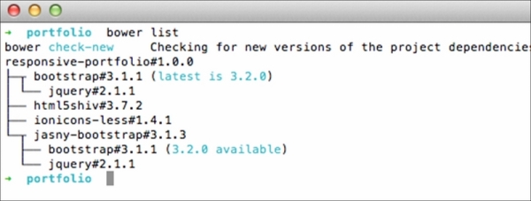
Then, install the new version using the bower install command and followed by the Bower package name along with the version number. To install Bootstrap version 3.2.0, for example, run the bower install bootstrap#3.2.0 ––save command.
Note
We actually should be able to update packages with the bower update command. Yet, it seems this command does not work as expected in accordance with a number of reports in the following Bower Issue thread (https://github.com/bower/bower/issues/1054). So, using the bower install command, as shown previously, is the way to go at the moment.
index.html. Images and icons that are going to be displayed on the website are also prepared. We also recorded the project specification in bower.json. Through this file, we can tell that the project is named responsive-portfolio, currently at version 1.0.0, and has a couple of dependencies, as follows:
We have downloaded these libraries via the bower install command, which is leaner than having to download and extract the .zip package. All the libraries should have been added within a folder named bower_components, as shown in the following screenshot:
Bower, by default, creates a new folder named bower_components. Bower allows us to configure the folder name through the Bower configuration file, .bowerrc. Change the folder name as per your preference by creating .bowerrc. Follow this reference (http://bower.io/docs/config/) to configure bower.
As the dependencies are installed with Bower, maintaining the project will be more streamlined. These libraries can be updated to the newer version at a later time. With the use of Bower commands, updating the libraries that we have just installed is practically leaner than downloading the .zip package and manually moving the files into the project directory.
Run the bower list command to see all installed Bower packages, and check whether a new version of the packages is available, as shown in the following screenshot:
Then, install the new version using the bower install command and followed by the Bower package name along with the version number. To install Bootstrap version 3.2.0, for example, run the bower install bootstrap#3.2.0 ––save command.
Note
We actually should be able to update packages with the bower update command. Yet, it seems this command does not work as expected in accordance with a number of reports in the following Bower Issue thread (https://github.com/bower/bower/issues/1054). So, using the bower install command, as shown previously, is the way to go at the moment.
a new folder named bower_components. Bower allows us to configure the folder name through the Bower configuration file, .bowerrc. Change the folder name as per your preference by creating .bowerrc. Follow this reference (http://bower.io/docs/config/) to configure bower.
As the dependencies are installed with Bower, maintaining the project will be more streamlined. These libraries can be updated to the newer version at a later time. With the use of Bower commands, updating the libraries that we have just installed is practically leaner than downloading the .zip package and manually moving the files into the project directory.
Run the bower list command to see all installed Bower packages, and check whether a new version of the packages is available, as shown in the following screenshot:
Then, install the new version using the bower install command and followed by the Bower package name along with the version number. To install Bootstrap version 3.2.0, for example, run the bower install bootstrap#3.2.0 ––save command.
Note
We actually should be able to update packages with the bower update command. Yet, it seems this command does not work as expected in accordance with a number of reports in the following Bower Issue thread (https://github.com/bower/bower/issues/1054). So, using the bower install command, as shown previously, is the way to go at the moment.
bower remove command.
bower uninstall command.
bower delete command.
bower search followed by a keyword.
bower search followed by the library name.
bower browse followed by a keyword.
bower info.
bower detail.
bower property.
As the dependencies are installed with Bower, maintaining the project will be more streamlined. These libraries can be updated to the newer version at a later time. With the use of Bower commands, updating the libraries that we have just installed is practically leaner than downloading the .zip package and manually moving the files into the project directory.
Run the bower list command to see all installed Bower packages, and check whether a new version of the packages is available, as shown in the following screenshot:
Then, install the new version using the bower install command and followed by the Bower package name along with the version number. To install Bootstrap version 3.2.0, for example, run the bower install bootstrap#3.2.0 ––save command.
Note
We actually should be able to update packages with the bower update command. Yet, it seems this command does not work as expected in accordance with a number of reports in the following Bower Issue thread (https://github.com/bower/bower/issues/1054). So, using the bower install command, as shown previously, is the way to go at the moment.
Now that we have put together the essential stuff to build the website. Let's start building the website's HTML structure. As in the last project, herein, we will be using a couple of new HTML5 elements to build the semantic structure.
In this section, we are going to build the website's HTML structure. You will find that a few of the elements that we are going to add herein will be similar to the ones we added in the first website, responsive blog. Hence, the following steps will be straightforward. If you have followed the first through to the end, these steps should also be easy to follow. Let's carry on.
- Open
index.html. Then, add the basic HTML structure, as follows:<!DOCTYPE html> <html lang="en"> <head> <meta charset="UTF-8"> <title>Portfolio</title> </head> <body> </body> </html>
- Below
<meta charset="UTF-8">, add a meta tag to address the Internet Explorer rendering compatibility:<meta http-equiv="X-UA-Compatible" content="IE=edge">
The preceding meta tag specification will force Internet Explorer to use the latest engine's version therein to render the page.
- Below the
http-equivmeta tag, add the meta viewport tag:<meta name="viewport" content="width=device-width, initial-scale=1">
The preceding viewport meta tag specification defines the web page viewport width to follow the device viewport size, as well as scale the page at a ratio of 1:1 upon opening the web page the first time.
- Below the viewport meta tag, add the link to the favicon and apple-touch-icon, which will display the website's icon in Apple devices, such as iPhone, iPad, and iPod:
<link rel="apple-touch-icon" href="assets/img/apple-icon.png">
<link rel="shortcut icon" href="assets/img/favicon.png" type="image/png">
- Add the website's meta description below
<title>:<meta name="description" content="A simple portoflio website built using Bootstrap">
The description specified within this meta tag will be displayed in the Search Engine Result Page (SERP).
- You may also specify the author of the page with a meta tag below the meta description tag, as follows.
<meta name="author" content="Thoriq Firdaus">
- Inside
<body>, add the website off-canvas navigation HTML, as follows:<nav id="menu" class="navmenu navmenu-inverse navmenu-fixed-left offcanvas portfolio-menu" role="navigation"> <ul class="nav navmenu-nav"> <li class="active"><a href="#">Home</a></li> <li><a href="#">Blog</a></li> <li><a href="#">Shop</a></li> <li><a href="#">Speaking</a></li> <li><a href="#">Writing</a></li> <li><a href="#">About</a></li> </ul> </nav>Aside from the essential classes that we have mentioned in the Jasny Bootstrap off-canvas section in this chapter, we have also added a new class named
portfolio-menuin the<nav>element to apply our very own styles to the off-canvas navigation. - Add the Bootstrap
navbarstructure, along with<button>to slide the off-canvas in and out:<div class="navbar navbar-default navbar-portfolio portfolio-topbar"> <button type="button" class="navbar-toggle" data-toggle="offcanvas" data-target="#menu" data-canvas="body"> <span class="icon-bar"></span> <span class="icon-bar"></span> <span class="icon-bar"></span> </button> </div> - Below
navbar, add the<main>element, as follows:<main class="portfolio-main" id="content" role="main"> </main>
As described in W3C (http://www.w3.org/TR/html-main-element/), the
<main>element defines the main content of the website. So, this is where we will put the website content including the portfolio images. - Add Bootstrap Jumbotron, containing the portfolio website name and a line of catchphrase. Since I will display the work of a friend of mine, Yoga Perdana, I wish to show off his name, along with his catchphrase that is displayed in his Dribbble page profile (https://dribbble.com/yoga), as follows:
<main class="portfolio-main" id="content" role="main"> <section class="jumbotron portfolio-about" id="about"> <h1 class="portfolio-name">Yoga Perdana</h1> <p class="lead">Illustrator & Logo designer. I work using digital tools, specially vector.</p> </section> </main>
You may freely add your name or company name in this matter.
- Below the Bootstrap Jumbotron section, add a new section with the HTML5
<section>element, along with a heading that defines this section, as follows:... <section class="jumbotron portfolio-about" id="about"> <h1 class="portfolio-name">Yoga Perdana</h1> <p class="lead">Illustrator & Logo designer. I work using digital tools, specially vector.</p> </section> <section class="portfolio-display" id="portfolio"> <h2>Portfolio</h2> </section>
- Add a Bootstrap container (http://getbootstrap.com/css/#overview-container) below the heading that will contain the portfolio images using the following code:
<section class="portfolio-display" id="portfolio">
<h2>Portfolio</h2>
   <div class="container">
</div>
</section>
- Arrange the portfolio images into columns and rows. We have 12 portfolio images, which means we may have four images/columns in a row. The following is the first row:
...
<div class="container">
<div class="row">
<div class="col-md-3 col-sm-6 portfolio-item">
    <figure class="portfolio-image">
<img class="img-responsive" src="assets/img/6layers.jpg" height="300" width="400" alt="">
<figcaption class="portfolio-caption">6 Layers</figcaption>
          </figure>
  </div>
<div class="col-md-3 col-sm-6 portfolio-item">
    <figure class="portfolio-image">
<img class="img-responsive" src="assets/img/blur.jpg" height="300" width="400" alt="">
<figcaption class="portfolio-caption">Blur</figcaption>
</figure>
  </div>
<div class="col-md-3 col-sm-6 portfolio-item">
          <figure class="portfolio-image">
<img class="img-responsive" src="assets/img/brain.jpg" height="300" width="400" alt="">
<figcaption class="portfolio-caption">Brain</figcaption>
</figure>
  </div>
  <div class="col-md-3 col-sm-6 portfolio-item">
       <figure class="portfolio-image">
<img class="img-responsive" src="assets/img/color.jpg" height="300" width="400" alt="">
<figcaption class="portfolio-caption">Color</figcaption>
</figure>
  </div>
</div>
</div>
Each column is assigned with a special class to allow us to apply customized styles. We also added a class in
<figure>that wraps the image, as well as the<figcaption>element that wraps the image caption for the same purpose. - Add the remaining images into columns and rows. Since, in this case, we have 12 images, there should be three rows displayed in the website. Each row contains four images, including one row that we've added in step 13.
- Below the portfolio section, add the website message form containing three form fields and a button, as shown in the following code:
...
</section>
<div class="portfolio-contact" id="contact">
      <div class="container">
        <h2>Get in Touch</h2>
<form id="contact" method="post" class="form" role="form">
            <div class="form-group">
<input type="text" class="form-control input-lg" id="input-name" placeholder="Name">
</div>
                 <div class="form-group">
<input type="email" class="form-control input-lg" id="input-email" placeholder="Email">
                  </div>
                  <div class="form-group">
<textarea class="form-control" rows="10"></textarea>
                  </div>
 <button type="submit" class="btn btn-lg btn-primary">Submit</button>
           </form>
</div>
</div>
Herein, we made the website form simple with only three form fields. But, you may add extra form fields, as per your own requirement.
- Finally, we will add the website footer with the HTML5
<footer>element. The footer, as we have seen from the website wireframe, contains the social media icons and the website copyright statement. - Add the following HTML markup below the website's main content:
... </main> <footer class="portfolio-footer" id="footer"> <div class="container"> <div class="social" id="social"> <ul> <li class="twitter"><a class="icon ion-social-twitter" href="#">Twitter</a></li> <li class="dribbble"><a class="icon ion-social-dribbble-outline" href="#">Dribbble</a></li> </ul> </div> <div class="copyright">Yoga Perdana © 2014</div> </div> </footer>
We just constructed the portfolio website HTML structure with a couple of HTML5 elements and Bootstrap reusable classes. You should be able to see the website through the following address http://localhost/portfolio/ or http://{computer-username}/portfolio/ if you are using OS X. No styles have yet been applied to the website at this stage; we haven't linked any style sheet in the page. So, the screenshot following the upcoming tip is how the website looks currently.

Bootstrap ships a variety of components. Yet, we use only a couple, including the grids, Jumbotron, buttons, and forms. Extend the website by adding extra Bootstrap components, as follows:
In addition, try creating more web pages and link them through the off-canvas navigation menus.
Bootstrap ships a variety of components. Yet, we use only a couple, including the grids, Jumbotron, buttons, and forms. Extend the website by adding extra Bootstrap components, as follows:
In addition, try creating more web pages and link them through the off-canvas navigation menus.
In addition, try creating more web pages and link them through the off-canvas navigation menus.
col-sm-pull-8
col-md-push-3
col-xs-offset-5
col-lg-6
col-xl-7
btn-link
btn-submit
btn-send
btn-cancel
btn-enter
In this chapter, we will discuss many things, including the following topics:
- Learn the basic LESS syntax, such as variables and mixins
- Organize the style sheet references with LESS
@importdirective - Configure Koala to compile LESS into regular CSS
- Look into the source map to debug LESS
- Compose the website custom styles with LESS
- Compile JavaScript to activate off-canvas navigation
LESS (http://lesscss.org/) is a JavaScript-based CSS preprocessor developed by Alexis Sellier (http://cloudhead.io/), also known as CloudHead. As mentioned, Bootstrap uses LESS to compose its component styles—though it only recently released the Sass version officially. As mentioned, we will follow Bootstrap to use LESS to compose our own style rules and manage style sheets.
A variable is the most fundamental feature in LESS. A variable in LESS, as in other programming languages, is used to store a constant or a value that can be reused later limitlessly within the entire style sheet. In LESS, a variable is declared with an @ sign and is followed by the variable name. The variable name can be a combination of numbers and letters. In the following example, we will create a couple of LESS variables to store some colors in the HEX format and assign them in the succeeding style rules to pass the colors, as shown in the following code:
One of the advantages of using a variable is that, if we have to make a change, we will only need to change the value within the variable. The change we make will take place in every occurrence of that variable in the style sheet. This is certainly a time saver. Scanning through the style sheet and making the change singly or perhaps with the search and replace feature of the code editor might cause unintended changes if not done carefully.
LESS lets us nest style rules into one another. Traditionally with plain CSS, when we want to apply style rules to elements, say, under a <nav> element, we can compose the style rules in the following way:
Eventually, the preceding style rules will return the same result—only we write the style rules more efficiently this time.
Mixins are one of the most powerful features in LESS. Mixins simplify style rules declaration by allowing us to create a group of CSS properties that can be included in other style rules in the style sheets. Let's take a look at the following code snippet:
Afterwards, we include .border-radius into the succeeding style rules to pass the containing properties into them, as follows:
Furthermore, we can also extend the mixins into so-called parametric mixins. This feature allows us to add arguments or variables and turn the mixins to be configurable. Let's take the same example as in the preceding section. But, this time, we will not assign a fixed value; instead, we replace it with a variable, as follows:
Now, we can insert this mixin into other style rules and assign a different value to each:
When we compile it into regular CSS, each style rule is applied with a different border-radius value, as follows:
Furthermore, we can specify a default value in a parametric mixin, which will be useful in case a parameter is not passed. When we set a parameter in a mixin, as we did in the preceding example, LESS will take the parameter as a requirement. If we do not pass a parameter in it, LESS will return an error. So, let's take the preceding example and extend it with a default value, say, 5px, as follows:
Extend syntax is the long-awaited feature to come into LESS. One main issue with LESS mixins is that it simply copies the containing CSS properties of a mixin, thus producing duplicate code. Again, if we are dealing with a large-scale website with a thousand lines of codes, the amount of duplicated code would make the style sheet size unnecessarily large.
To begin with, we include a mixin without the :extend syntax:
In this second example, we will put the :extend syntax into practice into the same mixin:
We can also perform math operations with LESS-like addition, subtraction, division, and multiplication. Operations could be pretty useful to determine a length, such as the element's width and height. In the following example, we will calculate the proper box width by subtracting it with the padding so that it can be fit into the parent container.
First, we will define the variable for the padding with the @padding variable:
Then, we specify the box width and subtract it with the @padding variable:
In other cases, we can do the same to the height property, as follows:
Believe it or not, in LESS, we can alter colors with math operations. It's like mixing paint colors, except we do it by addition, subtraction, division, and multiplication. For instance:
When compiled, the color turns into the following:
Alternatively, to darken the color, use the darken() function, as follows:
This is one of my favorite features in LESS. The referential import, as the name implies, allows us to import an external style sheet merely as reference. Prior to the emerging of this feature, all style rules in the style sheet imported with the @import directive will be appended, which is more often than not unnecessary.
One of the constraints that LESS used to encounter was when using a variable within the @import directive (https://github.com/less/less.js/issues/410). It is one of the most requested features to present in LESS and finally has been resolved since LESS 1.4. We are now able to declare a variable in an @import statement by naming the variable within curly braces, for example, @{variable-name}.
Note
Refer to the Import Directive section of the LESS official website (http://lesscss.org/features/#import-directives-feature) for further assistance on importing an external style sheet with LESS.
While CSS preprocessors like LESS allows us to write style rules more efficiently, the browsers are still only able to read plain CSS, which will cause a new problem particularly when debugging issues in the style sheet.

LESS has plenty of features and will only grow with more additions in the years to come. It's impractical to include and discuss them all at once In this module. So, the following are a few references to dig in deeper:
- LESS's official website (http://lesscss.org/); the best source to be up-to-date with LESS
- LESS Web Development Essentials, Bass Jobsen, Packt Publishing (https://www.packtpub.com/web-development/less-web-development-essentials)
- Instant LESS CSS preprocessor (https://www.packtpub.com/web-development/instant-less-css-preprocessor-how-instant)
We walked through a big amount of basic syntax in LESS in the preceding section. Now, we will start to actually work with LESS, speaking of which, before we are able to write our own style rules as well as reuse variables, mixins, and functions that are shipped in Bootstrap and the Jasny Bootstrap package, we will have to import them into our own style sheet with the LESS @import directive.
Perform the following steps to manage the style sheet references:
- Go to the project directory and create a new style sheet named
var-bootstrap.lessinassets/lessdirectory. This style sheet contains the copy of Bootstrap's predefined variables. This copy will allow us to customize the variables without affecting the initial specifications. - Hence, copy the Bootstrap variables in the
variables.lessstyle sheet of the/bootstrap/lessdirectory. Paste the complete variables intovar-bootstrap.lessthat we only created in step 1. - Create a new style sheet named
var-jasny.less. Similar tovar-bootstrap.less, this style sheet will contain the copy of the Jasny Bootstrap variables. - Obtain the Jasny Bootstrap variables in
variables.lessof thejasny-bootstrap/lessdirectory. Paste all the variables in thevar-jasny.lessstyle sheet we just created in step 3. - Create a new style sheet named
frameworks.less. - We are going to use this style sheet to import the Bootstrap and Jasny Bootstrap style sheets residing in the
bower_componentfolder. - In
frameworks.less, create a variable named@path-bootstrapto define the path, pointing to the folder namedless, where all the LESS style sheets of Bootstrap reside:@path-bootstrap: '../../bower_components/bootstrap/less/';
- Similarly, create a variable that defines the path, pointing to the Jasny Bootstrap
lessfolder, as follows:@path-jasny: '../../bower_components/jasny-bootstrap/less/';
- Also create one to define the Ionicons path:
@path-ionicons: '../../bower_components/ionicons-less/less/';
- Import the style sheets that contain variables using the following code:
@import 'var-bootstrap.less';
@import 'var-jasny.less';
- Import the Bootstrap and Jasny Bootstrap style sheets, which are only required to build the portfolio website. Specify the paths using the variables we created in steps 6 to 8, as follows:
// Mixins @import '@{path-bootstrap}mixins.less'; // Reset @import '@{path-bootstrap}normalize.less'; @import '@{path-bootstrap}print.less'; // Core CSS @import '@{path-bootstrap}scaffolding.less'; @import '@{path-bootstrap}type.less'; @import '@{path-bootstrap}grid.less'; @import '@{path-bootstrap}forms.less'; @import '@{path-bootstrap}buttons.less'; // Icons @import '@{path-ionicons}ionicons.less'; // Components @import '@{path-bootstrap}navs.less'; @import '@{path-bootstrap}navbar.less'; @import '@{path-bootstrap}jumbotron.less'; // Offcanvas @import "@{path-jasny}navmenu.less"; @import "@{path-jasny}offcanvas.less"; // Utility classes @import '@{path-bootstrap}utilities.less'; @import '@{path-bootstrap}responsive-utilities.less'; - Create a new style sheet named
style.less. This is the style sheet where we are going to compose our very own style rules. - Import the Bootstrap variables and the mixins within
style.less:@path-bootstrap: '../../bower_components/bootstrap/less/'; @import 'var-bootstrap.less'; @import 'var-jasny.less'; @import (reference) '@{path-bootstrap}mixins.less';
In the preceding steps, we organized and named the folders as well as the files to my personal preferences. Even so, you don't have to follow the naming conventions absolutely. Do organize and name them in your own way.
The following are a few ideas:
- Rename
var-bootstrap.lessto simplyvars.less. - Alternatively, create a new folder name
varsorconfigsto put thevar-bootstrap.lessandvar-jasny.lessstyle sheet in it. - Did you know that you can also import the LESS style sheet without declaring the
.lessextension. For the sake of simplicity, you can omit the extensions, for example:@import (reference) '@{path-bootstrap}mixins.less';
var-bootstrap.less and var-jasny.less to store the Bootstrap and Jasny Bootstrap variables. As mentioned, we made these copies to avoid directly altering the originals. We have also created a style sheet named frameworks.less, containing references to the Bootstrap and Jasny Bootstrap style sheets.
style.less and imported the variables and mixins so that they are reusable inside the style.less.
In the preceding steps, we organized and named the folders as well as the files to my personal preferences. Even so, you don't have to follow the naming conventions absolutely. Do organize and name them in your own way.
The following are a few ideas:
- Rename
var-bootstrap.lessto simplyvars.less. - Alternatively, create a new folder name
varsorconfigsto put thevar-bootstrap.lessandvar-jasny.lessstyle sheet in it. - Did you know that you can also import the LESS style sheet without declaring the
.lessextension. For the sake of simplicity, you can omit the extensions, for example:@import (reference) '@{path-bootstrap}mixins.less';
preceding steps, we organized and named the folders as well as the files to my personal preferences. Even so, you don't have to follow the naming conventions absolutely. Do organize and name them in your own way.
The following are a few ideas:
- Rename
var-bootstrap.lessto simplyvars.less. - Alternatively, create a new folder name
varsorconfigsto put thevar-bootstrap.lessandvar-jasny.lessstyle sheet in it. - Did you know that you can also import the LESS style sheet without declaring the
.lessextension. For the sake of simplicity, you can omit the extensions, for example:@import (reference) '@{path-bootstrap}mixins.less';
(reference), which imports yet treats external LESS style sheets only as a reference. In addition to (reference), LESS also provides more options to import a style sheet. So, which of the following is not the LESS import option?
(less)
(css)
(multiple)
(once)
(default)
@import statement?
@import '@{variable}style.less';
@import '@[variable]style.less';
@import '@(variable)style.less';
The HTML and the style sheets have been prepared. It's now time to put them together to shape a solid portfolio website. We will compose the website styles using LESS syntax. Herein, we will also use Koala as in the first project. This time, we will compile LESS into plain CSS.
Perform the following steps to compile LESS into CSS using Koala:
- Add the project directory in the Koala sidebar, as follows:

- Select all the style sheets except
frameworks.lessandstyle.less. Right-click and select Toggle Auto Compile. Have a look at the following screenshot:
This will turn off the Auto Compile option on the selected style sheets and prevent Koala from compiling these style sheet unintentionally.
- On the other hand, ensure that Auto Compile is checked for the two remaining style sheets,
frameworks.lessandstyle.less:
- Make sure that the
frameworks.lessandstyle.lessoutput is set to/assets/cssdirectory, as shown in the following screenshot:
- Check the Source Map option for both style sheets to generate the source map files, which will help us when debugging:

- Select the output styles for the two style sheets,
frameworks.lessandstyle.less, to compress:
This option will generate a small-sized CSS style sheet, as the codes within the style sheet will be compressed into a single line. Hence, the style sheet will load faster in the browser and also save bandwidth consumption on the user's side.
- Select
frameworks.lessand click on the Compile button to compile it into CSS:
- Do the same for
style.less. Select it and click on the Compile button to compile it into CSS. Openindex.htmlin the code editor, and link both of the style sheets inside<head>, as follows:<link href="assets/css/frameworks.css" rel="stylesheet"> <link href="assets/css/style.css" rel="stylesheet">

frameworks.less and style.less, from LESS to CSS. You should now have them along with the source maps in the assets/css/ directory. The code is compressed, thus resulting in a relatively small file size, as shown in the following screenshot:
The style sheets are relatively small in size. As shown, frameworks.css is 92 kb, while style.css is only 2 kb
This is the section you might be waiting for, to style the portfolio website. It is apparently a pleasing experience to see the website start to have shapes, colors, and look. In this section, we will customize the default styles and compose our style rules using the LESS syntax that we have covered earlier in this chapter.
Perform the following steps to style the website:
- Add a new font family from Google Font. Herein, I opted for Varela Round (http://www.google.com/fonts/specimen/Varela+Round). Place the following Google Font link before any other style sheets:
<link href='http://fonts.googleapis.com/css?family=Varela+Round' rel='stylesheet' type='text/css'>
- We will customize the default styles by changing some variables. Open
var-bootstrap.lessin Sublime Text. First, we change the@brand-primaryvariable that defines the Bootstrap primary color; change it from#428bcato#46acb8:
- Also, change the color in the
@brand-successvariable from#5cb85cto#7ba47c:
- Change the
@headings-font-familyvariable, which defines the font family used in the headings, frominheritto"Varela Round", as follows:@headings-font-family: "Varela Round", @font-family-sans-serif;
- The Bootstrap default style shows a glowing effect when the user focusses on a form field. The color of this effect is specified in
@input-border-focus. Change the color from#66afe9to#89c6cb:
- In the top section of the website, you can see that the navbar still has the Bootstrap default style with the gray background and border color, as shown in the following screenshot:

- These two colors are specified in
@navbar-default-bgand@navbar-default-border, respectively. Change both of these variable values to transparent, as follows:@navbar-default-bg: transparent; @navbar-default-border: transparent;
- Similarly, the default style of the Jumbotron section is set with a gray background color. To remove this color, set the
@jumbotron-bgvariable totransparent, as follows:@jumbotron-bg: transparent;
- We will be back editing a few more Bootstrap variables later on. For the meantime, let's write our own style rules. To begin with, we will show the navbar toggle button, which is hidden by the Bootstrap default styles. In our case, this button will be used to slide the off-canvas navigation on and off. Let's force this button to be visible with the following style rules:
.portfolio-topbar { .navbar-toggle { display: block; } } - As you can see from the following screenshot, the toggle button with the so-called hamburger icon (http://gizmodo.com/who-designed-the-iconic-hamburger-icon-1555438787) is now visible:

- Currently, this button is positioned on the right-hand side. Referring to the website blueprint, it should be on the left. Add
float:leftto put it on the left-hand side andmargin-left:15pxto add a little whitespace to the button's left, as follows:.portfolio-topbar { .navbar-toggle { display: block; float: left; margin-left: 15px; } } - Herein, I want to customize the toggle button's default styles, which are also specified through a couple of variables in
var-bootstrap.less. Hence, openvar-bootstrap.lessin Sublime Text. - First of all, we will remove the button borders by changing the value of the
@navbar-default-toggle-border-colorvariable from#dddtotransparent, as follows:@navbar-default-toggle-border-color: transparent;
- We will also remove the gray background color that appears when we hover over the button. Remove the gray background color out of it by changing the
@navbar-default-toggle-hover-bgvariable from#dddtotransparent, as follows:@navbar-default-toggle-hover-bg: transparent;
- I want the hamburger icon to look bolder and strong. So, herein, we want to change the colors to black. Change the value of
@navbar-default-toggle-icon-bar-bgfrom#888to#000:@navbar-default-toggle-icon-bar-bg: #000;
- At this stage, the website content is aligned to the left-hand side, which is the default browser alignment for any content. Following the website blueprint, the website content should be centered. Use
text-align: center, as follows, to align the content to the center:.portfolio-about, .portfolio-display, .portfolio-contact, .portfolio-footer { text-align: center; } - Add the following to turn the website name to all-caps (all capital letters), making it bigger and bolder:
.portfolio-about { .portfolio-name { text-transform: uppercase; } } - On the other hand, make the catchphrase line subtler by specifying the text color to gray light. Herein, we can simply use Bootstrap's predefined variable named
@gray-lightto apply the gray color, as follows:.portfolio-about { .portfolio-name { text-transform: uppercase; } .lead { color: @gray-light; } } - In the portfolio section, specify the background color with gray light, which is lighter than the color in
@gray-lightervariable. The addition of the background color aims to lay a bit of emphasis on the portfolio section. - In this project, we opt to use the LESS
darken()function to slightly darken the white color, as follows:.portfolio-display { background-color: darken(#fff, 1%); } - At this stage, if we take a look at the portfolio section, it seems there are merely little spaces at the top and the bottom, as pointed out in the following screenshot:

- Give the portfolio section more space to breathe at the top and bottom by adding
padding-topandpadding-bottom, as follows:.portfolio-display { background-color: darken(#fff, 1%); padding-top: 60px; padding-bottom: 60px; } - To sum up, we added two headings in the website, including one in the portfolio section, to explicitly display the section name. These headings will share the same style rules. So, in that case, we better create a mixin that specifically defines the heading styles.
- Define the mixin as well as the CSS properties to apply the heading styles, as follows:
.heading { color: lighten(#000, 70%); text-transform: uppercase; font-size: 21px; margin-bottom: 60px; } - Add the following style rules for the section heading, which will make it look subtler and in tune with the background color of the portfolio section:
.portfolio-display { ... h2 { &:extend(.heading); } } - As shown in the following screenshot, there is only very little space in between each row; the rows are too close to each other, as follows:

So, put more space by specifying
margin-bottomfor each portfolio item, as follows:.portfolio-item { margin-bottom: 30px; } - Add styles for the portfolio image, as follows:
.portfolio-image { padding: 15px; background-color: #fff; margin-right: auto; margin-left: auto; } - Also, add the styles for the caption, as follows:
.portfolio-caption { font-weight: 500; margin-top: 15px; color: @gray; } - What do you think about showing a transition effect when we hover over the portfolio image? That will look nice, won't it? In this case, I would like to show a shadow surrounding the portfolio image upon hover.
- Add the effect using Bootstrap's predefined mixins,
.transition()and.box-shadow(), as follows:.portfolio-image { padding: 15px; background-color: #fff; margin-right: auto; margin-left: auto; .transition(box-shadow 1s); &:hover { .box-shadow(0 0 8px fade(#000, 10%)); } } - Below the portfolio section, we have the website contact form, which has already been applied with the Bootstrap default styling. So, let's customize it with our own style rules.
- First, we will add more spaces at the top and the bottom of the contact form section with
padding. - Add the styles for the heading with the
.headingmixin we created in step 18:.portfolio-contact { ... h2 { &:extend(.heading); } } - The form currently spans the container fully. So, add the following style rules to set the maximum width, yet still display the form in the middle of the container, as follows:
.portfolio-contact { ... .form { width: 100%; max-width: 600px; margin-right: auto; margin-left: auto; } } - Add the following style rules to make the form elements—
<input>,<textarea>,<button>—look flatter. These style rules remove the shadow and lower the border radius. Have a look at the following code:.portfolio-contact { ... .form { width: 100%; max-width: 600px; margin-right: auto; margin-left: auto; input, textarea, button { box-shadow: none; border-radius: @border-radius-small; } } } - Add the following lines to style the button and make it live with a transition effect, as follows:
.portfolio-contact { ... .form { width: 100%; max-width: 600px; margin-right: auto; margin-left: auto; input, textarea, button { box-shadow: none; border-radius: @border-radius-small; } .btn { display: block; width: 100%; .transition(background-color 500ms); } } } - Starting this step, we will add style rules for the footer, the last section of the website. The footer contains the social media links, Dribbble and Twitter, and a copyright statement at the very bottom.
- First, as in the preceding sections, we put more whitespace at the top and bottom of the section with padding:
.portfolio-footer { padding-top: 60px; padding-bottom: 60px; } - Then, we put more spaces between the social media links and the copyright statement with
margin-bottom:.portfolio-footer { padding-top: 60px; padding-bottom: 60px; .social { margin-bottom: 30px; } } - Add the following lines to remove the
<ul>elementpaddingderived from default browser styles:.portfolio-footer { ... .social { margin-bottom: 30px; ul { padding-left: 0; } } } - Add the highlighted lines in the following code to display the social media links beside each other:
.portfolio-footer { ... .social { margin-bottom: 30px; ul { padding-left: 0; } li { list-style: none; display: inline-block; margin: 0 15px; } } } - Give the social media links the color of their respective social media brands, as follows:
.portfolio-footer { ... .social { ... a { font-weight: 600; color: @gray; text-decoration: none; .transition(color 500ms); &:before { display: block; font-size: 32px; margin-bottom: 5px; } } .twitter a:hover { color: #55acee; } .dribbble a:hover { color: #ea4c89; } } } - Finally, make the copyright statement color subtler with the gray color:
.portfolio-footer {
...
  .copyright {
    color: @gray-light;
  }
}
In the preceding steps, we just styled the website by customizing a number of Bootstrap variables as well as composing our own style rules. Compile style.less to generate the CSS. Additionally, you can obtain all the style rules we applied from this Gist (http://git.io/-FWuiQ).
The website should now be presentable. The following screenshot shows how the website looks in the desktop view:
The website is also responsive; the layout will adapt to the viewport width size, as shown in the following screenshot:

- Explore the website's new color schemes. Use handy tools, such as Kuler, (https://kuler.adobe.com/) to generate color scheme
- Apply different font families
- Present more awesome transition effects with CSS3
style.less to generate the CSS. Additionally, you can obtain all the style rules we applied from this Gist (
The website should now be presentable. The following screenshot shows how the website looks in the desktop view:
The website is also responsive; the layout will adapt to the viewport width size, as shown in the following screenshot:
- Explore the website's new color schemes. Use handy tools, such as Kuler, (https://kuler.adobe.com/) to generate color scheme
- Apply different font families
- Present more awesome transition effects with CSS3
- the website's new color schemes. Use handy tools, such as Kuler, (https://kuler.adobe.com/) to generate color scheme
- Apply different font families
- Present more awesome transition effects with CSS3
lighter(#000, 30%);
lighten(#000, 30%);
lightening(#000, 30%);
fadeout(#000, 10%);
transparentize(#000, 10%);
fade-out(#000, 10%);
.class:extend(.another-class);
.class::extend(.another-class);
.class {
:extend(.another-class);
}
The off-canvas navigation has not yet been activated. If you click on the toggle button, the off-canvas navigation will not slide in. Furthermore, if you view the portfolio website in Internet Explorer 8, you will find that a number of style rules are not applied. This is because Internet Explorer 8 does not recognize the HTML5 elements that are used in the website. To sort these issues out, we will have to make use of some JavaScript libraries..
- Create a new JavaScript file named
html5shiv.jsinassets/jsdirectory. - Import
html5shiv.jsfrom the HTML5Shiv package we downloaded through Bower into this file:// @koala-prepend "../../bower_components/html5shiv/dist/html5shiv.js"
- Create a new JavaScript file named
bootstrap.js. - In
bootstrap.js, import the JavaScript libraries that are required to turn the off-canvas navigation functionality on, as follows:// @koala-prepend "../../bower_components/jquery/dist/jquery.js" // @koala-prepend "../../bower_components/bootstrap/js/transition.js" // @koala-prepend "../../bower_components/jasny-bootstrap/js/offcanvas.js"
- Open Koala and ensure that the Auto Compile option for
html5shiv.jsandbootstrap.jsis checked, as shown in the following screenshot:
- Also, make sure that the output path of these two JavaScript files is set to the
/assets/jsdirectory, as shown in the following screenshot:
- Compile both these JavaScript files by clicking on the Compile button in Koala, as follows:

Once these JavaScript files are compiled, you should find the minified version of these files,
html5shiv.min.jsandbootstrap.min.js, as shown in the following screenshot:
- Open
index.htmlin Sublime Text, and linkhtml5shiv.jswithin the<head>section using the Internet Explorer conditional comment tag, as follows:<!--[if lt IE 9]> <script type="text/javascript" src="assets/js/html5shiv.min.js"></script> <![endif]-->
- Link
bootstrap.min.jsat the bottom ofindex.html, as follows:<script type="text/javascript" src="assets/js/bootstrap.min.js"></script>
To build the website, we will adopt a new framework called Foundation. Foundation is built by ZURB, a web-development agency based in California. It's a meticulously crafted framework with a stack of interactive widgets. On the technical side, Foundation styles are built on top of Sass and SCSS. Hence, we will also walk through the subject during the course of working on the project.
So, without further ado, let's get the project started.
First and foremost, unlike the previous two projects we did, we are going to examine the website layout in wireframe before going any further in the chapter. After examining it, we will discover the Foundation components that are required for the website, along with the components and assets that may not be available in the Foundation package. The following is the website layout in the normal desktop screen size:

The preceding wireframe shows that the website will have five sections. The first section, plainly, is the header. The header section will contain the website logo, menu navigation, a few lines of catchphrases, and a button—many call it a call-to-action button.
- Call to Action Buttons: Examples and Best Practices (http://www.smashingmagazine.com/2009/10/13/call-to-action-buttons-examples-and-best-practices/).
- "Call To Action" Buttons: Guidelines, Best Practices And Examples (http://www.hongkiat.com/blog/call-to-action-buttons-guidelines-best-practices-and-examples/).
- How To Design Call to Action Buttons That Convert (http://unbounce.com/conversion-rate-optimization/design-call-to-action-buttons/).
Normally, people need to get as much information as they can about the advantages and disadvantages before deciding to buy. So, under the header, we will display the list of items of the product or the key features offered.
In addition to the features list, we will also display customer testimonials within a slider. According to www.entrepreneur.com (http://www.entrepreneur.com/article/83752), displaying customer testimonials is one of the effective ways to drive more customers or sales, which is eventually good for business.
Below the testimonial section, the website will display the plan and price tables. And the last section will be the footer, containing secondary website navigation and links to Facebook and Twitter.
Let's now see how the website's layout will be in a smaller viewport size, which is as follows:

Much like the websites we built in the previous projects, all the content will be stacked. The catchphrases and the call-to-action button are aligned to the center. The menu in the navigation is now depicted as the hamburger icon. Next, we will see what Foundation has to offer in its package to build the website.
Foundation (http://foundation.zurb.com/) is one of the most popular frontend development frameworks. It is used by a number of notable companies, such as Pixar, Washington Post, Warby Parker (https://www.warbyparker.com/), and so on. As mentioned, Foundation ships with common web components and interactive widgets. Herein, we will look into the components, as well as the widgets we are going to employ for the website.
The grid system is an integral part of a framework. It is one thing that makes managing web layout feel like a breeze. Foundation's grid system comprises twelve columns that can adapt to narrow viewport size through the drop-in classes provided. Similar to both the frameworks we explored in the previous chapters, the grid consists of rows and columns. Every column has to be wrapped within a row for the layout to span properly.
You may also omit the s from columns, as follows:
The column size is defined through the following series of classes:
small-{n}: This specifies the grid column width in the small viewport size scope (approximately 0 px – 640 px).medium-{n}: This specifies the grid column width in the medium viewport size scope (approximately 641 px – 1,024 px).large-{n}: This specifies the grid column width in the large viewport size scope (approximately 1,025 px – 1,440 px).
These classes can be applied in conjunction within a single element. For example:
The preceding example gives the following result in the browser:

Resize the viewport size such that it is small enough and that the columns' width shifts following the assigned classes. In this case, each column has an equal width since both of them are assigned with the small-6 class:

Note
Generally, you may resize the viewport size by dragging the browser window. If you are using Chrome, you can activate the device mode and mobile emulator (https://developer.chrome.com/devtools/docs/device-mode). Or, if you use Firefox, you can enable the responsive design view (https://developer.mozilla.org/en-US/docs/Tools/Responsive_Design_View), which will allow you to resize the viewport size without having to drag the Firefox window.
The button is essential for any kind of website, and we will certainly add a button in some places in the website. Foundation uses the button class to define an element as a button. You can assign the class to the elements, such as <a> and <button>. This class applies the default button styles, as shown in the following screenshot:

Furthermore, you can include additional classes to define the button color or context. Use one of the classes—secondary, success, alert—to set the button color:

You can also specify the button size using one of the following classes: tiny, small, or large:

Make the button fancier with rounded corners using one of the classes, radius and round:

One of the important sections on a website is the navigation. The navigation helps users to browse the website from one page to another. Foundation, in this case, provides a couple of navigation types, and among them, one is called the top bar. Foundation's top bar will reside at the very top of the website before any content or section. The following is how the top bar will appear with the Foundation default style:


The Foundation top bar is primarily formed with the top-bar class to apply the styles, the data-topbar attribute to run the JavaScript function related to the top bar, and finally role="navigation" for better accessibility.
So, the following code is how we start to build the top bar in Foundation:
Foundation splits the top bar content into two sections. The left-hand side area is called the title area, consisting of the website name or logo. Foundation constructs this section with the list element, as follows:
Certainly, you will have to link the Foundation CSS style sheet beforehand in the document to see the top bar look.
Whether you are selling products or services, you should name your price.
As we will build a website for business, we will need to display pricing tables. Fortunately, Foundation has included this component at its core, hence we won't need a third-party extension. For flexibility, Foundation structures a pricing table with the list element, as follows:

The carousel or slider is one of the most popular design patterns on the web. Despite the debate with respect to its accessibility, many people still love to have it on their website—and so do we. Herein, we want to employ Orbit (http://foundation.zurb.com/docs/components/orbit.html), the Foundation jQuery plugin to display a content slider.
Orbit is customizable in that we can fully control the output, as well as the behavior of the slide through classes, attributes, or JavaScript initiation. We can also add almost anything within the Orbit slides, including textual content, images, links, and the mix. And needless to say, we can style most of its parts.
Foundation uses the list element to construct the slide container, as well as the slides, and initiates the functionality using the HTML5 data- attribute named data-orbit. The following is a basic example of the Orbit slider structure, containing two slides of images:
Deploying Orbit is downright easy, and technically, it can contain almost any type of content within the slide and not only images. We will look more in that regard later as we build the website.
Note
For the time being, feel free to explore the Orbit slider section (http://foundation.zurb.com/docs/components/orbit.html) in Foundation's official website, which, to my account is the best place to get into the Orbit slider.
Foundation also provides a handful of add-ons, one of which is Webicons (http://zurb.com/playground/social-webicons). Needless to say, we will need social icons, and since these icons are basically vectors, they are infinitely scalable and thus will remain crisp and sharp in any screen resolution–—normal or high definition. Have a look at the following icon set:

Aside from this icon set, you can also find the following:
- A collection of starter templates (http://foundation.zurb.com/templates.html) that will be useful to kick-off a new website and webpage
- Responsive tables (http://foundation.zurb.com/responsive-tables.html)
- Stencils (http://foundation.zurb.com/stencils.html), which you will find useful for sketching and prototyping new websites
Detailing every corner and aspect of Foundation is beyond the scope of this module. These are, by far, the most essential components of the framework that we are going to employ in the project and the website.
Fortunately, Packt Publishing has published a couple of titles that exclusively cover Foundation. I suggest you have a look at one of the following books if you are keen on further exploring the framework:
- Learning Zurb Foundation, Kevin Horek, Packt Publishing (https://www.packtpub.com/web-development/learning-zurb-foundation)
- ZURB Foundation Blueprints, James Michael Stone, Packt Publishing (https://www.packtpub.com/web-development/zurb-foundation-blueprints)
viewport size through the drop-in classes provided. Similar to both the frameworks we explored in the previous chapters, the grid consists of rows and columns. Every column has to be wrapped within a row for the layout to span properly.
You may also omit the s from columns, as follows:
The column size is defined through the following series of classes:
small-{n}: This specifies the grid column width in the small viewport size scope (approximately 0 px – 640 px).medium-{n}: This specifies the grid column width in the medium viewport size scope (approximately 641 px – 1,024 px).large-{n}: This specifies the grid column width in the large viewport size scope (approximately 1,025 px – 1,440 px).
These classes can be applied in conjunction within a single element. For example:
The preceding example gives the following result in the browser:
Resize the viewport size such that it is small enough and that the columns' width shifts following the assigned classes. In this case, each column has an equal width since both of them are assigned with the small-6 class:
Note
Generally, you may resize the viewport size by dragging the browser window. If you are using Chrome, you can activate the device mode and mobile emulator (https://developer.chrome.com/devtools/docs/device-mode). Or, if you use Firefox, you can enable the responsive design view (https://developer.mozilla.org/en-US/docs/Tools/Responsive_Design_View), which will allow you to resize the viewport size without having to drag the Firefox window.
The button is essential for any kind of website, and we will certainly add a button in some places in the website. Foundation uses the button class to define an element as a button. You can assign the class to the elements, such as <a> and <button>. This class applies the default button styles, as shown in the following screenshot:
Furthermore, you can include additional classes to define the button color or context. Use one of the classes—secondary, success, alert—to set the button color:
You can also specify the button size using one of the following classes: tiny, small, or large:
Make the button fancier with rounded corners using one of the classes, radius and round:
One of the important sections on a website is the navigation. The navigation helps users to browse the website from one page to another. Foundation, in this case, provides a couple of navigation types, and among them, one is called the top bar. Foundation's top bar will reside at the very top of the website before any content or section. The following is how the top bar will appear with the Foundation default style:
The Foundation top bar is primarily formed with the top-bar class to apply the styles, the data-topbar attribute to run the JavaScript function related to the top bar, and finally role="navigation" for better accessibility.
So, the following code is how we start to build the top bar in Foundation:
Foundation splits the top bar content into two sections. The left-hand side area is called the title area, consisting of the website name or logo. Foundation constructs this section with the list element, as follows:
Certainly, you will have to link the Foundation CSS style sheet beforehand in the document to see the top bar look.
Whether you are selling products or services, you should name your price.
As we will build a website for business, we will need to display pricing tables. Fortunately, Foundation has included this component at its core, hence we won't need a third-party extension. For flexibility, Foundation structures a pricing table with the list element, as follows:
The carousel or slider is one of the most popular design patterns on the web. Despite the debate with respect to its accessibility, many people still love to have it on their website—and so do we. Herein, we want to employ Orbit (http://foundation.zurb.com/docs/components/orbit.html), the Foundation jQuery plugin to display a content slider.
Orbit is customizable in that we can fully control the output, as well as the behavior of the slide through classes, attributes, or JavaScript initiation. We can also add almost anything within the Orbit slides, including textual content, images, links, and the mix. And needless to say, we can style most of its parts.
Foundation uses the list element to construct the slide container, as well as the slides, and initiates the functionality using the HTML5 data- attribute named data-orbit. The following is a basic example of the Orbit slider structure, containing two slides of images:
Deploying Orbit is downright easy, and technically, it can contain almost any type of content within the slide and not only images. We will look more in that regard later as we build the website.
Note
For the time being, feel free to explore the Orbit slider section (http://foundation.zurb.com/docs/components/orbit.html) in Foundation's official website, which, to my account is the best place to get into the Orbit slider.
Foundation also provides a handful of add-ons, one of which is Webicons (http://zurb.com/playground/social-webicons). Needless to say, we will need social icons, and since these icons are basically vectors, they are infinitely scalable and thus will remain crisp and sharp in any screen resolution–—normal or high definition. Have a look at the following icon set:
Aside from this icon set, you can also find the following:
- A collection of starter templates (http://foundation.zurb.com/templates.html) that will be useful to kick-off a new website and webpage
- Responsive tables (http://foundation.zurb.com/responsive-tables.html)
- Stencils (http://foundation.zurb.com/stencils.html), which you will find useful for sketching and prototyping new websites
Detailing every corner and aspect of Foundation is beyond the scope of this module. These are, by far, the most essential components of the framework that we are going to employ in the project and the website.
Fortunately, Packt Publishing has published a couple of titles that exclusively cover Foundation. I suggest you have a look at one of the following books if you are keen on further exploring the framework:
- Learning Zurb Foundation, Kevin Horek, Packt Publishing (https://www.packtpub.com/web-development/learning-zurb-foundation)
- ZURB Foundation Blueprints, James Michael Stone, Packt Publishing (https://www.packtpub.com/web-development/zurb-foundation-blueprints)
essential for any kind of website, and we will certainly add a button in some places in the website. Foundation uses the button class to define an element as a button. You can assign the class to the elements, such as <a> and <button>. This class applies the default button styles, as shown in the following screenshot:
Furthermore, you can include additional classes to define the button color or context. Use one of the classes—secondary, success, alert—to set the button color:
You can also specify the button size using one of the following classes: tiny, small, or large:
Make the button fancier with rounded corners using one of the classes, radius and round:
One of the important sections on a website is the navigation. The navigation helps users to browse the website from one page to another. Foundation, in this case, provides a couple of navigation types, and among them, one is called the top bar. Foundation's top bar will reside at the very top of the website before any content or section. The following is how the top bar will appear with the Foundation default style:
The Foundation top bar is primarily formed with the top-bar class to apply the styles, the data-topbar attribute to run the JavaScript function related to the top bar, and finally role="navigation" for better accessibility.
So, the following code is how we start to build the top bar in Foundation:
Foundation splits the top bar content into two sections. The left-hand side area is called the title area, consisting of the website name or logo. Foundation constructs this section with the list element, as follows:
Certainly, you will have to link the Foundation CSS style sheet beforehand in the document to see the top bar look.
Whether you are selling products or services, you should name your price.
As we will build a website for business, we will need to display pricing tables. Fortunately, Foundation has included this component at its core, hence we won't need a third-party extension. For flexibility, Foundation structures a pricing table with the list element, as follows:
The carousel or slider is one of the most popular design patterns on the web. Despite the debate with respect to its accessibility, many people still love to have it on their website—and so do we. Herein, we want to employ Orbit (http://foundation.zurb.com/docs/components/orbit.html), the Foundation jQuery plugin to display a content slider.
Orbit is customizable in that we can fully control the output, as well as the behavior of the slide through classes, attributes, or JavaScript initiation. We can also add almost anything within the Orbit slides, including textual content, images, links, and the mix. And needless to say, we can style most of its parts.
Foundation uses the list element to construct the slide container, as well as the slides, and initiates the functionality using the HTML5 data- attribute named data-orbit. The following is a basic example of the Orbit slider structure, containing two slides of images:
Deploying Orbit is downright easy, and technically, it can contain almost any type of content within the slide and not only images. We will look more in that regard later as we build the website.
Note
For the time being, feel free to explore the Orbit slider section (http://foundation.zurb.com/docs/components/orbit.html) in Foundation's official website, which, to my account is the best place to get into the Orbit slider.
Foundation also provides a handful of add-ons, one of which is Webicons (http://zurb.com/playground/social-webicons). Needless to say, we will need social icons, and since these icons are basically vectors, they are infinitely scalable and thus will remain crisp and sharp in any screen resolution–—normal or high definition. Have a look at the following icon set:
Aside from this icon set, you can also find the following:
- A collection of starter templates (http://foundation.zurb.com/templates.html) that will be useful to kick-off a new website and webpage
- Responsive tables (http://foundation.zurb.com/responsive-tables.html)
- Stencils (http://foundation.zurb.com/stencils.html), which you will find useful for sketching and prototyping new websites
Detailing every corner and aspect of Foundation is beyond the scope of this module. These are, by far, the most essential components of the framework that we are going to employ in the project and the website.
Fortunately, Packt Publishing has published a couple of titles that exclusively cover Foundation. I suggest you have a look at one of the following books if you are keen on further exploring the framework:
- Learning Zurb Foundation, Kevin Horek, Packt Publishing (https://www.packtpub.com/web-development/learning-zurb-foundation)
- ZURB Foundation Blueprints, James Michael Stone, Packt Publishing (https://www.packtpub.com/web-development/zurb-foundation-blueprints)
sections on a website is the navigation. The navigation helps users to browse the website from one page to another. Foundation, in this case, provides a couple of navigation types, and among them, one is called the top bar. Foundation's top bar will reside at the very top of the website before any content or section. The following is how the top bar will appear with the Foundation default style:
The Foundation top bar is primarily formed with the top-bar class to apply the styles, the data-topbar attribute to run the JavaScript function related to the top bar, and finally role="navigation" for better accessibility.
So, the following code is how we start to build the top bar in Foundation:
Foundation splits the top bar content into two sections. The left-hand side area is called the title area, consisting of the website name or logo. Foundation constructs this section with the list element, as follows:
Certainly, you will have to link the Foundation CSS style sheet beforehand in the document to see the top bar look.
Whether you are selling products or services, you should name your price.
As we will build a website for business, we will need to display pricing tables. Fortunately, Foundation has included this component at its core, hence we won't need a third-party extension. For flexibility, Foundation structures a pricing table with the list element, as follows:
The carousel or slider is one of the most popular design patterns on the web. Despite the debate with respect to its accessibility, many people still love to have it on their website—and so do we. Herein, we want to employ Orbit (http://foundation.zurb.com/docs/components/orbit.html), the Foundation jQuery plugin to display a content slider.
Orbit is customizable in that we can fully control the output, as well as the behavior of the slide through classes, attributes, or JavaScript initiation. We can also add almost anything within the Orbit slides, including textual content, images, links, and the mix. And needless to say, we can style most of its parts.
Foundation uses the list element to construct the slide container, as well as the slides, and initiates the functionality using the HTML5 data- attribute named data-orbit. The following is a basic example of the Orbit slider structure, containing two slides of images:
Deploying Orbit is downright easy, and technically, it can contain almost any type of content within the slide and not only images. We will look more in that regard later as we build the website.
Note
For the time being, feel free to explore the Orbit slider section (http://foundation.zurb.com/docs/components/orbit.html) in Foundation's official website, which, to my account is the best place to get into the Orbit slider.
Foundation also provides a handful of add-ons, one of which is Webicons (http://zurb.com/playground/social-webicons). Needless to say, we will need social icons, and since these icons are basically vectors, they are infinitely scalable and thus will remain crisp and sharp in any screen resolution–—normal or high definition. Have a look at the following icon set:
Aside from this icon set, you can also find the following:
- A collection of starter templates (http://foundation.zurb.com/templates.html) that will be useful to kick-off a new website and webpage
- Responsive tables (http://foundation.zurb.com/responsive-tables.html)
- Stencils (http://foundation.zurb.com/stencils.html), which you will find useful for sketching and prototyping new websites
Detailing every corner and aspect of Foundation is beyond the scope of this module. These are, by far, the most essential components of the framework that we are going to employ in the project and the website.
Fortunately, Packt Publishing has published a couple of titles that exclusively cover Foundation. I suggest you have a look at one of the following books if you are keen on further exploring the framework:
- Learning Zurb Foundation, Kevin Horek, Packt Publishing (https://www.packtpub.com/web-development/learning-zurb-foundation)
- ZURB Foundation Blueprints, James Michael Stone, Packt Publishing (https://www.packtpub.com/web-development/zurb-foundation-blueprints)
has included this component at its core, hence we won't need a third-party extension. For flexibility, Foundation structures a pricing table with the list element, as follows:
The carousel or slider is one of the most popular design patterns on the web. Despite the debate with respect to its accessibility, many people still love to have it on their website—and so do we. Herein, we want to employ Orbit (http://foundation.zurb.com/docs/components/orbit.html), the Foundation jQuery plugin to display a content slider.
Orbit is customizable in that we can fully control the output, as well as the behavior of the slide through classes, attributes, or JavaScript initiation. We can also add almost anything within the Orbit slides, including textual content, images, links, and the mix. And needless to say, we can style most of its parts.
Foundation uses the list element to construct the slide container, as well as the slides, and initiates the functionality using the HTML5 data- attribute named data-orbit. The following is a basic example of the Orbit slider structure, containing two slides of images:
Deploying Orbit is downright easy, and technically, it can contain almost any type of content within the slide and not only images. We will look more in that regard later as we build the website.
Note
For the time being, feel free to explore the Orbit slider section (http://foundation.zurb.com/docs/components/orbit.html) in Foundation's official website, which, to my account is the best place to get into the Orbit slider.
Foundation also provides a handful of add-ons, one of which is Webicons (http://zurb.com/playground/social-webicons). Needless to say, we will need social icons, and since these icons are basically vectors, they are infinitely scalable and thus will remain crisp and sharp in any screen resolution–—normal or high definition. Have a look at the following icon set:
Aside from this icon set, you can also find the following:
- A collection of starter templates (http://foundation.zurb.com/templates.html) that will be useful to kick-off a new website and webpage
- Responsive tables (http://foundation.zurb.com/responsive-tables.html)
- Stencils (http://foundation.zurb.com/stencils.html), which you will find useful for sketching and prototyping new websites
Detailing every corner and aspect of Foundation is beyond the scope of this module. These are, by far, the most essential components of the framework that we are going to employ in the project and the website.
Fortunately, Packt Publishing has published a couple of titles that exclusively cover Foundation. I suggest you have a look at one of the following books if you are keen on further exploring the framework:
- Learning Zurb Foundation, Kevin Horek, Packt Publishing (https://www.packtpub.com/web-development/learning-zurb-foundation)
- ZURB Foundation Blueprints, James Michael Stone, Packt Publishing (https://www.packtpub.com/web-development/zurb-foundation-blueprints)
slider is one of the most popular design patterns on the web. Despite the debate with respect to its accessibility, many people still love to have it on their website—and so do we. Herein, we want to employ Orbit (http://foundation.zurb.com/docs/components/orbit.html), the Foundation jQuery plugin to display a content slider.
Orbit is customizable in that we can fully control the output, as well as the behavior of the slide through classes, attributes, or JavaScript initiation. We can also add almost anything within the Orbit slides, including textual content, images, links, and the mix. And needless to say, we can style most of its parts.
Foundation uses the list element to construct the slide container, as well as the slides, and initiates the functionality using the HTML5 data- attribute named data-orbit. The following is a basic example of the Orbit slider structure, containing two slides of images:
Deploying Orbit is downright easy, and technically, it can contain almost any type of content within the slide and not only images. We will look more in that regard later as we build the website.
Note
For the time being, feel free to explore the Orbit slider section (http://foundation.zurb.com/docs/components/orbit.html) in Foundation's official website, which, to my account is the best place to get into the Orbit slider.
Foundation also provides a handful of add-ons, one of which is Webicons (http://zurb.com/playground/social-webicons). Needless to say, we will need social icons, and since these icons are basically vectors, they are infinitely scalable and thus will remain crisp and sharp in any screen resolution–—normal or high definition. Have a look at the following icon set:
Aside from this icon set, you can also find the following:
- A collection of starter templates (http://foundation.zurb.com/templates.html) that will be useful to kick-off a new website and webpage
- Responsive tables (http://foundation.zurb.com/responsive-tables.html)
- Stencils (http://foundation.zurb.com/stencils.html), which you will find useful for sketching and prototyping new websites
Detailing every corner and aspect of Foundation is beyond the scope of this module. These are, by far, the most essential components of the framework that we are going to employ in the project and the website.
Fortunately, Packt Publishing has published a couple of titles that exclusively cover Foundation. I suggest you have a look at one of the following books if you are keen on further exploring the framework:
- Learning Zurb Foundation, Kevin Horek, Packt Publishing (https://www.packtpub.com/web-development/learning-zurb-foundation)
- ZURB Foundation Blueprints, James Michael Stone, Packt Publishing (https://www.packtpub.com/web-development/zurb-foundation-blueprints)
list element to construct the slide container, as well as the slides, and initiates the functionality
Deploying Orbit is downright easy, and technically, it can contain almost any type of content within the slide and not only images. We will look more in that regard later as we build the website.
Note
For the time being, feel free to explore the Orbit slider section (http://foundation.zurb.com/docs/components/orbit.html) in Foundation's official website, which, to my account is the best place to get into the Orbit slider.
Foundation also provides a handful of add-ons, one of which is Webicons (http://zurb.com/playground/social-webicons). Needless to say, we will need social icons, and since these icons are basically vectors, they are infinitely scalable and thus will remain crisp and sharp in any screen resolution–—normal or high definition. Have a look at the following icon set:
Aside from this icon set, you can also find the following:
- A collection of starter templates (http://foundation.zurb.com/templates.html) that will be useful to kick-off a new website and webpage
- Responsive tables (http://foundation.zurb.com/responsive-tables.html)
- Stencils (http://foundation.zurb.com/stencils.html), which you will find useful for sketching and prototyping new websites
Detailing every corner and aspect of Foundation is beyond the scope of this module. These are, by far, the most essential components of the framework that we are going to employ in the project and the website.
Fortunately, Packt Publishing has published a couple of titles that exclusively cover Foundation. I suggest you have a look at one of the following books if you are keen on further exploring the framework:
- Learning Zurb Foundation, Kevin Horek, Packt Publishing (https://www.packtpub.com/web-development/learning-zurb-foundation)
- ZURB Foundation Blueprints, James Michael Stone, Packt Publishing (https://www.packtpub.com/web-development/zurb-foundation-blueprints)
provides a handful of add-ons, one of which is Webicons (http://zurb.com/playground/social-webicons). Needless to say, we will need social icons, and since these icons are basically vectors, they are infinitely scalable and thus will remain crisp and sharp in any screen resolution–—normal or high definition. Have a look at the following icon set:
Aside from this icon set, you can also find the following:
- A collection of starter templates (http://foundation.zurb.com/templates.html) that will be useful to kick-off a new website and webpage
- Responsive tables (http://foundation.zurb.com/responsive-tables.html)
- Stencils (http://foundation.zurb.com/stencils.html), which you will find useful for sketching and prototyping new websites
Detailing every corner and aspect of Foundation is beyond the scope of this module. These are, by far, the most essential components of the framework that we are going to employ in the project and the website.
Fortunately, Packt Publishing has published a couple of titles that exclusively cover Foundation. I suggest you have a look at one of the following books if you are keen on further exploring the framework:
- Learning Zurb Foundation, Kevin Horek, Packt Publishing (https://www.packtpub.com/web-development/learning-zurb-foundation)
- ZURB Foundation Blueprints, James Michael Stone, Packt Publishing (https://www.packtpub.com/web-development/zurb-foundation-blueprints)
There are several files that we will need in addition to Foundation's own components. These files encompass the image cover for the website header, the icons that will represent the feature in the website feature list section, the favicon image as well as the Apple icons, the avatar image to display in the testimonial section, and finally (which is also important) the website logo.
In terms of the header image, we will use the following image photographed by Alejandro Escamilla, which shows a man working with his Macbook Air; the screen seems off though (http://unsplash.com/post/51493972685/download-by-alejandro-escamilla):

The icons to display alongside the feature list items are designed by Nick Frost from Ballicons (http://ballicons.net/). Among the icons in the collection that we will include in the website are the following:

The following are the favicon and the Apple icon, which are generated using a Photoshop action called AppIconTemplate (http://appicontemplate.com/):

Favicon and the Apple icon
We will use the mystery man of WordPress as the default avatar. This avatar image will be displayed above the testimonial lines, as shown in the following wireframe:

The mystery man
The logo of this website is made with SVG for the sake of clarity and scalability. The logo is shown in the following screenshot:

Once we assess the website layout, the framework features, and all the assets required, we will start working on the project. Herein, we will start getting the project directories and the assets organized. Also, we will grab and record all the project dependencies through Bower, the second project with Bootstrap. So, it's time for action.
- In the
htdocsfolder, create a new folder, and name itstartup. This is the folder in which the website will live. - Within the
startupfolder, create a folder namedassetsto contain all the assets like the style sheets, JavaScripts, images, and others. - Inside the
assetsfolder create folders to group these assets:cssfor the style sheets.jsto contain the JavaScripts.scssto contain SCSS style sheet (more about SCSS in the next chapter).imgto contain the images.fontsto contain the font icons.
- Add the images, including the website logo, header image, icons, and the avatar image, as shown in the following screenshot:

- Now, we will download the project dependencies, which will include the Foundation framework, the icons, jQuery, and a couple of other libraries. Hence, let's open a terminal or command prompt if you are using Windows. Then, navigate to the project directory with the
cdcommand:- In Windows:
cd \xampp\htdocs\startup - In OSX:
cd /Applications/XAMPP/htdocs/startup - In Ubuntu:
cd /opt/lampp/htdocs/startup
- In Windows:
- As we did in the second project, type the command, fill out the prompts to set the project specification, including the project name and the project version, as shown in the following screenshot:

When all the prompts are filled and completed, Bower will generate a new file named
bower.jsonto put all the information in. - Before we install the project dependencies, we will set the dependencies folder destination. To do so, create a dot file named
.bowerrc. Save the file with the following lines in it:{ "directory": "components" }This line will tell Bower to name the folder components instead of
bower_components. And once the configuration is set, we are ready to install the libraries, starting with installing the Foundation package. - To install the Foundation package through Bower, type
bower install foundation ––save. Make sure that the--saveparameter is included to record Foundation within thebower.json file.Note
Fastclick (https://github.com/ftlabs/fastclick)
jQuery (http://jquery.com/)
jQuery Cookie (https://github.com/carhartl/jquery-cookie)
jQuery Placeholder (https://github.com/mathiasbynens/jquery-placeholder)
Modernizr (http://modernizr.com/)
- The Foundation font icon is set in a separate repository. To install it, type the
bower install foundation-icons --savecommand. - The Foundation icon package comes with the style sheet that specifies and presents the icon through HTML classes and also the icon files. Herein, we need to make a copy of the font from the package folder into our own
fontsfolder. Have a look at the following screenshot:
- Create a new HTML file named
index.html. Then, open it in Sublime Text, our code editor of choice In this module. - Let's add the basic HTML5 structure as follows:
<!DOCTYPE html> <html lang="en"> <head> <meta charset="UTF-8"> <title>Startup</title> </head> <body> </body> </html>
- Add the meta
X-UA-Compatiblevariable with the content valueIE=edgeto allow Internet Explorer to use its latest cutting-edge rendering version:<meta http-equiv="X-UA-Compatible" content="IE=edge">
- Not to forget the meta
viewporttag required to make the website responsive; add it in<head>as follows:<meta name="viewport" content="width=device-width, initial-scale=1">
- Add the favicon, as well as the Apple icon, below the meta viewport tag, as follows:
<link rel="apple-touch-icon" href="assets/img/apple-icon.png"> <link rel="shortcut icon" href="assets/img/favicon.png" type="image/png">
- Add the meta description for the search engine result purposes:
<meta name="description" content="A startup company website built using Foundation">
- The HTML markup for the content will follow the Foundation guidelines, as we have discussed in the early sections of this module. In addition, we may add extra classes in the elements to customize the styles. Let's start off by adding the website
<header>, for which, add the following lines within<body>:<header class="startup-header"> ... </header>
- Next, add the website navigation bar within the header, as follows:
<header class="startup-header"> <div class="contain-to-grid startup-top-bar"> <nav class="top-bar" data-topbar> <ul class="title-area"> <li class="name startup-name"> <h1><a href="#">Startup</a></h1> </li> <li class="toggle-topbar menu-icon"> <a href="#"><span>Menu</span></a> </li> </ul> <section class="top-bar-section"> <ul class="right"> <li><a href="#">Features</a></li> <li><a href="#">Pricing</a></li> <li><a href="#">Blog</a></li> <li class="has-form log-in"><a href="" class="button secondary round">Log In</a></li> <li class="has-form sign-up"><a href="#" class="button round">Sign Up</a></li> </ul> </section> </nav> </div> </header>
- Below the navigation bar HTML markup, we add the catchphrase and call-to-action button, as follows:
<header class="startup-header"> ... <div class="panel startup-hero"> <div class="row"> <h2 class="hero-title">Stay Cool and be Awesome</h2> <p class="hero-lead">The most awesome web application in the galaxy.</p> </div> <div class="row"> <a href="#" class="button success round">Signup</a> </div> </div> </header>
- Next, we will add the website's body content that will contain the product feature list section, the testimonial section, and the plan table price. First, add a
<div>that will wrap the body content sections below the header, as follows:<div class="startup-body"> ... </div>
- Within
<div>, we add the HTML markup for the feature list section, as follows:<div class="startup-body"> <div class="startup-features"> <div class="row"> <div class="medium-6 columns"> <div class="row"> <div class="small-3 medium-4 columns"> <figure> <img src="assets/img/analytics.png" height="128" width="128" alt=""> </figure> </div> <div class="small-9 medium-8 columns"> <h4>Easy</h4> <p>This web application is super easy to use. No complicated setup. It just works out of the box.</p> </div> </div> </div> <div class="medium-6 columns"> <div class="row"> <div class="small-3 medium-4 columns"> <figure> <img src="assets/img/clock.png" height="128" width="128" alt=""> </figure> </div> <div class="small-9 medium-8 columns"> <h4>Fast</h4> <p>This web application runs in a blink of eye. There is no other application that is on par with our application in term of speed.</p> </div> </div> </div> </div> <div class="row"> <div class="medium-6 columns"> <div class="row"> <div class="small-3 medium-4 columns"> <figure> <img src="assets/img/target.png" height="128" width="128" alt=""> </figure> </div> <div class="small-9 medium-8 columns"> <h4>Secure</h4> <p>Your data is encyrpted with the latest Kryptonian technology. It will never be shared to anyone. Rest assured, your data is totally safe.</p> </div> </div> </div> <div class="medium-6 columns"> <div class="row"> <div class="small-3 medium-4 columns"> <figure> <img src="assets/img/bubbles.png" height="128" width="128" alt=""> </figure> </div> <div class="small-9 medium-8 columns"> <h4>Awesome</h4> <p>It's simply the most awesome web application and make you the coolest person in the galaxy. Enough said.</p> </div> </div> </div> </div> </div> </div>
The column division for this section refers to the layout shown in the website wireframe. So, as you can see from the preceding code that we just added, each feature list item is assigned with
medium-6columns, hence the column width of each item will be equal. - Below the feature list section, we add the testimonial section's HTML markup, as follows:
<div class="startup-body"> ... <div class="startup-testimonial"> <div class="row"> <ul class="testimonial-list" data-orbit> <li data-orbit-slide="testimonial-1"> <div> <blockquote>Lorem ipsum dolor sit amet, consectetur adipisicing elit. Dolor numquam quaerat doloremque in quis dolore enim modi cumque eligendi eius.</blockquote> <figure> <img class="avatar" src="assets/img/mystery.png" height="128" width="128" alt=""> <figcaption>John Doe</figcaption> </figure> </div> </li> <li data-orbit-slide="testimonial-2"> <div> <blockquote>Lorem ipsum dolor sit amet, consectetur adipisicing elit.</blockquote> <figure> <img class="avatar" src="assets/img/mystery.png" height="128" width="128" alt=""> <figcaption>Jane Doe</figcaption> </figure> </div> </li> </ul> </div> </div> </div>
- Referring to the layout in the wireframe, we should add the plan price table below the testimonial section, as follows:
<div class="startup-body"> <!-- ... feature list section … --> <!-- ... testimonial section … --> <div class="startup-pricing"> <div class="row"> <div class="medium-4 columns"> <ul class="pricing-table pricing-basic"> <li class="title">Basic</li> <li class="price">$10<small>/month</small></li> <li class="description">Perfect for personal use.</li> <li class="bullet-item">1GB Storage</li> <li class="bullet-item">1 User</li> <li class="bullet-item">24/7 Support</li> <li class="cta-button"><a class="button success round" href="#">Sign Up</a></li> </ul> </div> <div class="medium-4 columns"> <ul class="pricing-table pricing-team"> <li class="title">Team</li> <li class="price">$50<small>/month</small></li> <li class="description">For a small team.</li> <li class="bullet-item">50GB Storage</li> <li class="bullet-item">Up to 10 Users</li> <li class="bullet-item">24/7 Support</li> <li class="cta-button"><a class="button success round" href="#">Sign Up</a></li> </ul> </div> <div class="medium-4 columns"> <ul class="pricing-table pricing-enterprise"> <li class="title">Enterprise</li> <li class="price">$300<small>/month</small></li> <li class="description">For large corporation</li> <li class="bullet-item">Unlimited Storage</li> <li class="bullet-item">Unlimited Users</li> <li class="bullet-item">24/7 Priority Support</li> <li class="cta-button"><a class="button success round" href="#">Sign Up</a></li> </ul> </div> </div> </div> </div>
- Finally, we add the website footer below the body content, as follows:
</div> <!—the body content end --> <footer class="startup-footer"> <div class="row footer-nav"> <ul class="secondary-nav"> <li><a href="#">About</a></li> <li><a href="#">Contact</a></li> <li><a href="#">Help</a></li> <li><a href="#">Careers</a></li> <li><a href="#">Terms</a></li> <li><a href="#">Privacy</a></li> </ul> <ul class="social-nav"> <li><a class="foundicon-facebook" href="#">Facebook</a></li> <li><a class="foundicon-twitter" href="#">Twitter</a></li> </ul> </div> <div class="row footer-copyright"> <p>Copyright 2014 Super Awesome App. All rights reserved.</p> </div> </footer> </body>

SCSS is a syntax variation of a CSS preprocessor named Sass. The Sass original syntax uses indentation formatting that makes the codes look neat. SCSS, on the other hand, uses curly braces and semicolons just like regular CSS. The similarity helps everyone to quickly grasp the syntax, in particular those who are new to Sass.
This might sound challenging. And if you like a challenge, we can just get started right away.
This chapter will revolve around the following topics:
- Exploring Sass features and learning the syntax
- Looking into Bourbon, a Sass mixins library
- Organizing the style sheet structure and using the Import directive to include partial style sheets
- Setting up Koala to compile SCSS into CSS
- Customizing Foundation's default styles through variables
- Composing the website custom styles
- Optimizing the website layout for various viewport sizes
- Turning the website live by compiling the JavaScripts
Sass (http://sass-lang.com/) is a CSS preprocessor created by Hampton Catlin, Natalie Weizenbaum, and Chris Eppstein, which is the same team that also created Haml (http://haml.info/). Foundation, as mentioned at the beginning of this chapter, uses Sass to generate its CSS, and so will we. So, before we get our hands dirty, first we will delve into several Sass features, such as nesting, variables, mixins, functions, and others, that will allow us to write style rules more efficiently.
Sass allows us to nest style rules into one another. This feature eventually allows us to write style rules that resemble the HTML structure of the web page. That way, the style rules can be more concise and more easy to scan through. Say, we added the header markup of our website, as follows:
With Sass, we can construct the style rules, as follows:
Consider it before nesting style rules. The main objective of this feature is to make the style rules look simpler, more concise, easier to scan through, and not to make it unnecessarily look more complex.
A variable is one useful piece in programming language that allows us to define a value once within a specified name. Each language has a slightly different way to declare a variable. For example, JavaScript uses the keyword var, LESS uses @, and Sass in this case uses the $ sign.
When compiled to regular CSS, these variables are replaced with the defined value, as follows:
We can use a variable to store a number or a length:
We can use a variable to inherit the value of another variable:
We can use a variable to define the output of a function:
There are certain circumstances when a variable is not applicable, such as when it is inserted within a string (plain text), as follows:
There are a few cases where we have to use interpolation to declare a variable. Variable interpolation happens to other programming languages, such as PHP, Ruby, and Swift. But I'm not going into the details of the technicalities of its workings, as I don't exactly know either. Simply put, interpolation allows us to embed a variable in a situation where it does not allow the variable to work—especially where it is a string that is actually expected.
And the result will be as follows:
Note
Follow Hugo Giraudel posts (https://webdesign.tutsplus.com/tutorials/all-you-ever-need-to-know-about-sass-interpolation--cms-21375) for further assistance about variable interpolation in Sass.
Now, we are going to look into Sass mixins. If you followed and accomplished the second project, you should know about LESS mixins. Mixins, both in Sass and LESS, have similar purposes; they allow developers to reuse code blocks and style rules within the entire style sheet and thus comply with the DRY principle (http://programmer.97things.oreilly.com/wiki/index.php/Don't_Repeat_Yourself). However, it is slightly different in terms of how we declare and reuse the mixins. This is how we declare a mixin in LESS:
.buttons {
color: @link-color;
font-weight: normal;
border-radius: 0;
}In Sass, we use the @mixins directive to create a mixin, for example:
$linkColor: $tertiary;
@mixin buttons {
color: $linkColor;
font-weight: normal;
border-radius: 0;
}Sass uses the @include directive to reuse the preceding code block within style rules. Given the preceding example, we can write:
.button {
@include buttons;
}The following is the output when the preceding example is compiled to CSS:
.button {
color: #2ecc71;
font-weight: normal;
border-radius: 0;
}That is a basic example of the application of Sass mixins.
Some CSS3 syntaxes are so complex that writing them can be really tedious work. And this is where mixins can be particularly useful. Fortunately, with Sass being so popular and supported by so many generous developers, we don't have to port all CSS3 syntax into Sass mixins on our own. Instead, we can simply employ Sass's mixin library that makes our work as a web developer more enjoyable.
The Sass library comes with a collection of useful mixins and functions (we will talk about functions shortly) that we can use right away out-of-the-box. There are dozens of popular libraries available, and one that we are going to use herein is called Bourbon (http://bourbon.io/).
Bourbon compiles a number of mixins in a library that simplifies the way we declare CSS3 syntax, including syntax that is still marked as experimental, such as image-rendering, filter, and the CSS3 calc function. Now, which do you think is easier and faster to write when it comes to specifying the Hi-DPI Media Query?
- High DPI Images for Variable Pixel Densities by Boris Smus (http://www.html5rocks.com/en/mobile/high-dpi/).
- Towards A Retina Web by Reda Lemeden (http://www.smashingmagazine.com/2012/08/20/towards-retina-web/).
Is the following standard syntax?
@media only screen and (-webkit-min-device-pixel-ratio: 2),
only screen and (min--moz-device-pixel-ratio: 2),
only screen and (-o-min-device-pixel-ratio: 2 / 1),
only screen and (min-resolution: 192dpi),
only screen and (min-resolution: 2dppx) {
width: 500px;
}Or, will it be the following one with the Bourbon mixin?:
@include hidpi(2) {
width: 500px;
}Without spending years researching, we can commonly agree that using the mixin should be a lot easier to write, as well as easier to remember.
Note
As mentioned, in addition to CSS3 mixins, Bourbon also ships with a couple of Sass functions, such as Triangle, which allows us to create CSS-based triangles. However, I'm not going to mention all the bits that are there in the Bourbon library. Since the library collection will most likely be updated or revised along with the introduction of new CSS specifications, it is better to refer to the list on the official documentation page (http://bourbon.io/docs/).
A function is one piece of a feature that makes creating style rules more dynamic. A function in Sass is declared using the @function directive, which is then followed by the function name, a parameter with preferably its default value. In its simplest form, a Sass function may look as follows:
This function, however, won't output anything yet. To generate a result of this function, we need to add a @return value. Given the preceding example, we want to output the default value parameter, which says "hello". To do so, we write the @return value, which is then followed by $parameter, as follows:
Use this function within a selector, as follows:
Compile it, and you get the following output:
Customize the output by specifying a new value out of the default one, as follows:
We will get a new output, as shown in the following code:
Note
This example merely shows the basic functionality of a function. There are a lot more examples on how we can utilize it in real cases to build reusable code series. So, I recommend you head over to the following references for further advanced discussion and find more examples.
Using pure Sass functions to make reusable logic more useful (http://thesassway.com/advanced/pure-sass-functions).
A couple of Sass functions (http://hugogiraudel.com/2013/08/12/sass-functions/).
One thing that I love about using CSS preprocessors such as Sass, is how easy it is to determine and alter colors. Sass, in this case, provides a bunch of built-in functions to manipulate colors seamlessly. The following is a list of a few Sass color functions for your reference, which may be useful to manipulate colors in the website later on:
|
Functions |
Description |
Example |
|---|---|---|
|
|
Turns a color lighter by the specified amount. |
In this example, we lighten |
|
|
Turns a color darker than the specified amount. |
In this example, we darken |
|
|
Turns the color to be more transparent than the specified amount. |
|
Note
Please follow the Sass official documentation (http://sass-lang.com/documentation/Sass/Script/Functions.html) to find out the full list of the color functions available.
The Foundation framework comes with an array of its own functions. Foundation uses these functions to build its own default styles, and we can also use them to build our own. One such useful function therein is rem-calc(), which allows us to calculate the rem unit with less hassle.
The rem unit is a relative value that inherited concepts similar to em. Here is what Ian Yates expounded about the origin of em in his post (https://webdesign.tutsplus.com/articles/taking-the-erm-out-of-ems--webdesign-12321):
But the problem with the em unit, as Jonathan Snook described in his post (http://snook.ca/archives/html_and_css/font-size-with-rem), is its compounding nature. Since the size is relative to its closest parent, in my experience the size output can be unpredictably frustrating at best; the size will be varying depending on where it is specified. Examine the following example:
body {
font-size:16px;
}
div {
font-size: 1.2em; /* 19px */
}
ul {
font-size: 1em; /* 19px */
}
ul li {
font-size: 1.2em; /* 23px */
}This is where the rem unit comes in. The rem unit measures the calculation directly against the font size of <html>, the root element of an HTML document—thus, it is also dubbed as root em. Regardless of where the unit is specified, the result will be precise, consistent, and more importantly, easy to figure out (it's like the px unit, but it's relative).
The rem-calc function accepts both integer and length. Hence, the following code examples work:
There is a lot more about Sass than we are able to cover In this module, such as placeholder, conditional statement, and operators, just to name a few. Thankfully, there are enough good references and books that have covered Sass, as well as its supporting utilities in greater depth, into which you can dig into on your own. The following are some of my best recommendations:
- Sass and Compass for Designers, Ben Frain, Packt Publishing (https://www.packtpub.com/web-development/sass-and-compass-designers)
- Sass for Web Designers, Dan Cederholm, A Book Apart (http://www.abookapart.com/products/sass-for-web-designers)
- The Sass Way—tutorials and tips on using Sass (http://thesassway.com/)
- A dedicated category on web design tutorials and for covering anything related to Sass (https://webdesign.tutsplus.com/categories/sass)
Before we resume the work, let's end this section with a couple of quizzes, shall we?
In Chapter 7, A Responsive Website for Business with Foundation, we installed Foundation and Foundation Icons, along with their dependencies (jQuery, Fastclick, Modernizr, and so on) through Bower (http://bower.io/). We also prepared the website assets, namely, the images, image icons, and the website logo. In the last section of the chapter, we created index.html for the website home page, and we also constructed the markup using a couple of new HTML5 tags. So, the files and folders that are currently in the working directory are shown in the following screenshot:

Files that are still missing from our working directories are the style sheets to compose our customized styles for the website, and the Bourbon library that we briefly mentioned in the preceding section to provide us with some ready-to-use mixins and functions. This is what we are going to do in this section. We are going to create style sheets and organize them in a way to make them easily maintainable in the future.
Perform the following steps right to the end to properly organize the style sheets and compile them into CSS.
- We need to install Bourbon. Launch a terminal or the command prompt, and type the following command:
bower install bourbon --saveThis command installs the Bourbon package through the Bower registry and registers it within the
bower.jsonfile of the project. - Create new style sheets named
main.scss,responsive.scss, andstyles.scssin thescssfolder. - The
_main.scssstyle sheet is the one where we will put all our own style rules. We will use the_responsive.scssfile to exclusively put in the media queries of the website. And thestyles.scssfile is where we will compile those style sheets together. - Still within the
scssfolder, create two more style sheets. This time, name them_config.scssandfoundation.scss. - The
_config.scsswill contain a copy of all the variables used in Foundation, whilefoundation.scsswill contain imported partials of Foundation style sheets. These copies will prevent us from directly modifying the original files, which will eventually be overridden when we update to the newest version. - Next, copy the whole content of the Foundation
_settings.scssfile to the_config.scssfile that we recently created. In our case, the_settings.scssfile is located in the/components/foundation/scss/foundation/directory. - Also, copy the whole content of Foundation's own
foundation.scssand paste it to our ownfoundation.scssthat we also recently created. - Then, we need to correct the path of the imported partials in our
foundation.scssfile. At this stage, all paths are pointing to thefoundationfolder, as follows:@import "foundation/components/grid"; @import "foundation/components/accordion"; @import "foundation/components/alert-boxes"; ... /* other imports */
This certainly is incorrect because we don't have a folder named
foundationin thescssfolder. Herein, we need to direct the path to thecomponentsfolder instead, where the partials actually reside. So, change the path to be as follows:@import "../../components/foundation/scss/foundation/components/grid"; @import "../../components/foundation/scss/foundation/components/accordion"; @import "../../components/foundation/scss/foundation/components/alert-boxes"; ... /* other imports */
- Another path that we have to correct is the path referring to the Foundation,
_functions.scss, which contains therem-calc()function. Open the_config.scssfile, and change the line@import "foundation/functions";to@import "../../components/foundation/scss/foundation/functions";. - We are going to compile these style sheets into CSS using Koala. Launch Koala and add the working directory:

- Within the style list in Koala, you won't find the SCSS style sheets with the underscore prefix. Koala, by default, ignores this file since it eventually won't be compiled into CSS.
- However, you should find the two primary style sheets of the project listed therein, namely,
styles.scssandfoundation.scss. Be sure that this output is set to thecssfolder, as shown in the following screenshot:
- Then, make sure that the option of
Auto Compileis checked so that they will be automatically compiled into CSS, as we've made changes. Also, check theSource Mapoption to make debugging the style sheet easier. Have a look at the following screenshot:
- Click the Compile button of
styles.scssandfoundation.scssto compile them into CSS. - Open
index.htmland link both the compiled CSSs within the<head>tag, as follows:<link rel="stylesheet" href="assets/css/foundation.css"> <link rel="stylesheet" href="assets/css/styles.css">
index.html. Hence, as you can see in the following screenshot, the website is now starting to take place—with the Foundation default styles:
With the style sheets organized and compiled, now comes the time to customize the website's styles. As it happens, we don't have to write every bit of the style rules on our own. In this case, since we are using a framework (Foundation), sometimes customizing the website styles can be as easy as changing the default value in a variable.
Styling the website will involve multiple style sheets. Hence, follow the following steps carefully:
- Import the following style sheets in
foundation.scss:@import "config"; @import "../../components/foundation/scss/normalize"; @import "../../components/foundation-icons/foundation_icons_social/sass/social_foundicons.scss"; ... /* other partials */
That way, the variables, as well as the changes within
_config.scss, will affect other component style sheets through Foundation. Thenormalizevariable will standardize basic element styles,social_foundicons.scss; as you can guess, this allows us to apply Foundation's social icons. - Open
styles.scssand import Bourbon,_config.scss,main.scss, andresponsive.scss, as follows:@import "../../components/bourbon/dist/bourbon"; @import "config"; @import "main"; @import "responsive";
- Then, I want to apply a custom font from Google Font simply because the custom fonts look better than the average font system, such as Arial or Times. Herein, I picked a font named Varela Round (https://www.google.com/fonts/specimen/Varela+Round).
- Open
index.html, and add the font style sheet within the<head>tag, as follows:<link rel='stylesheet' href='http://fonts.googleapis.com/css?family=Varela+Round' type='text/css'>
- Now, we will change the
font-familystack, which is currently specified as the Foundation default font, to use Varela Round. - To do so, open
_config.scss, uncomment the variable named$body-font-family, and insert"Varela Round", as follows:$body-font-family: "Varela Round", "Helvetica Neue", "Helvetica", Helvetica, Arial, sans-serif;
- We will style each of the website sections. To begin with, we will focus on the website header, and then, subsequently down to the footer. Let's start off by adding an image background. Open
_main.scssand then add the following lines:.startup-header { background: url('../img/banner.jpg') no-repeat center center fixed; background-size: cover; }Note
Background size is a special CSS3 property that controls the background stretch. The value of the cover that we used in the preceding snippets will proportionally stretch the background image to entirely cover the container. Head to the following references for further assistance on the CSS3 Background Size:
- CSS Backgrounds and Borders Module Level 3 (http://www.w3.org/TR/css3-background/#the-background-size)
- Perfect Full Page Background Image by Chris Coyier (http://css-tricks.com/perfect-full-page-background-image/)
- Can I Use CSS3 Background Size? (http://caniuse.com/#feat=background-img-opts)
The image, however, is currently hidden at the back of the background color that applies to the top bar and a section in which Foundation named it Panel (http://foundation.zurb.com/docs/components/panels.html), as shown in the following screenshot:

- Remove these background colors so that we can see through the background image. To do so, open the
_config.scssfile and uncomment the following lines:$topbar-bg-color: #333; $topbar-bg: $topbar-bg-color;
Change the value of the
$topbar-bg-colorvariable from#333totransparent$topbar-bg: transparent;
- Uncomment this following line, which specifies the panel's background color:
$panel-bg: scale-color($white, $lightness: -5%);
Then, change the value to
transparentas well:$panel-bg: transparent;
Now, we can see the background image, which is shown in the following screenshot:

- From the preceding screenshot, it is evident that the top bar and the panel background color have been removed, but some of the menu items still have it.
- Let's remove these background colors. In
_config.scss, uncomment the following line:$topbar-dropdown-bg: #333;
And change the value to use the value of the
$topbar-bgvariable, as follows:$topbar-dropdown-bg: $topbar-bg;
- Save it and let a few seconds pass for the files to be compiled, and you should see now that the background color of those menu items are removed, as shown in the following screenshot:

- Add
padding-topto give more distance between the top bar and the upper boundary of the browser viewport:.startup-header { ... .startup-top-bar { padding-top: rem-calc(30); } }And now, as you can see, there is more breadth therein:

The left-half of the image is before we add the padding-top, and the right-half definitely is after we add the padding-top.
- Give more padding at the top and bottom of the panel section; hence, we can view more of the background image. Nest the style rules under the
.startup-header, as follows:.startup-header { ... .startup-hero { padding-top: rem-calc(150px); padding-bottom: rem-calc(150px); } } - Add the logo image, as follows:
.startup-name { max-width: 60px; a { text-indent: 100%; white-space: nowrap; overflow: hidden; background: url('../img/logo.svg') no-repeat center left; background-size: auto 90%; opacity: 0.9; } }Now we have the logo added, as follows:

- Hover over the menu links in the top bar, and you will find it with a dark background color, as follows:

This background color is not quite right when it comes to the website's aesthetic as a whole, so let's remove that. In
_config.scss, uncomment the following lines:$topbar-link-bg-hover: #272727;
Then, change the value to transparent by inheriting the value of the
$topbar-bgvariable, as follows:$topbar-link-bg-hover: $topbar-bg;
- Turn the menu links to uppercase so that it looks slightly bigger. Set the variable named
$topbar-link-text-transformin_config.scssfrom none touppercase:$topbar-link-text-transform: uppercase;
- The next thing we will do is change the styles of the two buttons:
LoginandSign Up. We will make it just a little bit more fashionable, and the following are all the new styles for these buttons; nest these lines under the.startup-header:.startup-header { ... .startup-top-bar { padding-top: rem-calc(30); ul { $color: fade-out(#fff, 0.8); $color-hover: fade-out(#fff, 0.5); background-color: transparent; .button { @include transition (border 300ms ease-out, background-color 300ms ease-out); } .log-in { padding-right: 0; > .button { background-color: transparent; border: 2px solid $color; color: #fff; &:hover { background-color: transparent; border: 2px solid $color-hover; color: #fff; } } } .sign-up { > .button { background-color: $color; border: 2px solid transparent; color: #fff; &:hover { background-color: $color-hover; border: 2px solid transparent; } } } } } }Now, the buttons should look as shown in the following screenshot. Hover over the button, and you will see nice little transition effects that we added through the
transition()mixin of Bourbon:
However, it's worth noticing that I consider this merely as decoration. It's up to you to customize the button styles.
- With buttons on a transparent background, let's make three menu link items on the left-hand side, namely, PRICES, PRICING, and BLOG, slightly transparent as well. To do so, uncomment and change the variable named
$topbar-link-colorin_config.scsstofade-out(#fff, 0.3), as follows:$topbar-link-color: fade-out(#fff, 0.3);
- Then, let's give the links a transition effect. Add the following lines in
_main.scss:.startup-header { ... .startup-top-bar { ... a { @include transition(color 300ms ease-out); } } } - Next, we will add a dark transparent layer on the header. By adding this dark layer, the text in the header can be more distinct over the background image.
Add the following lines in
_main.scss:.startup-header { ... .startup-top-bar, .startup-hero { background-color: fade-out(#000, 0.5); } } - Add the following lines as our last touch for the header section:
.startup-header { ... .startup-hero { padding-top: rem-calc(150px); padding-bottom: rem-calc(150px); .hero-lead { color: darken(#fff, 30%); } } ... }Now, we have a nice header for the website, as you can see in the following screenshot:

- With the website styled, we will move to the next section. Below the header, we have the feature section that contains a number of key features of our products and services. And these are all the styles for the feature section:
... .startup-features { padding: rem-calc(90 0); figure { margin: 0; } .columns { margin-bottom: rem-calc(15); } }In the preceding snippet, we remove the margin from the figure element that wraps the image icon. This will give the image icons figure more room to span, as you can see in the following screenshot:

Other than that,
margin-bottom, as well as the padding we added in conjunction with it, simply gives this section more whitespace. - Below the feature section, we have the section that shows happy customers speaking. We call it the testimonial section. Add the following style rules to build on it:
.startup-testimonial { padding: rem-calc(90 0); text-align: center; background-color: darken(#fff, 2%); blockquote { font-size: rem-calc(24); } figure { margin-top: 0; margin-bottom: 0; .avatar { border-radius: 50%; display: inline-block; width: 64px; } } figcaption { margin-top: rem-calc(20); color: darken(#fff, 30%);; } } - Also, remove the
blockquoteelement's left-hand side border by changing the value of$blockquote-borderin_config.scss, as follows:$blockquote-border: 0 solid #ddd;
Note that the preceding styles are merely decoration. At this stage, this is how the testimonial section looks:

Don't freak out, it's not broken. The remaining styles will be added through the Orbit Slider plugin once it is enabled. We will take a look at the steps for this shortly.
- Next, we will style the price and plan tables. These are all the styles for the table price, and their main purpose is to give each table a distinct color.
.startup-pricing { $basic-bg : #85c1d0; $team-bg : #9489a3; $enterprise-bg : #d04040; padding-top: rem-calc(120); padding-bottom: rem-calc(120); .pricing-table { background-color: darken(#fff, 2%); } .pricing-basic { .title { background-color: $basic-bg; } .price { background-color: lighten($basic-bg, 25%); } } .pricing-team { .title { background-color: $team-bg; } .price { background-color: lighten($team-bg, 25%); } } .pricing-enterprise { .title { background-color: $enterprise-bg; } .price { background-color: lighten($enterprise-bg, 25%); } } } - The footer section is bare and straightforward. There's nothing prominent. There is just a bunch of style rules to make the footer look nicer, as follows:
.startup-footer { $footer-bg: darken(#fff, 5%); text-align: center; padding: rem-calc(60 0 30); background-color: $footer-bg; border-top: 1px solid darken($footer-bg, 15%); .footer-nav { ul { margin-left: 0; } li { display: inline-block; margin: rem-calc(0 10); } a { color: darken($footer-bg, 30%); @include transition (color 300ms ease-out); &:hover { color: darken($footer-bg, 70%); } } } .social-nav { li a:before { margin-right: rem-calc(5); position: relative; top: 2px; } .foundicon-facebook:hover { color: #3b5998; } .foundicon-twitter:hover { color: #55acee; } } .footer-copyright { margin-top: rem-calc(30); color: darken($footer-bg, 15%); } }
In this section, we focused on the website's appearance. We just added styles that eventually make the website look a lot nicer from the header and down to the footer. However, a few things are not workable at this stage, such as Orbit, and we have yet to test how the website looks in the smaller viewport size. So, that is exactly what we are going to address in the next section. This is how the website should now look at this stage:

As mentioned, there are a couple of things we need to do before we call the website done. First, we are going to enable Orbit and the toggle function of the top bar, and optimize the website styles, such as the positioning and the sizing, for smaller viewport size. It's time for action again.
Perform the following steps to compile the JavaScript files and optimize the website for a small viewport size:
- Create a new JavaScript file in the
assets/jsdirectory namedfoundation.js. - In
foundation.js, import the following JavaScript files:// @koala-prepend "../../components/foundation/js/vendor/jquery.js" // @koala-prepend "../../components/foundation/js/foundation/foundation.js" // @koala-prepend "../../components/foundation/js/foundation/foundation.topbar.js" // @koala-prepend "../../components/foundation/js/foundation/foundation.orbit.js"
- Via Koala, compile
foundation.js. - Then, open
index.htmland add the following lines right before</body>to enable the Orbit Slider functionalities:<script src="assets/js/foundation.min.js"></script> <script> $(document).foundation({ orbit: { timer_speed: 3000, pause_on_hover: true, resume_on_mouseout: true, slide_number: false } }); </script> - Now, we will refine the website layout for smaller viewport viewing with media queries. To do so, we need to uncomment the variables that define the media query ranges used in Foundation, so that we can use them in our style sheets as well:
$small-range: (0em, 40em); $medium-range: (40.063em, 64em); $large-range: (64.063em, 90em); $xlarge-range: (90.063em, 120em); $xxlarge-range: (120.063em, 99999999em); $screen: "only screen"; $landscape: "#{$screen} and (orientation: landscape)"; $portrait: "#{$screen} and (orientation: portrait)"; $small-up: $screen; $small-only: "#{$screen} and (max-width: #{upper-bound($small-range)})"; $medium-up: "#{$screen} and (min-width:#{lower-bound($medium-range)})"; $medium-only: "#{$screen} and (min-width:#{lower-bound($medium-range)}) and (max-width:#{upper-bound($medium-range)})"; $large-up: "#{$screen} and (min-width:#{lower-bound($large-range)})"; $large-only: "#{$screen} and (min-width:#{lower-bound($large-range)}) and (max-width:#{upper-bound($large-range)})"; $xlarge-up: "#{$screen} and (min-width:#{lower-bound($xlarge-range)})"; $xlarge-only: "#{$screen} and (min-width:#{lower-bound($xlarge-range)}) and (max-width:#{upper-bound($xlarge-range)})"; $xxlarge-up: "#{$screen} and (min-width:#{lower-bound($xxlarge-range)})"; $xxlarge-only: "#{$screen} and (min-width:#{lower-bound($xxlarge-range)}) and (max-width:#{upper-bound($xxlarge-range)})"; - Now, we will define a couple of style rules through these media queries to adjust the website's styles, particularly the sizing, positioning, and whitespace.
- And these are all the style rules to add in
_responsive.scss.@media #{$small-up} { .startup-name a { position: relative; left: rem-calc(15); } } @media #{$small-only} { .startup-header { .startup-name a { background-size: auto 80%; } .startup-top-bar { padding-top: rem-calc(15); .top-bar-section { text-align: center; } .sign-up { padding-top: 0; } } .startup-hero { text-align: center; } } .startup-footer { .secondary-nav { li, a { display: block; } a { padding: rem-calc(10); } } } } @media #{$medium-up} { .startup-top-bar { .log-in { padding-right: 3px; } .sign-up { padding-left: 3px; } } } @media #{$large-only} { .startup-name a { position: relative; left: rem-calc(0); } }
We just compiled the JavaScript to enable the Orbit Slider and the toggle function of the top bar. And we also refined the website layout for a smaller viewport size. And the following screenshot shows how the website looks in a small viewport:
JavaScript to enable the Orbit Slider and the toggle function of the top bar. And we also refined the website layout for a smaller viewport size. And the following screenshot shows how the website looks in a small viewport:
_foundation.scss, and comment the @import components that we do not need (at least at this moment) and recompile the style sheets.
|
Q1. |
1 |
|
Q2. |
2 |
|
Q1. |
2 |
|
Q2. |
2 |
|
Q3. |
1 |
|
Q1. |
2 |
|
Q1. |
2 |
|
Q2. |
2 |
|
Q3. |
1 |
|
Q1. |
2 |
|
Q2. |
2 |
|
Q3. |
1 |
|
Q1. |
4 |
|
Q1. |
2 |
|
Q2. |
1 |
|
Q3. |
2 |
|
Q1. |
5 |
|
Q2. |
1 |
|
Q1. |
2 |
|
Q2. |
1 |
|
Q3. |
2 |
|
Q1. |
5 |
|
Q2. |
1 |
|
Q1. |
5 |
|
Q2. |
1 |
|
Q1. |
2 |
|
Q2. |
1 |
|
Q3. |
2 |
|
Q1. |
5 |
|
Q2. |
1 |
|
Q1. |
2 |
|
Q2. |
1 |
|
Q3. |
2 |
|
Q1. |
2 |
|
Q2. |
1 |
|
Q3. |
2 |
|
Q1. |
1 |
|
Q1. |
1 |