


Although Bootstrap is the most popular CSS framework on the block, which polarizes web developers of all skill levels, one of the main complaints against it is that it's too large and hard to use. The primary goal of this book is to give you an advanced set of tools to make building websites with Bootstrap easier and even enjoyable. We'll start out by showing you how to create a development environment and workflow that is easy to set up and reuse in all your Bootstrap projects. From there on, we'll tackle a number of common website designs to get you comfortable with the advanced techniques. Finally, we'll include some JavaScript libraries and really take our Bootstrap projects to the next level. Sit back, fire up your code editor of choice, and get ready to dive into some advanced Bootstrap blueprints.
In this chapter, you'll learn:
How to create a development environment with
Harp.jsHow to run a localhost server with
Node.jsto preview your projectHow to write templates with EJS and use variables and partials
How to set up your theme with Less in the most efficient manner
How to compile your project for production
I won't lie. Bootstrap theming can be really challenging. There is a large library of components that take some time to understand, and learning the best ways to customize them also takes time. But what if there was an easier way? I'm happy to say that I've designed a workflow using some modern frontend development tools that make it much easier to work with Bootstrap. The problem with frontend languages such as HTML and CSS is that they lack some core programming features, such as variables and includes. Thanks to tools such as Less for CSS and Harp.js for templating, these missing features are now available for building static websites.
The title says it all, and it is taken from the official http://harpjs.com/ website. Harp is an open source project from some of the same people who brought us PhoneGap, and it is my tool of choice for any static website project I work on. Why is Harp so great? Here are just a few reasons:
It includes automatic preprocessing of languages such as EJS, Jade, Markdown, CoffeeScript, Less, Sass, and Stylus
Harp converts the aforementioned languages into vanilla HTML, CSS, and JavaScript and feeds it to the browser
It allows powerful templating through the use of common layouts and partials or includes for PHP people
It includes a lightweight web server that compiles your code in the background for quick and easy testing
It passes in custom metadata through JSON to save your time
It compiles all of your code into production-friendly files that you can deploy on your server.
Tip
Downloading the example code
You can download the example code files for all Packt books you have purchased from your account at http://www.packtpub.com. If you purchased this book elsewhere, you can visit http://www.packtpub.com/support and register to have the files e-mailed directly to you.
Everything that I outlined earlier basically creates a development environment for your Bootstrap websites. The advantage of using a development environment is that you can use tools such as Harp to make your website development faster and easier. It provides you with a working copy on your local computer, and you can use that copy to develop your projects. When you're done, you can compile it into the production version and deploy it on the Internet. It's a good idea to get into the habit of creating a development environment because it's a better coding practice and makes it easier to maintain your project in the future. This is because the production code is totally separate from the source development files. Running a localhost server for testing also allows you to build new features without having to worry about negatively affecting your live production website.
The web server that is built into Harp runs on Node.js. Therefore, you will need to install Node on your computer before you can set up Harp. If you don't have Node already installed, head over to the following link to download the version you need:
Once you've downloaded and installed Node, you'll have to open and use the command line to test the installation. If you're on a Mac, I'd recommend that you use the terminal or an app such as iTerm to access the command line. If you're working on Windows, you can use Cygwin. Once you've opened up your command-line app, type in the following line:
$ node -v
If you have installed Node correctly, the number of the version you have installed should be printed on the terminal. You should see something like this:
$ v0.10.33
Great! Now we can move on to installing Harp.
Actually, setting up Harp.js is really easy. If you have closed your terminal, open it again. Insert this command if you're on a Mac:
$ sudo npm install -g harp
If you're on Windows, use the following command:
$ npm install -g harp
After you execute this command, you should see a bunch of packages being installed in the terminal window. Once everything stops loading, Harp is installed. To verify that it has worked, enter the following in the terminal and hit Enter:
$ harp version
This should give you the version number, which means that Harp was successfully installed.
Since Less preprocessing is included with Harp, we don't need to install anything special to use Less. This is great news, because we don't need to rely on less.js or a standalone compiler app. Once we compile our Harp project and run the web server, any changes to Less files will be picked up automatically. For now, just celebrate, and we'll cover compiling Less in more detail a little later.
For the rest of this chapter, I'm going to teach you how to set up a Bootstrap boilerplate project in Harp. Moving forward, this boilerplate will be the basis for all the projects in the book. One of the great things about Harp is that you can simply copy and paste a project to create a new instance of it on your local machine. There are also some other commands that you can run to generate project scaffolding, and I welcome you to check them out at http://harpjs.com/docs/. However, for this book, we aren't going to take any shortcuts, and I'm going to show you how to manually set up a project. The best practice is to do it the hard way first so that you learn how it works. This will save you a headache down the road if you are troubleshooting a problem. The first thing you should do is navigate to a directory on your computer where you want to store your project. In the directory you created the following files and sub directories. For the time being, just leave the .json and .ejs files blank. We'll fill them in a little later. Take a look at the following image to see how your project directory should look.
Note
Note that there is a project boilerplate available for download or forking from GitHub at https://github.com/cardeo/booterator.
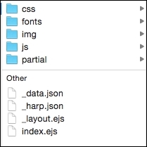
This is the root of our project, and here we'll find everything at a high level:
/css: This directory will contain all our custom CSS and the Bootstrap framework CSS files./fonts: This directory will be for holding any web fonts or icon web fonts. The directory isn't totally necessary, but I always include Font Awesome with all my projects so that I have an icon library to pull from./img: This directory will hold all the images for the project. For the boilerplate, we won't actually need any images, but we're setting this up for future projects too./js: This directory will hold any custom libraries and the Bootstrap framework's JavaScript file./partial: This directory will hold the pieces of code that we want to reuse in our templates, such as our header and footer._data.json: This is the file in which we will define any metadata that we want to use in our template. An example of this could be the page title for each web page._harp.json: This is a file for setting global properties, such as the title of the website, which is used on all pages._layout.ejs: This file is the scaffolding for our page. It includes the<head>and<body>sections of our document. At the very least, you need one layout in every Harp project. It is possible to have multiple layouts if you want to load in JavaScript libraries to only some pages.index.ejs: This file holds the actual code for our boilerplate home page. This is the body or content of the page minus the wrapping template pieces that are held in_layout.ejs.
Note
The Embedded JavaScript (EJS) template language is very similar to HTML and is therefore really easy to grasp. The advantage of using EJS is that it allows the use of elements such as variables.
Now that the root of our project is set up, let's set up the subdirectories. We'll start with the CSS directory by adding the following files. Now would be a good time to download the latest version of Bootstrap from http://getbootstrap.com if you haven't done so already. Again, just leave theme.less blank for now.
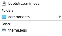
Within the components directory, create a Less file and name it _variables.less. Leave this file blank for the time being.
Note
Starting a file with an underscore in Harp will mark it as a template file that should not be a straight copy to the production directory. It is file that should be compiled into another to create a full HTML page or CSS style sheet.
Let's quickly walk through the files in the /css directory:
bootstrap.min.css: This is the Bootstrap CSS framework. When you download the Bootstrap package, there are a number of other CSS files. We don't need any of those files; we only need the minified version of the framework./components: This is a directory for storing the Bootstrap component's Less files. If you are customizing a Bootstrap component, you should create a Less file for it and enter the custom CSS.theme.less: This is the master file for our CSS. All our components should be imported into this file so that upon compilation, it will be a singletheme.cssfile for our project.
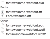
Bootstrap comes with Glyphicons out of the box, which is fine. I, however, prefer to use font awesome because their license is more flexible. To add font awesome to your project, head to http://fontawesome.io and download the package. Unzip it into your computer after downloading and copy the contents of the /fonts directory to your project's /fonts directory. Next, go to the /css folder and copy font-awesome.min.css to your project's /css directory. For now, that's all you need to do; we'll hook up everything else a little later. The /fonts directory should now look like this:
For our boilerplate, all that we need to do is copy bootstrap.min.js to our /js directory. Like the Bootstrap CSS, there are a few JavaScript files included in the download package. You can ignore the other files as we won't need them.
The last directory that we need to set up is our partials. If you come from the PHP world, note that partials are includes. They are little snippets of code that are reused across all or many of your pages, such as your header, footer, and navigation. Partials are one of the best features of Harp because you can update these template pieces in one place when changes occur, instead of updating on every page! For now, create two files in your /partial directory, called _header.ejs and _footer.ejs.
Now that we've finished setting up the basic structure of our project, we can move on to actually filling in some code for our .json and .ejs files.
I'm going to start with _harp.json before _data.json. This is because the first file deals with the global settings for our project. In this case, we're going to use _harp.json to set up a global variable that will map to the website name for our project. Later on, we'll insert this variable into our layout so that it appears on every page of our website. Enter the following code and save it:
{
  "globals": {
    "siteTitle": "My Bootstrap Boilerplate"
  }
}
What we've done here is set up a global variable named siteTitle and set its value to My Bootstrap Boilerplate. Once we insert this variable into our layout, the title will be shown on every page of our project.
Note
This is only a fraction of what you can do here. Check out http://harpjs.com/docs/development/globals to learn more about globals.
If _harp.json
applies to all the pages in our website, _data.json contains page-specific data for our project. In this case, I'm going to set up a variable that can be used to insert the page name for each page of my project:
{
  "index": {
    "pageTitle": "Home"
  }
}
Here's how this data works:
The
indexrefers to the name of myejstemplate that I want to target. Currently, we have only one, calledindex.ejs.The
pageTitleis a variable I created for the title of each of my pages. We'll need to insert this variable into the layout later on.Finally, I entered a value of
Homefor my variable.
Again, there is more that you can do with metadata in Harp, but at this point, this is all that we need. To learn more about Harp metadata, visit http://harpjs.com/docs/development/metadata.
As I mentioned previously, _layout.ejs is the wrapper file for my index.ejs page template. Layouts can be reused, and pages will always default to using _layout.ejs unless you tell them otherwise. If you want to create a second layout for use on a specific page, you simply have to create a new file called something like _layout-two.ejs. Then, in your _data.json file, you have to add a second line to your template declaration that points to the new layout:
{
  "index": {
    "pageTitle": "Home",
    "layout": "_layout-two"
  }
}Now, that's an example of how to use multiple layouts. For our boilerplate, we'll need only one layout. A layout file can be written in mostly normal HTML, but we need to insert a yield property to tell Harp where to insert the content from the page file (index.ejs). We also need to insert the variables that we defined in _harp.json and _data.json. Open up your _layout.ejs file in the root of the project and insert the following <head> code:
<!DOCTYPE html>
<html lang="en">
<head>
  <meta charset="utf-8">
  <meta http-equiv="X-UA-Compatible" content="IE=edge">
  <meta name="viewport" content="width=device-width, initial-scale=1">
  <title><%- pageTitle %> | <%- siteTitle %></title>

  <link rel="stylesheet" type="text/css" href="css/bootstrap.min.css">
  <link rel="stylesheet" type="text/css" href="css/font-awesome.min.css">
  <link rel="stylesheet" type="text/css" href="css/theme.css">

  <!-- HTML5 shim and Respond.js for IE8 support of HTML5 elements and media queries -->
  <!-- WARNING: Respond.js doesn't work if you view the page via file:// -->
  <!--[if lt IE 9]>
    <script src="https://oss.maxcdn.com/html5shiv/3.7.2/html5shiv.min.js"></script>
    <script src="https://oss.maxcdn.com/respond/1.4.2/respond.min.js"></script>
  <![endif]-->
</head>
The preceding code is the standard Bootstrap header with some small changes:
Always load the Bootstrap CSS first, as you may want to overwrite something in your theme
Include the font awesome CSS file so that you can use the icons in your projects
Insert your theme CSS file, which will contain all your custom CSS
If you look at the <title> tag in <head>, you'll notice a couple of variables. These are the two variables that we set up in _harp.json and _data.json. On compiling, pageTitle and siteTitle will be inserted into the page layout. Depending on the page, the proper pageTitle variable will be inserted.
Now that we have the <head> element of our layout set up, let's enter the code for <body>:
<body>
  <%- partial("partial/_header") %>

  <%- yield %>

  <%- partial("partial/_footer") %>

  <!-- javascript //-->
  <script src="//ajax.googleapis.com/ajax/libs/jquery/1.11.1/jquery.min.js"></script>
  <script src="js/bootstrap.min.js" type="text/javascript"></script>
</body>
</html>
Now, the <body> code is going to look a little different from what we are used to with Bootstrap and HTML. Let me go through each part of the layout:
The
headerpartial will include our header code, which we haven't set up yet.The yield tag is the marker for loading in the contents of our pages. In this case, it will load
index.ejs.Like the header, the footer partial will be included wherever the tag is inserted.
At the bottom, I've included jQuery and a link to the Bootstrap JavaScript framework that is in our project.
To set up the header, we need to edit the _header.ejs file that we created earlier in this chapter. Head to the /partial directory and open up _header.ejs. Then paste the following in the Bootstrap navbar code:
<nav class="navbar navbar-default" role="navigation">
  <div class="container-fluid">
    <div class="navbar-header">
      <button type="button" class="navbar-toggle collapsed" data-toggle="collapse" data-target="#navbar1">
        <span class="sr-only">Toggle navigation</span>
        <span class="icon-bar"></span>
        <span class="icon-bar"></span>
        <span class="icon-bar"></span>
      </button>
     <a href="index.html" class="navbar-brand"><%- siteTitle %></a>
    </div>

    <div class="collapse navbar-collapse" id="navbar1">
      <ul class="nav navbar-nav">
       <li><a href="index.html">Home</a></li>
      </ul>
    </div>
  </div>
</nav>
The code for the header is pretty straightforward, except for one thing; it's your standard Bootstrap navbar. One more thing that is different is that I've used the siteTitle global variable again so that siteTitle will automatically be inserted into the navbar brand for each page upon compilation. This is a simple example of how you can reuse variables in your templates.
Next, open up the _footer.ejs file, which is in the same /partial directory. Here, we'll just want to insert some super simple footer code that can be used as a placeholder. Notice how I'm wrapping my footer in a container-fluid class. It's a good idea to componentize the pieces of your theme so that they are easily interchangeable and don't rely on markup in other components or partials:
<div class="container-fluid">
<div class="row">
<div class="col-lg-12">
© 2015 Matt Lambert
</div>
</div>
</div>As you can see, it is super simple! The last template or HTML/EJS work that we need to do is set up the body of our page, which lives inside of index.ejs. For our boilerplate, let's create a super simple piece of page content:
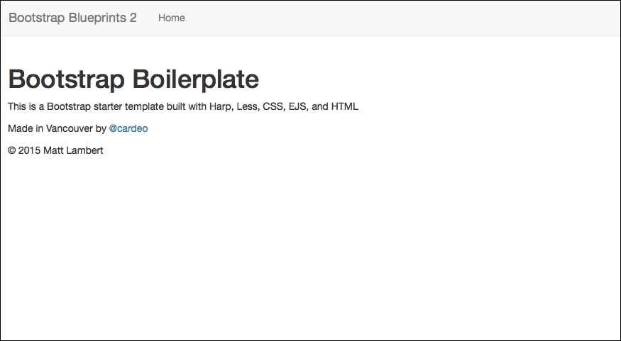
<div class="container-fluid">
  <div class="row">
    <div class="col-lg-12">
      <h1>Bootstrap Boilerplate</h1>
      <p>This is a Bootstrap starter template built with Harp, Less, CSS, EJS, and HTML</p>
      <p>Made in Vancouver by <a href="http://twitter.com/cardeo">@cardeo</a></p>
   </div>
  </div>
</div>
This chunk of code should be self-explanatory. I've purposely kept it simple so that you can easily see where the lines between page templates and partials are. Now that the base of our project is set up, let's compile and preview it!
Now that our initial project is set up, it's time to compile it and test it out to make sure that everything works. When we compile our project for the first time, Harp creates a directory in the root of our project, called /www. Within this directory, it will dump all the compiled HTML, CSS, and JavaScript files. When you are ready to publish your project, simply upload the contents of this directory to your server. See how simple and clean it is? Your development and production files live in the same project directory but are totally separate.
Note
You should never manually edit any of the files in your /www directory. If you do, on the next compilation, any changes you make will be overwritten.
The compilation of your project is done from the command line or terminal app. If you have closed it, open it again and navigate to your project directory. Once you get there, run the following command:
$ harp compile
If all goes well, a new line should appear in the terminal. If there is an error, Harp will give you an error message with a clue to the problem. Let's assume that all has gone well and everything has worked fine. Go to your project directory and look for the /www directory. If it's there, it means that the compile worked fine.
The next thing you'll want to do is actually test your project in a browser. To do this, we can use Harp's built-in web server to test the website locally. This is a great feature because you can test drive your project locally without having to upload it to the Internet. To fire up the server, enter the following command in the terminal from your project directory:
$ harp server --port 9000
This will deploy your project locally on port 9000. Open up a web browser and go to http://localhost:9000 to view the website.
Your page should look like this:
Now that you have the server running, you can take advantage of one of Harp's other awesome features. Every time you make a change to a template file, CSS file, and so on, you don't have to recompile your project. You can simply save the file and refresh the browser, and you'll see the updated version. This will save you so much time! One thing to remember, however, is to make sure you compile when you're done so that the changes are applied to the /www directory.
I encourage you to memorize the preceding commands, but if you want something easier to remember, you can use $ harp server www to run the local server. The only problem with this command, however, is that I've found it to be a bit buggy. It will start the server but updates to templates in the background won't always be picked up. A more reliable method is to manually declare which port to use when you fire up the server. Now that our project is all set up and running, it's time to set up our Less configuration to theme our project.
A great advantage of using Harp is that it has a built-in Less compiler. When you run the $ harp compile command, it compiles both your .ejs templates and your .less files into regular HTML and CSS. This is much easier than using something like less.js, which you would have to remove from production. When you're compiling your project for the first time, ensure that you include some code inside your theme.less file. Otherwise, theme.css will not be written.
Head back to the css/components directory that you created earlier and open up the _variables.less file. Within this file, we'll configure what I call global CSS variables. Moreover, within this file, we'll define only those variables that apply across our entire website. Component-specific variables have no place in this file. I know that some developers like to have one big file for variables, but I prefer to keep the component-specific ones out in their own Less files. We will see more on that later, when we dive into custom components. For now, let's start pasting the following code in _variables.less.
Let's start by inserting some color variables that can be used throughout all our Bootstrap projects:
@black: #000;
@dark-grey: #333;
@grey: #ccc;
@light-grey: #ebebeb;
@off-white: #f5f5f5;
@white: #ffffff;
@blue1: #3498db;
@blue2: #2980b9;
@red1: #e74c3c;
@red2: #c0392b;
@yellow1: #f1c40f;
@yellow2: #f39c12;
@green1: #2ecc71;
@green2: #27ae60;
@orange1: #e67e22;
@orange2: #d35400;
@aqua1: #1abc9c;
@aqua2: #16a085;
@purple1: #9b59b6;
@purple2: #8e44ad;
@navy1: #34495e;
@navy2: #2c3e50;
As you'll see, I like to define a fairly large color palette. But this doesn't mean that all my projects will use all of these colors. However, like a good typography, it's a good idea over time to develop a library of colors that work well together. We can then easily include them in all our projects so that we have colors that work well together right at our fingertips. When you are diving deep into theming, this is really valuable because you don't have to go and look for a new color palette with every new theme. You already have a collection of colors that you can pull from, which will speed up your theming process.
Lets add the background variables:
@primary-background: @white;
@secondary-background: @off-white;
@third-background: @light-grey;
@fourth-background: @grey;
@inverse-background: @dark-grey;
Tip
The preceding code is my boilerplate for backgrounds. Note how these colors use a variable name for their value and not a hexadecimal value. The reason that this is done is to speed up theming. Instead of having to change a color in two places, we only have to change it in one, and then it inherits throughout our other variables. Here are a few more key points about backgrounds.
The variable naming convention here is similar to that of Bootstrap, for consistency. This also makes it easier to remember a variable name, such as primary, as against something like white-background.
At the very least, you should have a primary, a secondary, and an inverse background. I like to include a couple more, but feel free to scale this back a bit if it makes it easier for you.
As with our backgrounds, we are following the Bootstrap naming conventions for our text colors:
@primary-text: @dark-grey;
@light-text: @light-grey;
@loud-text: @black;
@inverse-text: @white;
@heading-text: @dark-grey;
Consistency is the key as it makes it easier to remember variable names. It is critical when you're dealing with a large framework that you make things as easy as possible to remember. Again, make sure you use color variables for the values here and not actual hexadecimal numbers.
Defining the link colors is pretty straightforward:
@primary-link-color: @blue1;
@primary-link-color-hover: @blue2;
One thing that I'll point out here is that this is the first example where you'll see why you should have at least two versions of every color that you use in your palette. Things such as hover states usually require a base color and a darker or lighter version of the same color to indicate a change in hovering. You may want to expand this section to include a second or even third-link color variation.
The border variable is the first place where you'll see some values that aren't only color-based:
@border-color: @light-grey;
@border-size: 1px;
@border-type: solid;
@border-focus: @grey;
@secondary-border-color: @blue1;
In this case, you should always set your size to 1px. The reason for this is that you can use a Less operation like the following to increase the size of your border. Starting from 1px makes your operations simple and easy to follow for other developers who may be maintaining or editing your code:
.good-class {
  border-size: (@border-size + 1);
}

.bad-class {
  border-size: 2px;
}Next we need to setup the global settings for our typography variables. We'll set our body and heading font stacks, a base font size and line height.
@body-copy: "Helvetica Neue", helvetica, arial, verdana, sans-serif;
@heading-copy: "Helvetica Neue", helvetica, arial, verdana, sans-serif;
@base-font-size: 14px;
@font-size: 1em;
@base-line-height: 1.5;
When I set up typography for a theme, I like to follow a few simple rules:
Make sure you define at least a body and a heading copy variable.
Set the base font size as a pixel value.
Set the actual font size to
1emand use this variable throughout your custom CSS. In this way, you will be using a relative value that is easier with operations. This is exactly the same as the preceding border example.I personally prefer to reset Bootstrap's line-height to 1.5 for easier math.
The only layout variables that you should be setting in your globals are margin and padding:
@margin: 1em;
@padding: 1em;
Both should be set to 1em for easy relative operations. This follows the same unit of measurement patterns set with borders and typography.
The other element that I recommend including in your global Less file is mixins. In my opinion, there are only two of them (and maybe only one) that you definitely need to include to speed up your Bootstrap theming.
The border radius is by far the most important as it is used a ton through Bootstrap components:
.round-corners (@radius: 2px) {
-moz-border-radius: @radius;
-ms-border-radius: @radius;
border-radius: @radius;
}
Make sure you set this up and use it for everything. If you are thorough, you can change the border radius of all elements in one place. An example of this would look like the following:
.btn {
  /* fill in the rest of the styles here */
  .round-corners;
}
Now, if I change my @radius value to a different pixel amount, it will inherit down to my button corners. Do this for all your Bootstrap components!
Another property that I use heavily in my themes is the animations or transitions property:
.transition (@transition: background .1s linear) {
-moz-transition: @transition;
-webkit-transition: @transition;
transition: background @transition;
}
I find that a little transition, when added, can add a lot to a UI. Instead of defining this from the ground up on every component, use this simple mixin. It will speed up your theming time and also ensure that transitions are consistent across your entire theme. That's just good design and coding. Here's an example that shows you how to apply the round corners and transition mixins to a button:
.btn {
  /* fill in the rest of the styles here */
  .round-corners;
  .transition;
}
This completes your _variables.less file. Save the file and close it. Next, we'll cover the setup of the master theme file for our project.
Now that we've set up our variables file, we need to set up the master theme that we'll import it into. The master theme file, or theme.less, is the primary file that we will link in the <head> section of our pages. I've organized the theme using the Scalable and Modular CSS (SMACSS) system. Using a modular approach while coding the CSS will make the job easier and the code more maintainable over time.
The scalable and modular CSS system was created by Jonathan Snook, who is currently a product manager at Shopify. It divides your style sheet into five sections in order to make it easier to categorize your CSS. Let's review each SMACSS category to see how it applies to our Bootstrap theme structure.
A base rule applies to any element that is an element selector, descendent selector, child selector, or pseudo-class. It doesn't apply to CSS classes or IDs. These are basically all your core HTML tags.
The layout section is dedicated to any custom classes that you've written for the layout of your project. This could be something simple, such as a header, or something more complex, such as a widget. If you're following best practices, your layout should only use classes. However, if you have used some IDs, you should include them here as well.
This is the big one for Bootstrap, because this is where you should import all your component Less files. Later on, I'll explain how you should break down each Bootstrap component into its own Less file and then import it into the master theme. The code for this will look a little something like the following:
@import "components/_badges.less";
@import "components/_typography.less";
@import "components/_tables.less";
These styles refer to anything that applies to a state change, such as form validation or alert bars.
This part of your style sheet is optional. You may cover it in the preceding sections. However, if you find yourself needing a section for styles specific to your theme, this is where you should insert them.
Now that I've explained how we'll organize our master theme, let's actually start putting it together. The first thing we need to do is import the _variables.less file that we created. We want this to be the first thing that we load into the theme, so we place the following line of code at the top:
@import "components/_variables";
The next section that we want to set up in our theme is the base. Insert the following boilerplate CSS. We want to keep this really basic so that we have a starting point for our future projects:
body {
  background: @primary-background;
  font-family: @body-copy;
  font-size: @base-font-size;
  line-height: @base-line-height;
  color: @primary-text;
}

ul,
ol {
}

li {
}

a, a:link, a:visited {
}

a:hover {
}

p {
}

hr {
}
I'm not even going to fill in any of the tags at this point, as they will be defined in the actual project. The only tag I will fill in is <body>. Let's review the properties that we have added to the body tag at the top of the preceding section of code:
We'll set our background to the
@primary-backgroundvariable. The@primary-backgroundvariable should be set to the color you want for the background of your project.We set the
font-familyproperty to our@body-copyvariable.Set the
font-sizeproperty to the@base-font-sizevariable. Remember that this is the one that has the pixel value, and it should be a value of this type on the body tag. In any future use of thefont-sizeproperty, you should use the@font-sizevariable.The line-height is set using the
@base-line-heightvariable.Finally, we'll set the font color to our
@primary-textvariable.
As I mentioned earlier, we'll leave the rest of this section blank as it will be filled in to match the actual project that we will be designing in the future.
Since this is a boilerplate project, we don't really have a layout. We can fall back on the Bootstrap's grid and we don't need anything custom. Therefore, just leave this section blank for now, but you might want to insert a comment to show where the layout code should be inserted for future projects:
/*
02. LAYOUT
Styles specific to your layout or website
*/
This section should be a list of @import keywords that load into our Less component files. As I mentioned earlier, you should break down any custom Bootstrap component CSS into its own Less file and save it in the /components directory. This is the way to keep your CSS neat and tidy in the development version of your theme. On compile, all of these Less files will be combined into a single CSS file called theme.css. However, for development purposes, it makes a ton of sense to break down the CSS for easier maintenance and writing.
As you create a project, you may not need to overwrite code in every Bootstrap component. Personally, I think it's good practice to customize everything, but it's not always practical to do this. The following is a list of potential Less component files that you can make with Bootstrap:
badgesbreadcrumbsbuttonsbuttongroupsbuttondropdownscarouselcodecollapsedropdownformsiconsinputgroupsimageshelpersjumbotronlabelsThe
listgroupThe
mediaobjectmodalnavsnavbarpagerThe
pageheaderpaginationpanelspillspopoverprogressbarsscrollspytablestabsthumbnailstooltiptypographywell
When you're creating a component Less file, first save it at css/components, and then use the @import keyword to import it into theme.less. You need a different @import statement for each file to load it in:
@import "components/_badges.less";
@import "components/_typography.less";
@import "components/_tables.less";
With Bootstrap, the States section works much like modules, but I like to divide the following two components into the states section:
@import "components/_alerts.less";
@import "components/_form-validation.less";
These two make sense from a Bootstrap component standpoint. If you are using a different JavaScript library to perform your form validation, you should include the corresponding styles here. This should also apply for any component that has a state change.
The final section is the theme, and it is totally optional. One thing that would be theme-specific is your color palette. I break my color palette into another Less file and import it under the modules section.
You may be wondering what goes into this colors.less file, since we have defined our colors in the _variables.less file. In the variables file, we only assign hexadecimal numbers to variables. In the colors.less file, I assign these variable names to actual CSS classes so that we can use them in our layouts. In this way, we stay more modular because we can assign a color class to a widget instead of putting the color in the widget's CSS layout code. I usually define a text and background color class for each color in my palette:
.red1 {
  color: @red1;
}

.red1-bg {
  background: @red1;
}

.red2 {
  color: @red2;
}

.red2-bg {
  background: @red2;
}
Now, those class names are way easier to remember than hexadecimal numbers, and this allows you to apply them to a widget, as follows:
<div class="custom-box red1-bg">this is a custom box with a red background</div>
Using this method, I can leave out any color styles in my custom-box class and only worry about layout styles. I can then apply the color using a CSS class, which is much more modular and reusable.
In this chapter, you learned how to—and why it's important to—build a development environment with Harp.js. You also learned how to write templates in EJS using variables and partials. Lastly, you got to know how to set up your theme with Less and compile your project for production.
In the next chapter, we'll begin our first project, where we'll build a full-fledged restaurant website. Eager to get started? Flip those pages and dive right in!