


With the advent and increase in popularity of the mobile web, developers have had to adapt themselves to handling new challenges, such as different layouts in different resolutions, the new user experience paradigm, and optimization for low-bandwidth connections. While facing this, there were also a lot of old problems related to browser compatibility and lack of patterns in the community.
This was the outline scenario when the Bootstrap framework arrived. Developed by Twitter, the main goal of Bootstrap is to provide a web frontend framework for responsive developing with cross-browser compatibility. It is awesome! Developers fell in love with it and started to adopt it right away.
Therefore, to cover this book's objective of presenting the Bootstrap framework to build responsive, mobile-first websites faster than ever before, we must get started by setting up our work environment in the best recommended way. Thus, the topics that we will cover in this chapter are:
Getting Bootstrap
Setting up Bootstrap in a web page
Building the first Bootstrap example
The container element tag
Support sources
Framework compatibility
There is some version of the framework, but in this book, we will provide support for the latest Bootstrap 3 version (which is v3.3.5), along with the newest version 4 (which is 4.0.0-alpha). When a feature or component is differently supported by one of these versions, we will point it out properly.
First of all, access the official website at http://getbootstrap.com/ and click on the Download Bootstrap button, as shown in the following screenshot:

Tip
Downloading the example code
You can download the example code files for this book from your account at http://www.packtpub.com. If you purchased this book elsewhere, you can visit http://www.packtpub.com/support and register to have the files e-mailed directly to you.
You can download the code files by following these steps:
Log in or register to our website using your e-mail address and password.
Hover the mouse pointer on the SUPPORT tab at the top.
Click on Code Downloads & Errata.
Enter the name of the book in the Search box.
Select the book for which you're looking to download the code files.
Choose from the drop-down menu where you purchased this book from.
Click on Code Download.
Once the file is downloaded, please make sure that you unzip or extract the folder using the latest version of:
WinRAR / 7-Zip for Windows
Zipeg / iZip / UnRarX for Mac
7-Zip / PeaZip for Linux
Then you will be redirected to another page that contains these buttons:
Download Bootstrap: This is the release with the files already compiled.
Download source: Use this if you want to get the source for customization. This requires knowledge of the Less language.
Download Sass: Here, you can get the source code in the Sass language.
Click on the Download Bootstrap button to get the framework, since we will cover the full framework using, not Sass, but just HTML, CSS, and JavaScript. After the download, extract the files and you will see that the framework is organized in folders.
Tip
Other versions and releases
Check out the official repository at https://github.com/twbs/bootstrap/ to pick up other versions and see the new releases under development. You will also be able to see other features and community activity.
If you want to go hands-on straightforward with version 4, go to http://v4-alpha.getbootstrap.com/ and download it, or enter the GitHub repository and select the corresponding branch of version 4.
After you've extracted the files, you will see some folders. The first one, in alphabetical order, is css. Here, you will find the main CSS file (named bootstrap.css), other files related to the minified version, and a bootstrap-theme.css file, which is a simple theme of using the Bootstrap components.
There is also a fonts folder; it contains the files used for the icon components that we will see in future chapters. Finally, there is a folder named js, where we can find the bootstrap.js file, the minified version, and the specification for npm.
Now that we have downloaded the framework and covered its basic file architecture, we will advance to setting up Bootstrap on a web page.
First, let's explicit the folder structure that we will be using in this book. In a folder that we will call main_folder, we extract the Bootstrap contents and create a file called hello_world.html at the same level. Inside the Bootstrap contents will be some folders for fonts, CSS, and JavaScript. The final layout should be like this:

Now, we will add the recommended setup of the Bootstrap framework to the hello_world.html file. Open it in your preferred code editor and add the outline HTML code, like this:
<!DOCTYPE html>
<html>
<head>
    <title>Hello World!</title>
</head>
<body>
    Hello World
</body>
</html>
Next, add the code for loading css inside the head tag:
<!DOCTYPE html>
<html>
<head>
    <title>Hello World!</title>
    <link rel="stylesheet" href="css/bootstrap.css">
</head>
<body>
    Hello World
</body>
</html>
And at the end of the body tag, load the JavaScript file:
<!DOCTYPE html>
<html>
<head>
    <title>Hello World!</title>
    <link rel="stylesheet" href="css/bootstrap.css">
</head>
<body>
    Hello World
    <script src="js/bootstrap.js"></script>
</body>
</html>
Open the hello_world.html file in a browser (we will use Google Chrome in this book) and open the JavaScript console. In Chrome, it can be found at Options button (the hamburger button on right upper corner. Go to More Tools | Developer Tools, just as shown in the following screenshot, and click on Console in the opened window. You will see a message saying Bootstrap's JavaScript requires jQuery:

jQuery is a cross-platform JavaScript library, and it is the only third-party requirement for Bootstrap. To get it, we recommend the download from the official website and the latest version (https://jquery.com/download/). Bootstrap requires version 1.9 or higher.
Note
Just use versions above 2.x if you do not want to add support for Internet Explorer 6, 7, and 8. In this book, we will use version 1.11.3.
Copy the jQuery file inside the js folder, and load it in the HTML code at the end of the body tag but before the bootstrap.js loads, like this:
<script src="js/jquery-1.11.3.js"></script>
<script src="js/bootstrap.js"></script>
Bootstrap has three tags that must be at the beginning of the <head> tag. These tags are used for text encoding and improved visualization on mobile devices:
<meta charset="utf-8">
<meta http-equiv="X-UA-Compatible" content="IE=edge">
<meta name="viewport" content="width=device-width, initial-scale=1">
The viewport tag is related to the mobile-first philosophy. By adding it, you ensure proper rendering in mobile devices and touch zooming.
You can also disable the zoom functionality by appending user-scalable=no in the content key. With this option, users will only be able to scroll on the web page, resulting in a feel of using a native mobile application.
Note
If you are going to use this tag, you must be sure that users need not use the zoom feature and it will create a good user experience. Therefore, use it with caution.
Also, if you want to add support for older versions of the Internet Explorer (IE) browser (older than version 9), you must add some libraries to have fallback compatibility for the HTML5 and CSS3 elements. We will add them via CDN, which is the Bootstrap recommendation. So, add these lines at the end of the <head> tag:
<!--[if lt IE 9]>
    <script src="https://oss.maxcdn.com/html5shiv/3.7.2/html5shiv.min.js"></script>
    <script src="https://oss.maxcdn.com/respond/1.4.2/respond.min.js">
</script> <![endif]-->
Tip
Do you know what CDN is?
CDN, the abbreviation of Content Delivery Network, is a term used to describe a network of computers that are connected in order to deliver some content. A CDN should provide high availability and performance.
At this point, the file should be like this:
<!DOCTYPE html>
<html>
  <head>
    <meta charset="utf-8">
    <meta http-equiv="X-UA-Compatible" content="IE=edge">
    <meta name="viewport" content="width=device-width,
initial-scale=1">
    <title>Hello World!</title>

    <link rel="stylesheet" href="css/bootstrap.css">

    <!--[if lt IE 9]>
      <script src="https://oss.maxcdn.com/html5shiv/3.7.2/html5shiv.min.js">
      </script>
      <script src="https://oss.maxcdn.com/respond/1.4.2/respond.min.js">
      </script>
    <![endif]-->
  </head>
  <body>
    Hello World!

    <script src="js/jquery-1.11.3.js"></script>
    <script src="js/bootstrap.js"></script>
  </body>
</html>
This is our base page example! Keep it for the purpose of coding every example of this book and for any other web page that you will develop.
We would like to point out that Bootstrap requires the doctype HTML5 style before the <html> tag:
<!DOCTYPE html>
<html>
    ... <!--rest of the HTML code -->
</html>Now we are all set for the framework. Replace the Hello World! line in the body tag with this:
<!DOCTYPE html>
<html>
<head>
<meta charset="utf-8">
<meta http-equiv="X-UA-Compatible" content="IE=edge">
<meta name="viewport" content="width=device-width, initial-scale=1">
<title>Hello World!</title>
<link rel="stylesheet" href="css/bootstrap.css">
<!--[if lt IE 9]>
<script src="https://oss.maxcdn.com/html5shiv/3.7.2/html5shiv.min.js">
</script>
<script src="https://oss.maxcdn.com/respond/1.4.2/respond.min.js">
</script>
<![endif]-->
</head>
<body>
<div class="jumbotron">
<h1>Hello, world!</h1>
<p>This is our first sample example that will be more awesome in the next chapters!</p>
<a class="btn btn-primary btn-lg" href="#" role="button">
Bootstrap by Example, Chapter 1
</a>
</div>
<script src="js/jquery-1.11.3.js"></script>
<script src="js/bootstrap.js"></script>
</body>
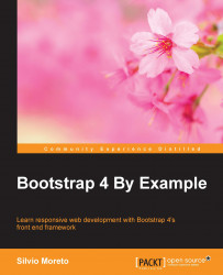
</html>Open the
hello_world.html file in the browser, and it must appear like what is shown in the following screenshot:
Congratulations! You have created your first Bootstrap web page. It is simple but very important to understand the details of how to set the framework correctly to keep the recommendation pattern.
Furthermore, we added some components in this example that will be explained in future chapters, but you can start becoming familiar with the CSS classes used and the placement of the elements.
You may notice that in our example, the page content is too close to the left-hand side and without a margin/padding. This is because Bootstrap has a required element called container that we have not added in the example.
The container tag must be placed to wrap the site content and nest the grid system (we will present the grid system, called scaffolding, in the next chapter). There are two options for using the container element.
The first one is for creating a web page responsive with a fixed-width container. This one will add responsive margins depending on the device viewport:
<div class="container">
    ...
</div>
In case you want a full-width container, covering the entire width of the viewport, use container-fluid:
<div class="container-fluid">
    ...
</div>
In our example, we will create a fixed-width responsive website. So, our code will be like this:
<!DOCTYPE html>
<html>
<head>
<meta charset="utf-8">
<meta http-equiv="X-UA-Compatible" content="IE=edge">
<meta name="viewport" content="width=device-width, initial-scale=1">
<title>Hello World!</title>
<link rel="stylesheet" href="css/bootstrap.css">
<!--[if lt IE 9]>
<script src="https://oss.maxcdn.com/html5shiv/3.7.2/html5shiv.min.js">
</script>
<script src="https://oss.maxcdn.com/respond/1.4.2/respond.min.js">
</script>
<![endif]-->
</head>
<body>
<div class="container">
<div class="jumbotron">
<h1>Hello, world!</h1>
<p>This is our first sample example that will be more awesome in the next chapters!</p>
<a class="btn btn-primary btn-lg" href="#" role="button">
Bootstrap by Example, Chapter 1
</a>
</div>
</div>
<script src="js/jquery-1.11.3.js"></script>
<script src="js/bootstrap.js"></script>
</body>
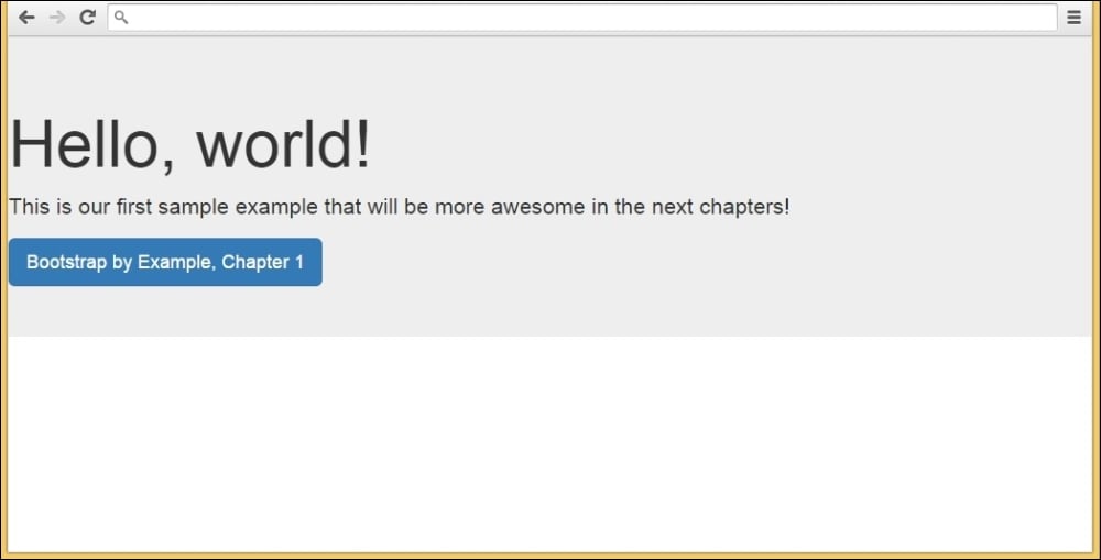
</html>The next screenshot shows what our example looks like with the addition of the container class. I recommend for practicing and complete understanding, that you change the container class to .container-fluid and see what happens. Change your viewport by resizing your browser window and see how Bootstrap adapts your page visualization:
The preceding image shows the differences between using .container and .container-fluid. See the differences of the margins in the sides.
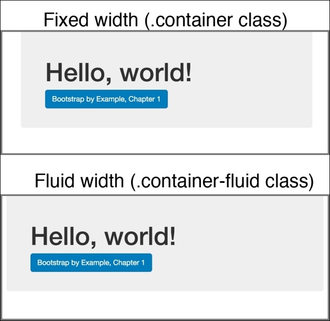
Soon during this book, you will be able to create more complex and beautiful websites, using more advanced Bootstrap components such as the show case shown in the following screenshot, which is an example of a landing page.
Do not worry. We will start at a slow pace to reveal the basics of Bootstrap and how to use it properly on our web page. The following example is our first goal when we develop a landing page example. Just keep in mind that we will always use the same basis presented in this chapter.
Bootstrap also offers a setup using CDN to load the framework. It's much easier to set up but comes with some regards. Instead of the <link> that we created to load the CSS, we must load it from CDN using this:
<link rel="stylesheet" href="https://maxcdn.bootstrapcdn.com/bootstrap/3.3.5/css/bootstrap.min.css">
And to load the JavaScript file, replace the JavaScript <script> tag with the following line:
<script src="https://maxcdn.bootstrapcdn.com/bootstrap/3.3.5/js/bootstrap.min.js"></script>
There is some discussion on whether or not to use CDN. We will not touch upon this point, but the main pro is having the content provided faster with high availability. The main con is that you cannot have direct control over what is in the content provided, having unreliable imported code.
The decision of whether or not to use CDN depends on the case. You should consider the different arguments and choose an option that best fits your web page. There is no right or wrong, just different points of view.
The Bootstrap framework is discussed in several places across the Internet. It is important to have an engaged community that keeps evolving the framework and supporting it. You can have support and acquire more knowledge by going to some other resources, such as the following:
The Bootstrap official GitHub repository. Here (https://github.com/twbs/bootstrap), you can find the road map development and the newest releases, report issues, and solve them by making a pull request.
The Bootstrap official documentation (http://getbootstrap.com/) provides some additional information of the framework's usage and support.
Bootstrap Blog (http://blog.getbootstrap.com/) is the best way to follow news about Bootstrap and read the releases notes.
Bootstrap Expo (http://expo.getbootstrap.com/) is a showcase web page where you can see some beautiful websites that use the framework and resources to be used within such as plugins, themes, and so on.
Stack Overflow questions related to Bootstrap (http://stackoverflow.com/questions/tagged/twitter-bootstrap). This is one of the best means of communication to get help from for your issues. Search for questions related to yours, and if you can't find something related, I guarantee that you will have an answer very soon.
There are many other resources spread across the Internet. Use them all to your advantage, and appreciate the taste of developing in fast pace with the best frontend framework of our time.
Bootstrap has an official HTML lint called Bootlint (https://github.com/twbs/bootlint). It checks the DOM for mistakes in using Bootstrap elements and components. Add Bootlint to avoid mistakes that delay your development. Check out the repository for installation and usage instructions.
Bootstrap is one of the best frameworks for building web apps. Since you may use the same layout pattern across the web app, with premade classes and themes provided by the framework, you can speed up your development while maintaining the coherence of the elements used.
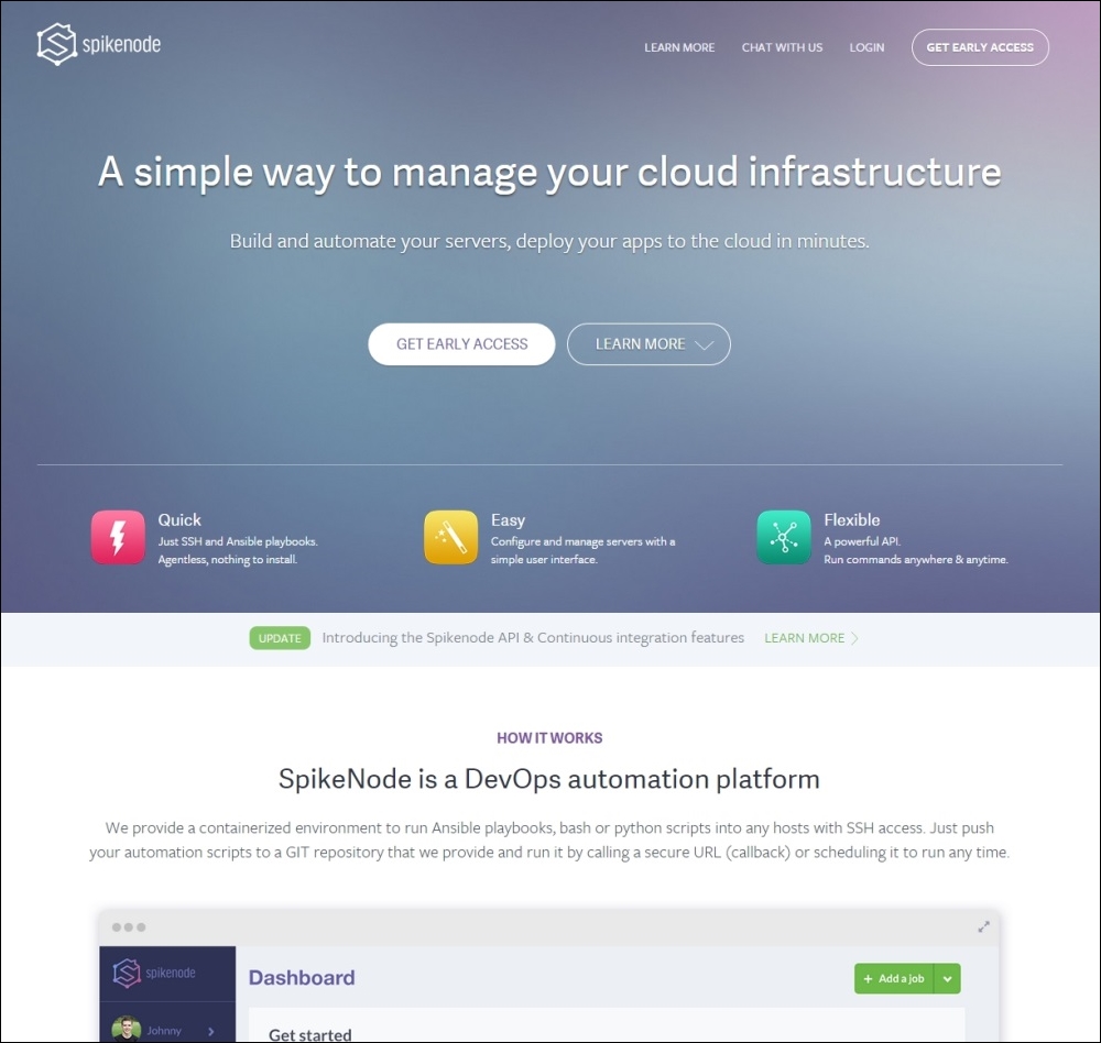
After the framework's release, Twitter adopted it like many other web apps as well. The following screenshot shows a great example of a fluid web app that uses Bootstrap with a fluid container:

The Bootstrap framework supports the most recent versions of the most used browsers. However, depending on the browser, the elements' rendering might look a little different from others, such as in the Chrome and Firefox Linux versions.
Internet Explorer's (IE) old versions do not have some properties from CSS3 and HTML5 that are used in the framework, so be aware of this when supporting these browsers. The following table presents the official browser compatibility.
Also, with the new version 4 of the framework, some compatibilities have been dropped. They decided to drop the support that existed for IE8, since it was dragging down the addition of new features, and now Bootstrap is able to take advantage of the use of some new CSS features.
With regard to this, version 4 moved from pixels to rems and ems measures to make responsive and resizing easier, and with that, they dropped support for iOS 6 as well:
|
Chrome |
Firefox |
Internet Explorer |
Opera |
Safari | |
|---|---|---|---|---|---|
|
Android |
Yes |
Yes |
N/A |
No |
N/A |
|
iOS |
Yes |
N/A |
N/A |
No |
Yes (iOS 7 + for v4) |
|
OS X |
Yes |
Yes |
N/A |
Yes |
Yes |
|
Windows |
Yes |
Yes |
Yes (IE9 + for v4) |
Yes |
No |
Tip
The meaning of em and rem
The units em and rem have moved from trending to reality! They are enforced as present in our context and have now gained the support of Bootstrap. The main difference between em and rem is that they are relative unit metrics, while pixels are not. em is a unit relative to the parent font size and rem is a unit relative to the root element, perfectly fitting this responsivity development context.
In this chapter, you learned some basic concepts about using the Bootstrap framework. These are the key points for creating web sites with high quality. Knowing them in depth gives you a huge advantage and helps with the handling of future problems.
The chapter's goal was to show the recommended setup for the Bootstrap framework, presenting the placement of the tags, libraries import, and creating a very simple web page. Remember that consistency across the website is the main thing about Bootstrap, saving your precious time.
Also keep in mind that when starting a new web page, you have to guarantee a good placement of the main tags and components no matter how you created it (manually, boilerplate, or in other ways). Many problems stem from inadequate groundwork.
We also presented some resources from which you can acquire further knowledge or any kind of help. You now belong to a big "open arms" community that you can always count on.
Now that we have this background, let's attack some real-world problems! In the next chapter, we will start developing a very common real-life example, which is a landing page, while presenting some Bootstrap components, HTML elements, and grid systems.