


 Download code from GitHub
Getting to Know NumPy, pandas, Arrow, and Matplotlib
One of Python’s biggest strengths is its profusion of high-quality science and data processing libraries. At the core of all of them is NumPy, which provides efficient array and matrix support. On top of NumPy, we can find almost all of the scientific libraries. For example, in our field, there’s Biopython. But other generic data analysis libraries can also be used in our field. For example, pandas is the de facto standard for processing tabled data. More recently, Apache Arrow provides efficient implementations of some of pandas’ functionality, along with language interoperability. Finally, Matplotlib is the most common plotting library in the Python space and is appropriate for scientific computing. While these are general libraries with wide applicability, they are fundamental for bioinformatics processing, so we will study them in this chapter.
We will start by looking at pandas as it provides a high-level library with very broad practical applicability. Then, we’ll introduce Arrow, which we will use only in the scope of supporting pandas. After that, we’ll discuss NumPy, the workhorse behind almost everything we do. Finally, we’ll introduce Matplotlib.
Our recipes are very introductory – each of these libraries could easily occupy a full book, but the recipes should be enough to help you through this book. If you are using Docker, and because all these libraries are fundamental for data analysis, they can be found in the tiagoantao/bioinformatics_base Docker image from Chapter 1.
In this chapter, we will cover the following recipes:
- Using pandas to process vaccine-adverse events
- Dealing with the pitfalls of joining pandas DataFrames
- Reducing the memory usage of pandas DataFrames
- Accelerating pandas processing with Apache Arrow
- Understanding NumPy as the engine behind Python data science and bioinformatics
- Introducing Matplotlib for chart generation
Using pandas to process vaccine-adverse events
We will be introducing pandas with a concrete bioinformatics data analysis example: we will be studying data from the Vaccine Adverse Event Reporting System (VAERS, https://vaers.hhs.gov/). VAERS, which is maintained by the US Department of Health and Human Services, includes a database of vaccine-adverse events going back to 1990.
VAERS makes data available in comma-separated values (CSV) format. The CSV format is quite simple and can even be opened with a simple text editor (be careful with very large file sizes as they may crash your editor) or a spreadsheet such as Excel. pandas can work very easily with this format.
Getting ready
First, we need to download the data. It is available at https://vaers.hhs.gov/data/datasets.html. Please download the ZIP file: we will be using the 2021 file; do not download a single CSV file only. After downloading the file, unzip it, and then recompress all the files individually with gzip –9 *csv to save disk space.
Feel free to have a look at the files with a text editor, or preferably with a tool such as less (zless for compressed files). You can find documentation for the content of the files at https://vaers.hhs.gov/docs/VAERSDataUseGuide_en_September2021.pdf.
If you are using the Notebooks, code is provided at the beginning of them so that you can take care of the necessary processing. If you are using Docker, the base image is enough.
The code can be found in Chapter02/Pandas_Basic.py.
How to do it...
Follow these steps:
- Let’s start by loading the main data file and gathering the basic statistics:
vdata = pd.read_csv(
    "2021VAERSDATA.csv.gz", encoding="iso-8859-1")
vdata.columns
vdata.dtypes
vdata.shape
We start by loading the data. In most cases, there is no need to worry about the text encoding as the default, UTF-8, will work, but in this case, the text encoding is legacy iso-8859-1. Then, we print the column names, which start with VAERS_ID, RECVDATE, STATE, AGE_YRS, and so on. They include 35 entries corresponding to each of the columns. Then, we print the types of each column. Here are the first few entries:
VAERS_ID          int64
RECVDATE         object
STATE            object
AGE_YRS         float64
CAGE_YR         float64
CAGE_MO         float64
SEX              object
By doing this, we get the shape of the data: (654986, 35). This means 654,986 rows and 35 columns. You can use any of the preceding strategies to get the information you need regarding the metadata of the table.
- Now, let’s explore the data:
vdata.iloc[0]
vdata = vdata.set_index("VAERS_ID")
vdata.loc[916600]
vdata.head(3)
vdata.iloc[:3]
vdata.iloc[:5, 2:4]
There are many ways we can look at the data. We will start by inspecting the first row, based on location. Here is an abridged version:
VAERS_ID                                       916600
RECVDATE                                       01/01/2021
STATE                                          TX
AGE_YRS                                        33.0
CAGE_YR                                        33.0
CAGE_MO                                        NaN
SEX                                            F
…
TODAYS_DATE                                          01/01/2021
BIRTH_DEFECT                                  NaN
OFC_VISIT                                     Y
ER_ED_VISIT                                       NaN
ALLERGIES                                       Pcn and bee venom
After we index by VAERS_ID, we can use one ID to get a row. We can use 916600 (which is the ID from the preceding record) and get the same result.
Then, we retrieve the first three rows. Notice the two different ways we can do so:
- Using the
headmethod - Using the more general array specification; that is,
iloc[:3]
Finally, we retrieve the first five rows, but only the second and third columns –iloc[:5, 2:4]. Here is the output:
          AGE_YRS  CAGE_YR
VAERS_ID
916600       33.0     33.0
916601       73.0     73.0
916602       23.0     23.0
916603       58.0     58.0
916604       47.0     47.0
- Let’s do some basic computations now, namely computing the maximum age in the dataset:
vdata["AGE_YRS"].max()
vdata.AGE_YRS.max()
The maximum value is 119 years. More importantly than the result, notice the two dialects for accessing AGE_YRS (as a dictionary key and as an object field) for the access columns.
- Now, let’s plot the ages involved:
vdata["AGE_YRS"].sort_values().plot(use_index=False)
vdata["AGE_YRS"].plot.hist(bins=20)
This generates two plots (a condensed version is shown in the following step). We use pandas plotting machinery here, which uses Matplotib underneath.
- While we have a full recipe for charting with Matplotlib (Introducing Matplotlib for chart generation), let’s have a sneak peek here by using it directly:
import matplotlib.pylot as plt
fig, ax = plt.subplots(1, 2, sharey=True)
fig.suptitle("Age of adverse events")
vdata["AGE_YRS"].sort_values().plot(
    use_index=False, ax=ax[0],
    xlabel="Obervation", ylabel="Age")
vdata["AGE_YRS"].plot.hist(bins=20, orientation="horizontal")
This includes both figures from the previous steps. Here is the output:
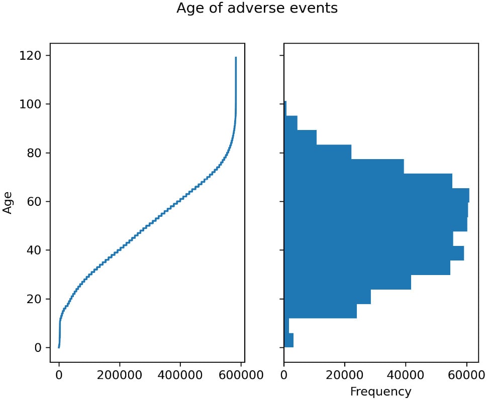
Figure 2.1 – Left – the age for each observation of adverse effect; right – a histogram showing the distribution of ages
- We can also take a non-graphical, more analytical approach, such as counting the events per year:
vdata["AGE_YRS"].dropna().apply(lambda x: int(x)).value_counts()
The output will be as follows:
50     11006
65     10948
60     10616
51     10513
58     10362
      ...
- Now, let’s see how many people died:
vdata.DIED.value_counts(dropna=False)
vdata["is_dead"] = (vdata.DIED == "Y")
The output of the count is as follows:
NaN    646450
Y        8536
Name: DIED, dtype: int64
Note that the type of DIED is not a Boolean. It’s more declarative to have a Boolean representation of a Boolean characteristic, so we create is_dead for it.
Tip
Here, we are assuming that NaN is to be interpreted as False. In general, we must be careful with the interpretation of NaN. It may mean False or it may simply mean – as in most cases – a lack of data. If that were the case, it should not be converted into False.
- Now, let’s associate the individual data about deaths with the type of vaccine involved:
dead = vdata[vdata.is_dead]
vax = pd.read_csv("2021VAERSVAX.csv.gz", encoding="iso-8859-1").set_index("VAERS_ID")
vax.groupby("VAX_TYPE").size().sort_values()
vax19 = vax[vax.VAX_TYPE == "COVID19"]
vax19_dead = dead.join(vax19)
After we get a DataFrame containing just deaths, we must read the data that contains vaccine information. First, we must do some exploratory analysis of the types of vaccines and their adverse events. Here is the abridged output:
           …
HPV9         1506
FLU4         3342
UNK          7941
VARZOS      11034
COVID19    648723
After that, we must choose just the COVID-related vaccines and join them with individual data.
- Finally, let’s see the top 10 COVID vaccine lots that are overrepresented in terms of deaths and how many US states were affected by each lot:
baddies = vax19_dead.groupby("VAX_LOT").size().sort_values(ascending=False)
for I, (lot, cnt) in enumerate(baddies.items()):
    print(lot, cnt, len(vax19_dead[vax19_dead.VAX_LOT == lot].groupby""STAT"")))
    if i == 10:
        break
The output is as follows:
Unknown 254 34
EN6201 120 30
EN5318 102 26
EN6200 101 22
EN6198 90 23
039K20A 89 13
EL3248 87 17
EL9261 86 21
EM9810 84 21
EL9269 76 18
EN6202 75 18
There’s more...
The preceding data about vaccines and lots is not completely correct; we will cover some data analysis pitfalls in the next recipe.
In the Introducing Matplotlib for chart generation recipe, we will introduce Matplotlib, a chart library that provides the backend for pandas plotting. It is a fundamental component of Python’s data analysis ecosystem.
See also
The following is some extra information that may be useful:
- While the first three recipes of this chapter are enough to support you throughout this book, there is plenty of content available on the web to help you understand pandas. You can start with the main user guide, which is available at https://pandas.pydata.org/docs/user_guide/index.html.
- If you need to plot data, do not forget to check the visualization part of the guide since it is especially helpful: https://pandas.pydata.org/docs/user_guide/visualization.html.
Dealing with the pitfalls of joining pandas DataFrames
The previous recipe was a whirlwind tour that introduced pandas and exposed most of the features that we will use in this book. While an exhaustive discussion about pandas would require a complete book, in this recipe – and in the next one – we are going to discuss topics that impact data analysis and are seldom discussed in the literature but are very important.
In this recipe, we are going to discuss some pitfalls that deal with relating DataFrames through joins: it turns out that many data analysis errors are introduced by carelessly joining data. We will introduce techniques to reduce such problems here.
Getting ready
We will be using the same data as in the previous recipe, but we will jumble it a bit so that we can discuss typical data analysis pitfalls. Once again, we will be joining the main adverse events table with the vaccination table, but we will randomly sample 90% of the data from each. This mimics, for example, the scenario where you only have incomplete information. This is one of the many examples where joins between tables do not have intuitively obvious results.
Use the following code to prepare our files by randomly sampling 90% of the data:
vdata = pd.read_csv("2021VAERSDATA.csv.gz", encoding="iso-8859-1")
vdata.sample(frac=0.9).to_csv("vdata_sample.csv.gz", index=False)
vax = pd.read_csv("2021VAERSVAX.csv.gz", encoding="iso-8859-1")
vax.sample(frac=0.9).to_csv("vax_sample.csv.gz", index=False)
Because this code involves random sampling, the results that you will get will be different from the ones reported here. If you want to get the same results, I have provided the files that I used in the Chapter02 directory. The code for this recipe can be found in Chapter02/Pandas_Join.py.
How to do it...
Follow these steps:
- Let’s start by doing an inner join of the individual and vaccine tables:
vdata = pd.read_csv("vdata_sample.csv.gz")
vax = pd.read_csv("vax_sample.csv.gz")
vdata_with_vax = vdata.join(
    vax.set_index("VAERS_ID"),
    on="VAERS_ID",
    how="inner")
len(vdata), len(vax), len(vdata_with_vax)
The len output for this code is 589,487 for the individual data, 620,361 for the vaccination data, and 558,220 for the join. This suggests that some individual and vaccine data was not captured.
- Let’s find the data that was not captured with the following join:
lost_vdata = vdata.loc[~vdata.index.isin(vdata_with_vax.index)]
lost_vdata
lost_vax = vax[~vax["VAERS_ID"].isin(vdata.index)]
lost_vax
You will see that 56,524 rows of individual data aren’t joined and that there are 62,141 rows of vaccinated data.
- There are other ways to join data. The default way is by performing a left outer join:
vdata_with_vax_left = vdata.join(
    vax.set_index("VAERS_ID"),
    on="VAERS_ID")
vdata_with_vax_left.groupby("VAERS_ID").size().sort_values()
A left outer join assures that all the rows on the left table are always represented. If there are no rows on the right, then all the right columns will be filled with None values.
Warning
There is a caveat that you should be careful with. Remember that the left table – vdata – had one entry per VAERS_ID. When you left join, you may end up with a case where the left-hand side is repeated several times. For example, the groupby operation that we did previously shows that VAERS_ID of 962303 has 11 entries. This is correct, but it’s not uncommon to have the incorrect expectation that you will still have a single row on the output per row on the left-hand side. This is because the left join returns 1 or more left entries, whereas the inner join above returns 0 or 1 entries, where sometimes, we would like to have precisely 1 entry. Be sure to always test the output for what you want in terms of the number of entries.
- There is a right join as well. Let’s right join COVID vaccines – the left table – with death events – the right table:
dead = vdata[vdata.DIED == "Y"]
vax19 = vax[vax.VAX_TYPE == "COVID19"]
vax19_dead = vax19.join(dead.set_index("VAERS_ID"), on="VAERS_ID", how="right")
len(vax19), len(dead), len(vax19_dead)
len(vax19_dead[vax19_dead.VAERS_ID.duplicated()])
len(vax19_dead) - len(dead)
As you may expect, a right join will ensure that all the rows on the right table are represented. So, we end up with 583,817 COVID entries, 7,670 dead entries, and a right join of 8,624 entries.
We also check the number of duplicated entries on the joined table and we get 954. If we subtract the length of the dead table from the joined table, we also get, as expected, 954. Make sure you have checks like this when you’re making joins.
- Finally, we are going to revisit the problematic COVID lot calculations since we now understand that we might be overcounting lots:
vax19_dead["STATE"] = vax19_dead["STATE"].str.upper()
dead_lot = vax19_dead[["VAERS_ID", "VAX_LOT", "STATE"]].set_index(["VAERS_ID", "VAX_LOT"])
dead_lot_clean = dead_lot[~dead_lot.index.duplicated()]
dead_lot_clean = dead_lot_clean.reset_index()
dead_lot_clean[dead_lot_clean.VAERS_ID.isna()]
baddies = dead_lot_clean.groupby("VAX_LOT").size().sort_values(ascending=False)
for i, (lot, cnt) in enumerate(baddies.items()):
    print(lot, cnt, len(dead_lot_clean[dead_lot_clean.VAX_LOT == lot].groupby("STATE")))
    if i == 10:
        break
Note that the strategies that we’ve used here ensure that we don’t get repeats: first, we limit the number of columns to the ones we will be using, then we remove repeated indexes and empty VAERS_ID. This ensures no repetition of the VAERS_ID, VAX_LOT pair, and that no lots are associated with no IDs.
There’s more...
There are other types of joins other than left, inner, and right. Most notably, there is the outer join, which assures all entries from both tables have representation.
Make sure you have tests and assertions for your joins: a very common bug is having the wrong expectations for how joins behave. You should also make sure that there are no empty values on the columns where you are joining, as they can produce a lot of excess tuples.
Reducing the memory usage of pandas DataFrames
When you are dealing with lots of information – for example, when analyzing whole genome sequencing data – memory usage may become a limitation for your analysis. It turns out that naïve pandas is not very efficient from a memory perspective, and we can substantially reduce its consumption.
In this recipe, we are going to revisit our VAERS data and look at several ways to reduce pandas memory usage. The impact of these changes can be massive: in many cases, reducing memory consumption may mean the difference between being able to use pandas or requiring a more alternative and complex approach, such as Dask or Spark.
Getting ready
We will be using the data from the first recipe. If you have run it, you are all set; if not, please follow the steps discussed there. You can find this code in Chapter02/Pandas_Memory.py.
How to do it…
Follow these steps:
- First, let’s load the data and inspect the size of the DataFrame:
import numpy as np
import pandas as pd
vdata = pd.read_csv("2021VAERSDATA.csv.gz", encoding="iso-8859-1")
vdata.info(memory_usage="deep")
Here is an abridged version of the output:
RangeIndex: 654986 entries, 0 to 654985
Data columns (total 35 columns):
#   Column        Non-Null Count   Dtype
---  ------        --------------   -----
0   VAERS_ID      654986 non-null  int64
2   STATE         572236 non-null  object
3   AGE_YRS       583424 non-null  float64
6   SEX           654986 non-null  object
8   SYMPTOM_TEXT  654828 non-null  object
9   DIED          8536 non-null    object
31  BIRTH_DEFECT  383 non-null     object
34  ALLERGIES     330630 non-null  object
dtypes: float64(5), int64(2), object(28)
memory usage: 1.3 GB
Here, we have information about the number of rows and the type and non-null values of each row. Finally, we can see that the DataFrame requires a whopping 1.3 GB.
- We can also inspect the size of each column:
for name in vdata.columns:
    col_bytes = vdata[name].memory_usage(index=False, deep=True)
    col_type = vdata[name].dtype
    print(
        name,
        col_type, col_bytes // (1024 ** 2))
Here is an abridged version of the output:
VAERS_ID int64 4
STATE object 34
AGE_YRS float64 4
SEX object 36
RPT_DATE object 20
SYMPTOM_TEXT object 442
DIED object 20
ALLERGIES object 34
SYMPTOM_TEXT occupies 442 MB, so 1/3 of our entire table.
- Now, let’s look at the
DIEDcolumn. Can we find a more efficient representation?vdata.DIED.memory_usage(index=False, deep=True) vdata.DIED.fillna(False).astype(bool).memory_usage(index=False, deep=True)
The original column takes 21,181,488 bytes, whereas our compact representation takes 656,986 bytes. That’s 32 times less!
- What about the
STATEcolumn? Can we do better?vdata["STATE"] = vdata.STATE.str.upper() states = list(vdata["STATE"].unique()) vdata["encoded_state"] = vdata.STATE.apply(lambda state: states.index(state)) vdata["encoded_state"] = vdata["encoded_state"].astype(np.uint8) vdata["STATE"].memory_usage(index=False, deep=True) vdata["encoded_state"].memory_usage(index=False, deep=True)
Here, we convert the STATE column, which is text, into encoded_state, which is a number. This number is the position of the state’s name in the list state. We use this number to look up the list of states. The original column takes around 36 MB, whereas the encoded column takes 0.6 MB.
As an alternative to this approach, you can look at categorical variables in pandas. I prefer to use them as they have wider applications.
- We can apply most of these optimizations when we load the data, so let’s prepare for that. But now, we have a chicken-and-egg problem: to be able to know the content of the state table, we have to do a first pass to get the list of states, like so:
states = list(pd.read_csv(
    "vdata_sample.csv.gz",
    converters={
       "STATE": lambda state: state.upper()
    },
    usecols=["STATE"]
)["STATE"].unique())
We have a converter that simply returns the uppercase version of the state. We only return the STATE column to save memory and processing time. Finally, we get the STATE column from the DataFrame (which has only a single column).
- The ultimate optimization is not to load the data. Imagine that we don’t need
SYMPTOM_TEXT– that is around 1/3 of the data. In that case, we can just skip it. Here is the final version:vdata = pd.read_csv( "vdata_sample.csv.gz", index_col="VAERS_ID", converters={ "DIED": lambda died: died == "Y", "STATE": lambda state: states.index(state.upper()) }, usecols=lambda name: name != "SYMPTOM_TEXT" ) vdata["STATE"] = vdata["STATE"].astype(np.uint8) vdata.info(memory_usage="deep")
We are now at 714 MB, which is a bit over half of the original. This could be still substantially reduced by applying the methods we used for STATE and DIED to all other columns.
See also
The following is some extra information that may be useful:
- If you are willing to use a support library to help with Python processing, check the next recipe on Apache Arrow, which will allow you to have extra memory savings for more memory efficiency.
- If you end up with DataFrames that take more memory than you have available on a single machine, then you must step up your game and use chunking - which we will not cover in the Pandas context - or something that can deal with large data automatically. Dask, which we’ll cover in Chapter 11, Parallel Processing with Dask and Zarr, allows you to work with larger-than-memory datasets with, among others, a pandas-like interface.
Accelerating pandas processing with Apache Arrow
When dealing with large amounts of data, such as in whole genome sequencing, pandas is both slow and memory-consuming. Apache Arrow provides faster and more memory-efficient implementations of several pandas operations and can interoperate with it.
Apache Arrow is a project co-founded by Wes McKinney, the founder of pandas, and it has several objectives, including working with tabular data in a language-agnostic way, which allows for language interoperability while providing a memory- and computation-efficient implementation. Here, we will only be concerned with the second part: getting more efficiency for large-data processing. We will do this in an integrated way with pandas.
Here, we will once again use VAERS data and show how Apache Arrow can be used to accelerate pandas data loading and reduce memory consumption.
Getting ready
Again, we will be using data from the first recipe. Be sure you download and prepare it, as explained in the Getting ready section of the Using pandas to process vaccine-adverse events recipe. The code is available in Chapter02/Arrow.py.
How to do it...
Follow these steps:
- Let’s start by loading the data using both pandas and Arrow:
import gzip
import pandas as pd
from pyarrow import csv
import pyarrow.compute as pc
vdata_pd = pd.read_csv("2021VAERSDATA.csv.gz", encoding="iso-8859-1")
columns = list(vdata_pd.columns)
vdata_pd.info(memory_usage="deep")
vdata_arrow = csv.read_csv("2021VAERSDATA.csv.gz")
tot_bytes = sum([
    vdata_arrow[name].nbytes
    for name in vdata_arrow.column_names])
print(f"Total {tot_bytes // (1024 ** 2)} MB")
pandas requires 1.3 GB, whereas Arrow requires 614 MB: less than half the memory. For large files like this, this may mean the difference between being able to process data in memory or needing to find another solution, such as Dask. While some functions in Arrow have similar names to pandas (for example, read_csv), that is not the most common occurrence. For example, note the way we compute the total size of the DataFrame: by getting the size of each column and performing a sum, which is a different approach from pandas.
- Let’s do a side-by-side comparison of the inferred types:
for name in vdata_arrow.column_names:
    arr_bytes = vdata_arrow[name].nbytes
    arr_type = vdata_arrow[name].type
    pd_bytes = vdata_pd[name].memory_usage(index=False, deep=True)
    pd_type = vdata_pd[name].dtype
    print(
        name,
        arr_type, arr_bytes // (1024 ** 2),
        pd_type, pd_bytes // (1024 ** 2),)
Here is an abridged version of the output:
VAERS_ID int64 4 int64 4
RECVDATE string 8 object 41
STATE string 3 object 34
CAGE_YR int64 5 float64 4
SEX string 3 object 36
RPT_DATE string 2 object 20
DIED string 2 object 20
L_THREAT string 2 object 20
ER_VISIT string 2 object 19
HOSPITAL string 2 object 20
HOSPDAYS int64 5 float64 4
As you can see, Arrow is generally more specific with type inference and is one of the main reasons why memory usage is substantially lower.
- Now, let’s do a time performance comparison:
%timeit pd.read_csv("2021VAERSDATA.csv.gz", encoding="iso-8859-1")
%timeit csv.read_csv("2021VAERSDATA.csv.gz")
On my computer, the results are as follows:
7.36 s ± 201 ms per loop (mean ± std. dev. of 7 runs, 1 loop each)
2.28 s ± 70.7 ms per loop (mean ± std. dev. of 7 runs, 1 loop each)
Arrow’s implementation is three times faster. The results on your computer will vary as this is dependent on the hardware.
- Let’s repeat the memory occupation comparison while not loading the
SYMPTOM_TEXTcolumn. This is a fairer comparison as most numerical datasets do not tend to have a very large text column:vdata_pd = pd.read_csv("2021VAERSDATA.csv.gz", encoding="iso-8859-1", usecols=lambda x: x != "SYMPTOM_TEXT") vdata_pd.info(memory_usage="deep") columns.remove("SYMPTOM_TEXT") vdata_arrow = csv.read_csv( "2021VAERSDATA.csv.gz", convert_options=csv.ConvertOptions(include_columns=columns)) vdata_arrow.nbytes
pandas requires 847 MB, whereas Arrow requires 205 MB: four times less.
- Our objective is to use Arrow to load data into pandas. For that, we need to convert the data structure:
vdata = vdata_arrow.to_pandas()
vdata.info(memory_usage="deep")
There are two very important points to be made here: the pandas representation created by Arrow uses only 1 GB, whereas the pandas representation, from its native read_csv, is 1.3 GB. This means that even if you use pandas to process data, Arrow can create a more compact representation to start with.
The preceding code has one problem regarding memory consumption: when the converter is running, it will require memory to hold both the pandas and the Arrow representations, hence defeating the purpose of using less memory. Arrow can self-destruct its representation while creating the pandas version, hence resolving the problem. The line for this is vdata = vdata_arrow.to_pandas(self_destruct=True).
There’s more...
If you have a very large DataFrame that cannot be processed by pandas, even after it’s been loaded by Arrow, then maybe Arrow can do all the processing as it has a computing engine as well. That being said, Arrow’s engine is, at the time of writing, substantially less complete in terms of functionality than pandas. Remember that Arrow has many other features, such as language interoperability, but we will not be making use of those in this book.
Understanding NumPy as the engine behind Python data science and bioinformatics
Most of your analysis will make use of NumPy, even if you don’t use it explicitly. NumPy is an array manipulation library that is behind libraries such as pandas, Matplotlib, Biopython, and scikit-learn, among many others. While much of your bioinformatics work may not require explicit direct use of NumPy, you should be aware of its existence as it underpins almost everything you do, even if only indirectly via the other libraries.
In this recipe, we will use VAERS data to demonstrate how NumPy is behind many of the core libraries that we use. This is a very light introduction to the library so that you are aware that it exists and that it is behind almost everything. Our example will extract the number of cases from the five US states with more adverse effects, splitting them into age bins: 0 to 19 years, 20 to 39, up to 100 to 119.
Getting ready
Once again, we will be using the data from the first recipe, so make sure it’s available. The code for it can be found in Chapter02/NumPy.py.
How to do it…
Follow these steps:
- Let’s start by loading the data with pandas and reducing the data so that it’s related to the top five US states only:
import numpy as np
import pandas as pd
import matplotlib.pyplot as plt
vdata = pd.read_csv(
    "2021VAERSDATA.csv.gz", encoding="iso-8859-1")
vdata["STATE"] = vdata["STATE"].str.upper()
top_states = pd.DataFrame({
    "size": vdata.groupby("STATE").size().sort_values(ascending=False).head(5)}).reset_index()
top_states["rank"] = top_states.index
top_states = top_states.set_index("STATE")
top_vdata = vdata[vdata["STATE"].isin(top_states.index)]
top_vdata["state_code"] = top_vdata["STATE"].apply(
    lambda state: top_states["rank"].at[state]
).astype(np.uint8)
top_vdata = top_vdata[top_vdata["AGE_YRS"].notna()]
top_vdata.loc[:,"AGE_YRS"] = top_vdata["AGE_YRS"].astype(int)
top_states
The top states are as follows. This rank will be used later to construct a NumPy matrix:
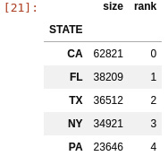
Figure 2.2 – US states with largest numbers of adverse effects
- Now, let’s extract the two NumPy arrays that contain age and state data:
age_state = top_vdata[["state_code", "AGE_YRS"]]
age_state["state_code"]
state_code_arr = age_state["state_code"].values
type(state_code_arr), state_code_arr.shape, state_code_arr.dtype
age_arr = age_state["AGE_YRS"].values
type(age_arr), age_arr.shape, age_arr.dtype
Note that the data that underlies pandas is NumPy data (the values call for both Series returns NumPy types). Also, you may recall that pandas has properties such as .shape or .dtype: these were inspired by NumPy and behave the same.
- Now, let’s create a NumPy matrix from scratch (a 2D array), where each row is a state and each column represents an age group:
age_state_mat = np.zeros((5,6), dtype=np.uint64)
for row in age_state.itertuples():
    age_state_mat[row.state_code, row.AGE_YRS//20] += 1
age_state_mat
The array has five rows – one for each state – and six columns – one for each age group. All the cells in the array must have the same type.
We initialize the array with zeros. There are many ways to initialize arrays, but if you have a very large array, initializing it may take a lot of time. Sometimes, depending on your task, it might be OK that the array is empty at the beginning (meaning it was initialized with random trash). In that case, using np.empty will be much faster. We use pandas iteration here: this is not the best way to do things from a pandas perspective, but we want to make the NumPy part very explicit.
- We can extract a single row – in our case, the data for a state – very easily. The same applies to a column. Let’s take California data and then the 0-19 age group:
cal = age_state_mat[0,:]
kids = age_state_mat[:,0]
Note the syntax to extract a row or a column. It should be familiar to you, given that pandas copied the syntax from NumPy and we encountered it in previous recipes.
- Now, let’s compute a new matrix where we have the fraction of cases per age group:
def compute_frac(arr_1d):
    return arr_1d / arr_1d.sum()
frac_age_stat_mat = np.apply_along_axis(compute_frac, 1, age_state_mat)
The last line applies the compute_frac function to all rows. compute_frac takes a single row and returns a new row where all the elements are divided by the total sum.
- Now, let’s create a new matrix that acts as a percentage instead of a fraction – simply because it reads better:
perc_age_stat_mat = frac_age_stat_mat * 100
perc_age_stat_mat = perc_age_stat_mat.astype(np.uint8)
perc_age_stat_mat
The first line simply multiplies all the elements of the 2D array by 100. Matplotlib is smart enough to traverse different array structures. That line will work if it’s presented with an array with any dimensions and would do exactly what is expected.
Here is the result:
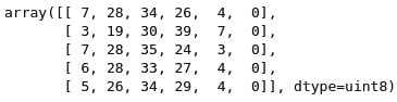
Figure 2.3 – A matrix representing the distribution of vaccine-adverse effects in the five US states with the most cases
- Finally, let’s create a graphical representation of the matrix using Matplotlib:
fig = plt.figure()
ax = fig.add_subplot()
ax.matshow(perc_age_stat_mat, cmap=plt.get_cmap("Greys"))
ax.set_yticks(range(5))
ax.set_yticklabels(top_states.index)
ax.set_xticks(range(6))
ax.set_xticklabels(["0-19", "20-39", "40-59", "60-79", "80-99", "100-119"])
fig.savefig("matrix.png")
Do not dwell too much on the Matplotlib code – we are going to discuss it in the next recipe. The fundamental point here is that you can pass NumPy data structures to Matplotlib. Matplotlib, like pandas, is based on NumPy.
See also
The following is some extra information that may be useful:
- NumPy has many more features than the ones we’ve discussed here. There are plenty of books and tutorials on them. The official documentation is a good place to start: https://numpy.org/doc/stable/.
- There are many important issues to discover with NumPy, but probably one of the most important is broadcasting: NumPy’s ability to take arrays of different structures and get the operations right. For details, go to https://numpy.org/doc/stable/user/theory.broadcasting.html.
Introducing Matplotlib for chart generation
Matplotlib is the most common Python library for generating charts. There are more modern alternatives, such as Bokeh, which is web-centered, but the advantage of Matplotlib is not only that it is the most widely available and widely documented chart library but also, in the computational biology world, we want a chart library that is both web- and paper-centric. This is because many of our charts will be submitted to scientific journals, which are equally concerned with both formats. Matplotlib can handle this for us.
Many of the examples in this recipe could also be done directly with pandas (hence indirectly with Matplotlib), but the point here is to exercise Matplotlib.
Once again, we are going to use VAERS data to plot some information about the DataFrame’s metadata and summarize the epidemiological data.
Getting ready
Again, we will be using the data from the first recipe. The code can be found in Chapter02/Matplotlib.py.
How to do it...
Follow these steps:
- The first thing that we will do is plot the fraction of nulls per column:
import numpy as np
import pandas as pd
import matplotlib as mpl
import matplotlib.pyplot as plt
vdata = pd.read_csv(
    "2021VAERSDATA.csv.gz", encoding="iso-8859-1",
    usecols=lambda name: name != "SYMPTOM_TEXT")
num_rows = len(vdata)
perc_nan = {}
for col_name in vdata.columns:
    num_nans = len(vdata[col_name][vdata[col_name].isna()])
    perc_nan[col_name] = 100 * num_nans / num_rows
labels = perc_nan.keys()
bar_values = list(perc_nan.values())
x_positions = np.arange(len(labels))
labels is the column names that we are analyzing, bar_values is the fraction of null values, and x_positions is the location of the bars on the bar chart that we are going to plot next.
- Here is the code for the first version of the bar plot:
fig = plt.figure()
fig.suptitle("Fraction of empty values per column")
ax = fig.add_subplot()
ax.bar(x_positions, bar_values)
ax.set_ylabel("Percent of empty values")
ax.set_ylabel("Column")
ax.set_xticks(x_positions)
ax.set_xticklabels(labels)
ax.legend()
fig.savefig("naive_chart.png")
We start by creating a figure object with a title. The figure will have a subplot that will contain the bar chart. We also set several labels and only used defaults. Here is the sad result:
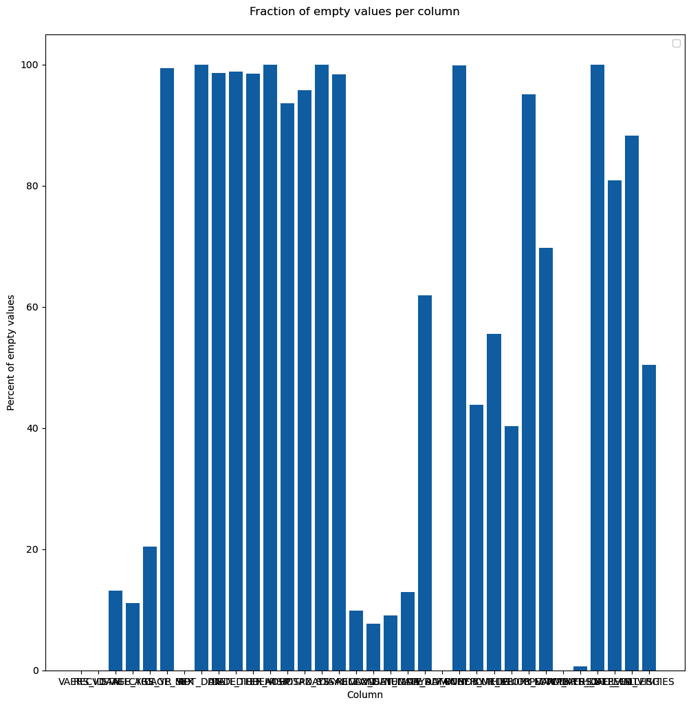
Figure 2.4 – Our first chart attempt, just using the defaults
- Surely, we can do better. Let’s format the chart substantially more:
fig = plt.figure(figsize=(16, 9), tight_layout=True, dpi=600)
fig.suptitle("Fraction of empty values per column", fontsize="48")
ax = fig.add_subplot()
b1 = ax.bar(x_positions, bar_values)
ax.set_ylabel("Percent of empty values", fontsize="xx-large")
ax.set_xticks(x_positions)
ax.set_xticklabels(labels, rotation=45, ha="right")
ax.set_ylim(0, 100)
ax.set_xlim(-0.5, len(labels))
for i, x in enumerate(x_positions):
    ax.text(
        x, 2, "%.1f" % bar_values[i], rotation=90,
        va="bottom", ha="center",
        backgroundcolor="white")
fig.text(0.2, 0.01, "Column", fontsize="xx-large")
fig.savefig("cleaner_chart.png")
The first thing that we do is set up a bigger figure for Matplotlib to provide a tighter layout. We rotate the x-axis tick labels 45 degrees so that they fit better. We also put the values on the bars. Finally, we do not have a standard x-axis label as it would be on top of the tick labels. Instead, we write the text explicitly. Note that the coordinate system of the figure can be completely different from the coordinate system of the subplot – for example, compare the coordinates of ax.text and fig.text. Here is the result:
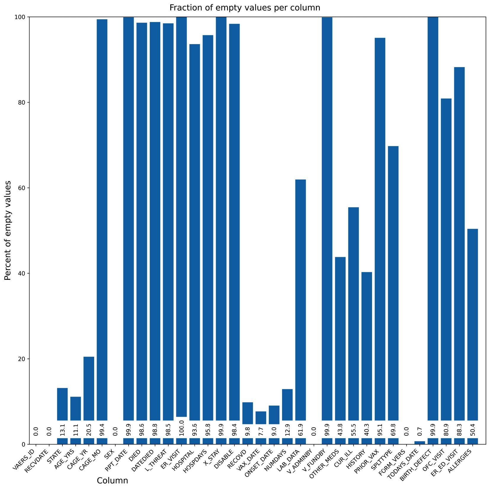
Figure 2.5 – Our second chart attempt, while taking care of the layout
- Now, we are going to do some summary analysis of our data based on four plots on a single figure. We will chart the vaccines involved in deaths, the days between administration and death, the deaths over time, and the sex of people who have died for the top 10 states in terms of their quantity:
dead = vdata[vdata.DIED == "Y"]
vax = pd.read_csv("2021VAERSVAX.csv.gz", encoding="iso-8859-1").set_index("VAERS_ID")
vax_dead = dead.join(vax, on="VAERS_ID", how="inner")
dead_counts = vax_dead["VAX_TYPE"].value_counts()
large_values = dead_counts[dead_counts >= 10]
other_sum = dead_counts[dead_counts < 10].sum()
large_values = large_values.append(pd.Series({"OTHER": other_sum}))
distance_df = vax_dead[vax_dead.DATEDIED.notna() & vax_dead.VAX_DATE.notna()]
distance_df["DATEDIED"] = pd.to_datetime(distance_df["DATEDIED"])
distance_df["VAX_DATE"] = pd.to_datetime(distance_df["VAX_DATE"])
distance_df = distance_df[distance_df.DATEDIED >= "2021"]
distance_df = distance_df[distance_df.VAX_DATE >= "2021"]
distance_df = distance_df[distance_df.DATEDIED >= distance_df.VAX_DATE]
time_distances = distance_df["DATEDIED"] - distance_df["VAX_DATE"]
time_distances_d = time_distances.astype(int) / (10**9 * 60 * 60 * 24)
date_died = pd.to_datetime(vax_dead[vax_dead.DATEDIED.notna()]["DATEDIED"])
date_died = date_died[date_died >= "2021"]
date_died_counts = date_died.value_counts().sort_index()
cum_deaths = date_died_counts.cumsum()
state_dead = vax_dead[vax_dead["STATE"].notna()][["STATE", "SEX"]]
top_states = sorted(state_dead["STATE"].value_counts().head(10).index)
top_state_dead = state_dead[state_dead["STATE"].isin(top_states)].groupby(["STATE", "SEX"]).size()#.reset_index()
top_state_dead.loc["MN", "U"] = 0  # XXXX
top_state_dead = top_state_dead.sort_index().reset_index()
top_state_females = top_state_dead[top_state_dead.SEX == "F"][0]
top_state_males = top_state_dead[top_state_dead.SEX == "M"][0]
top_state_unk = top_state_dead[top_state_dead.SEX == "U"][0]
The preceding code is strictly pandas-based and was made in preparation for the plotting activity.
- The following code plots all the information simultaneously. We are going to have four subplots organized in 2 by 2 format:
fig, ((vax_cnt, time_dist), (death_time, state_reps)) = plt.subplots(
    2, 2,
    figsize=(16, 9), tight_layout=True)
vax_cnt.set_title("Vaccines involved in deaths")
wedges, texts = vax_cnt.pie(large_values)
vax_cnt.legend(wedges, large_values.index, loc="lower left")
time_dist.hist(time_distances_d, bins=50)
time_dist.set_title("Days between vaccine administration and death")
time_dist.set_xlabel("Days")
time_dist.set_ylabel("Observations")
death_time.plot(date_died_counts.index, date_died_counts, ".")
death_time.set_title("Deaths over time")
death_time.set_ylabel("Daily deaths")
death_time.set_xlabel("Date")
tw = death_time.twinx()
tw.plot(cum_deaths.index, cum_deaths)
tw.set_ylabel("Cummulative deaths")
state_reps.set_title("Deaths per state stratified by sex") state_reps.bar(top_states, top_state_females, label="Females")
state_reps.bar(top_states, top_state_males, label="Males", bottom=top_state_females)
state_reps.bar(top_states, top_state_unk, label="Unknown",
               bottom=top_state_females.values + top_state_males.values)
state_reps.legend()
state_reps.set_xlabel("State")
state_reps.set_ylabel("Deaths")
fig.savefig("summary.png")
We start by creating a figure with 2x2 subplots. The subplots function returns, along with the figure object, four axes objects that we can use to create our charts. Note that the legend is positioned in the pie chart, we have used a twin axis on the time distance plot, and we have a way to compute stacked bars on the death per state chart. Here is the result:
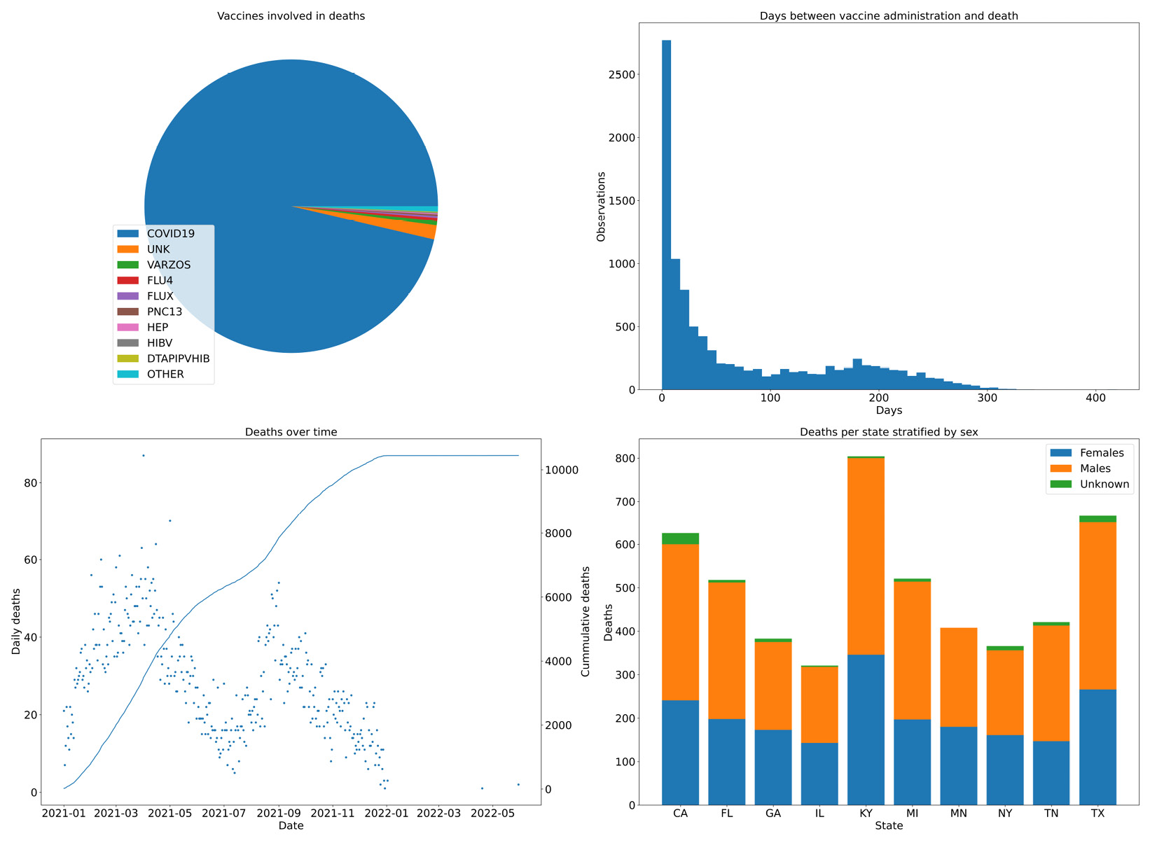
Figure 2.6 – Four combined charts summarizing the vaccine data
There’s more...
Matplotlib has two interfaces you can use – an older interface, designed to be similar to MATLAB, and a more powerful object-oriented (OO) interface. Try as much as possible to avoid mixing the two. Using the OO interface is probably more future-proof. The MATLAB-like interface is below the matplotlib.pyplot module. To make things confusing, the entry points for the OO interface are in that module – that is, matplotlib.pyplot.figure and matplotlib.pyplot.subplots.
See also
The following is some extra information that may be useful:
- The documentation for Matplolib is really, really good. For example, there’s a gallery of visual samples with links to the code for generating each sample. This can be found at https://matplotlib.org/stable/gallery/index.html. The API documentation is generally very complete.
- Another way to improve the looks of Matplotlib charts is to use the Seaborn library. Seaborn’s main purpose is to add statistical visualization artifacts, but as a side effect, when imported, it changes the defaults of Matplotlib to something more palatable. We will be using Seaborn throughout this book; check out the plots provided in the next chapter.
