


If you are at all interested in developing web apps in the future, it is important you understand the increasing role played by mobile devices, and how to develop apps fitting their capabilities. I'm saying this not to scare you into buying my book (though I hope that you are currently reading your purchased copy), but to underscore the fact that mobile computing will play an increased role in the lives of every connected person.
To appreciate the growth in mobile usage, one should consider the iPhone. The iPhone, typically heralded as the smartphone that began the current mobile computing revolution, wasn't introduced until 2007. At the end of 2008, more than a year after its release, mobile traffic accounted for less than 1 percent of the global Internet traffic, which was not much of a revolution.
However, by the end of 2010, mobile traffic accounted for nearly 5 percent of all the Internet traffic, and at the end of 2012 it was nearly 13 percent. Halfway through 2013, mobile traffic has passed 15 percent of all the Internet traffic. This trend is roughly a multiplier of 1.5, year-over-year, and is likely to accelerate.
In the 4th quarter of 2012, iPad sales reached approximately 140,000,000 total units shipped, approximately 3 times the total number of iPhones shipped. The iPad was introduced 3 years after the iPhone, and just 3 years after the tablet revolution was launched by the iPad, total tablet shipments in the 4th quarter of 2012 surpassed both desktop and notebook shipments.
As developers, it is important we understand and embrace this mobile revolution or else we will be run over by it.
Throughout this book, we will be building a fully functional web app using ASP.NET MVC 4, HTML5, and CSS3 to support both desktop and mobile computing platforms. We will begin with building the desktop version of the web app but will be keeping mobile considerations in mind.
Once our desktop app is complete, we will modify it to support the mobile web using concepts such as responsive design and media queries. During this modification, we will examine the new features of ASP.NET MVC 4 we can use to better target mobile web devices.
In the last chapters of this book, we will modify the app to support a truly mobile experience using jQuery Mobile. It is my goal that, by the end of the last chapter in this book, you will have a complete understanding of what it takes to develop for the mobile web, and the tools to take your mobile web apps to the next level.
In this chapter, we will begin by examining a history of the mobile web. This understanding is essential in appreciating the unprecedented growth in the past few years. This chapter will also highlight some of the constraints that existed, and still exist, when trying to target the mobile devices of yesterday, today, and tomorrow. We will end with a preview of the new platform support in Microsoft ASP.NET MVC 4.
Our journey into the mobile web begins now.
Without knowing how the mobile web started, it's impossible to appreciate the ease with which we can develop for mobile devices. If the mobile web works at all, it is a feat in itself, and it took the convergence of several technologies to make it all possible.
The Nokia 9000 is, arguably, the first mobile web device. Developed by Nokia in 1996, this phone weighed in at a whopping 14 ounces (397 g), and was powered by an Intel i386. It was equipped with a 640 x 200 pixel gray-scale LCD. This phone allowed owners to send faxes, send and receive email, and surf the web. It also came equipped with terminal and Telnet applications for accessing mainframe systems.
During this time, Nokia was in competition with Ericsson and others for control of the mobile data space. The Nokia 9000 was designed to use Narrow Band Sockets, a communication protocol developed and championed by Nokia. Information that was to be displayed on the Nokia 9000 was returned to the phone using Tagged Text Markup Language (TTML), a markup language that content providers could use to optimize web pages for mobile devices by removing extraneous information from the display and transmission.
At about the same time, Ericsson had developed Intelligent Terminal Transfer Protocol (ITTP). ITTP was Ericsson's proprietary markup for the mobile web.
It became evident to the major phone manufacturers that market fragmentation was going to be inevitable unless they could develop a common standard to enable the mobile web on their devices.
On June 26, 1997, Nokia, Ericsson, Motorola, and Unwired Planet publicly announced that they would be cooperating on a Wireless Application Protocol (WAP). WAP 1.0 was to be an open protocol that any vendor could implement, and this new protocol would enable mobile device manufacturers to connect to the IP-based world of the Internet from mobile devices that had an inherently high rate of data loss during communication.
Wireless Markup Language (WML) became the standard for designing applications that ran on WAP 1.0, and was a second-generation derivative of HTML and XML.
However, WAP and WML had some shortcomings. The protocol and companion markup languages were designed for very slow data networks and very limited display capabilities. If your device had limited data input capabilities and a low-resolution display, then WML served you well, but with the advent of smart phones and mobile web browsers, derivatives of their desktop counterparts, WAP 1.0 and WML became less relevant.
As the convergence of mobile phones and PDAs gained momentum, new standards were needed to support the growing use of web-enabled mobile devices. To support the new browsers that began to ship with mobile devices, a new markup language was required.
In 2001, eXtensible HyperText Markup Language Mobile Profile (XHTML MP) was adapted from XHTML Basic by the WAP Forum (now part of the Open Mobile Alliance) to replace WML as the default protocol for WAP.
Note
While WAP became the standard in the United States, United Kingdom, and Europe, the standard in Japan, i-mode, was developed by NTT DoCoMo.
The new standards were short-lived. Today, most mobile devices ship with browsers supporting the latest HTML standards including HTML5 and CSS3, but it is still a good practice to deliver content to target the broadest market possible.
Having modern browsers on our phones, tablets, and other mobile devices doesn't mean we should make no accommodation for users of the mobile web. There are still many real-time constraints placed upon mobile devices which we, as developers, should take into consideration when writing mobile web apps. We can't simply shrink down the desktop version of our web app and provide a satisfying experience to the user. One must keep in mind when developing mobile apps that the mobile devices on which our app is being executed have different processing, network, and presentation constraints than their desktop counterparts.
Today's mobile devices have several times the processing power of the Apollo Guidance Computer that put humans on the moon. They do not, however, have infinite processing power and have much less processing power than the common PC has at its disposal.
To accommodate the lack of processing power, mobile web apps should refrain from running highly intensive JavaScript functions, image manipulation, or any other processor-intensive operations in your app unless it is absolutely necessary to the functionality of the app.
One way to reduce the load on the client is to make certain determinations on the server before returning content back to the mobile device. This practice, referred to as server-side browser sniffing, allows the application to return web pages and content targeted for a specific device, and limits the need to do browser capability checks on the client. It is during this time that you can also preprocess data that would be returned to the client for processing otherwise. This is a shift from current web development trends where data is typically submitted to the client for processing.
By reducing the amount of content that is returned to the client by the server, you also mitigate some of the network constraints inherent to mobile devices.
While today's mobile networks rival, and in some cases surpass, speeds available to home-based broadband networks, your users may be constrained by data limits, speed governance, corporate policy, or some other constraint on the limit or speed at which they can retrieve data on their mobile device.
Mobile networks also inherently lose more network data in transmission than land-based communication. This data loss has two effects on the application and the user experience. Firstly, packet loss requires the TCP/IP stack implementation to request resends for lost packets and increases the amount of data that must be sent across the network. Secondly, your app needs to be written such that it can survive failed requests because it's guaranteed to happen.
How do we, as developers, ensure that our mobile web apps provide a great user experience on such a network?
We can start reducing the amount of data representing content we're sending to the client by compressing it on the server side.
Content compression can occur as part of the communication between client apps and web servers that support it. Content compression works by serving static, and occasionally dynamic content, and compressing it using gzip or deflate before returning it to the requesting app.
For a client to indicate that it can accept and process content, it must send an Accept-Encoding HTTP header with the request with the types of encoding it will accept.
Accept-Encoding: gzip, deflate
Enabling compression on the server is vendor and version-specific. It should be noted that while enabling compression on the server for communication does reduce the amount of data the server must send, it increases server processor utilization.
In addition to compression, we can also reduce the amount of data that needs to be sent to the client through a process called minification.
Minification is the act of removing extraneous white space from our HTML, CSS, and JavaScript files. Minification is not compression in the typical sense. The benefit of minification is that while you have reduced the amount of data you are sending to the client, it is immediately usable because nothing functional from that data has been removed.
Some minification techniques can also serve as a way to obfuscate JavaScript making it harder for people with ill intent to decipher what your code is doing. This is accomplished by parsing the content that is being minified and renaming long variables to between 1 and 3 characters.
Images make up a large percentage of the content your app will be serving to the client. Outside of minification, image optimizations may be one of the fastest ways to reduce the size of your app.
Perhaps the easiest way to optimize images on your site is to reduce their color depth. Most images on the web are icons that can easily be represented with images of 8-bit or 16-bit color depth. With that said, it is an art more than a science. As today's mobile device displays increase their pixel depth, images of poor quality can detract from the functionality of your site and may discourage some users from using it.
An image sprite is a single image (that contains multiple images) that might be used on a site. The image sprite is then referenced by the stylesheet with different image offsets to only show a portion of that image. The following image from the Packt Publishing website (www.packtpub.com) is an example of an image sprite:

This image is actually a single image that contains two images for the site to use. Both images are 31 x 31 pixels. From this image we can create the following two styles:
.white-go
{
    width:31px;
    background:url('img-sprite.png') 0 0;
}

.orange-go
{
    width: 31px;
    background:url('img-sprite.png') -32px 0;
}
Firstly, note that the styles both have a width that is limited to the width of the actual image we want to display, that is, 31 pixels.
The white-go class sets the background image of the element which is applied to the sprite and sets the offset of the image to be the top-left corner, that is, 0,0. Since the image is restricted to 31 pixels wide, the viewer of the image will only be presented with the portion of the image containing the white go button.
The orange-go class has a negative offset to the image display telling the browser to show 31 pixels of the image starting at pixel 32. This displays only the orange image.
Both images may be reused by the app by applying the defined styles to the elements within the HTML markup, but the true benefit is that the app only made one request to the server to retrieve both images.
Data URIs (Universal Resource Identifiers) allow you to put content data directly into a URI link. The URI is formatted using the data:[<mediatype>][;base64],<data> format. From RFC 2397, the data URI scheme is defined as follows:
The <mediatype> is an Internet media type specification (with optional parameters). The appearance of ";base64" means that the data is encoded as base64. Without ";base64", the data (as a sequence of octets) is represented using ASCII encoding for octets inside the range of safe URL characters and using the standard %xx hex encoding of URLs for octets outside that range. If <mediatype> is omitted, it defaults to text/plain;charset=US-ASCII.
Assume we want to embed the following simple image in a page using a data URI:

If you were to embed the image above as a base-64 encoded PNG data URI into a page on your site, you would construct a data URI in your HTML source.

This provides the browser the benefit of not having to make a separate request to retrieve the image. With some clever JavaScript and CSS you could reuse the content of the URI without submitting another request to retrieve the image or embedding the image twice into the page.
As part of the page content, there is a second added benefit: the image data is compressed when sent from the server to the client as part of the web server's gzip compression.
A Content Delivery Network (CDN) is a distributed network of servers that exist solely for returning static content. CDNs can reduce network load by hosting static content that is commonly cached and reducing the amount of data an application sends and receives for any given request.
If you are using common third-party libraries such as jQuery, the mobile device executing your app may have already loaded that library from a third-party CDN. If the device has already retrieved the data you want to load, there is no need for the client to retrieve it again from the server. It can simply load it from the cache. There are several free CDN networks available for common content. As of this writing, Microsoft hosts a large amount of common third-party content on its CDN, of which a listing may be found at http://www.asp.net/ajaxlibrary/cdn.ashx.
As a routine point of maintenance, you will want to make sure the CDN you are using for shared content continues to provide the content. If they remove the content, your app will eventually degrade or fail.
A CDN is also useful for your proprietary static content. If you are using cookies within your site, every HTTP request to the domain specified in the cookie will retransmit the cookie data. Static content has no need for this data and it is consuming bandwidth that could be used elsewhere. If you move the static content of your site onto a different domain than the domain(s) on which your cookies reside, you reduce the amount of data sent to and from your app.
Processing constraints and network constraints help define how you implement your background services, but it is what the user sees that typically defines their experience. When presenting the content of your app to the user you need to keep in mind there are very real constraints placed on how information is presented to the user.
For starters, you only have a single window in which you can work. This means you should not be creating content that requires pop-up windows. Pop-up windows will open up in new tabs on most mobile browsers and those browsers may have limits as to the number of tabs open at any given time.
It is far better to stick with a simple navigation paradigm, and reduce the amount of data you present to the user at any given time. The user may have a few more screen touches to navigate through your application, but if you make the behavior consistent then it is unlikely your users will notice.
With the exception of the newest mobile devices on the market, most devices do not have the resolution of their desktop counterparts.
Comparing standard phone form factors, the iPhone 5 has a screen resolution of 1136 x 640 pixels and the Samsung Galaxy S3 has a resolution of 1280 x 720. Of the popular 7-inch tablets, both the Kindle Fire HD and Google Nexus 7 have a screen resolution of 1280 x 800. Only the largest tablets such as the 10-inch third generation iPad (2048 x 1536) and the 8.9-inch Kindle Fire HD (1920 x 1200) come close to matching a desktop's display capability.
By way of comparison, the iPhone 4 and iPhone 4S have a resolution of 960 x 640.
While these resolutions seem respectable for mobile devices you must keep in mind that these resolutions are presented on screens that are substantially smaller than a desktop monitor, meaning not only is the number of available pixels for your app reduced on these smaller displays, but your app needs to present content, text, and buttons larger than it would to a desktop browser. This is partly because of the increased pixel density of the mobile devices, and partly because the input mechanism to these devices is your user's finger.
Designing a system to support touch instead of traditional input methods of mouse and keyboard mean that your buttons need to be larger, and a larger area of padding must surround any area of the screen that is designed for interaction with the user. This means your user interface and user experience must account for a large percentage of spacing.
While most of us own one, two, or perhaps three or more mobile devices with which we can browse the web, we need to develop our mobile web applications to support the broadest number of devices possible.
It is important for us to look at what technology is being used to browse the mobile web, so that we can target our mobile app appropriately. Currently, Android and iOS dominate the mobile OS market, but the newest version of Windows Mobile is gaining market share. Supporting the common browsers on these operating systems should be sufficient for most application needs.
How does one target these specific browsers? All of these systems allow third-party browsers to be installed on them, so we cannot look at OS percentages as the sole determining factor when looking at compatibility.
Fortunately, while there are multiple browsers available for these platforms, there are only a handful of layout engines with which we must concern ourselves.
WebKit is the layout engine for the majority of the web. Safari, Chrome, the Android Web Browser, Dolphin HD (a popular third-party Android web browser), Blackberry Browser 6.0+, and even a version of the PS3 software all use WebKit. If you target WebKit without any vendor-specific extensions, you will be supporting a huge segment of the web.
Internet Explorer uses the Trident engine to lay out HTML content. If you have done any Windows desktop development you might know this engine by the name MSHTML.
Trident has received a new version with every release of Internet Explorer since Internet Explorer 7. Both Windows and Windows Mobile share the same version of the engine. Internet Explorer 10 and Internet Explorer Mobile 10 use Version 6.0 of the Trident engine.
Gecko has been around since Netscape 6, and is the current layout engine in Firefox, and several other Mozilla Foundation projects.
The Opera browser and the Nintendo DS/DSi use the Presto engine. This engine is only available as part of Opera but cannot be overlooked. Opera was the dominant browser on the mobile web and, depending on whose statistics you believe, continues to be the number two or number three used mobile browser today with over 20 percent of the market (no single browser currently eclipses 25 percent).
Since we will be implementing our mobile app on a desktop or laptop, we will want to emulate the mobile devices we are targeting. We can do this by installing emulators for each platform on our development machine, or by faking the mobile browser experience within our computer's browser.
Mobile device simulators provide us the best means of testing the functionality of our app within a mobile browser without having access to a physical mobile device.
The Opera Mobile Emulator has the smallest footprint of any emulator available. This is in large part due to the fact that there is no emulation of a mobile operating system. The installation comes with support for various device and browser version variants allowing you to test your app's look and feel on any device on which Opera Mobile is offered. There is also an optional install for Opera Dragonfly. Dragonfly allows you to debug your CSS and JavaScript as well as tune the performance of your app inside the emulator.
The Opera Mobile Emulator may be downloaded at http://www.opera.com/developer/tools/mobile/.
The Android SDK, available at http://developer.android.com/sdk, comes with a mobile device emulator you can use to test your applications on the Android platform. The SDK requires you to install several third-party tools, JDK 6 most notably, to be fully functional.
If you do not have access to a machine running OS X, you cannot emulate the iOS environment with the official Apple SDK tools. Third-party emulators do exist, and you can find them by consulting your local search engine. Mac users may download the iOS emulator as part of Xcode (Apple's IDE) at https://developer.apple.com/xcode/index.php.
Microsoft provides a rather comprehensive set of tools with its Windows Mobile SDK. You can download and install the Windows Mobile SDK at http://dev.windowsphone.com/.
Outside of an emulator, the easiest way for us to view the mobile web for multiple browser and device variants is by manipulating our desktop browser's user agent. The user agent is contained in an HTTP header the browser sends with any standard request for content to identify itself to the web server. The following line is a representation of the User-Agent HTTP header that Internet Explorer 10 submits to a web server with each request:
User-Agent: Mozilla/5.0 (compatible; MSIE 10.0; Windows NT 6.2; Trident/6.0)
It cannot be stressed enough that altering the user agent is only marginally beneficial for testing the application. Even though mobile browsers are often built on top of the layout engines of their desktop brethren, you cannot assume that these engines will behave the same. The mobile engines are often ports of the desktop engines, and may have been altered or tweaked due to mobile device constraints. They may even not be written in the same language. Due to these issues, it must not be assumed that WebKit == WebKit. It does not. Because of this you will want to test your application using actual mobile devices, and all browser variants for which your mobile web app is targeted before pushing a product out to a production system.
With that said, let's examine how to set the User-Agent string of Internet Explorer, Safari, and Chrome so that they identify themselves to a web server as their mobile version.
To emulate Internet Explorer Mobile from the desktop, you will need to access the developer tools. To do this, you can either press F12 in Internet Explorer or click on the settings wheel in the top-left corner of the window, and select F12 developer tools from the menu options.

Internet Explorer will then present a dockable window containing the Internet Explorer developer tools. In the tools window, click on Tools from the menu, and then select the Change user agent string menu option. You will be presented with a list of preconfigured User-Agent strings within Internet Explorer. You may also enter a custom User-Agent string by selecting the Custom… menu option.

Internet Explorer will revert to the default User-Agent string after you close all browser windows and exit the process. This is important to remember when you are debugging your mobile app using Internet Explorer.
To set the User-Agent string in Mobile Safari we first have to enable the mobile tools. To do this, open the preferences pane for Safari by pressing Ctrl + , or by clicking on the settings icon in the top-left corner of the window, and then clicking Preferences….

On the Preferences window, click on the icon labeled Advanced to display the Advanced Preferences pane, and ensure that the checkbox captioned Show Desktop menu in menu bar is checked.

After you close the window, you will have a new Develop menu available. Clicking on the menu and hovering over User Agent will open up the known User-Agent strings for which Safari has built-in support. If you do not see the User-Agent string you wish to target, you may provide a custom User-Agent string by clicking on the menu item labeled Other….
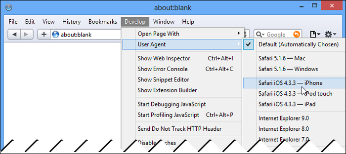
It is important to note that Safari, like Internet Explorer, will restore the value of the User-Agent string to the default value after you close the browser window.
Like Safari, Chrome has built-in developer tools that are immediately accessible by pressing Ctrl + Shift + I or by clicking the customize icon in the top-right, selecting Tools and then clicking on the Developer tools menu item.

Clicking on the Developer tool menu item will display a docked window at the bottom of the browser. In the bottom-left corner of this window is a small gear icon. Clicking on the icon will display the settings for the developer tools in an overlaid window. The window has three tabs: General, Overrides, and Shortcuts. Click on the Overrides tab, check the checkbox labeled User Agent, and then select the User-Agent string you wish to use from the drop-down menu.

Like Safari and Internet Explorer, you can create custom User-Agent strings to be used by the browser. Unlike those browsers, Google Chrome will remember the User-Agent string to be used if you close all the windows.
When using user agent emulation, all samples in this book will emulate the mobile Safari browser used by iOS from within Chrome. This is in small part due to Chrome using the same layout engine as Safari, but is primarily due to the developer tools that are built into the browser itself and the fact that it is more widely installed on computers running Windows than is Safari.
When using a mobile emulator, we will use Opera Mobile emulating a Samsung Galaxy S II—a device that has a screen resolution of 480 x 800, and has 216 pixels per inch.
We will also show screens from a few physical devices such as iPhone 4, iPhone 5, and the Asus Nexus 7 Android tablet.
You should feel free to run the samples in the book against any browser or emulator mentioned above.
Microsoft has unprecedented development support for the mobile web with Visual Studio 2012 and ASP.NET MVC 4.0. Out-of-the-box, the latest environment supports:
HTML5 and CSS3 (standards crucial to developing responsive mobile web apps)
The ability to merge, compress, and transform JavaScript and CSS files to minimize browser requests and bandwidth requirements
New convention support to target specific mobile platforms
As part of the new mobile application project template, jQuery Mobile integration into your mobile app projects
All of these improvements to Microsoft's development environment directly address the constraints with which we, as developers, engineers, architects, and content designers, must concern ourselves. If you couple these improvements with the improvements in .NET 4.5, .NET users such as us can now target the mobile web better than ever before.
In this chapter, we learned why it is important as developers to embrace the mobile web and ensure that our apps support it. We began with a brief history of the mobile web and the constraints still placed upon developers like us to ensure an optimal user experience when viewing our sites through a mobile browser. We also learned how to emulate the common mobile browsers from our desktop and received a glimpse of what Microsoft has provided in support of the mobile web with the new ASP.NET MVC 4 tooling, Visual Studio 2012, and .NET 4.5.
In the next chapter, we will create the shell for our app—a homebrew recipe sharing app called BrewHow—and configure our environment to run the app within an emulator.