


 Download code from GitHub
2. Python's Main Tools for Statistics
Overview
This chapter presents a practical introduction to the main libraries that most statistics practitioners use in Python. It will cover some of the most important and useful concepts, functions, and Application Programming Interfaces (APIs) of each of the key libraries. Almost all of the computational tools that will be needed for the rest of this book will be introduced in this chapter.
By the end of this chapter, you will understand the idea behind array vectorization of the NumPy library and be able to use its sampling functionalities. You'll be able to initialize pandas DataFrames to represent tabular data and manipulate their content. You'll also understand the importance of data visualization in data analysis and be able to utilize Python's two most popular visualization libraries: Matplotlib and Seaborn.
Introduction
After going through a refresher on the Python language in the previous chapter, we are now ready to tackle the main topics of this book: mathematics and statistics.
Among others, the general fields of computational mathematics and statistics can be broken up into three main tool-centric components: representation and engineering; analysis and computation; and finally, visualization. In the ecosystem of the Python programming language, specific libraries are dedicated to each of these components (namely, pandas, NumPy, Matplotlib, and Seaborn), making the process modular.
While there might be other similar packages and tools, the libraries that we will be discussing have been proven to possess a wide range of functionalities and support powerful options in terms of computation, data processing, and visualization, making them some of a Python programmer's preferred tools over the years.
In this chapter, we will be introduced to each of these libraries and learn about their main API. Using a hands-on approach, we will see how these tools allow great freedom and flexibility in terms of creating, manipulating, analyzing, and visualizing data in Python. Knowing how to use these tools will also equip us for more complicated topics in the later chapters of this workshop.
Scientific Computing and NumPy Basics
The term scientific computing has been used several times in this workshop so far; in the broadest sense of the term, it denotes the process of using computer programs (or anything with computing capabilities) to model and solve a specific problem in mathematics, engineering, or science. Examples may include mathematical models to look for and analyze patterns and trends in biological and social data, or machine learning models to make future predictions using economic data. As you may have already noticed, this definition has a significant overlap with the general fields of data science, and sometimes the terms are even used interchangeably.
The main workhorse of many (if not most) scientific computing projects in Python is the NumPy library. Since NumPy is an external library that does not come preinstalled with Python, we need to download and install it. As you may already know, installing external libraries and packages in Python can be done easily using package managers such as pip or Anaconda.
From your Terminal, run the following command to use pip to install NumPy in your Python environment:
$ pip install numpy
If you are currently in an Anaconda environment, you can run the following command instead:
$ conda install numpy
With these simple commands, all the necessary steps in the installation process are taken care of for us.
Some of NumPy's most powerful capabilities include vectorized, multi-dimensional array representations of objects; implementation of a wide range of linear algebraic functions and transformations; and random sampling. We will cover all of these topics in this section, starting with the general concept of arrays.
NumPy Arrays
We have actually already come across the concept of an array in the previous chapter, when we discussed Python lists. In general, an array is also a sequence of different elements that can be accessed individually or manipulated as a whole. As such, NumPy arrays are very similar to Python lists; in fact, the most common way to declare a NumPy array is to pass a Python list to the numpy.array() method, as illustrated here:
>>> import numpy as np
>>> a = np.array([1, 2, 3])
>>> a
array([1, 2, 3])
>>> a[1]
2
The biggest difference we need to keep in mind is that elements in a NumPy array need to be of the same type. For example, here, we are trying to create an array with two numbers and a string, which causes NumPy to forcibly convert all elements in the array into strings (the <U21 data type denotes the Unicode strings with fewer than 21 characters):
>>> b = np.array([1, 2, 'a'])
>>> b
array(['1', '2', 'a'], dtype='<U21')
Similar to the way we can create multi-dimensional Python lists, NumPy arrays support the same option:
>>> c = np.array([[1, 2, 3], [4, 5, 6], [7, 8, 9]])
>>> c
array([[1, 2, 3],
       [4, 5, 6],
       [7, 8, 9]])
Note
While working with NumPy, we often refer to multi-dimensional arrays as matrices.
Apart from initialization from Python lists, we can create NumPy arrays that are in a specific form. In particular, a matrix full of zeros or ones can be initialized using np.zeros() and np.ones(), respectively, with a given dimension and data type. Let's have a look at an example:
>>> zero_array = np.zeros((2, 2))  # 2 by 2 zero matrix
>>> zero_array
array([[0., 0.],
       [0., 0.]])
Here, the tuple (2, 2) specifies that the array (or matrix) being initialized should have a two-by-two dimension. As we can see by the dots after the zeros, the default data type of a NumPy array is a float and can be further specified using the dtype argument:
>>> one_array = np.ones((2, 2, 3), dtype=int)  # 3D one integer matrix
>>> one_array
array([[[1, 1, 1],
        [1, 1, 1]],
        [[1, 1, 1],
        [1, 1, 1]]])
All-zero or all-one matrices are common objects in mathematics and statistics, so these API calls will prove to be quite useful later on. Now, let's look at a common matrix object whose elements are all random numbers. Using np.random.rand(), we can create a matrix of a given shape, whose elements are uniformly sampled between 0 (inclusive) and 1 (exclusive):
>>> rand_array = np.random.rand(2, 3)
>>> rand_array
array([[0.90581261, 0.88732623, 0.291661  ],
       [0.44705149, 0.25966191, 0.73547706]])
Notice here that we are not passing the desired shape of our matrix as a tuple anymore, but as individual parameters of the np.random.rand() function instead.
If you are not familiar with the concept of randomness and random sampling from various distributions, don't worry, as we will cover that topic later on in this chapter as well. For now, let's move forward with our discussion about NumPy arrays, particularly about indexing and slicing.
You will recall that in order to access individual elements in a Python list, we pass its index inside square brackets next to the list variable; the same goes for one-dimensional NumPy arrays:
>>> a = np.array([1, 2, 3])
>>> a[0]
1
>>> a[1]
2
However, when an array is multi-dimensional, instead of using multiple square brackets to access subarrays, we simply need to separate the individual indices using commas. For example, we access the element in the second row and the second column of a three-by-three matrix as follows:
>>> b = np.array([[1, 2, 3], [4, 5, 6], [7, 8, 9]])
>>> b
array([[1, 2, 3],
       [4, 5, 6],
       [7, 8, 9]])
>>> b[1, 1]
5
Slicing NumPy arrays can be done in the same way: using commas. This syntax is very useful in terms of helping us access submatrices with more than one dimension in a matrix:
>>> a = np.random.rand(2, 3, 4)  # random 2-by-3-by-4 matrix
>>> a
array([[[0.54376986, 0.00244875, 0.74179644, 0.14304955],
        [0.77229612, 0.32254451, 0.0778769 , 0.2832851 ],
        [0.26492963, 0.5217093 , 0.68267418, 0.29538502]],
       [[0.94479229, 0.28608588, 0.52837161, 0.18493272],
        [0.08970716, 0.00239815, 0.80097454, 0.74721516],
        [0.70845696, 0.09788526, 0.98864408, 0.82521871]]])
>>> a[1, 0: 2, 1:]
array([[0.28608588, 0.52837161, 0.18493272],
       [0.00239815, 0.80097454, 0.74721516]])
In the preceding example, a[1, 0: 2, 1:] helps us to access the numbers in the original matrix, a; that is, in the second element in the first axis (corresponding to index 1), the first two elements in the second axis (corresponding to 0: 2), and the last three elements in the third axis (corresponding to 1:). This option is one reason why NumPy arrays are more powerful and flexible than Python lists, which do not support multi-dimensional indexing and slicing, as we have demonstrated.
Finally, another important syntax to manipulate NumPy arrays is the np.reshape() function, which, as its name suggests, changes the shape of a given NumPy array. The need for this functionality can arise on multiple occasions: when we need to display an array in a certain way for better readability, or when we need to pass an array to a built-in function that only takes in arrays of a certain shape.
We can explore the effect of this function in the following code snippet:
>>> a
array([[[0.54376986, 0.00244875, 0.74179644, 0.14304955],
        [0.77229612, 0.32254451, 0.0778769 , 0.2832851 ],
        [0.26492963, 0.5217093 , 0.68267418, 0.29538502]],
       [[0.94479229, 0.28608588, 0.52837161, 0.18493272],
        [0.08970716, 0.00239815, 0.80097454, 0.74721516],
        [0.70845696, 0.09788526, 0.98864408, 0.82521871]]])
>>> a.shape
(2, 3, 4)
>>> np.reshape(a, (3, 2, 4))
array([[[0.54376986, 0.00244875, 0.74179644, 0.14304955],
        [0.77229612, 0.32254451, 0.0778769 , 0.2832851 ]],
       [[0.26492963, 0.5217093 , 0.68267418, 0.29538502],
        [0.94479229, 0.28608588, 0.52837161, 0.18493272]],
       [[0.08970716, 0.00239815, 0.80097454, 0.74721516],
        [0.70845696, 0.09788526, 0.98864408, 0.82521871]]])
Note that the np.reshape() function does not mutate the array that is passed in-place; instead, it returns a copy of the original array with the new shape without modifying the original. We can also assign this returned value to a variable.
Additionally, notice that while the original shape of the array is (2, 3, 4), we changed it to (3, 2, 4). This can only be done when the total numbers of elements resulting from the two shapes are the same (2 x 3 x 4 = 3 x 2 x 4 = 24). An error will be raised if the new shape does not correspond to the original shape of an array in this way, as shown here:
>>> np.reshape(a, (3, 3, 3))
-------------------------------------------------------------------------
ValueError                          Traceback (most recent call last)
...
ValueError: cannot reshape array of size 24 into shape (3,3,3)
Speaking of reshaping a NumPy array, transposing a matrix is a special form of reshaping that flips the elements in the matrix along its diagonal. Computing the transpose of a matrix is a common task in mathematics and machine learning. The transpose of a NumPy array can be computed using the [array].T syntax. For example, when we run a.T in the Terminal, we get the transpose of matrix a, as follows:
>>> a.T
array([[[0.54376986, 0.94479229],
       [0.77229612, 0.08970716],
        [0.26492963, 0.70845696]],
       [[0.00244875, 0.28608588],
        [0.32254451, 0.00239815],
        [0.5217093 , 0.09788526]],
       [[0.74179644, 0.52837161],
        [0.0778769 , 0.80097454],
        [0.68267418, 0.98864408]],
       [[0.14304955, 0.18493272],
        [0.2832851 , 0.74721516],
        [0.29538502, 0.82521871]]])
And with that, we can conclude our introduction to NumPy arrays. In the next section, we will learn about another concept that goes hand in hand with NumPy arrays: vectorization.
Vectorization
In the broadest sense, the term vectorization in computer science denotes the process of applying a mathematical operation to an array (in a general sense) element by element. For example, an add operation where every element in an array is added to the same term is a vectorized operation; the same goes for vectorized multiplication, where all elements in an array are multiplied by the same term. In general, vectorization is achieved when all array elements are put through the same function.
Vectorization is done by default when an applicable operation is performed on a NumPy array (or multiple arrays). This includes binary functions such as addition, subtraction, multiplication, division, power, and mod, as well as several unary built-in functions in NumPy, such as absolute value, square root, trigonometric functions, logarithmic functions, and exponential functions.
Before we see vectorization in NumPy in action, it is worth discussing the importance of vectorization and its role in NumPy. As we mentioned previously, vectorization is generally the application of a common operation on the elements in an array. Due to the repeatability of the process, a vectorized operation can be optimized to be more efficient than its alternative implementation in, say, a for loop. However, the trade-off for this capability is that the elements in the array would need to be of the same data type—this is also a requirement for any NumPy array.
With that, let's move on to the following exercise, where we will see this effect in action.
Exercise 2.01: Timing Vectorized Operations in NumPy
In this exercise, we will calculate the speedup achieved by implementing various vectorized operations such as addition, multiplication, and square root calculation with NumPy arrays compared to a pure Python alternative without vectorization. To do this, perform the following steps:
- In the first cell of a new Jupyter notebook, import the NumPy package and the
Timerclass from thetimeitlibrary. The latter will be used to implement our timing functionality:import numpy as np from timeit import Timer
- In a new cell, initialize a Python list containing numbers ranging from 0 (inclusive) to 1,000,000 (exclusive) using the
range()function, as well as its NumPy array counterpart using thenp.array()function:my_list = list(range(10 ** 6)) my_array = np.array(my_list)
- We will now apply mathematical operations to this list and array in the following steps. In a new cell, write a function named
for_add()that returns a list whose elements are the elements in themy_listvariable with1added to each (we will use list comprehension for this). Write another function namedvec_add()that returns the NumPy array version of the same data, which is simplymy_array + 1:def for_add(): return [item + 1 for item in my_list] def vec_add(): return my_array + 1
- In the next code cell, initialize two
Timerobjects while passing in each of the preceding two functions. These objects contain the interface that we will use to keep track of the speed of the functions.Call the
repeat()function on each of the objects with the arguments 10 and 10—in essence, we are repeating the timing experiment by 100 times. Finally, as therepeat()function returns a list of numbers representing how much time passed in each experiment for a given function we are recording, we print out the minimum of this list. In short, we want the time of the fastest run of each of the functions:print('For-loop addition:') print(min(Timer(for_add).repeat(10, 10))) print('Vectorized addition:') print(min(Timer(vec_add).repeat(10, 10)))The following is the output that this program produced:
For-loop addition:
0.5640330809999909
Vectorized addition:
0.006047582000007878
While yours might be different, the relationship between the two numbers should be clear: the speed of the
forloop addition function should be many times lower than that of the vectorized addition function. - In the next code cell, implement the same comparison of speed where we multiply the numbers by
2. For the NumPy array, simply returnmy_array * 2:def for_mul(): return [item * 2 for item in my_list] def vec_mul(): return my_array * 2 print('For-loop multiplication:') print(min(Timer(for_mul).repeat(10, 10))) print('Vectorized multiplication:') print(min(Timer(vec_mul).repeat(10, 10)))Verify from the output that the vectorized multiplication function is also faster than the
forloop version. The output after running this code is as follows:For-loop multiplication: 0.5431750800000259 Vectorized multiplication: 0.005795304000002943
- In the next code cell, implement the same comparison where we compute the square root of the numbers. For the Python list, import and use the
math.sqrt()function on each element in the list comprehension. For the NumPy array, return the expressionnp.sqrt(my_array):import math def for_sqrt(): return [math.sqrt(item) for item in my_list] def vec_sqrt(): return np.sqrt(my_array) print('For-loop square root:') print(min(Timer(for_sqrt).repeat(10, 10))) print('Vectorized square root:') print(min(Timer(vec_sqrt).repeat(10, 10)))Verify from the output that the vectorized square root function is once again faster than its
forloop counterpart:For-loop square root: 1.1018582749999268 Vectorized square root: 0.01677640299999439
Also, notice that the
np.sqrt()function is implemented to be vectorized, which is why we were able to pass the whole array to the function.
This exercise introduced a few vectorized operations for NumPy arrays and demonstrated how much faster they are compared to their pure Python loop counterparts.
Note
To access the source code for this specific section, please refer to https://packt.live/38l3Nk7.
You can also run this example online at https://packt.live/2ZtBSdY.
That concludes the topic of vectorization in NumPy. In the next and final section on NumPy, we'll discuss another powerful feature that the package offers: random sampling.
Random Sampling
In the previous chapter, we saw an example of how to implement randomization in Python using the random library. However, the randomization in most of the methods implemented in that library is uniform, and in scientific computing and data science projects, sometimes, we need to draw samples from distributions other than the uniform one. This area is where NumPy once again offers a wide range of options.
Generally speaking, random sampling from a probability distribution is the process of selecting an instance from that probability distribution, where elements having a higher probability are more likely to be selected (or drawn). This concept is closely tied to the concept of a random variable in statistics. A random variable is typically used to model some unknown quantity in a statistical analysis, and it usually follows a given distribution, depending on what type of data it models. For example, the ages of members of a population are typically modeled using the normal distribution (also known as the bell curve or the Gaussian distribution), while the arrivals of customers to, say, a bank are often modeled using the Poisson distribution.
By randomly sampling a given distribution that is associated with a random variable, we can obtain an actual realization of the variable, from which we can perform various computations to obtain insights and inferences about the random variable in question.
We will revisit the concept and usage of probability distributions later in this book. For now, let's simply focus on the task at hand: how to draw samples from these distributions. This is done using the np.random package, which includes the interface that allows us to draw from various distributions.
For example, the following code snippet initializes a sample from the normal distribution (note that your output might be different from the following due to randomness):
>>> sample = np.random.normal()
>>> sample
-0.43658969989465696
You might be aware of the fact that the normal distribution is specified by two statistics: a mean and a standard deviation. These can be specified using the loc (whose default value is 0.0) and scale (whose default value is 1.0) arguments, respectively, in the np.random.normal() function, as follows:
>>> sample = np.random.normal(loc=100, scale=10)
>>> sample
80.31187658687652
It is also possible to draw multiple samples, as opposed to just a single sample, at once as a NumPy array. To do this, we specify the size argument of the np.random.normal() function with the desired shape of the output array. For example, here, we are creating a 2 x 3 matrix of samples drawn from the same normal distribution:
>>> samples = np.random.normal(loc=100, scale=10, size=(2, 3))
>>> samples
array([[ 82.7834678 , 109.16410976, 101.35105681],
       [112.54825751, 107.79073472,  77.70239823]])
This option allows us to take the output array and potentially apply other NumPy-specific operations to it (such as vectorization). The alternative is to sequentially draw individual samples into a list and convert it into a NumPy array afterward.
It is important to note that each probability distribution has its own statistic(s) that define it. The normal distribution, as we have seen, has a mean and a standard deviation, while the aforementioned Poisson distribution is defined with a λ (lambda) parameter, which is interpreted as the expectation of interval. Let's see this in an example:
>>> samples = np.random.poisson(lam=10, size=(2, 2))
>>> samples
array([[11, 10],
       [15, 11]])
Generally, before drawing a sample from a probability distribution in NumPy, you should always look up the corresponding documentation to see what arguments are available for that specific distribution and what their default values are.
Aside from probability distribution, NumPy also offers other randomness-related functionalities that can be found in the random module. For example, the np.random.randint() function returns a random integer between two given numbers; np.random.choice() randomly draws a sample from a given one-dimensional array; np.random.shuffle(), on the other hand, randomly shuffles a given sequence in-place.
These functionalities, which are demonstrated in the following code snippet, offer a significant degree of flexibility in terms of working with randomness in Python in general, and specifically in scientific computing:
>>> np.random.randint(low=0, high=10, size=(2, 5))
array([[6, 4, 1, 3, 6],
       [0, 8, 8, 8, 8]])
>>> np.random.choice([1, 3, 4, -6], size=(2, 2))
array([[1, 1],
       [1, 4]])
>>> a = [1, 2, 3, 4]
>>> for _ in range(3):
...        np.random.shuffle(a)
...        print(a)
[4, 1, 3, 2]
[4, 1, 2, 3]
[1, 2, 4, 3]
A final important topic that we need to discuss whenever there is randomness involved in programming is reproducibility. This term denotes the ability to obtain the same result from a program in a different run, especially when there are randomness-related elements in that program.
Reproducibility is essential when a bug exists in a program but only manifests itself in certain random cases. By forcing the program to generate the same random numbers every time it executes, we have another way to narrow down and identify this kind of bug aside from unit testing.
In data science and statistics, reproducibility is of the utmost importance. Without a program being reproducible, it is possible for one researcher to find a statistically significant result while another is unable to, even when the two have the same code and methods. This is why many practitioners have begun placing heavy emphasis on reproducibility in the fields of data science and machine learning.
The most common method to implement reproducibility (which is also the easiest to program) is to simply fix the seed of the program (specifically its libraries) that utilizes randomness. Fixing the seed of a randomness-related library ensures that the same random numbers will be generated across different runs of the same program. In other words, this allows for the same result to be produced, even if a program is run multiple times on different machines.
To do this, we can simply pass an integer to the appropriate seed function of the library/package that produces randomness for our programs. For example, to fix the seed for the random library, we can write the following code:
>>> import random
>>> random.seed(0)  # can use any other number
For the random package in NumPy, we can write the following:
>>> np.random.seed(0)
Setting the seed for these libraries/packages is generally a good practice when you are contributing to a group or an open source project; again, it ensures that all members of the team are able to achieve the same result and eliminates miscommunication.
This topic also concludes our discussion of the NumPy library. Next, we will move on to another integral part of the data science and scientific computing ecosystem in Python: the pandas library.
Working with Tabular Data in pandas
If NumPy is used on matrix data and linear algebraic operations, pandas is designed to work with data in the form of tables. Just like NumPy, pandas can be installed in your Python environment using the pip package manager:
$ pip install pandas
If you are using Anaconda, you can download it using the following command:
$ conda install pandas
Once the installation process completes, fire off a Python interpreter and try importing the library:
>>> import pandas as pd
If this command runs without any error message, then you have successfully installed pandas. With that, let's move on with our discussions, beginning with the most commonly used data structure in pandas, DataFrame, which can represent table data: two-dimensional data with row and column labels. This is to be contrasted with NumPy arrays, which can take on any dimension but do not support labeling.
Initializing a DataFrame Object
There are multiple ways to initialize a DataFrame object. First, we can manually create one by passing in a Python dictionary, where each key should be the name of a column, and the value for that key should be the data included for that column, in the form of a list or a NumPy array.
For example, in the following code, we are creating a table with two rows and three columns. The first column contains the numbers 1 and 2 in order, the second contains 3 and 4, and the third 5 and 6:
>>> import pandas as pd
>>> my_dict = {'col1': [1, 2], 'col2': np.array([3, 4]),'col3': [5, 6]}
>>> df = pd.DataFrame(my_dict)
>>> df
     col1    col2    col3
0    1       3       5
1    2       4       6
The first thing to note about DataFrame objects is that, as you can see from the preceding code snippet, when one is printed out, the output is automatically formatted by the backend of pandas. The tabular format makes the data represented in that object more readable. Additionally, when a DataFrame object is printed out in a Jupyter notebook, similar formatting is utilized for the same purpose of readability, as illustrated in the following screenshot:
Figure 2.1: Printed DataFrame objects in Jupyter Notebooks
Another common way to initialize a DataFrame object is that when we already have its data represented by a 2D NumPy array, we can directly pass that array to the DataFrame class. For example, we can initialize the same DataFrame we looked at previously with the following code:
>>> my_array = np.array([[1, 3, 5], [2, 4, 6]])
>>> alt_df = pd.DataFrame(my_array, columns=['col1', 'col2', 'col3'])
>>> alt_df
     col1    col2    col3
0    1       3       5
1    2       4       6
That said, the most common way in which a DataFrame object is initialized is through the pd.read_csv() function, which, as the name suggests, reads in a CSV file (or any text file formatted in the same way but with a different separating special character) and renders it as a DataFrame object. We will see this function in action in the next section, where we will understand the working of more functionalities from the pandas library.
Accessing Rows and Columns
Once we already have a table of data represented in a DataFrame object, there are numerous options we can use to interact with and manipulate this table. For example, the first thing we might care about is accessing the data of certain rows and columns. Luckily, pandas offers intuitive Python syntax for this task.
To access a group of rows or columns, we can take advantage of the loc method, which takes in the labels of the rows/columns we are interested in. Syntactically, this method is used with square brackets (to simulate the indexing syntax in Python). For example, using the same table from our previous section, we can pass in the name of a row (for example, 0):
>>> df.loc[0]
col1    1
col2    3
col3    5
Name: 0, dtype: int64
We can see that the object returned previously contains the information we want (the first row, and the numbers 1, 3, and 5), but it is formatted in an unfamiliar way. This is because it is returned as a Series object. Series objects are a special case of DataFrame objects that only contain 1D data. We don't need to pay too much attention to this data structure as its interface is very similar to that of DataFrame.
Still considering the loc method, we can pass in a list of row labels to access multiple rows. The following code returns both rows in our example table:
>>> df.loc[[0, 1]]
     col1    col2    col3
0    1       3       5
1    2       4       6
Say you want to access the data in our table column-wise. The loc method offers that option via the indexing syntax that we are familiar with in NumPy arrays (row indices separated by column indices by a comma). Accessing the data in the first row and the second and third columns:
>>> df.loc[0, ['col2', 'col3']]
col2    3
col3    5
Name: 0, dtype: int64
Note that if you'd like to return a whole column in a DataFrame object, you can use the special character colon, :, in the row index to indicate that all the rows should be returned. For example, to access the 'col3' column in our DataFrame object, we can say df.loc[:, 'col3']. However, in this special case of accessing a whole column, there is another simple syntax: just using the square brackets without the loc method, as follows:
>>> df['col3']
0    5
1    6
Name: col3, dtype: int64
Earlier, we said that when accessing individual rows or columns in a DataFrame, Series objects are returned. These objects can be iterated using, for example, a for loop:
>>> for item in df.loc[:, 'col3']:
...     print(item)
5
6
In terms of changing values in a DataFrame object, we can use the preceding syntax to assign new values to rows and columns:
>>> df.loc[0] = [3, 6, 9]  # change first row
>>> df
     col1    col2    col3
0    3       6       9
1    2       4       6
>>> df['col2'] = [0, 0]  # change second column
>>> df
     col1    col2    col3
0    3       0       9
1    2       0       6
Additionally, we can use the same syntax to declare new rows and columns:
>>> df['col4'] = [10, 10]
>>> df.loc[3] = [1, 2, 3, 4]
>>> df
     col1    col2    col3    col4
0    3       0       9       10
1    2       0       6       10
3    1       2       3       4
Finally, even though it is more common to access rows and columns in a DataFrame object by specifying their actual indices in the loc method, it is also possible to achieve the same effect using an array of Boolean values (True and False) to indicate which items should be returned.
For example, we can access the items in the second row and the second and fourth columns in our current table by writing the following:
>>> df.loc[[False, True, False], [False, True, False, True]]
     col2    col4
1    0       10
Here, the Boolean index list for the rows [False, True, False] indicates that only the second element (that is, the second row) should be returned, while the Boolean index list for the columns, similarly, specifies that the second and fourth columns are to be returned.
While this method of accessing elements in a DataFrame object might seem strange, it is highly valuable for filtering and replacing tasks. Specifically, instead of passing in lists of Boolean values as indices, we can simply use a conditional inside the loc method. For example, to display our current table, just with the columns whose values in their first row are larger than 5 (which should be the third and fourth columns), we can write the following:
>>> df.loc[:, df.loc[0] > 5]
     col3    col4
0    9       10
1    6       10
3    3       4
Again, this syntax is specifically useful in terms of filtering out the rows or columns in a DataFrame object that satisfy some condition and potentially assign new values to them. A special case of this functionality is find-and-replace tasks (which we will go through in the next section).
Manipulating DataFrames
In this section, we will try out a number of methods and functions for DataFrame objects that are used to manipulate the data within those objects. Of course, there are numerous other methods that are available (which you can find in the official documentation: https://pandas.pydata.org/pandas-docs/stable/reference/api/pandas.DataFrame.html). However, the methods given in the following table are among the most commonly used and offer great power and flexibility in terms of helping us to create, maintain, and mutate our data tables:
Figure 2.2: Methods used to manipulate pandas data
The following exercise will demonstrate the effects of the preceding methods for better understanding.
Exercise 2.02: Data Table Manipulation
In this hands-on exercise, we will go through the functions and methods included in the preceding section. Our goal is to see the effects of those methods, and to perform common data manipulation techniques such as renaming columns, filling in missing values, sorting values, or writing a data table to file.
Perform the following steps to complete this exercise:
- From the GitHub repository of this workshop, copy the
Exercise2.02/dataset.csvfile within theChapter02folder to a new directory. The content of the file is as follows:id,x,y,z 0,1,1,3 1,1,0,9 2,1,3, 3,2,0,10 4,1,,4 5,2,2,3
- Inside that new directory, create a new Jupyter notebook. Make sure that this notebook and the CSV file are in the same location.
- In the first cell of this notebook, import both pandas and NumPy, and then read in the
dataset.csvfile using thepd.read_csv()function. Specify theindex_colargument of this function to be'id', which is the name of the first column in our sample dataset:import pandas as pd import numpy as np df = pd.read_csv('dataset.csv', index_col='id') - When we print this newly created
DataFrameobject out, we can see that its values correspond directly to our original input file:x y z id 0 1 1.0 3.0 1 1 0.0 9.0 2 1 3.0 NaN 3 2 0.0 10.0 4 1 NaN 4.0 5 2 2.0 3.0
Notice the
NaN(Not a Number) values here;NaNis the default value that will be filled in empty cells of aDataFrameobject upon initialization. Since our original dataset was purposefully designed to contain two empty cells, those cells were appropriately filled in withNaN, as we can see here.Additionally,
NaNvalues are registered as floats in Python, which is why the data type of the two columns containing them are converted into floats accordingly (indicated by the decimal points in the values). - In the next cell, rename the current columns to
'col_x','col_y', and'col_z'with therename()method. Here, thecolumnsargument should be specified with a Python dictionary mapping each old column name to its new name:df = df.rename(columns={'x': 'col_x', 'y': 'col_y', \ 'z': 'col_z'})This change can be observed when
dfis printed out after the line of code is run:col_x col_y col_z id 0 1 1.0 3.0 1 1 0.0 9.0 2 1 3.0 NaN 3 2 0.0 10.0 4 1 NaN 4.0 5 2 2.0 3.0
- In the next cell, use the
fillna()function to replace theNaNvalues with zeros. After this, convert all the data in our table into integers usingastype(int):df = df.fillna(0) df = df.astype(int)
The resulting
DataFrameobject now looks like this:col_x col_y col_z id 0 1 1 3 1 1 0 9 2 1 3 0 3 2 0 10 4 1 0 4 5 2 2 3
- In the next cell, remove the second, fourth, and fifth rows from the dataset by passing the
[1, 3, 4]list to thedropmethod:df = df.drop([1, 3, 4], axis=0)
Note that the
axis=0argument specifies that the labels we are passing to the method specify rows, not columns, of the dataset. Similarly, to drop specific columns, you can use a list of column labels while specifyingaxis=1.The resulting table now looks like this:
     col_x    col_y    col_z
id
0    1        1        3
2    1        3        0
5    2        2        3
- In the next cell, create an all-zero, 2 x 3
DataFrameobject with the corresponding column labels as the currentdfvariable:zero_df = pd.DataFrame(np.zeros((2, 3)), columns=['col_x', 'col_y', \ 'col_z'])
The output is as follows:
     col_x    col_y    col_z
0    0.0      0.0      0.0
1    0.0      0.0      0.0
- In the next code cell, use the
pd.concat()function to concatenate the twoDataFrameobjects together (specifyaxis=0so that the two tables are concatenated vertically, instead of horizontally):df = pd.concat([df, zero_df], axis=0)
Our current
dfvariable now prints out the following (notice the two newly concatenated rows at the bottom of the table):col_x col_y col_z 0 1.0 1.0 3.0 2 1.0 3.0 0.0 5 2.0 2.0 3.0 0 0.0 0.0 0.0 1 0.0 0.0 0.0
- In the next cell, sort our current table in increasing order by the data in the
col_xcolumn:df = df.sort_values('col_x', axis=0)The resulting dataset now looks like this:
     col_x    col_y    col_z
0    0.0      0.0      0.0
1    0.0      0.0      0.0
0    1.0      1.0      3.0
2    1.0      3.0      0.0
5    2.0      2.0      3.0
- Finally, in another code cell, convert our table into the integer data type (the same way as before) and use the
to_csv()method to write this table to a file. Pass in'output.csv'as the name of the output file and specifyindex=Falseso that the row labels are not included in the output:df = df.astype(int) df.to_csv('output.csv', index=False)The written output should look as follows:
col_x, col_y, col_z
0,0,0
0,0,0
1,1,3
1,3,0
2,2,3
And that is the end of this exercise. Overall, this exercise simulated a simplified workflow of working with a tabular dataset: reading in the data, manipulating it in some way, and finally writing it to file.
Note
To access the source code for this specific section, please refer to https://packt.live/38ldQ8O.
You can also run this example online at https://packt.live/3dTzkL6.
In the next and final section on pandas, we will consider a number of more advanced functionalities offered by the library.
Advanced Pandas Functionalities
Accessing and changing the values in the rows and columns of a DataFrame object are among the simplest ways to work with tabular data using the pandas library. In this section, we will go through three other options that are more complicated but also offer powerful options for us to manipulate our DataFrame objects. The first is the apply() method.
If you are already familiar with the concept of this method for other data structures, the same goes for this method, which is implemented for DataFrame objects. In a general sense, this method is used to apply a function to all elements within a DataFrame object. Similar to the concept of vectorization that we discussed earlier, the resulting DataFrame object, after the apply() method, will have its elements as the result of the specified function when each element of the original data is fed to it.
For example, say we have the following DataFrame object:
>>> df = pd.DataFrame({'x': [1, 2, -1], 'y': [-3, 6, 5], \
                       'z': [1, 3, 2]})
>>> df
     x     y     z
0    1     -3    1
1    2     6     3
2    -1    5     2
Now, say we'd like to create another column whose entries are the entries in the x_squared column. We can then use the apply() method, as follows:
>>> df['x_squared'] = df['x'].apply(lambda x: x ** 2)
>>> df
     x     y    z    x_squared
0    1     -3   1    1
1    2     6    3    4
2    -1    5    2    1
The term lambda x: x ** 2 here is simply a quick way to declare a function without a name. From the printed output, we see that the 'x_squared' column was created correctly. Additionally, note that with simple functions such as the square function, we can actually take advantage of the simple syntax of NumPy arrays that we are already familiar with. For example, the following code will have the same effect as the one we just considered:
>>> df['x_squared'] = df['x'] ** 2
However, with a function that is more complex and cannot be vectorized easily, it is better to fully write it out and then pass it to the apply() method. For example, let's say we'd like to create a column, each cell of which should contain the string 'even' if the element in the x column in the same row is even, and the string 'odd' otherwise.
Here, we can create a separate function called parity_str() that takes in a number and returns the corresponding string. This function can then be used with the apply() method on df['x'], as follows:
>>> def parity_str(x):
...     if x % 2 == 0:
...         return 'even'

...     return 'odd'
>>> df['x_parity'] = df['x'].apply(parity_str)
>>> df
     x     y     z    x_squared    x_parity
0    1     -3    1    1            odd
1    2     6     3    4            even
2    -1    5     2    1            odd
Another commonly used functionality in pandas that is slightly more advanced is the pd.get_dummies() function. This function implements the technique called one-hot encoding, which is to be used on a categorical attribute (or column) in a dataset.
We will discuss the concept of categorical attributes, along with other types of data, in more detail in the next chapter. For now, we simply need to keep in mind that plain categorical data sometimes cannot be interpreted by statistical and machine learning models. Instead, we would like to have a way to translate the categorical characteristic of the data into a numerical form while ensuring that no information is lost.
One-hot encoding is one such method; it works by generating a new column/attribute for each unique value and populating the cells in the new column with Boolean data, indicating the values from the original categorical attribute.
This method is easier to understand via examples, so let's consider the new 'x_parity' column we created in the preceding example:
>>> df['x_parity']
0     odd
1    even
2     odd
Name: x_parity, dtype: object
This column is considered a categorical attribute since its values belong to a specific set of categories (in this case, the categories are odd and even). Now, by calling pd.get_dummies() on the column, we obtain the following DataFrame object:
>>> pd.get_dummies(df['x_parity'])
     even    odd
0    0       1
1    1       0
2    0       1
As we can observe from the printed output, the DataFrame object includes two columns that correspond to the unique values in the original categorical data (the 'x_parity' column). For each row, the column that corresponds to the value in the original data is set to 1 and the other column(s) is/are set to 0. For example, the first row originally contained odd in the 'x_parity' column, so its new odd column is set to 1.
We can see that with one-hot encoding, we can convert any categorical attribute into a new set of binary attributes, making the data readably numerical for statistical and machine learning models. However, a big drawback of this method is the increase in dimensionality, as it creates a number of new columns that are equal to the number of unique values in the original categorical attribute. As such, this method can cause our table to greatly increase in size if the categorical data contains many different values. Depending on your computing power and resources, the recommended limit for the number of unique categorical values for the method is 50.
The value_counts() method is another valuable tool in pandas that you should have in your toolkit. This method, to be called on a column of a DataFrame object, returns a list of unique values in that column and their respective counts. This method is thus only applicable to categorical or discrete data, whose values belong to a given, predetermined set of possible values.
For example, still considering the 'x_parity' attribute of our sample dataset, we'll inspect the effect of the value_counts() method:
>>> df['x_parity'].value_counts()
odd     2
even    1
Name: x_parity, dtype: int64
We can see that in the 'x_parity' column, we indeed have two entries (or rows) whose values are odd and one entry for even. Overall, this method is quite useful in determining the distribution of values in, again, categorical and discrete data types.
The next and last advanced functionality of pandas that we will discuss is the groupby operation. This operation allows us to separate a DataFrame object into subgroups, where the rows in a group all share a value in a categorical attribute. From these separate groups, we can then compute descriptive statistics (a concept we will delve into in the next chapter) to explore our dataset further.
We will see this in action in our next exercise, where we'll explore a sample student dataset.
Exercise 2.03: The Student Dataset
By considering a sample of what can be a real-life dataset, we will put our knowledge of pandas' most common functions to use, including what we have been discussing, as well as the new groupby operation.
Perform the following steps to complete this exercise:
- Create a new Jupyter notebook and, in its first cell, run the following code to generate our sample dataset:
import pandas as pd
student_df = pd.DataFrame({'name': ['Alice', 'Bob', 'Carol', \
                                    'Dan', 'Eli', 'Fran'],\
                           'gender': ['female', 'male', \
                                      'female', 'male', \
                                      'male', 'female'],\
                           'class': ['FY', 'SO', 'SR', \
                                     'SO',' JR', 'SR'],\
                           'gpa': [90, 93, 97, 89, 95, 92],\
                           'num_classes': [4, 3, 4, 4, 3, 2]})
student_df
This code will produce the following output, which displays our sample dataset in tabular form:
     name    gender    class    gpa    num_classes
0    Alice   female    FY       90     4
1    Bob     male      SO       93     3
2    Carol   female    SR       97     4
3    Dan     male      SO       89     4
4    Eli     male      JR       95     3
5    Fran    female    SR       92     2
Most of the attributes in our dataset are self-explanatory: in each row (which represents a student),
namecontains the name of the student,genderindicates whether the student is male or female,classis a categorical attribute that can take four unique values (FYfor first-year,SOfor sophomore,JRfor junior, andSRfor senior),gpadenotes the cumulative score of the student, and finally,num_classesholds the information of how many classes the student is currently taking. - In a new code cell, create a new attribute named
'female_flag'whose individual cells should hold the Boolean valueTrueif the corresponding student is female, andFalseotherwise.Here, we can see that we can take advantage of the
apply()method while passing in a lambda object, like so:student_df['female_flag'] = student_df['gender']\ .apply(lambda x: x == 'female')
However, we can also simply declare the new attribute using the
student_df['gender'] == 'female'expression, which evaluates the conditionals sequentially in order:student_df['female_flag'] = student_df['gender'] == 'female'
- This newly created attribute contains all the information included in the old
gendercolumn, so we will remove the latter from our dataset using thedrop()method (note that we need to specify theaxis=1argument since we are dropping a column):student_df = student_df.drop('gender', axis=1)Our current
DataFrameobject should look as follows:name class gpa num_classes female_flag 0 Alice FY 90 4 True 1 Bob SO 93 3 False 2 Carol SR 97 4 True 3 Dan SO 89 4 False 4 Eli JR 95 3 False 5 Fran SR 92 2 True
- In a new code cell, write an expression to apply one-hot encoding to the categorical attribute,
class:pd.get_dummies(student_df['class'])
- In the same code cell, take this expression and include it in a
pd.concat()function to concatenate this newly createdDataFrameobject to our old one, while simultaneously dropping theclasscolumn (as we now have an alternative for the information in this attribute):student_df = pd.concat([student_df.drop('class', axis=1), \ pd.get_dummies(student_df['class'])], axis=1)The current dataset should now look as follows:
     name    gpa    num_classes    female_flag    JR    FY    SO    SR
0    Alice   90     4              True           1     0     0     0
1    Bob     93     3              False          0     0     1     0
2    Carol   97     4              True           0     0     0     1
3    Dan     89     4              False          0     0     1     0
4    Eli     95     3              False          0     1     0     0
5    Fran    92     2              True           0     0     0     1
- In the next cell, call the
groupby()method onstudent_dfwith thefemale_flagargument and assign the returned value to a variable namedgender_group:gender_group = student_df.groupby('female_flag')As you might have guessed, here, we are grouping the students of the same gender into groups, so male students will be grouped together, and female students will also be grouped together but separate from the first group.
It is important to note that when we attempt to print out this
GroupByobject stored in thegender_groupvariable, we only obtain a generic, memory-based string representation:<pandas.core.groupby.generic.DataFrameGroupBy object at 0x11d492550>
- Now, we'd like to compute the average GPA of each group in the preceding grouping. To do that, we can use the following simple syntax:
gender_group['gpa'].mean()
The output will be as follows:
female_flag
False    92.333333
True     93.000000
Name: gpa, dtype: float64
Our command on the
gender_groupvariable is quite intuitive: we'd like to compute the average of a specific attribute, so we access that attribute using square brackets,[' gpa '], and then call themean()method on it. - Similarly, we can compute the total number of classes taking male students, as well as that number for the female students, with the following code:
gender_group['num_classes'].sum()
The output is as follows:
female_flag
False    10
True     10
Name: num_classes, dtype: int64
Throughout this exercise, we have reminded ourselves of some of the important methods available in pandas, and seen the effects of the groupby operation in action via a sample real-life dataset. This exercise also concludes our discussion on the pandas library, the premier tool for working with tabular data in Python.
Note
To access the source code for this specific section, please refer to https://packt.live/2NOe5jt.
You can also run this example online at https://packt.live/3io2gP2.
In the final section of this chapter, we will talk about the final piece of a typical data science/scientific computing pipeline: data visualization.
Data Visualization with Matplotlib and Seaborn
Data visualization is undoubtedly an integral part of any data pipeline. Good visualizations can not only help scientists and researchers find unique insights about their data, but also help convey complex, advanced ideas in an intuitive, easy to understand way. In Python, the backend of most of the data visualization tools is connected to the Matplotlib library, which offers an incredibly wide range of options and functionalities, as we will see in this upcoming discussion.
First, to install Matplotlib, simply run either of the following commands, depending on which one is your Python package manager:
$ pip install matplotlib
$ conda install matplotlib
The convention in Python is to import the pyplot package from the Matplotlib library, like so:
>>> import matplotlib.pyplot as plt
This pyplot package, whose alias is now plt, is the main workhorse for any visualization functionality in Python and will therefore be used extensively.
Overall, instead of learning about the theoretical background of the library, in this section, we will take a more hands-on approach and go through a number of different visualization options that Matplotlib offers. In the end, we will obtain practical takeaways that will be beneficial for your own projects in the future.
Scatter Plots
One of the most fundamental visualization methods is a scatter plot – plotting a list of points on a plane (or other higher-dimensional spaces). This is simply done by means of the plt.scatter() function. As an example, say we have a list of five points, whose x- and y-coordinates are stored in the following two lists, respectively:
>>> x = [1, 2, 3, 1.5, 2]
>>> y = [-1, 5, 2, 3, 0]
Now, we can use the plt.scatter() function to create a scatter plot:
>>> import matplotlib.pyplot as plt
>>> plt.scatter(x, y)
>>> plt.show()
The preceding code will generate the following plot, which corresponds exactly to the data in the two lists that we fed into the plt.scatter() function:
Figure 2.3: Scatter plot using Matplotlib
Note the plt.show() command at the end of the code snippet. This function is responsible for displaying the plot that is customized by the preceding code, and it should be placed at the very end of a block of visualization-related code.
As for the plt.scatter() function, there are arguments that we can specify to customize our plots further. For example, we can customize the size of the individual points, as well as their respective colors:
>>> sizes = [10, 40, 60, 80, 100]
>>> colors = ['r', 'b', 'y', 'g', 'k']
>>> plt.scatter(x, y, s=sizes, c=colors)
>>> plt.show()
The preceding code produces the following output:
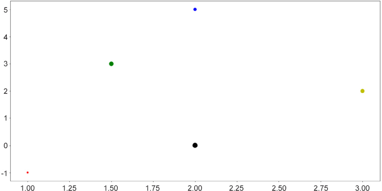
Figure 2.4: Scatter plots with size and color customization
This functionality is useful when the points you'd like to visualize in a scatter plot belong to different groups of data, in which case you can assign a color to each group. In many cases, clusters formed by different groups of data are discovered using this method.
Note
To see a complete documentation of Matplotlib colors and their usage, you can consult the following web page: https://matplotlib.org/2.0.2/api/colors_api.html.
Overall, scatter plots are used when we'd like to visualize the spatial distribution of the data that we are interested in. A potential goal of using a scatter plot is to reveal any clustering existing within our data, which can offer us further insights regarding the relationship between the attributes of our dataset.
Next, let's consider line graphs.
Line Graphs
Line graphs are another of the most fundamental visualization methods, where points are plotted along a curve, as opposed to individually scattered. This is done via the simple plt.plot() function. As an example, we are plotting out the sine wave (from 0 to 10) in the following code:
>>> import numpy as np
>>> x = np.linspace(0, 10, 1000)
>>> y = np.sin(x)
>>> plt.plot(x, y)
>>> plt.show()
Note that here, the np.linspace() function returns an array of evenly spaced numbers between two endpoints. In our case, we obtain 1,000 evenly spaced numbers between 0 and 10. The goal here is to take the sine function on these numbers and plot them out. Since the points are extremely close to one another, it will create the effect that a true smooth function is being plotted.
This will result in the following graph:
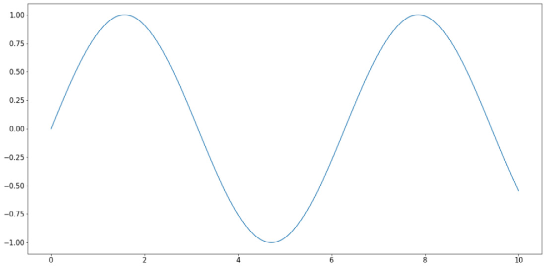
Figure 2.5: Line graphs using Matplotlib
Similar to the options for scatter plots, here, we can customize various elements for our line graphs, specifically the colors and styles of the lines. The following code, which is plotting three separate curves (the y = x graph, the natural logarithm function, and the sine wave), provides an example of this:
x = np.linspace(1, 10, 1000)
linear_line = x
log_curve = np.log(x)
sin_wave = np.sin(x)
curves = [linear_line, log_curve, sin_wave]
colors = ['k', 'r', 'b']
styles = ['-', '--', ':']
for curve, color, style in zip(curves, colors, styles):
    plt.plot(x, curve, c=color, linestyle=style)
plt.show()
The following output is produced by the preceding code:
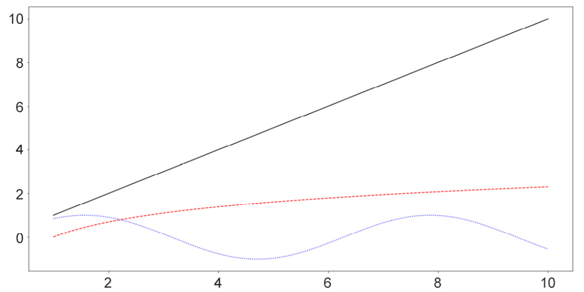
Figure 2.6: Line graphs with style customization
Note
A complete list of line styles can be found in Matplotlib's official documentation, specifically at the following page: https://matplotlib.org/3.1.0/gallery/lines_bars_and_markers/linestyles.html.
Generally, line graphs are used to visualize the trend of a specific function, which is represented by a list of points sequenced in order. As such, this method is highly applicable to data with some sequential elements, such as a time series dataset.
Next, we will consider the available options for bar graphs in Matplotlib.
Bar Graphs
Bar graphs are typically used to represent the counts of unique values in a dataset via the height of individual bars. In terms of implementation in Matplotlib, this is done using the plt.bar() function, as follows:
labels = ['Type 1', 'Type 2', 'Type 3']
counts = [2, 3, 5]
plt.bar(labels, counts)
plt.show()
The first argument that the plt.bar() function takes in (the labels variable, in this case) specifies what the labels for the individual bars will be, while the second argument (counts, in this case) specifies the height of the bars. With this code, the following graph is produced:
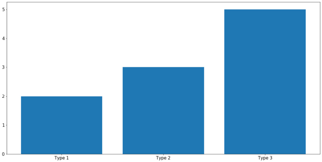
Figure 2.7: Bar graphs using Matplotlib
As always, you can specify the colors of individual bars using the c argument. What is more interesting to us is the ability to create more complex bar graphs with stacked or grouped bars. Instead of simply comparing the counts of different data, stacked or grouped bars are used to visualize the composition of each bar in smaller subgroups.
For example, let's say within each group of Type 1, Type 2, and Type 3, as in the previous example, we have two subgroups, Type A and Type B, as follows:
type_1 = [1, 1]  # 1 of type A and 1 of type B
type_2 = [1, 2]  # 1 of type A and 2 of type B
type_3 = [2, 3]  # 2 of type A and 3 of type B
counts = [type_1, type_2, type_3]
In essence, the total counts for Type 1, Type 2, and Type 3 are still the same, but now each can be further broken up into two subgroups, represented by the 2D list counts. In general, the types here can be anything; our goal is to simply visualize this composition of the subgroups within each large type using a stacked or grouped bar graph.
First, we aim to create a grouped bar graph; our goal is the following visualization:
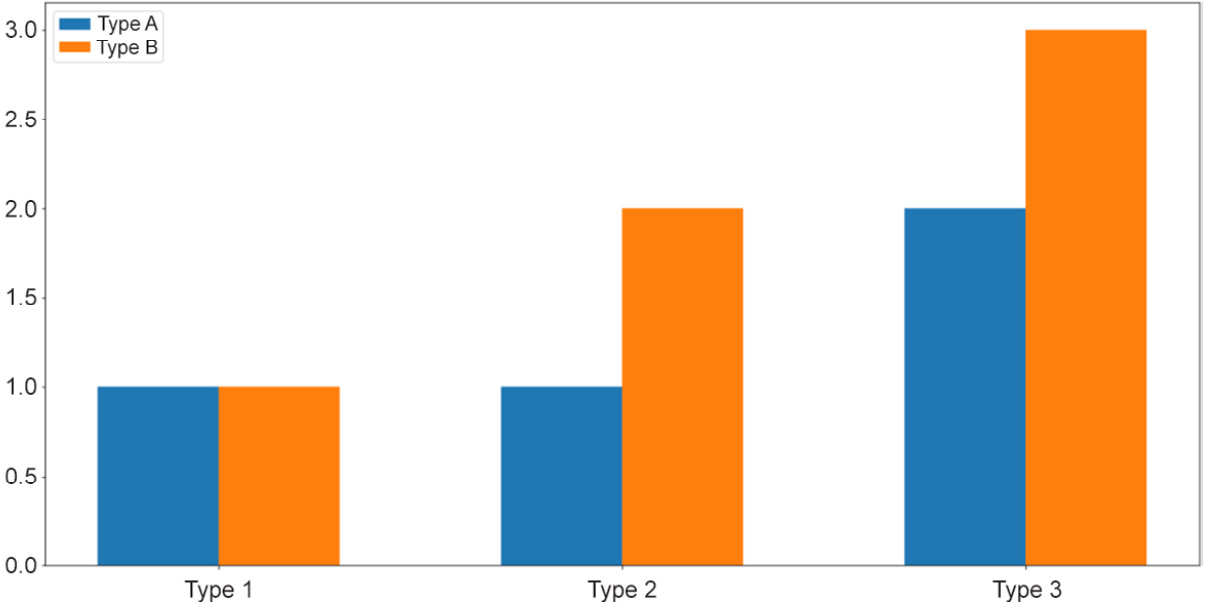
Figure 2.8: Grouped bar graphs
This is a more advanced visualization, and the process of creating the graph is thus more involved. First, we need to specify the individual locations of the grouped bars and their width:
locations = np.array([0, 1, 2])
width = 0.3
Then, we call the plt.bar() function on the appropriate data: once on the Type A numbers ([my_type[0] for my_type in counts], using list comprehension) and once on the Type B numbers ([my_type[1] for my_type in counts]):
bars_a = plt.bar(locations - width / 2,   [my_type[0] for my_type in counts], width=width)
bars_b = plt.bar(locations + width / 2,   [my_type[1] for my_type in counts], width=width)
The terms locations - width / 2 and locations + width / 2 specify the exact locations of the Type A bars and the Type B bars, respectively. It is important that we reuse this width variable in the width argument of the plt.bar() function so that the two bars of each group are right next to each other.
Next, we'd like to customize the labels for each group of bars. Additionally, note that we are also assigning the returned values of the calls to plt.bar() to two variables, bars_a and bars_b, which will then be used to generate the legend for our graph:
plt.xticks(locations, ['Type 1', 'Type 2', 'Type 3'])
plt.legend([bars_a, bars_b], ['Type A', 'Type B'])
Finally, as we call plt.show(), the desired graph will be displayed.
So, that is the process of creating a grouped bar graph, where individual bars belonging to a group are placed next to one another. On the other hand, a stacked bar graph places the bars on top of each other. These two types of graphs are mostly used to convey the same information, but with stacked bars, the total counts of each group are easier to visually inspect and compare.
To create a stacked bar graph, we take advantage of the bottom argument of the plt.bar() function while declaring the non-first groups. Specifically, we do the following:
bars_a = plt.bar(locations, [my_type[0] for my_type in counts])
bars_b = plt.bar(locations, [my_type[1] for my_type in counts], \
                 bottom=[my_type[0] for my_type in counts])
plt.xticks(locations, ['Type 1', 'Type 2', 'Type 3'])
plt.legend([bars_a, bars_b], ['Type A', 'Type B'])
plt.show()
The preceding code will create the following visualization:
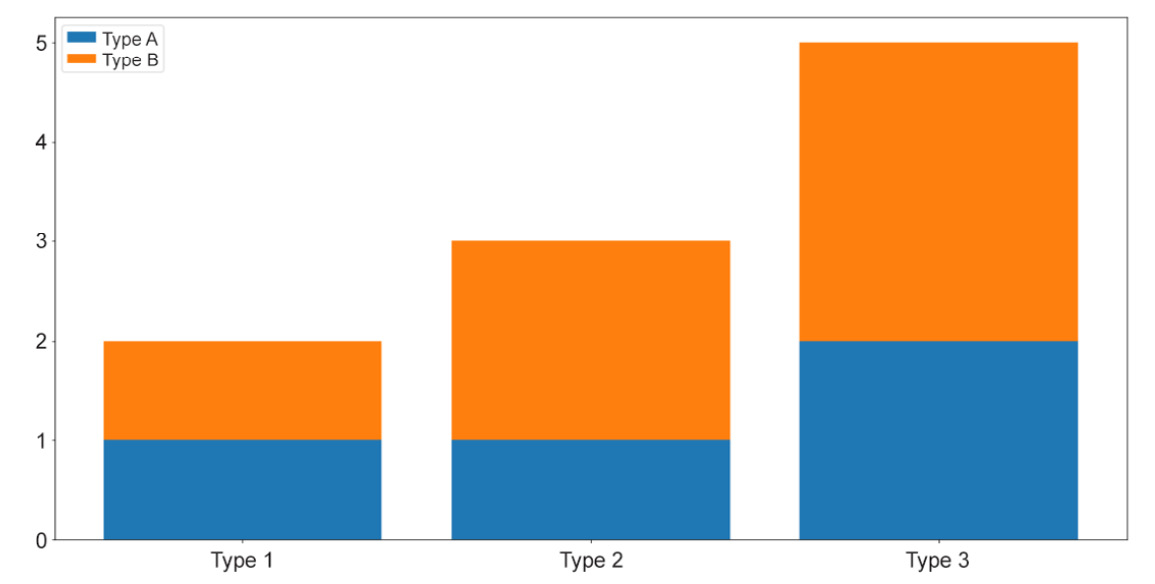
Figure 2.9: Stacked bar graphs
And that concludes our introduction to bar graphs in Matplotlib. Generally, these types of graph are used to visualize the counts or percentages of different groups of values in a categorical attribute. As we have observed, Matplotlib offers extendable APIs that can help generate these graphs in a flexible way.
Now, let's move on to our next visualization technique: histograms.
Histograms
A histogram is a visualization that places multiple bars together, but its connection to bar graphs ends there. Histograms are usually used to represent the distribution of values within an attribute (a numerical attribute, to be more precise). Taking in an array of numbers, a histogram should consist of multiple bars, each spanning across a specific range to denote the amount of numbers belonging to that range.
Say we have an attribute in our dataset that contains the sample data stored in x. We can call plt.hist() on x to plot the distribution of the values in the attribute like so:
x = np.random.randn(100)
plt.hist(x)
plt.show()
The preceding code produces a visualization similar to the following:
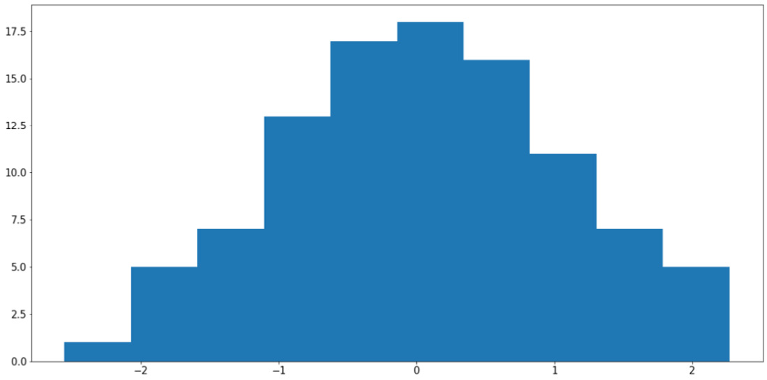
Figure 2.10: Histogram using Matplotlib
Note
Your output might somewhat differ from what we have here, but the general shape of the histogram should be the same—a bell curve.
It is possible to specify the bins argument in the plt.hist() function (whose default value is 10) to customize the number of bars that should be generated. Roughly speaking, increasing the number of bins decreases the width of the range each bin spans across, thereby improving the granularity of the histogram.
However, it is also possible to use too many bins in a histogram and achieve a bad visualization. For example, using the same variable, x, we can do the following:
plt.hist(x, bins=100)
plt.show()
The preceding code will produce the following graph:
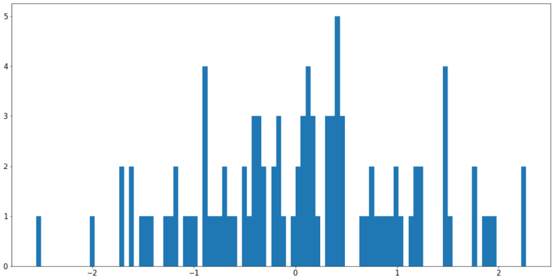
Figure 2.11: Using too many bins in a histogram
This visualization is arguably worse than the previous example as it causes our histogram to become fragmented and non-continuous. The easiest way to address this problem is to increase the ratio between the size of the input data and the number of bins, either by having more input data or using fewer bins.
Histograms are also quite useful in terms of helping us to compare the distributions of more than one attribute. For example, by adjusting the alpha argument (which specifies the opaqueness of a histogram), we can overlay multiple histograms in one graph so that their differences are highlighted. This is demonstrated by the following code and visualization:
y = np.random.randn(100) * 4 + 5
plt.hist(x, color='b', bins=20, alpha=0.2)
plt.hist(y, color='r', bins=20, alpha=0.2)
plt.show()
The output will be as follows:
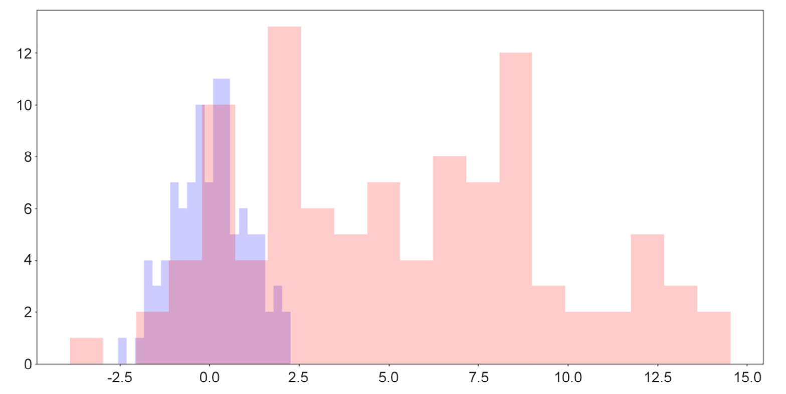
Figure 2.12: Overlaid histograms
Here, we can see that while the two distributions have roughly similar shapes, one is to the right of the other, indicating that its values are generally greater than the values of the attribute on the left.
One useful fact for us to note here is that when we simply call the plt.hist() function, a tuple containing two arrays of numbers is returned, denoting the locations and heights of individual bars in the corresponding histogram, as follows:
>>> plt.hist(x)
(array([ 9.,  7., 19., 18., 23., 12.,  6.,  4.,  1.,  1.]),
    array([-1.86590701, -1.34312205, -0.82033708, -0.29755212,
            0.22523285, 0.74801781,  1.27080278,  1.79358774,
            2.31637271,  2.83915767, 3.36194264]),
  <a list of 10 Patch objects>)
The two arrays include all the histogram-related information about the input data, processed by Matplotlib. This data can then be used to plot out the histogram, but in some cases, we can even store the arrays in new variables and use these statistics to perform further analysis on our data.
In the next section, we will move on to the final type of visualization we will be discussing in this chapter: heatmaps.
Heatmaps
A heatmap is generated with a 2D array of numbers, where numbers with high values correspond to hot colors, and low-valued numbers correspond to cold colors. With Matplotlib, a heatmap is created with the plt.imshow() function. Let's say we have the following code:
my_map = np.random.randn(10, 10)
plt.imshow(my_map)
plt.colorbar()
plt.show()
The preceding code will produce the following visualization:
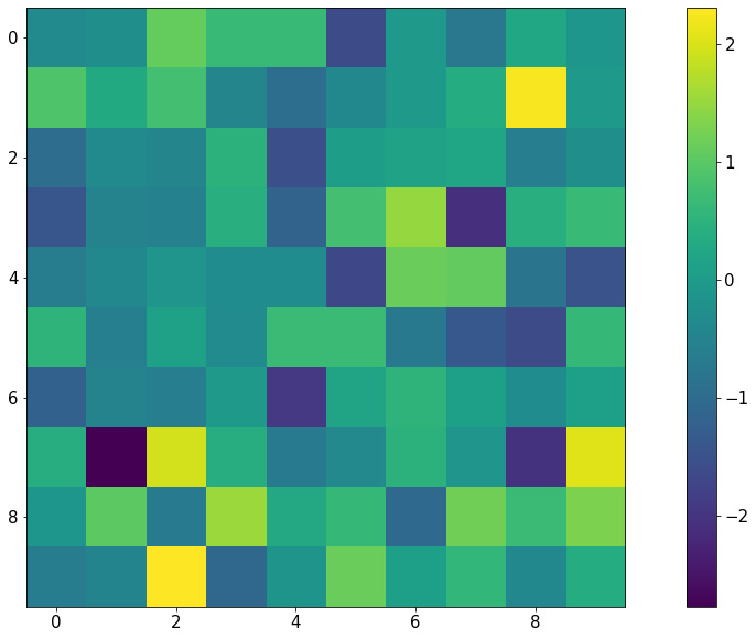
Figure 2.13: Heatmap using Matplotlib
Notice that with this representation, any group structure in the input 2D array (for example, if there is a block of cells whose values are significantly greater than the rest) will be effectively visualized.
An important use of heatmaps is when we consider the correlation matrix of a dataset (which is a 2D array containing a correlation between any given pair of attributes within the dataset). A heatmap will be able to help us pinpoint any and all attributes that are highly correlated to one another.
This concludes our final topic of discussion in this section regarding the visualization library, Matplotlib. The next exercise will help us consolidate the knowledge that we have gained by means of a hands-on example.
Exercise 2.04: Visualization of Probability Distributions
As we briefly mentioned when we talked about sampling, probability distributions are mathematical objects widely used in statistics and machine learning to model real-life data. While a number of probability distributions can prove abstract and complicated to work with, being able to effectively visualize their characteristics is the first step to understanding their usage.
In this exercise, we will apply some visualization techniques (histogram and line plot) to compare the sampling functions from NumPy against their true probability distributions. For a given probability distribution, the probability density function (also known as the PDF) defines the probability of any real number according to that distribution. The goal here is to verify that with a large enough sample size, NumPy's sampling function gives us the true shape of the corresponding PDF for a given probability distribution.
Perform the following steps to complete this exercise:
- From your Terminal, that is, in your Python environment (if you are using one), install the SciPy package. You can install it, as always, using pip:
$ pip install scipy
To install SciPy using Anaconda, use the following command:
$ conda install scipy
SciPy is another popular statistical computing tool in Python. It contains a simple API for PDFs of various probability distributions that we will be using. We will revisit this library in the next chapter.
- In the first code cell of a Jupyter notebook, import NumPy, the
statspackage of SciPy, and Matplotlib, as follows:import numpy as np import scipy.stats as stats import matplotlib.pyplot as plt
- In the next cell, draw 1,000 samples from the normal distribution with a mean of
0and a standard deviation of1using NumPy:samples = np.random.normal(0, 1, size=1000)
- Next, we will create a
np.linspacearray between the minimum and the maximum of the samples that we have drawn, and finally call the true PDF on the numbers in the array. We're doing this so that we can plot these points in a graph in the next step:x = np.linspace(samples.min(), samples.max(), 1000) y = stats.norm.pdf(x)
- Create a histogram for the drawn samples and a line graph for the points obtained via the PDF. In the
plt.hist()function, specify thedensity=Trueargument so that the heights of the bars are normalized to probabilistic values (numbers between 0 and 1), thealpha=0.2argument to make the histogram lighter in color, and thebins=20argument for a greater granularity for the histogram:plt.hist(samples, alpha=0.2, bins=20, density=True) plt.plot(x, y) plt.show()
The preceding code will create (roughly) the following visualization:

Figure 2.14: Histogram versus PDF for the normal distribution
We can see that the histogram for the samples we have drawn fits quite nicely with the true PDF of the normal distribution. This is evidence that the sampling function from NumPy and the PDF function from SciPy are working consistently with each other.
Note
To get an even smoother histogram, you can try increasing the number of bins in the histogram.
- Next, we will create the same visualization for the Beta distribution with parameters (2, 5). For now, we don't need to know too much about the probability distribution itself; again, here, we only want to test out the sampling function from NumPy and the corresponding PDF from SciPy.
In the next code cell, follow the same procedure that we followed previously:
samples = np.random.beta(2, 5, size=1000)
x = np.linspace(samples.min(), samples.max(), 1000)
y = stats.beta.pdf(x, 2, 5)
plt.hist(samples, alpha=0.2, bins=20, density=True)
plt.plot(x, y)
plt.show()
This will, in turn, generate the following graph:

Figure 2.15: Histogram versus PDF for the Beta distribution
- Create the same visualization for the Gamma distribution with parameter α = 1:
samples = np.random.gamma(1, size=1000)
x = np.linspace(samples.min(), samples.max(), 1000)
y = stats.gamma.pdf(x, 1)
plt.hist(samples, alpha=0.2, bins=20, density=True)
plt.plot(x, y)
plt.show()
The following visualization is then plotted:

Figure 2.16: Histogram versus PDF for the Gamma distribution
Throughout this exercise, we have learned to combine a histogram and a line graph to verify a number of probability distributions implemented by NumPy and SciPy. We were also briefly introduced to the concept of probability distributions and their probability density functions.
Note
To access the source code for this specific section, please refer to https://packt.live/3eZrEbW.
You can also run this example online at https://packt.live/3gmjLx8.
This exercise serves as the conclusion for the topic of Matplotlib. In the next section, we will end our discussion in this chapter by going through a number of shorthand APIs, provided by Seaborn and pandas, to quickly create complex visualizations.
Visualization Shorthand from Seaborn and Pandas
First, let's discuss the Seaborn library, the second most popular visualization library in Python after Matplotlib. Though still powered by Matplotlib, Seaborn offers simple, expressive functions that can facilitate complex visualization methods.
After successfully installing Seaborn via pip or Anaconda, the convention programmers typically use to import the library is with the sns alias. Now, say we have a tabular dataset with two numerical attributes, and we'd like to visualize their respective distributions:
x = np.random.normal(0, 1, 1000)
y = np.random.normal(5, 2, 1000)
df = pd.DataFrame({'Column 1': x, 'Column 2': y})
df.head()
Normally, we can create two histograms, one for each attribute that we have. However, we'd also like to inspect the relationship between the two attributes themselves, in which case we can take advantage of the jointplot() function in Seaborn. Let's see this in action:
import seaborn as sns
sns.jointplot(x='Column 1', y='Column 2', data=df)
plt.show()
As you can see, we can pass in a whole DataFrame object to a Seaborn function and specify the elements to be plotted in the function arguments. This process is arguably less painstaking than passing in the actual attributes we'd like to visualize using Matplotlib.
The following visualization will be generated by the preceding code:
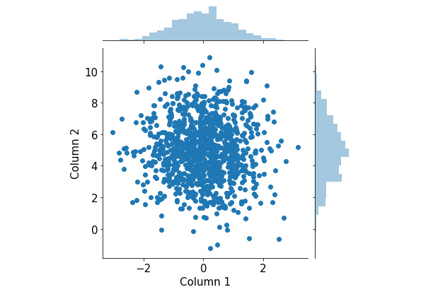
Figure 2.17: Joint plots using Seaborn
This visualization consists of a scatter plot for the two attributes and their respective histograms attached to the appropriate axes. From here, we can observe the distribution of individual attributes that we put in from the two histograms, as well as their joint distribution from the scatter plot.
Again, because this is a fairly complex visualization that can offer significant insights into the input data, it can be quite difficult to create manually in Matplotlib. What Seaborn succeeds in doing is building a pipeline for these complex but valuable visualization techniques and creating simple APIs to generate them.
Let's consider another example. Say we have a larger version of the same student dataset that we considered in Exercise 2.03, The Student Dataset, which looks as follows:
student_df = pd.DataFrame({
    'name': ['Alice', 'Bob', 'Carol', 'Dan', 'Eli', 'Fran', \
             'George', 'Howl', 'Ivan', 'Jack', 'Kate'],\
    'gender': ['female', 'male', 'female', 'male', \
               'male', 'female', 'male', 'male', \
               'male', 'male', 'female'],\
    'class': ['JR', 'SO', 'SO', 'SO', 'JR', 'SR', \
              'FY', 'SO', 'SR', 'JR', 'FY'],\
    'gpa': [90, 93, 97, 89, 95, 92, 90, 87, 95, 100, 95],\
    'num_classes': [4, 3, 4, 4, 3, 2, 2, 3, 3, 4, 2]})
Now, we'd like to consider the average GPA of the students we have in the dataset, grouped by class. Additionally, within each class, we are also interested in the difference between female and male students. This description calls for a grouped/stacked bar plot, where each group corresponds to a class and is broken into female and male averages.
With Seaborn, this is again done with a one-liner:
sns.catplot(x='class', y='gpa', hue='gender', kind='bar', \
            data=student_df)
plt.show()
This generates the following plot (notice how the legend is automatically included in the plot):
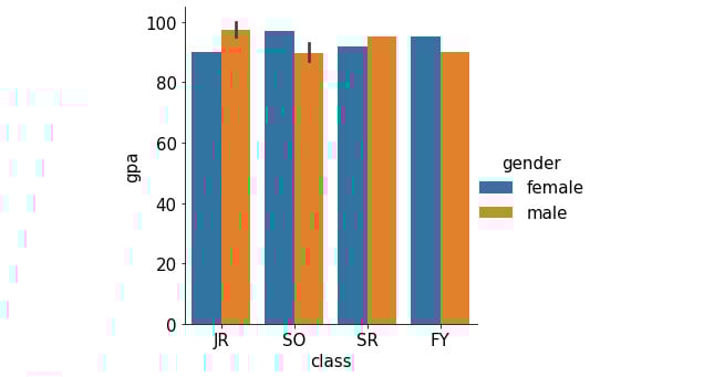
Figure 2.18: Grouped bar graph using Seaborn
In addition to Seaborn, the pandas library itself also offers unique APIs that directly interact with Matplotlib. This is generally done via the DataFrame.plot API. For example, still using our student_df variable we used previously, we can quickly generate a histogram for the data in the gpa attribute as follows:
student_df['gpa'].plot.hist()
plt.show()
The following graph is then created:
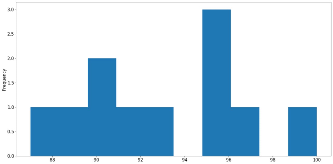
Figure 2.19: Histogram using pandas
Say we are interested in the percentage breakdown of the classes (that is, how much of a portion each class is with respect to all students). We can generate a pie chart from the class count (obtained via the value_counts() method):
student_df['class'].value_counts().plot.pie()
plt.show()
This results in the following output:
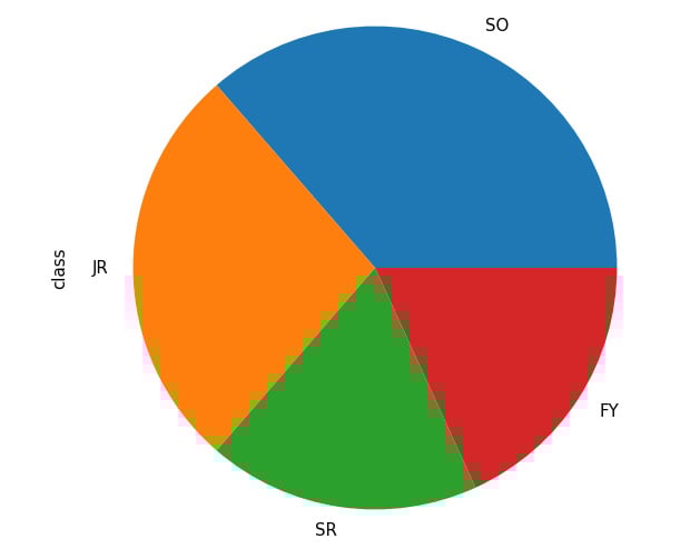
Figure 2.20: Pie chart from pandas
Through these examples, we have an idea of how Seaborn and Matplotlib streamline the process of creating complex visualizations, especially for DataFrame objects, using simple function calls. This clearly demonstrates the functional integration between various statistical and scientific tools in Python, making it one of the most, if not the most, popular modern scientific computing languages.
That concludes the material to be covered in the second chapter of this book. Now, let's go through a hands-on activity with a real-life dataset.
Activity 2.01: Analyzing the Communities and Crime Dataset
In this activity, we will practice some basic data processing and analysis techniques on a dataset available online called Communities and Crime, with the hope of consolidating our knowledge and techniques. Specifically, we will process missing values in the dataset, iterate through the attributes, and visualize the distribution of their values.
First, we need to download this dataset to our local environment, which can be accessed on this page: https://packt.live/31C5yrZ
The dataset should have the name CommViolPredUnnormalizedData.txt. From the same directory as this dataset text file, create a new Jupyter notebook. Now, perform the following steps:
- As a first step, import the libraries that we will be using: pandas, NumPy, and Matplotlib.
- Read in the dataset from the text file using pandas and print out the first five rows by calling the
head()method on theDataFrameobject. - Loop through all the columns in the dataset and print them out line by line. At the end of the loop, also print out the total number of columns.
- Notice that missing values are indicated as
'?'in different cells of the dataset. Call thereplace()method on theDataFrameobject to replace that character withnp.nanto faithfully represent missing values in Python. - Print out the list of columns in the dataset and their respective numbers of missing values using
df.isnull().sum(), wheredfis the variable name of theDataFrameobject. - Using the
df.isnull().sum()[column_name]syntax (wherecolumn_nameis the name of the column we are interested in), print out the number of missing values in theNumStreetandPolicPerPopcolumns. - Compute a
DataFrameobject that contains a list of values in thestateattribute and their respective counts. Then, use theDataFrame.plot.bar()method to visualize that information in a bar graph. - Observe that, with the default scale of the plot, the labels on the x-axis are overlapping. Address this problem by making the plot bigger with the
f, ax = plt.subplots(figsize=(15, 10))command. This should be placed at the beginning of any plotting commands. - Using the same value count
DataFrameobject that we used previously, call theDataFrame.plot.pie()method to create a corresponding pie chart. Adjust the figure size to ensure that the labels for your graph are displayed correctly. - Create a histogram representing the distribution of the population sizes in areas in the dataset (included in the
populationattribute). Adjust the figure size to ensure that the labels for your graph are displayed correctly.
Figure 2.21: Histogram for population distribution
- Create an equivalent histogram to visualize the distribution of household sizes in the dataset (included in the
householdsizeattribute).
Figure 2.22: Histogram for household size distribution
Note
The solution for this activity can be found via this link.
Summary
This chapter went through the core tools for data science and statistical computing in Python, namely, NumPy for linear algebra and computation, pandas for tabular data processing, and Matplotlib and Seaborn for visualization. These tools will be used extensively in later chapters of this book, and they will prove useful in your future projects. In the next chapter, we will go into the specifics of a number of statistical concepts that we will be using throughout this book and learn how to implement them in Python.


