


 Download code from GitHub
Look-and-Feel Customization with Qt Designer
We will cover the following recipes in this chapter:
- Using style sheets with Qt Designer
- Customizing basic style sheets
- Creating a login screen using style sheets
- Using resources in style sheets
- Customizing properties and sub-controls
- Styling in Qt Modeling Language (QML)
- Exposing the QML object pointer to C++
Introduction
Qt 5 allows us to easily design our program's user interface through a method most people are familiar with. Qt not only provides us with a powerful user interface toolkit, called Qt Designer, which enables us to design our user interface without writing a single line of code, but it also allows advanced users to customize their user interface components through a simple scripting language called Qt Style Sheets.
Technical requirements
The technical requirements for this chapter include Qt 5.11.2 MinGW 32 bit, Qt Creator 4.8.2, and Windows 10.
All the code used in this chapter can be downloaded from the following GitHub repository, at: https://github.com/PacktPublishing/Qt5-CPP-GUI-Programming-Cookbook-Second-Edition/tree/master/Chapter01.
Check out the following video to see the code in action: http://bit.ly/2TqQJ3I
Using style sheets with Qt Designer
In this example, we will learn how to change the look and feel of our program and make it look more professional by using style sheets and resources. Qt allows you to decorate your graphical user interfaces (GUIs) using a style sheet language called Qt Style Sheets, which is very similar to Cascading Style Sheets (CSS), used by web designers to decorate their websites.
How to do it...
Let's get started by learning how to create a new project and get ourselves familiar with the Qt Designer:
- Open up Qt Creator and create a new project. If this is the first time you have used Qt Creator, you can either click the big button, which reads + New Project, or simply go to File | New File or Project.
- Select Application under the Projects window, and select Qt Widgets Application.
- Click the Choose... button at the bottom. A window will pop out and ask you to insert the project name and its location.
- Click Next several times, and click the Finish button to create the project. We will stick with the default settings for now. Once the project has been created, the first thing you will see is the panel with tons of big icons on the left side of the window, which is called the mode selector panel; we will discuss this more later in the How it works... section.
- You will see all your source files listed on the sidebar panel which is located next to the mode selector panel. This is where you can select which file you want to edit, which in this case is mainwindow.ui, because we are about to start designing the program's UI.
- Double-click the mainwindow.ui file, and you will see an entirely different interface appear out of nowhere. Qt Creator actually helped you to switch from the script editor to the UI editor (Qt Designer) because it detected the .ui extension on the file you're trying to open.
- You will also notice that the highlighted button on the mode selector panel has changed from the Edit button to the Design button. You can switch back to the script editor or change to any other tools by clicking one of the buttons located in the upper half of the mode selector panel.
- Let's go back to the Qt Designer and look at the mainwindow.ui file. This is basically the main window of our program (as the filename implies) and it's empty by default, without any widget on it. You can try to compile and run the program by pressing the Run button (the green arrow button) at the bottom of the mode selector panel, and you will see an empty window pop up once the compilation is complete.
- Let's add a push button to our program's UI by clicking on the Push Button item in the Widget Box (under the Buttons category) and dragging it to your main window in the form editor. Keep the push button selected, and now you will see all the properties of this button inside the Property Editor on the right side of your window. Scroll down to the middle and look for a property called styleSheet. This is where you apply styles to your widget, which may or may not inherit to its children or grandchildren recursively, depending on how you set your style sheet. Alternatively, you can right-click on any widget in your UI at the form editor and select Change styleSheet... from the pop-up menu.
- You can click on the input field of the styleSheet property to directly write the style sheet code, or click on the … button beside the input field to open up the Edit Style Sheet window, which has a bigger space for writing longer code for style sheets. At the top of the window, you can find several buttons, such as Add Resource, Add Gradient, Add Color, and Add Font, that can help you to kickstart your coding if you can't remember the properties' names. Let's try to do some simple styling with the Edit Style Sheet window.
- Click Add Color and choose a color.
- Pick a random color from the color picker window; let's say, a pure red color. Then click OK.
- A line of code has been added to the text field on the Edit Style Sheet window, which in my case is as follows:
color: rgb(255, 0, 0);
- Click the OK button and the text on your push button should have changed to red.
How it works...
Let's take a bit of time to get familiar with Qt Designer's interface before we start learning how to design our own UI:
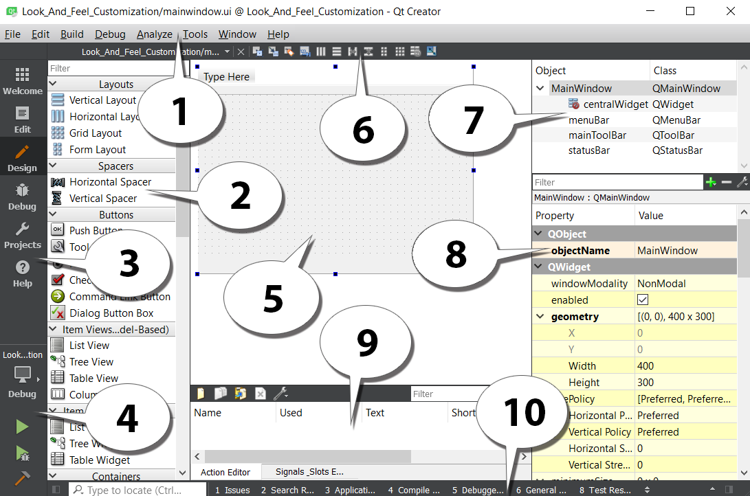
The explanation for the preceding screenshot is as follows:
- Menu bar: The menu bar houses application-specific menus that provide easy access to essential functions such as creating new projects, saving files, undoing, redoing, copying, and pasting. It also allows you to access development tools that come with Qt Creator, such as the compiler, debugger, and profiler.
- Widget Box: This is where you can find all the different types of widget provided by Qt Designer. You can add a widget to your program's UI by clicking one of the widgets from the Widget Box and dragging it to the form editor.
- Mode selector: The mode selector is a side panel that places shortcut buttons for easy access to different tools. You can quickly switch between the script editor and form editor by clicking the Edit or Design buttons on the mode selector panel, which is very useful for multitasking. You can also easily navigate to the debugger and profiler tools in the same speed and manner.
- Build shortcuts: The build shortcuts are located at the bottom of the mode selector panel. You can build, run, and debug your project easily by pressing the shortcut buttons here.
- Form editor: The form editor is where you edit your program's UI. You can add different widgets to your program by selecting a widget from the Widget Box and dragging it to the form editor.
- Form toolbar: From here, you can quickly select a different form to edit. Click the drop-down box located on top of the Widget Box and select the file you want to open with Qt Designer. Beside the drop-down box are buttons to switch between the different modes of the form editor, and also buttons to change the layout of your UI.
- Object Inspector: The Object Inspector lists all the widgets within your current .ui file. All the widgets are arranged according to their parent-child relationship in the hierarchy. You can select a widget from the Object Inspector to display its properties in the Property Editor.
- Property Editor: The Property Editor will display all the properties of the widget you selected from either the Object Inspector window or the form editor window.
- Action Editor and the Signals & Slots Editor: This window contains two editors, the Action Editor and the Signals & Slots Editor, which can be accessed from the tabs beneath the window. The Action Editor is where you create actions that can be added to a menu bar or toolbar in your program's UI.
- Output panes: Output panes consist of several different windows that display information and output messages related to script compilation and debugging. You can switch between different output panes by pressing the buttons that carry a number before them, such as 1 Issues, 2 Search Results, or 3 Application Output.
There's more...
In the previous section, we discussed how to apply style sheets to Qt Widgets through C++ coding. Although that method works really well, most of the time, the person who is in charge of designing the program's UI is not the programmer, but rather a UI designer who specializes in designing user-friendly UI. In this case, it's better to let the UI designer design the program's layout and style sheet with a different tool and not mess around with the code. Qt provides an all-in-one editor called Qt Creator.
Qt Creator consists of several different tools, such as script editor, compiler, debugger, profiler, and UI editor. The UI editor, which is also called Qt Designer, is the perfect tool for designers to design their program's UI without writing any code. This is because Qt Designer adopted the what you see is what you get approach by providing an accurate visual representation of the final result, which means whatever you design with Qt Designer will turn out exactly the same visually when the program is compiled and run.
The similarities between Qt Style Sheets and CSS are as follows:
- This is how a typical piece of CSS code looks:
h1 { color: red; background-color: white;}
- This is how Qt Style Sheets look, which is almost the same as the preceding CSS:
QLineEdit { color: red; background-color: white;}
As you can see, both of them contain a selector and a declaration block. Each declaration contains a property and a value, separated by a colon. In Qt, a style sheet can be applied to a single widget by calling the QObject::setStyleSheet() function in C++ code. Consider the following, for example:
myPushButton->setStyleSheet("color : blue");
The preceding code will turn the text of a button with the myPushButton variable name to blue. You can achieve the same result by writing the declaration in the style sheet property field in Qt Designer. We will discuss Qt Designer more in the following Customizing basic style sheets section.
Qt Style Sheets also supports all the different types of selectors defined in the CSS2 standard, including the universal selector, type selector, class selector, and ID selector, which allows us to apply styling to a very specific individual widget or group of widgets. For instance, if we want to change the background color of a specific line-edit widget with the usernameEdit object name, we can do this by using an ID selector to refer to it:
QLineEdit#usernameEdit { background-color: blue }
Customizing basic style sheets
In the previous recipe, you learned how to apply a style sheet to a widget with Qt Designer. Let's go crazy and push things further by creating a few other types of widgets and change their style properties to something bizarre for the sake of learning.
This time, however, we will not apply the style to every single widget one by one, but we will learn to apply the style sheet to the main window and let it inherit down the hierarchy to all the other widgets, so that the style sheet is easier to manage and maintain in the long run.
How to do it...
In the following example, we will format different types of widgets on the canvas and add some code to the style sheet to change its appearance:
- Remove the style sheet from PushButton by selecting it and clicking the small arrow button beside the styleSheet property. This button will revert the property to the default value, which in this case is the empty style sheet.
- Add a few more widgets to the UI by dragging them one by one from the Widget Box to the form editor. I've added a line edit, combo box, horizontal slider, radio button, and a check box.
- For the sake of simplicity, delete the menuBar, mainToolBar, and the statusBar from your UI by selecting them from the Object Inspector, right-click, and choose Remove. Now, your UI should look similar to this:

- Select the main window from either the form editor or the Object Inspector, then right-click and choose Change styleSheet... to open up the Edit Style Sheet window. Insert the following into the style sheet:
border: 2px solid gray;
border-radius: 10px;
padding: 0 8px;
background: yellow;
- You will see a bizarre-looking UI with everything covered in yellow with a thick border. This is because the preceding style sheet does not have a selector, which means the style will apply to the children widgets of the main window all the way down the hierarchy. To change that, let's try something different:
QPushButton {
    border: 2px solid gray;
    border-radius: 10px;
    padding: 0 8px;
    background: yellow;
}
- This time, only PushButton will get the style described in the preceding code, and all other widgets will return to the default styling. You can try to add a few more push buttons to your UI and they will all look the same:

- This happens because we specifically tell the selector to apply the style to all the widgets with the QPushButton class. We can also apply the style to just one of the push buttons by mentioning its name in the style sheet, as in the following code:
QPushButton#pushButton_3 {
 border: 2px solid gray;
 border-radius: 10px;
 padding: 0 8px;
 background: yellow;
}
- Once you understand this method, we can add the following code to the style sheet:
QPushButton {
    color: red;
    border: 0px;
    padding: 0 8px;
    background: white;
}

QPushButton#pushButton_2 {
    border: 1px solid red;
    border-radius: 10px;
}
- This code basically changes the style of all the push buttons, as well as some properties of the pushButton_2 button. We keep the style sheet of pushButton_3 as it is. Now the buttons will look like this:

- The first set of style sheets will change all widgets of the QPushButton type to a white rectangular button with no border and red text. The second set of style sheets changes only the border of a specific QPushButton widget called pushButton_2. Notice that the background color and text color of pushButton_2 remain white and red, respectively, because we didn't override them in the second set of style sheets, hence it will return to the style described in the first set of style sheets since it's applicable to all the QPushButton widgets. The text of the third button has also changed to red because we didn't describe the Color property in the third set of style sheets.
- Create another set of style sheets that use the universal selector, using the following code:
* {
 background: qradialgradient(cx: 0.3, cy: -0.4, fx: 0.3, fy: -0.4, radius: 1.35, stop: 0 #fff, stop: 1 #888);
 color: rgb(255, 255, 255);
 border: 1px solid #ffffff;
}
- The universal selector will affect all the widgets, regardless of their type. Therefore, the preceding style sheet will apply a nice gradient color to all the widgets' backgrounds and set their text to white with a one-pixel solid outline that is also white. Instead of writing the name of the color (that is, white), we can use the rgb function (rgb(255, 255, 255)) or hex code (#ffffff) to describe the color value.
- As before, the preceding style sheet will not affect the push buttons because we have already given them their own styles, which will override the general style described in the universal selector. Just remember that in Qt, the style that is more specific will ultimately be used when there is more than one style with an influence on a widget. This is how the UI will look now:

How it works...
If you are ever involved in web development using HTML and CSS, Qt's style sheet works exactly the same way as CSS. Style sheets provide the definitions to describe the presentation of the widgets – what the colors are for each element in the widget group, how thick the border should be, and so on and so forth. If you specify the name of the widget to the style sheet, it will change the style of the particular PushButton widget with the name you provide. None of the other widgets will be affected and will remain as the default style.
To change the name of a widget, select the widget from either the form editor or the Object Inspector and change the property called objectName in the property window. If you have used the ID selector previously to change the style of the widget, changing its object name will break the style sheet and lose the style. To fix this problem, simply change the object name in the style sheet as well.
Creating a login screen using style sheets
Next, we will learn how to put all the knowledge we've learned in the previous example together and create a fake graphical login screen for an imaginary operating system. Style sheets are not the only thing you need to master in order to design a good UI. You will also need to learn how to arrange the widgets neatly using the layout system in Qt Designer.
How to do it...
Let's get started by following these steps:
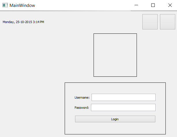
- We need to design the layout of the graphical login screen before we start doing anything. Planning is very important in order to produce good software. The following is a sample layout design I made to show you how I imagine the login screen will look. Just a simple line drawing like this is sufficient as long as it conveys the message clearly:

- Go back to Qt Designer again.
- We will be placing the widgets at the top panel first, then the logo and the login form beneath it.
- Select the main window and change its width and height from 400 and 300 to 800 and 600, respectively, because we'll need a bigger space in which to place all the widgets.
- Click and drag a label under the Display Widgets category from the Widget Box to the form editor.
- Change the objectName property of the label to currentDateTime and change its text property to the current date and time just for display purposes, such as Monday, 25-10-2015 3:14 PM.
- Click and drag a PushButton under the Buttons category to the form editor. Repeat this process once more because we have two buttons on the top panel. Rename the two buttons restartButton and shutdownButton.
- Select the main window and click the small icon button on the form toolbar that says Lay Out Vertically when you mouse over it. You will see the widgets are automatically arranged on the main window, but it's not exactly what we want yet.
- Click and drag a Horizontal Layout widget under the Layouts category to the main window.
- Click and drag the two push buttons and the text label into the horizontal layout. You will see the three widgets being arranged in a horizontal row, but vertically they are located in the middle of the screen. The horizontal arrangement is almost correct, but the vertical position is totally off.
- Click and drag a Vertical Spacer from the Spacers category and place it beneath the Horizontal Layout we created previously in step 9 (under the red rectangular outline). All the widgets are pushed to the top by the spacer.
- Place a Horizontal Spacer between the text label and the two buttons to keep them apart. This will ensure the text label always sticks to the left and the buttons align to the right.
- Set both the Horizontal Policy and Vertical Policy properties of the two buttons to Fixed and set the minimumSize property to 55 x 55. Set the text property of the buttons to empty, as we will be using icons instead of text. We will learn how to place an icon in the button widgets in the following Using resources in style sheets section.
- Your UI should look similar to this:
Next, we will be adding the logo using the following steps:
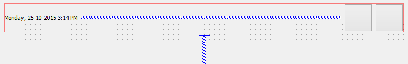
- Add a Horizontal Layout between the top panel and the Vertical Spacer to serve as a container for the logo.
- After adding the Horizontal Layout, you will find the layout is way too thin in height (almost zero height) to be able to add any widgets to it. This is because the layout is empty and it's being pushed by the vertical spacer under it into zero height. To solve this problem, we can set its vertical margin (either layoutTopMargin or layoutBottomMargin) to be temporarily bigger until a widget is added to the layout.
- Add a Label to the Horizontal Layout that you just created and rename it logo. We will learn more about how to insert an image into the label to use it as a logo in the following Using resources in style sheets section. For now, just empty out the text property and set both its Horizontal Policy and Vertical Policy properties to Fixed. Set the minimumSize property to 150 x 150.
- Set the vertical margin of the layout back to zero if you haven't already done so.
- The logo now appears to be invisible, so we will just place a temporary style sheet to make it visible until we add an image to it in the following Using resources in style sheets section. The style sheet is really simple:
border: 1px solid;
- Your UI should look similar to this:
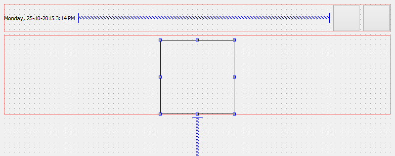
Now, let's create the login form using the following steps:
- Add a Horizontal Layout between the logo's layout and the Vertical Spacer. Set the layoutTopMargin property to a large number (that is, 100), so that you can add a widget to it more easily.
- Add a Vertical Layout inside the Horizontal Layout you just created. This layout will be used as a container for the login form. Set its layoutTopMargin to a number lower than that of the horizontal layout (that is, 20) so that we can place widgets in it.
- Right-click the Vertical Layout you just created and choose Morph into | QWidget. The Vertical Layout is being converted into an empty widget. This step is essential because we will be adjusting the width and height of the container for the login form. A layout widget does not contain any properties for width and height, but only margins, due to the fact that a layout will expand toward the empty space surrounding it, which makes sense, considering that it does not have any size properties. After you have converted the layout to a QWidget object, it will automatically inherit all the properties from the widget class, and so we are now able to adjust its size to suit our needs.
- Rename the QWidget object, which we just converted from the layout, to loginForm and change both its Horizontal Policy and Vertical Policy properties to Fixed. Set the minimumSize parameter to 350 x 200.
- Since we already placed the loginForm widget inside the Horizontal Layout, we can now set its layoutTopMargin property back to zero.
- Add the same style sheet as for the logo to the loginForm widget to make it visible temporarily, except this time we need to add an ID selector in front, so that it will only apply the style to loginForm and not its children widgets:
#loginForm { border: 1px solid; }
- Your UI should look something like this:
We are not done with the login form yet. Now that we have created the container for the login form, it's time to put more widgets into the form:
- Place two horizontal layouts into the login form container. We need two layouts: one for the username field and another for the password field.
- Add a Label and a Line Edit to each of the layouts you just added. Change the text property of the upper label to Username: and the one beneath to Password:. Rename the two line edits to username and password, respectively.
- Add a push button beneath the password layout and change its text property to Login. Rename it to loginButton.
- You can add a Vertical Spacer between the password layout and the Login button to distance them slightly. After the Vertical Spacer has been placed, change its sizeType property to Fixed and change the Height to 5.
- Select the loginForm container and set all its margins to 35. This is to make the login form look better by adding some space to all its sides.
- Set the Height property of the Username, Password, and loginButton widgets to 25 so that they don't look so cramped.
- Your UI should look something like this:

We're not done yet! As you can see, the login form and the logo are both sticking to the top of the main window due to the Vertical Spacer beneath them. The logo and the login form should be placed at the center of the main window instead of the top. To fix this problem, use the following steps:
- Add another Vertical Spacer between the top panel and the logo's layout, which will counter the spacer at the bottom that balances out the alignment.
- If you think that the logo is sticking too close to the login form, you can add a Vertical Spacer between the logo's layout and the login form's layout. Set its sizeType property to Fixed and the Height property to 10.
- Right-click the top panel's layout and choose Morph into | QWidget. Rename it topPanel. The layout has to be converted into QWidget because we cannot apply style sheets to a layout, as it doesn't have any properties other than margins.
- There is a little bit of a margin around the edges of the main window—we don't want that. To remove the margins, select the centralWidget object from the Object Inspector window, which is right under the MainWindow panel, and set all the margin values to zero.
- Run the project by clicking the Run button (with the green arrow icon) to see what your program looks like. If everything went well, you should see something like this:
- Let's decorate the UI using style sheets! Since all the important widgets have been given an object name, it's easier for us to apply the style sheets to it from the main window, since we will only write the style sheets to the main window and let them inherit down the hierarchy tree.
- Right-click on MainWindow from the Object Inspector window and choose Change styleSheet....
- Add the following code to the style sheet:
#centralWidget { background: rgba(32, 80, 96, 100); }
- The background of the main window changes its color. We will learn how to use an image for the background in the following Using resources in style sheets section. So the color is just temporary.
- In Qt, if you want to apply styles to the main window itself, you must apply them to its centralWidget, instead of the main window because the window is just a container.
- Add a nice gradient color to the top panel:
#topPanel {
    background-color: qlineargradient(spread:reflect, x1:0.5, y1:0, x2:0, y2:0, stop:0 rgba(91, 204, 233, 100), stop:1 rgba(32, 80, 96, 100));
}
- Apply the black color to the login form and make it look semi-transparent. We will also make the corners of the login form container slightly rounded by setting the border-radius property:
#loginForm {
 background: rgba(0, 0, 0, 80);
 border-radius: 8px;
}
- Apply styles to the general types of widgets:
QLabel { color: white; }
QLineEdit { border-radius: 3px; }
- The preceding style sheets will change all the labels' texts to a white color, which includes the text on the widgets as well because, internally, Qt uses the same type of label on the widgets that have text on them. Also, we made the corners of the line edit widgets slightly rounded.
- Apply style sheets to all the push buttons on our UI:
QPushButton {
    color: white;
    background-color: #27a9e3;
    border-width: 0px;
    border-radius: 3px;
}
- The preceding style sheet changes the text of all the buttons to a white color, then sets its background color to blue, and makes its corners slightly rounded as well.
- To push things even further, we will make it so that the color of the push buttons changes when we mouse over it, using the hover keyword:
QPushButton:hover { background-color: #66c011; }
- The preceding style sheet will change the background color of the push buttons to green when we mouse over them. We will talk more about this in the following Customizing properties and sub-controls section.
- You can further adjust the size and margins of the widgets to make them look even better. Remember to remove the border line of the login form by removing the style sheet that we applied directly to it earlier in step 6.
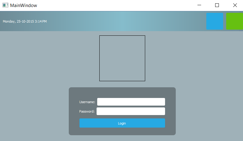
- Your login screen should look something like this:
How it works...
This example focuses more on the layout system of Qt. Qt's layout system allows our application GUI to automatically arrange itself within the given space by arranging the children objects of each widget. The spacer items used in the preceding example help to push the widgets contained in a layout outward to create spacing along the width of the spacer item.
To locate a widget to the middle of the layout, put two spacer items to the layout: one on the left side of the widget and one on the right side of the widget. The widget will then be pushed to the middle of the layout by the two spacers.
Using resources in style sheets
Qt provides us with a platform-independent resource system that allows us to store any type of files in our program's executable for later use. There is no limit to the types of files we can store in our executable – images, audio, video, HTML, XML, text files, binary files, and so on are all permitted.
The resource system is really useful for embedding resource files (such as icons and translation files) into the executable so that it can be accessed by the application at any time. To achieve this, we must tell Qt which files we want to add to its resource system in the .qrc file and Qt will handle the rest during the build process.
How to do it
To add a new .qrc file to our project, go to File | New File or Project. Then, select Qt under the Files and Classes category and select Qt Resources File. After that, give it a name (that is, resources) and click the Next button followed by the Finish button. The .qrc file will now be created and automatically opened by Qt Creator. You don't have to edit the .qrc file directly in XML format as Qt Creator provides you the user interface to manage your resources.
To add images and icons to your project, you need to make sure that the images and icons are being placed in your project's directory. While the .qrc file is opened in Qt Creator, click the Add button, followed by Add Prefix button. The prefix is used to categorize your resources so that they can be better managed when you have a ton of resources in your project:
- Rename the prefix you just created to /icons.
- Create another prefix by clicking Add, followed by Add Prefix.
- Rename the new prefix to /images.
- Select the /icon prefix and click Add, followed by Add Files.
- A file selection window will appear; use that to select all the icon files. You can select multiple files at a time by holding the Ctrl key on your keyboard while clicking on the files to select them. Click Open once you're done.
- Select the /images prefix and click the Add button, followed by the Add Files button. The file-selection window will pop up again, and this time we will select the background image.
- Repeat the preceding steps, but this time we will add the logo image to the /images prefix. Don't forget to save once you're done by pressing Ctrl + S. Your .qrc file should now look like this:

- Go back to the mainwindow.ui file; let's make use of the resources we have just added to our project. Select the restart button located on the top panel. Scroll down the Property Editor until you see the icon property. Click the little button with a drop-down arrow icon and click Choose Resources from its menu.
- The Select Resource window will pop up. Click on the icons prefix on the left panel and select the restart icon on the right panel. Press OK.
- A tiny icon will appear on the button. The icon looks very tiny because the default icon size is set to 16 x 16. Change the iconSize property to 50 x 50 and you will see the icon appear bigger. Repeat the preceding steps for the shutdown button, except this time, choose the shutdown icon instead.
- The two buttons should now look like this:

- Let's use the image we added to the resource file as our logo. Select the logo widget and remove the style sheet that we added earlier to render its outline.
- Scroll down the Property Editor until you see the pixmap property.
- Click the little drop-down button behind the pixmap property and select Choose Resources from the menu. Select the logo image and click OK. The logo size no longer follows the dimension you set previously; it follows the actual dimension of the image instead. We cannot change its dimension because this is simply how the pixmap property works.
- If you want more control over the logo's dimension, you can remove the image from the pixmap property and use a style sheet instead. You can use the following code to apply an image to the icon container:
border-image: url(:/images/logo.png);
- To obtain the path of the image, right-click the image's name on the file list window and choose Copy path. The path will be saved to your operating system's clipboard and now you can just paste it into the preceding style sheet. Using this method will ensure that the image fits the dimensions of the widget that you applied the style to. Your logo should now appear like that in the following screenshot:

- Apply the wallpaper image to the background using a style sheet. Since the background dimension will change according to the window size, we cannot use pixmap here. Instead, we will use the border-image property in a style sheet. Right-click the main window and select Change styleSheet... to open up the Edit Style Sheet window. We will add a new line under the style sheet of the centralWidget:
#centralWidget {
    background: rgba(32, 80, 96, 100);
    border-image: url(:/images/login_bg.png);
}
- It's really that simple and easy! Your login screen should now look like this:

How it works...
The resource system in Qt stores binary files, such as images and translation files, in the executable when it gets compiled. It reads the resource collection files (.qrc) in your project to locate the files that need to be stored in the executable and include them in the build process. A .qrc file looks something like this:
<!DOCTYPE RCC><RCC version="1.0">
 <qresource>
 <file>images/copy.png</file>
 <file>images/cut.png</file>
 <file>images/new.png</file>
 <file>images/open.png</file>
 <file>images/paste.png</file>
 <file>images/save.png</file>
 </qresource>
 </RCC>
It uses the XML format to store the paths of the resource files, which are relative to the directory that contains them. The listed resource files must be located in the same directory as the .qrc file, or one of its subdirectories.
Customizing properties and sub-controls
Qt's style sheet system enables us to create stunning and professional-looking UIs with ease. In this example, we will learn how to set custom properties to our widgets and use them to switch between different styles.
How to do it...
Let's follow these steps to customize widget properties and sub-controls:
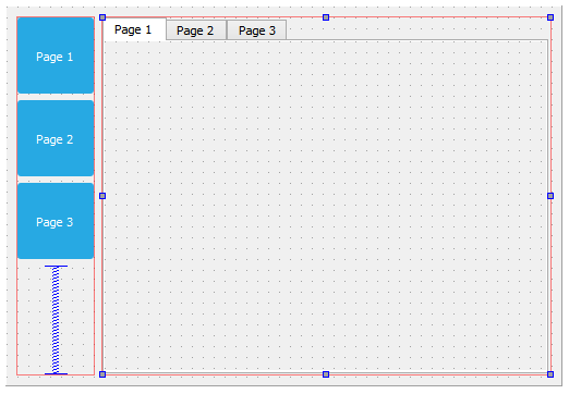
- Let's create a new Qt project. I have prepared the UI for this purpose. The UI contains three buttons on the left side and a Tab Widget with three pages located on the right side, as shown in the following screenshot:
- The three buttons are blue because I've added the following style sheet to the main window (not to the individual button):
QPushButton {
    color: white;
    background-color: #27a9e3;
    border-width: 0px;
    border-radius: 3px;
}
- I will explain what pseudo-states are in Qt by adding the following style sheet to the main window, which you might be familiar with:
QPushButton:hover {
    color: white;
    background-color: #66c011;
    border-width: 0px;
    border-radius: 3px;
}
- We used the preceding style sheet in the previous Creating a login screen using style sheets recipe, to make the buttons change color when there is a mouse-over event. This is made possible by Qt Style Sheet's pseudo-state, which in this case is the word hover separated from the QPushButton class by a colon. Every widget has a set of generic pseudo-states, such as active, disabled, and enabled, and also a set of pseudo states that are applicable to their widget type. For example, states such as open and flat are available for QPushButton, but not for QLineEdit. Let's add the pressed pseudo-state to change the buttons' color to yellow when the user clicks on it:
QPushButton:pressed {
    color: white;
    background-color: yellow;
    border-width: 0px;
    border-radius: 3px;
}
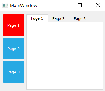
- Pseudo-states allow the users to load a different set of style sheets based on the condition that applies to it. Qt pushes this concept further by implementing dynamic properties in Qt Style Sheets. This allows us to change the style sheet of a widget when a custom condition has been met. We can make use of this feature to change the style sheet of our buttons based on a custom condition that we can set using custom properties in Qt. First, we will add this style sheet to our main window:
QPushButton[pagematches=true] {
    color: white;
    background-color: red;
    border-width: 0px;
    border-radius: 3px;
}
- This changes the push button's background color to red if the pagematches property returns true. Obviously, this property does not exist in the QPushButton class. However, we can add it to our buttons using QObject::setProperty():
-
- In your mainwindow.cpp source code, add the following code right after ui->setupUi(this):
ui->button1->setProperty("pagematches", true);
-
- The preceding code will add a custom property called pagematches to the first button and set its value as true. This will make the first button turn red by default.
- After that, right-click on the Tab Widget and choose Go to slot.... A window will then pop up; select the currentChanged(int) option from the list and click OK. Qt will generate a slot function for you, which looks something like this:
private slots:
void on_tabWidget_currentChanged(int index);
-
- The slot function will be called whenever we change the page of the Tab Widget. We can then decide what we want it to do by adding our code into the slot function. To do that, open up mainwindow.cpp and you will see the function's declaration there. Let's add some code to the function:
void MainWindow::on_tabWidget_currentChanged(int index) {
    // Set all buttons to false
    ui->button1->setProperty("pagematches", false);
    ui->button2->setProperty("pagematches", false);
    ui->button3->setProperty("pagematches", false);

    // Set one of the buttons to true
    if (index == 0)
        ui->button1->setProperty("pagematches", true);
    else if (index == 1)
        ui->button2->setProperty("pagematches", true);
    else
        ui->button3->setProperty("pagematches", true);

    // Update buttons style
    ui->button1->style()->polish(ui->button1);
    ui->button2->style()->polish(ui->button2);
    ui->button3->style()->polish(ui->button3);
}
- The preceding code sets the pagematches properties of all three buttons to false when the Tab Widget switches its current page. Be sure to reset everything before we decide which button should change to red.
- Check the index variable supplied by the event signal, which will tell you the index number of the current page. Set the pagematches property of one of the buttons to true, based on the index number.
- Refresh the style of all three buttons by calling polish(). You may also want to add the following header to mainwindow.h:
#include <QStyle>
- Build and run the project. You should now see the three buttons changing to red whenever you switch the Tab Widget to a different page. Also, the buttons will change to green when there is a mouse-over, as well as change to yellow when you click on them:
How it works...
Qt provides users the freedom of adding their own custom properties to any type of widget. Custom properties are very useful if you want to change a particular widget when a special condition is met, where Qt doesn't provide such a context by default. This allows the user to extend the usability of Qt and makes it a flexible tool for customized solutions. For example, if we have a row of buttons on our main window and we need one of them to change its color depending on which page the Tab Widget is currently showing, there is no way the buttons would know when they should change their color, because Qt itself has no built-in context for this type of situation. To solve this issue, Qt gives us a method to add our own properties to the widgets, which uses a generic function called QObject::setProperty(). To read the custom property, we can use another function called QObject::property().
Next, we will talk about sub-controls in Qt Style Sheets. Often, a widget is not just a single object, but a combination of more than one object or control, used to form a more complex widget. These objects are called sub-controls.
For example, a spin box widget contains an input field, a down button, an up button, an up arrow, and a down arrow, which is quite complicated compared to some other widgets. In this case, Qt grants us more flexibility by allowing us to change every sub-control using a style sheet if we wanted to. We can do so by specifying the name of the sub-control behind the widget's class name, separated by a double colon. For instance, if I want to change the image of the down button to a spin box, I can write my style sheet as follows:
QSpinBox::down-button {
    image: url(:/images/spindown.png);
    subcontrol-origin: padding;
    subcontrol-position: right bottom;
}
That will only apply the image to the down button of my spin box, and not to any other parts of the widget. By combining custom properties, pseudo-states, and sub-controls, Qt provides us with a very flexible method to customize our user interface.
http://doc.qt.io/qt-5.12/stylesheet-reference.html.
Styling in Qt Modeling Language (QML)
Qt Meta Language or Qt Modeling Language (QML) is a JavaScript-inspired user interface markup language used by Qt to design user interfaces. Qt provides you with Qt Quick Components (widgets powered by the QML technology) to easily design touch-friendly UI without C++ programming. We will learn more about how to use QML and Qt Quick Components to design our program's UI by following the steps given in the following section.
How to do it...
Let's follow these steps to learn about styling in QML:
- Create a new project by going to File | New File or Project. Select Application under the Projects category and choose Qt Quick Application - Empty.
- Press the Choose... button, which will bring you to the next window. Insert a name for your project and click the Next button again.
- Another window will appear and ask you to choose the minimum Qt version required. Pick the latest version installed on your computer and click Next.
- Click Next again, followed by Finish. Qt Creator will now create a new project for you.
- There are some differences between a QML project and a C++ Qt project. You will see a main.qml file inside the project resource. This .qml file is the UI description file written using the QML mark-up language. If you double-click the main.qml file, Qt Creator will open up the script editor and you will see something like this:
import QtQuick 2.5
import QtQuick.Window 2.2
Window {
    visible: true
    width: 640
    height: 480
    title: qsTr("Hello World")
}
- This file tells Qt to create an empty window with 640 x 480 resolution and a window title that says Hello World.
- If you open up the main.cpp file in your project, you will see this line of code:
QQmlApplicationEngine engine;
engine.load(QUrl(QStringLiteral("qrc:/main.qml")));
- The preceding code tells Qt's QML engine to load the main.qml file when the program starts. If you want to load the other .qml file, you know where to look for the code.
- If you build the project now, all you get is an empty window. To add in UI elements, let's first create a QtQuick UI File by going to File | New File or Project and selecting QtQuick UI File under the Files and Classes | Qt category:
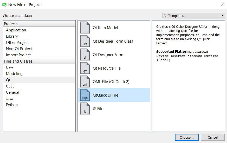
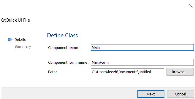
- Enter the component name as Main, followed by the component form name as MainForm. Click Next, followed by Finish:
- A new file called MainForm.ui.qml has been added to your project resources. Try to open the MainForm.ui.qml file by double-clicking on it, if it hasn't been automatically opened by Qt Designer (UI editor) upon creation. You will see a completely different UI editor compared to the C++ project we did in all previous recipes. This editor is also called the Qt Quick Designer; it is specially designed for editing QML-based UIs only.
- When main.qml is loaded by the QML engine, it will also import MainForm.ui.qml into the UI, since MainForm is being called in the main.qml file. Qt will check whether MainForm is a valid UI by searching for its .qml file based on the naming convention. The concept is similar to the C++ project we did in all our previous recipes; the main.qml file acts like the main.cpp file and MainForm.ui.qml acts like the MainWindow class. You can also create other UI templates and use them in main.qml. Hopefully, this comparison will make it easier to understand how QML works.
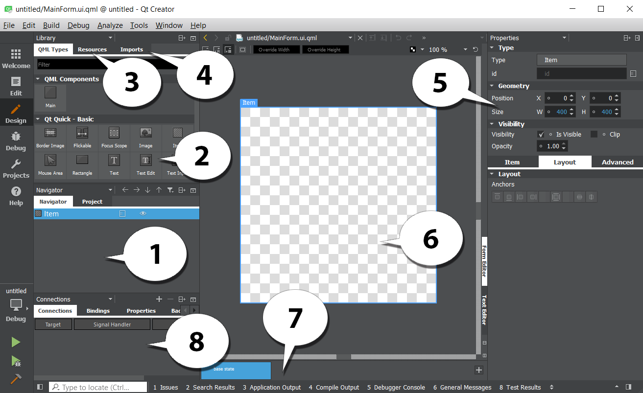
- Open up MainForm.ui.qml. You should see only one item listed on the Navigator window: Item. The Item item is basically the base layout of the window, which shouldn't be deleted. It is similar to the centralWidget we used in the previous section.
- The canvas is really empty at the moment, let's drag a Mouse Area and Text items, to the canvas from the QML Types panel on the left. Resize the Mouse Area to fill the entire canvas. Also, make sure that both Mouse Area and Text items are being placed under the Item item in the Navigator panel, as in the following screenshot:
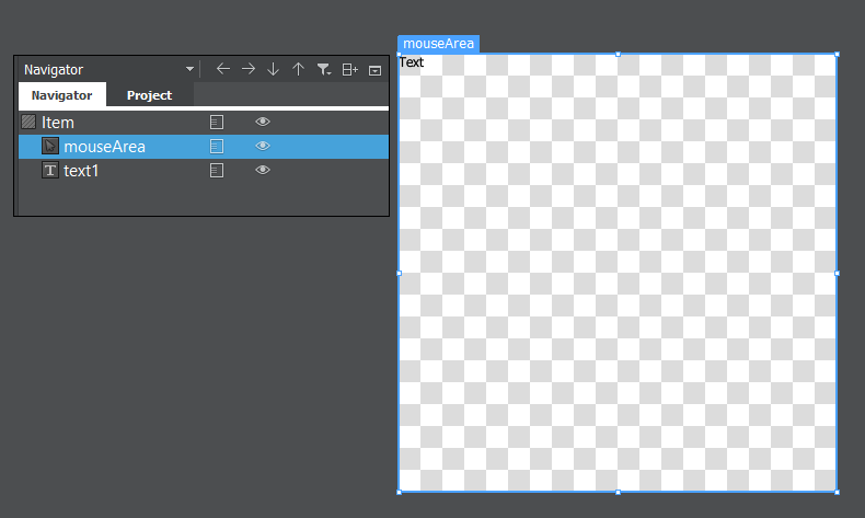
- The Mouse Area item is an invincible item that gets triggered when the mouse is clicking on it, or when a finger is touching it (for mobile platforms). The Mouse Area item is also used in a button component, which we will be using in a while. The Text item is self-explanatory: it is a label that displays a block of text on the application.
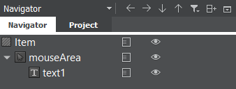
- On the Navigator window, we can hide or show an item by clicking on the icon, beside the item, that resembles an eye. When an item is hidden, it will not show on the canvas nor the compiled application. Just like the widgets in a C++ Qt project, Qt Quick Components are arranged in a hierarchy based on the parent-child relationship. All the child items will be placed under the parent item with an indented position. In our case, you can see the Mouse Area and Text items are positioned slightly to the right compared to the Item item, because they are both the children of the Item item. We can rearrange the parent-child relationship, as well as their position in the hierarchy, by using a click-and-drag method from the Navigator window. You can try clicking on the Text item and dragging it on top of the mouse area. You will then see that the Text item changes its position and is now located beneath the mouse area with a wider indentation:
- We can rearrange them by using the arrow buttons located on top of the Navigator window, as shown in the preceding screenshot. Anything that happens to the parent item will also affect all its children, such as moving the parent item, and hiding and showing the parent item.
- Delete both the Mouse Area and Text items as we will be learning how to create a user interface from scratch using QML and Qt Quick.
- Set the Item item's size to 800 x 600, as we're going to need a bigger space for the widgets.
- Copy the images we used in the previous C++ project, the Using resources in style sheets recipe, over to the QML project's folder, because we are going recreate the same login screen, with QML.
- Add the images to the resource file so that we can use them for our UI.
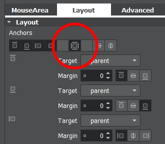
- Open up Qt Quick Designer and switch to the Resources window. Click and drag the background image directly to the canvas. Switch over to the Layout tab on the Properties pane and click the fill anchor button, indicated here by a red circle. This will make the background image always stick to the window size:
- Click and drag a Rectangle component from the Library window to the canvas. We will use this as the top panel for our program.
- For the top panel, enable the top anchor, left anchor, and right anchor so that the panel sticks to the top of the window and follows its width. Make sure all the margins are set to zero.
- Go to the Color property of the top panel and select the Gradient mode. Set the first color to #805bcce9 and the second color to #80000000. This will create a half-transparent panel with a blue gradient.
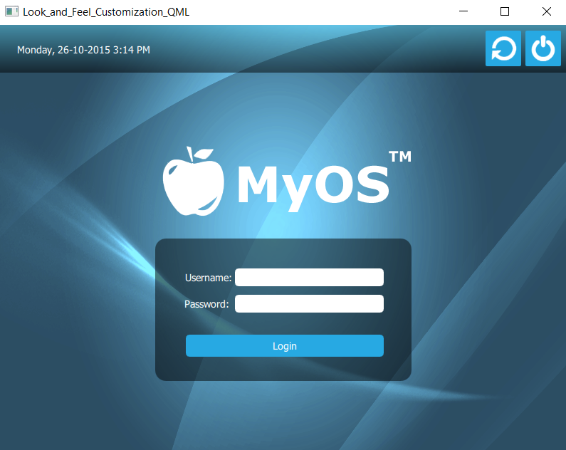
- Add a Text widget to the canvas and make it a child of the top panel. Set its text property to the current date and time (for example, Monday, 26-10-2015 3:14 PM) for display purposes. Then, set the text color to white.
- Switch over to the Layout tab and enable top anchor and left anchor so that the text widget will always stick to the top-left corner of the screen.
- Add a Mouse Area to the screen and set its size to 50 x 50. Then, make it a child of the top panel by dragging it on top of the top panel in the Navigator window.
- Set the color of the mouse area to blue (#27a9e3) and set its radius to 2 to make its corners slightly rounded. Enable the top anchor and right anchor to make it stick to the top-right corner of the window. Set the top anchor's margin to 8 and the right anchor's margin to 10 to create some space.
- Open up the Resources window and drag the shutdown icon to the canvas. Make it a child of the Mouse Area item we created a moment ago. Then, enable the fill anchor to make it fit the size of the mouse area.
- Phew, that's a lot of steps! Now your items should be arranged as follows on the navigator window:
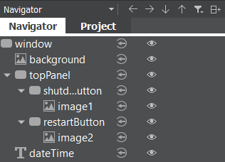
- The parent-child relationship and the layout anchors are both very important to keep the widgets in the correct positions when the main window changes its size. Your top panel should look something like this:

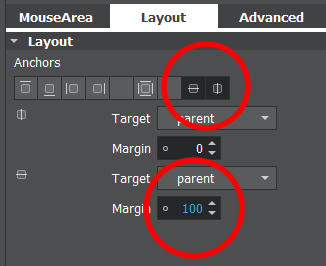
- Let's work on the login form. Add a new Rectangle to the canvas by dragging it from the Library window. Resize the rectangle to 360 x 200 and set its radius to 15.
- Set its color to #80000000, which will change it to black with 50% transparency.
- Enable the vertical center anchor and the horizontal center anchor to make the rectangle always align to the center of the window. Then, set the margin of the vertical center anchor to 100 so that it moves slightly lower to the bottom, so that we have the space to place the logo. The following screenshot illustrates the settings of the Anchors:
- Add the text objects to the canvas. Make them children of the login form (Rectangle widget) and set their text property to Username: and Password:. Change their text color to white and position them accordingly. We don't need to set a margin this time because they will follow the rectangle's position.
- Add two text input objects to the canvas and place them next to the text widgets we just created. Make sure the text input are also the children of the login form. Since the text input don't contain any background color property, we need to add two rectangles to the canvas to use as their background.
- Add two rectangles to the canvas and make each of them a child of one of the text input we just created. Set the radius property to 5 to give them some rounded corners. After that, enable fill anchors on both of the rectangles so that they will follow the size of the text input widgets.
- Let's create the login button beneath the password field. Add a mouse area to the canvas and make it a child of the login form. Resize it to your preferred dimension and move it into place.
- Since the mouse area does not contain any background color property, we need to add a Rectangle widget and make it a child of the mouse area. Set the color of the rectangle to blue (#27a9e3) and enable the fill anchor so that it fits nicely with the mouse area.
- Add a text object to the canvas and make it a child of the login button. Change its text color to white and set its text property to Login. Finally, enable the horizontal center anchor and the vertical center anchor to align it to the center of the button.
- You will now get a login form that looks pretty similar to the one we made in the C++ project:
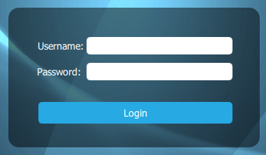
- It's time to add the logo, which is actually very simple. Open up the Resources window and drag the logo image to the canvas.
- Make it a child of the login form and set its size to 512 x 200.
- Position it on top of the login form and you're done.
- This is what the entire UI looks like when compiled. We have successfully recreated the login screen from the C++ project, but this time we did it with QML and Qt Quick:
How it works...
Qt Quick editor uses a very different approach for placing widgets in the application compared to the form editor. The user can decide which method is best suited to their purposes. The following screenshot shows what the Qt Quick Designer looks like:
We will now look at the various elements of the editor's UI:
- Navigator: The Navigator window displays the items in the current QML file as a tree structure. It's similar to the object operator window in the other Qt Designer we used in the previous Using style sheets with Qt Designer section.
- Library: The Library window displays all the Qt Quick Components or Qt Quick Controls available in QML. You can click and drag it to the canvas window to add to your UI. You can also create your own custom QML components and display it here.
- Resources: The Resources window displays all the resources in a list that can then be used in your UI design.
- Imports: The Imports window allows you to import different QML modules into your current QML file, such as a Bluetooth module, a WebKit module, or a positioning module, to add additional functionality to your QML project.
- Properties pane: Similar to the Property Editor we used in previous recipe, the Properties pane in QML Designer displays the properties of the selected item. You can also change the properties of the items in the code editor.
- anvas: The canvas is the working area where you create QML components and design applications.
- tate pane: The State pane displays the different states in the QML project, describing UI configurations, such as the UI controls, their properties and behavior, and the available actions.
- onnections: This panel is where you set the signal handlers for each QML component in your canvas, which empowers the signals and slots mechanism provided by Qt.
Exposing the QML object pointer to C++
Sometimes, we want to modify the properties of a QML object through C++ scripting, such as changing the text of a label, hiding/showing the widget, or changing its size. Qt's QML engine allows you to register your QML objects to C++ types, which automatically exposes all its properties.
How to do it...
We want to create a label in QML and change its text occasionally. In order to expose the label object to C++, we can do the following steps:
- Create a C++ class called MyLabel that extends from the QObject class in mylabel.h:
class MyLabel : public QObject {
Q_OBJECT
public:
    // Object pointer
    QObject* myObject;
    explicit MyLabel(QObject *parent = 0);

    // Must call Q_INVOKABLE so that this function can be used in QML
    Q_INVOKABLE void SetMyObject(QObject* obj);
}
-
In the mylabel.cpp source file, define a function called SetMyObject() to save the object pointer. This function will later be called in QML in mylabel.cpp:
void MyLabel::SetMyObject(QObject* obj) {
    // Set the object pointer
    myObject = obj;
}
- In main.cpp, include the MyLabel header and register it to the QML engine using the
qmlRegisterType() function:
include "mylabel.h"
int main(int argc, char *argv[]) {
    // Register your class to QML
    qmlRegisterType<MyLabel>("MyLabelLib", 1, 0, "MyLabel");
}
- Notice that there are four parameters you need to declare in qmlRegisterType(). Besides declaring your class name (MyLabel), you also need to declare your library name (MyLabelLib) and its version (1.0), which will be used to import your class to QML.
- Map the QML engine to our label object in QML and import the class library we defined earlier in step 3 by calling import MyLabelLib 1.0 in our QML file. Notice that the library name and its version number have to match the one you declared in main.cpp, otherwise it will throw an error. After declaring MyLabel in QML and setting its ID as mylabels, call mylabel.SetMyObject(myLabel) to expose its pointer to C/C++ right after the label is initialized:
import MyLabelLib 1.0
ApplicationWindow {
    id: mainWindow
    width: 480
    height: 640
    MyLabel {
        id: mylabel
    }
    Label {
        id: helloWorldLabel
        text: qsTr("Hello World!")
        Component.onCompleted: {
            mylabel.SetMyObject(hellowWorldLabel);
        }
    }
}
- Wait until the label is fully initiated before exposing its pointer to C/C++, otherwise you may cause the program to crash. To make sure it's fully initiated, call the SetMyObject() function within Component.onCompleted and not in any other functions or event callbacks. Now that the QML label has been exposed to C/C++, we can change any of its properties by calling the setProperty() function. For instance, we can set its visibility to true and change its text to Bye bye world!:
// QVariant automatically detects your data type
myObject->setProperty("visible", QVariant(true));
myObject->setProperty("text", QVariant("Bye bye world!"));
- Besides changing the properties, we can also call its functions by calling the following:
QMetaObject::invokeMethod():
QVariant returnedValue;
QVariant message = "Hello world!";
QMetaObject::invokeMethod(myObject, "myQMLFunction", Q_RETURN_ARG(QVariant, returnedValue), Q_ARG(QVariant, message));
qDebug() << "QML function returned:" << returnedValue.toString();
- Or, simply, we can call the invokedMethod() function with only two parameters if we do not expect any values to be returned from it:
QMetaObject::invokeMethod(myObject, "myQMLFunction");
How it works...
QML is designed in such a way that it can be expanded through C++ code. The classes in the Qt QML module permit QML objects to be used and operate from C++, and the capability of the QML engine's united with Qt's meta-object system allows C++ functionality to be called directly from QML. To add some C++ data or usage to QML, it should come forward from a QObject-derived class. QML object types could be instituted from C++ and supervised to access their properties, appeal their methods, and get their signal alerts. This is possible because all QML object types are executed using QObject-derived classes, allowing the QML engine to forcibly load and inspect objects through the Qt meta-object system.