


A simple table is basically composed of the <table>, <tr>, and <td> tags. Besides this, its contents should also make sense if you remove these tags. Hence you should have a clear understanding of its contents.
With the use of additional elements such as caption, thead, tbody, and tfooter, we have a data table, that is two or more dimensions. Each data cell <td> needs to be represented by a minimum of two unique vertices for the <th> headings.
Also, the table needs to be structured so that when it is rendered, for each row there are the same number of columns.
Using these elements we can maintain our table with a semantic code. As mentioned in the W3C Candidate Recommendation for tabular data (dated 17 December 2012), it is not mandatory to close <thead>, <tr>, <th>, <td>, and <tbody> tags.
Before we see the difference in the code, let's see a simple table. Remember, every table requires a minimum markup to be valid, it should have at least the <table>, <tr> and <td> tags. The following screenshot shows a simple table without any stylesheet:
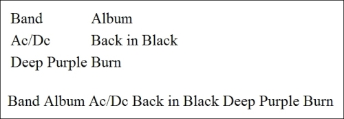
Table 01
Now we use a more complex markup with the <caption>, <thead>, <tbody>, and <tfooter> tags. In order to achieve a better visual result, we apply some lines of CSS. The following screenshot shows a table with a basic stylesheet:
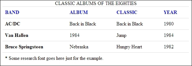
Table 02
Here we assume that you already have the minimum markup of an HTML5 document formatted, but if you prefer open the example (Chapter01_Codes) of the book and follow the code:
First insert the minimum markup necessary to create a table.
Then we use the
<caption>,<thead>, and<tbody>elements to give us more flexibility in styling the table.And finally apply the style to format the table and improve the visualization as follows:
  <!--Very basic Table layout-->
  <table>
  <tr>
  <td>Band</td>
  <td>Album</td>
    </tr>
  <tr>
  <td>Ac/Dc</td>
  <td>Back in Black</td>
  </tr>
  <tr>
  <td>Deep Purple</td>
  <td>Burn</td>
  </tr>
  </table>
Now we add the new elements to the HTML document:
<!--This div is only to create a border around the table -->
<div class="container">
  <table class="table">
    <caption>CLASSIC ALBUMS OF THE EIGHTIES</caption>
    <thead>
    <tr>
    <th scope="col">BAND</th>
    <th scope="col">ALBUM</th>
    <th scope="col">CLASSIC</th>
    <th scope="col">YEAR</th>
    </tr>
    </thead>
    <tfoot>
    <tr>
    <td colspan="4">* Some research font goes here just for the example.</td>
    </tr>
    </tfoot>
    <tbody>
    <tr>
    <th scope="row">AC/DC</th>
    <td>Back in Black</td>
    <td>Back in Black</td>
    <td>1980</td>
    </tr>
    <tr>
    <th scope="row">Van Hallen</th>
    <td>1984</td>
    <td>Jump</td>
    <td>1984</td>
    </tr>
    <tr>
    <th scope="row">Bruce Springsteen</th>
    <td>Nebraska</td>
    <td>Hungry Heart</td>
    <td>1982</td>
    </tr>
    <tbody>
  </table>
</div>
And finally, we add the CSS rules to our table as follows:
.container {
      width:600px;
      overflow: hidden;
      border:1px solid #000;
    }
    .table {
        background-color: transparent;
        border-collapse: collapse;
        border-spacing: 0;
        background-color: #fff
    }
    .table th,
    .table td {
        padding: 8px;
        line-height: 20px;
        text-align: left;
        vertical-align: top;
        border-top: 1px solid #dddddd;
    }
    .table th {
        font-weight: bold;
    }
    .table thead th {
        vertical-align: bottom;
        color:#0006ff;
    }
The result is what we saw in screenshot, Table 02.
For the purposes of this book, the CSS code was embedded in the header of our page as you can see in the code examples.
With the addition of new elements, you can easily stylize your table only using the <thead> and <th> selectors. Note that we add the .table class just for demonstration.
This is a very simple style, but our markup is semantic and our code can be easily interpreted by the screen readers. With the aid of the <scope> tag, we can define the individual headers for each column as follows:
<tr>
    <th scope="col">BAND</th>
    <th scope="col">ALBUM</th>
    <th scope="col">CLASSIC</th>
    <th scope="col">YEAR</th>
</tr>
And apply the blue color to all our headers as you can see in Table 02.
The <scope> syntax is very intuitive and is written as follows:
<th scope="col|row|colgroup|rowgroup">
The preceding syntax is explained as follows:
col– The header cell is a header for a columnrow– The header cell is a header for rowcolgroup– The header cell is a header for group of columnsrowgroup– The header cell is a header for group of rows
Let's take a look at the tables by the User Experience Design perspective:
Always give abbreviations for numbers and names as it's unnecessary to display every digit of a number. You can abbreviate large numbers such as $250,000 to $250k and large names such as John Doe Novatto to John Doe.
Tooltips are welcome too. It helps the users see the real and full value for each field.
Keep headers fixed on table scrolling. It's hard for users to know what the information they're looking at is, without seeing the column header. See line 125 for example.
Differentiate their lines with different colors (zebra stripes), extensive tables are very easy to get confused when you look at certain lines.
Get used to using the
<caption>tag to describe the contents of your tables, it is very important for accessibility because screen readers identify this information and use the<scope>tag to associate the cells with the headers.
Of course, this list has a few tips but you can search more info on the web.
Tip
Accessibility tip
Use of the <th> and <scope> tags combined with the <caption> and <summary> tags will provide sufficient information for most newer screen readers to process simple tables.
A good resource for accessibility can be found here at http://accessibility.psu.edu/wcag2.
Responsive web design requires a very different way of thinking about layout that is both challenging and exciting. First we must base our layout in fluid grids, that is we should use percentages instead of pixels.
This way we can have greater control over the width of the elements positioned on the screen. This is one of the basic principles of responsive layout. There are two other important aspects that help us deal with this development technique but both are outside the scope of our book. You can find more information by visiting the following link:
http://en.wikipedia.org/wiki/Responsive_web_design
With this information it would be very simple to think that we can set the width of our table in percentages and that our problems are solved, right? Wrong or not exactly right, let's go back to our table in the last recipe and add more columns to make a simple verification.
Let's open the example code, Chapter02_Codes.
Now we add four
<th>tags to the<thead>tag.Then add more four
<td>to each<tr>on the table body.Finally, add a border to the container div on our CSS.
Here's our HTML code with four more columns:
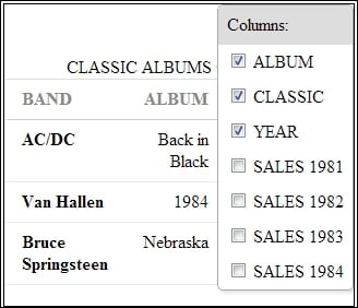
<div class="container">
  <table>
    <caption>CLASSIC ALBUMS OF THE EIGHTIES</caption>
    <thead>
    <tr>
    <th scope="col">BAND</th>
    <th scope="col">ALBUM</th>
    <th scope="col">CLASSIC</th>
    <th scope="col">YEAR</th>
    <th scope="col">SALES 1981</th>
    <th scope="col">SALES 1982</th>
    <th scope="col">SALES 1983</th>
    <th scope="col">SALES 1984</th>
    </tr>
    </thead>
    <tfoot>
    <tr>
    <td colspan="8">* This table is only for example purposes and don't express the really.</td>
    </tr>
    </tfoot>
    <tbody>
    <tr>
    <th scope="row">AC/DC</th>
    <td>Back in Black</td>
    <td>Back in Black</td>
    <td>1980</td>
    <td>120.000</td>
    <td>60.000</td>
    <td>10.000</td>
    <td>130.000</td>
    </tr>
    <tr>
    <th scope="row">Van Hallen</th>
    <td>1984</td>
    <td>Jump</td>
    <td>1984</td>
    <td>0</td>
    <td>0</td>
    <td>0</td>
    <td>120.000</td>
    </tr>
    <tr>
    <th scope="row">Bruce Springsteen</th>
    <td>Nebraska</td>
    <td>Hungry Heart</td>
    <td>1982</td>
    <td>0</td>
    <td>60.000</td>
    <td>70.000</td>
    <td>120.000</td>
    </tr>
    <tbody>
</table>
</div>
We can use more than eight columns but this is enough for our example.
Tip
Downloading the example code
You can download the example code files for all Packt books you have purchased from your account at http://www.packtpub.com. If you purchased this book elsewhere, you can visit http://www.packtpub.com/support and register to have the files e-mailed directly to you.
Add a border to the div
container, as we see here:.container { width:980px; overflow: hidden; border:1px solid #000; }
When our div container is 600px, our table is good but when we change the container width to 980px (Table 03), our table is still safe but does not occupy the entire space of the container, as shown in the following screenshot (note the blank space on right side):

Table 03
Now let's see what happens when we add 100 percent of width on our table:

Table 04: Table with 100 percent width
A little better than the previous one, in this case it is not really a problem, but imagine if our div decreased instead of increasing?
For this, from now to the end of the book we'll use some Media Queries techniques to help us with small screen devices.
This matter being outside the scope of this book, we recommend reading the w3c article at http://www.w3.org/TR/css3-mediaqueries/ for better understanding of how this method of development works.
Media queries, which are part of the CSS3 draft spec, don't work in Internet Explorer 6, 7, or 8, Firefox 3, and Opera 9. Hardly surprising, but certainly annoying. So, we need a JavaScript solution for older browsers.
Here's a link to a useful resource to check browsers' support:
The following screenshot shows the media queries' browser compatibility:

For the next recipes we introduce a small library called Respond.js also known as Polyfill to help us with media queries in outdated browsers.
This script simply scans the CSS files for the queries, and then implements them as normal CSS when the page is resized. It's a simple enough idea but the code itself is reasonably complex; it actually loads the external CSS files using AJAX, and herein lies the rub.
You can read more about this at http://en.wikipedia.org/wiki/Polyfill.
Now that we already know how to run a responsive layout, let's dive into this challenging field and use some CSS3 properties to give a better design and look to our table.
First add the following lines at the bottom of the HTML page:
<!-- JavaScript at the bottom for fast page loading with just one js file -->
  <script src="http://ajax.googleapis.com/ajax/libs/jquery/1.8.3/jquery.min.js"></script>
  <script src="https://raw.github.com/scottjehl/Respond/master/respond.min.js"></script>
Open the example file, Chapter03_Codes_1. We need to apply our CSS to make a responsive table as follows:
Add a round corner to our
containerclass withborder-radiusand usemax-widthto increase thecontainerwidth to800px.Use the browser vendor prefix (
-mozand-webkit) to make some browsers understand gradient CSS property.Add another new feature from CSS3,
box-shadow.Use pseudo-classes
nth-child(odd)andnth-child(even)to "zebra" the table rows as follows:.container { max-width: 800px; margin: 0 auto; font-family: 'Crimison Text', Arial, sans-serif; padding: 0.5em 1em 1em 1em; border-radius: 10px; background-color: #808080; background: -webkit-gradient(linear, left top, left bottom, from(#333), to(#ccc)); background: -moz-linear-gradient(top, #606060, #808080); -moz-box-shadow: 5px 5px 10px rgba(0,0,0,0.3); -webkit-box-shadow: 5px 5px 10px rgba(0,0,0,0.3); box-shadow: 5px 5px 10px rgba(0,0,0,0.3); } h1 {color:#fff; font-size:1.5em; text-align: center;} table.tableCss3 { width: 100%; border-collapse:collapse; text-align:left; color: #000000; } table.tableCss3 thead tr td { background-color: White; vertical-align:middle; padding: 0.6em; font-size:0.8em; } table.tableCss3 thead tr th { padding: 0.5em; /* add gradient */ background-color: #bdbdbd; background: -webkit-gradient(linear, left top, left bottom, from(#d6d6d6), to(#bdbdbd)); background: -moz-linear-gradient(top, #d6d6d6, #bdbdbd); color: #000000; } table.tableCss3 tbody tr:nth-child(odd) { background-color: #fafafa; } table.tableCss3 tbody tr:nth-child(odd):hover { cursor:pointer; /* add gradient */ background-color: #fafafa; background: -webkit-gradient(linear, left top, left bottom, from(#fafafa), to(#e0e0e0)); background: -moz-linear-gradient(top, #fafafa, #e0e0e0); color: #333; } table.tableCss3 tbody tr:nth-child(even) { background-color: #efefef; } table.tableCss3 tbody tr:nth-child(even):hover { cursor:pointer; /* add gradient */ background-color: #808080; background: -webkit-gradient(linear, left top, left bottom, from(#e0e0e0), to(#f1f1f1)); background: -moz-linear-gradient(top, #ebebeb, #f7f7f7); color: #333; } table.tableCss3 tbody tr:last-child { border-bottom: solid 1px #838383; } table.tableCss3 td { vertical-align:middle; padding: 0.5em; } table.tableCss3 tfoot{ text-align:center; color:#303030; text-shadow: 0 1px 1px rgba(255,255,255,0.3); }We set
max-widthof thecontainerto800pxandwidthof the table to100%to adjust the table width to all screen size. The800pxfrom div container is only for the example here but can be of any size.After incorporating these minimal changes, our table is shown throughout our browser.
We add a
.tableCss3class just to illustrate the new CSS3 selectors and pseudo-classes.
The preceding screenshot is of the browser at 1024 px – 768 px.
And when we resize the browser window, our table adjusts to fit their new size:

The preceding screenshot is of the browser at 320px – 480px.
So far so good, but how can we improve this result with more columns?
We can filter the data columns that are less important to the user. But remember you should always allow your user tp to choose what is most important to him, so be flexible.
Find more information about CSS3 selector here: http://www.w3.org/TR/selectors/#selectors
Browser prefix is a technique used in the stylesheets to warn browsers that have not yet implemented certain property that it is being used through a prefix placed before the property.
For example, -ms for Internet Explorer, -webkit for Safari and Chrome, and so on.
You will find a complete reference guide of prefixes and properties at http://www.w3schools.com/cssref/css3_browsersupport.asp.
In the following example, we will see how to apply a filter and select some columns to be displayed in smaller devices, and gradually show all columns in larger devices.
We'll use the example code, Chapter03_Codes_2.
Hands on and add the following tag to the bottom of our file:
<script src="https://raw.github.com/thepeg/MediaTable/master/jquery.mediaTable.js">
</script>
Also, add the following script tag just after the preceding line of code:
<script>
  $(document).ready(function(){
    $('.mediaTable').mediaTable();
  });
</script>
Now add the following script to the head of our page, just after the <style> tag:
<link rel="stylesheet" type="text/css" media="all" href="mediatable.css" />
Here is a short description of the code, it's a jQuery plugin that helps us with the table filters. We apply them to our columns, so this way we can give options to our users to filter the content themselves.
We can choose a solution using only pure JavaScript or even write a new jQuery plugin, but it is not necessary to reinvent the wheel.
Note
JavaScript is the fastest growing language today. We have an infinity of snippets and plugins available to us everyday, and a very active community.
We recommend that you do a little search on github at https://github.com and explore the endless existing codes on it.
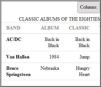
Here's a very simple piece of code, we will add some classes to our markup just to prefilter some options and we will set some columns as optional and others as essential:
      <tr>
    <th scope="col" class="essential persist">BAND</th>
    <th scope="col" class="essential">ALBUM</th>
    <th scope="col" class="essential">CLASSIC</th>
    <th scope="col" class="essential">YEAR</th>
    <th scope="col" class="optional">SALES 1981</th>
    <th scope="col" class="optional">SALES 1982</th>
    <th scope="col" class="optional">SALES 1983</th>
    <th scope="col" class="optional">SALES 1984</th>
    </tr>
Now on resizing, we see the three essential columns and a link on top-right corner:
The preceding screenshot is of the browser at 320px.
When we press the link, we can see the filter, as shown in the following screenshot:
Browser screenshot at 320 px, now with the filter.
Note that we are not taking into account the height of the table, we are only considering the width. We will have the scroll bar down later and it does not affect the way in which we provide the data.
After append mediatable.css, we introduce the breakpoints from our media queries. Breakpoints means that we can set a new size with a expression like this:
@media screen and (min-width: 768px) {...your code here}This means that the style between the brackets will be interpreted by the browser if the screen resolution is less than 768px. And the same will apply to any other resolution when we define our size in the min or max width.
Let's look at another alternative now. How to deal with numerical tables? When dealing with responsive design it is strongly recommended that you develop your application from the bottom up, that is the smallest to the largest 320px to 1024px or 1280px to 1360px. This way of development is known as mobile first.
It is hard to imagine how to show a table with over 10 columns on such a small screen. Let's see a pretty interesting alternative. Using another trick with a jQuery Plugin called: Footable.js.
First let's take a look in our table:
Full width table of 1024px
Now on resizing, we have something like an accordion:
Browser resized at 320px
When we click on the table header, we see the other rows, as shown in the following screenshot:
Accordion behavior when the header is clicked
The following are steps required to complete this task, you can use the code examples (Chapter04_Codes_1):
Add some extra CSS lines to our markup.
Include the stylesheet plugin to the head of page.
Insert the JavaScript plugin to the bottom of our page.
And finally, initiate the plugin with a jQuery function.
Now we going into the magic, let's see our changes on css:
     .table tbody tr:nth-child(odd) td,
    .table tbody tr:nth-child(odd) th {
      background-color: #f9f9f9;
    }
    .table tbody tr:hover td,
    .table tbody tr:hover th {
      background-color: whitesmoke;
    }
In the head of our page, include a stylesheet link to the plugin's CSS:
<link rel="stylesheet" type="text/css" media="all" href="https://raw.github.com/bradvin/FooTable/master/css/footable-0.1.css" />
Add the plugin's link to the bottom of the page right after the jQuery:
<script src="https://raw.github.com/bradvin/FooTable/master/js/footable-0.1.js"></script>
Finally, invoke the jQuery function to make the magic happen:
<script type="text/javascript">
    $(function() {
      $('.table').footable();
    });
  </script>
We will see a way to load the data from your table through a JSON file and a few lines of JavaScript and jQuery.
You can even use this snippet of code into their applications, code example Chapter04_Codes_2.
Note
Here we need to publish our HTML file on a web server, otherwise you might not been able to see the result when you load the JSON file in your browser due to Access-Control-Allow-Origin.
Here you can use the Mongoose Server included in the codes examples, or download it from the link provided on our Preface.
Just go to downloaded codes folder and execute the server with a double click, now open your browser and type http://localhost:8080. This is the default port for Mongoose but if you already have your port 8080 busy, just right-click on the Mongoose icon present at the bottom toolbar and choose Edit Config File and change the port.
Check out the JavaScript code:
        // Build the table from a Json file
        $.getJSON('table_content_2.json', function(data) {

              var table = $('#dynamicTable');

              var trthead = $('<tr/>');

              var head = $('<thead/>');

              trthead.appendTo(head);

            //Loop over the columns
                $.each(data.listColumns, function (index, value) {
                    var column = $('<th>' + value.Title + '</th>');
                    trthead.append(column);
                });

              var tbody = $('<tbody/>');

            //Loop over the rows;
              for (var i = 0; i < data.listRows.length; i++) {
                  var tr = $('<tr/>');
                      for (var t = 0; t < data.listRows[i].Value.length; t++) {

  if(t == 0){
    tr.append('<th>' + data.listRows[i].Value[t] + '</th>');
  }else{
    tr.append('<td>' + data.listRows[i].Value[t] + '</td>');
  }

                      }

                tbody.append(tr);
              }
                table.append(head);
                table.append(tbody);
        });
It is a simple yet functional code and can be applied to any type of table. Following this basic JSON structure, add the table markup on the document body:
<table id="dynamicTable" class="table"></table>
On the body of your document add the script on the bottom, after the jQuery script.
Here's our JSON file:
{
    "listColumns": [
        {"Title": "Column 01", "id": 1},
        {"Title": "Column 02", "id": 2},
        {"Title": "Column 03", "id": 3},
        {"Title": "Column 04", "id": 4},
        {"Title": "Column 05", "id": 5},
        {"Title": "Column 06", "id": 6}
    ],
    "listRows": [
        {"Value": ["0","0","0","0","0","0"]},
        {"Value": ["0","0","0","0","0","0"]},
        {"Value": ["0","0","0","0","0","0"]},
        {"Value": ["0","0","0","0","0","0"]},
        {"Value": ["0","0","0","0","0","0"]},
        {"Value": ["0","0","0","0","0","0"]}
    ]
}Now we introduce the JSON validate tool called jsonlint and you can find here:
Its operation is very simple, just copy and paste your code in the JSON address and click on Validate.
In addition to validating your code, this tool can still indents and makes the code more pleasing to our eyes.
Now let's see another way of dealing with our data table, based only on CSS and loading data via JSON file using the $.getJSON(); and $.ajax(); methods. Remember that you can use this code in your work, we have carefully optimized it as the JSON loading is very fast and the JSON file is very lightweight.
First it is necessary to run our small web server so that our request to JSON file works perfectly.
We'll be using Chrome throughout this recipe, although you may prefer to use a different browser—the Origin null message that you may see applies only to Chrome. Also you can use Firefox or Internet Explorer browser if you prefer, but the "Origin null is not allowed by Access-Control-Allow-Origin" message is only for Chrome browser.
Start the Mongoose Server and go to
http://localhost:8080on your browser.Open the example file, Chapter05_Codes_1 or follow the next steps.
Insert a breakpoint in our stylesheet, to be more exact, in the head of the page.
Place the new CSS rules inside the Media Queries brackets.
Now, just below the existing style, we add the new code.
Let's now add in the relevant styles, as highlighted:
    table {
        max-width: 100%;
        background-color: transparent;
        border-collapse: collapse;
        border-spacing: 0;
        background-color: #fff
    }
    .table {
        width: 100%;
        margin-bottom: 20px;
    }
    .table th,
    .table td {
        padding: 8px;
        line-height: 20px;
        text-align: left;
        vertical-align: top;
        border-top: 1px solid #dddddd;
    }
    .table th {
        font-weight: bold;
    }
    .table thead th {
        vertical-align: bottom;
        color:#0006ff;
    }
    .table tbody tr:nth-child(odd) td,
    .table tbody tr:nth-child(odd) th {
        background-color: #f9f9f9;
    }
    .table tbody tr:hover td,
    .table tbody tr:hover th {
        background-color: whitesmoke;
    }

  @media only screen and (max-width: 768px) { }


@media only screen and (max-width: 768px) {

    .table { display: block; position: relative; width: 100%; }
    .table thead { display: block; float: left; background-color: #ccc; }
    .table tbody {
      display: block;
      width: auto;
      position: relative;
      overflow-x: auto;
      white-space: nowrap;
      }
    .table thead tr { display: block; }
    .table th { display: block; }
    .table tbody tr { display: inline-block; vertical-align: top; }
    .table td { display: block; min-height: 1.25em; }

    table tbody tr { border-right: 1px solid #babcbf; }

  }
Note that we use only a
max-width: 768pxfor this example and it works fine for this purpose.At this moment our page must look like this on full-browser resolution:

Screenshot at 1024px
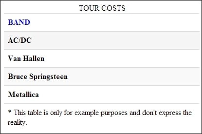
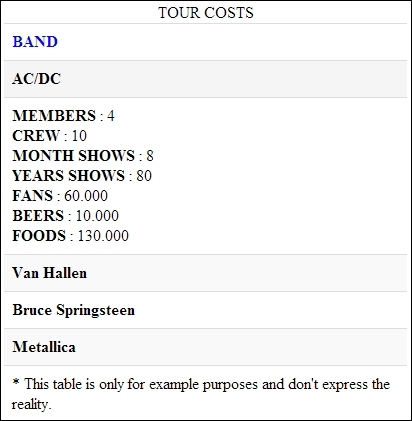
When resized to 320px, we see the scroll bar just below the table:

Screenshot at 320px
Not bad, in our Media Queries we apply the display block property and the display inline-block property to our table <tbody> in the <tr> section.
Thus we force the table to show like a block and shift the <thead> tag to the left-hand side forcing the body to behave like a div and present it with a scroll bar.
Lets take a look at our JavaScript using the $.getJSON() jQuery function:
$.getJSON('table_content_2.json', function(data) {

              var table = $('#dynamicTable');

              var trthead = $('<tr/>');

              var head = $('<thead/>');

              trthead.appendTo(head);

            //Loop over the columns
                $.each(data.listColumns, function (index, value) {
                    var column = $('<th>' + value.Title + '</th>');
                    trthead.append(column);
                });

              var tbody = $('<tbody/>');

            //Loop over the rows;
              for (var i = 0; i < data.listRows.length; i++) {
                  var tr = $('<tr/>');
                      for (var t = 0; t < data.listRows[i].Value.length; t++) {

                        if(t == 0){
                          tr.append('<th>' + data.listRows[i].Value[t] + '</th>');
                        }else{
                          tr.append('<td>' + data.listRows[i].Value[t] + '</td>');
                        }

                      }

                tbody.append(tr);
              }
                table.append(head);
                table.append(tbody);
        });
As stated earlier our JSON file is lightweight and very easy to be generated by any server-side language that you want to use.
But it is necessary to obey the naming conventions of columns and rows as shown in the following code snippet:
{
    "listColumns": [
        {
            "Title": "BANDS",
            "id": 1
        }

    ],
    "listRows": [
        {
            "Value": [
                "Studio Hours",
                "1.900 h"

            ]
        }

    ]
}We will now cover some information about $.ajax() method:
Using the $. Ajax() method, we have even more flexibility to work with very large JSON files.
We can determine a loading to appear during our request (using the beforeSend function) and when the data is transferred we can remove it (using the complete function).
Additionally we have a function to handle any errors that prevent the loading of data from our table, code example, Chapter05_Codes_2.
$.ajax({
        type: 'GET',
        url: 'http://localhost:8080/table_content_2.json',
        timeout: 5000,
        dataType: "json",
        beforeSend: function () {
           var load = $('<div id="load"><p>Loading data...</p></div>');
           load.appendTo('body');
        },
        complete: function () {
          $('#load').remove();
        },
        success: function (data) {
          var table = $('#dynamicTable');
            var trthead = $('<tr/>');
            var head = $('<thead/>');
            trthead.appendTo(head);
            //Loop over the columns
                $.each(data.listColumns, function (index, value) {
            var column = $('<th>' + value.Title + '</th>');
           trthead.append(column);
                });
           var tbody = $('<tbody/>');
           //Loop over the rows;
           for (var i = 0; i < data.listRows.length; i++) {
                var tr = $('<tr/>');
           for (var t = 0; t < data.listRows[i].Value.length; t++) {
            if(t == 0){
            tr.append('<th>' + data.listRows[i].Value[t] + '</th>');
             }else{
             tr.append('<td>' + data.listRows[i].Value[t] + '</td>');}
            }
            tbody.append(tr);
            }
             table.append(head);
                table.append(tbody);
        },
        error: function (xhr, er) {
           $('body').html('<p>Sorry! Something wrong happened.')

        }
    });
Note
You can read more about Ajax requests using jQuery at http://api.jquery.com/jQuery.ajax.
Another alternative much discussed by the community of developers is transforming the table into a graphic when it is being displayed on small screen devices. This is not an easy task taking into account the size and amount of data that a table can have.
Let's see an alternative solution combining the previous recipes with another plugin for rendering graphics. The main reason for this combination is we use only one plugin per page, thus optimizing our load.
We maintained the same structure for our table, however this time we do not use this example and load it via AJAX. So the markup looks as follows, code example, Chapter06_Codes_1:
<table id="dynamicTable" class="table">
<thead>
<tr>
<th>Reviews</th>
<th>Top</th>
<th>Rolling Stones</th>
<th>Rock Hard</th>
<th>Kerrang</th>
</tr>
</thead>
<tbody>
<tr>
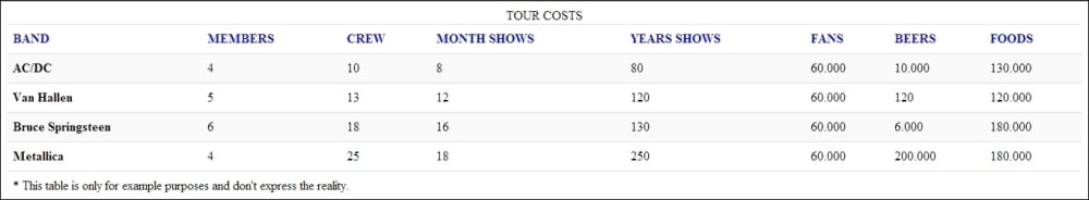
<th>Ac/Dc</th>
<td>10</td>
<td>9</td>
<td>8</td>
<td>9</td>
</tr>
<tr>
<th>Queen</th>
<td>9</td>
<td>6</td>
<td>8</td>
<td>5</td>
</tr>
<tr>
<th>Whitesnake</th>
<td>8</td>
<td>9</td>
<td>8</td>
<td>6</td>
</tr>
<tr>
<th>Deep Purple</th>
<td>10</td>
<td>6</td>
<td>9</td>
<td>8</td>
</tr>
<tr>
<th>Black Sabbath</th>
<td>10</td>
<td>5</td>
<td>7</td>
<td>8</td>
</tr>
</tbody>
</table>Let's see what we need to do:
Add a div right on the top of our table with an ID called
graph:<div id="graph"></div>
We will use a jQuery Plugin called Highcharts, which can be downloaded for free from http://www.highcharts.com/products/highcharts.
Add the following script to the bottom of our document:
<script src="highcharts.js"></script>
Add a simple script to initialize the graph as follows:
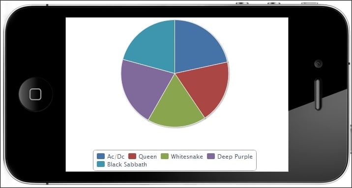
      var chart;
      Highcharts.visualize = function(table, options) {
         // the data series
          options.series = [];
          var l= options.series.length;
          options.series[l] = {
            name: $('thead th:eq('+(l+1)+')', table).text(),
            data: []
          };
         $('tbody tr', table).each( function(i) {
            var tr = this;
            var th = $('th', tr).text();
            var td = parseFloat($('td', tr).text());
            options.series[0].data.push({name:th,y:td});
         });
         chart = new Highcharts.Chart(options);
      }
      // On document ready, call visualize on the datatable.
      $(document).ready(function() {

         var table = document.getElementById('dynamicTable'),
         options = {
               chart: {
                  renderTo: 'graph',
                  defaultSeriesType: 'pie'
               },
               title: {
                  text: 'Review Notes from Metal Mags'
               },
               plotOptions: {
                    pie: {
                        allowPointSelect: true,
                        cursor: 'pointer',
                        dataLabels: {
                            enabled: false
                        },
                        showInLegend: true
                    }
                 },
               tooltip: {
                    pointFormat: 'Total: <b>{point.percentage}%</b>',
                    percentageDecimals: 1
                  }
      };

   Highcharts.visualize(table, options);
});
Many people choose to hide the div with the table in smaller devices and show only the graph.
Once they've optimized our table and depending on the amount of data, there is no problem. It also shows that the choice is yours.
Now when we look at the browser, we can view both the table and the graph as shown in the following screenshot:

Browser screenshot at 320px.
Highcharts plugins have an excellent quality in all browsers and works with SVG, they are compatible with iPad, iPhone, and IE 6.
The plugin can generate the table using only a single data array, but by our intuition and step-by-step description of its uses, we have created the following code to generate the graph starting from a table previously created.
We create the graph using the id#= dynamicTable function, where we read its contents through the following function:
$('tbody tr', table).each( function(i) {
            var tr = this;
            var th = $('th', tr).text();
            var td = parseFloat($('td', tr).text());
            options.series[0].data.push({name:th,y:td});
         });
In the plugin settings, we set the div graph to receive the graph after it is rendered by the script. We also add a pie type and a title for our graph.
options = {
               chart: {
                  renderTo: 'graph',
                  defaultSeriesType: 'pie'
               },
               title: {
                  text: 'Review Notes from Metal Mags'
},We can hide the table using media query so that only the graph appears. Remember that it just hides the fact and does not prevent it from being loaded by the browser; however we still need it to build the graph.
For this, just apply display none to the table inside the breakpoint:
@media only screen and (max-width: 768px) {

    .table { display: none; }
}
Browser screenshot at 320px, without the table
We introduce an alternative based on CSS3 for dealing with tables containing text and numbers.
Tables are used for different purposes, we will see an example where our data is not a data table. (Code Example: Chapter07_Codes_1)

Browser screenshot at 1024px
Although our table did not have many columns, showing it on a small screen is not easy. Hence we will progressively show the change in the table by subtracting the width of the screen.
Note that we have removed the .table class so this time apply the style directly in the table tags, see the following steps:
Let's use a simple table structure as we saw before.
Add some CSS3 to make some magic with our selectors.
Set our breakpoints to two sizes.
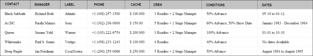
<table>
      <thead>
        <tr>
        <th>CONTACT</th>
        <th scope="col">Manager</th>
        <th scope="col">Label</th>
        <th scope="col">Phone</th>
        </tr>
      </thead>
      <tbody>
        <tr>
          <th scope="row">Black Sabbath</th>
          <td>Richard Both</td>
          <td>Atlantic</td>
          <td>+1 (408) 257-1500 </td>
        </tr>
        <tr>
          <th scope="row">Ac/DC</th>
          <td>Paolla Matazo</td>
          <td>Sony</td>
          <td>+1 (302) 236-0800</td>
        </tr>
        <tr>
          <th scope="row">Queen</th>
          <td>Suzane Yeld</td>
          <td>Warner</td>
          <td>+1 (103) 222-6754</td>
        </tr>
        <tr>
          <th scope="row">Whitesnake</th>
          <td>Paul S. Senne</td>
          <td>Vertigo</td>
          <td>+1 (456) 233-1243</td>
        </tr>
        <tr>
          <th scope="row">Deep Purple</th>
          <td>Ian Friedman</td>
          <td>CosaNostra</td>
          <td>+1 (200) 255-0066</td>
        </tr>
    </tbody>
  </table>
Applying the style as follows:
  table {
        width: 100%;
        background-color: transparent;
        border-collapse: collapse;
        border-spacing: 0;
        background-color: #fff
    }
    th {
      text-align: left;
    }
    td:last-child, th:last-child {
      text-align:right;
    }
    td, th {
      padding: 6px 12px;
    }
    tr:nth-child(odd), tr:nth-child(odd) {
      background: #f3f3f3;
    }
    tr:nth-child(even) {
      background: #ebebeb;
    }
    thead tr:first-child, thead tr:first-child {
      background: #000;
      color:white;
    }
    table td:empty {
      background:white;
    }
We use CSS3 pseudo-selectors here again to help in the transformation of the table. And the most important part, the Media Queries breakpoints:
@media (max-width: 768px) {
      tr :nth-child(3) {display: none;}
    }

    @media (max-width: 480px) {
      thead tr:first-child {display: none;}
      th {display: block}
      td {display: inline!important;}
    }
When the resolution is set to
768px, we note that the penultimate column is removed.
This way we keep the most relevant information on the screen. We have hidden the information less relevant to the subject. And when we decrease further, we have the data distributed as a block.

So far, during our examples we have seen several alternatives to deal with our tables, from simple CSS-based solutions to the use of JavaScript and some jQuery plugins.
We also saw how to convert our table into graph and several tips on how we can optimize its appearance in various screen sizes. Now we bring an extreme alternative, let's completely transform our table to use <div> elements.
Let's now use the jQuery method, replaceWith (), to make the transformation of the table's elements to div elements. (Code example: Chapter08_Codes_1)
More information about this method can be found here: http://api.jquery.com/replaceWith
The following screenshot shows how our table looks on this browser:
Screenshot of the browser at 1024px
We keep the same semantic table structure. Still we make use of the CSS3 pseudo-classes to help us with the style of the table. In our stylesheet we are using classes as .row and .column that are currently not in our markup.
Add more style to Media Query breakpoint.
Add the JavaScript to complete the task.
Let's have a hands on experience:
<table class="table">
      <thead>
        <tr>
          <th scope="column"></th>
        </tr>
      </thead>
      <tbody>
        <tr>
          <th scope="row"></th>
          <td></td>
      </tr>
    </tbody>
  </table>
Add the additional CSS as follows:
.table{
  display:table;
  border-bottom:2px solid #dddddd;
  margin:10px 0;
  width:100%;
}
.table-head{
   display: table-header-group;
}
.table-head .column {
  background:#333333;
  color:#7d7d7d;
  border-right:1px solid #5d5d5d;
  border-bottom:none;
}
.table-head .column:hover{
  background:#222222;
}
.row{
  display:table-row;
}
.row .column:nth-child(1){
  border-left:1px solid #eeeeee;
}
.row:last-child .column{
  border-bottom:none;
}
.column{
  display:table-cell;
  padding:10px 20px;
  border-bottom:1px solid #eeeeee;
  border-right:1px solid #eeeeee;
}
.column:hover{
  background:#f9f9f9;
}
And finally add our Media Query as follows:
@media all and (max-width: 768px){
  .table,
  .row,
  .column,
  .column:before{
    display:block;
  }
  .table,
  .row .column:last-child{
    border-bottom:none;
  }
  .table-head{
    position:absolute;
    top:-1000em;
    left:-1000em;
  }
  .row{
    border:1px solid #eee;
    border-top:2px solid #ddd;
    border-bottom:2px solid #ddd;
    margin:20px 0;
  }
  .row .column:nth-child(1){
    border-left:none;
  }
  .row .column:last-child{
    border-right:none;
  }
  .row:last-child .column,
  .column{
    border-bottom:1px solid #eeeeee;
  }
  .column:before{
    font-weight:bold;
    padding-right:20px;
    font-size:12px;
    content:" "attr(data-label)" :";
  }
}
Now the magic happens in our JavaScript, when we use the
replaceWith()method:var headCol = $('thead th').size(); for ( i=0; i <= headCol; i++ ) { var headColLabel = $('thead th:nth-child('+ i +')').text(); $('tr th:nth-child('+ i +')').replaceWith( function(){ return $('<div class="column" data-label="'+ headColLabel +'">').append($(this).contents()); } ); $('tr td:nth-child('+ i +')').replaceWith( function(){ return $('<div class="column" data-label="'+ headColLabel +'">').append($(this).contents()); } ); } $('table').replaceWith( function(){ return $('<div class="table">').append($(this).contents()); } ); $('thead').replaceWith( function(){ return $('<div class="table-head">').append($(this).contents()); } ); $('tr').replaceWith( function(){ return $('<div class="row">').append($(this).contents()); } ); $('th').replaceWith( function(){ return $('<div class="column">').append($(this).contents()); } );Now when we resize our browser, all the table elements that we see before changed to div elements. Take a look at the result after the DOM is ready:
<div class="table">
      <div class="table-head">
        <div class="row">
          <div class="column" data-label="CONTACT">CONTACT</div>
          <div class="column" data-label="Manager">Manager</div>
        </div>
      </div>
      <tbody>
        <div class="row">
          <div class="column" data-label="CONTACT">Black Sabbath</div>
          <div class="column" data-label="Manager">Richard Both</div>
        </div>
    </tbody>
</div>
The result on browser after resizing:

As you can see, we transform table rows into divs and add the contents of our table.


