


 Download code from GitHub
Getting Started with Tkinter
In this chapter, we will cover the following recipes:
- Structuring a Tkinter application
- Working with buttons
- Creating text entries
- Tracing text changes
- Validating a text entry
- Selecting numerical values
- Creating selections with radio buttons
- Implementing switches with checkboxes
- Displaying a list of items
- Handling mouse and keyboard events
- Setting the main window's icon, title, and size
Introduction
Thanks to its clear syntax and the wide ecosystem of libraries and tools, Python has become a popular and general-purpose programming language. From web development to Natural Language Processing (NLP), you can easily find an open source library that fits the need of your application domain, and in the last instance, you can always use any of the modules included in the Python standard library.
The standard library follows the "batteries-included" philosophy, which means that it contains a large collection of utilities: regular expressions, mathematical functions, networking, and so on. The standard Graphical User Interface (GUI) package of this library is Tkinter, a thin object-oriented layer on top of Tcl/Tk.
Starting from Python 3, the Tkinter module was renamed to tkinter (with a lowercase t). It also affects to the tkinter.ttk and tkinter.tix extensions. We will dive into the tkinter.ttk module in the last chapter of this book, since the tkinter.tix module is officially deprecated.
In this chapter, we will explore several patterns for some basic classes of the tkinter module and some methods that are common to all widget subclasses.
Structuring a Tkinter application
One of the main advantages of making applications with Tkinter is that it is very easy to set up a basic GUI with a script of a few lines. As the programs get more complex, it becomes more difficult to separate logically each part, so an organized structure will help us to keep our code clean.
Getting ready
We will take the following program as an example:
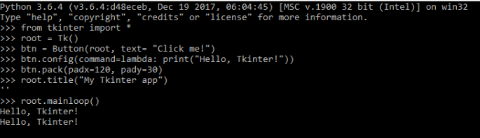
from tkinter import *

root = Tk()
btn = Button(root, text="Click me!")
btn.config(command=lambda: print("Hello, Tkinter!"))
btn.pack(padx=120, pady=30)
root.title("My Tkinter app")
root.mainloop()
It creates a main window with a button that prints Hello, Tkinter! in the console each time it is clicked. The button is placed with a padding of 120px in the horizontal axis and 30px in the vertical axis. The last statement starts the main loop, which processes user events and updates the GUI until the main window is destroyed:
You can execute the program and verify that it is working as expected. However, all our variables are defined in the global namespace, and the more widgets you add, the more difficult it becomes to reason about the parts where they are used.
These maintainability issues can be addressed with basic OOP techniques, which are considered good practice in all types of Python programs.
How to do it...
To improve the modularity of our simple program, we will define a class that wraps our global variables:
import tkinter as tk

class App(tk.Tk):
    def __init__(self):
        super().__init__()
        self.btn = tk.Button(self, text="Click me!",
                             command=self.say_hello)
        self.btn.pack(padx=120, pady=30)

    def say_hello(self):
        print("Hello, Tkinter!")

if __name__ == "__main__":
    app = App()
    app.title("My Tkinter app")
    app.mainloop()
Now, each variable is enclosed in a specific scope, including the command function, which is moved as a separate method.
How it works...
First, we replaced the wildcard import with the import ... as syntax to have better control over our global namespace.
Then, we defined our App class as a Tk subclass, which now is referenced via the tk namespace. To properly initialize the base class, we will call the __init__ method of the Tk class with the built-in super() function. This corresponds to the following lines:
class App(tk.Tk):
    def __init__(self):
        super().__init__()
        # ...
Now, we have a reference to the App instance with the self variable, so we will add all the Button widget as an attribute of our class.
Although it may look overkill for such a simple program, this refactoring will help us to reason about each part, the button instantiation is separated from the callback that gets executed when it is clicked, and the application bootstrapping is moved to the if __name__ == "__main__" block, which is a common practice in executable Python scripts.
We will follow this convention through all the code samples, so you can take this template as the starting point of any larger application.
There's more...
We subclassed the Tk class in our example, but it is also common to subclass other widget classes. We did this to reproduce the same statements that we had before we refactored the code.
However, it may be more convenient to subclass Frame or Toplevel in larger programs, such as those with multiple windows. This is because a Tkinter application should have only one Tk instance, and the system creates one automatically if you instantiate a widget before you create the Tk instance.
Keep in mind that this decision does not affect the structure of our App class since all widget classes have a mainloop method that internally starts the Tk main loop.
Working with buttons
Button widgets represent a clickable item of your GUI applications. They typically use a text or an image indicating the action that will be performed when clicked. Tkinter allows you to easily configure this functionality with some standard options of the Button widget class.
How to do it...
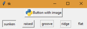
The following contains a button with an image that gets disabled when clicked and a list of buttons with the different types of available reliefs:
import tkinter as tk

RELIEFS = [tk.SUNKEN, tk.RAISED, tk.GROOVE, tk.RIDGE, tk.FLAT]

class ButtonsApp(tk.Tk):
    def __init__(self):
        super().__init__()
        self.img = tk.PhotoImage(file="python.gif")
        self.btn = tk.Button(self, text="Button with image",
                             image=self.img, compound=tk.LEFT,
                             command=self.disable_btn)
        self.btns = [self.create_btn(r) for r in RELIEFS]
        self.btn.pack()
        for btn in self.btns:
            btn.pack(padx=10, pady=10, side=tk.LEFT)

    def create_btn(self, relief):
        return tk.Button(self, text=relief, relief=relief)

    def disable_btn(self):
        self.btn.config(state=tk.DISABLED)

if __name__ == "__main__":
    app = ButtonsApp()
    app.mainloop()
The purpose of this program is to show several configuration options that can be used when creating a Button widget.
After executing the preceding code, you will get the following output:
How it works...
The most basic way of instantiation of Button is using the text option to set the button label and the command option that references the function to be invoked when the button is clicked.
In out example, we also added PhotoImage via the image option, which takes precedence over the text string. The compound option serves to combine image and text in the same button, determining the position where the image is placed. It accepts the following constants as valid values: CENTER, BOTTOM, LEFT, RIGHT, and TOP.
The second row of buttons is created with a list comprehension, using the list of RELIEF values. The label of each button corresponds to the name of the constant, so you can note the difference in the appearance of each button.
There's more...
We used an attribute to keep a reference to our PhotoImage instance, even though we are not using it outside our __init__ method. The reason is that images are cleared when they are garbage collected, which will happen if we declare it as a local variable and the method exists.
To avoid this, always remember to keep a reference to each PhotoImage object as long as the window where it is shown is still alive.
Creating text entries
The Entry widget represents a text input displayed in a single line. Along with the Label and Button classes, it is one of the most commonly used Tkinter classes.
How to do it...
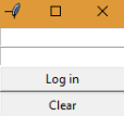
This example shows how to create a login form with two entry instances for the username and password fields. Each character of password is displayed as an asterisk to avoid showing it in clear text:
import tkinter as tk

class LoginApp(tk.Tk):
    def __init__(self):
        super().__init__()
        self.username = tk.Entry(self)
        self.password = tk.Entry(self, show="*")
        self.login_btn = tk.Button(self, text="Log in",
                                   command=self.print_login)
        self.clear_btn = tk.Button(self, text="Clear",
                                   command=self.clear_form)
        self.username.pack()
        self.password.pack()
        self.login_btn.pack(fill=tk.BOTH)
        self.clear_btn.pack(fill=tk.BOTH)

    def print_login(self):
        print("Username: {}".format(self.username.get()))
        print("Password: {}".format(self.password.get()))

    def clear_form(self):
        self.username.delete(0, tk.END)
        self.password.delete(0, tk.END)
        self.username.focus_set()

if __name__ == "__main__":
    app = LoginApp()
    app.mainloop()
The Log in button prints the values in the console, whereas the Clear button removes the content of both entries and returns the focus to the entry for username:
How it works...
The Entry widgets are instantiated using the parent window or frame as the first argument and a set of optional keyword arguments to configure additional options. We did not specify any options for the entry corresponding to the username field. To keep the password secret, we specify the show argument with the string "*", which will display each typed character as an asterisk.
With the get() method, we will retrieve the current text as a string. This is used in the print_login method to show the entries' content in the standard output.
The delete() method takes two arguments that indicate the range of the characters that should be deleted. Keep in mind that the indices start at the position 0, and they do not include the character at the end of the range. If only one argument is passed, it deletes the character at that position.
In the clear_form() method, we delete from index 0 to the constant END, which means that the whole content is removed. Finally, we set the focus to the username entry.
There's more...
The content of an Entry widget can be modified programmatically with the insert() method, which takes two arguments:
- index: The position to insert the text; note that entry positions are 0-indexed
- string: The text to insert
A common pattern to reset the content of an entry with a default value can be achieved with a combination of delete() and insert():
entry.delete(0, tk.END)
entry.insert(0, "default value")
Another pattern is to append the text in the current position of the text cursor. Here, you can use the INSERT constant instead of having to calculate the numerical index:
entry.insert(tk.INSERT, "cursor here")
Like the Button class, the Entry class also accepts the relief and state options to modify its border style and state. Keep in mind that calls to delete() and insert() are ignored when the state is "disabled" or "readonly".
See also
- The Tracing text changes recipe
- The Validating a text entry recipe
Tracing text changes
Tk variables allow your applications to get notified when an input changes its value. There are four variable classes in Tkinter: BooleanVar, DoubleVar, IntVar, and StringVar. Each one wraps the value of the corresponding Python type, which should match the type of the input widget attached to the variable.
This feature is particularly useful if you want to automatically update certain parts of your application based on the current state of some input widgets.
How to do it...
In the following example, we will associate a StringVar instance to our entry with the textvariable option; this variable traces write operations with the show_message() method as callback:
import tkinter as tk

class App(tk.Tk):
    def __init__(self):
        super().__init__()
        self.var = tk.StringVar()
        self.var.trace("w", self.show_message)
        self.entry = tk.Entry(self, textvariable=self.var)
        self.btn = tk.Button(self, text="Clear",
                             command=lambda: self.var.set(""))
        self.label = tk.Label(self)
        self.entry.pack()
        self.btn.pack()
        self.label.pack()

    def show_message(self, *args):
        value = self.var.get()
        text = "Hello, {}!".format(value) if value else ""
        self.label.config(text=text)

if __name__ == "__main__":
    app = App()
    app.mainloop()
When you type something into the Entry widget, the label updates its text with a message composed with the Tk variable value. For instance, if you type the word Phara, the label will show Hello, Phara!. If the entry is empty, the label will not show any text. To show you how to modify the variable's content programmatically, we added a button that clears the entry when you click on it:

How it works...
The first lines of our application constructor instantiate StringVar and attach a callback to the write mode. The valid mode values are as follows:
- "w": Called when the variable is written
- "r": Called when the variable is read
- "u" (for unset): Called when the variable is deleted
When invoked, the callback function receives three arguments: the internal variable name, an empty string (it is used in other types of Tk variables), and the mode that triggered the operation. By declaring the method with *args, we make these arguments optional, because we are not using any of these values within the callback.
The get() method of Tk wrappers returns the current value of the variable, and the set() method updates its value. They also notify the corresponding observers, so both modifying the entry's content through the GUI or clicking on the Clear button will trigger the call to the show_message() method.
There's more...
Tk variables are optional for Entry widgets, but they are necessary for other widget classes to work correctly, such as the Checkbutton and Radiobutton classes.
See also
- The Creating selections with radio buttons recipe
- The Implementing switches with checkboxes recipe
Validating a text entry
Typically, text inputs represent fields that follow certain validation rules, such as having a maximum length or matching a specific format. Some applications allow typing any kind of content into these fields and trigger the validation when the whole form is submitted.
Under some circumstances, we want to prevent users from typing invalid content into a text field. We will take a look at how to implement this behavior using the validation options of the Entry widget.
How to do it...
The following application shows how to validate an entry using regular expressions:
import re
import tkinter as tk

class App(tk.Tk):
    def __init__(self):
        super().__init__()
        self.pattern = re.compile("^\w{0,10}$")
        self.label = tk.Label(self, text="Enter your username")
        vcmd = (self.register(self.validate_username), "%i", "%P")
        self.entry = tk.Entry(self, validate="key",
                              validatecommand=vcmd,
                              invalidcommand=self.print_error)
        self.label.pack()
        self.entry.pack(anchor=tk.W, padx=10, pady=10)

    def validate_username(self, index, username):
        print("Modification at index " + index)
        return self.pattern.match(username) is not None

    def print_error(self):
        print("Invalid username character")

if __name__ == "__main__":
    app = App()
    app.mainloop()
If you run this script and type a non-alphanumeric character in the Entry widget, it will keep the same content and print the error message. This will also happen when you try to type more than 10 valid characters since the regular expression also limits the content's length.
How it works...
With the validate option set to "key", we will activate the entry validation that gets triggered on any content modification. The value is "none" by default, which means that there is no validation.
Other possible values are "focusin" and "focusout", which validate when the widget gets or loses the focus, respectively, or simply "focus" to validate in both cases. Alternatively, we can use the "all" value to validate in all situations.
The validatecommand function is called each time the validation is triggered, and it should return true if the new content is valid, and false otherwise.
Since we need more information to determine whether the content is valid or not, we create a Tcl wrapper around our Python function using the register method of the Widget class. Then, you can add the percent substitution for each parameter that will be passed to the Python function. Finally, we will group these values as a Python tuple. This corresponds to the following line from our example:
vcmd = (self.register(self.validate_username), "%i", "%P")
In general, you can use any of the following substitutions:
- %d: Type of action; 1 for insertion, 0 for deletion, and -1 otherwise
- %i: Index of the string being inserted or deleted
- %P: Value of the entry if the modification is allowed
- %s: Value of the entry before the modification
- %S: String content that is being inserted or deleted
- %v: The type of validation currently set
- %V: Type of validation that triggered the action
- %W: The name of the Entry widget
The invalidcommand option takes a function that is invoked when validatecommand returns false. The same percent substitutions can be applied to this option, but in our example, we directly passed the print_error() method of our class.
There's more...
The Tcl/Tk documentation suggests not mixing the validatecommand and the textvariable options since setting an invalid value to the Tk variable will turn off validation. The same occurs if the validatecommand function do not return a Boolean value.
In case you are not familiar with the re module, you can check out the detailed introduction to regular expressions in the official Python documentation at https://docs.python.org/3.6/howto/regex.html.
See also
- The Creating text entries recipe
Selecting numerical values
Previous recipes cover how to work with text inputs; we may want to enforce some inputs to contain only numerical values. This is the use case for the Spinbox and Scale classes—both widgets allow users to select a numerical value from a range or a list of valid options, but there are several differences in the way they are displayed and configured.
How to do it...
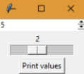
This program has Spinbox and Scale for selecting an integer value from 0 to 5:
import tkinter as tk

class App(tk.Tk):
    def __init__(self):
        super().__init__()
        self.spinbox = tk.Spinbox(self, from_=0, to=5)
        self.scale = tk.Scale(self, from_=0, to=5,
                              orient=tk.HORIZONTAL)
        self.btn = tk.Button(self, text="Print values",
                             command=self.print_values)
        self.spinbox.pack()
        self.scale.pack()
        self.btn.pack()

    def print_values(self):
        print("Spinbox: {}".format(self.spinbox.get()))
        print("Scale: {}".format(self.scale.get()))

if __name__ == "__main__":
    app = App()
    app.mainloop()
In the preceding code, for debugging purposes, we added a button that prints the value of each widget when you click on it:
How it works...
Both classes accept the from_ and to options to indicate the range of valid values—the trailing underscore is necessary because the from option was originally defined in Tcl/Tk, but it is a reserved keyword in Python.
A handy functionality of the Scale class is the resolution option, which sets the precision of the rounding. For instance, a resolution of 0.2 will allow the user to select the values 0.0, 0.2, 0.4, and so on. The value of this option is 1 by default, so the widget rounds all values to the nearest integer.
As usual, the value of each widget can be retrieved with the get() method. An important difference is that Spinbox returns the number as a string, whereas Scale returns an integer value or a float value if the rounding accepts decimal values.
There's more...
The Spinbox class has a similar configuration to the Entry widget, such as the textvariable and validate options. You can apply all these patterns to spinboxes with the main difference that it restricts to numerical values.
See also
- The Tracing text changes recipe
Creating selections with radio buttons
With the Radiobutton widget, you can let the user select among several options. This pattern works well for a relatively small number of mutually exclusive choices.
How to do it...
You can connect multiple Radiobutton instances using a Tkinter variable so that when you click on a non-selected option, it will deselect whatever other option was previously selected.
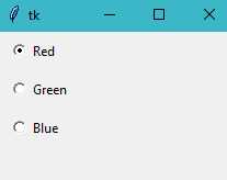
In the following program, we created three radio buttons for the Red, Green, and Blue options. Each time you click on a radio button, it prints the lowercase name of the corresponding color:
import tkinter as tk

COLORS = [("Red", "red"), ("Green", "green"), ("Blue", "blue")]

class ChoiceApp(tk.Tk):
    def __init__(self):
        super().__init__()
        self.var = tk.StringVar()
        self.var.set("red")
        self.buttons = [self.create_radio(c) for c in COLORS]
        for button in self.buttons:
            button.pack(anchor=tk.W, padx=10, pady=5)

    def create_radio(self, option):
        text, value = option
        return tk.Radiobutton(self, text=text, value=value,
                              command=self.print_option,
                              variable=self.var)

    def print_option(self):
        print(self.var.get())

if __name__ == "__main__":
    app = ChoiceApp()
    app.mainloop()
If you run this script, it will display the application with the Red radio button already selected:
How it works...
To avoid repeating the code of the Radiobutton initialization, we defined a utility method that is called from a list comprehension. We unpacked the values of each tuple of the COLORS list and then passed these local variables as options to Radiobutton. Remember to try to not repeat yourself whenever possible.
Since StringVar is shared among all the Radiobutton instances, they are automatically connected, and we force the user to select only one choice.
There's more...
We set a default value of "red" in our program; however, what would happen if we omit this line, and the value of StringVar does not match any of the radio button values? It will match the default value of the tristatevalue option, which is the empty string. This causes the widget to display in a special "tri-state" or indeterminate mode. Although this option can be modified with the config() method, a better practice is to set a sensible default value so the variable is initialized in a valid state.
Implementing switches with checkboxes
Choices between two alternatives are typically implemented with checkboxes and lists of options where each choice is independent from the rest. As we will see in the next example, these concepts can be implemented using the Checkbutton widget.
How to do it...
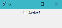
The following application shows how to create Checkbutton, which must be connected to an IntVar variable to be able to inspect the button state:
import tkinter as tk

class SwitchApp(tk.Tk):
    def __init__(self):
        super().__init__()
        self.var = tk.IntVar()
        self.cb = tk.Checkbutton(self, text="Active?",
                                 variable=self.var,
                                 command=self.print_value)
        self.cb.pack()

    def print_value(self):
        print(self.var.get())

if __name__ == "__main__":
    app = SwitchApp()
    app.mainloop()
In the preceding code, we simply printed the value of the widget each time it is clicked:
How it works...
Like the Button widget, the Checkbutton also accepts the command and text options.
With the onvalue and offvalue options, we can specify the values used when the button is on and off. We use an integer variable because these values are 1 and 0 by default, respectively; however, you can also set them to any other integer values.
There's more...
With Checkbuttons, it is also possible to use other variable types:
var = tk.StringVar()
var.set("OFF")
checkbutton_active = tk.Checkbutton(master, text="Active?", variable=self.var,
                                    onvalue="ON", offvalue="OFF",
                                    command=update_value)
The only restriction is to match onvalue and offvalue with the type of the Tkinter variable; in this case, since "ON" and "OFF" are strings, the variable should be a StringVar. Otherwise, the Tcl interpreter will raise an error when trying to set the corresponding value of a different type.
See also
- The Tracing text changes recipe
- The Creating selections with radio buttons recipe
Displaying a list of items
The Listbox widget contains text items that can be selected by the user with the mouse or keyboard. This selection can be individual or multiple, depending on the widget configuration.
How to do it...
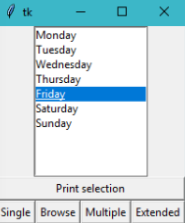
The following program creates a list selection with the days of the week. There is a button to print the actual selection and a list of buttons to change the selection mode:
import tkinter as tk

DAYS = ["Monday", "Tuesday", "Wednesday", "Thursday",
        "Friday", "Saturday", "Sunday"]
MODES = [tk.SINGLE, tk.BROWSE, tk.MULTIPLE, tk.EXTENDED]

class ListApp(tk.Tk):
    def __init__(self):
        super().__init__()
        self.list = tk.Listbox(self)
        self.list.insert(0, *DAYS)
        self.print_btn = tk.Button(self, text="Print selection",
                                   command=self.print_selection)
        self.btns = [self.create_btn(m) for m in MODES]

        self.list.pack()
        self.print_btn.pack(fill=tk.BOTH)
        for btn in self.btns:
            btn.pack(side=tk.LEFT)

    def create_btn(self, mode):
        cmd = lambda: self.list.config(selectmode=mode)
        return tk.Button(self, command=cmd,
                         text=mode.capitalize())

    def print_selection(self):
        selection = self.list.curselection()
        print([self.list.get(i) for i in selection])

if __name__ == "__main__":
    app = ListApp()
    app.mainloop()
You can try out changing the mode of selection and printing the selected items:
How it works...
We create an empty Listbox object and add all the text items with the insert() method. The 0 index indicates that the items should be added at the beginning of the list. In the following code snippet, we unpacked the DAYS list, but individual items can be appended at the end with the END constant:
self.list.insert(tk.END, "New item")
The current selection is retrieved using the curselection() method. It returns the indices of the selected items to transform them to the corresponding text items we called the get() method for each index in a comprehension list. Finally, the list is printed in the standard output for debugging purposes.
In our example, the selectmode option can be changed programmatically to explore the different behaviors, as follows:
- SINGLE: Single choice
- BROWSE: Single choice that can be moved with the up and down keys
- MULTIPLE: Multiple choice
- EXTENDED: Multiple choice with ranges that can be selected with the Shift and Ctrl keys
There's more...
If the number of text items is large enough, it may be necessary to add a vertical scroll bar. You can easily connect it using the yscrollcommand option. In our example, we can wrap both widgets in a frame to keep the same layout. Remember to specify the fill option when packing the scroll so that it fills the available space in the y axis:
def __init__(self):
    self.frame = tk.Frame(self)
    self.scroll = tk.Scrollbar(self.frame, orient=tk.VERTICAL)
    self.list = tk.Listbox(self.frame, yscrollcommand=self.scroll.set)
    self.scroll.config(command=self.list.yview)
    # ...
    self.frame.pack()
    self.list.pack(side=tk.LEFT)
    self.scroll.pack(side=tk.LEFT, fill=tk.Y)
Similarly, there is a xscrollcommand option for the horizontal axis.
See also
- The Creating selections with radio buttons recipe
Handling mouse and keyboard events
Being able to react to events is one of the most basic but important topics in GUI application development since it determines how users can interact with the program.
Pressing keys of the keyboard and clicking on items with the mouse are some common types of events, which are automatically handled in some Tkinter classes. For instance, this behavior is already implemented on the command option of the Button widget class, which invokes the specified callback function.
Some events can get triggered without user interaction, such as changing the input focus programmatically from one widget to another.
How to do it...
You can attach an event binding to a widget using the bind method. The following example binds some mouse events to a Frame instance:
import tkinter as tk

class App(tk.Tk):
    def __init__(self):
        super().__init__()
        frame = tk.Frame(self, bg="green",
                         height=100, width=100)
        frame.bind("<Button-1>", self.print_event)
        frame.bind("<Double-Button-1>", self.print_event)
        frame.bind("<ButtonRelease-1>", self.print_event)
        frame.bind("<B1-Motion>", self.print_event)
        frame.bind("<Enter>", self.print_event)
        frame.bind("<Leave>", self.print_event)
        frame.pack(padx=50, pady=50)

    def print_event(self, event):
        position = "(x={}, y={})".format(event.x, event.y)
        print(event.type, "event", position)

if __name__ == "__main__":
    app = App()
    app.mainloop()
All events are handled by the print_event() method of our class, which prints the type of event and the position of the mouse in the console. You can try it out by clicking on the green frame with the mouse, and moving it around while it starts printing the event messages.
The following example contains an Entry widget with a couple of bindings; one for the event that gets triggered when the entry gets the focus, and another for all the key press events:
import tkinter as tk

class App(tk.Tk):
    def __init__(self):
        super().__init__()
        entry = tk.Entry(self)
        entry.bind("<FocusIn>", self.print_type)
        entry.bind("<Key>", self.print_key)
        entry.pack(padx=20, pady=20)

    def print_type(self, event):
        print(event.type)

    def print_key(self, event):
        args = event.keysym, event.keycode, event.char
        print("Symbol: {}, Code: {}, Char: {}".format(*args))

if __name__ == "__main__":
    app = App()
    app.mainloop()
The first message this program will output is the FocusIn event when you set the focus on the Entry widget. If you try it out, you will see that it will also show the events of keys that do not correspond to non-printable characters, such as arrow keys or the return key.
How it works...
The bind method is defined in the widget class and takes three arguments, an event sequence, a callback function, and an optional add string:
widget.bind(sequence, callback, add='')
The sequence string uses the <modifier-type-detail> syntax.
In first place, modifiers are optional and allow you to specify additional combinations to the general type of the event:
- Shift: When the user presses the Shift key
- Alt: When the user presses the Alt key
- Control: When the user presses the Ctrl key
- Lock: When the user presses the Shift lock
- Double: When the event happens twice in quick succession
- Triple: When the event happens thrice in quick succession
Event types determine the general type of event:
- ButtonPress or Button: Event generated when a mouse button is pressed
- ButtonRelease: Event generated when a mouse button is released
- Enter: Event generated when you move the mouse over a widget
- Leave: Event generated when the mouse pointer leaves a widget
- FocusIn: Event generated when the widget gets the input focus
- FocusOut: Event generated when the widget loses the input focus
- KeyPress or Key: Event generated when a key is pressed
- KeyRelease: Event generated when a key is released
- Motion: Event generated when the mouse is moved
The detail is also optional and serves to indicate the mouse button or key:
- For mouse events, 1 is the left button, 2 is the middle button, and 3 is the right button.
- For keyboard events, it is the key character. Special keys use the key symbol; some common examples are return, Tab, Esc, up, down, right, left, Backspace, and function keys (from F1 to F12).
The callback function takes an event parameter. For mouse events, it has the following attributes:
- x and y: Current mouse position in pixels
- x_root and y_root: Same as x and y, but relative to the left-upper corner of the screen
- num: Mouse button number
For keyboard events, it contains these attributes:
- char: Pressed character code as a string
- keysym: Pressed key symbol
- keycode: Pressed key code
In both cases, the event has the widget attribute, referencing the instance that generated the event, and type, which specifies the event type.
Finally, the add parameter can be '', to replace the callback function if there was a previous binding, or '+' to add the callback and preserve the old ones.
There's more...
Apart from the event types described here, there are also other types that may be useful in some scenarios, such as the <Destroy> event that is generated when a widget is destroyed or the <Configure> event that is sent when the size or position of the widget changes.
You can check out the Tcl/Tk documentation for a complete list of event types at https://www.tcl.tk/man/tcl/TkCmd/bind.htm#M7.
See also
- The Structuring a Tkinter application recipe
Setting the main window's icon, title, and size
The Tk instance differs from normal widgets in the way that it is configured, so we will explore some basic methods that allow us to customize how it is displayed.
How to do it...
This snippet creates a main window with a custom title and icon. It has 400px of width by 200px of height, with a separation of 10px in each axis to the upper-left corner of the screen:
import tkinter as tk

class App(tk.Tk):
    def __init__(self):
        super().__init__()
        self.title("My Tkinter app")
        self.iconbitmap("python.ico")
        self.geometry("400x200+10+10")

if __name__ == "__main__":
    app = App()
    app.mainloop()
This program assumes that you have a valid ICO file called python.ico in the same directory where the script is placed and executed.
How it works...
The methods title() and iconbitmap() of the Tk class are very self-descriptive—the first one sets the window title, whereas the second one takes the path to the icon that is associated to the window.
The geometry() method configures the size of the window with a string that follows the following pattern:
{width}x{height}+{offset_x}+{offset_y}
In case you add more secondary windows to your application, these methods are also available in the Toplevel class.
There's more...
If you want to make the application fullscreen, replace the call to the geometry() method with self.state("zoomed").