Download code from GitHub
Learning about Geospatial Analysis with Python
This chapter is an overview of geospatial analysis. We will see how geospatial technology is currently impacting our world by looking at a case study of one of the worst pandemics the world has ever seen and how geospatial analysis helped track the spread of the disease to buy researchers time to create a vaccine. Next, we’ll step through the history of geospatial analysis, which predates computers and even paper maps! Then, we’ll examine why you might want to learn a programming language as a geospatial analyst as opposed to just using Geographic Information System (GIS) applications. We’ll realize the importance of making geospatial analysis as accessible as possible to the broadest number of people. Then, we’ll step through basic GIS and remote sensing concepts and terminology that will stay with you through the rest of this book. Finally, we’ll start using Python for geospatial analysis by building the simplest possible GIS from scratch!
Here’s a quick overview of the topics we’ll be covering in this chapter:
- Geospatial analysis and our world
- History of geospatial analysis
- Evolution of Geographic Information Systems (GISs)
- Remote sensing concepts
- Point cloud data
- Computer-aided drafting
- Geospatial analysis and computer programming
- The importance of geospatial analysis
- GIS concepts
- Common GIS processes
- Common remote sensing processes
- Common raster data concepts
- Creating the simplest possible Python GIS
By the end of this chapter, you will understand geospatial analysis as a way of answering questions about our world and the differences between GIS and remote sensing.
Technical requirements
This chapter provides a foundation for geospatial analysis, which is needed to pursue any subject in the areas of remote sensing and GIS, including the material in the rest of the chapters of this book. The code for this book can be found in the following GitHub code repository: https://github.com/PacktPublishing/Learning-Geospatial-Analysis-with-Python-4th-Edition. We will be using Python 3.10.9 for the code examples, which will be provided through the Anaconda 3 platform. The code files for this chapter can be accessed on GitHub: https://github.com/PacktPublishing/Learning-Geospatial-Analysis-with-Python-Fourth-Edition/tree/main/B19730_01_Asset_Files.
Geospatial analysis and our world
In December 2019, doctors reported a cluster of cases of a mysterious pneumonia-like illness in Wuhan, China. At first, it was thought to be a minor outbreak, but as the number of cases continued to rise, it quickly became clear that this was something much more serious.
As the virus began to spread to other countries, the World Health Organization (WHO) declared a global health emergency on January 30, 2020. Despite this warning, many countries were slow to take action, and the virus continued to spread unchecked.
By March 2020, the virus had reached pandemic proportions, with cases reported in every corner of the globe. Governments scrambled to respond, implementing lockdowns and travel bans in an attempt to slow the spread of the virus.
As the number of cases and deaths continued to rise, the world watched in horror as hospitals became overwhelmed and healthcare systems struggled to keep up. For the first time in over a century, humanity found itself in a global pandemic, battling a new virus named COVID-19.
As with any new virus, there was no vaccine or even an effective treatment. Medical experts raced to develop a vaccine. The only solution in the short term was to buy time. To do that, the world needed a way to track the virus as it spread to focus resources in the areas it raged most intensely.
In the US, at Johns Hopkins University in Baltimore, Maryland, a PhD candidate named Ensheng Dong had watched as news of the virus spread from his home country – China. As a student, Dong studied both epidemiology and a technology called GIS, a computer system that displays and analyzes geographically referenced information. Dong became worried about his family’s safety, and when the first COVID case hit Washington, he wanted to take action.
The next day, he met with his faculty advisor, Dr. Lauren Gardner, who suggested he use his knowledge of epidemiology and GIS to create a dashboard that would track the virus for the world. Dong began scouring the internet for COVID data and posted it to an online map twice a day while barely sleeping in between. He posted red dots on a map with a dark background. In areas with a large number of cases, he would increase the size of the dot to show the severity of the spread. As word of the dashboard grew, Dong began receiving help to automate the data collection and posting process.
These dashboard map visualizations helped public health officials understand where the virus was spreading and identify hotspots that needed extra attention. It helped track the effectiveness of containment measures such as lockdowns and social distancing rules. It also allowed news organizations to notify the public.
The following figure shows the COVID-19 dashboard:

Figure 1.1 – The COVID-19 dashboard
Government organizations used other GIS maps as well in response to the pandemic to identify high-risk populations. By overlaying data on demographics, income levels, and pre-existing health conditions, GIS helped officials identify communities that were particularly vulnerable to the virus and target resources to those areas.
Officials also used GIS to help manage the logistics of the pandemic’s response. For example, they used it to plan the distribution of personal protective equipment, medical supplies, and vaccines. GIS also tracked the movements of healthcare workers and other essential personnel, ensuring they were deployed to where they were needed most.
In short, GIS has played a vital role in the response to the pandemic, providing critical information and tools to help organizations respond to the crisis more effectively.
Other uses of GIS
Geospatial analysis can be found in almost every industry, including real estate, oil and gas, agriculture, defense, politics, health, transportation, and oceanography, to name a few. For a good overview of how geospatial analysis is used in dozens of different industries, visit https://www.esri.com/en-us/what-is-gis/overview.
History of geospatial analysis
Geospatial analysis can be traced back as far as 17,000 years ago, to the Lascaux cave in southwestern France. In this cave, Paleolithic artists painted commonly hunted animals and what many experts recently concluded are dots representing the animals’ lunar cycles to note seasonal behavior patterns of prey, such as mating or migration. Though crude, these paintings demonstrate an ancient example of humans creating abstract models of the world around them and correlating spatial-temporal features to find relationships. The following figure shows one of these paintings – a bull with four dots on its back, cross-referencing a lunar time reference:

Figure 1.2 – A cave painting of prey tagged with a lunar cycle reference to predict when it will appear in hunting grounds again
Over the centuries, the art of cartography and the science of land surveying have developed, but it wasn’t until the 1800s that significant advances in geographic analysis emerged. Deadly cholera outbreaks in Europe between 1830 and 1860 led geographers in Paris and London to use geographic analysis for epidemiological studies.
In 1832, Charles Picquet used different halftone shades of gray to represent the deaths per thousand citizens in the 48 districts of Paris as part of a report on the cholera outbreak. In 1854, Dr. John Snow expanded on this method by tracking a cholera outbreak in London as it occurred. By placing a point on a map of the city each time a fatality was diagnosed, he was able to analyze the clustering of cholera cases. Snow traced the disease to a single water pump and prevented further cases. The following zoomed-in map section has three layers with streets, a labeled dot for each pump, and bars for each cholera death in a household:

Figure 1.3 – 1854 map of London tracking a cholera outbreak, with dots for the location of water pumps that were potential sources of the disease and bars showing the number of outbreaks per household
Geospatial analysis wasn’t just used for the war on diseases. For centuries, generals and historians have used maps to understand human warfare. A retired French engineer named Charles Minard produced some of the most sophisticated infographics that were ever drawn between 1850 and 1870. The term infographics is too generic to describe these drawings because they have strong geographic components. The quality and detail of these maps make them fantastic examples of geographic information analysis, even by today’s standards. Minard released his masterpiece in 1869:
This depicts the decimation of Napoleon’s army in the Russian campaign of 1812. The map shows the size and location of the army over time, along with prevailing weather conditions. The following figure contains four different series of information on a single theme. It is a fantastic example of geographic analysis using pen and paper. The size of the army is represented by the widths of the brown and black swaths at a ratio of one millimeter for every 10,000 men. The numbers are also written along the swaths. The brown-colored path shows soldiers who entered Russia, while the black-colored path represents the ones who made it out. The map scale is shown to the right in the center as one French league (2.75 miles or 4.4 kilometers). The chart at the bottom runs from right to left and depicts the brutally freezing temperatures that were experienced by the soldiers on their march home from Russia:

Figure 1.4 – Charles Minard’s famous geographic story map showing the decimation of Napoleon’s army during the Russian Campaign of 1812. It combines geography, time, and statistics
While far more mundane than a war campaign, Minard released another compelling map cataloging the number of cattle sent to Paris from around France. Minard used pie charts of varying sizes in the regions of France to show each area’s variety and the volume of cattle that was shipped:

Figure 1.5 – Another map by Minard combining geography and statistics showing beef production in France using pie charts
In the early 1900s, mass printing drove the development of the concept of map layers – a key feature of geospatial analysis. Cartographers drew different map elements (vegetation, roads, and elevation contours) on plates of glass that could then be stacked and photographed to be printed as a single image. If the cartographer made a mistake, only one plate of glass had to be changed instead of the entire map. Later, the development of plastic sheets made it even easier to create, edit, and store maps in this manner. However, the layering concept for maps as a benefit to analysis would not come into play until the modern computer age.
Evolution of Geographic Information Systems (GISs)
Computer mapping evolved with the computer itself in the 1960s. However, the origin of the term GIS began with the Canadian Department of Forestry and Rural Development. Dr. Roger Tomlinson headed a team of 40 developers in an agreement with IBM to build the Canada Geographic Information System (CGIS). The CGIS tracked the natural resources of Canada and allowed those features to be profiled for further analysis. The CGIS stored each type of land cover as a different layer.
It also stored data in a Canadian-specific coordinate system, suitable for the entire country, which was devised for optimal area calculations. While the technology that was used was primitive by today’s standards, the system had phenomenal capability at that time. The CGIS included the following software features, all of which can still be found in modern GIS software over 60 years later:
- Map projection switching
- The rubber sheeting of scanned images
- Map scale change
- Line smoothing and generalization to reduce the number of points in a feature
- Automatic gap closing for polygons
- Area measurement
- The dissolving and merging of polygons
- Geometric buffering
- The creation of new polygons
- Scanning
- The digitizing of new features from the reference data
More about CGIS
The National Film Board of Canada produced a documentary in 1967 on the CGIS, which you can view at https://www.youtube.com/watch?v=3VLGvWEuZxI.
Tomlinson was often called the father of GIS. After launching the CGIS, he earned his doctorate from the University of London with his 1974 dissertation, titled The application of electronic computing methods and techniques to the storage, compilation, and assessment of mapped data, which describes GIS and geospatial analysis. Tomlinson ran his own global consulting firm, Tomlinson Associates Ltd., where he remained an active participant in the industry late in life. He was often found delivering keynote addresses at geospatial conferences.
CGIS is the starting point of geospatial analysis, as defined by this book. However, this book would not have been written if not for the work of Howard Fisher and the Harvard Laboratory for Computer Graphics and Spatial Analysis at the Harvard Graduate School of Design. His work on the SYMAP GIS software, which outputs maps to a line printer, started an era of development at the laboratory, which produced two other important packages and, as a whole, permanently defined the geospatial industry. SYMAP led to other packages, including GRID and the Odyssey project, which come from the same lab:
- GRID was a raster-based GIS system that used cells to represent geographic features instead of geometry. GRID was written by Carl Steinitz and David Sinton. The system later became IMGRID.
- Odyssey was a team effort led by Nick Chrisman and Denis White. It was a system of programs that included many advanced geospatial data management features that are typical of modern geodatabase systems. Harvard attempted to commercialize these packages with limited success. However, their impact is still seen today.
Virtually, every existing commercial and open source package owes something to these code bases.
Howard Fisher produced a film in 1967 using the output from SYMAP to show the urban expansion of Lansing, Michigan, from 1850 to 1965 by hand-coding decades of property information into the system. This analysis took months. However, in this day and age, it would take only a few minutes to recreate them because of modern tools and data.
More on SYMAP
You can watch the film at https://www.youtube.com/watch?v=xj8DQ7IQ8_o.
There are dozens of graphical user interface (GUI) geospatial desktop applications available today from companies, including Esri, ERDAS, Intergraph, ENVI, and so on. Esri is the oldest, continuously operating GIS software company, which started in the late 1960s. In the open source realm, packages including Quantum GIS (QGIS) and the Geographic Resources Analysis Support System (GRASS) are widely used. Beyond comprehensive desktop software packages, software libraries for building new software exist in the thousands.
GIS can provide detailed information about the Earth, but it is still just a model. Sometimes, we need a direct representation to gain knowledge about current or recent changes on our planet. At that point, we need remote sensing.
Remote sensing
Remote sensing is where you collect information about an object without making physical contact with that object. In the context of geospatial analysis, that object is usually the Earth. Remote sensing also includes processing the collected information. The potential of geographic information systems is limited only by the available geographic data. The cost of land surveying, even using a modern GPS to populate a GIS, has always been resource-intensive.
The advent of remote sensing not only dramatically reduced the cost of geospatial analysis but took the field in entirely new directions. In addition to powerful reference data for GIS systems, remote sensing has made generating automated and semi-automated GIS data possible by extracting features from images and geographic data. The eccentric French photographer Gaspard-Félix Tournachon, also known as Nadar, took the first aerial photograph in 1858, from a hot air balloon over Paris:

Figure 1.6 – An aerial photo of Paris from a hot air balloon taken in 1858 by Nadar. It is considered to be the first aerial photo and the dawn of geospatial remote sensing
The value of a true bird’s-eye view of the world was immediately apparent. As early as 1920, books on aerial photo interpretation began to appear.
When the United States entered the Cold War with the Soviet Union after World War II, aerial photography to monitor military capability became prolific with the invention of the American U-2 spy plane. The U-2 spy plane could fly at 75,000 feet, putting it out of the range of existing anti-aircraft weapons designed to reach only 50,000 feet. The American U-2 flights over Russia ended when the Soviets finally shot down a U-2 and captured the pilot.
However, aerial photography had little impact on modern geospatial analysis. Planes could only capture small footprints of an area. Photographs were tacked to walls or examined on light tables but not in the context of other information. Though extremely useful, aerial photo interpretation was simply another visual perspective.
The game changer came on October 4, 1957, when the Soviet Union launched the Sputnik 1 satellite. The Soviets had scrapped a much more complex and sophisticated satellite prototype because of manufacturing difficulties. Once corrected, this prototype would later become Sputnik 3. Instead, they opted for a simple metal sphere with four antennae and a simple radio transmitter. Other countries, including the United States, were also working on satellites. These satellite initiatives were not entirely a secret. They were driven by scientific motives as part of the International Geophysical Year (IGY).
Advancements in rocket technology made artificial satellites a natural evolution for Earth science. However, in nearly every case, each country’s defense agency was also heavily involved. Similar to the Soviets, other countries were struggling with complex satellite designs packed with scientific instruments. The Soviets’ decision to switch to the simplest possible device was for the sole reason of launching a satellite before the Americans were effective. Sputnik was visible in the sky as it passed over, and its radio pulse could be heard by amateur radio operators. Despite Sputnik’s simplicity, it provided valuable scientific information that could be derived from its orbital mechanics and radiofrequency physics.
The Sputnik program’s biggest impact was on the American space program. America’s chief adversary had gained a tremendous advantage in the space race. The United States ultimately responded with the Apollo moon landings. However, before this, the US launched a program that would remain a national secret until 1995. The classified CORONA program resulted in the first pictures from space. The US and Soviet Union had signed an agreement to end spy plane flights, but satellites were conspicuously absent from the negotiations.
The following figure shows the CORONA process. The dashed lines are the satellite flight paths, the long white tubes are the satellites, the small white cones are the film canisters, and the black blobs are the control stations that triggered the ejection of the film so that a plane could catch it in the sky:

Figure 1.7 – An illustration of the early CORONA spy satellite that ejected film canisters that were caught in mid-air by a plane
The first CORONA satellite was a four-year effort with many setbacks. However, the program ultimately succeeded. The difficulty with satellite imaging, even today, is retrieving the images from space. The CORONA satellites used canisters of black and white film that were ejected from the vehicle once exposed. As a film canister parachuted to Earth, a US military plane would catch the package in midair. If the plane missed the canister, it would float for a brief period in the water before sinking into the ocean to protect the sensitive information.
The US continued to develop the CORONA satellites until they matched the resolution and photographic quality of the U-2 spy plane photos. The primary disadvantages of the CORONA instruments were reusability and timeliness. Once out of film, a satellite would no longer be of service. Additionally, the film’s recovery was on a set schedule, making the system unsuitable for monitoring real-time situations. The overall success of the CORONA program, however, paved the way for the next wave of satellites, which ushered in the modern era of remote sensing.
Due to the CORONA program’s secret status, its impact on remote sensing was indirect. Photographs of the Earth taken on manned US space missions inspired the idea of a civilian-operated remote-sensing satellite. The benefits of such a satellite were clear, but the idea was still controversial. Government officials questioned whether a satellite was as cost-efficient as aerial photography. The military was worried that the public satellite could endanger the secrecy of the CORONA program. Other officials worried about the political consequences of imaging other countries without permission. However, the Department of the Interior (DOI) finally won permission for NASA to create a satellite to monitor Earth’s surface resources.
On July 23, 1972, NASA launched the Earth Resources Technology Satellite (ERTS). The ERTS was quickly renamed Landsat 1. The platform contained two sensors. The first was the Return Beam Vidicon (RBV) sensor, which was essentially a video camera. It was built by the radio and television giant known as the Radio Corporation of America (RCA). The RBV immediately had problems, which included disabling the satellite’s altitude guidance system. The second sensor was the highly experimental Multispectral Scanner (MSS). The MSS performed flawlessly and produced superior results compared to the RBV. The MSS captured four separate images at four different wavelengths of the light reflected from the Earth’s surface.
This sensor had several revolutionary capabilities. The first and most important capability was the first global imaging of the planet scanning every spot on Earth every 16 days. It also recorded light beyond the visible spectrum. While it did capture green and red light visible to the human eye, it also scanned near-infrared light at two different wavelengths not visible to the human eye. The images were stored and transmitted digitally to three different ground stations in Maryland, California, and Alaska. Its multispectral capabilities and digital format meant that the aerial view provided by Landsat wasn’t just another photograph from the sky. It was beaming down the data. This data could be processed by computers to output derivative information about the Earth in the same way a GIS provided derivative information about the Earth by analyzing one geographic feature in the context of another. NASA promoted the use of Landsat worldwide and made the data available at very affordable prices to anyone who asked.
This global imaging capability led to many scientific breakthroughs, including the discovery of previously unknown geography, which occurred as late as 1976. For example, using Landsat imagery, the government of Canada located a tiny uncharted island inhabited by polar bears. They named the new landmass Landsat Island.
Landsat 1 was followed by six other missions that were turned over to the National Oceanic and Atmospheric Administration (NOAA) as the responsible agency. Landsat 6 failed to achieve orbit due to a ruptured manifold, which disabled its maneuvering engines. During some of these missions, the satellites were managed by the Earth Observation Satellite (EOSAT) company, now called Space Imaging, but returned to government management by the Landsat 7 mission. The following figure from NASA is a sample of a Landsat 7 product over Cape Cod, Massachusetts, USA:

Figure 1.8 – An example of a Landsat 7 satellite image over Cape Cod, Massachusetts, USA
The Landsat Data Continuity Mission (LDCM) was launched on February 13, 2013, and began collecting images on April 27, 2013, as part of its calibration cycle to become Landsat 8. The LDCM is a joint mission between NASA and the US Geological Survey (USGS).
Point cloud data
Remote sensing data can measure the Earth in two dimensions. But we can also use remote sensing to measure the Earth and things on it in three dimensions using point cloud data. Point cloud data are collections of discrete points with horizontal coordinates represented by X and Y values and a vertical coordinate represented by a Z value. These points are collected in a variety of ways, including lasers (as in the case of lidar data), sound (which is commonly used for mapping the seafloor but can also be used on land), stereoscopic imagery, radio waves (such as radar), or “structure-in-motion” data, where a single geo-located camera is used to collect overlapping images to estimate the 3D structure of a scene. Point cloud data can be mapped relative to any origin and is not necessarily dependent on GPS like other types of geospatial data. This feature allows it to be used to map indoor spaces, as well as outdoor spaces. Point cloud data can also be colorized for visualization using color photography or video for creating immersive 3D models, as shown in the following colorized point cloud of Red Rocks, Colorado, USA:
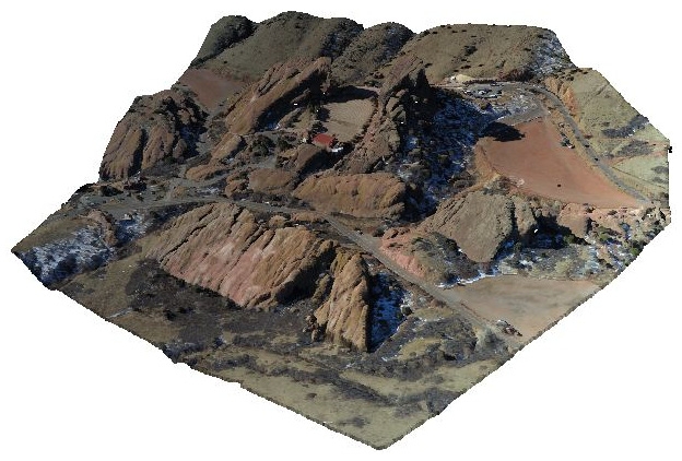
Figure 1.9 – A colorized lidar point cloud of Red Rocks, Colorado, USA, which creates a photorealistic 3D model
Point cloud data is the most common way to create elevation data that can be turned into a gridded format. This is called a Digital Elevation Model (DEM). A DEM is a three-dimensional representation of a planet’s terrain. In the context of this book, this planet is the Earth. The history of digital elevation models is far less complicated than remotely-sensed imagery but no less significant. Before computers, representations of elevation data were limited to topographic maps created through traditional land surveys. The technology existed to create three-dimensional models from stereoscopic images or physical models from materials such as clay or wood, but these approaches were not widely used for geography.
The concept of digital elevation models came about in 1986 when the French space agency, Centre National d’études Spatiales (CNES) or National Center for the Study of Space, launched its SPOT-1 satellite, which included a stereoscopic radar. This system created the first usable DEM. Several other US and European satellites followed this model with similar missions.
In February 2000, the space shuttle Endeavour conducted the Shuttle Radar Topography Mission (SRTM), which collected elevation data of over 80% of the Earth’s surface using a special radar antenna configuration that allowed a single pass. This model was surpassed in 2009 by the joint US and Japanese mission, which used the Advanced Spaceborne Thermal Emission and Reflection Radiometer (ASTER) sensor aboard NASA’s Terra satellite. This system captured 99% of the Earth’s surface but has proven to have minor data issues. Since the Space Shuttle’s orbit did not cross the Earth’s poles, it did not capture the entire surface. SRTM remains the gold standard. The following figure from the USGS (https://www.usgs.gov/media/images/national-elevation-dataset) shows a colorized DEM known as a hill shade. Greener areas are at lower elevations, while yellow and brown areas are at mid-range to high elevations:
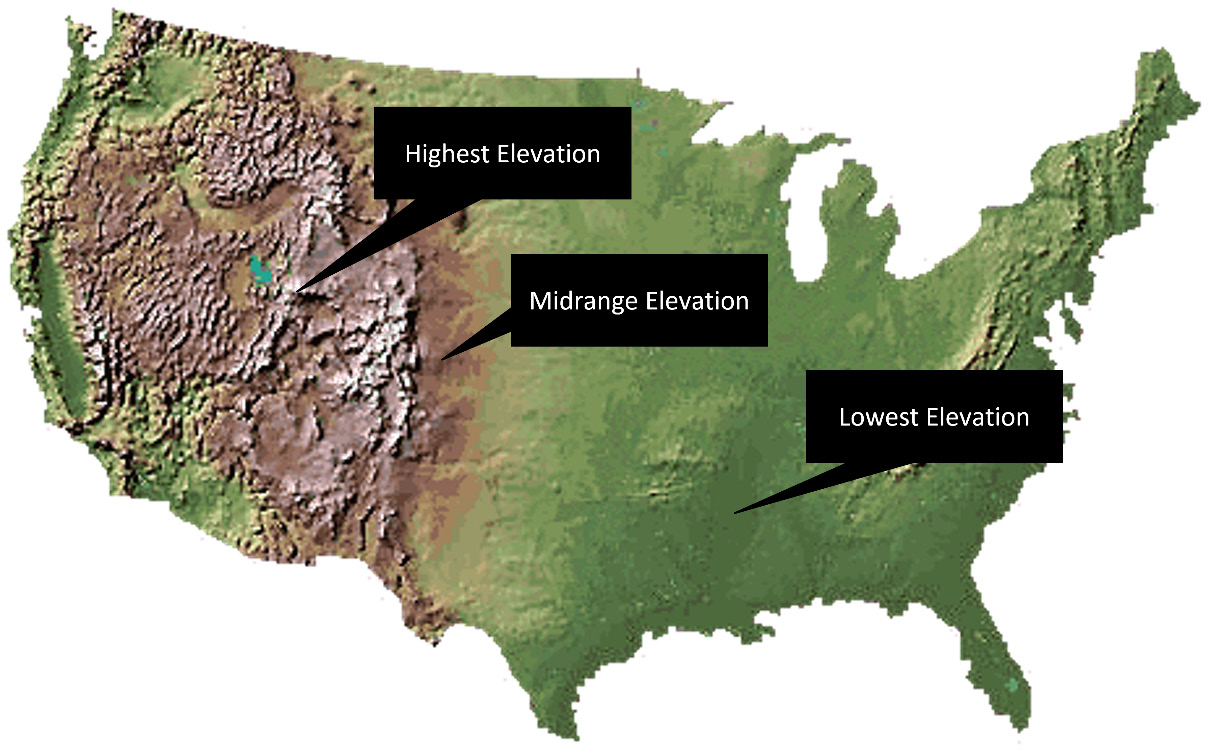
Figure 1.10 – An example of a DEM using colors and hill shade shadows to create a natural-looking representation of elevation
Recently, more ambitious attempts at a worldwide elevation dataset are underway in the form of the TerraSAR-X and TanDEM-X satellites, which were launched by Germany in 2007 and 2010, respectively. These two radar elevation satellites worked together to produce a global DEM called WorldDEM, which was released on April 15, 2014. This dataset has a relative accuracy of 2 meters and an absolute accuracy of 4 meters.
Computer-aided drafting
Computer-aided drafting (CAD) is worth mentioning, though it does not directly relate to geospatial analysis. The history of CAD system development parallels and intertwines with the history of geospatial analysis. CAD is an engineering tool that’s used to model two- and three-dimensional objects, usually for engineering and manufacturing purposes. The primary difference between a geospatial model and a CAD model is that a geospatial model is referenced to the Earth, whereas a CAD model can exist in abstract space.
For example, a three-dimensional blueprint of a building in a CAD system would not have latitude or longitude, but in a GIS, the same building model would have a location on Earth. However, over the years, CAD systems have taken on many features of GIS systems and are commonly used for smaller GIS projects. Likewise, many GIS programs can import CAD data that has been georeferenced. Traditionally, CAD tools were designed primarily to engineer data that was not geospatial.
However, engineers who became involved with geospatial engineering projects, such as designing a city’s utility electric system, would use the CAD tools that they were familiar with to create maps. Over time, the GIS software evolved to import the geospatial-oriented CAD data produced by engineers, and CAD tools evolved to support geospatial data creation and better compatibility with GIS software. AutoCAD by Autodesk and ArcGIS by Esri were the leading commercial packages to develop this capability, and the Geospatial Data Abstraction Library (GDAL) OGR library developers added CAD support as well.
Geospatial analysis and computer programming
Modern geospatial analysis can be conducted with the click of a button in any of the easy-to-use commercial or open source geospatial packages. So, why would you want to use a programming language to learn this field? The most important reasons are as follows:
- You want complete control of the underlying algorithms, data, and execution
- You want to automate task-specific, repetitive analysis tasks with minimal overhead from a large, multipurpose geospatial framework
- You want to create a program that’s easy to share
- You want to learn geospatial analysis beyond pushing buttons in software
The geospatial industry is gradually moving away from the traditional workflow, in which teams of analysts use expensive desktop software to produce geospatial products.
Geospatial analysis is being pushed toward automated processes that reside in the cloud. End user software is moving toward task-specific tools, many of which are accessed from mobile devices. Knowledge of geospatial concepts and data, as well as the ability to build custom geospatial processes, is where the geospatial work in the future lies.
Object-oriented programming for geospatial analysis
Object-oriented programming is a software development paradigm in which concepts are modeled as objects that have properties and behaviors represented as attributes and methods, respectively. The goal of this paradigm is more modular software in which one object can inherit from one or more other objects to encourage software reuse.
The Python programming language is known for its ability to serve multiple roles as a well-designed, object-oriented language, a procedural scripting language, or even a functional programming language. However, you never completely abandon object-oriented programming in Python because even its native data types are objects and all Python libraries, known as modules, adhere to a basic object structure and behavior.
Geospatial analysis is the perfect activity for object-oriented programming. In most object-oriented programming projects, the objects are abstract concepts, such as database connections that have no real-world analogy. However, in geospatial analysis, the concepts that are modeled are, well, real-world objects! The domain of geospatial analysis is the Earth and everything on it. Trees, buildings, rivers, and people are all examples of objects within a geospatial system.
A common example in literature for newcomers to object-oriented programming is the concrete analogy of a cat. Books on object-oriented programming frequently use some form of the following example.
Imagine that you are looking at a cat. We know some information about the cat, such as its name, age, color, and size. These features are the properties of the cat. The cat also exhibits behaviors such as eating, sleeping, jumping, and purring. In object-oriented programming, objects have properties and behaviors too. You can model a real-world object such as the cat in our example, or something more abstract such as a bank account.
Most concepts in object-oriented programming are far more abstract than the simple cat paradigm or even a bank account. However, in geospatial analysis, the objects that are modeled remain concrete, such as the simple cat analogy, and in many cases are cats.
Geospatial analysis allows you to continue with the simple cat analogy and even visualize it. The following figure represents the feral cat population of Australia using data provided by the Atlas of Living Australia (ALA):

Figure 1.11 – A geospatial heat map of feral cat populations in Australia illustrating that in object-oriented geospatial programming, objects are real-world objects and not just software abstractions
So, we can use computers to analyze the relationships between features on Earth, but why should we? In the next section, we’ll look at why geospatial analysis is a worthwhile endeavor.
The importance of geospatial analysis
Geospatial analysis helps people make better decisions. It doesn’t make the decision for you, but it can answer critical questions that are at the heart of the choice to be made and often cannot be answered any other way. Until recently, geospatial technology and data were tools available only to governments and well-funded researchers. However, in the last decade, data has become much more widely available and software has become much more accessible to anyone.
In addition to freely available government satellite imagery, many local governments now conduct aerial photo surveys and make the data available online. The ubiquitous Google Earth provides a cross-platform spinning globe view of the Earth with satellite and aerial data, streets, points of interest, photographs, and much more. Google Earth users can create custom Keyhole Markup Language (KML) files, which are XML files that are used to load and style data to the globe. This program and similar tools are often called geographic exploration tools because they are excellent data viewers but provide very limited data analysis capabilities.
The ambitious OpenStreetMap project (https://www.openstreetmap.org/#map=5/51.500/-0.100) is a crowd-sourced, worldwide, geographic base map containing most layers commonly found in a GIS. Nearly every mobile phone now contains a GPS, along with mobile apps to collect GPS tracks as points, lines, or polygons. Most phones will also tag photos taken with the phone’s camera with GPS coordinates. In short, anyone can be a geospatial analyst.
The global population has reached 7 billion people. The world is changing faster than ever before. The planet is undergoing environmental changes that have never been seen in recorded history. Faster communication and transportation increase the interaction between us and the environment in which we live. Managing people and resources safely and responsibly is more challenging than ever. Geospatial analysis is the best approach to understanding our world more efficiently and deeply. The more politicians, activists, relief workers, parents, teachers, first responders, medical professionals, and small businesses that harness the power of geospatial analysis, the more potential we have for a better, healthier, safer, and fairer world.
GIS concepts
To begin geospatial analysis, we need to understand some key underlying concepts that are unique to the field. The list isn’t long, but nearly every aspect of analysis traces back to one of these ideas.
Thematic maps
As its name suggests, a thematic map portrays a specific theme. A general reference map visually represents features as they relate geographically to navigation or planning. A thematic map goes beyond location to provide the geographic context for information around a central idea. Usually, a thematic map is designed for a targeted audience to answer specific questions. The value of thematic maps lies in what they do not show. A thematic map uses minimal geographic features to avoid distracting the reader from the theme. Most thematic maps include political boundaries such as country or state borders but omit navigational features, such as street names or points of interest beyond major landmarks that orient the reader.
The cholera map by Dr. John Snow, which was provided earlier in this chapter, is a perfect example of a thematic map. Common uses for thematic maps include visualizing health issues, such as disease, election results, and environmental phenomena such as rainfall. These maps are also the most common output of geospatial analysis. The following map from the United States Census Bureau shows monthly business applications by state:

Figure 1.12 – A modern example of a thematic map from the US Census Bureau showing the distribution of business applications by states
Thematic maps tell a story and are very useful. However, it is important to remember that, while thematic maps are models of reality just like any other map, they are also generalizations of information. Two different analysts using the same source of information will often come up with very different thematic maps, depending on how they analyze and summarize the data. They may also choose to focus on different aspects of the dataset. The technical nature of thematic maps often leads people to treat them as if they are scientific evidence. However, geospatial analysis is often inconclusive. While the analysis may be based on scientific data, the analyst does not always follow the rigor of the scientific method.
In his classic book, How to Lie with Maps, Mark Monmonier, University of Chicago Press, demonstrates in detail how maps are easily manipulated models of reality, which are commonly abused. This fact doesn’t degrade the value of these tools. The legendary statistician, George Box, wrote the following in his 1987 book, Empirical Model-Building and Response Surfaces:
Thematic maps have been used as guides to start (and end) wars, stop deadly diseases in their tracks, win elections, feed nations, fight poverty, protect endangered species, and rescue those impacted by a disaster. Thematic maps may be the most useful models ever created.
Spatial databases
In its purest form, a database is simply an organized collection of information. A database management system (DBMS) is an interactive suite of software that can interact with a database. People often use the word database as a catch-all term that refers to both the DBMS and the underlying data structure. Databases typically contain alphanumeric data and, in some cases, binary large objects (blobs), which can store binary data such as images. Most databases also allow a relational database structure in which entries in normalized tables can be referenced to each other to create many-to-one and one-to-many relationships among data.
Spatial databases, also known as geodatabases, use specialized software to extend a traditional relational database management system (RDBMS) to store and query data defined in a two- or three-dimensional space. Some systems also account for a series of data over time. In a spatial database, attributes about geographic features are stored and queried as traditional relational database structures. These spatial extensions allow you to query geometries using Structured Query Language (SQL) in a similar way to traditional database queries. Spatial queries and attribute queries can also be combined to aid with selecting results based on both location and attributes.
Spatial indexing
Spatial indexing is a process that organizes geospatial vector data for faster retrieval. It is a way of prefiltering the data for common queries or rendering. Indexing is commonly used in large databases to speed up the returns to queries. Spatial data is no different. Even a moderately sized geodatabase can contain millions of points or objects. If you perform a spatial query, every point in the database must be considered by the system for it to include them or eliminate them from the results. Spatial indexing groups data in ways that allow large portions of the dataset to be eliminated from consideration by doing computationally simpler checks before going into a detailed and slower analysis of the remaining items.
Metadata
Metadata is defined as data about data. Accordingly, geospatial metadata is data about geospatial datasets that provides traceability for the source and history of a dataset, as well as a summary of the technical details. Metadata also provides long-term preservation of data by way of documenting the asset over time.
Geospatial metadata can be represented by several possible standards. One of the most prominent standards is the international standard, ISO 19115-1, which includes hundreds of potential fields to describe a single geospatial dataset. Additionally, the ISO 19115-2 standard includes extensions for geospatial imagery and gridded data. Some example fields include spatial representation, temporal extent, and lineage. ISO 19115-3 is the standard for describing the procedure to generate an XML schema from ISO geographic metadata. Dublin Core is another international standard that was developed for digital data that has been extended for geospatial data, along with the associated DCAT vocabulary for building catalogs of data from a single source.
The primary use of metadata is for cataloging datasets. Modern metadata can be ingested by geographic search engines, making it potentially discoverable by other systems automatically. It also lists points of contact for a dataset if you have questions.
Python and metadata
Metadata is an important support tool for geospatial analysts and adds credibility and accessibility to your work. The Open Geospatial Consortium (OGC), which created the Catalog Service for the Web (CSW), is used to manage metadata. The pycsw Python library implements the CSW standard.
Map projections
Map projections have entire books devoted to them and can be a challenge for new analysts. If you take any 3D object and flatten it on a plane, such as your screen or a sheet of paper, the object will be distorted. Many grade school geography classes demonstrate this concept by having students peel an orange and then attempt to lay the peel flat on their desks to understand the resulting distortion. The same effect occurs when you take the round shape of the Earth and project it onto a computer screen.
In geospatial analysis, you can manipulate this distortion to preserve common properties, such as area, scale, bearing, distance, or shape. There is no one-size-fits-all solution to map projections. The choice of projection is always a compromise of gaining accuracy in one dimension in exchange for errors in another. Projections are typically represented as a set of over 40 parameters, either in XML or in a text format called Well-Known Text (WKT), which is used to define the transformation algorithm.
The International Association of Oil and Gas Producers (IOGP) maintains a registry of the most well-known projections. The organization was formerly known as the European Petroleum Survey Group (EPSG). The entries in the registry are still known as EPSG codes. The EPSG maintained the registry as a common benefit for the oil and gas industry, which is a prolific user of geospatial analysis for energy exploration. At the last count, this registry contained over 5,000 entries.
As recently as 10 years ago, map projections were of primary concern for a geospatial analyst. Data storage was expensive, high-speed internet was rare, and cloud computing didn’t really exist. Geospatial data was typically exchanged among small groups working in separate areas of interest. The technology constraints at the time meant that geospatial analysis was highly localized. Analysts would use the best projection for their area of interest.
Data in different projections could not be displayed on the same map because they represent two different models of the Earth. Any time an analyst received data from a third party, it had to be reprojected before they could use it with the existing data. This process was tedious and time-consuming.
Most geospatial data formats do not provide a way to store the projection information. This information is stored in an ancillary file, usually as text or XML. Since analysts didn’t exchange data often, many people wouldn’t bother defining projection information. Every analyst’s nightmare was to come across an extremely valuable dataset that was missing the projection information. It rendered the dataset useless. The coordinates in the file are just numbers and offer no clue about the projection. With over 5,000 choices, it was nearly impossible to guess.
Now, thanks to modern software and the internet making data exchange easier and more common, nearly every data format has added a metadata format that defines a projection or places it in the file header, if supported. Advances in technology have also allowed for global base maps, which allow for more common uses of projections, such as the common Google Mercator projection, which is used for Google Maps. This projection is also known as Web Mercator and uses code EPSG:3857 (or the deprecated EPSG:900913).
Geospatial portal projects such as OpenStreetMap (https://www.openstreetmap.org) have consolidated datasets for much of the world in common projections. Modern geospatial software can also reproject data on the fly, saving the analyst the trouble of preprocessing the data before using it. Closely related to map projections are geodetic datums. A datum is a model of the Earth’s surface that’s used to match the location of features on the Earth to a coordinate system. One common datum is called WGS 84 and is used by GPS.
Rendering
The exciting part of geospatial analysis is visualization. Since geospatial analysis is a computer-based process, it is good to be aware of how geographic data appears on a computer screen.
Geographic data including points, lines, and polygons are stored numerically as one or more points, which come in (X, Y) pairs or (X, Y, Z) tuples. The X represents the horizontal axis on a graph, while the Y represents the vertical axis. The Z represents terrain elevation. In computer graphics, a computer screen is represented by an X- and Y-axis. The Z-axis is not used because the computer screen is treated as a two-dimensional plane by most graphics software APIs. However, because desktop computing power continues to improve, three-dimensional maps are starting to become more common.
Another important factor is screen coordinates versus world coordinates. Geographic data is stored in a coordinate system representing a grid overlaid on the Earth, which is three-dimensional and round. Screen coordinates, also known as pixel coordinates, represent a grid of pixels on a flat, two-dimensional computer screen. Mapping X and Y world coordinates to pixel coordinates is fairly straightforward and involves a simple scaling algorithm. However, if a Z coordinate exists, then a more complicated transformation must be performed to map coordinates from a three-dimensional space to a two-dimensional plane. These transformations can be computationally costly and therefore slow if not handled correctly.
In the case of remote sensing data, the challenge is typically the file size. Even a moderately sized satellite image that is compressed can be tens, if not hundreds, of megabytes. Images can be compressed using two methods:
- Lossless methods: They use tricks to reduce the file size without discarding any data
- Lossy compression algorithms: They reduce the file size by reducing the amount of data in the image while avoiding a significant change in the appearance of the image
Rendering an image on the screen can be computationally intensive. Most remote sensing file formats allow you to store multiple lower-resolution versions of the image – called overviews or pyramids – for the sole purpose of faster rendering at different scales. When zoomed out from the image to a scale where you can see the detail of the full-resolution image, a preprocessed, lower-resolution version of the image is displayed quickly and seamlessly.
Remote sensing concepts
Most of the GIS concepts we’ve described also apply to raster data. However, raster data has some unique properties as well. Earlier in this chapter, when we went over the history of remote sensing, the focus was on Earth imaging from aerial platforms. It is important to note that raster data can come in many forms, including ground-based radar, laser range finders, and other specialized devices to detect gases, radiation, and other forms of energy in a geographic context.
For this book, we will focus on remote sensing platforms that capture large amounts of Earth data. These sources include Earth imaging systems, certain types of elevation data, and some weather systems, where applicable.
Images as data
Raster data is captured digitally as square tiles. This means that the data is stored on a computer as a numerical array of rows and columns. If the data is multispectral, the dataset will usually contain multiple arrays of the same size, which are geospatially referenced together to represent a single area on the Earth. These different arrays are called bands.
Any numerical array can be represented on a computer as an image. In fact, all computer data is ultimately numbers. In geospatial analysis, it is important to think of images as a numeric array because mathematical formulas are used to process them.
In remotely sensed images, each pixel represents both space (the location on the Earth of a certain size) and the reflectance captured as light reflected from the Earth at that location into space. So, each pixel has a ground size and contains a number representing the intensity. Since each pixel is a number, we can perform mathematical equations on this data to combine data from different bands and highlight specific classes of objects in the image. If the wavelength value is beyond the visible spectrum, we can highlight features that aren’t visible to the human eye. Substances such as chlorophyll in plants can be greatly contrasted using a specific formula called the Normalized Difference Vegetation Index (NDVI).
By processing remotely sensed images, we can turn this data into visual information. Using the NDVI formula, we can answer the question, what is the relative health of the plants in this image? You can also create new types of digital information, which can be used as input for computer programs to output other types of information.
Remote sensing and color
Computer screens display images as combinations of Red, Green, and Blue (RGB) to match the capability of the human eye. Satellites and other remote sensing imaging devices can capture light beyond this visible spectrum. On a computer, wavelengths beyond the visible spectrum are represented in the visible spectrum so that we can see them. These images are known as false color images. In remote sensing, for instance, infrared light makes moisture highly visible.
This phenomenon has a variety of uses, such as monitoring ground saturation during a flood or finding hidden leaks in a roof or levee.
Common vector GIS concepts
In this section, we will discuss the different types of GIS processes that are commonly used in geospatial analysis. This list is not exhaustive; however, it will provide you with the essential operations that all other operations are based on. If you understand these operations, you will quickly understand much more complex processes as they are either derivatives or combinations of these processes.
Data structures
GIS vector data uses coordinates consisting of, at a minimum, an X horizontal value and a Y vertical value to represent a location on Earth. In many cases, a point may also contain a Z value. Other ancillary values are possible, including measurements or timestamps.
These coordinates are used to form points, lines, and polygons to model real-world objects. Points can be a geometric feature in and of themselves or they can connect line segments. Closed areas created by line segments are considered polygons. Polygons model objects such as buildings, terrain, or political boundaries.
A GIS feature can consist of a single point, line, or polygon, or it can consist of more than one shape. For example, in a GIS polygon dataset containing world country boundaries, the Philippines, which is made up of 7,107 islands, would be represented as a single country made up of thousands of polygons.
Vector data typically represents topographic features better than raster data. Vector data has more accuracy potential and is more precise. However, collecting vector data on a large scale is also traditionally more costly than raster data.
Two other important terms related to vector data structures are bounding box and convex hull. The bounding box, or minimum bounding box, is the smallest possible square that contains all of the points in a dataset. The following diagram demonstrates a bounding box for a collection of points:

Figure 1.13 – A bounding box is the smallest possible box that fully contains a group of geospatial features
The convex hull of a dataset is similar to the bounding box, but instead of a square, it is the smallest possible polygon that can contain a dataset. The following diagram shows the same point data as the previous example, with the convex hull polygon shown in red:

Figure 1.14 – A convex hull is the smallest possible polygon that fully contains a group of geospatial features
As you can see, the bounding box of a dataset always contains a convex hull.
Geospatial rules about polygons
In geospatial analysis, there are several general rules of thumb regarding polygons that are different from mathematical descriptions of polygons:
- Polygons must have at least four points – the first and last points must be the same
- A polygon boundary should not overlap itself
- Polygons in a layer shouldn’t overlap
- A polygon in a layer inside another polygon is considered a hole in the underlying polygon
Different geospatial software packages and libraries handle exceptions to these rules differently, which can lead to confusing errors or software behaviors. The safest route is to make sure that your polygons obey these rules. There’s one more important piece of information about polygons that we need to talk about.
A polygon is, by definition, a closed shape, which means that the first and last vertices of a polygon are identical. Some geospatial software will throw an error if you haven’t explicitly duplicated the first point as the last point in the polygon dataset. Other software will automatically close the polygon without complaining. The data format that you use to store your geospatial data may also dictate how polygons are defined. This issue is a gray area, so it didn’t make the polygon rules, but knowing this quirk will come in handy someday when you run into an error that you can’t explain easily.
Buffer
A buffer operation can be applied to spatial objects, including points, lines, or polygons. This operation creates a polygon around the object at a specified distance. Buffer operations are used for proximity analysis – for example, establishing a safety zone around a dangerous area. Let’s review the following diagram:

Figure 1.15 – A buffer is a polygon around a geospatial feature at a specified distance
The black shapes represent the original geometry, while the red outlines represent the larger buffer polygons that were generated from the original shape.
Dissolve
A dissolve operation creates a single polygon out of adjacent polygons. Dissolves are also used to simplify data that’s been extracted from remote sensing, as shown here:

Figure 1.16 – A polygon dissolve creates a single polygon out of adjacent polygons
A common use for a dissolve operation is to merge two adjacent properties in a tax database that has been purchased by a single owner.
Generalize
Objects that have more points than necessary for the geospatial model can be generalized to reduce the number of points that are used to represent the shape. This operation usually requires a few attempts to get the optimal number of points without compromising the overall shape. It is a data optimization technique that’s used to simplify data for the efficiency of computing or better visualization. This technique is useful in web mapping applications.
Here is an example of polygon generalization:

Figure 1.17 – Polygon generalization reduces the number of points in a polygon to simplify the geometry to speed up computation geometry or the graphical rendering of the feature. The compromise is losing detail in the shape, which may affect the visualization or analysis
Since computer screens have a resolution of 72 dots per inch (dpi), highly detailed point data, which would not be visible, can be reduced so that less bandwidth is used to send a visually equivalent map to the user.
Intersection
An intersection operation is used to see if one part of a feature intersects with one or more features. This operation is used for spatial queries in proximity analysis and is often a follow-on operation to buffer analysis:

Figure 1.18 – A shape intersection checks whether one feature crosses the geometry of one or more other features
Merge
A merge operation combines two or more non-overlapping shapes in a single multi-shape object. Multi-shape objects are shapes that maintain separate geometries but are treated as a single feature with a single set of attributes by the GIS:

Figure 1.19 – A shape merge combines multiple non-overlapping features into a single dataset
Point in polygon
A fundamental geospatial operation is checking to see whether a point is inside a polygon. This operation is the atomic building block of many different types of spatial queries. If the point is on the boundary of the polygon, it is considered inside. Very few spatial queries exist that do not rely on this calculation in some way. However, it can be very slow on a large number of points.
The most common and efficient algorithm to detect whether a point is inside a polygon is called the ray casting algorithm. First, a test is performed to see whether the point is on the polygon boundary. Next, the algorithm draws a line from the point in question in a single direction. The program counts the number of times the line crosses the polygon’s boundary until it reaches the bounding box of the polygon, as shown here:

Figure 1.20 – The point-in-polygon ray casting algorithm is an efficient way to detect whether a point is inside a polygon
Union
The union operation is less common but is very useful when you wish to combine two or more overlapping polygons in a single shape. It is similar to dissolve, but in this case, the polygons are overlapping as opposed to being adjacent:

Figure 1.21 – A polygon union merges overlapping polygons into a single shape, similar to a dissolve, in which polygons are only adjacent
Usually, this operation is used to clean up automatically generated feature datasets from remote sensing operations.
Join
A join or SQL join is a database operation that’s used to combine two or more tables of information. Relational databases are designed to avoid storing redundant information for one-to-many relationships. For example, a US state may contain many cities. Rather than creating a table for each state containing all of its cities, a table of states with numeric IDs is created, while a table for all the cities in every state is created with a state numeric ID.
In a GIS, you can also have spatial joins that are part of the spatial extension software for a database. In spatial joins, you combine the attributes in the same way that you do in a SQL join. However, the relation is based on the spatial proximity of the two features.
To follow the previous cities example, we could add the county name that each city resides in using a spatial join. The cities layer could be loaded over a county polygon layer whose attributes contain the county’s name. The spatial join would determine which city is in which county and perform a SQL join to add the county name to each city’s attribute row.
Common raster data concepts
As we mentioned earlier, remotely sensed raster data is a matrix of numbers. Remote sensing contains thousands of operations that can be performed on data. This field changes on almost a daily basis as new satellites are put into space and computer power increases.
Despite its decade-long history, we haven’t even scratched the surface of the knowledge that this field can provide to the human race. Once again, similar to the common GIS processes, this minimal list of operations allows you to evaluate any technique that’s used in remote sensing.
Band math
Band math is multidimensional array mathematics. In array math, arrays are treated as single units, which are added, subtracted, multiplied, and divided. However, in an array, the corresponding numbers in each row and column across multiple arrays are computed simultaneously. These arrays are termed matrices, and computations involving matrices are the focus of linear algebra.
Change detection
Change detection is the process of taking two images of the same location at different times and highlighting those changes. A change could be due to the addition of something on the ground, such as a new building, or the loss of a feature, such as coastal erosion. Many algorithms detect changes among images and also determine qualitative factors such as how long ago the change took place.
The following figure from a research project by the US Oak Ridge National Laboratory (ORNL) shows rainforest deforestation between 1984 and 2000 in the state of Rondonia, Brazil:

Figure 1.22 – This US Department of Energy satellite image analysis illustrates change detection by comparing the deforestation of a rainforest over time
Colors are used to show how recently the forest was cut. Green represents virgin rainforests, white represents a forest that was cut within 2 years of the end of the date range, red represents within 22 years, and the other colors fall in between, as described in the legend.
Histogram
A histogram is the statistical distribution of values in a dataset. The horizontal axis represents a unique value in a dataset, while the vertical axis represents the frequency of this unique value in the raster. The following example, which was generated from a NASA Landsat image, shows a histogram showing pixel value distributions for the first three bands:

Figure 1.23 – Histogram distribution of red, green, and blue pixels in a satellite image that can be redistributed to enhance an image for visualizing or analyzing certain features
A histogram is a key operation in most raster processing. It can be used for everything from enhancing contrast in an image to serving as a basis for object classification and image comparison.
Feature extraction
Feature extraction is the process of manually or automatically digitizing features in an image to points, lines, or polygons. This process serves as the basis for the vectorization of images, in which a raster is converted into a vector dataset. An example of feature extraction is extracting a coastline from a satellite image and saving it as a vector dataset.
If this extraction is performed over several years, you could monitor the erosion or other changes along this coastline.
Supervised and unsupervised classification
Objects on the Earth reflect different wavelengths of light, depending on the materials that they are made of. In remote sensing, analysts collect wavelength signatures for specific types of land cover (for example, concrete) and build a library for a specific area. A computer can then use this library to automatically locate classes in the library in a new image of the same area.
In unsupervised classification, a computer groups pixels with similar reflectance values in an image without any other reference information other than the histogram of the image.
Creating the simplest possible Python GIS
Now that we have a better understanding of geospatial analysis, the next step is to build a simple GIS, known as SimpleGIS, using Python. This small program will be a technically complete GIS with a geographic data model that can render the data as a visual thematic map showing the population of different cities.
The data model will also be structured so that you can perform basic queries. Our SimpleGIS will contain the state of Colorado, three cities, and population counts for each city.
Most importantly, we will demonstrate the power and simplicity of Python programming by building this tiny system in pure Python. We will only use modules available in the standard Python distribution without downloading any third-party libraries.
Getting started with Python
As we stated earlier, this book assumes that you have some basic knowledge of Python. The only module that’s used in the following example is the turtle module, which provides a very simple graphics engine based on the Tkinter library, which is included with Python. In this book, we will use the Anaconda environment, which provides a Python environment plus a simple package manager called conda that will make installing any additional geospatial libraries we need easier. You can find the installer and installation instructions for your platform at https://conda.io/projects/conda/en/latest/user-guide/install/index.html. Once you have installed Anaconda, open the Anaconda PowerShell prompt. This will give you a command line to run Python interactively, as well as scripts.
Make sure that you can import the turtle module by typing the following in the command prompt. This will run the Turtle demo script:
python –m turtle
The preceding command will begin a real-time drawing program that will demonstrate the capabilities of the turtle module, as shown in the following screenshot:
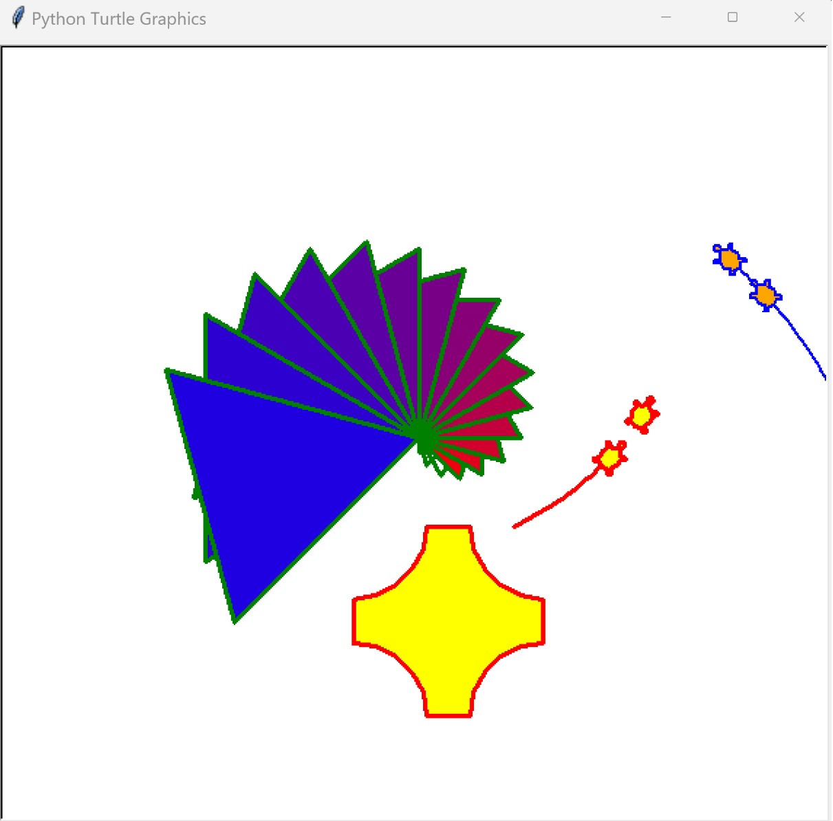
Figure 1.24 – The output of the Python Turtle graphics library
Now that we’ve seen what the turtle graphics module can do, let’s use it to build an actual GIS!
Building a SimpleGIS
The code is divided into two different sections:
- The data model section
- The map renderer that draws the data
For the data model, we will use simple Python lists. A Python list is a native data type that serves as a container for other Python objects in a specified order. Python lists can contain other lists and are great for simple data structures. They also map well to more complex structures or even databases if you decide you want to develop your script further.
The second portion of the code will render the map using the Python Turtle graphics engine. We will have only one function in the GIS that converts the world coordinates – in this case, longitude and latitude – into pixel coordinates. All graphics engines have an origin point of (0,0) and it’s usually in the top-left or lower-left corner of the canvas.
Turtle graphics are designed to teach programming visually. The Turtle graphics canvas uses an origin of (0,0) in the center, similar to a graphing calculator. The following graph illustrates the type of Cartesian graph that the turtle module uses. Some of the points are plotted in both positive and negative space:
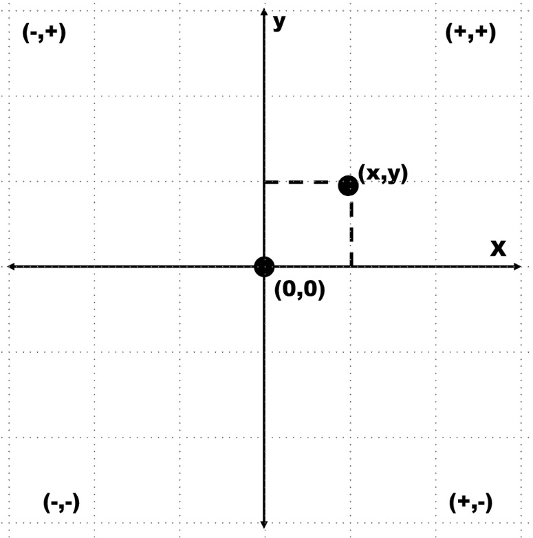
Figure 1.25 – The turtle module uses a standard Cartesian graph to plot coordinates
This also means that the Turtle graphics engine can have negative pixel coordinates, which is uncommon for graphics canvases. However, for this example, the turtle module is the quickest and simplest way for us to render our map.
Setting up the data model
You can run this program interactively in the Python interpreter or you can save the complete program as a script and run it. The Python interpreter is an incredibly powerful way to learn about new concepts because it gives you real-time feedback on errors or unexpected program behavior. You can easily recover from these issues and try something else until you get the results that you want:
- In Python, you usually import modules at the beginning of the script, so we’ll import the
turtlemodule first. We’ll use Python’s import feature to assign the module the nametto save space and time when typingturtlecommands:import turtle as t
- Next, we’ll set up the data model, starting with some simple variables that allow us to access list indexes by name instead of numbers to make the code easier to follow. Python lists index the contained objects, starting with the number
0. So, if we wanted to access the first item in a list calledmyList, we would reference it as follows:myList[0]
- To make our code easier to read, we can also use a variable name that’s been assigned to commonly used indexes:
firstItem = 0 myList[firstItem]
In computer science, assigning commonly used numbers to an easy-to-remember variable is a common practice. These variables are called constants. So, for our example, we’ll assign constants for some common elements that are used for all of the cities. All cities will have a name, one or more points, and a population count:
NAME = 0POINTS = 1
POP = 2
- Now, we’ll set up the data for Colorado as a list with a name, polygon points, and the population. Note that the coordinates are a list within a list:
state = ["COLORADO", [[-109, 37],[-109, 41],[-102, 41],[-102, 37]], 5187582]
- The cities will be stored as nested lists. Each city’s location consists of a single point as a longitude and latitude pair. These entries will complete our GIS data model. We’ll start with an empty list called
citiesand then append the data to this list for each city:cities = []cities.append(["DENVER",[-104.98, 39.74], 634265]) cities.append(["BOULDER",[-105.27, 40.02], 98889]) cities.append(["DURANGO",[-107.88,37.28], 17069])
- We will now render our GIS data as a map by first defining a map size. The width and height can be anything that you want, depending on your screen resolution:
map_width = 400map_height = 300
- To scale the map to the graphics canvas, we must first determine the bounding box of the largest layer, which is the state. We’ll set the map’s bounding box to a global scale and reduce it to the size of the state. To do so, we’ll loop through the longitude and latitude of each point and compare it with the current minimum and maximum X and Y values. If it is larger than the current maximum or smaller than the current minimum, we’ll make this value the new maximum or minimum, respectively:
Minx =     180Maxx =     -180
Miny =     90
Maxy =     -90
for x,y in state[POINTS]:
    if x < minx:
        minx = x
    elif x > maxx:
        maxx = x
    if y < miny:
        miny = y
    elif y > maxy:
        maxy = y
- The second step when it comes to scaling is calculating a ratio between the actual state and the tiny canvas that we will render it on. This ratio is used for coordinate-to-pixel conversion. We get the size along the X and Y axes of the state and then we divide the map’s width and height by these numbers to get our scaling ratio:
dist_x = maxx – minxdist_y = maxy – miny
x_ratio = map_width / dist_x
y_ratio = map_height / dist_y
- The following function, called
convert(), is our only function in SimpleGIS. It transforms a point in the map coordinates from one of our data layers into pixel coordinates using the previous calculations. You’ll notice that, in the end, we divide the map’s width and height in half and subtract it from the final conversion to account for the unusual center origin of the Turtle graphics canvas. Every geospatial program has some form of this function:def convert(point): lon = point[0] lat = point[1] x = map_width - ((maxx - lon) * x_ratio) y = map_height - ((maxy - lat) * y_ratio) # Python turtle graphics start in the # middle of the screen so we must offset # the points so they are centered x = x - (map_width/2) y = y - (map_height/2) return [x,y]
Now comes the exciting part! We’re ready to render our GIS as a thematic map.
Rendering the map
The turtle module uses the concept of a cursor, known as a pen. Moving the cursor around the canvas is the same as moving a pen around a piece of paper. The cursor will draw a line when you move it. You’ll notice that, throughout the code, we use the t.up() and t.down() commands to pick the pen up when we want to move to a new location and put it down when we’re ready to draw. We have some important steps to follow in this section, so let’s get started:
- First, we need to set up the Turtle graphics window:
t.setup(900,600)t.screensize(800,500) wn = t.Screen() wn.title("Simple GIS") - Since the border of Colorado is a polygon, we must draw a line between the last point and the first point to close the polygon. We can also leave out the closing step and just add a duplicate point to the Colorado dataset. Once we’ve drawn the state, we can use the
write()method to label the polygon:t.up()first_pixel = None for point in state[POINTS]: pixel = convert(point) if not first_pixel: first_pixel = pixel t.goto(pixel) t.down() t.goto(first_pixel) t.up() t.goto([0,0]) t.write(state[NAME], align="center", \ font=("Arial",16,"bold")) - If we were to run the code at this point, we would see a simplified map of the state of Colorado, as shown in the following screenshot. Note that if you run the previous code, you need to temporarily add
t.done()to the end to keep the window from automatically closing:
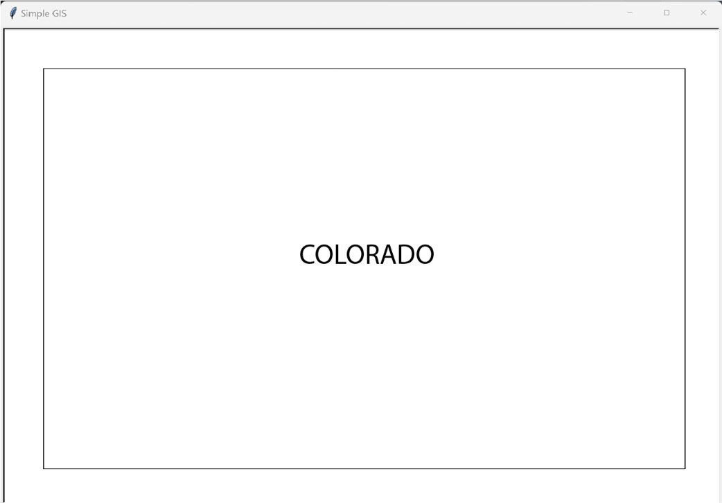
Figure 1.26 – A basemap of the state of Colorado, USA, produced by the SimpleGIS Python script
- Now, we’ll render the cities as point locations and label them with their names and population. Since the cities are a group of features in a list, we’ll loop through them to render them. Instead of drawing lines by moving the pen around, we’ll use Turtle’s
dot()method to plot a small circle at the pixel coordinate that’s returned by ourSimpleGISconvert()function. We’ll then label the dot with the city’s name and add the population. You’ll notice that we must convert the population number into a string to use it in Turtle’swrite()method. To do so, we will use Python’s built-instr()function:for city in cities: pixel = convert(city[POINTS]) t.up() t.goto(pixel) # Place a point for the city t.dot(10) # Label the city t.write(city[NAME] + ", Pop.: " + str(city[POP])\ , align="left") t.up()
- Now, we will perform one last operation to prove that we have created a real GIS. We will perform an attribute query on our data to determine which city has the largest population. Then, we’ll perform a spatial query to see which city lies the furthest west. Finally, we’ll print the answers to our questions on our thematic map page safely, out of the range of the map.
- For our query engine, we’ll use Python’s built-in
min()andmax()functions. These functions take a list as an argument and return the minimum and maximum values of this list, respectively. These functions have a special feature called a key argument that allows you to sort complex objects. Since we are dealing with nested lists in our data model, we’ll take advantage of the key argument in these functions. The key argument accepts a function that temporarily alters the list for evaluation before a final value is returned. In this case, we want to isolate the population values for comparison, and then the points. We could write a whole new function to return the specified value, but we can use Python’slambdakeyword instead. Thelambdakeyword defines an anonymous function that is used inline. Other Python functions can be used inline, such as the string function,str(), but they are not anonymous. This temporary function will isolate our value of interest. - So, our first question is, which city has the largest population?
biggest_city = max(cities, key=lambda city:city[POP]) t.goto(0,-200)t.write("The biggest city is: " + biggest_city[NAME]) - The next question is, which city lies the furthest west?
western_city = min(cities, key=lambda city:city[POINTS]) t.goto(0,-220)t.write("The western-most city is: " + western_city[NAME]) - In the preceding query, we used Python’s built-in
min()function to select the smallest longitude value. This works because we represented our city locations as longitude and latitude pairs. It is possible to use different representations for points, including possible representations where this code would need to be modified to work correctly. However, for our SimpleGIS, we are using a common point representation to make it as intuitive as possible. - These last two commands are just for cleanup purposes. First, we hide the cursor. Then, we call Turtle’s
done()method, which will keep the Turtle graphics window with our map on it open until we choose to close it using the close handle at the top of the window:t.pen(shown=False)t.done()
Whether you followed along using the Python interpreter or you ran the complete program as a script, you should see the following map being rendered in real time:
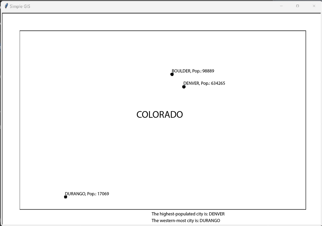
Figure 1.27 – The final output of the SimpleGIS script illustrating a complete GIS in only 60 lines of Python
Congratulations! You have followed in the footsteps of Paleolithic hunters, the father of GIS Dr. Roger Tomlinson, geospatial pioneer Howard Fisher, and game-changing humanitarian programmers to create a functional, extensible, and technically complete GIS.
It took less than 60 lines of pure Python code! You will be hard-pressed to find a programming language that can create a complete GIS using only its core libraries in such a finite amount of readable code as Python. Even if you did, it is highly unlikely that the language would survive the geospatial Python journey that you’ll take through the rest of this book.
As you can see, there is lots of room for expansion when it comes to SimpleGIS. Here are some other ways that you might expand this simple tool using the reference material for Tkinter and Python that were linked at the beginning of this section:
- Create an overview map in the top-right corner with a US border outline and Colorado’s location in the US
- Add color for visual appeal and further clarity
- Create a map key for different features
- Make a list of states and cities and add more states and cities
- Add a title to the map
- Create a bar chart to compare population numbers visually
The possibilities are endless. SimpleGIS can also be used as a way to quickly test and visualize geospatial algorithms that you come across. If you want to add more data layers, you can create more lists, but these lists will become difficult to manage. In this case, you can use another Python module that’s included in the standard distribution. The SQLite module provides a SQL-like database in Python that can be saved to disk or run in memory.
Summary
Well done! You are now a geospatial analyst. In this chapter, you learned about the history of geospatial analysis and the technologies that support it. You saw how geospatial technology led the fight against the COVID-19 pandemic. You also became familiar with foundational GIS and remote sensing concepts that will serve you through the rest of this book. Finally, you took all of this knowledge and built a working GIS that can be expanded to do whatever you can imagine!
In the next chapter, we’ll tackle the data formats that you’ll encounter as a geospatial analyst. Geospatial analysts spend far more time dealing with data than actually performing analysis. Understanding the data that you’re working with is essential to working efficiently and having fun.