Download code from GitHub
2. Data Exploration and Visualization
Objectives
In this chapter, you will learn to explore, analyze, and reshape your data so that you can shed light on the attributes of your data that are important to the business – a key skill in a marketing analyst's repertoire. You will discover functions that will help you derive summary and descriptive statistics from your data. You will build pivot tables and perform comparative tests and analyses to discover hidden relationships between various data points. Later, you will create impactful visualizations by using two of the most popular Python packages, Matplotlib and seaborn.
Introduction
"How does this data make sense to the business?" It's a critical question you'll need to ask every time you start working with a new, raw dataset. Even after you clean and prepare raw data, you won't be able to derive actionable insights from it just by scanning through thousands of rows and columns. To be able to present the data in a way that it provides value to the business, you may need group similar rows, re-arrange the columns, generate detailed charts, and more. Manipulating and visualizing the data to uncover insights that stakeholders can easily understand and implement is a key skill in a marketing analyst's toolbox. This chapter is all about learning that skill.
In the last chapter, you learned how you can transform raw data with the help of pandas. You saw how to clean the data and handle the missing values after which the data can be structured into a tabular form. The structured data can be further analyzed so that meaningful information can be extracted from it.
In this chapter, you'll discover the functions and libraries that help you explore and visualize your data in greater detail. You will go through techniques to explore and analyze data through solving some problems critical for businesses, such as identifying attributes useful for marketing, analyzing key performance indicators, performing comparative analyses, and generating insights and visualizations. You will use the pandas, Matplotlib, and seaborn libraries in Python to solve these problems.
Let us begin by first understanding how we can identify the attributes that will help us derive insights from our data.
Identifying and Focusing on the Right Attributes
Whether you're trying to meet your marketing goals or solve problems in an existing marketing campaign, a structured dataset may comprise numerous rows and columns. In such cases, deriving actionable insights by studying each attribute might prove challenging and time-consuming. The better your data analysis skills are, the more valuable the insights you'll be able to generate in a shorter amount of time. A prudent marketing analyst would use their experience to determine the attributes that are not needed for the study; then, using their data analysis skills, they'd remove such attributes from the dataset. It is these data analysis skills that you'll be building in this chapter.
Learning to identify the right attributes is one aspect of the problem, though. Marketing goals and campaigns often involve target metrics. These metrics may depend on domain knowledge and business acumen and are known as key performance indicators (KPIs). As a marketing analyst, you'll need to be able to analyze the relationships between the attributes of your data to quantify your data in line with these metrics. For example, you may be asked to derive any of the following commonly used KPIs from a dataset comprising 30 odd columns:
- Revenue: What are the total sales the company is generating in a given time frame?
- Profit: What is the money a company makes from its total sales after deducting its expenses?
- Customer Life Cycle Value: What is the metric that indicates the total revenue the company can expect from a customer throughout his association?
- Customer Acquisition cost: What is the amount of money a company spends to convert a prospective lead to a customer?
- Conversion rate: How many of all the people you have targeted for a marketing campaign have actually bought the product or used the company's services?
- Churn: How many customers have stopped using the company's services or have stopped buying the product?
Note
These are only the commonly used KPIs. You'll find that there are numerous more in the marketing domain.
You will of course have to get rid of columns that are not needed, and then use your data analysis tools to calculate the needed metrics. pandas, the library we encountered in the previous chapter, provides quite a lot of such tools in the form of functions and collections that help generate insights and summaries. One such useful function is groupby.
The groupby( ) Function
Take a look at the following data stored in an Excel sheet:
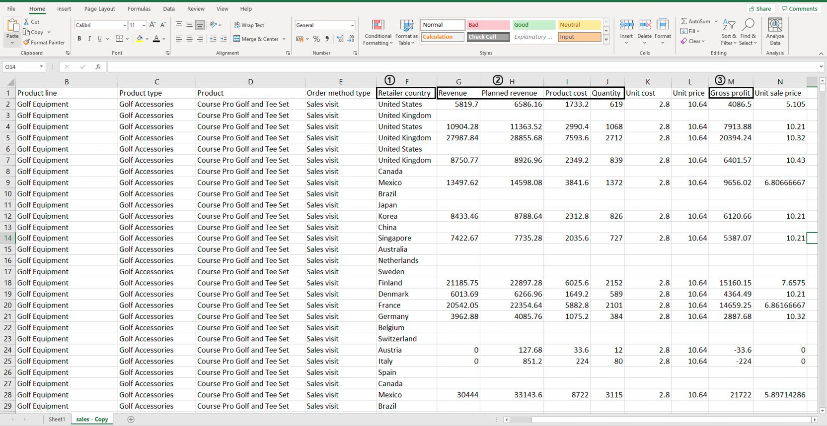
Figure 2.1: Sample sales data in an Excel sheet
You don't need to study all the attributes of the data as you'll be working with it later on. But suppose, using this dataset, you wanted to individually calculate the sums of values stored in the following columns: Revenue, Planned Revenue, Product Cost, Quantity (all four columns annotated by 2), and Gross profit (annotated by 3). Then, you wanted to segregate the sums of values for each column by the countries listed in column Retailer_country (annotated by 1). Before making any changes to it, your first task would be to visually analyze the data and find patterns in it.
Looking at the data, you can see that country names are repeated quite a lot. Now instead of calculating how many uniquely occurring countries there are, you can simply group these rows together using pivot tables as follows:
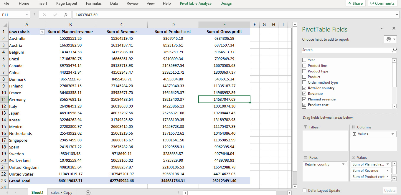
Figure 2.2: Pivot of sales data in Excel
In the preceding figure, not only is the data grouped by various countries, the values for Planned Revenue, Revenue, Product cost, and Gross profit are summed as well. That solves our problem. But what if this data was stored in a DataFrame?
This is where the groupby function comes in handy.
groupby(col)[cols].agg_func
This function groups rows with similar values in a column denoted by col and applies the aggregator function agg_func to the column of the DataFrame denoted by cols.
For example, think of the sample sales data as a DataFrame df. Now, you want to find out the total planned revenue by country. For that, you will need to group the countries and focusing on the Planned revenue column, sum all the values that correspond to the grouped countries. In the following command, we are grouping the values present in the Retailer country column and adding the corresponding values of the Planned revenue column.
df.groupby('Retailer country')['Planned revenue'].sum()
You'd get an output similar to the following:
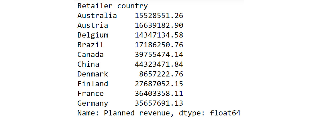
Figure 2.3: Calculating total Planned Revenue Using groupby()
The preceding output shows the sum of planned revenue grouped by country. To help us better compare the results we got here with the results of our pivot data in Figure 2.2, we can also chain another command as follows:
df.groupby('Retailer country')['Planned revenue'].sum().round()
You should get the following output:
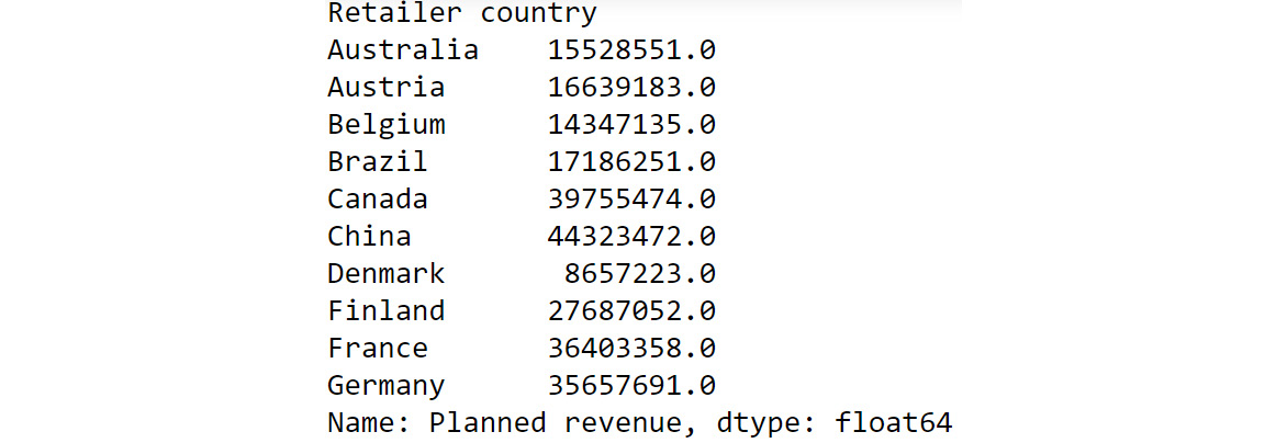
Figure 2.4: Chaining multiple functions to groupby
If we compare the preceding output to what we got in Figure 2.2, we can see that we have achieved the same results as the pivot functionality in Excel but using a built-in pandas function.
Some of the most common aggregator functions that can be used alongside groupby function are as follows:
- count(): This function returns the total number of values present in the column.
- min(): This function returns the minimum value present in the column.
- max(): This function returns the maximum value present in the column.
- mean(): This function returns the mean of all values in the column.
- median(): This function returns the median value in the column.
- mode(): This function returns the most frequently occurring value in the column.
Next, let us look into another pandas function that can help us derive useful insights.
The unique( ) function
While you know how to group data based on certain attributes, there are times when you don't know which attribute to choose to group the data by (or even make other analyses). For example, suppose you wanted to focus on customer life cycle value to design targeted marketing campaigns. Your dataset has attributes such as recency, frequency, and monetary values. Just looking at the dataset, you won't be able to understand how the attributes in each column vary. For example, one column might comprise lots of rows with numerous unique values, making it difficult to use the groupby() function on it. The other might be replete with duplicate values and have just two unique values. Thus, examining how much your values vary in a column is essential before doing further analysis. pandas provides a very handy function for doing that, and it's called unique().
For example, let's say you have a dataset called customerdetails that contains the names of customers, their IDs, and their countries. The data is stored in a DataFrame df and you would like to see a list of all the countries you have customers in.
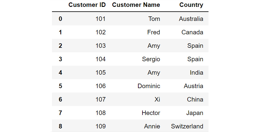
Figure 2.5: DataFrame df
Just by looking at the data, you see that there are a lot of countries in the column titled Country. Some country names are repeated multiple times. To know where your customers are located around the globe, you'll have to filter out all the unique values in this column. To do that, you can use the unique function as follows:
df['Country'].unique()
You should get the following output:

Figure 2.6: Different country names
You can see from the preceding output that the customers are from the following countries – Australia, Canada, Spain, India, Austria, China, Japan, Switzerland, the UK, New Zealand, and the USA.
Now that you know which countries your customers belong to, you may also want to know how many customers are present in each of these countries. This can be taken care of by the value_counts() function provided by pandas.
The value_counts( ) function
Sometimes, apart from just seeing what the unique values in a column are, you also want to know the count of each unique value in that column. For example, if, after running the unique() function, you find out that Product 1, Product 2, and Product 3 are the only three values that are repeated in a column comprising 1,000 rows; you may want to know how many entries of each product there are in the column. In such cases, you can use the value_counts() function. This function displays the unique values of the categories along with their counts.
Let's revisit the customerdetails dataset we encountered in the previous section. To find out the number of customers present in each country, we can use the value_counts() function as follows:
df['Country'].value_counts()
You will get output similar to the following:
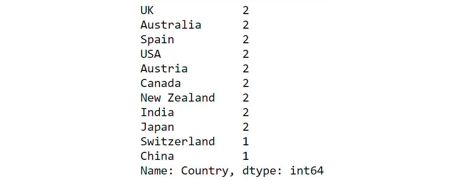
Figure 2.7: Output of value_counts function
From the preceding output, you can see that the count of each country is provided against the country name. Now that you have gotten a hang of these methods, let us implement them to derive some insights from sales data.
Exercise 2.01: Exploring the Attributes in Sales Data
You and your team are creating a marketing campaign for a client. All they've handed you is a file called sales.csv, which as they explained, contains the company's historical sales records. Apart from that, you know nothing about this dataset.
Using this data, you'll need to derive insights that will be used to create a comprehensive marketing campaign. Not all insights may be useful to the business, but since you will be presenting your findings to various teams first, an insight that's useful for one team may not matter much for the other team. So, your approach would be to gather as many actionable insights as possible and present those to the stakeholders.
You neither know the time period of these historical sales nor do you know which products the company sells. Download the file sales.csv from GitHub and create as many actionable insights as possible.
Note
You can find sales.csv at the following link: https://packt.link/Z2gRS.
- Open a new Jupyter Notebook to implement this exercise. Save the file as Exercise2-01.ipnyb. In a new Jupyter Notebook cell, import the pandas library as follows
import pandas as pd
- Create a new pandas DataFrame named sales and read the sales.csv file into it. Examine if your data is properly loaded by checking the first few values in the DataFrame by using the head() command:
sales = pd.read_csv('sales.csv')
sales.head()
Note
Make sure you change the path (highlighted) to the CSV file based on its location on your system. If you're running the Jupyter Notebook from the same directory where the CSV file is stored, you can run the preceding code without any modification.
Your output should look as follows:
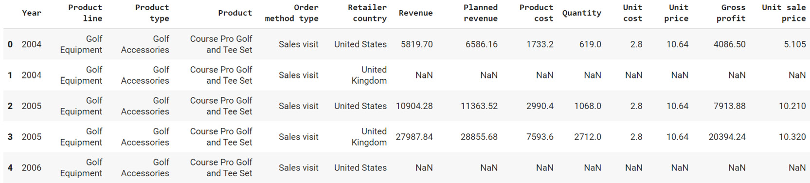
Figure 2.8: The first five rows of sales.csv
- Examine the columns of the DataFrame using the following code:
sales.columns
This produces the following output:
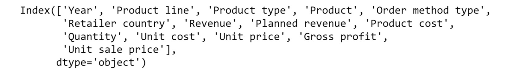
Figure 2.9: The columns in sales.csv
- Use the info function to print the datatypes of columns of sales DataFrame using the following code:
sales.info()
This should give you the following output:
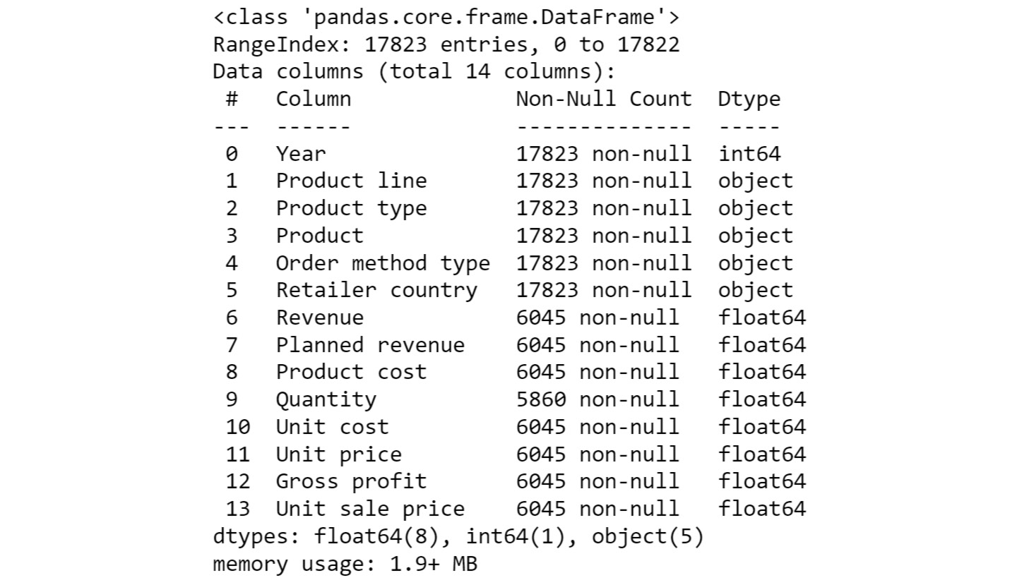
Figure 2.10: Information about the sales DataFrame
From the preceding output, you can see that Year is of int data type and columns such as Product line, Product type, etc. are of the object types.
- To check the time frame of the data, use the unique function on the Year column:
sales['Year'].unique()
You will get the following output:

Figure 2.11: The number of years the data is spread over
You can see that we have the data for the years 2004 – 2007.
- Use the unique function again to find out the types of products that the company is selling:
sales['Product line'].unique()
You should get the following output:

Figure 2.12: The different product lines the data covers
You can see that company is selling four different types of products.
- Now, check the Product type column:
sales['Product type'].unique()
You will get the following output:

Figure 2.13: The different types of products the data covers
From the above output, you can see that you have six different product types namely Golf Accessories, Sleeping Bags, Cooking Gear, First Aid, Insect Repellents, and Climbing Accessories.
- Check the Product column to find the unique categories present in it:
sales['Product'].unique()
You will get the following output:

Figure 2.14: Different products covered in the dataset
The above output shows the different products that are sold.
- Now, check the Order method type column to find out the ways through which the customer can place an order:
sales['Order method type'].unique()
You will get the following output:

Figure 2.15: Different ways in which people making purchases have ordered
As you can see from the preceding figure, there are seven different order methods through which a customer can place an order.
- Use the same function again on the Retailer country column to find out the countries where the client has a presence:
sales['Retailer country'].unique()
You will get the following output:

Figure 2.16: The countries in which products have been sold
The preceding output shows the geographical presence of the company.
- Now that you have analyzed the categorical values, get a quick summary of the numerical fields using the describe function:
sales.describe()
This gives the following output:
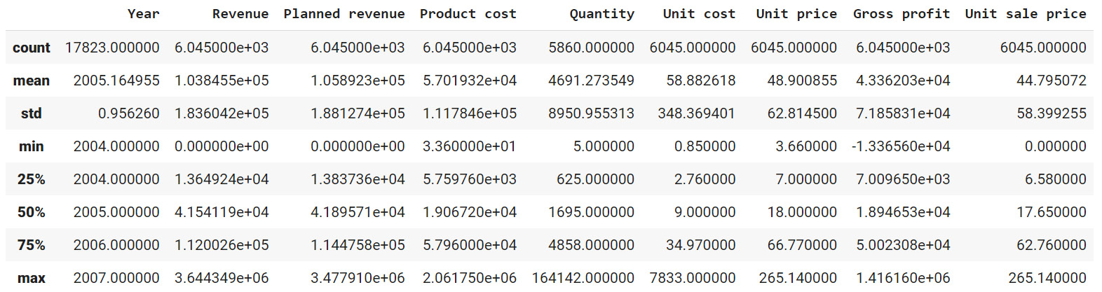
Figure 2.17: Description of the numerical columns in sales.csv
You can observe that the mean revenue the company is earning is around $103,846. The describe function is used to give us an overall idea about the range of the data present in the DataFrame.
- Analyze the spread of the categorical columns in the data using the value_counts() function. This would shed light on how the data is distributed. Start with the Year column:
sales['Year'].value_counts()
This gives the following output:

Figure 2.18: Frequency table of the Year column
From the above result, you can see that you have around 5451 records in the years 2004, 2005, and 2006 and the number of records in the year 2007 is 1470.
- Use the same function on the Product line column:
sales['Product line'].value_counts()
This gives the following output:

Figure 2.19: Frequency table of the Product line column
As you can see from the preceding output, Camping Equipment has the highest number of observations in the dataset followed by Outdoor Protection.
- Now, check for the Product type column:
sales['Product type'].value_counts()
This gives the following output:

Figure 2.20: Frequency table of the Product line column
Cooking gear followed by climbing accessories has the highest number of observations in the dataset which means that these product types are quite popular among the customers.
- Now, find out the most popular order method using the following code:
sales['Order method type'].value_counts()
This gives the following output:

Figure 2.21: Frequency table of the Product line column
Almost all the order methods are equally represented in the dataset which means customers have an equal probability of ordering through any of these methods.
- Finally, check for the Retailer country column along with their respective counts:
sales['Retailer country'].value_counts()
You should get the following output:
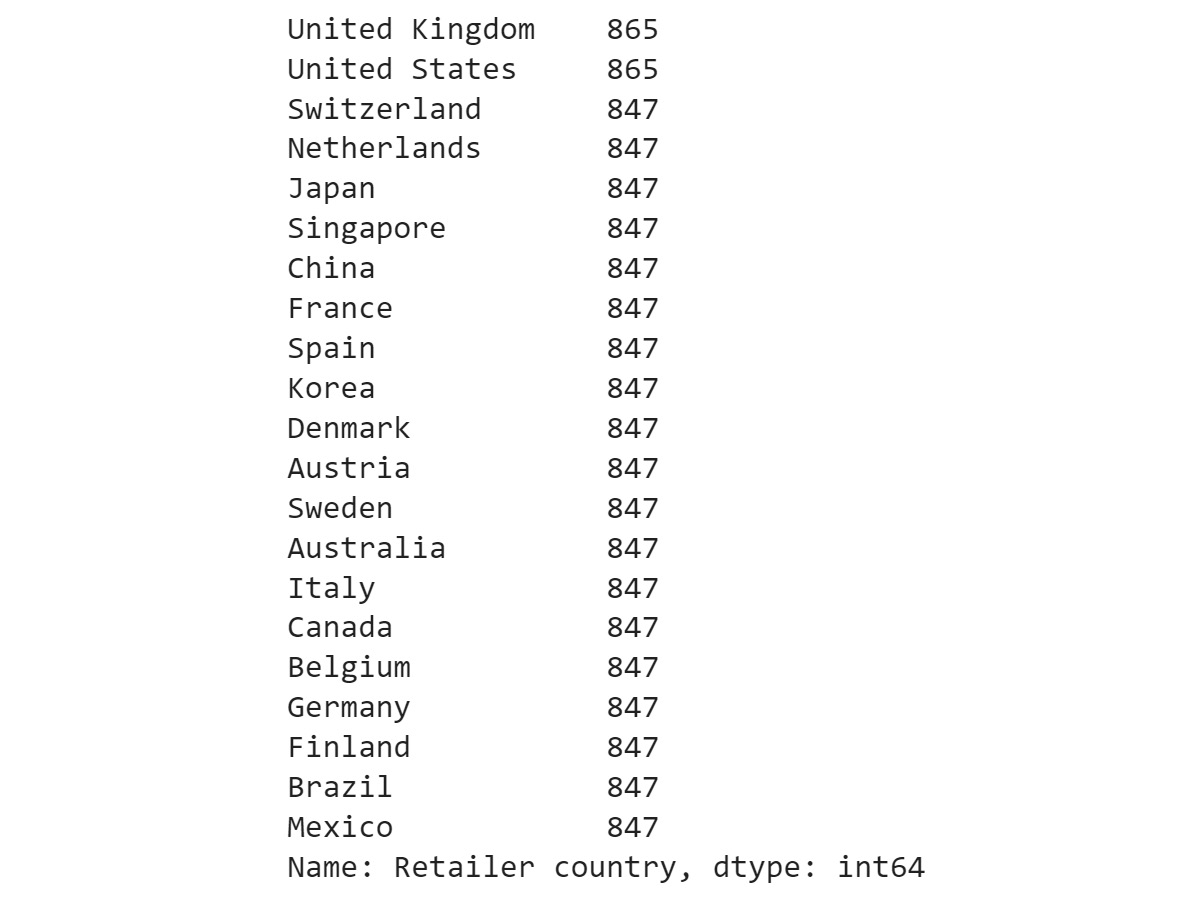
Figure 2.22: Frequency table of the Product line column
The preceding result shows that data points are evenly distributed among all the countries showing no bias.
- Get insights into country-wide statistics now. Group attributes such as Revenue, Planned revenue, Product cost, Quantity, and Gross profit by their countries, and sum their corresponding values. Use the following code:
sales.groupby('Retailer country')[['Revenue',\
'Planned revenue',\
'Product cost',\
'Quantity',\
'Gross profit']].sum()
You should get the following output:
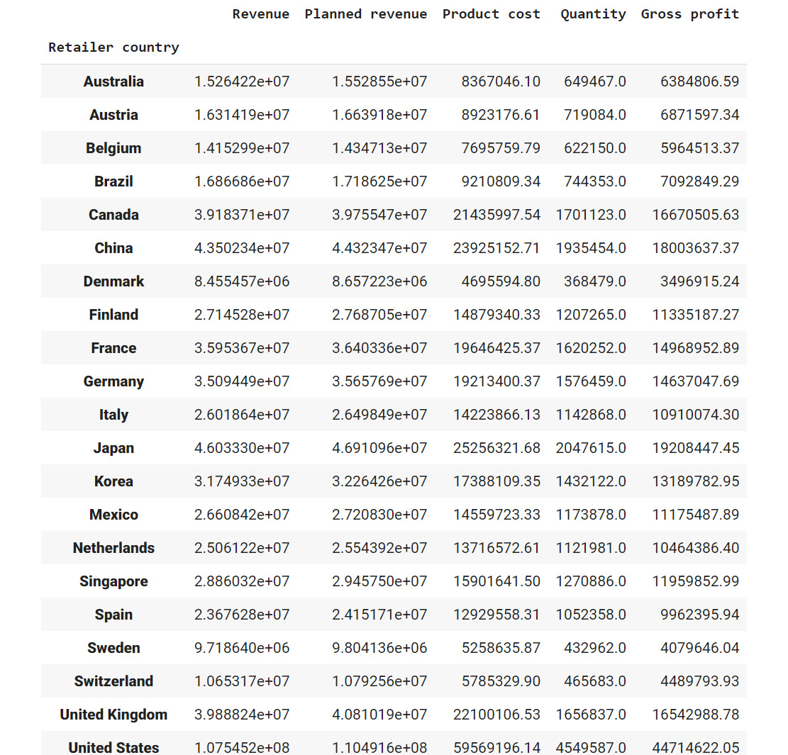
Figure 2.23: Total revenue, cost, quantities sold, and profit in each country in the past four years
From the preceding figure, you can infer that Denmark had the least revenue and the US had the highest revenue in the past four years. Most countries generated revenue of around 20,000,000 USD and almost reached their revenue targets.
- Now find out the country whose product performance was affected the worst when sales dipped. Use the following code to group data by Retailer country:
sales.dropna().groupby('Retailer country')\
[['Revenue',\
'Planned revenue',\
'Product cost',\
'Quantity',\
'Unit cost',\
'Unit price',\
'Gross profit',\
'Unit sale price']].min()
You should get the following output:
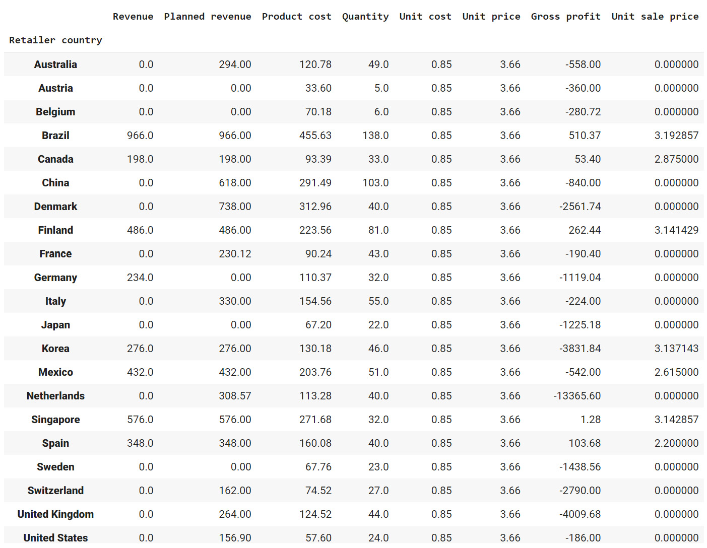
Figure 2.24: The lowest price, quantity, cost prices, and so on for each country
Since most of the values in the gross profit column are negative, you can infer that almost every product has at some point made a loss in the target markets. Brazil, Spain, Finland, and Canada are some exceptions.
- Similarly, generate statistics for other categorical variables, such as Year, Product line, Product type, and Product. Use the following code for the Year variable:
sales.groupby('Year')[['Revenue',\
'Planned revenue',\
'Product cost',\
'Quantity',\
'Unit cost',\
'Unit price',\
'Gross profit',\
'Unit sale price']].sum()
This gives the following output:
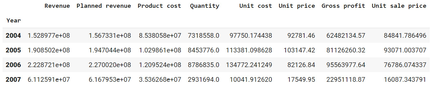
Figure 2.25: Total revenue, cost, quantities, and so on sold every year
From the above figure, it appears that revenue, profits, and quantities have dipped in the year 2007.
- Use the following code for the Product line variable:
sales.groupby('Product line')[['Revenue',\
'Planned revenue',\
'Product cost',\
'Quantity',\
'Unit cost',\
'Unit price',\
'Gross profit',\
'Unit sale price']].sum()
You should get the following output:
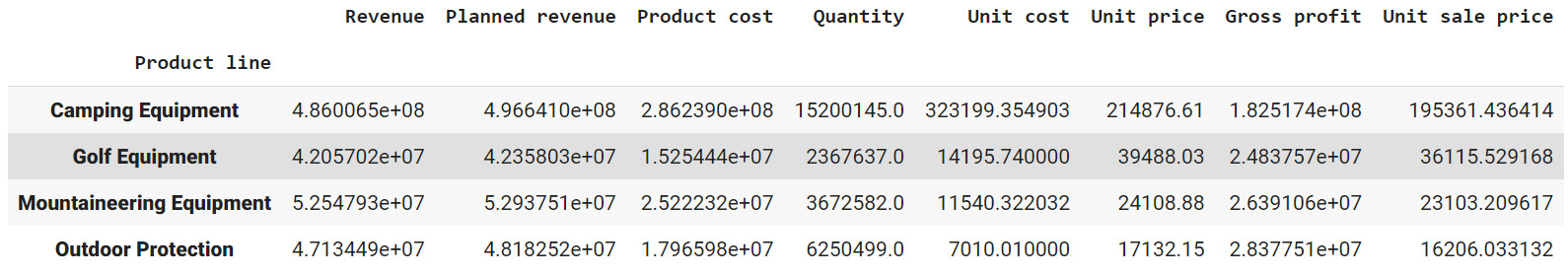
Figure 2.26: Total revenue, cost, quantities, and so on, generated by each product division
The preceding figure indicates that the sale of Camping Equipment contributes the highest to the overall revenue of the company.
- Now, find out which order method contributes to the maximum revenue:
sales.groupby('Order method type')[['Revenue',\
'Planned revenue',\
'Product cost',\
'Quantity',\
'Gross profit']].sum()
You should get the following output:
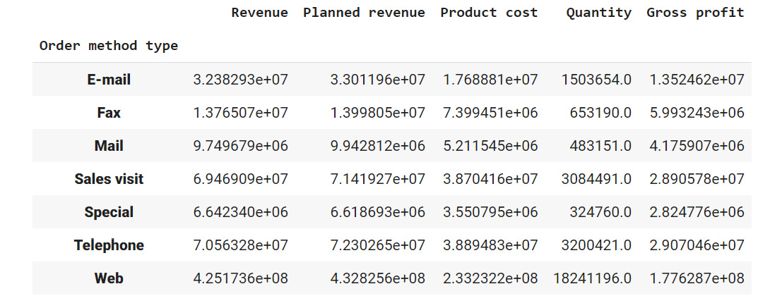
Figure 2.27: Average revenue, cost, quantities, and so on generated by each method of ordering
Observe that the highest sales were generated through the internet (more than all the other sources combined).
Now that you've generated the insights, it's time to select the most useful ones, summarize them, and present them to the business as follows:
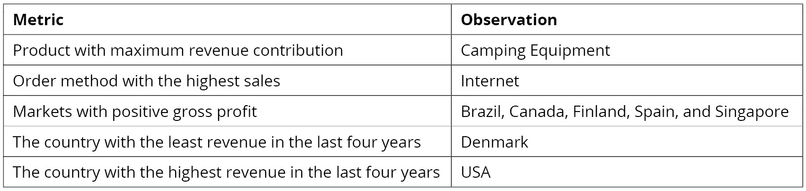
Figure 2.28: Summary of the derived insights
In this exercise, you have successfully explored the attributes in a dataset. In the next section, you will learn how to generate targeted insights from the prepared data.
Note
You'll be working with the sales.csv data in the upcoming section as well. It's recommended that you keep the Jupyter Notebook open and continue there.
Fine Tuning Generated Insights
Now that you've generated a few insights, it's important to fine-tune your results to cater to the business. This can involve small changes like renaming columns or relatively big ones like turning a set of rows into columns. pandas provides ample tools that help you fine-tune your data so that you can extract insights from it that are more comprehensible and valuable to the business. Let's examine a few of them in the section that follows.
Selecting and Renaming Attributes
At times, you might notice variances in certain attributes of your dataset. You may want to isolate those attributes so that you can examine them in greater detail. The following functions come in handy for performing such tasks:
- loc[label]: This method selects rows and columns by a label or by a boolean condition.
- loc[row_labels, cols]: This method selects rows present in row_labels and their values in the cols columns.
- iloc[location]: This method selects rows by integer location. It can be used to pass a list of row indices, slices, and so on.
In the sales DataFrame you can use the loc method to select, based on a certain condition, the values of Revenue, Quantity, and Gross Profit columns:
sales.loc[sales['Retailer country']=='United States', \
['Revenue', 'Quantity', 'Gross profit']].head()
This code selects values from the Revenue, Quantity, and Gross profit columns only if the Retailer country is the United States. The output of the first five rows should be:

Figure 2.29: Sub-selecting observations and attributes in pandas
Let's also learn about iloc. Even though you won't be using it predominantly in your analysis, it is good to know how it works. For example, in the sales DataFrame, you can select the first two rows (0,1) and the first 3 columns (0,1,2) using the iloc method as follows.
sales.iloc[[0,1],[0,1,2]]
This should give you the following output:

Figure 2.30: Sub-selecting observations using iloc
At times, you may find that the attributes of your interest might not have meaningful names, or, in some cases, they might be incorrectly named as well. For example, Profit may be named as P&L, making it harder to interpret. To address such issues, you can use the rename function in pandas to rename columns as well as the indexes.
The rename function takes a dictionary as an input, which contains the current column name as a key and the desired renamed attribute name as value. It also takes the axis as a parameter, which denotes whether the index or the column should be renamed.
The syntax of the function is as follows.
df.rename({'old column name':'new column name'},axis=1)
The preceding code will change the 'old column name' to 'new column name'. Here, axis=1 is used to rename across columns. The following code renames the Revenue column to Earnings:
sales=sales.rename({'Revenue':'Earnings'}, axis = 1)
sales.head()
Since we're using the parameter axis=1, we are renaming across columns. The resulting DataFrame will now be:
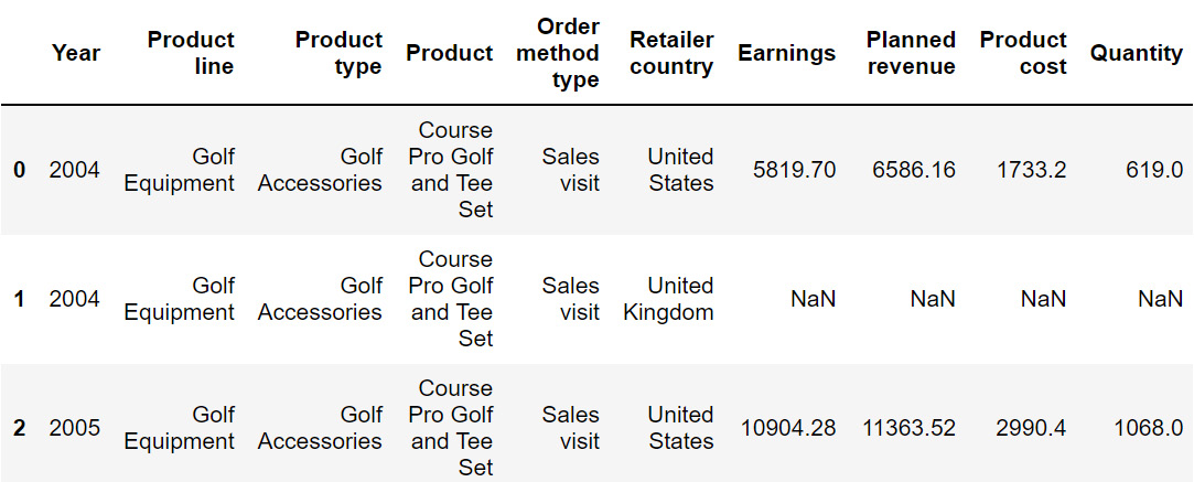
Figure 2.31: Output after using the rename function on sales
The preceding image does not show all the rows of the output.
From the preceding output, you can observe that the Revenue column is now represented as Earnings. In the next section, we will understand how to transform values numerical values into categorical ones and vice versa.
Up until this chapter, we've been using the sales.csv dataset and deriving insights from it. Now, in the upcoming section and exercise, we will be working on another dataset (we will revisit sales.csv in Exercise 2.03, Visualizing Data with pandas).
In the next section, we will be looking at how to reshape data as well as its implementation.
Reshaping the Data
Sometimes, changing how certain attributes and observations are arranged can help understand the data better, focus on the relevant parts, and extract more information.
Let's consider the data present in CTA_comparison.csv. The dataset consists of Click to Action data of various variants of ads for a mobile phone along with the corresponding views and sales. Click to Action (CTA) is a marketing terminology that prompts the user for some kind of response.
Note
You can find the CTA_comparison.csv file here: https://packt.link/RHxDI.
Let's store the data in a DataFrame named cta as follows:
cta = pd.read_csv('CTA_comparison.csv')
cta
Note
Make sure you change the path (highlighted) to the CSV file based on its location on your system. If you're running the Jupyter Notebook from the same directory where the CSV file is stored, you can run the preceding code without any modification.
You should get the following DataFrame:
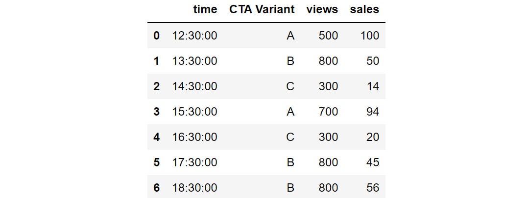
Figure 2.32: Snapshot of the data in CTA_comparison.csv
Notes
The outputs in Figure 2.32, Figure 2.33, and Figure 2.34 are truncated. These are for demonstration purposes only.
The DataFrame consists of CTA data for various variants of the ad along with the corresponding timestamps.
But, since we need to analyze the variants in detail, the CTA Variant column should be the index of the DataFrame and not time. For that, we'll need to reshape the data frame so that CTA Variant becomes the index. This can be done in pandas using the set_index function.
You can set the index of the cta DataFrame to CTA Variant using the following code:
cta.set_index('CTA Variant')
The DataFrame will now appear as follows:
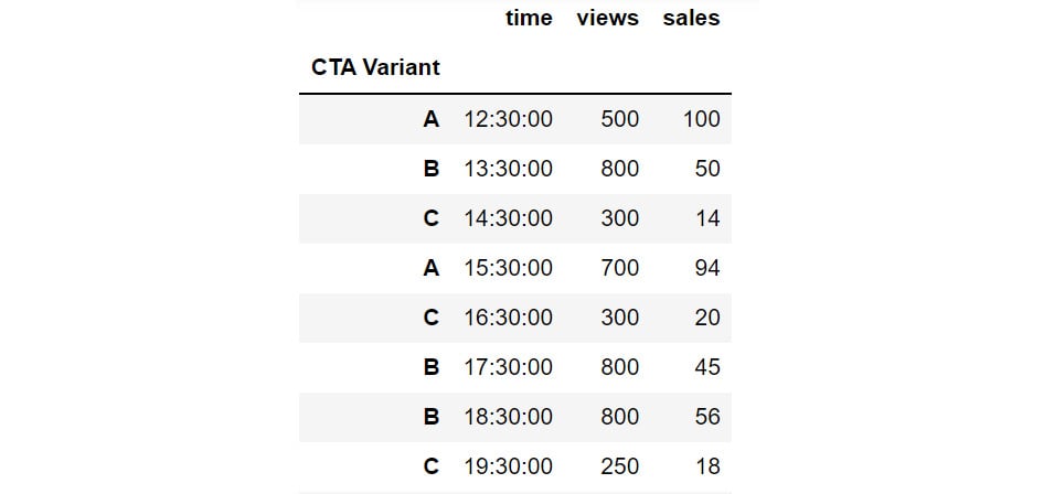
Figure 2.33: Changing the index with the help of set_index
You can also reshape data by creating multiple indexes. This can be done by passing multiple columns to the set_index function. For instance, you can set the CTA Variant and views as the indexes of the DataFrame as follows:
cta.set_index(['CTA Variant', 'views'])
The DataFrame will now appear as follows:
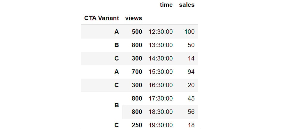
Figure 2.34: Hierarchical Data in pandas through set_index
In the preceding figure, you can see that CTA Variant and views are set as indexes. The same hierarchy can also be created, by passing multiple columns to the groupby function:
cta_views = cta.groupby(['CTA Variant', 'views']).count()
cta_views
This gives the following output:

Figure 2.35: Grouping by multiple columns to generate hierarchies
Using this hierarchy, you can see that CTA Variant B with 800 views is present thrice in the data.
Sometimes, switching the indices from rows to columns and vice versa can reveal greater insights into the data. This reshape transformation is achieved in pandas by using the unstack and stack functions:
- unstack(level): This function moves the row index with the name or integral location level to the innermost column index. By default, it moves the innermost row:
h1 = cta_views.unstack(level = 'CTA Variant')
h1
This gives the following output:
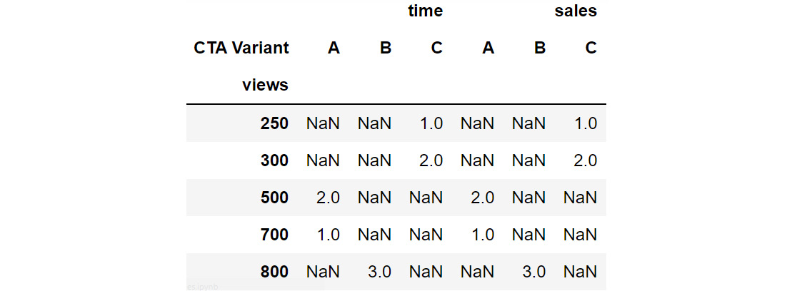
Figure 2.36: Example of unstacking DataFrames
You can see that the row index has changed to only views while the column has got the additional CTA Variant attribute as an index along with the existing time and sales columns.
- stack(level): This function moves the column index with the name or integral location level to the innermost row index. By default, it moves the innermost column:
h1.stack(0)
This gives the following output:
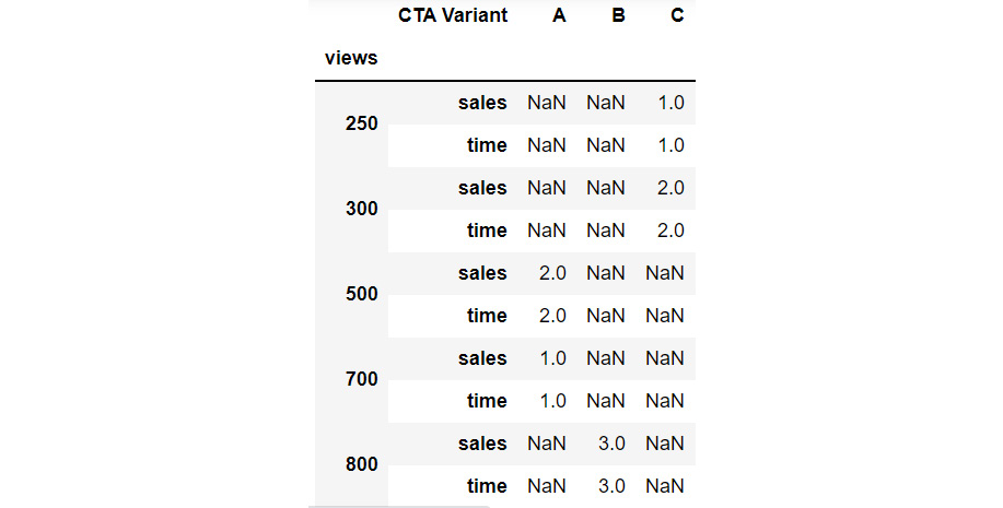
Figure 2.37: Example of stacking a DataFrame
Now the stack function has taken the other sales and time column values to the row index and only the CTA Variant feature has become the column index.
In the next exercise, you will implement stacking and unstacking with the help of a dataset.
Exercise 2.02: Calculating Conversion Ratios for Website Ads.
You are the owner of a website that randomly shows advertisements A or B to users each time a page is loaded. The performance of these advertisements is captured in a simple file called conversion_rates.csv. The file contains two columns: converted and group. If an advertisement succeeds in getting a user to click on it, the converted field gets the value 1, otherwise, it gets 0 by default; the group field denotes which ad was clicked – A or B.
As you can see, comparing the performance of these two ads is not that easy when the data is stored in this format. Use the skills you've learned so far, store this data in a data frame and modify it to show, in one table, information about:
- The number of views ads in each group got.
- The number of ads converted in each group.
- The conversion ratio for each group.
Note
You can find the conversion_rates.csv file here: https://packt.link/JyEic.
- Open a new Jupyter Notebook to implement this exercise. Save the file as Exercise2-02.ipnyb. Import the pandas library using the import command, as follows:
import pandas as pd
- Create a new pandas DataFrame named data and read the conversion_rates.csv file into it. Examine if your data is properly loaded by checking the first few values in the DataFrame by using the head() command:
data = pd.read_csv('conversion_rates.csv')
data.head()
Note
Make sure you change the path (highlighted) to the CSV file based on its location on your system. If you're running the Jupyter Notebook from the same directory where the CSV file is stored, you can run the preceding code without any modification.
You should get the following output:

Figure 2.38: The first few rows of conversion_rates.csv
- Group the data by the group column and count the number of conversions. Store the result in a DataFrame named converted_df:
converted_df = data.groupby('group').sum()
converted_df
You will get the following output:

Figure 2.39: Count of converted displays
From the preceding output, you can see that group A has 90 people who have converted. This means that advertisement A is quite successful compared to B.
- We would like to find out how many people have viewed the advertisement. For that use the groupby function to group the data and the count() function to count the number of times each advertisement was displayed. Store the result in a DataFrame viewed_df. Also, make sure you change the column name from converted to viewed:
viewed_df = data.groupby('group').count()\
.rename({'converted':'viewed'}, \
axis = 'columns')
viewed_df
You will get the following output:

Figure 2.40: Count of number of views
You can see that around 1030 people viewed advertisement A and 970 people viewed advertisement B.
- Combine the converted_df and viewed_df datasets in a new DataFrame, named stats using the following commands:
stats = converted_df.merge(viewed_df, on = 'group')
stats
This gives the following output:

Figure 2.41: Combined dataset
From the preceding figure, you can see that group A has 1030 people who viewed the advertisement, and 90 of them got converted.
- Create a new column called conversion_ratio that displays the ratio of converted ads to the number of views the ads received:
stats['conversion_ratio'] = stats['converted']\
/stats['viewed']
stats
This gives the following output:

Figure 2.42: Adding a column to stats
From the preceding figure, you can see that group A has a better conversion factor when compared with group B.
- Create a DataFrame df where group A's conversion ratio is accessed as df['A'] ['conversion_ratio']. Use the stack function for this operation:
df = stats.stack()
df
This gives the following output:
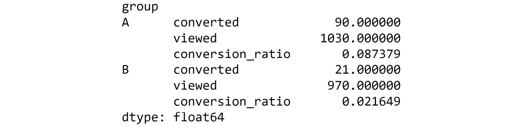
Figure 2.43: Understanding the different levels of your dataset
From the preceding figure, you can see the group-wise details which are easier to understand.
- Check the conversion ratio of group A using the following code:
df['A']['conversion_ratio']
You should get a value of 0.08738.
- To bring back the data to its original form we can reverse the rows with the columns in the stats DataFrame with the unstack() function twice:
stats.unstack().unstack()
This gives the following output:

Figure 2.44: Reversing rows with columns
This is exactly the information we needed in the goal of the exercise, stored in a neat, tabulated format. It is clear by now that ad A is performing much better than ad B given its better conversion ratio.
In this exercise, you have reshaped the data in a readable format. pandas also provides a simpler way to reshape the data that allows making comparisons while analyzing data very easy. Let's have a look at it in the next section.
Pivot Tables
A pivot table can be used to summarize, sort, or group data stored in a table. You've already seen an example of the pivot table functionality in excel; this one's similar to that. With a pivot table, you can transform rows to columns and columns to rows. The pivot function is used to create a pivot table. It creates a new table, whose row and column indices are the unique values of the respective parameters.
For example, consider the data DataFrame you saw in Step 2 of the preceding exercise:

Figure 2.45: The first few rows of the dataset being considered
You can use the pivot function to change the columns to rows as follows:
data=data.pivot(columns = 'group', values='converted')
data.head()
This gives the following output:

Figure 2.46: Data after being passed through the pivot command
In the preceding figure, note that the columns and indices have changed but the observations individually have not. You can see that the data that had either a 0 or 1 value remains as it is, but the groups that were not considered have their remaining values filled in as NaN.
There is also a function called pivot_table, which aggregates fields together using the function specified in the aggfunc parameter and creates outputs accordingly. It is an alternative to aggregations such as groupby functions. For instance, if we apply the pivot_table function to the same DataFrame to aggregate the data:
data.pivot_table(index='group', columns='converted', aggfunc=len)
This gives the following output:

Figure 2.47: Applying pivot_table to data
Note that the use of the len argument results in columns 0 and 1 that show how many times each of these values appeared in each group. Remember that, unlike pivot, it is essential to pass the aggfunc function when using the pivot_table function.
In the next section, you will be learning how to understand your data even better by visually representing it.
Visualizing Data
There are a lot of benefits to presenting data visually. Visualized data is easy to understand, and it can help reveal hidden trends and patterns in data that might not be so conspicuous compared to when the data is presented in numeric format. Furthermore, it is much quicker to interpret visual data. That is why you'll notice that many businesses rely on dashboards comprising multiple charts. In this section, you will learn the functions that will help you visualize numeric data by generating engaging plots. Once again, pandas comes to our rescue with its built-in plot function. This function has a parameter called kind that lets you choose between different types of plots. Let us look at some common types of plots you'll be able to create.
Density plots:
A density plot helps us to find the distribution of a variable. In a density plot, the peaks display where the values are concentrated.
Here's a sample density plot drawn for the Product cost column in a sales DataFrame:
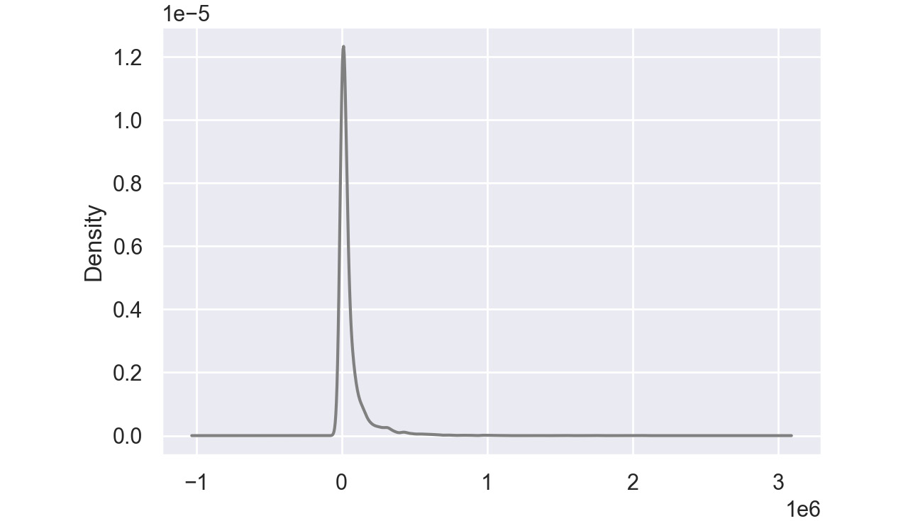
Figure 2.48: Sample density plot
In this plot, the Product cost is distributed with a peak very close to 0. In pandas, you can create density plots using the following command:
df['Column'].plot(kind = 'kde',color='gray')
Note
The value gray for the attribute color is used to generate graphs in grayscale. You can use other colors like darkgreen, maroon, etc. as values of color parameters to get the colored graphs.
Bar Charts:
Bar charts are used with categorical variables to find their distribution. Here is a sample bar chart:
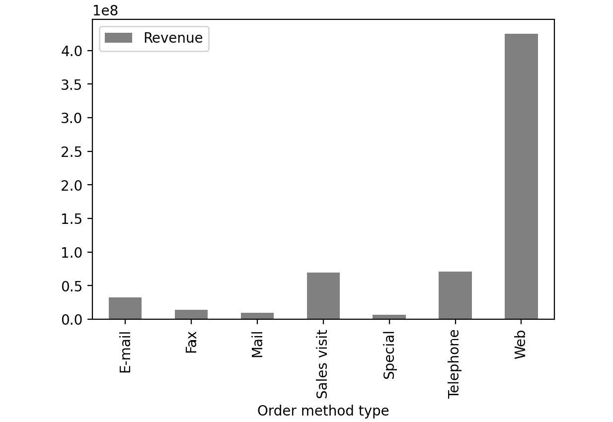
Figure 2.49: Sample bar chart
In this plot, you can see the distribution of revenue of the product via different order methods. In pandas, you can create bar plots by passing bar as value to the kind parameter.
df['Column'].plot(kind = 'bar', color='gray')
Box Plot:
A box plot is used to depict the distribution of numerical data and is primarily used for comparisons. Here is a sample box plot:
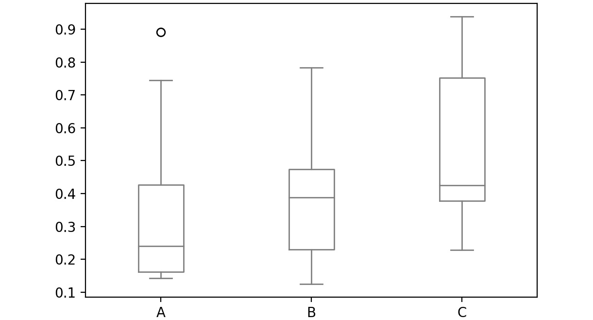
Figure 2.50: Sample box plot
The line inside the box represents the median values for each numerical variable. In pandas, you can create a box plot by passing box as a value to the kind parameter:
df['Column'].plot(kind = 'box', color='gray')
Scatter Plot:
Scatter plots are used to represent the values of two numerical variables. Scatter plots help you to determine the relationship between the variables.
Here is a sample scatter plot:
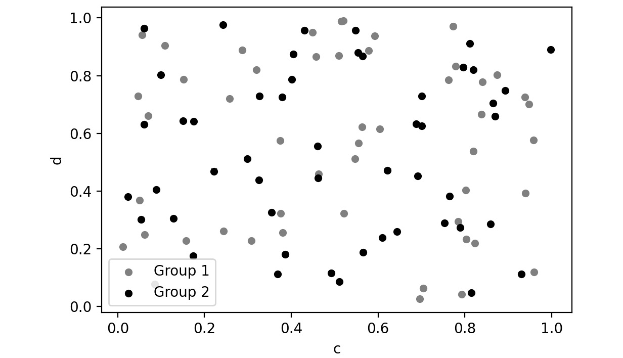
Figure 2.51: Sample scatter plot
In this plot, you can observe the relationship between the two variables. In pandas, you can create scatter plots by passing scatter as a value to the kind parameter.
df['Column'].plot(kind = 'scatter', color='gray')
Let's implement these concepts in the exercise that follows.
Exercise 2.03: Visualizing Data With pandas
In this exercise, you'll be revisiting the sales.csv file you worked on in Exercise 2.01, Exploring the Attributes in Sales Data. This time, you'll need to visualize the sales data to answer the following two questions:
- Which mode of order generates the most revenue?
- How have the following parameters varied over four years: Revenue, Planned revenue, and Gross profit?
Note
You can find the sales.csv file here: https://packt.link/dhAbB.
You will make use of bar plots and box plots to explore the distribution of the Revenue column.
- Open a new Jupyter Notebook to implement this exercise. Save the file as Exercise2-03.ipnyb.
- Import the pandas library using the import command as follows:
import pandas as pd
- Create a new panda DataFrame named sales and load the sales.csv file into it. Examine if your data is properly loaded by checking the first few values in the DataFrame by using the head() command:
sales = pd.read_csv("sales.csv")
sales.head()
Note
Make sure you change the path (highlighted) to the CSV file based on its location on your system. If you're running the Jupyter notebook from the same directory where the CSV file is stored, you can run the preceding code without any modification.
You will get the following output:
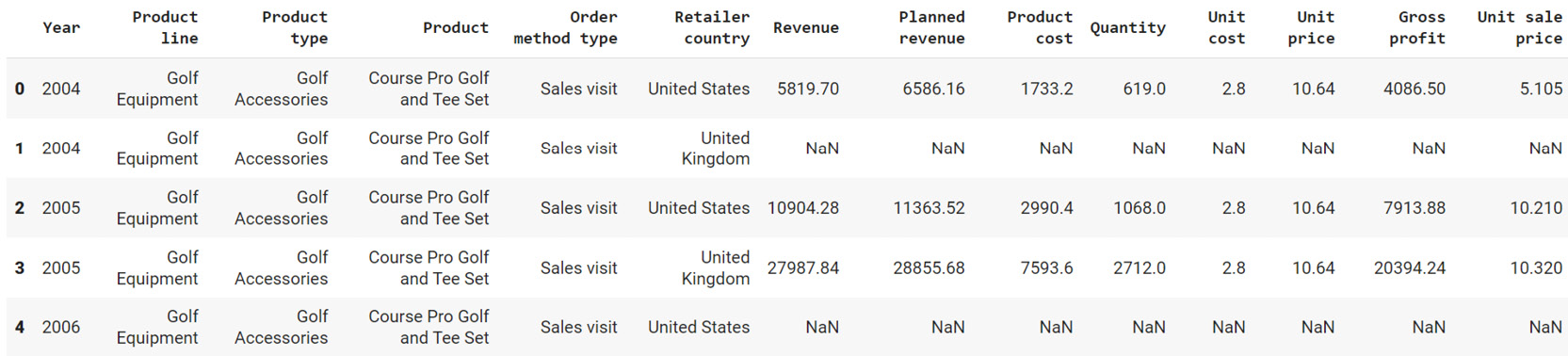
Figure 2.52: Output of sales.head()
- Group the Revenue by Order method type and create a bar plot:
sales.groupby('Order method type').sum()\
.plot(kind = 'bar', y = 'Revenue', color='gray')
This gives the following output:
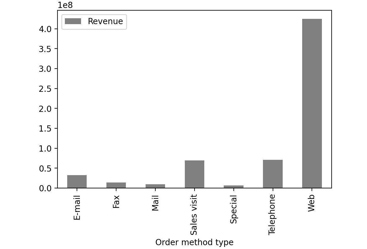
Figure 2.53: Revenue generated through each order method type in sales.csv
From the preceding image, you can infer that web orders generate the maximum revenue.
- Now group the columns by year and create boxplots to get an idea on a relative scale:
sales.groupby('Year')[['Revenue', 'Planned revenue', \
'Gross profit']].plot(kind= 'box',\
color='gray')
Note
In Steps 4 and 5, the value gray for the attribute color (emboldened) is used to generate graphs in grayscale. You can use other colors like darkgreen, maroon, etc. as values of color parameter to get the colored graphs. You can also refer to the following document to get the code for the colored plot and the colored output: https://packt.link/NOjgT.
You should get the following plots:
The first plot represents the year 2004, the second plot represents the year 2005, the third plot represents the year 2006 and the final one represents 2007.
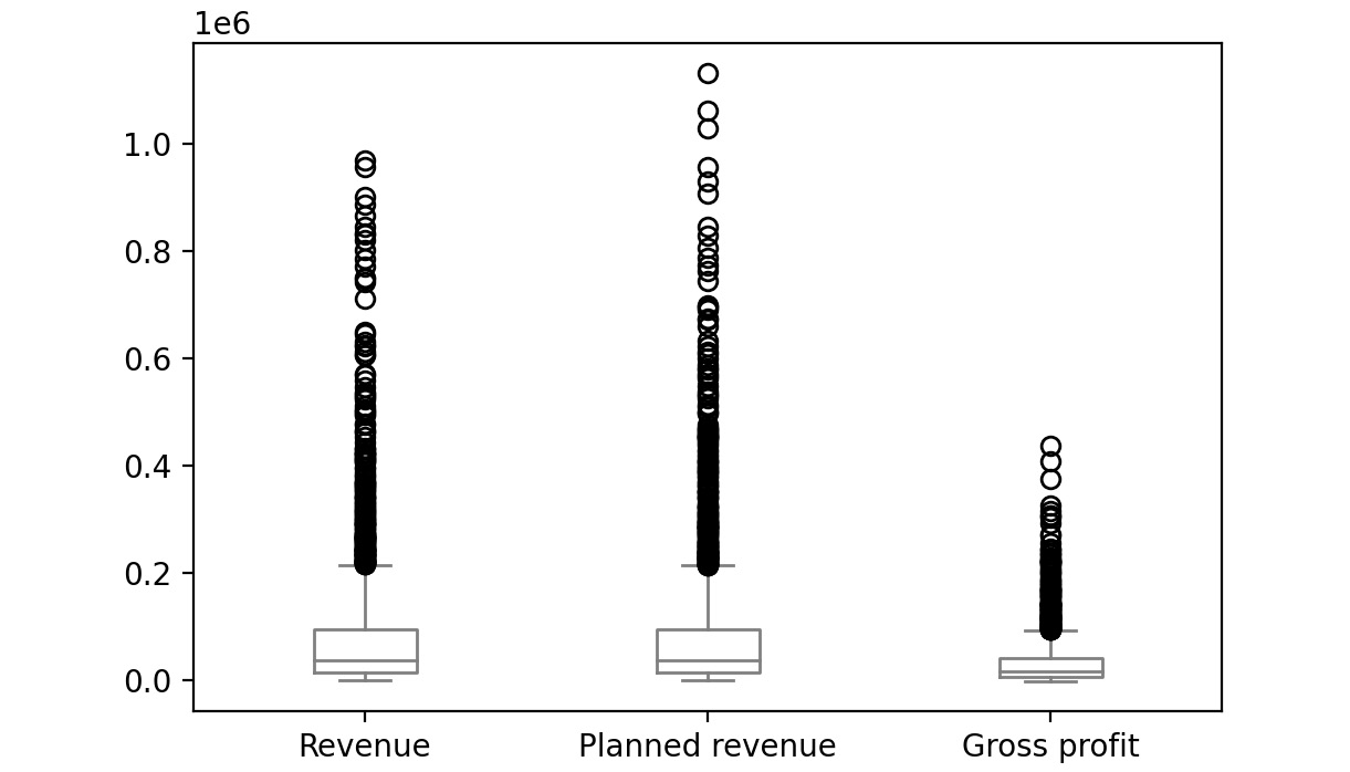
Figure 2.54: Boxplot for Revenue, Planned revenue and Gross profit for year 2004
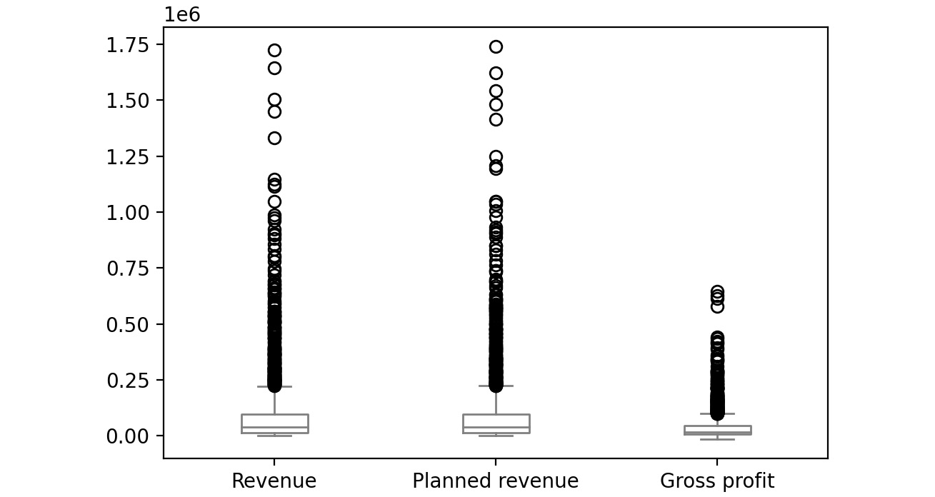
Figure 2.55: Boxplot for Revenue, Planned revenue and Gross profit for year 2005
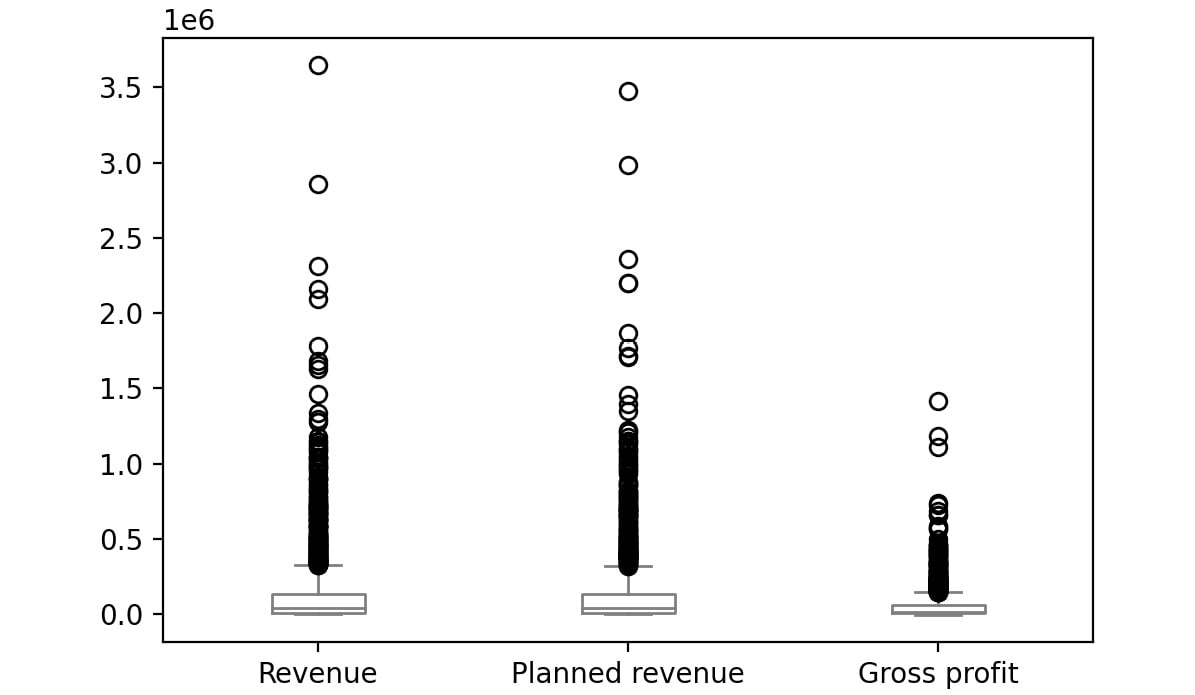
Figure 2.56: Boxplot for Revenue, Planned revenue and Gross profit for year 2006
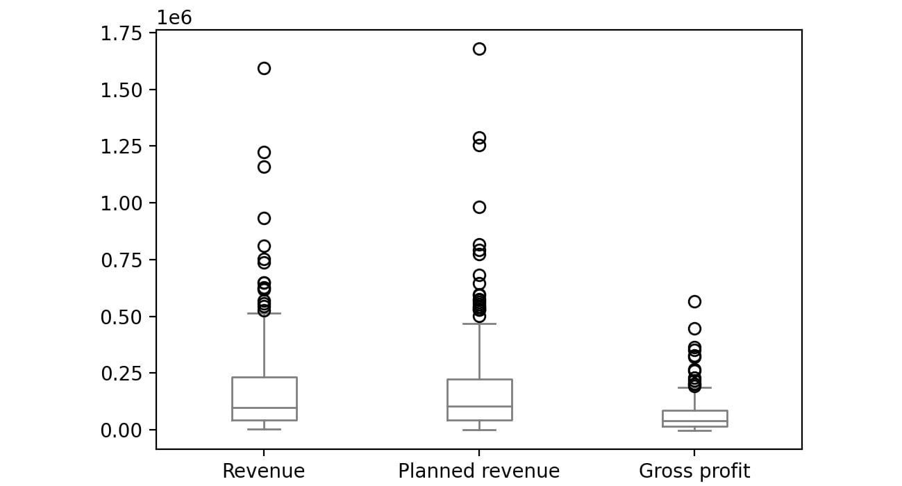
Figure 2.57: Boxplot for Revenue, Planned revenue and Gross profit for year 2007
The bubbles in the plots represent outliers. Outliers are extreme values in the data. They are caused either due to mistakes in measurement or due to the real behavior of the data. Outlier treatment depends entirely on the business use case. In some of the scenarios, outliers are dropped or are capped at a certain value based on the inputs from the business. It is not always advisable to drop the outliers as they can give us a lot of hidden information in the data.
From the above plots, we can infer that Revenue and Planned revenue have a higher median than Gross profit (the median is represented by the line inside the box).
Even though pandas provides you with the basic plots, it does not give you a lot of control over the look and feel of the visualizations.
Python has alternate packages such as seaborn which allow you to generate more fine-tuned and customized plots. Let's learn about this package in the next section.
Visualization through Seaborn
Even though pandas provides us with many of the most common plots required for analysis, Python also has a useful visualization library, seaborn. It provides a high-level API to easily generate top-quality plots with a lot of customization options.
You can change the environment from regular pandas/Matplotlib to seaborn directly through the set function of seaborn. Seaborn also supports a displot function, which plots the actual distribution of the pandas series passed to. To generate histograms through seaborn, you can use the following code:
import seaborn as sns
sns.set()
sns.displot(sales['Gross profit'].dropna(),color='gray')
The preceding code plots a histogram of the values of the Gross profit column. We have set the parameter dropna() which tells the plotting function to ignore null values if present in the data. The sns.set() function changes the environment from regular pandas/Matplotlib to seaborn.
The color attribute is used to provide colors to the graphs. In the preceding code, gray color is used to generate grayscale graphs. You can use other colors like darkgreen, maroon, etc. as values of color parameters to get the colored graphs.
This gives the following output:
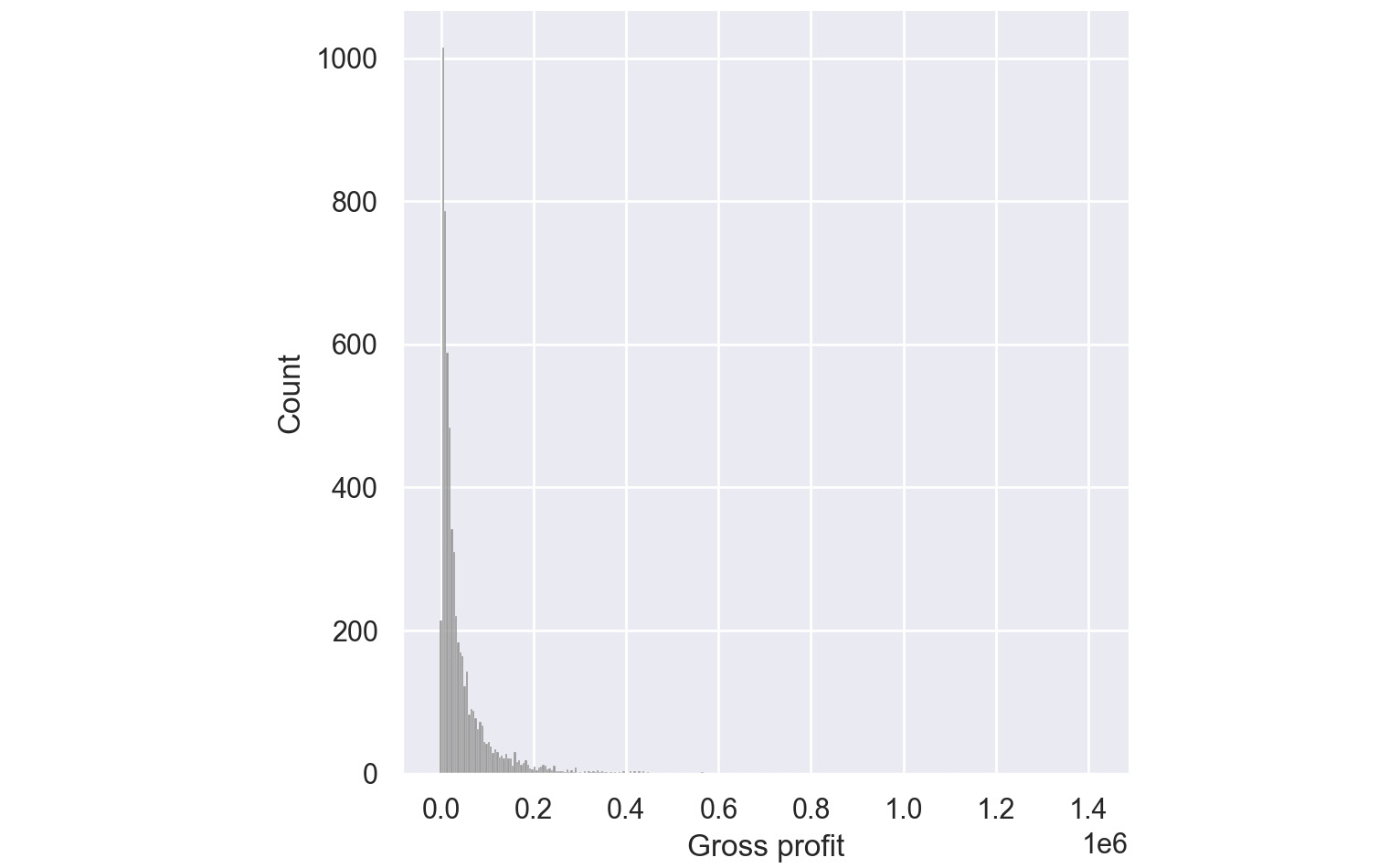
Figure 2.58: Histogram for Gross Profit through Seaborn
From the preceding plot, you can infer that most of the gross profit is around $1,000.
Pair Plots:
Pair plots are one of the most effective tools for exploratory data analysis. They can be considered as a collection of scatter plots between the variables present in the dataset. With a pair plot, one can easily study the distribution of a variable and its relationship with the other variables. These plots also reveal trends that may need further exploration.
For example, if your dataset has four variables, a pair plot would generate 16 charts that show the relationship of all the combinations of variables.
To generate a pair plot through seaborn, you can use the following code:
import seaborn as sns
sns.pairplot(dataframe, palette='gray')
The palette attribute is used to define the color of the pair plot. In the preceding code, gray color is used to generate grayscale graphs.
An example pair plot generated using seaborn would look like this:
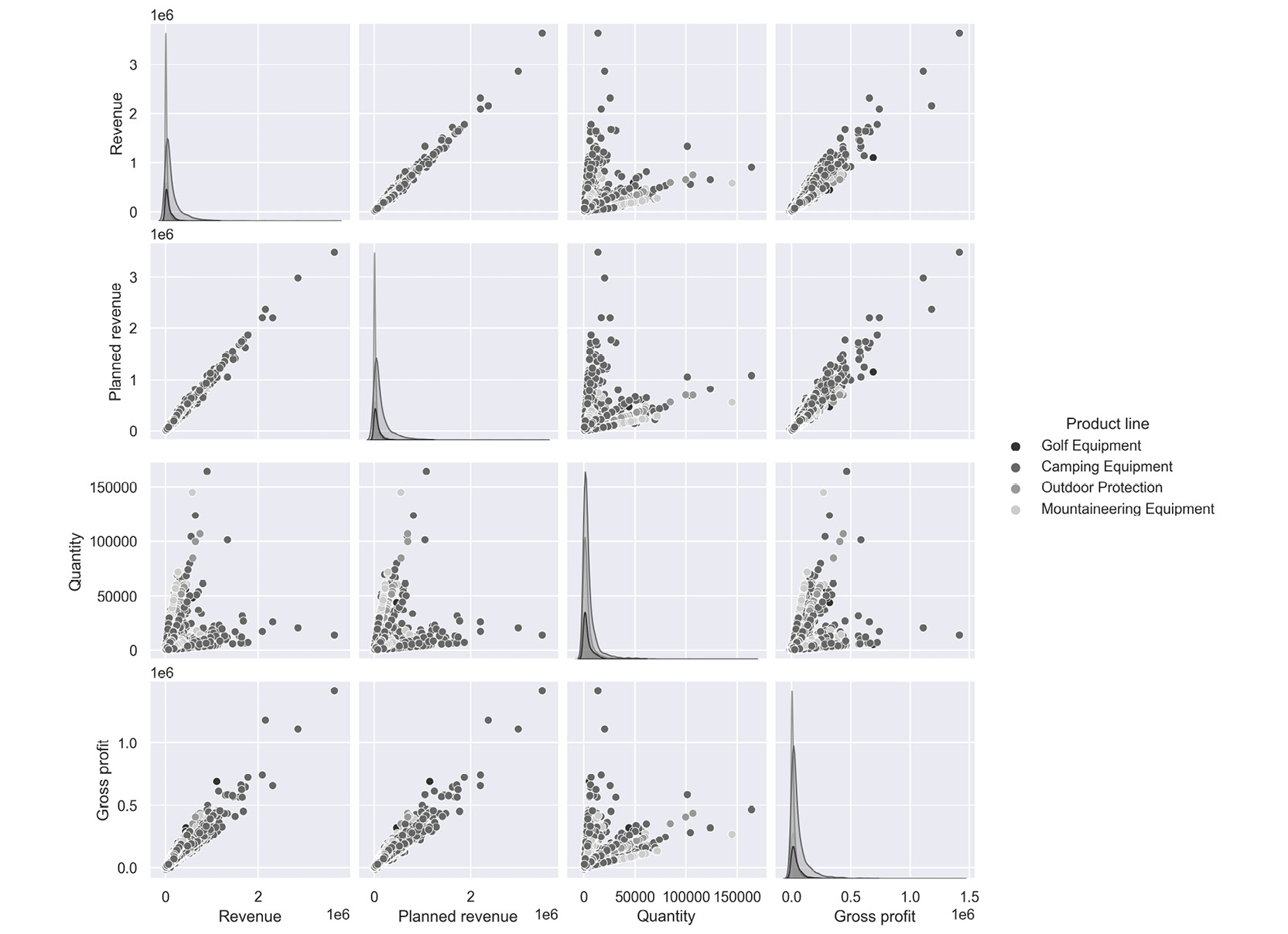
Figure 2.59: Sample pair plot
The following inferences can be made from the above plot.
- Revenue and Gross profit have a linear relationship; that is, when Revenue increases the Gross Profit increases
- Quantity and Revenue show no trend; that is, there is no relationship.
Note
You can refer to the following link for more details about the seaborn library: https://seaborn.pydata.org/tutorial.html.
In the next section, we will understand how to visualize insights using the matplotlib library.
Visualization with Matplotlib
Python's default visualization library is matplotlib. matplotlib was originally developed to bring visualization capabilities from the MATLAB academic tool into an open-source programming language, Python. matplotlib provides low-level additional features that can be added to plots made from any other visualization library like pandas or seaborn.
To start using matplotlib, you need to first import the matplotlib.pyplot object as plt. This plt object becomes the basis for generating figures in matplotlib.
import matplotlib.pyplot as plt
We can then run any functions on this object as follows:
plt.<function name>
Some of the functions that we can call on this plt object for these options are as follows:
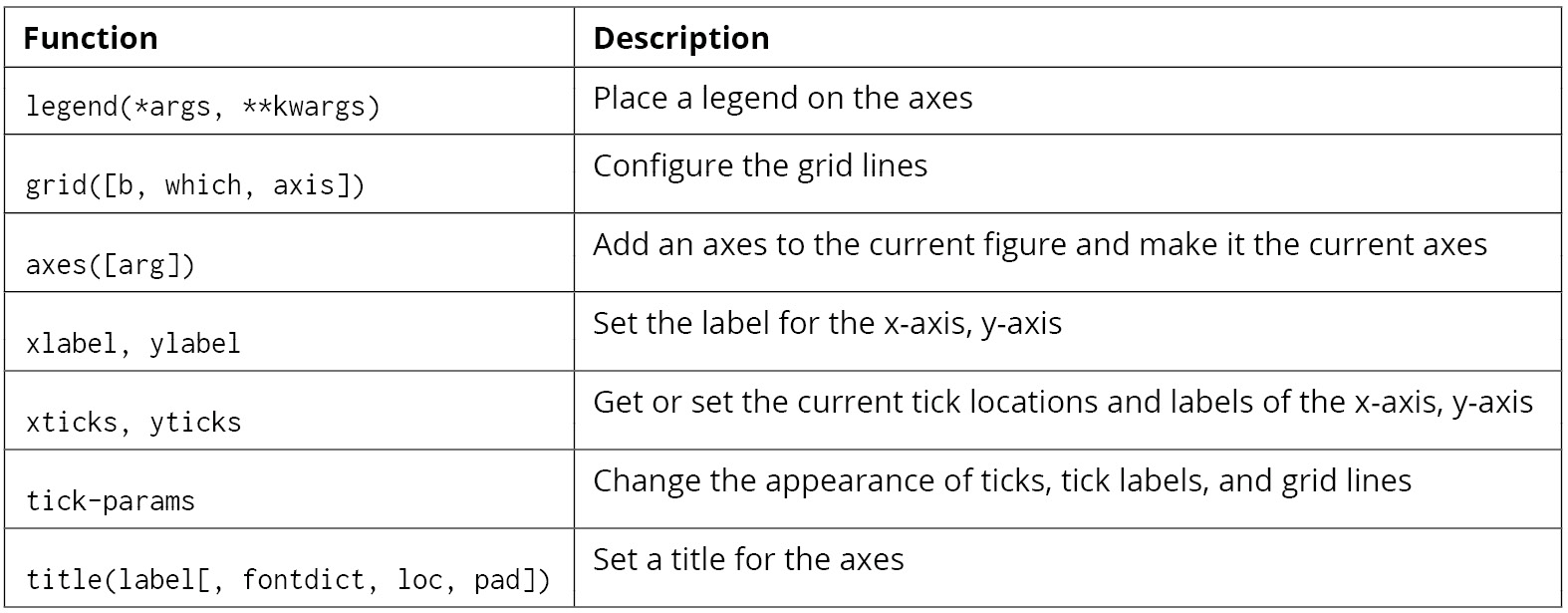
Figure 2.60: Functions that can be used on plt
For example, on the sales DataFrame, you can plot a bar graph between products and revenue using the following code.
# Importing the matplotlib library
import matplotlib.pyplot as plt
#Declaring the color of the plot as gray
plt.bar(sales['Product line'], sales['Revenue'], color='gray')
# Giving the title for the plot
plt.title("Products with their corresponding revenue")
# Naming the x and y axis
plt.xlabel('Products')
plt.ylabel('Revenue')
# Rotates X-Axis labels by 45-degrees
plt.xticks(rotation = 45)
# Displaying the bar plot
plt.show()
This gives the following output:
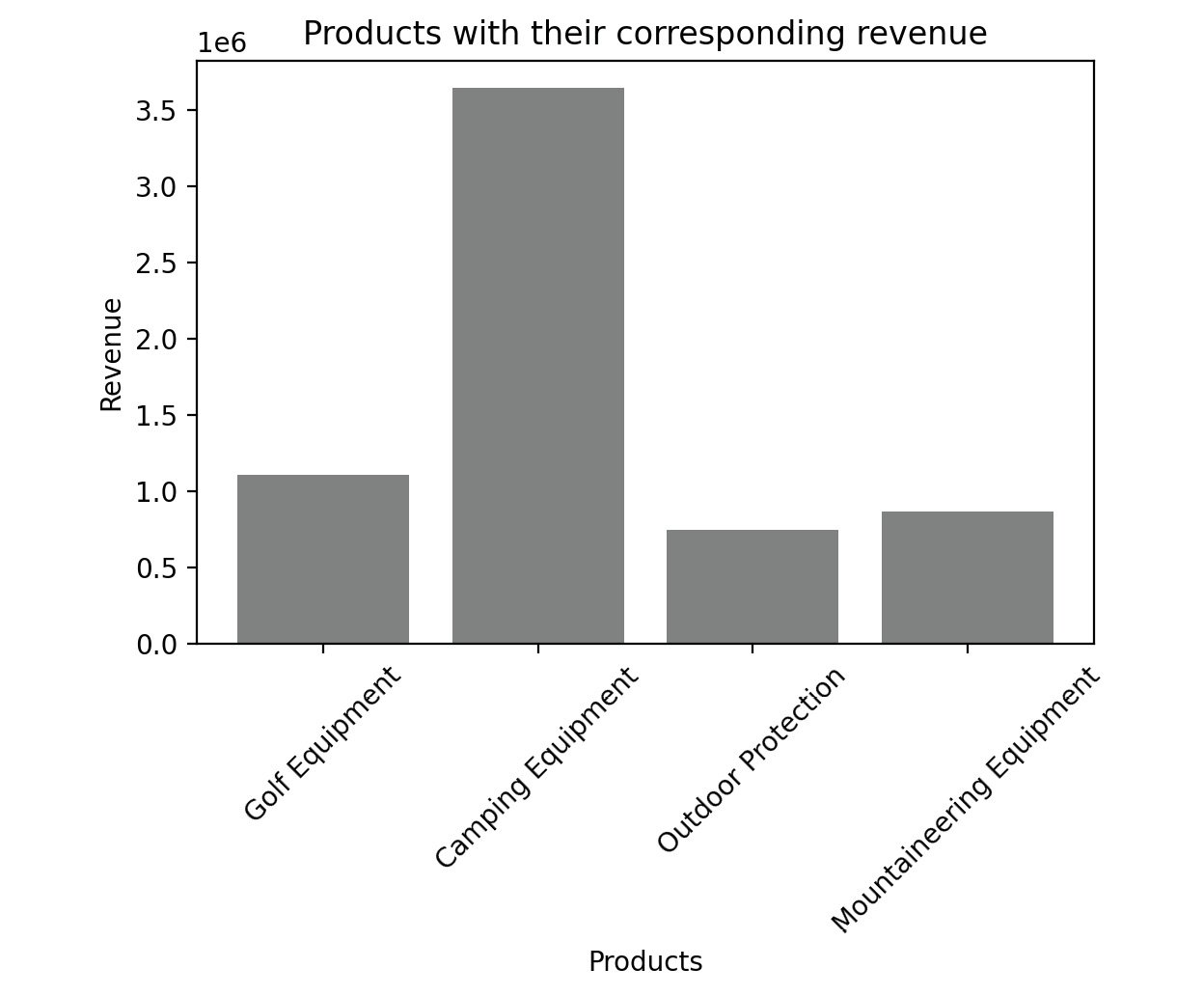
Figure 2.61: Sample bar graph
The color of the plot can be altered with the color parameter. We can use different colors such as blue, black, red, and cyan.
Note
Feel free to explore some of the things you can do directly with Matplotlib by reading up the official documentation at https://matplotlib.org/stable/api/_as_gen/matplotlib.pyplot.html.
For a complete course on data visualization in general, you can refer to the Data Visualization Workshop: https://www.packtpub.com/product/the-data-visualization-workshop/9781800568846.
Before we head to the activity, the following table shows some of the key plots along with their usage:
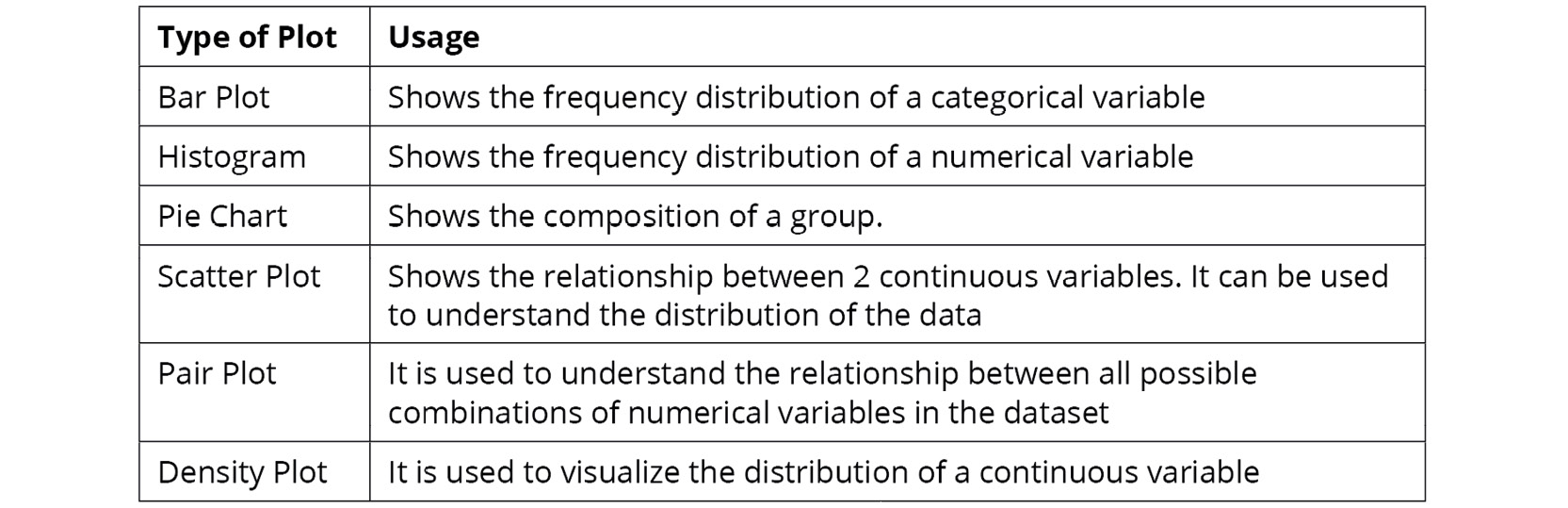
Figure 2.62: Key plots and their usage
With that, it's time to put everything you've learned so far to test in the activity that follows.
Activity 2.01: Analyzing Advertisements
Your company has collated data on the advertisement views through various mediums in a file called Advertising.csv. The advert campaign ran through radio, TV, web, and newspaper and you need to mine the data to answer the following questions:
- What are the unique values present in the Products column?
- How many data points belong to each category in the Products column?
- What are the total views across each category in the Products column?
- Which product has the highest viewership on TV?
- Which product has the lowest viewership on the web?
To do that, you will need to examine the dataset with the help of the functions you have learned, along with charts wherever needed.
Note
You can find the Advertising.csv file here: https://packt.link/q1c34.
Follow the following steps to achieve the aim of this activity:
- Open a new Jupyter Notebook and load pandas and the visualization libraries that you will need.
- Load the data into a pandas DataFrame named ads and look at the first few rows. Your DataFrame should look as follows:
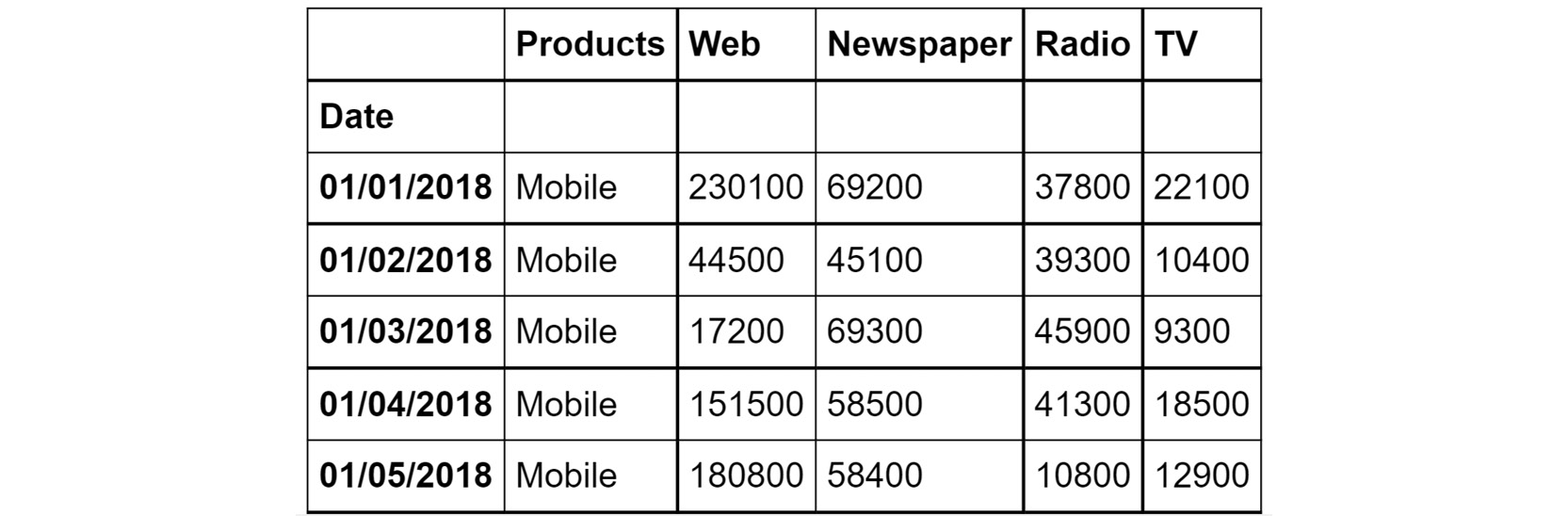
Figure 2.63: The first few rows of Advertising.csv
- Understand the distribution of numerical variables in the dataset using the describe function.
- Plot the relationship between the variables in the dataset with the help of pair plots. You can use the hue parameter as Products. The hue parameter determines which column can be used for color encoding. Using Products as a hue parameter will show the different products in various shades of gray.
You should get the below output:
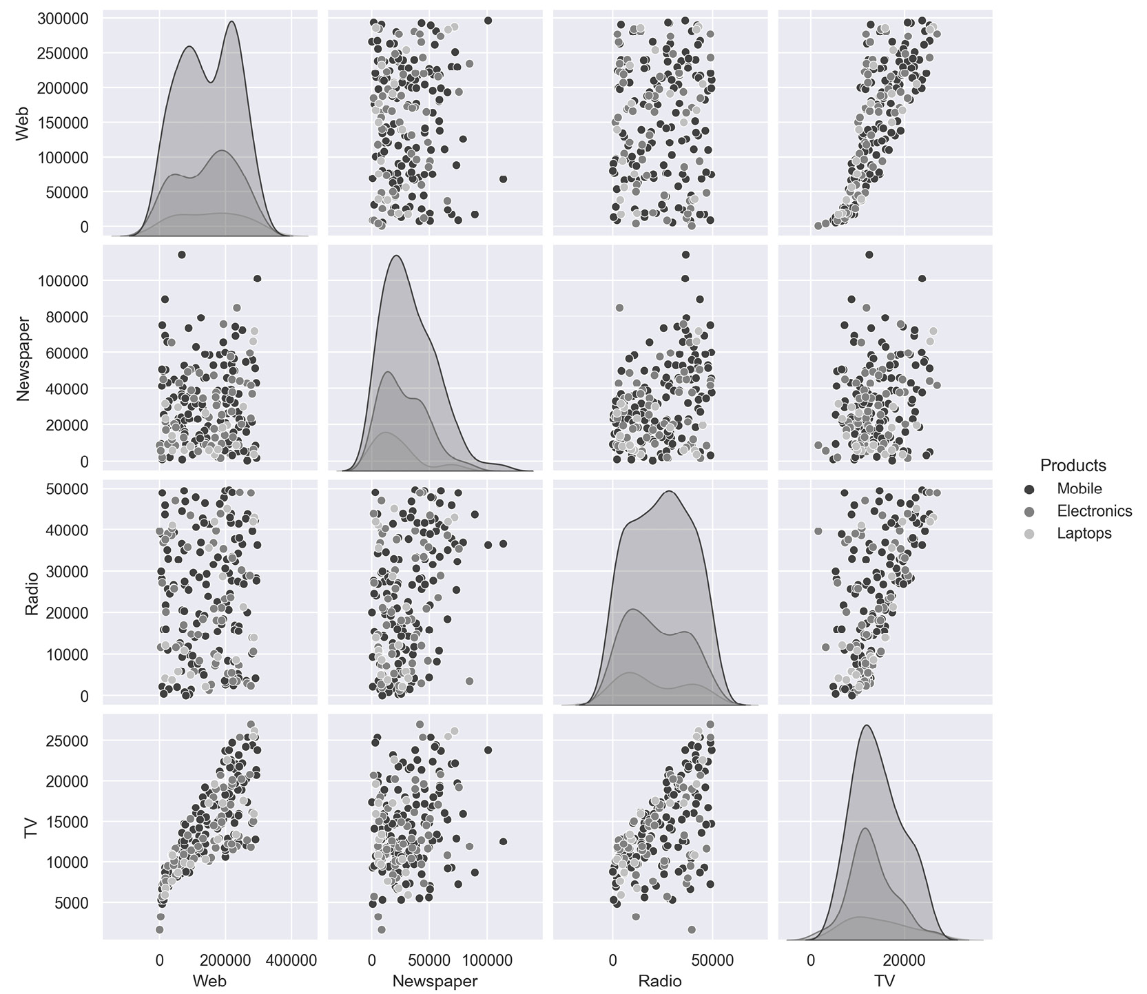
Figure 2.64: Expected output of Activity 2.01
Note
The solution to this activity can be found via this link.
Summary
In this chapter, you have looked at exploratory data analysis. You learned how to leverage pandas to help you focus on the attributes that are critical to your business goals. Later, you learned how to use the tools that helped you fine-tuned these insights to make them more comprehensible to your stakeholders. Toward the end of the chapter, you used visualization libraries like seaborn and matplotlib to visually present your insights. Effective data visualization will also help reveal hidden insights in your data. The skills you've learned so far should help you create a strong foundation for your journey toward mastering marketing analytics.
In the next chapter, you will build upon these skills by learning some of the practical applications of exploratory data analysis through examples you may encounter in practice as a marketing analyst.