


 Download code from GitHub
Chapter 2: Building Your First Blazor WebAssembly Application
Razor components are the building blocks of Blazor WebAssembly applications. A Razor component is a chunk of user interface that can be shared, nested, and reused. Razor components are ordinary C# classes and can be placed anywhere in a project.
In this chapter, we will learn about Razor components. We will learn how to use them, how to apply parameters, and about their life cycle and their structure. We will learn how to use the @page directive to define routing. We will also learn how to use Razor syntax to combine C# code with HTML markup.
The Blazor WebAssembly project in this chapter will be created by using the Blazor WebAssembly App project template provided by Microsoft. After we create the project, we will examine it to further familiarize ourselves with Razor components. We will learn how to use components, how to add parameters, how to apply routing, how to use Razor syntax, and how to separate the Razor markup and code into separate files. Finally, we will configure our own custom project template that creates an empty Blazor WebAssembly project.
In this chapter, we will cover the following topics:
- Razor components
- Routing
- Razor syntax
- Using the Blazor App project template
- Creating an empty Blazor WebAssembly project template
Technical requirements
To complete this project, you need to have Visual Studio 2019 installed on your PC. For instructions on how to install the free Community edition of Visual Studio 2019, refer to Chapter 1, Introduction to Blazor WebAssembly.
The source code for this chapter is available in the following GitHub repository: https://github.com/PacktPublishing/Blazor-WebAssembly-by-Example/tree/main/Chapter02.
The code in action video is available here: https://bit.ly/3bEZrrg.
Razor components
Blazor WebAssembly is a component-driven framework. Razor components are the fundamental building blocks of a Blazor WebAssembly application. They are classes that are implemented using a combination of C#, HTML, and Razor markup. When the web app loads, the classes get downloaded into the browser as normal .NET assemblies (DLLs).
Important note
In this book, the terms Razor component and component are used interchangeably.
Using components
HTML element syntax is used to add a component to another component. The markup looks like an HTML tag where the name of the tag is the component type.
The following markup in the Pages\Index.razor file of the Demo project that we will create in this chapter will render a SurveyPrompt instance:
<SurveyPrompt Title="How is Blazor working for you?" />
The preceding SurveyPrompt element includes an attribute parameter named Title.
Parameters
Component parameters are used to make components dynamic. Parameters are public properties of the component that are decorated with either the Parameter attribute or the CascadingParameter attribute. Parameters can be simple types, complex types, functions, RenderFragments, or event callbacks.
The following code for a component named HelloWorld includes a parameter named Text:
HelloWorld.razor
<h1>Hello @Text!</h1>
@code {
    [Parameter] public string Text { get; set; }
}
To use the HelloWorld component, include the following HTML syntax in another component:
<HelloWorld Text="World" />
In the preceding example, the Text attribute of the HelloWorld component is the source of the Text parameter. This screenshot shows the results of using the component as indicated:

Figure 2.1 – HelloWorld component
A component can also receive parameters from its route or a query string. You will learn more about the different types of parameters later in this chapter.
Naming components
The name of a Razor component must be in title case. Therefore, helloWorld would not be a valid name for a Razor component since the h is not capitalized. Also, Razor components use the RAZOR extension rather than the CSHTML extension that is used by Razor Pages.
Important note
Razor components must start with a capital letter.
Component life cycle
Razor components inherit from the ComponentBase class. The ComponentBase class includes both asynchronous and synchronous methods used to manage the life cycle of a component. In this book, we will be using the asynchronous versions of the methods since they execute without blocking other operations. This is the order in which the methods in the life cycle of a component are invoked:
SetParameterAsync: This method sets the parameters that are supplied by the component's parent in the render tree.OnInitializedAsync: This method is invoked after the component is first rendered.OnParametersSetAsync: This method is invoked after the component initializes and each time the component re-renders.OnAfterRenderAsync: This method is invoked after the component has finished rendering. This method is for working with JavaScript since JavaScript requires the Document Object Model (DOM) elements to be rendered before they can do any work.
Component structure
The following diagram shows code from the Counter component of the Demo project that we will create in this chapter:
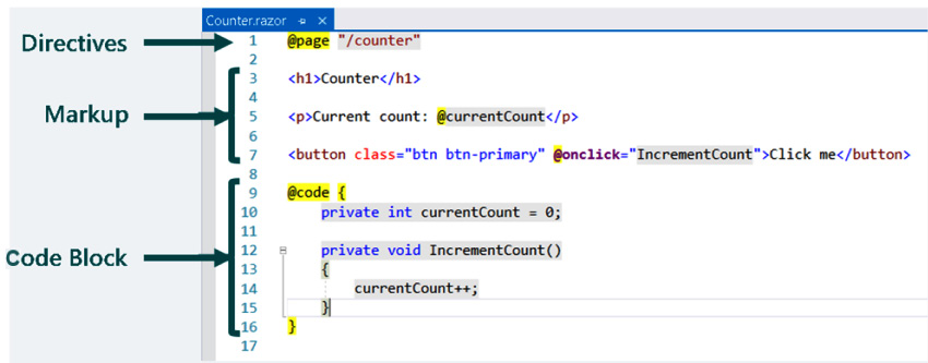
Figure 2.2 – Component structure
The code in the preceding example is divided into three sections:
- Directives
- Markup
- Code Block
Each of the sections has a different purpose.
Directives
Directives are used to add special functionality, such as routing, layout, and dependency injection. They are defined within Razor and you cannot define your own directives.
In the preceding example, there is only one directive used – the @page directive. The @page directive is used for routing. In this example, the following URL will route the user to the Counter component:
/counter
A typical page can include many directives at the top of the page. Also, many pages have more than one @page directive.
Most of the directives in Razor can be used in a Blazor WebAssembly application. These are the Razor directives that are used in Blazor, in alphabetical order:
@attribute: This directive adds a class-level attribute to the component. The following example adds the[Authorize]attribute:@attribute [Authorize]@code: This directive adds class members to the component. In the example, it is used to distinguish the code block.@implements: This directive implements the specified class.@inherits: This directive provides full control of the class that the view inherits.@inject: This directive is used for dependency injection. It enables the component to inject a service from the dependency injection container into the view. The following example injectsHttpClientdefined in theProgram.csfile into the component:@inject HttpClient Http@layout: This directive is used to specify a layout for the Razor component.@namespace: This directive sets the component's namespace. You only need to use this directive if you do not want to use the default namespace for the component. The default namespace is based on the location of the component.@page: This directive is used for routing.@typeparam: This directive sets a type parameter for the component.@using: This directive controls the components that are in scope.
Markup
This is HTML with Razor syntax. The Razor syntax can be used to render text and allows C# to be used as part of the markup. We will cover more about Razor syntax later in this chapter.
Code block
The code block contains the logic for the page. It begins with the @code directive. By convention, the @code directive is at the bottom of the page. It is the only file-level directive that is not placed at the top of the page.
The code block is where we add C# fields, properties, and methods to the component. Later in this chapter, we will move the code block to a separate code-behind file.
Razor components are the building blocks of a Blazor WebAssembly application. They are easy to use since they are simply a combination of HTML markup and C# code. In the next section, we will see how routing is used to navigate between each of the components.
Routing in Blazor WebAssembly
In Blazor WebAssembly, routing is handled on the client, not on the server. As you navigate in the browser, Blazor intercepts that navigation and renders the component with the matching route.
The URLs are resolved relative to the base path that is specified in the wwwroot/index.html file. It is specified in the head element using the following syntax:
<base href="/" />
Unlike other frameworks that you may have used, the route is not inferred from the location of its file. For example, in the Demo project, the Counter component is in the /Pages/Counter folder, yet it uses the following route:
@page "/counter"
Route parameters
The Router component uses route parameters to populate the parameters of the corresponding component. The parameters of both the component and the route must have the same name, but they are not case sensitive.
Since optional route parameters are not supported, you may need to provide more than one @page directive to a component to simulate optional parameters. The following example shows how to include multiple @page parameters:
RoutingExample.razor
@page "/routing"
@page "/routing/{text}"
<h1>Blazor WebAssembly is @Text!</h1>
@code {
    [Parameter] public string Text { get; set; }
    protected override void OnInitialized()
    {
        Text = Text ?? "fantastic";
    }
}
In the preceding code, the first @page directive allows navigation to the component without a parameter and the second @page directive allows a route parameter. If a value for text is provided, it is assigned to the Text property of the component. If the Text property of the component is null, it is set to fantastic.
The following URL will route the user to the RoutingExample component:
/routing
The following URL will also route the user to the RoutingExample component, but this time the Text parameter will be set by the route:
/routing/amazing
This screenshot shows the results of using the indicated route:

Figure 2.3 – RoutingExample component
Important note
Route parameters are not case sensitive.
Catch-all route parameters
Catch-all route parameters are used to capture paths across multiple folder boundaries. This type of route parameter is a string type and can only be placed at the end of the URL.
This is a sample component that uses a catch-all route parameter:
CatchAll.razor
@page "/{*path}"
<h1>Catch All</h1>
Route: @Path
@code {
    [Parameter] public string Path { get; set; }
}
For the /error/type/3 URL, the preceding code will set the value of the Path parameter to error/type/3:
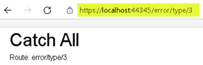
Figure 2.4 – Catch-all route parameter example
Route constraints
Route constraints are used to enforce the datatype of a route parameter. To define a constraint, add a colon followed by the constraint type to the parameter. In the following example, the route is expecting a route parameter named Increment with the type of int:
@page "/counter/{increment:int}"
The following route constraints are supported:
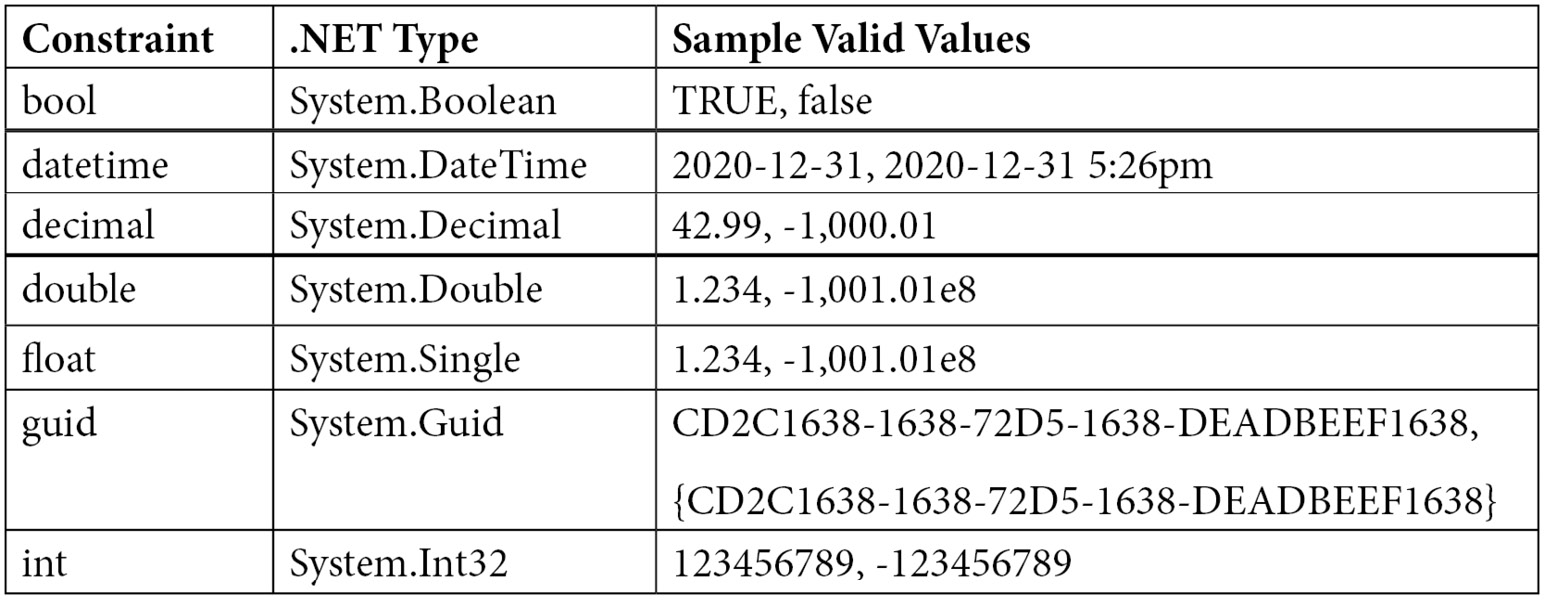
Figure 2.5 – Supported route constraints
The following types are not currently supported as constraints:
- Regular expressions
- Enums
- Custom constraints
Routing is handled on the client. We can use both route parameters and catch-all route parameters to enable routing. Route constraints are used to ensure that a route parameter is of the required datatype. Razor components use Razor syntax to seamlessly merge HTML with C# code, which is what we will see in the next section.
Razor syntax
Razor syntax is made up of HTML, Razor markup, and C#. Rendering HTML from a Razor component is the same as rendering HTML from an HTML file. The HTML in a Razor component is rendered by the server unchanged. Razor syntax uses both inline expressions and control structures.
Inline expressions
Inline expressions start with an @ symbol followed by a variable or function name. This is an example of an inline expression:
<h1>Blazor is @Text!</h1>
Control structures
Control structures also start with an @ symbol. The content within the curly brackets is evaluated and rendered to the output. This is an example of an if statement from the FetchData component in the Demo project:
@if (forecasts == null)
{
    <p><em>Loading...</em></p>
}
Each code statement within a Razor code block must end with a semicolon. C# code is case sensitive and strings must be enclosed in quotation marks.
Conditionals
The following types of conditionals are included in Razor syntax:
ifstatementsswitchstatements
This is an example of an if statement:
@if (DateTime.Now.DayOfWeek.ToString() != "Friday")
{
    <p>Today is not Friday.</p>
}
else if (DateTime.Now.Day != 13)
{
    <p>Today is not the 13th.</p>
}
else
{
    <p>Today is Friday the 13th.</p>
}
The preceding code uses an if statement to check it the current day of the week is Friday and/or the current day of the month is the 13th.
This is an example of a switch statement:
@switch (value)
{
    case 1:
        <p>The value is 1!</p>
        break;
    case 42:
        <p>Your number is 42!</p>
        break;
    default:
        <p>Your number was not 1 or 42.</p>
        break;
}
@code {
    private int value = 2;
}
The preceding switch statement compares the value variable to 1 and 42.
Loops
The following types of loops are included in Razor syntax:
forloopsforeachloopswhileloopsdo whileloops
Each of the following examples uses an array of the WeatherForecast type. WeatherForecast includes a Summary property and is defined in the Demo project.
This is an example of a for loop:
@for (var i = 0; i < forecasts.Count(); i++)
{
   <div> forecasts[i].Summary</div>
};
@code {
    private WeatherForecast[] forecasts;
}
This is an example of a foreach loop:
@foreach (var forecast in forecasts)
{
    <div>@forecast.Summary</div>
};
@code {
    private WeatherForecast[] forecasts;
}
This is an example of a while loop:
@while (i < forecasts.Count())
{
    <div>@forecasts[i].Summary</div>
    i++;
};
@code {
    private WeatherForecast[] forecasts;
    private int i = 0;
}
This is an example of a do while loop:
@do
{
    <div>@forecasts[i].Summary</div>
    i++;
} while (i < forecasts.Count());
@code {
    private WeatherForecast[] forecasts;
    private int i = 0;
}
Razor syntax is easy to learn if you already know C#. It includes both inline expressions and control structures such as conditionals and loops.
Project overview
The Blazor WebAssembly application that we are going to build in this chapter is a simple three-page application. Each page will be used to demonstrate one or more features of Razor components.
This is a screenshot of the completed Demo project:

Figure 2.6 – Home page of the Demo project
After we have completed the Demo project, we will convert it into an empty Blazor WebAssembly project. The empty Blazor WebAssembly project will be used as the basis for a custom Blazor WebAssembly App project template.
Creating the Demo Blazor WebAssembly project
The Demo project that we are creating is based on one of the many sample projects that are provided by the Blazor WebAssembly App project template. After we have used the template to create the project, we will examine the files in the sample project and update some of the files to demonstrate how to use Razor components. Finally, we will separate the code block of one of the components into a separate file to demonstrate how to use the code-behind technique to separate the markup from the code.
Creating the Demo project
Visual Studio comes with quite a few project templates. We are going to use the Blazor WebAssembly App project template to create our first Blazor WebAssembly project. Since this project template can be used to create many different types of Blazor projects, it is important to follow the instructions carefully:
- Open Visual Studio 2019.
- Click the Create a new project button.
- In the Search for templates (Alt+S) textbox, enter
Blazorand hit the Enter key.The following screenshot shows the Blazor WebAssembly App project template that we will be using:

Figure 2.7 – Blazor WebAssembly App project template
- Select the Blazor WebAssembly App project template and click the Next button.
- Enter
Demoin the Project name textbox and click the Next button.This is a screenshot of the dialog used to configure our new project:

Figure 2.8 – The Configure your new project dialog
Tip
In the preceding example, we placed the
Demoproject into theE:\Blazorfolder. However, the location of this project is not important. - Select .NET 5.0 as the version of the .NET Framework to use.
This is a screenshot of the dialog used to create our new Blazor WebAssembly app:

Figure 2.9 – Additional information for the Blazor WebAssembly App dialog
- Click the Create button.
You have created the Demo Blazor WebAssembly project.
Running the Demo project
Once the project has been created, you need to run it to get an understanding of what it does. The Demo project contains three pages: Home, Counter, and Fetch data:
- From the Debug menu, select the Start Without Debugging (Ctrl+F5) option to run the
Demoproject.This is a screenshot of the Home page from the
Demoproject:
Figure 2.10 – The Home page
The Home page is split into two sections. The navigation menu is on the left side of the page and the body is on the right side of the page. The body of the Home page consists of some static text and a link to a survey.
- Click the Counter option on the navigation menu to navigate to the Counter page.
This is a screenshot of the Counter page from the
Demoproject:
Figure 2.11 – The Counter page
The body of the Counter page includes a counter and a Click me button. Each time the button on the Counter page is clicked, the counter is incremented without a page refresh.
Important note
Since this is a Single-Page Application (SPA), only the section of the page that needs to be updated is updated.
- Click the Fetch data option on the navigation menu to navigate to the Fetch data page.
This is a screenshot of the Fetch data page from the
Demoproject:
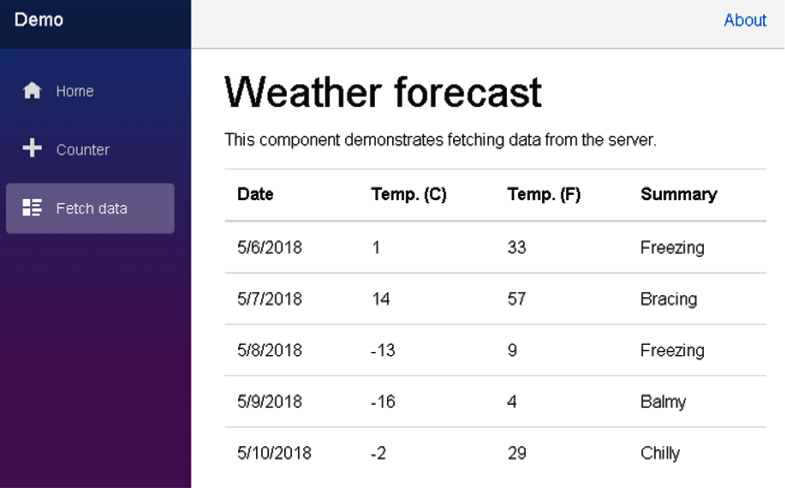
Figure 2.12 – The Fetch data page
The body of the Fetch data page includes a table that shows the weather forecast for a few days in 2018. As you will see, the data displayed in the table is static data from the wwwroot\sample-data\weather.json file.
Examining the Demo project's structure
Now let's return to Visual Studio to examine the files in the Demo project.
The following figure shows the project's structure:
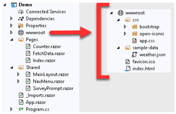
Figure 2.13 – Project structure
The project includes quite a few files with some of them divided into their own folders. Let's examine them.
The wwwroot folder
The wwwroot folder is the application's web root. Only the files in this folder are web-addressable. The wwwroot folder contains a collection of Cascading Style Sheets (CSS) files, a sample data file, an icon file, and index.html. Later in this book, in addition to these types of files, we will use this folder for public static resources such as images and JavaScript files.
The index.html file is the root page of the web application. Whenever a page is initially requested, the contents of the index.html page are rendered and returned in the response. The head element of the index.html file includes links to each of the CSS files in the css folder and specifies the base path to use for the web app. The body element of the index.html file includes two div elements and a reference to the blazor.webassembly.js file.
This is the code in the body element of the index.html file:
<body>
    <div id="app">Loading...</div>
    <div id="blazor-error-ui">
        An unhandled error has occurred.
        <a href="" class="reload">Reload</a>
        <a class="dismiss">x</a>
    </div>
    <script
      src="_framework/blazor.webassembly.js"></script>
</body>
The highlighted div element in the preceding code loads the App component.
The blazor-error-ui div element is for displaying unhandled exceptions. The styling for this div element is in the wwwroot\css\app.css file. The blazor.webassembly.js file is the script that downloads the .NET runtime, your application's assemblies, and your application's dependencies. It also initializes the runtime to run the web app.
The App component
The App component is defined in the App.razor file:
App.razor
<Router AppAssembly="@typeof(Program).Assembly"
        PreferExactMatches="@true">
    <Found Context="routeData">
        <RouteView RouteData="@routeData"
                   DefaultLayout="@typeof(MainLayout)" />
    </Found>
    <NotFound>
        <LayoutView Layout="@typeof(MainLayout)">
            <p>Sorry, there's nothing at this address.</p>
        </LayoutView>
    </NotFound>
</Router>
The App component is the root component of a Blazor WebAssembly application. It uses the Router component to set up the routing for the web app. In the preceding code, if the route is found, the RouteView component receives RouteData and renders the specified component using the indicated DefaultLayout. If the route is not found, the NotFound template is used and LayoutView is rendered using the indicated Layout.
As you can see, in the Demo project, both the Found template and the NotFound template are using the same layout. They are both using the MainLayout component. However, they do not need to use the same layout component.
The Shared folder
The Shared folder in the Demo project includes the shared user interface Razor components, including the MainLayout component. Each of these components may be used one or more times by other Razor components.
The Pages folder
The Pages folder includes the routable Razor components used by the project. The routable components are Counter, FetchData, and Index. Each of these components includes an @page directive that is used to route the user to the page.
The _Imports.razor file
This file includes Razor directives such as the @using directive for namespaces. Your project can include multiple _Imports.razor files. Each one is applied to its current folder and subfolders. Any @using directives in the _Imports.razor file are only applied to Razor (RAZOR) files. They are not applied to C# (CS) files. This distinction is important when using the code-behind technique.
The Program.cs file
The Program.cs file is the entry point for the application.
Examining the shared Razor components
The shared Razor components are in the Shared folder. There are three shared Razor components in the Demo project:
- The
MainLayoutcomponent - The
NavMenucomponent - The
SurveyPromptcomponent
The MainLayout component
The MainLayout component is used to define the page layout for the web app:
Pages/MainLayout.razor
@inherits LayoutComponentBase
<div class="page">
    <div class="sidebar">
        <NavMenu />
    </div>
    <div class="main">
        <div class="top-row px-4">
            <a href="http://blazor.net"
               target="_blank"
               class="ml-md-auto">About</a>
        </div>
        <div class="content px-4">
            @Body
        </div>
    </div>
</div>
The MainLayout component inherits from the LayoutComponentBase class. LayoutComponentBase represents a layout and has only one property, which is the Body property. The Body property gets the content to be rendered inside the layout.
The following diagram illustrates the layout of a page as defined by the MainLayout component:
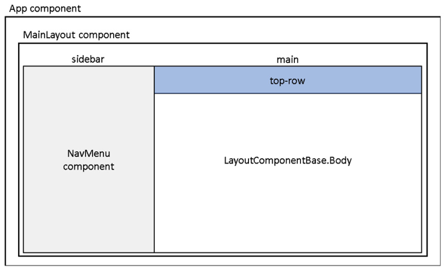
Figure 2.14 – Screen layout
Tip
The Blazor WebAssembly App project template uses Bootstrap 4 to style its pages. If you are unfamiliar with Bootstrap 4, you should refer to https://getbootstrap.com to familiarize yourself with its syntax.
The NavMenu component
The NavMenu component defines the navigation menu for the Demo project. It uses multiple NavLink components to define the various menu options. This is the section of the NavMenu component that references the NavLink components used for the project's navigation:
<div class="@NavMenuCssClass" @onclick="ToggleNavMenu">
    <ul class="nav flex-column">
        <li class="nav-item px-3">
            <NavLink class="nav-link" href=""
                     Match="NavLinkMatch.All">
                <span class="oi oi-home"
                      aria-hidden="true"></span> Home
            </NavLink>
        </li>
        <li class="nav-item px-3">
            <NavLink class="nav-link" href="counter">
                <span class="oi oi-plus"
                      aria-hidden="true"></span> Counter
            </NavLink>
        </li>
        <li class="nav-item px-3">
            <NavLink class="nav-link" href="fetchdata">
                <span class="oi oi-list-rich"
                      aria-hidden="true"></span> Fetch data
            </NavLink>
        </li>
    </ul>
</div>
The NavLink component is defined in the Microsoft.AspNetCore.Components.Routing namespace. It behaves like an a element, except it has added functionality that highlights the current URL. This is the HTML that is rendered by NavLink for the Counter component when the Counter component is selected:
<a href="counter" class="nav-link active">
    <span class="oi oi-plus" aria-hidden="true"></span>
    Counter
</a>
The style used for the nav-link class is from Bootstrap. The style used for the active class is defined in the wwwroot\css\app.css file:
.sidebar .nav-item a.active {
    background-color: rgba(255,255,255,0.25);
    color: white;
}
The SurveyPrompt component
The SurveyPrompt component creates a link to a brief survey on Blazor.
Examining the routable Razor components
The routable Razor components are in the Pages folder. There are three routable Razor components in the Demo project:
- The
Indexcomponent - The
Countercomponent - The
FetchDatacomponent
The Index component
The Home page of the Demo project uses the Index component that is defined in the Pages\Index.razor file:
Pages\Index.razor
@page "/"
<h1>Hello, world!</h1>
Welcome to your new app.
<SurveyPrompt Title="How is Blazor working for you?" />
The preceding code includes an @page directive that references the root of the web app and some markup. The markup includes a SurveyPrompt component.
The Counter component
The Counter component is more complex than the Index component. Similar to the Index component, it contains an @page directive that is used for routing and some markup. However, it also contains a C# code block:
Pages\Counter.razor
@page "/counter"
<h1>Counter</h1>
<p>Current count: @currentCount</p>
<button class="btn btn-primary" @onclick="IncrementCount">
    Click me
</button>
<a href="counter" class="nav-link active">
    <span class="oi oi-plus" aria-hidden="true"></span>
    Counter
</a>
@code {
    private int currentCount = 0;
    private void IncrementCount()
    {
        currentCount++;
    }
}
In the preceding code block, a private currentCount variable is used to hold the number of clicks. Each time the Counter button is clicked, the Counter component's registered @onclick handler is called. In this case, it is the IncrementCount method.
The IncrementCount method increments the value of the currentCount variable and the Counter component regenerates its render tree. Blazor compares the new render tree against the previous one and applies any modifications to the browser's DOM. This results in the displayed count being updated.
The FetchData component
The FetchData component is by far the most complex component in the Demo project.
These are the directives in the Pages\FetchData.razor file:
@page "/fetchdata"
@inject HttpClient Http
The @page directive is used for routing and the @inject directive is used for dependency injection. In this component, HttpClient that is defined in the Program.cs file is being injected into the view. For more information on dependency injection, refer to Chapter 6, Building a Shopping Cart Using Application State.
The following markup demonstrates the use of a very important pattern that you will often use when developing a Blazor WebAssembly application. Because the application runs on the browser, all data access must be asynchronous. That means that when the page first loads, the data will be null. For that reason, you need to test for the null case before attempting to process the data.
This is the markup in the Pages\FetchData.razor file:
<h1>Weather forecast</h1>
<p>This component demonstrates fetching data from the server.</p>
@if (forecasts == null)
{
    <p><em>Loading...</em></p>
}
else
{
    <table class="table">
        <thead>
            <tr>
                <th>Date</th>
                <th>Temp. (C)</th>
                <th>Temp. (F)</th>
                <th>Summary</th>
            </tr>
        </thead>
        <tbody>
            @foreach (var forecast in forecasts)
            {
                <tr>
                   <td>@forecast.Date.ToShortDateString()
                      </td>
                   <td>@forecast.TemperatureC</td>
                   <td>@forecast.TemperatureF</td>
                   <td>@forecast.Summary</td>
                </tr>
            }
        </tbody>
    </table>
}
The preceding markup includes an if statement and a foreach loop. While the value of forecasts is null, a Loading message is displayed. If you do not handle the case when the value of forecasts is null, the framework will throw an exception. Once the value of forecasts is no longer null, all of the items in the array are presented in a table.
Important note
The value of forecasts will be null the first time that the page is rendered.
As previously mentioned, Blazor components have a well-defined life cycle. The OnInitializedAsync method is invoked when the component is rendered. After the OnInitializedAsync method completes, the component is re-rendered.
This is the code block in the Pages\FetchData.razor file:
@code {
    private WeatherForecast[] forecasts;
    protected override async Task OnInitializedAsync()
    {
        forecasts = await
            Http.GetFromJsonAsync<WeatherForecast[]>
            ("sample-data/weather.json");
    }
    public class WeatherForecast
    {
        public DateTime Date { get; set; }
        public int TemperatureC { get; set; }
        public string Summary { get; set; }
        public int TemperatureF =>
            32 + (int)(TemperatureC / 0.5556);
    }
}
First, the preceding code block declares a parameter to contain an array of the type WeatherForecast. Next, it uses the OnInitializedAsync asynchronous method to populate the array. In order to populate the array, the GetFromJsonAsync method of the HttpClient service is used. For more information on HttpClient, refer to Chapter 8, Building a Task Manager Using the ASP.NET Web API.
Using a component
Razor components are used by including them in the markup of another component. We will add a Counter component to the Home page. We do this as follows:
- Return to Visual Studio.
- Open the
Pages\Index.razorfile. - Delete all of the markup. Be sure you do not remove the
@pagedirective at the top of the file. - Add the following markup below the
@pagedirective:<Counter />
- From the Build menu, select the Rebuild Solution option.
- Return to the browser and navigate to the Home page. If the
Demoproject is not still running, from the Debug menu, select the Start Without Debugging (Ctrl+F5) option to run it. - Use Ctrl + R to refresh the browser.
Tip
Whenever you update your C# code, you need to refresh the browser for the browser to load the updated DLL.
- Click the Click me button to test the
Countercomponent.
Adding a parameter to a component
Most components require parameters. To add a parameter to a component, use the Parameter attribute. We will add a parameter to specify the increment used by the IncrementCount method. We do this as follows:
- Return to Visual Studio.
- Open the
Pages\Counter.razorfile. - Add the following code to the top of the code block to define the new parameter:
[Parameter] public int? Increment { get; set; } private int increment = 1; - Update the
IncrementCountmethod to the following:private void IncrementCount() { currentCount += increment; } - Add the following
OnParametersSetmethod to set the value ofincrementto the value of theIncrementparameter:protected override void OnParametersSet() { if (Increment.HasValue) increment = Increment.Value; } - Add the highlighted text to the markup of the Click me button to display the current value of the
incrementvariable:<button class="btn btn-primary" @onclick="IncrementCount"> Click me (@increment) </button>
Using a parameter with an attribute
We will add another instance of the Counter component to the Home page that uses the new parameter. We do this as follows:
- Open the
Pages\Index.razorfile. - Add the following markup to the bottom of the
Index.razorfile:<Counter Increment="5"/>
As you add the markup, IntelliSense is provided for the new
Incrementparameter:
Figure 2.15 – IntelliSense
- From the Build menu, select the Build Solution option.
- Return to the browser.
- Use Ctrl + R to refresh the browser.
- Navigate to the Home page.
The Home page now contains two instances of the
Countercomponent. If you click the first Click me button, the first counter will be incremented by 1; if you click the second Click me button, the second counter will be incremented by 5:
Figure 2.16 – The Home page
- Click each of the Click me buttons to verify they both work as intended.
Adding a route parameter
Components can have multiple @page directives. We will add an @page directive to the Counter component that uses a parameter. We do this as follows:
- Return to Visual Studio.
- Open the
Pages/Counter.razorfile. - Add the following
@pagedirective to the top of the file:@page "/counter/{increment:int}"The
Countercomponent now includes two@pagedirectives. - From the Build menu, select the Build Solution option.
- Return to the browser.
- Navigate to the Counter page.
- Update the URL to the following:
/counter/4
Important note
Since the page is automatically reloaded when you change the URL, you do not need to refresh the browser in order to reload the page.
- Click the Click me button.
- Update the URL to an invalid route:
/counter/a
Since this is not a valid route, you will be directed to the
NotFoundcontent defined in theAppcomponent:
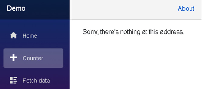
Figure 2.17 – Page not found
Tip
If you need to navigate to a URL in code, you should use NavigationManager. NavigationManager provides a NavigateTo method that is used to navigate the user to the specified URI without forcing a page load.
Using partial classes to separate markup from code
Many developers prefer to separate their markup from their C# fields, properties, and methods. Since Razor components are regular C# classes, they support partial classes. The partial keyword is used to create a partial class. We will use a partial class to move the code block from the RAZOR file to a CS file. We do this as follows:
- Return to Visual Studio.
- Right-click the Pages folder and select Add, Class from the menu.
- Name the new class
Counter.razor.cs. - Update the
Counterclass to be a partial class by using thepartialkeyword:public partial class Counter{} - Open the
Pages/Counter.razorfile. - Copy all of the code in the code block to the partial
Counterclass in theCounter.razor.csfile. - Delete the code block from the
Counter.razorfile. - Add the following
usingstatement to theCounter.razor.csfile:using Microsoft.AspNetCore.Components;
- From the Build menu, select the Build Solution option.
- Return to the browser.
- Use Ctrl + R to refresh the browser.
- Navigate to the Counter page.
- Click the Click me button to verify that it still works.
- Close the browser.
Using partial classes gives you the flexibility to move the code in the code block to a separate file, allowing you to use the code-behind technique.
We have created a Demo project by using the Blazor WebAssembly App project template provided by Microsoft. We added a parameter to the Counter component and moved the code in the code block of the Counter component to a separate file.
Creating a custom Blazor WebAssembly project template
As you have seen, the Demo Blazor WebAssembly project created by the Blazor WebAssembly App project template includes quite a few files. In later chapters, we will want to start with an empty Blazor project. So, we will create our own project template that creates an empty Blazor WebAssembly project.
Creating an empty Blazor project
We need to create an empty Blazor WebAssembly project to base our new project template on. We do this as follows:
- Return to Visual Studio.
- Delete the
wwwroot\sample-datafolder. - Delete all of the components in the
Pagesfolder, except for theIndexcomponent. - Open the
Index.razorfile. - Delete all of the markup from the
Indexcomponent. Make sure that you do not delete the@pagedirective at the top of the page. - Delete the
Shared\SurveyPrompt.razorfile. - Open the
Shared\MainLayout.razorfile. - Remove the
Aboutlink from the top row of the layout by removing the following markup:<a href="http://blazor.net" target="_blank" class="ml-md-auto"> About </a>
- Open the
Shared\NavMenu.razorfile. - Remove the
lielements for theCounterandFetch datapages. - From the Build menu, select the Build Solution option.
- From the Debug menu, select the Start Without Debugging (Ctrl+F5) option to run the
Demoproject.The
Demoproject is now empty. It only contains a blankHomepage.
Creating a project template
The Export Template Wizard is used to create custom project templates. We will use the empty project that we just created as the basis for a custom project template. We do this as follows:
- Return to Visual Studio.
- From the Project menu, select the Export Template option to open the Export Template Wizard window.
- Select Project template on the Choose Template Type dialog and click the Next button:

Figure 2.18 – The Choose Template Type dialog
- Complete the Select Template Options dialog as shown in the following screenshot and click the Finish button:
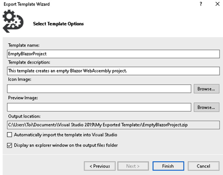
Figure 2.19 – The Select Template Options dialog
After you click the Finish button, your new project template will be saved to the folder indicated in the Output location field on the Select Template Options dialog and the folder will automatically open. The files that comprise your new project template are compressed into a file called EmptyBlazorProject.zip.
Updating a custom project template
We need to make a few updates to our custom project template before it is ready to use. First, we will declare a template parameter for the project's name, and then we will update the metadata. We do this as follows:
- Extract all of the files from the
EmptyBlazorProject.zipfile.The
EmptyBlazorProject.zipfile contains all of the files from the emptyDemoproject as well as aMyTemplate.vstemplatefile that contains all of the metadata for the project template. - Open the
Shared/NavMenu.razorfile and replace the wordDemowith$projectname$:<a class="navbar-brand" href="">$projectname$</a>
The
$projectname$parameter will be replaced by the name of the project that is provided by the user when the project is created.Open the
_Imports.razorfile and replace the wordDemowith$projectname$:@using $projectname$ @using $projectname$.Shared
- Open the
MyTemplate.vstemplatefile. - Update the value of the
Nameelement toEmpty Blazor WebAssembly App:<Name>Empty Blazor WebAssembly App</Name>
- Add the following elements after the
Descriptionelement:<LanguageTag>C#</LanguageTag> <ProjectTypeTag>Web</ProjectTypeTag>
- Replace the
Iconelement with the followingIcon Packageelement:<Icon Package="{AAB75614-2F8F-4DA6-B0A6-763C6DBB2969}" ID="13"/> - Change the
ReplaceParametersattribute totrueforNavMenu.razor ProjectItem:<ProjectItem ReplaceParameters="true" TargetFileName="NavMenu.razor"> NavMenu.razor </ProjectItem>
- Change the
ReplaceParametersattribute totruefor_Imports.razor ProjectItem:<ProjectItem ReplaceParameters="true" TargetFileName="_Imports.razor"> _Imports.razor </ProjectItem>
- Save all of the updated files.
- Update the
EmtpyBlazorProject.zipfile with the updated files. - Copy
EmtpyBlazorProject.zipfrom theVisual Studio2019\MyExportedTemplatesfolder to theVisual Studio2019\Templates\ProjectTemplatesfolder.
Using a custom project template
We can use a custom project template the same way that we use any of the built-in project templates. We do this as follows:
- From the File menu, select the New, Project option.
- Enter
Blazorin the Search for templates textbox to locate your new template:
Figure 2.20 – Empty Blazor WebAssembly App template
- Select the Empty Blazor WebAssembly App template and click the Next button.
- Update the project name to
Sampleand click the Create button. - From the Build menu, select the Build Solution option.
- From the Debug menu, select Start Without Debugging (Ctrl+F5).
We have created a new Sample project by using our custom project template. The only page in the Sample project is the Home page.
We created an empty project by deleting some of the components and code from the Demo project that we created in the previous section. Then, we used the Export Template Wizard to create a custom project template based on the empty project. After we updated some of the files in the custom project template, we copied them into the ProjectTemplates folder. Finally, we used the custom project template to create the Sample project.
Summary
You should now be able to create a Blazor WebAssembly application.
In this chapter, we introduced Razor components, routing, and Razor syntax.
After that, we used the Blazor WebAssembly App project template provided by Microsoft to create the Demo Blazor WebAssembly project. We added a parameter to the Counter component and examined how routing works.
In the last part of the chapter, we created an empty Blazor WebAssembly project on which to base our own custom project template. We created a custom project template using the Export Template Wizard. After we finished configuring our custom project template, we used it to create an empty Blazor WebAssembly project.
We will use the Empty Blazor WebAssembly App project template to create the project in the next chapter of this book.
Questions
The following questions are provided for your consideration:
- Can Razor components include JavaScript?
- What types of loops are supported by Razor syntax?
- Can the Blazor App project template be used to create both Blazor WebAssembly applications and Blazor Server applications?
- What are the advantages of using a custom project template?
- How would you create your own custom item template to automatically create a code-behind page for each new component?
Further reading
The following resources provide more information concerning the topics in this chapter:
- For more information on Bootstrap, refer to https://getbootstrap.com.
- For more information on Razor syntax, refer to https://docs.microsoft.com/en-us/aspnet/core/mvc/views/razor.
- For more information on creating custom project templates, refer to https://docs.microsoft.com/en-us/visualstudio/ide/creating-project-and-item-templates.
- For more information on template parameters, refer to https://docs.microsoft.com/en-us/visualstudio/ide/template-parameters.s