


Beyond buttons: using advanced pickers
In this recipe, we will learn how to implement pickers—namely, Picker, Toggle, Slider, Stepper, and DatePicker. Pickers are typically used to prompt the user to select from a set of mutually exclusive values. Toggle views are used to switch between on/off states. Slider views are used for selecting a value from a bounded linear range of values. As with Slider views, Stepper views also provide a UI for selecting from a range of values. However, steppers use the + and : signs to allow users to increment the desired value by a certain amount. Finally, DatePicker views are used for selecting dates.
Getting ready
Create a new SwiftUI project named UsingPickers.
How to do it…
Let’s create a SwiftUI project that implements various pickers. Each picker will have a @State variable to hold the current value of the picker. The steps are given here:
- In the
ContentView.swiftfile, create@Statevariables that will hold the values selected by the pickers and other controls. Place the variables between theContentViewstruct and the body:@State private var choice = 0 @State private var showText = false @State private var transitModes = ["Bike", "Car", "Bus"] @State private var sliderVal: Float = 0 @State private var stepVal = 0 @State private var gameTime = Date() - Replace the body of the
ContentViewstruct with aFormview. Then, add aSectionview and aPickerview to the form:Form { Section { Picker("Transit Modes", selection: $choice) { ForEach( 0 ..< transitModes.count, id: \.self) { index in Text("\(transitModes[index])") } } .pickerStyle(.segmented) Text("Current choice: \(transitModes[choice])") } } - Under the existing
Sectionview, add anotherSectionview and aToggleview:Section{ Toggle(isOn: $showText){ Text("Show Text") } if showText { Text("The Text toggle is on") } } - Add a
Sectionview and aSliderview:Section{ Slider(value: $sliderVal, in: 0...10, step: 0.001) Text("Slider current value \(sliderVal, specifier: "%.1f")") } - Add a
Sectionview and aStepperview:Section { Stepper("Stepper", value: $stepVal, in: 0...5) Text("Stepper current value \(stepVal)") } - Add a
Sectionview and aDatePickerview:Section { DatePicker("Please select a date", selection: $gameTime) } - Add a
Sectionview and a slightly modifiedDatePickerview that only accepts future dates:Section { DatePicker("Please select a date", selection: $gameTime, in: Date()...) } - The result should be a beautiful form, like what is shown here:
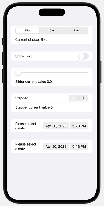
Figure 1.14: SwiftUI Form with Pickers
How it works…
Form views group controls that are used for data entry, and Section views create hierarchical view content. Section views can be embedded inside a Form view to display information grouped together. The default presentation style for a Form with embedded Section views is to include a gray padding area between each section for visual grouping, as shown in Figure 1.14.
Picker views are used for selecting from a set of mutually exclusive values. In the following example, a segmented picker is used to select a transit mode from our transitModes state variable:
Picker("Transit Modes", selection: $choice) {
   ForEach( 0 ..< transitModes.count, id:\.self) { index in
       Text("\(transitModes[index])")
   }
}
.pickerStyle(.segmented)
As shown in the preceding example, a Picker view takes two parameters, a string describing its function, and a state variable that holds the value selected. The state variable should be of the same type as the range of values to select from. In this case, the ForEach loop iterates through the transitModes array indices. The value selected would be an Int within the range of transitModes indices. The transit mode located in the selected index can then be displayed using Text("\(transitModes[index])"). It is also worth noting that we need to apply a .segmented style to the picker using the .pickerStyle() modifier, to use the visual segmented style everyone is used to in iOS.
Toggle views are controls that switch between “on” and “off” states. The state variable for holding the toggle selection should be of the Bool type. The section with the Toggle view also contains some text. The @State property of the Toggle reflects the current state of the toggle.
Creating a slider requires three arguments:
value: The@Statevariable to bind the user input toin: The range of the sliderstep: By how much the slider should change when the user moves it
In the sample code, our slider moves can hold values between 0 and 10, with a step of 0.001.
Steppers take three arguments too—a string for the label, value, and in. The value argument holds the @State variable that binds the user input, and the in argument holds the range of values for the stepper.
In this recipe, we also demonstrate two applications of a date picker. The first from the top shows a date picker whose first argument is the label of DatePicker, and the second argument holds the state variable that binds the user input. Use it in situations where the user is allowed to pick any date without restriction. The other date picker contains a third parameter, in. This parameter represents the date range the user can select.
Important Note
The @State variables need to be of the same type as the data to be stored. For example, the gameTime state variable is of the Date type.
Picker styles change based on its ancestor. The default appearance of a picker may be different when placed within a form or list instead of a VStack or some other container view. Styles can be overridden using the .pickerStyle() modifier.


