


Visualizing the data
First, we'll consider the spread of the heights of the London 2012 athletes. Let's plot our height values as a histogram to see how the data is distributed, remembering to filter the nil values first:
(defn ex-3-2 []
  (-> (remove nil? (i/$ "Height, cm" (athlete-data)))
      (c/histogram :nbins 20
                   :x-label "Height, cm"
                   :y-label "Frequency")
      (i/view)))
This code generates the following histogram:

The data is approximately normally distributed, as we have come to expect. The mean height of our athletes is around 177 cm. Let's take a look at the distribution of weights of swimmers from the 2012 Olympics:
(defn ex-3-3 []
  (-> (remove nil? (i/$ "Weight" (athlete-data)))
      (c/histogram :nbins 20
                   :x-label "Weight"
                   :y-label "Frequency")
      (i/view)))
This code generates the following histogram:
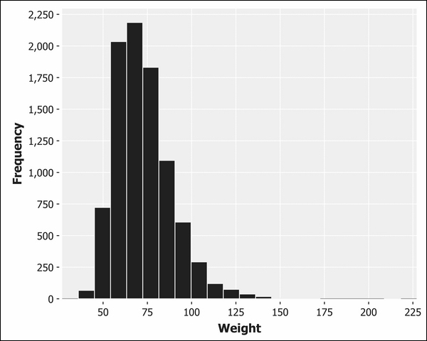
This data shows a pronounced skew. The tail is much longer to the right of the peak than to...


