


Simple graphics using SF Symbols
The SF Symbols 5 library provides a set of over 5,000 free consistent and highly configurable symbols. Each year, Apple adds more symbols and symbol variants to the collection.
You can download and browse through a list of SF symbols using the macOS app available for download here: https://developer.apple.com/sf-symbols/.
In this recipe, we will use SF symbols in labels and images. We’ll also apply various modifiers that will add a punch to your design.
Getting ready
Let’s start by creating a new SwiftUI project called UsingSF Symbols.
How to do it…
Let’s create an app where we use different combinations of SF Symbols and modifiers. The steps are given here:
- Open the
ContentView.swiftfile and replace the entire body content with aVStack,HStack, and some SF Symbols:VStack { HStack{ Image(systemName: "c") Image(systemName: "o") Image(systemName: "o") Image(systemName: "k") } .symbolVariant(.fill.circle) .foregroundStyle(.yellow, .blue) .font(.title) } - We continue working on our
VStackcontent and embed anotherHStackwith SF Symbols for the wordbook:HStack{ Image(systemName: "b.circle.fill") Image(systemName: "o.circle.fill") .foregroundStyle(.red) Image(systemName: "o.circle.fill") .imageScale(.large) Image(systemName: "k.circle.fill") .accessibility(identifier: "Letter K") } .foregroundStyle(.blue) .font(.title) .padding() - Let’s add another
HStackwith more SF Symbols:HStack{ Image(systemName: "allergens") Image(systemName: "ladybug") } .symbolVariant(.fill) .symbolRenderingMode(.multicolor) .font(.largeTitle) - Finally, let’s add a
Pickerview with a segmented style that changes the appearance of the Wi-Fi SF Symbol based on the picker selection:HStack { Picker("Pick One", selection: $wifiSelection) { Text("No Wifi").tag(0) Text("Searching").tag(1) Text("Wifi On").tag(2) } .pickerStyle(.segmented) .frame(width: 240) .padding(.horizontal) Group { switch wifiSelection { case 0: Image(systemName: "wifi") .symbolVariant(.slash) case 1: Image(systemName: "wifi") .symbolEffect(.variableColor.iterative.reversing) default: Image(systemName: "wifi") .foregroundStyle(.blue) } } .foregroundStyle(.secondary) .font(.title) } .padding() - Let’s add the
@Stateproperty to fix the Xcode error. Immediately below the declaration of theContentViewstruct, add thewifiSelectionproperty:@State private var wifiSelection = 0 - The resulting preview should look like this:
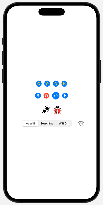
Figure 1.17: SF Symbols in action
How it works…
SF Symbols defines several design variants such as enclosed, fill, and slash. These different variants can be used to convey different information—for example, a slash variant on a Wi-Fi symbol lets the user know if the Wi-Fi is unavailable.
In our first HStack, we use the .symbolVariant(.fill.circle) modifier to apply the .fill and .circle variants to all the items in the HStack. This could also be accomplished using the following code:
HStack{
     Image(systemName: "c.circle.fill")
     Image(systemName: "o.circle.fill ")
     Image(systemName: "o.circle.fill ")
     Image(systemName: "k.circle.fill ")
}
However, the preceding code is too verbose and would require too many changes if we decided that we didn’t need either the .circle or .fill variant, or both.
We also notice something new in our first HStack —the .foregroundStyle(...) modifier. The .foregroundStyle modifier can accept one, two, or three parameters corresponding to the primary, secondary, and tertiary colors. Some symbols may have all three levels of colors, or only primary and secondary, or primary and tertiary. For symbols without all three levels, only the ones that pertain to them are applied to the symbol. For example, a tertiary color applied to an SF Symbol with only primary and secondary levels will have no effect on the symbol.
The second HStack also uses the .symbolVariant modifier with one variant. It also introduces a new modifier, .symbolRenderingMode(). Rendering modes can be used to control how color is applied to symbols. The multicolor rendering mode renders symbols as multiple layers with their inherited styles. Adding the .multicolor rendering mode is enough to present a symbol with its default layer colors. Other rendering modes include hierarchical, monochrome, and palette.
Finally, we create another HStack with a segmented picker for a Wi-Fi system image where we change the appearance based on the status of the wifiSelection state variable. The picker reads the state variable and changes the wifi symbol appearance from a slashed symbol when “No Wifi” is selected to a variable color animated symbol when “Searching” is selected to a solid blue symbol when “Wifi On” is selected. Here, we used the new Symbols framework introduced in iOS 17, and the .symbolEffect view modifier to add an animation to a symbol. When we want to add animations to a symbol, the SF Symbols Mac app allows us to configure all the animations and preview the result. We can even export the animation configuration to add it in Xcode.
See also
- SF Symbols in SwiftUI: https://developer.apple.com/videos/play/wwdc2021/10349
- What’s new in SF Symbols 5: https://developer.apple.com/videos/play/wwdc2023/10197
- Animate symbols in your app: https://developer.apple.com/videos/play/wwdc2023/10258


