Search icon CANCEL
Subscription
0
Cart icon
Your Cart (0 item)
Close icon
You have no products in your basket yet
Save more on your purchases! discount-offer-chevron-icon
Savings automatically calculated. No voucher code required.
Arrow left icon
Explore Products
Best Sellers
New Releases
Books
Videos
Audiobooks
Learning Hub
Newsletter Hub
Free Learning
Arrow right icon
timer SALE ENDS IN
0 Days
:
00 Hours
:
00 Minutes
:
00 Seconds
Arrow up icon
GO TO TOP
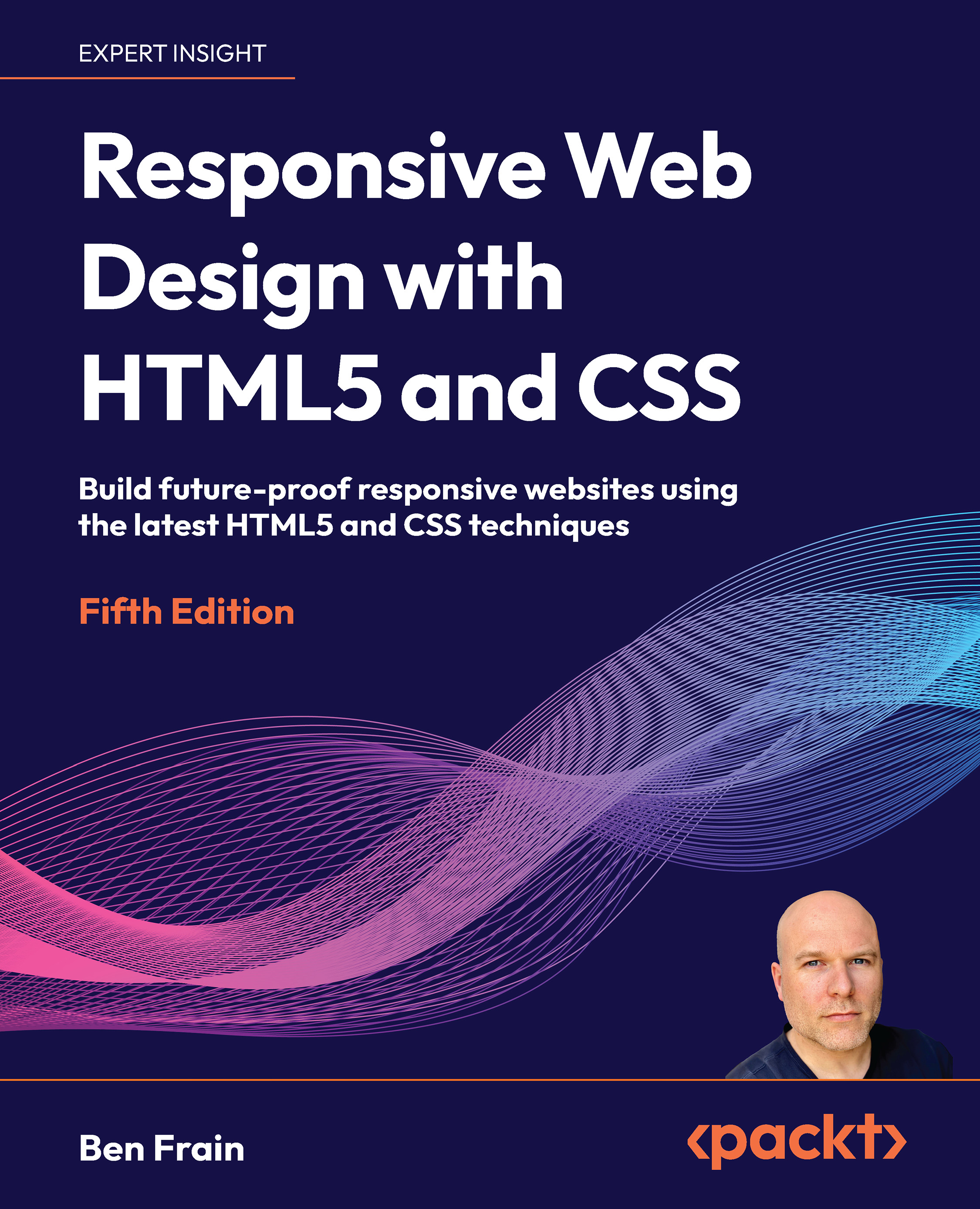
Responsive Web Design with HTML5 and CSS

You're reading from   Responsive Web Design with HTML5 and CSS Build future-proof responsive websites using the latest HTML5 and CSS techniques

Arrow left icon
Product type Paperback
Published in Oct 2025
Last Updated in Oct 2025
Publisher Packt
ISBN-13 9781837028238
Length 576 pages
Edition 5th Edition
Languages
Concepts
Arrow right icon
Author (1):
Arrow left icon
Ben Frain Ben Frain
Author Profile Icon Ben Frain
Ben Frain
Arrow right icon
View More author details
Toc

Table of Contents (22) Chapters Close

Preface 1. The Fundamentals of Responsive Web Design
2. The Essentials of Responsive Web Design FREE CHAPTER 3. Writing HTML Markup 4. Media and Container Queries 5. Fluid Layout and Flexbox 6. Layout with CSS Grid 7. Core Skills for Effective Frontend Web Development
8. CSS Nesting, Layers, Selectors, and More 9. Web Typography 10. CSS Colors 11. Stunning Aesthetics with CSS 12. Responsive Images 13. SVG 14. Transitions, Transformations, and Animations 15. Custom Properties and CSS Functions 16. Forms 17. Latest Platform Features and Parting Advice
18. Cutting-Edge CSS Features 19. Bonus Techniques and Parting Advice 20. Other Books You May Enjoy
21. Index

4 Fluid Layout and Flexbox

At the end of the last chapter, we reminded ourselves that the three core tenets of responsive web design are fluid layout, media queries, and flexible media. We spent Chapter 3 learning all about media queries and container queries. Now we know how to wield them to change a layout at a particular breakpoint. In this chapter, we will focus on another pillar of responsive web design: fluid layout.Eons ago, in the mists of time (well, the late 1990s), websites were typically built with their widths defined as percentages. These percentage-based widths were fluidly adjusted to the screen and were known as fluid layouts.In the years after, in the mid-to-late 2000s, there was an intervening fixation on fixed-width designs—I blame those pesky print designers and their obsession with pixel-perfect precision! Nowadays, as we build responsive web designs, we need to look back to fluid layouts and remember all the benefits they offer.Until fairly recently, web...

lock icon The rest of the chapter is locked
Visually different images
CONTINUE READING
83
Tech Concepts
36
Programming languages
73
Tech Tools
Icon Unlimited access to the largest independent learning library in tech of over 8,000 expert-authored tech books and videos.
Icon Innovative learning tools, including AI book assistants, code context explainers, and text-to-speech.
Icon 50+ new titles added per month and exclusive early access to books as they are being written.
Responsive Web Design with HTML5 and CSS
Register for a free Packt account to unlock a world of extra content!
A free Packt account unlocks extra newsletters, articles, discounted offers, and much more. Start advancing your knowledge today.
Unlock this book and the full library FREE for 7 days
Get unlimited access to 7000+ expert-authored eBooks and videos courses covering every tech area you can think of
Renews at €18.99/month. Cancel anytime
Modal Close icon
Modal Close icon