Search icon
Arrow left icon
All Products
Best Sellers
New Releases
Books
Videos
Audiobooks
Learning Hub
Newsletters
Free Learning
Arrow right icon
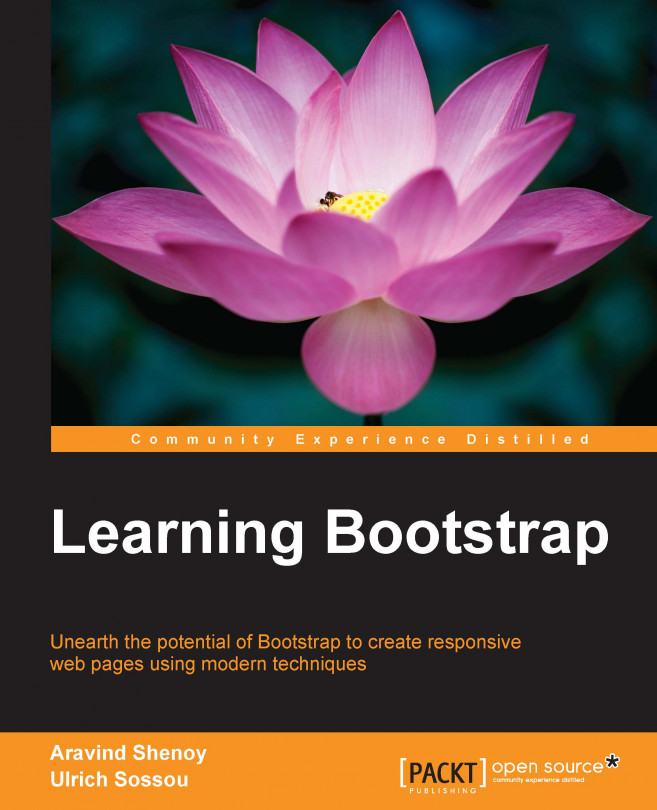
Learning Bootstrap
Learning Bootstrap

Learning Bootstrap: Unearth the potential of Bootstrap to create responsive web pages using modern techniques

$28.99 $19.99
Book Dec 2014 204 pages 1st Edition
eBook
$28.99 $19.99
Print
$48.99
Subscription
$15.99 Monthly
eBook
$28.99 $19.99
Print
$48.99
Subscription
$15.99 Monthly

What do you get with eBook?

Product feature icon Instant access to your Digital eBook purchase
Product feature icon Download this book in EPUB and PDF formats
Product feature icon Access this title in our online reader with advanced features
Product feature icon DRM FREE - Read whenever, wherever and however you want
Buy Now

Product Details


Publication date : Dec 23, 2014
Length 204 pages
Edition : 1st Edition
Language : English
ISBN-13 : 9781782161844
Category :
Table of content icon View table of contents Preview book icon Preview Book

Learning Bootstrap

Chapter 1. Getting Started with Bootstrap

The styling and presentation of your website is imperative, as it plays an important role in creating a sublime user experience. Therefore, you need to acquire design skills, which help you to create attractive websites. Add deadlines to the project where time is imperative and you realize you have quite a task at hand. Several toolkits and frameworks have come to the fore to ease and streamline the task of web designing but none comes close to the open source framework, Bootstrap.

Since 2013, Bootstrap has become one of the most popular projects on the code-sharing platform GitHub. It has good community support and a vast ecosystem including templates and extensions built around it. With a modular approach, Bootstrap saves you a considerable amount of time and effort allowing you to focus on the core parts of your web development projects. Released initially by Twitter to maintain consistency in their internal web designing and development projects, Bootstrap has evolved and since the release of Version 3 has been licensed under the open source MIT license.

Mobile-first design


With the advent of mobile phones and tablets, responsive web design is the need of the hour. Earlier, there was the graceful degradation approach wherein you build a website for desktops and then remove features and adapt it for small screen sizes with a lesser set of capabilities resulting in a watered down, subpar browsing experience.

With the release of Bootstrap 3, a mobile-first approach was implemented thereby helping you to create websites that function efficiently on mobile platforms despite the platform constraints. This included taking into account all the restrictions of mobile devices and creating a website that is powerful with cross-browser compatibility giving your website users an awesome mobile experience. Using progressive enhancement techniques, you then add other features for desktop users thereby increasing the accessibility significantly. Thus, your website is well-equipped to handle changes regardless of whether you are using an iPad device, a Windows PC, or any other platform of your choice.

Let's consider that we design a navigation bar for a web page. On a desktop screen, the web page will be displayed as follows:

It is quite evident that the website displays the navbar brand Packt Publishing alongside the menu options such as Books and Videos, Articles, Categories, and Support with the search field on the right-hand side.

However, on a small screen mobile phone, the web page would be displayed as follows:

On clicking the expandable mobile navigation icon displayed at the top right corner of the mobile screen, the following screen will be displayed:

Thus, you can see the mobile-first approach of Bootstrap demonstrated by the preceding screenshots.

Why Bootstrap


Bootstrap is "batteries-included", meaning that it brings along with it an incredible responsive Grid system and Base CSS, including extensible classes for implementing and enhancing styling for various elements ranging from typography, buttons, tables, forms, and images to mention a few. With an extensive list of components that consist of Glyphicons, responsive navigation bars, BreadCrumbs, Alerts, and much more in addition to official plugins for Modals, Carousels, and PopOvers to name a few, Bootstrap has you covered. With basic knowledge of HTML and CSS, you can understand Bootstrap and implement it in your projects thereby making it a go-to tool for web design.

Let's now look at why Bootstrap is a promising framework for web design:

  • Reusability: In web designing, a modular pattern is favored as you do not have to rewrite code for various portions of your design. Bootstrap has ready-made components, CSS styles, and plugins that can be included directly in your code. This aspect saves you a considerable amount of time and effort resulting in rapid development. Moreover, this results in easy code maintenance and helps you organize your code efficiently.

  • Consistency: Easy code readability is crucial for a designer. It also helps that the designers working with you or assigned the same project can understand the code well so as to implement modifications and alterations. As Bootstrap uses ready-made code snippets and is compatible across different browsers, there is a high degree of uniformity in your designing process. This also lowers the learning curve for new designers who want to build on the same project or implement a similar functionality on different projects.

  • Flexible grid layout: Bootstrap has a default Grid system that can scale up to 12 columns with the relative increase in the screen size and with the flexibility to opt for a fixed or fluid responsive grid. Apart from this, Bootstrap is flexible as you can add any number of customized columns that you may need on a row-by-row basis using its built-in LESS variables and mixins. Using the variables and mixins, you can determine the number of columns and the gutter width as well as the media query point, which decides the threshold for floating columns in addition to generating semantic CSS for individual grid columns. Offsetting and nesting can be implemented easily, with a few lines of code. Using Media Queries and responsive utility classes, you can also manipulate certain blocks of content by making them appear or hide based on the screen size.

  • Customization: You can customize Bootstrap significantly using the built-in Customize option, where you can choose the features that you want to use and uncheck features you don't want, making it as bloat-free as possible. You can use a Custom CSS sheet to override Bootstrap's default styles in addition to using LESS files for CSS preprocessing. Using LESS, you can use variables and mixins to alter almost every defined default attribute. Moreover, you can customize the way plugins such as Modals and Alerts work using advanced JavaScript. As SaaS compatibility and customization were introduced in the latest version of Bootstrap, you can create complex and interactive websites with Bootstrap.

  • Vibrant community with extensive third-party initiatives: Bootstrap has an active community of developers as well as immense third-party support wherein there is continuous improvisation. Bootlint, an HTML linting tool for projects using Vanilla Bootstrap, was released recently, which helps you identify incorrect Bootstrap usage errors. JavaScript frameworks such as AngularJS are used in conjunction with Bootstrap resulting in the creation of Mobile Angular UI specifically tailored for mobile-based designing. Another recent development is the installation of Bootstrap using the Node package manager. Bootstrap Bay (http://bootstrapbay.com/), Bootply (http://www.bootply.com/), and Bootsnipp (http://bootsnipp.com/) are some of the third-party websites that host a wide range of templates, editors and builders, and tailor-made snippets that help you streamline your web designing using Bootstrap.

  • Futuristic outlook and open development: The development of Bootstrap is explicitly carried out on GitHub. You can follow all the changes implemented and view the records of outstanding issues with the facility of reporting Bootstrap-related errors and bugs, in addition to contributing to the future development of Bootstrap. The project roadmap can also be found on the official website along with facets such as backward compatibility among the challenges to be addressed in the near future. Bootstrap is a framework that incorporates HTML5 and CSS3 in addition to a plethora of toolsets and utilities thereby shaping up to becoming a benchmark and a vital cog in the wheel for futuristic design and development.

Summary


In this chapter, we had a look at Bootstrap and the reasons to incorporate it in your web designing projects. You understood Bootstrap's mobile-first approach and its relevance in this era where mobiles and tablets are increasingly becoming the first medium for browsing the Web. In the next chapter, we will look at the different ways to install Bootstrap in your projects, which also includes customizing it to build impressive websites.

Left arrow icon Right arrow icon

Key benefits

What you will learn

Empower yourself with Bootstrap’s mobilefirst paradigm for create elegant responsive sites Customize Bootstrap to work for your individual needs right from installation Integrate LESS and get familiar with Base CSS to make your web pages beautiful Get handson with Bootstrap’s grid system and custom components for building robust and responsive pages Discover jQuery plugins for improving the user experience of your Bootstrap site Explore and implement the wealth of resources available for building with Bootstrap through the Bootstrap technical hub Put theory into practice by constructing an ecommerce site using modern web development techniques

What do you get with eBook?

Product feature icon Instant access to your Digital eBook purchase
Product feature icon Download this book in EPUB and PDF formats
Product feature icon Access this title in our online reader with advanced features
Product feature icon DRM FREE - Read whenever, wherever and however you want
Buy Now

Product Details


Publication date : Dec 23, 2014
Length 204 pages
Edition : 1st Edition
Language : English
ISBN-13 : 9781782161844
Category :

Table of Contents

15 Chapters
Learning Bootstrap Chevron down icon Chevron up icon
Credits Chevron down icon Chevron up icon
About the Authors Chevron down icon Chevron up icon
About the Reviewers Chevron down icon Chevron up icon
www.PacktPub.com Chevron down icon Chevron up icon
Preface Chevron down icon Chevron up icon
Getting Started with Bootstrap Chevron down icon Chevron up icon
Installing and Customizing Bootstrap Chevron down icon Chevron up icon
Using the Bootstrap Grid Chevron down icon Chevron up icon
Using the Base CSS Chevron down icon Chevron up icon
Adding Bootstrap Components Chevron down icon Chevron up icon
Doing More with Components Chevron down icon Chevron up icon
Enhancing User Experience with JavaScript Chevron down icon Chevron up icon
Bootstrap Technical Hub – A One-stop Shop for Powerful Bootstrap Utilities Chevron down icon Chevron up icon
Index Chevron down icon Chevron up icon

Customer reviews

Filter icon Filter
Top Reviews
Rating distribution
Empty star icon Empty star icon Empty star icon Empty star icon Empty star icon 0
(0 Ratings)
5 star 0%
4 star 0%
3 star 0%
2 star 0%
1 star 0%

Filter reviews by


No reviews found
Get free access to Packt library with over 7500+ books and video courses for 7 days!
Start Free Trial

FAQs

How do I buy and download an eBook? Chevron down icon Chevron up icon

Where there is an eBook version of a title available, you can buy it from the book details for that title. Add either the standalone eBook or the eBook and print book bundle to your shopping cart. Your eBook will show in your cart as a product on its own. After completing checkout and payment in the normal way, you will receive your receipt on the screen containing a link to a personalised PDF download file. This link will remain active for 30 days. You can download backup copies of the file by logging in to your account at any time.

If you already have Adobe reader installed, then clicking on the link will download and open the PDF file directly. If you don't, then save the PDF file on your machine and download the Reader to view it.

Please Note: Packt eBooks are non-returnable and non-refundable.

Packt eBook and Licensing When you buy an eBook from Packt Publishing, completing your purchase means you accept the terms of our licence agreement. Please read the full text of the agreement. In it we have tried to balance the need for the ebook to be usable for you the reader with our needs to protect the rights of us as Publishers and of our authors. In summary, the agreement says:

  • You may make copies of your eBook for your own use onto any machine
  • You may not pass copies of the eBook on to anyone else
How can I make a purchase on your website? Chevron down icon Chevron up icon

If you want to purchase a video course, eBook or Bundle (Print+eBook) please follow below steps:

  1. Register on our website using your email address and the password.
  2. Search for the title by name or ISBN using the search option.
  3. Select the title you want to purchase.
  4. Choose the format you wish to purchase the title in; if you order the Print Book, you get a free eBook copy of the same title. 
  5. Proceed with the checkout process (payment to be made using Credit Card, Debit Cart, or PayPal)
Where can I access support around an eBook? Chevron down icon Chevron up icon
  • If you experience a problem with using or installing Adobe Reader, the contact Adobe directly.
  • To view the errata for the book, see www.packtpub.com/support and view the pages for the title you have.
  • To view your account details or to download a new copy of the book go to www.packtpub.com/account
  • To contact us directly if a problem is not resolved, use www.packtpub.com/contact-us
What eBook formats do Packt support? Chevron down icon Chevron up icon

Our eBooks are currently available in a variety of formats such as PDF and ePubs. In the future, this may well change with trends and development in technology, but please note that our PDFs are not Adobe eBook Reader format, which has greater restrictions on security.

You will need to use Adobe Reader v9 or later in order to read Packt's PDF eBooks.

What are the benefits of eBooks? Chevron down icon Chevron up icon
  • You can get the information you need immediately
  • You can easily take them with you on a laptop
  • You can download them an unlimited number of times
  • You can print them out
  • They are copy-paste enabled
  • They are searchable
  • There is no password protection
  • They are lower price than print
  • They save resources and space
What is an eBook? Chevron down icon Chevron up icon

Packt eBooks are a complete electronic version of the print edition, available in PDF and ePub formats. Every piece of content down to the page numbering is the same. Because we save the costs of printing and shipping the book to you, we are able to offer eBooks at a lower cost than print editions.

When you have purchased an eBook, simply login to your account and click on the link in Your Download Area. We recommend you saving the file to your hard drive before opening it.

For optimal viewing of our eBooks, we recommend you download and install the free Adobe Reader version 9.