Creating Plots that Present Global Patterns in Data
In this section, we will study the context of plots that present global patterns in data, such as:
- Plots that show the variance in individual features in data, such as histograms
- Plots that show how different features present in data vary with respect to each other, such as scatter plots, line plots, and heatmaps
Most data scientists prefer to see such plots because they give an idea of the entire spectrum of values taken by the features of interest. Plots depicting global patterns are also useful because they make it easier to spot anomalies in data.
We will work with a dataset called mpg. It was published by the StatLib library, maintained at Carnegie Mellon University, and is available in the seaborn library. It was originally used to study the relationship of mileage – Miles Per Gallon (MPG) – with other features in the dataset; hence the name mpg. Since the dataset contains 3 discrete features and 5 continuous features, it is a good fit for illustrating multiple concepts in this chapter.
You can see what the dataset looks like using:
import seaborn as sns
# load a seaborn dataset
mpg_df = sns.load_dataset("mpg")
print(mpg_df.head())
The output is as follows:
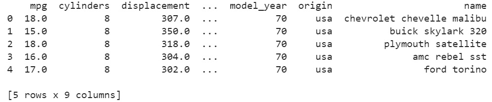
Figure 2.1: mpg dataset
Now, let's take a look at a few different kinds of plots to present this data and derive statistical insights from it.
Scatter Plots
The first type of plot that we will generate is a scatter plot. A scatter plot is a simple plot presenting the values of two features in a dataset. Each datapoint is represented by a point with the x coordinate as the value of the first feature and the y coordinate as the value of the second feature. A scatter plot is a great tool to learn more about two such numerical attributes.
Scatter plots can help excavate relationships among different features in data such as weather and sales, nutrition intake, and health statistics in several contexts.
We will learn how to create a scatter plot with the help of an exercise.
Exercise 13: Creating a Static Scatter Plot
In this exercise, we will generate a scatter plot to examine the relationship between weight and mileage (mpg) of the vehicles from the mpg dataset. To do so, let's go through the following steps:
- Open a Jupyter notebook and import the necessary Python modules:
import seaborn as sns
- Import the dataset from
seaborn:mpg_df = sns.load_dataset("mpg") - Generate a scatter plot using the
scatterplot()function:# seaborn ('version 0.9.0 is required') ax = sns.scatterplot(x="weight", y="mpg", data=mpg_df)The output is as follows:
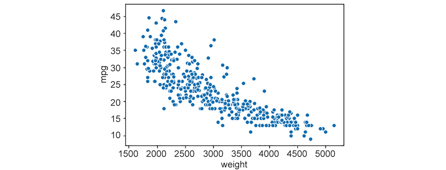
Figure 2.2: Scatter plot
Notice that the scatter plot shows a decline in mileage (mpg) with an increase in weight. That's a useful insight into the relationships between different features in the dataset.
Hexagonal Binning Plots
There's also a fancier version of scatter plots, called a hexagonal binning plot (hexbin plot) – this can be used when both rows and columns correspond to numerical attributes. Where there are lots of data points, the plotted points on a scatter plot can end up overlapping, resulting in a messy graph. It can be hard to infer trends in such cases. With a hexbin plot, a lot of data points in the same area can be shown using a darker shade. Hexbin plots use hexagons to represent clusters of data points. The darker bins indicate that there is a larger number of points in the corresponding ranges of features on the x and y axes. The lighter bins indicate fewer points. The white space corresponds to no points.This way, we end up with a cleaner graph that's clearer to read.
Let's see how to create a hexbin plot in the next exercise.
Exercise 14: Creating a Static Hexagonal Binning Plot
In this exercise, we will generate a hexagonal binning plot to get a better understanding of the relationship between weight and mileage (mpg). Let's go through the following steps:
- Import the necessary Python modules:
import seaborn as sns
- Import the dataset from
seaborn:mpg_df = sns.load_dataset("mpg") - Plot a hexbin plot using
jointplotwithkindset tohex:## set the plot style to include ticks on the axes. sns.set(style="ticks") ## hexbin plot sns.jointplot(mpg_df.weight, mpg_df.mpg, kind="hex", color="#4CB391")
Note the
jointplotfunction ofseabornmentioned in the above code. It is defined where we provide the values for the x axis and y axis along with specifying the kind argument, which is set tohexhere, to build the plot.The output is as follows:
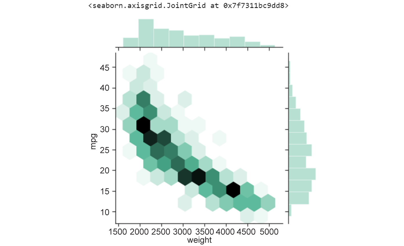
Figure 2.3: Hexagonal binning plot of weight versus mpg
As you might notice, the histogram on the top and right axes depict the variance in the features represented by the x and y axes respectively (mpg and weight, in this example). Also, you might have noticed in the previous scatter plot that data points overlapped heavily in certain areas, obscuring the actual distribution of the features. Hexbin plots are quite a nice data visualization tool when data points are very dense.
Contour Plots
Another alternative to scatter plots when data points are densely populated in specific region(s) is a contour plot. The advantage of using contour plots is the same as hexbin plots – accurately depicting the distribution of features in the visualization in cases where data points are likely to overlap heavily. Contour plots are commonly used to show the distribution of weather indicators such as temperature, rainfall, and others on maps of geographical regions.
Let's look at a contour plot in the following exercise.
Exercise 15: Creating a Static Contour Plot
In this exercise, we'll create a contour plot to show the relationship between weight and mileage in the mpg dataset. We'll be able to see that the relationship between weight and mileage is strongest when there are more data points. Let's go through the following steps:
- Import the necessary Python modules:
import seaborn as sns
- Import the dataset from
seaborn:mpg_df = sns.load_dataset("mpg") - Create a contour plot using the
set_stylemethod:# contour plot sns.set_style("white") - Generate a Kernel Density Estimate (KDE) (see Chapter 1, Introduction to Visualization with Python-Basic and Customized Plotting) plot:
# generate KDE plot: first two parameters are arrays of X and Y coordinates of data points # parameter shade is set to True so that the contours are filled with a color gradient based on number of data points sns.kdeplot(mpg_df.weight, mpg_df.mpg, shade=True)
The output is as follows:
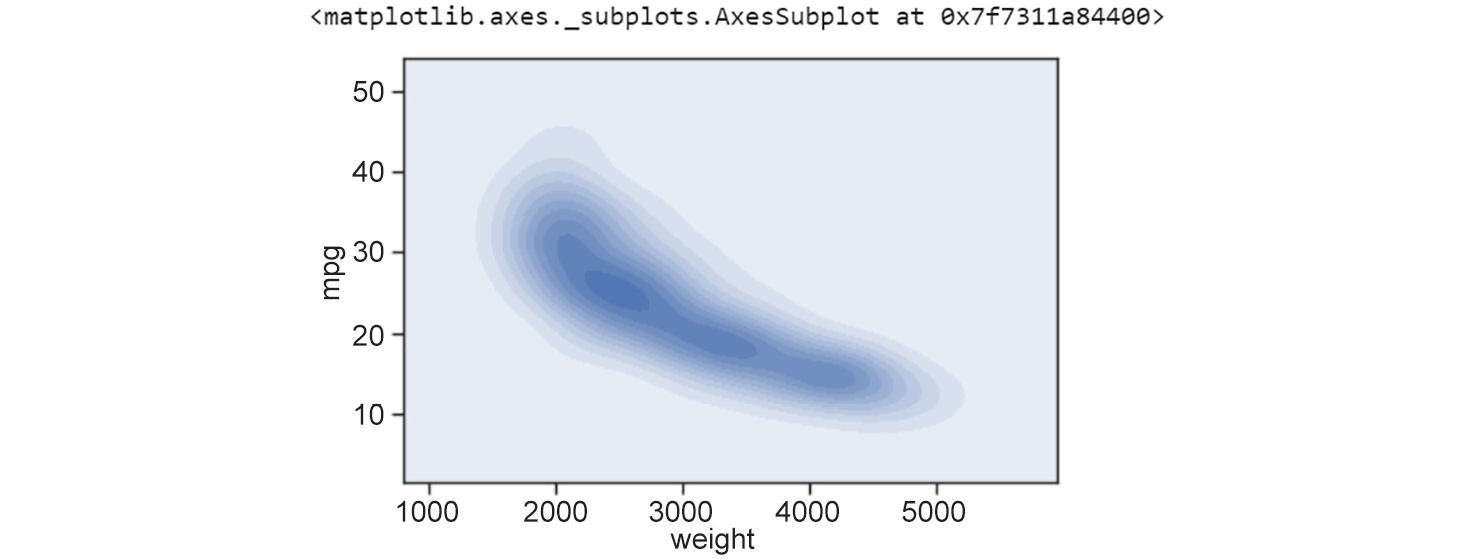
Figure 2.4: Contour plot showing weight versus mpg
Notice that the interpretation of contour plots is similar to that of hexbin plots – darker regions indicate more data points and lighter regions indicate fewer data points.
In our example of weight versus mileage (mpg), the hexbin plot and the contour plot indicate that there is a certain curve along which the negative relationship between weight and mileage is strongest, as is evident by the larger number of data points. The negative relationship becomes relatively weaker as we move away from the curve (fewer data points).
Line Plots
Another kind of plot for presenting global patterns in data is a line plot.
Line plots represent information as a series of data points connected by straight-line segments. They are useful for indicating the relationship between a discrete numerical feature (on the x axis), such as model_year, and a continuous numerical feature (on the y axis), such as mpg from the mpg dataset.
Let's look at the succeeding exercise on creating a line plot with model_year versus mpg.
Exercise 16: Creating a Static Line Plot
In this exercise, we will create a scatter plot for a different pair of features, model_year and mpg. Then, we'll generate a line plot based on those discrete attributes – model_year and mpg. To do so, let's go through the following steps:
- Import the necessary Python modules:
import seaborn as sns
- Import the dataset from
seaborn:mpg_df = sns.load_dataset("mpg") - Create a contour plot:
# contour plot sns.set_style("white") - Create a two dimensional scatter plot:
# seaborn 2-D scatter plot
ax1 = sns.scatterplot(x="model_year", y="mpg", data=mpg_df)
The output is as follows:
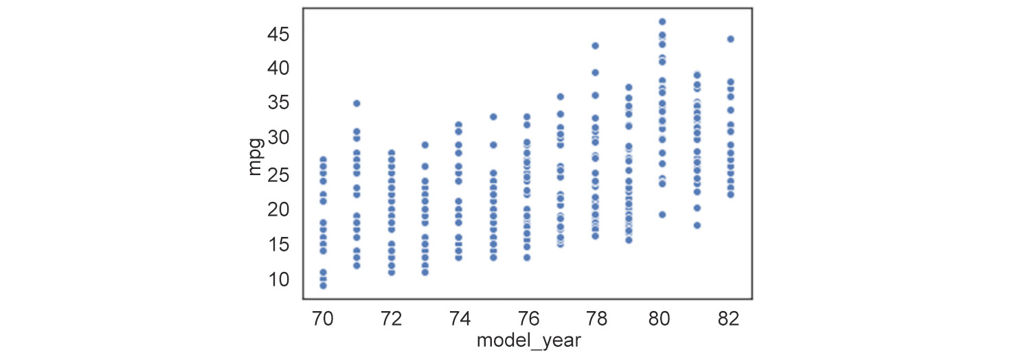
Figure 2.5: Two-dimensional line plot
In this example, we see that the
model_yearfeature only takes discrete values between70and82. Now, when we have a discrete numerical feature like this (model_year), drawing a line plot joining the data points is a good idea. We can draw a simple line plot showing the relationship betweenmodel_yearandmileagewith the following code. - Draw a simple line plot to show the relationship between
model_yearandmileage:# seaborn ('version 0.9.0 is required') line plot code ax = sns.lineplot(x="model_year", y="mpg", data=mpg_df)The output is as follows:
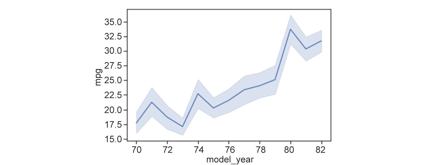
Figure 2.6: Line plot showing the relationship between model_year and mileage
As we can see, the points connected by the solid line represent the mean of the y axis feature at the corresponding x coordinate. The shaded area around the line plot shows the confidence interval for the y axis feature (by default, seaborn sets this to a
95%confidence interval). The ci parameter can be used to change to a different confidence interval. The phrasex%confidence interval translates to a range of feature values where x% of the data points are present. An example of changing to a confidence interval of68%is shown in the code that follows. - Change the confidence interval to
68:sns.lineplot(x="model_year", y="mpg", data=mpg_df, ci=68)
The output is as follows:
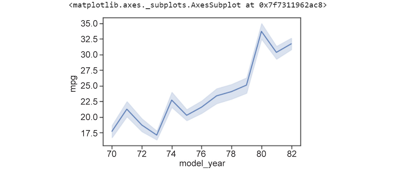
Figure 2.7: Line plot where ci = 68
As we can see from the preceding plot, the 68% confidence interval translates to a range of feature values where 68% of the data points are present. Line plots are great visualization techniques for scenarios where we have data that changes over time – the x axis could represent date or time, and the plot would help to visualize how a value varies over that period.
Speaking of presenting data across time using line plots, let's consider the example of the flights dataset from seaborn. The dataset is used to study a comparison between airlines, delay distribution, predicting flight delays, and more (this open source dataset is hosted on Packt's GitHub repository). Through the following example, we'll see how to generate line plots to represent this dataset.
Exercise 17: Presenting Data across Time with multiple Line Plots
In this example, we'll see how to present data across time with multiple line plots. We are using the flights dataset:
- Import the necessary Python modules:
import seaborn as sns
- Load the flights dataset:
flights_df = sns.load_dataset("flights")
print(flights_df.head())
The output is as follows:

Figure 2.8: Flights dataset
Suppose you want to look at how the number of passengers varies between months in different years. How would you display this information?
One option is to draw multiple line plots in a single figure. For example, let's look at the line plots for the months of December and January across different years. We can do this with the code that follows.
- Create multiple plots for the months of
DecemberandJanuary:#flights_df = flights_df.pivot("month", "year", "passengers") #ax = sns.heatmap(flights_df) # line plots for the planets dataset ax = sns.lineplot(x="year", y="passengers", data=flights_df[flights_df['month']=='January'], color='green') ax = sns.lineplot(x="year", y="passengers", data=flights_df[flights_df['month']=='February'], color='red') ax = sns.lineplot(x="year", y="passengers", data=flights_df[flights_df['month']=='March'], color='blue') ax = sns.lineplot(x="year", y="passengers", data=flights_df[flights_df['month']=='April'], color='cyan') ax = sns.lineplot(x="year", y="passengers", data=flights_df[flights_df['month']=='May'], color='pink') ax = sns.lineplot(x="year", y="passengers", data=flights_df[flights_df['month']=='June'], color='black') ax = sns.lineplot(x="year", y="passengers", data=flights_df[flights_df['month']=='July'], color='grey') ax = sns.lineplot(x="year", y="passengers", data=flights_df[flights_df['month']=='August'], color='yellow') ax = sns.lineplot(x="year", y="passengers", data=flights_df[flights_df['month']=='September'], color='turquoise') ax = sns.lineplot(x="year", y="passengers", data=flights_df[flights_df['month']=='October'], color='orange') ax = sns.lineplot(x="year", y="passengers", data=flights_df[flights_df['month']=='November'], color='darkgreen') ax = sns.lineplot(x="year", y="passengers", data=flights_df[flights_df['month']=='December'], color='darkred')The output is as follows:
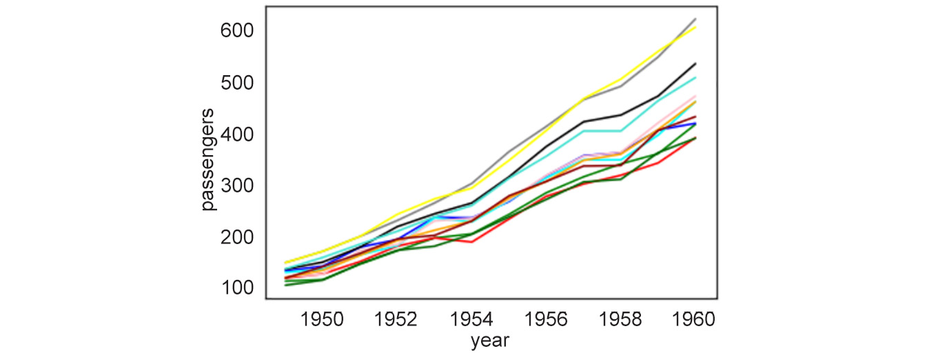
Figure 2.9: Multiple line plots for year versus passengers
With this example of 12 line plots, we can see how a figure with too many line plots quickly begins to get crowded and confusing. Thus, for certain scenarios, line plots are neither appealing nor useful.
So, what is the alternative for our use case?
Heatmaps
Enter heatmaps.
A heatmap is a visual representation of a specific continuous numerical feature as a function of two other discrete features (either a categorical or a discrete numerical) in the dataset. The information is presented in grid form – each cell in the grid corresponds to a specific pair of values taken by the two discrete features and is colored based on the value of the third numerical feature. A heatmap is a great tool to visualize high-dimensional data and even to tease out features that are particularly variable across different classes.
Let's go through a concrete exercise.
Exercise 18: Creating and Exploring a Static Heatmap
In this exercise, we will explore and create a heatmap. We will use the flights dataset from the seaborn library to generate a heatmap depicting the number of passengers per month across the years 1949-1960:
- Start by importing the
seabornmodule and loading theflightsdataset:import seaborn as sns flights_df = sns.load_dataset('flights') - Now we need to pivot the dataset on the required variables using the
pivot()function before generating the heatmap. Thepivotfunction first takes as arguments the feature that will be displayed in rows, then the one displayed in columns, and finally the feature whose variation we are interested in observing. It uses unique values from specified indexes/columns to form axes of the resulting DataFrame:df_pivoted = flights_df.pivot("month", "year", "passengers") ax = sns.heatmap(df_pivoted)The output is as follows:
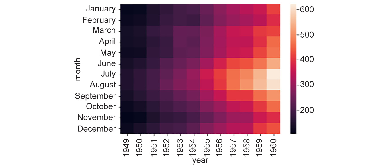
Figure 2.10: Generated heatmap
Here, we can note that the total number of yearly flights increased steadily from
1949to1960. Moreover, the months of July and August seem to have the largest number of flights (compared to other months) across the years in observation. Now, that's an interesting trend to find from a simple visualization!Plotting heatmaps is a very fun thing to explore, and there are lots of options available to tweak the parameters. You can learn more about them at https://seaborn.pydata.org/generated/seaborn.clustermap.html and https://seaborn.pydata.org/generated/seaborn.heatmap.html. However, we will only mention a few important aspects here – the clustering option and the distance metric.
Rows or columns in a heatmap can also be clustered based on the extent of their similarity. To do this in
seaborn, use theclustermapoption.Exercise18 continued
- Use
clustermapoption to cluster rows and columns:ax = sns.clustermap(df_pivoted, col_cluster=False, row_cluster=True)
The output is as follows:
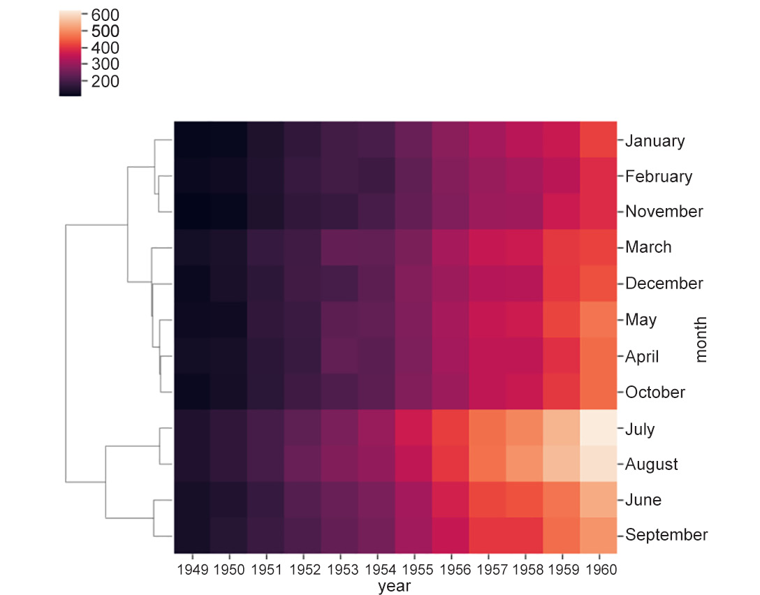
Figure 2.11: Heatmap using clustermap
Did you notice how the order of months got rearranged in the plots but some months (for example, July and August) stuck together because of their similar trends? In both July and August, the number of flights increased relatively more drastically in the last few years till
1960.Note
We can cluster the data by year by switching the parameter values (
row_cluster=False, col_cluster=True) or cluster both by row and column (row_cluster=True, col_cluster=True).At this point, you may be thinking, But wait, how is the similarity between rows and columns computed? The answer is that it depends on the distance metric – that is, how the distance between two rows or two columns is computed. The rows/columns with the least distance between them are clustered closer together than the ones with a greater distance between them. The user can set the distance metric to one of the many available options (
manhattan,euclidean,correlation, and others) simply using themetricoption as follows. You can read more about the distancemetricoptions here: https://scikit-learn.org/stable/modules/generated/sklearn.neighbors.DistanceMetric.html.Note
seabornsets the metric toeuclideanby default.Exercise18 continued:
- Set
metrictoeuclidean:# equivalent to ax = sns.clustermap(df_pivoted, row_cluster=False, metric='euclidean') ax = sns.clustermap(df_pivoted, col_cluster=False)
The output is as follows:
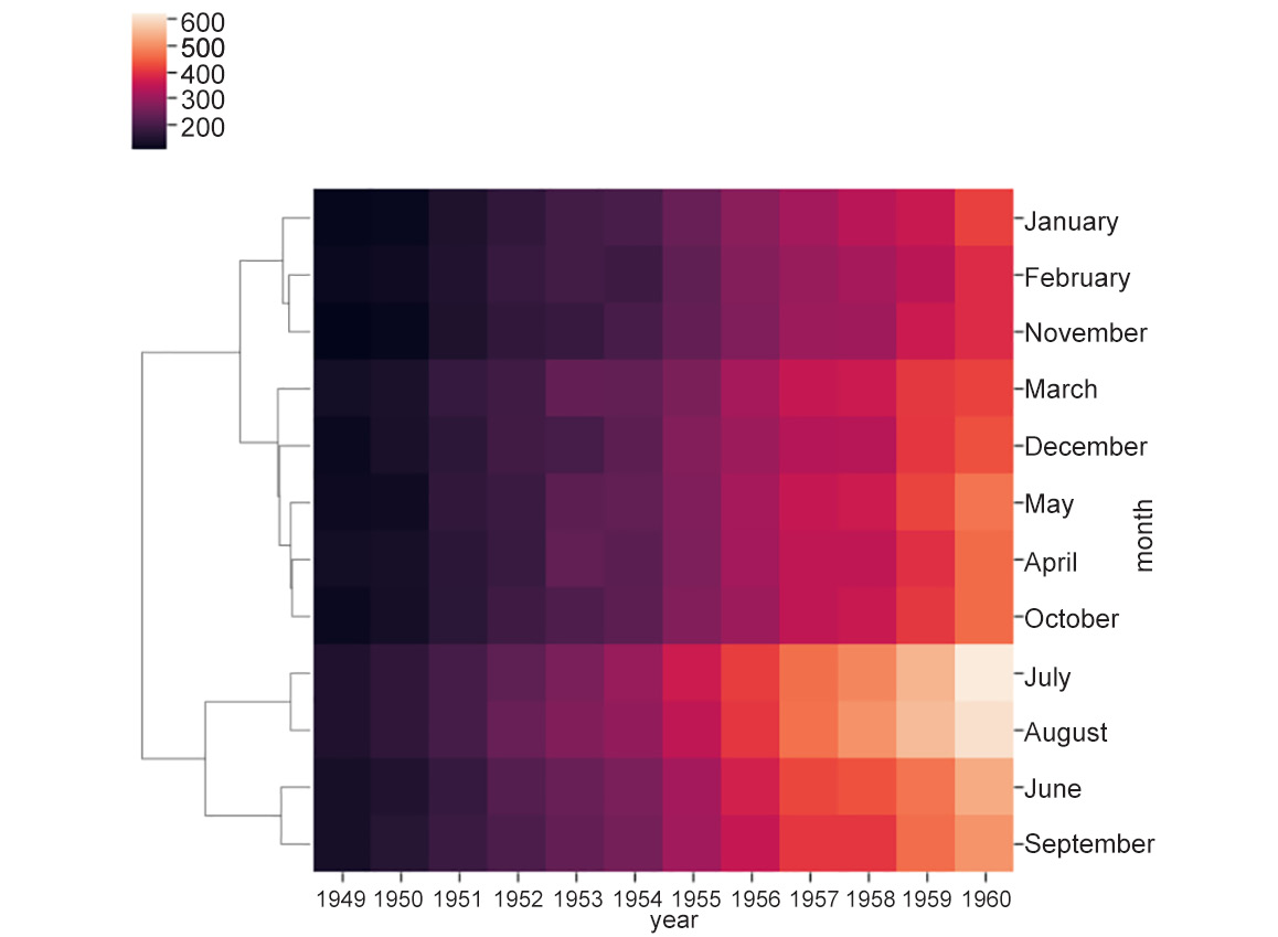
Figure 2.12: Heatmap with distance metric as euclidean
- Change
metrictocorrelation:# change distance metric to correlation ax = sns.clustermap(df_pivoted, row_cluster=False, metric='correlation')
The output is as follows:
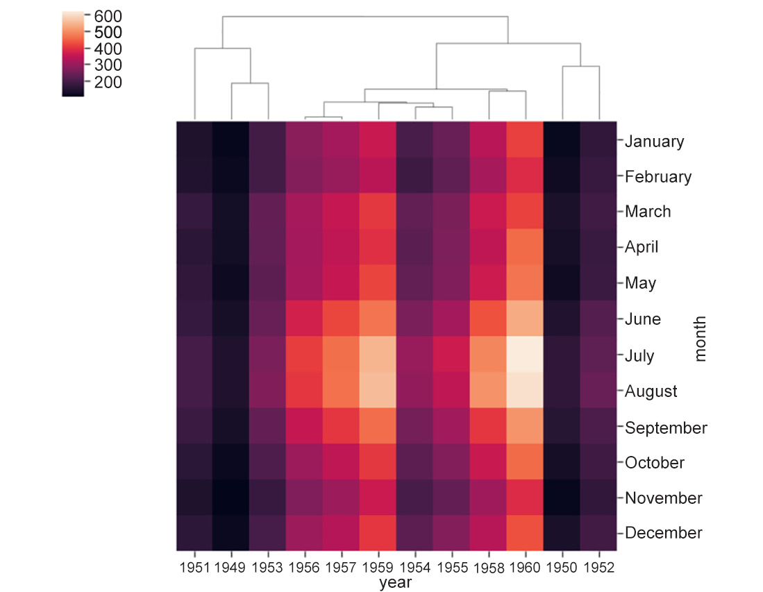
Figure 2.13: Heatmap with distance metric is correlation
On reading about distance metric, we learn that it defines the distance between two rows/columns. However, if we look carefully, we see that the heatmap also clusters not just individual rows or columns, but also groups of rows and columns. This is where linkage comes into the picture. But hold your breath for a moment before we come to that!
The Concept of Linkage in Heatmaps
The clustering seen in heatmaps is called agglomerative hierarchical clustering because it involves the sequential grouping of rows/columns until all of them belong to a single cluster, resulting in a hierarchy. Without loss of generality, let's assume we are clustering rows. The first step in hierarchical clustering is to compute the distance between all possible pairs of rows, and to select two rows, say, A and B, with the least distance between them. Once these rows are grouped, they are said to be merged into a single cluster. Once this happens, we need a rule that not only determines the distance between two rows but also the distance between any two clusters (even if the cluster contains a single point):
- If we define the distance between two clusters as the distance between the two points across the clusters closest to each other, the rule is called single linkage.
- If the rule is to define the distance between two clusters as the distance between the points farthest from each other, it is called complete linkage.
- If the rule is to define the distance as the average of all possible pairs of rows in the two clusters, it is called average linkage.
The same holds for clustering columns, too.
Exercise 19: Creating Linkage in Static Heatmaps
In this exercise, we'll generate a heatmap and understand the concept of single, complete, and average linkage in heatmaps using the flights dataset. We'll use the cluster map method and set the method parameter to different values, such as average, complete, and single. To do so, let's go throughout the following steps:
- Start by importing the
seabornmodule and loading theflightsdataset:import seaborn as sns flights_df = sns.load_dataset('flights') - Now we need to pivot the dataset on the required variables using the
pivot()function before generating the heatmap:df_pivoted = flights_df.pivot("month", "year", "passengers") ax = sns.heatmap(df_pivoted)The output is as follows:

Figure 2.14: Generated heatmap for the flights dataset
- Link the heatmaps using the code that follows:
ax = sns.clustermap(df_pivoted, col_cluster=False, metric='correlation', method='average')
ax = sns.clustermap(df_pivoted, row_cluster=False, metric='correlation', method='complete')
ax = sns.clustermap(df_pivoted, row_cluster=False, metric='correlation', method='single')
The output is as follows:
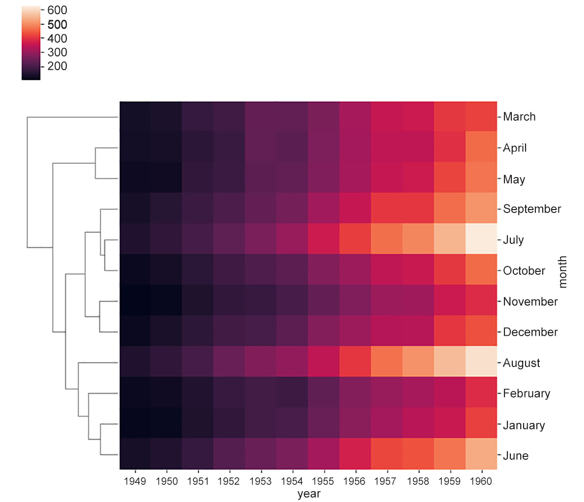
Figure 2.15a: Heatmap showing average linkage
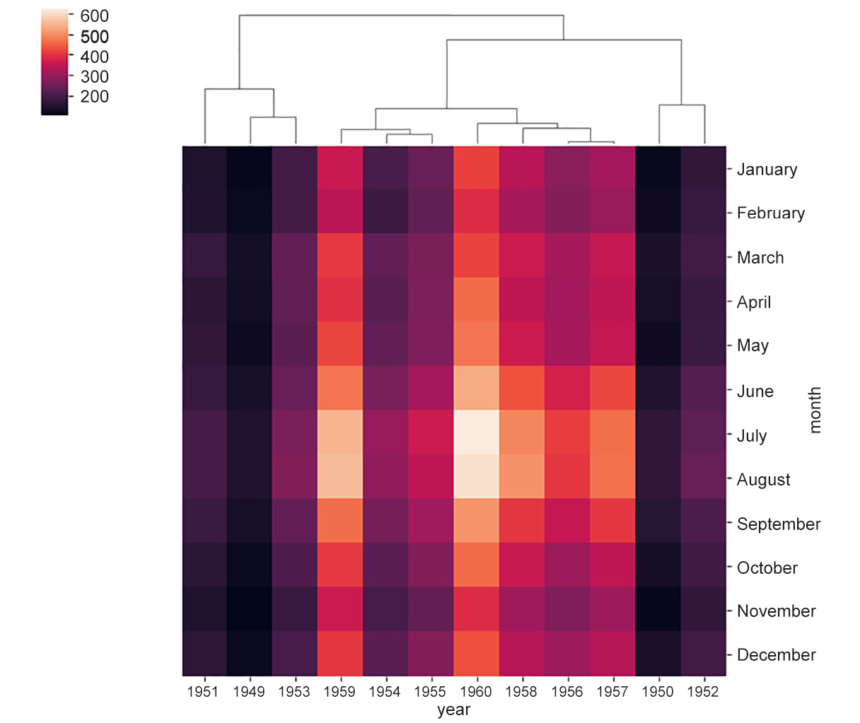
Figure 2.15b: Heatmap showing complete linkage
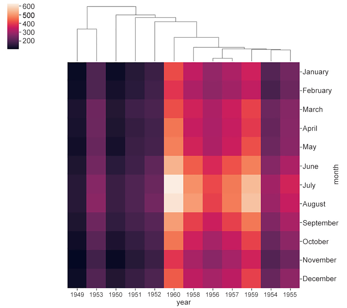
Figure 2.15c: Heatmap showing single linkage
Heatmaps are also a good way to visualize what happens in a 2D space. For example, they can be used to show where the most action is on the pitch in a soccer game. Similarly, for a website, heatmaps can be used to show the areas that are most frequently moussed over by users.
In this section, we have studied plots that present the global patterns of one or more features in a dataset. The following plots were specifically highlighted in the section:
- Scatter plots: Useful for observing the relationship between two potentially related features in a dataset
- Hexbin plots and contour plots: A good alternative for scatter plots when data is too dense in some parts of a feature space
- Line plots: Useful for indicating the relationship between a discrete numerical feature (on the x axis) and a continuous numerical feature (on the y axis)
- Heatmaps: Useful for examining the relationship between a continuous numerical feature of interest and two other features that are either a categorical or a discrete numerical