


 Download code from GitHub
Getting Started with KNIME
It's time to get our hands finally dirty with data as we unveil KNIME, the first instrument we find in our data analytics toolkit. This chapter will introduce you to the foundational features of any low-code analytics platform and will allow you to get started with the universal need you face at the beginning of every analytics project: loading and cleaning data.
Let's have a look at the questions this chapter aims to answer:
- What is KNIME and where can I get it?
- What are nodes and how do they work?
- What does a data workflow look like?
- How can I load some data in KNIME and clean it up?
This is going to be a rather hands-on initiation to the everyday practice of data analytics. Since we will spend some time with KNIME, it's worth first getting some basic background on it.
KNIME (/na�m/) is pronounced like the word knife but with an m at the end instead of an f.
KNIME in a nutshell
KNIME is a low-code data analytics platform known for its ease of use and versatility. Let's go through its most prominent features:
- KNIME allows the visual design of data analytics: this means that you can build your sequence of transformation and modeling steps by just drawing it. In the same way as you would sketch a flowchart to describe a process using pencil and paper, with KNIME you will use a mouse and keyboard to depict what you want to do with your data. This is the fundamental difference versus the approach implemented in code-based analytics environments: using tools like KNIME means you don't need to write a line of code unless you want to. The visual approach will also let you have a clear line of sight of what's happening with your data at each step of the process. This makes even complex procedures intuitive to understand and easier to build. For advanced data practitioners like data scientists, this means saving a lot of time for debugging a prototype, as they can easily spot issues along the way. For business users in need of some data analytics, KNIME offers a very hospitable environment, accessible to everyone who wants to learn from scratch.
- It is open source and free to use: you can download its full version and install it on your computer at no cost. Different from what happens with the trial version of other products, it offers the complete set of functionalities for data analytics without limitations or time constraints. For the sake of completeness: KNIME also offers a commercial product (called KNIME Server) that enables the full operationalization of workflows as real-time applications and services, but we will not need to use any of this on our journey.
- It offers a rich library of additional packages for extending its base functionalities. These are available—in most cases—for free. Some of these extensions will let you connect KNIME with cloud platforms (like Amazon Web Services or Microsoft Azure), access other applications (Twitter or Google Analytics, to mention a few), or run specific types of advanced analytics (such as text mining or deep learning). Some packages will even let you add some Python or R code into KNIME so that you can implement even the most specific and sophisticated functionalities offered within their extensive set of libraries. This means that if you know how to program, you can leverage that as well in KNIME. The good news is that—in the vast majority of cases—you simply don't need to!
- Lastly, there is a broad and growing community of KNIME practitioners around the world. This makes it easier to find blogs and forums filled with examples (like the KNIME official one, forum.knime.com), tutorials, and answers to the most frequent questions you will encounter. Generous KNIME users can also share some ready-to-use modules with the rest of the community to enable others to replicate them: this further enriches the functionalities available out there at the time of need.
All these features make KNIME an all-inclusive tool, to the point that some have called it the Swiss Army knife of data analytics. Whatever nickname we prefer to give it, KNIME is well suited for learning and practicing everyday analytics and is certainly a tool worth adding to our kit.
It's time to get KNIME up and running on your computer: you can download it from the official website www.knime.com. Just go to the Download page and get the installation started for your operating system (KNIME is available for Windows, Unix, and Mac). When you are done with the installation, open the app. At the first run, you might be asked to confirm the location of the Workspace; this will be the folder where all your projects will be saved. After confirming the workspace folder (you can select any location you like), you are ready to go: the KNIME interface will be there to welcome you.
Moving around in KNIME
As we enter the world of KNIME, it makes sense to familiarize ourselves with the two keywords we are going to use most often: nodes and workflows:
- A node is the essential building block of any data operation that happens in KNIME. Every action you apply on data—like loading a file, filtering out rows, applying some formula, or building a machine learning model—is represented by a square icon in KNIME, called a node.
- A workflow is the full sequence of nodes that describe what you want to do with your data, from the beginning to the end. To build a data process in KNIME you will have to select the nodes you need and connect them in the desired order, designing the workflow that is right for you:

Figure 2.1: KNIME user interface: your workbench for crafting analytics
KNIME's user interface has got all you need to pick and mix nodes to construct the workflow that you need. Let's go through the six fundamental elements of the interface that will welcome you as soon as you start the application:
- Explorer. This is where your workflows will be kept handy and tidy. In here you will find: the LOCAL workspace, which contains the folders stored on your local machine; the KNIME public server, storing many EXAMPLES organized by topic that you can use for inspiration and replication; the My-KNIME-Hub space, linked to your user on the KNIME Hub cloud, where you can share private and public workflows and reusable modules—called Components in KNIME—with others (you can create your space for free by registering at hub.knime.com).
- Node Repository. In this space, you can find all the nodes available to you, ready to be dragged and dropped into your workflow. Nodes are arranged in hierarchical categories: if you click on the chevron sign > on the left of each header, you will go to the level below. For instance, the first category is IO (input/output) which includes multiple subcategories, such as Read, Write, and Connectors. You can search for the node you need by entering some keywords in the textbox at the top right. Try entering the word
Excelin the search box: you will obtain all nodes that let you import and export data in the Microsoft spreadsheet format. As a painter would find all available colors in the palette, the repository will give you access to all available nodes for your workflow:
Figure 2.2: The Node Repository lists all the nodes available for you to pick
- Workflow Editor. This is where the magic happens: in here you will combine the nodes you need, connect them as required, and see your workflow come to life. Following the analogy we started above with the color palette, the Workflow Editor will be the white canvas on which you will paint your data masterpiece.
- Node Description. This is an always-on reference guide for each node. When you click on any node—lying either in the repository or in the Workflow Editor—this window gets updated with all you need to know about the node. The typical description of a node includes three parts: a summary of what it does and how it works, a list of the various steps of configuration we can apply (Dialog Options), and finally, a description of the input and output ports of the node (Ports).
- Outline. Your workflow can get quite big and you might not be able to see it fully within your Workflow Editor: the Outline gives you a full view of the workflow and shows which part you are currently visualizing in the Workflow Editor. If you drag the blue rectangle around, you can easily jump to the part of the workflow you are interested in.
- Console and Node Monitor. In this section, you will find a couple of helpful diagnostics and debugging gadgets. The Console will show the full description of the latest warnings and errors while the Node Monitor shows a summary of the data available at the output port of the currently selected node.
You can personalize the look and feel of the user interface by adding and removing elements from the View menu. Should you want to go back to the original setup, as displayed in the figure above, just click on View | Reset Perspective....
Although these six sections cover all the essential needs, the KNIME user interface offers more sections that you might be curious enough to explore. For instance, on the left, you have the Workflow Coach, which suggests the next most likely node you are going to add to the workflow, based on what other users do. Lastly, in the same window of the Node Description, you will find an additional panel (look for its header at the top) called KNIME Hub: in here, you can search for examples, additional packages, and modules that you can directly drag and drop into your workflow, as you would do from the Node Repository.
Nodes
Nodes are the backbone of KNIME and we need to feel totally confident with them: let's discover how they work and what types of nodes are available:
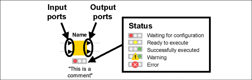
Figure 2.3: Anatomy of a node in KNIME: the traffic light tells us the current status
As you can see from the figure above, nodes look like square icons with some text and shapes around them. More precisely:
- On top of a node, you will find its Name in bold. The name tells you, in a nutshell, what that type of node does. For example, to rename some columns in a table, we use the node called Column Rename.
- At the bottom of the square, you find a Comment . This is a label that should explain the specific role of that node in your workflow. By default, KNIME applies a counter to every new node as it gets added to the workflow, like Node 1, Node 2, and so on. You can modify the comment by just double-clicking on it.
I strongly encourage you to comment on every single node in your workflow with a short description that explains what it does. When workflows get complex you will quickly forget what each node was meant to do there. Trust me: it's a worthy investment of your time!
- Nodes are connected through Ports, lying at the left and at the right of the square. By convention, the ports on the left are input ports, as they bring data into the node, while ports on the right are output ports, carrying the results of the node execution. Ports can have different shapes and colors, depending on what they carry: most of them are triangles, as they convey data tables, but they could be squares (models, connections, images, and more) or circles (variables).
- At the bottom of every node, you have a traffic light that signals the current Status of the node. If the red light is on, the node is not ready yet to do its job: it could be that some required data has not been given as an input or some configuration step is needed. When the light is amber, the node has all it needs and is ready to be executed on your command. The green light is good news: it means that the node was successfully executed and the results are available at the output ports. Some icons can appear on the traffic light if something is not right: a yellow triangle with an exclamation mark indicates a warning while a red circle with a cross announces an error. In these cases, you can learn more about what went wrong by keeping your mouse on them for a second (a label will appear) or by reading the Console.
As we have already started to see in the Node Repository, there are several families of nodes available in KNIME, each responding to a different class of data analytics needs. Here are the most popular ones:
- Input & Output: these nodes will bring data in and out of KNIME. Normally, input nodes are at the beginning of workflows: they can open files in different formats (CSV, Excel, images, webpages, to mention some) or connect to remote databases and pull the data they need. As you can see from Figure 2.4, the input nodes have only output ports on the right and do not have any input ports on the left (unless they require a connection with a database). This makes sense as they have the role of initiating a workflow by pulling data into it after reading it from somewhere. Conversely, output nodes tend to be used at the end of a workflow as they can save data to files or cloud locations. They rarely have output ports as they close our chain of operations.
- Manipulation: These nodes are capable of handling data tables and transforming them according to our needs. They can apply steps for aggregating, combining, sorting, filtering, and reshaping tables, but also managing missing values, normalizing data points, and converting data types. These nodes, together with those in the previous family, are virtually unmissable in any data analytics workflow: they can jointly clean the data and prepare it in the format required by any subsequent step, like creating a model, a report, or a chart. These nodes can have one or more input ports and one or more output ports, as they are capable of merging and splitting tables.
- Analytics: These are the smartest nodes of the pack, able to build statistical models and support the implementation of artificial intelligence algorithms. We will learn how to use these nodes in the chapters dedicated to machine learning. For now, it will be sufficient to keep with us the reassuring thought that even complex AI procedures (like creating a deep neural network) can be obtained by wisely combining the right modeling nodes, available in our Node Repository. As you will notice in Figure 2.4, some of the ports are squares as they stand for statistical models instead of data tables.
- Flow Control: Sometimes, our workflows will need to go beyond the simple one-branch structure where data flows only once and follows a single chain of nodes. These nodes can create loops across branches so we can repeat several steps through cycles, like a programmer would do with flow control statements (for those of you who can program, think of
whileorforconstructs). We can also dynamically change the behavior of nodes by controlling their configuration through variables. These nodes are more advanced and, although we don't need them most of the time, they are a useful resource when the going gets tough. - All others: On top of the ones above, KNIME offers many other types of nodes, which can help us with more specific needs. Some nodes let us interact systematically with third-party applications through interfaces called Application Programming Interfaces (APIs): for example, an extension called KNIME Twitter Connectors lets you search for tweets or download public user information in mass to run some analytics on it. Other extensions will let you blend KNIME with programming languages like Python and R so you can run snippets of code in KNIME or execute KNIME workflows from other environments. You will also have nodes for running statistical tests and for building visualizations or full reports.
When you are looking for advanced functionality in KNIME, you can check the KNIME Hub or run a search on nodepit.com, a search engine for KNIME workflows, components, and nodes.
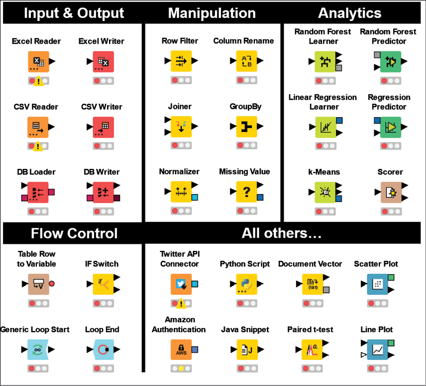
Figure 2.4: A selection of KNIME nodes by type: these are the LEGO® bricks of your data analytics flow
I hope that reading about the broad variety of things you can do with nodes has whetted your appetite for more. It's finally time to see nodes in action and build a simple KNIME workflow.
Hello World in KNIME
As you put together your first workflow, you will learn how to interact with KNIME's user interface to connect, configure, and execute nodes: this is the bread and butter of any KNIME user, which you are about to become.
The title of this section is a thing for geeks: in fact, when you learn a new programming language, "Hello, World!" is the first program you get to write. It is very simple and is meant to illustrate the basic syntax of a language.
Let's imagine we have a simple and repetitive data operation to perform regularly: every day we receive a text file in Comma-Separated Value (CSV) format, which reports the cumulative sales generated by country in the year to date. The original file has some unnecessary columns and the order of rows is random. We need to apply some basic transformation steps so that we end up with a simple table showing just two columns: one is the name of the country and the other the amount of generated sales. We also want the rows to be sorted by decreasing sales. Lastly, we need to convert the file into Excel as it is a format that's easier to read for our colleagues. We can build a KNIME workflow that does exactly that once, in a way that we don't need to repeat the tedious task manually every day. Let's open KNIME Analytics Platform and build our time-saving workflow.
To keep our workflows tidy, we can organize them hierarchically, in folders: in KNIME, folders are called Workflow Groups. So, let's start by creating a workflow group that will host our first piece of work:
- Right-click on the LOCAL entry in the KNIME Explorer section (top-left) and then click on New Workflow Group... in the pop-up menu.
- Enter the name of your new folder (you can call it
Chapter 2) and click on Finish:
Figure 2.5: Creating a Workflow Group in KNIME: keep your work tidy by organizing it in folders
You will see that the new folder has appeared in your local workspace. Now we can finally create a new workflow within this group. Similar to what you just did when creating a group, you just need to follow a few more steps:
- Right-click on the newly created workflow group and then on New KNIME Workflow....
- Enter the name of your new workflow (how about
Hello World?) and then click Finish. Your workflow will appear in the editor, which at this point will look like a sheet of squared paper. - It's time to load our CSV file into KNIME, using the proper input node. The fastest way to do so is to drag and drop the file directly into the Workflow Editor: just grab the file named
raw_sales_country.csvfrom the folder where it is located and drop it anywhere on the blank editor. KNIME will recognize the type of file and automatically implement the right node for reading it: in this case, CSV Reader. As you drop the file, its configuration dialog will appear. If at any point you need to revise its configuration, you can just double-click on the node to obtain the same dialog.Like we will do every time we meet a new KNIME node on our journey, let's quickly discover how it works and how to configure it.
 CSV Reader
This node (available in the repository under the path IO > Reader) reads data from a text file stored in a CSV format and makes it available as a table in KNIME. This node is pretty handy: it attempts to detect the format of the file and recognizes the type of data stored in each column, allowing you to manually change it if needed. It also lets you run some basic reformatting on the fly, like changing the names of columns. As you see in Figure 2.6, its configuration window displays multiple tabs, whose headers appear at the top. The first tab (Settings) lets you set the fundamentals:
- In the first section at the top, you can specify the path of the file to be read: to do so, just click on the Browse... button and select the file. If you dragged and dropped your file in the Workflow Editor, this field is pre-populated. The node lets you also read multiple files in a folder having the same format, by selecting the Files in folder mode.
- In the middle section, you can specify the format of the file, like the characters used to delimit rows and columns and if it has column headers. All these parameters get automatically guessed by the node when a new file is loaded (you can click on Autodetect format to force a new attempt). One useful option is Support short data rows: if this box is ticked, the node will keep working even if some rows have incomplete data points. The good news is that in most cases you will not need to change any of these parameters manually as the automatic detection feature is pretty robust.
- At the bottom of the tab, you find the Preview of the table read in the file. This lets you check that the format has been determined correctly.
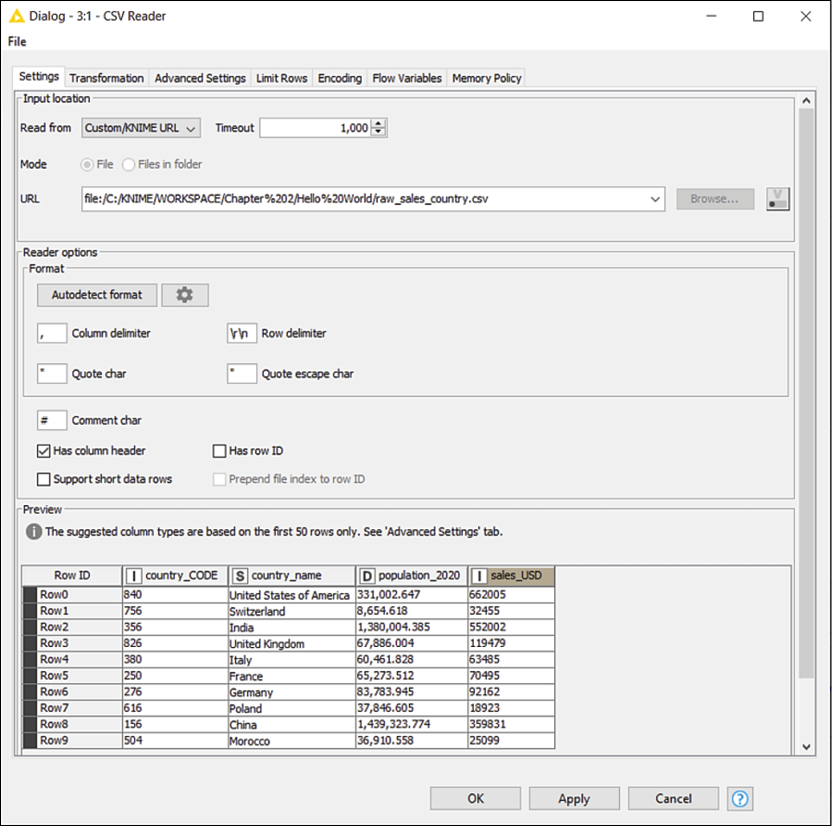
Figure 2.6: Configuration dialog of the CSV Reader node: you can specify which file to read and how
If you move to the second tab of the window (called Transformation) you will have the opportunity to apply some simple reformatting to your table as it gets loaded. For instance, you can: change the name of columns (just write the new one in the New name column), drop some columns you don't need (untick the box on the left of their name), change the column order (drag and drop them using your mouse), and change their data type (for instance, from text to numbers).
Every column in a KNIME table is associated with a data type, indicated by a squared letter beside the name of the column. The most common data types are strings (indicated by the letter S, which are sets of text characters), decimal numbers (letter D), integer numbers (I), long integers (L, like integers but able to store more digits), and Boolean values (B, which can be only FALSE or TRUE).
You can check the results of your transformation in the preview section at the bottom. To be clear, you could do these transformations later in your workflow (you have specific KNIME nodes for renaming columns, changing their orders, and so on) but it might be just faster and easier to make these changes here on the spot, using one single node.
In case the CSV Reader node fails in reading your data as you required, try another node called File Reader. Especially with ill-formatted files, the latter node is more robust than CSV Reader, although it cannot transform the structure of the table on the fly.
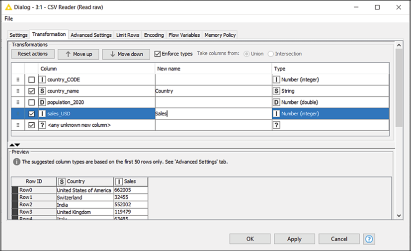
Figure 2.7: The transformation tab of the CSV Reader node: reformat your table on the fly
- Looking at the preview of the table in the Settings tab, it looks like the node has done a good job of interpreting the format of the file. We just noticed that there are some columns we don't need to carry and they can be dropped (specifically,
country_CODEandpopulation_2020) and, also, that we can simplify some of the column names by renaming them. To do this, we need to move to the Transformation tab: just click on its name at the top of the window. - Let's first remove the columns we don't need, by just unticking the boxes beside their names, as shown in Figure 2.7.
- Let's also assign more friendly titles to the other two columns by typing them in the New name section: let's rename
country_nametoCountryandsales_USDtoSales. - The preview of the transformed table looks exactly like we wanted; this means we are done with the configuration of this node, and we can close it by clicking on the OK button.
- To keep things clear to ourselves and others we want to comment on every node in our workflows. Let's start from this very first node. If we double-click on the label underneath (which by default will read Node 1), we can change it to something more meaningful, like
Read raw data. From this point on, I will not mention every time we need to comment on each node—just make it become a habit. - Our node is displaying an encouraging yellow traffic light: it means it has all it needs to fulfill its duty—we just need to say the word. To execute a node in KNIME, we can either select it and press F7 on our keyboard or right-click on the node to obtain the pop-up menu, as shown in Figure 2.8. When it appears, click on Execute:

Figure 2.8: The pop-up menu in the Workflow Editor: right-click on any node to make it appear
- The traffic light turning green is a good sign: our node was successfully executed. A useful feature of KNIME is that you can easily inspect what's going on at each step of the flow, by viewing what data is available at the output ports of every node. In the pop-up menu obtained by right-clicking on a node, you will find one or more icons showing a magnifying lens (normally one for each output port, at the bottom of the menu). By clicking on these icons, you will open a window showing the data you are after. Let's do so now: right-click to make the pop-up menu appear and then click on File Table at the bottom of the menu (alternatively you can check out the Node Monitor or use the keyboard shortcut to open the first output view of a node, which is Shift + F6). Not surprisingly, we obtain the same table we had in preview in the preview step. It seems that, so far, everything is working right. We can click OK and move on.
- The next step is to sort rows by decreasing amounts of sales. We can use a node that is meant to do exactly that: Sorter. Let's add our Sorter node to the workflow, pulling it from the Node Repository at the bottom left. You can either look it up by typing
Sorterin the search box or find it in the hierarchy by clicking first on Manipulation, then Row, and—finally—Transform. When you see the Sorter node, grab it with your mouse and drop it on the workflow, at the right of the CSV Reader node. - Your node is now lying alone in the workflow while we want it to be cooperating with other nodes. In fact, we need it to sort the table output by the CSV Reader, so we need to create a connection between the two nodes. In KNIME, we create connections by just drawing them with the mouse. Click on the output port of the CSV Reader (the little arrow on its right) and while keeping the mouse button pressed, go to the input port of the Sorter node. When you release the button, you will see a connection appearing between the nodes. This is exactly what we wanted, the table given in the output by the CSV Reader has now become an input for the Sorter.
We are now ready to configure the Sorter: let's learn about our new node.
 Sorter
This node (available in the repository in Manipulation > Row > Transform) can sort the rows of a table according to a set of criteria defined by the user. Its configuration is self-explanatory: from the drop-down menu, you can select the column you wish to sort by. The radio buttons on the right let you choose whether the sorting shall follow an Ascending (A to Z or 1 to 9) or Descending (the other way around) order. You can add additional rules on other columns that will come to play to break the ties in case multiple rows carry the same value in a column. To do so, just click on the Add Rule button and you will see further drop-down menus appearing. You can change the order of precedence among multiple rules by using the ↑ and ↓ arrows:
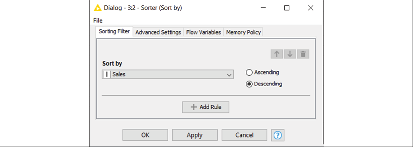
Figure 2.9: Configuration window of the node Sorter: define the desired order of your rows
- To open the configuration window of Sorter, you can either double-click on the node or right-click on it and then press Configure…. You could also just press F6 on your keyboard after selecting the node with your mouse.
- Given our needs, the configuration of the node is straightforward: just select
Salesin the drop-down menu and then click on the second radio button to apply a descending order. Press OK to close the window. - The Sorter node is now clear about the input table to use and about the way we want the sorting to happen: it is all ready to go. Let's execute it (F7 or right-click and select Execute) and open the view showing its output (Shift + F6 or right-click and select Sorted Table, the last icon with the magnifying lens):

Figure 2.10: Output of Sorter node: our countries are now showing by decreasing sales
Every row in a KNIME table is associated with a unique label called Row ID. When a table is created, row IDs are normally generated in the form of a counter (Row0, Row1, Row2, and so on) and are preserved along the workflow. That's why in the output of the Sorter node you can still find the original row position by looking at the Row IDs on the left.
It looks like we have our countries sorted in the right order and we can proceed to the last step: exporting our table as an Excel file.
 Excel Writer
This node (available within IO > Write in the repository) saves data as Excel worksheets. The configuration dialog will let you first select the format of the file to create (the legacy .xls or the latest .xlsx one) and where to save it (click on the Browse... button to select a path). By selecting the if exists radio buttons, you can specify what to do if a file with that name is already there where you want to save it: you can overwrite the old data, append the new data as additional rows, or preserve the original file. An important option to check is Write column headers: when selected, the column names of your table are added as headers in the first row of your Excel file.
Although we don't need to do that now, it's useful to know that some KNIME nodes can also save files on cloud-based file systems, like Google Drive or Microsoft Sharepoint. This is why you also see the option Add ports | File System Connection when you click on the three dots (...) at the bottom left of the node. Another useful feature of the node is that it can manage multiple input tables and save them as separate worksheets in the same Excel file. To do so, you need to click on the three dots on the node and click on Add ports > Sheet Input Ports. You can give different names to the various sheets by typing in the Sheets section of the configuration window.
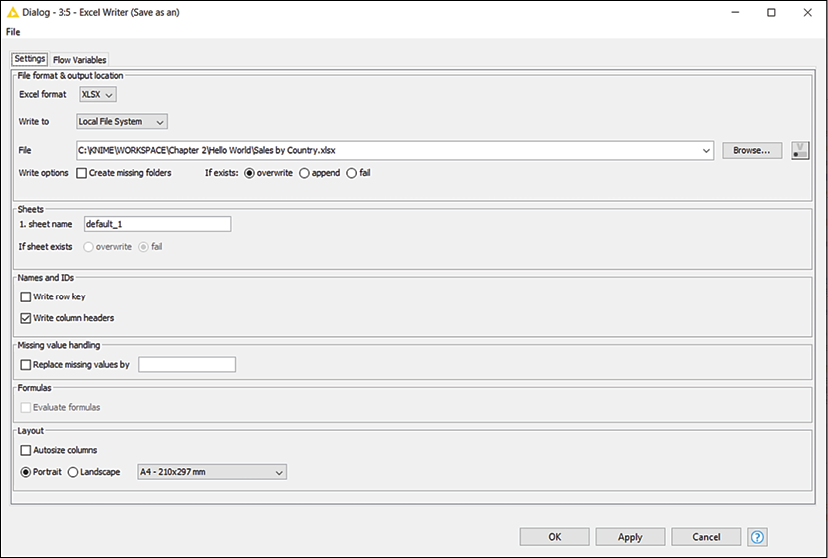
Figure 2.11: Configuration window of Excel Writer: select where to save your output file
- Let's add the Excel Writer node to our workflow, dragging it from the Node Repository, and then create a connection between the output port of the Sorter and the input node of the Excel Writer.
- Open the configuration window of the Excel Writer (double-click on it). The only configurations we need to add in this case are the location and the name of the output file (click on the Browse... button, go to the desired folder, and type the name of the new file) and, since we might need to repeat this process regularly, select the overwrite option using the radio button below.
- It's time to run the node (F7 or right-click and select Execute) and open the new file in Excel. You'll be pleased to see that the new file looks exactly how we wanted.
Congratulations on creating your first KNIME workflow! By combining three nodes and configuring them appropriately, you implemented a simple data transformation routine that you can now repeat in a matter of seconds, whenever it's needed. More importantly, we used this first tutorial to get acquainted with the fundamental operations you need to build any workflow, such as pulling the right nodes, configuring and executing them, and checking that all works as it should:
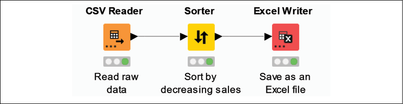
Figure 2.12: Hello World: your first workflow in KNIME
We now have all we need to start building more complex data operations, discovering what other KNIME nodes can do, and this is exactly what we will do in the next few pages. Since we don't want to lose our precious Hello World workflow, it would be a good idea to save it: just press Ctrl + S on your keyboard or click on the disk icon at the top left of your screen. If you want to share your workflow with others, you first need to export it as a standalone file. To do so, right-click on the name of the workflow within the KNIME Explorer panel on the left and then select Export KNIME Workflow...:
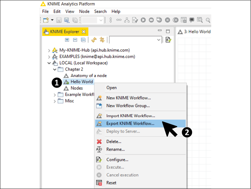
Figure 2.13: How to export a KNIME workflow: you can then share it with whoever you like
In the window that appears, you will have to specify the location and name of the file with your workflow by clicking on the Browse... button. If you keep the Reset Workflow(s) before export option checked, KNIME will only export the definition of the workflow (the nodes' structure and their configuration) without any data in it. If you untick it, the data stored in every executed node will be exported as well (making your export much larger in size). You can now send the resulting file (with .KNWF as an extension) via email or save it in a safe place. Whoever receives it can import it back in their KNIME installation by clicking on File | Import KNIME Workflow... and selecting the location of the file to import and the destination of the workflow.
Cleaning data
Often, when we deal with real-world data analytics, we face a reality that is as annoying as ubiquitous: data can be dirty. The format of text and numbers, the order of rows and columns, the presence of undesired data points, and the lack of some expected values are all possible glitches that can slow down or even jeopardize the process of creating some value from data. Indeed, the lower the quality of the input data, the less useful the resulting output will be. This inconvenient truth is often summarized with the acronym GIGO: Garbage In, Garbage Out. As a consequence, one of the preliminary phases of a data analytics workflow is Data Cleaning, meaning the process of systematically identifying and correcting inaccurate or corrupt data points. Let's learn how to build a full set of data cleaning steps in KNIME through a realistic example.
In this tutorial, we are going to clean a table that captures information on the users of an e-commerce website, such as name, age, email address, available credit, and so on. This table has been generated by pulling directly from the webserver all the available raw data. Our ultimate objective is to create a clean list of contactable users, which we can leverage as a mailing list for sending email newsletters. Since the list of users constantly changes (as some subscribe and unregister themselves every day), we want to build a KNIME workflow that systematically cleans the latest data for us every time we want to update our mailing list:
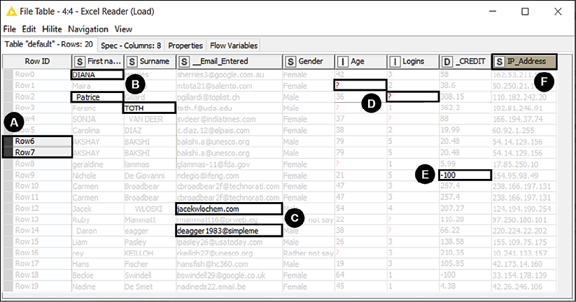
Figure 2.14: The raw data: we certainly have some cleaning chores ahead
As you can see from Figure 2.14, a first look at the raw table unveils a series of data quality flaws to be looked after. For instance:
- Some rows appear to be duplicated.
- Names and surnames have inconsistent capitalization and some unpleasant blank characters. Additionally, instead of having two separate fields for the name, we would prefer to have a single column (currently missing) with the full name of each person.
- Some email addresses are wrongly formatted (as they miss the
@symbol or the full domain), making the respective users not contactable. - Various values are missing, leaving the cell empty.
In KNIME, missing values are indicated with a red question mark symbol,
?. For reference, in computer science, a missing value is referred to with the expressionNULL. - Some credit values are negative. We know that according to company policy these users should be considered inactive and shall not be contacted, so we can remove them from the list.
- Some columns are not needed. In this case, we can drop the column holding the IP address of the user since it cannot be used for sending a newsletter or to personalize its content.
We have an Excel file (DirtyData.xlsx) with an excerpt of the raw data, showing samples of all those issues listed above. By using this file as a base, we can build a KNIME workflow that polishes the data and exports a good-looking and ready-to-use mailing list. Let's do this one step at a time:
- First of all, we need to create a blank workflow (you can do this as seen in the previous example or—alternatively—you can go to File | New... and then select New KNIME Workflow): we can call it
Cleaning data. - To load the data, we can either drag and drop the source file on the Workflow Editor or grab the Excel Reader node from the repository and place it in the blank editor space.
 Excel Reader
This node (IO > Read) opens Excel files, reads the content of the specified worksheet, and makes it available as a table at its output port. In the main tab of the configuration dialog, after indicating which file or folder to open (click on Browse... to change), you can specify (Sheet selection) the worksheet to consider: by default, the node will read the first sheet available in the workbook but you can indicate the name of a specific sheet or its position. If your sheet includes the column headers, you can ask KNIME to use them as column names in the resulting table: in the section Column Header, you can select which row contains the column headers. You can also restrict the reading to a portion of the sheet, by specifying the range of columns and rows to read within the Sheet area section. You can check whether the node is configured correctly by looking at the bottom of the window, which gives you a preview of what KNIME is reading from the file:
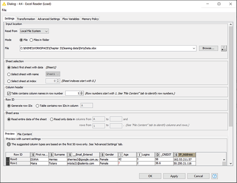
Figure 2.15: Configuration of the Excel Reader node: select file, sheets, and areas to read
If you want to apply some transformations (like renaming columns, reordering them, and so on) as the data gets read, you can use the Transformation tab, which works the same as in the CSV Reader node we have already met.
- Configuring this node will be pretty simple in our case: we should just select the file to open and leave all other parameters unchanged as the default selection looks good for us. We could use the Transformation tab to make some adjustments to the format but we will do it later using the appropriate nodes, so we can keep it easy for now.
To remove the duplicated rows we can use a new node that does exactly that: its name is Duplicate Row Filter.
 Duplicate Row Filter
This node (Manipulation > Row > Filter) identifies rows having the same values in selected columns and manages them accordingly. In the first tab of the configuration window, you select which columns should be considered for the search of duplicates.
If more than one column is selected, the node will consider duplicates as only rows that have exactly the same values across all the selected columns. In the configuration of many KNIME nodes, we will be asked to select a subset of columns, so it makes sense to spend some time on becoming acquainted with the interface:
- The panel on the right (having a green border) contains the columns included in your selection while the one on the left (red-bordered) displays the excluded columns.
- By double-clicking on the names of the columns or by using the four arrow buttons in the middle, you can transfer the columns across panes.
- If you have many columns, you can look them up by name using the Filter textboxes at the top of each pane.
- If you want to select columns by patterns in their names (like the ones starting with an
A) or by type (integers, decimal numbers, strings, and so on), you can select the other options available on the radio selector on top (Wildcard/Regex Selection or Type Selection).
The second tab in the configuration window (titled Advanced) lets you decide what to do with the duplicate rows once identified (by default, they get removed but you can also keep them and add an extra column specifying whether they are duplicates or not) and which rows should be kept among the duplicates (by default, the first row is kept and all others are removed, but other strategies are available):
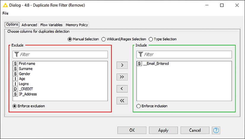
Figure 2.16: Configuration of the Duplicate Row Filter: select which columns to use for detecting duplicate rows
- Let's implement the Duplicate Row Filter node and connect it with the output port of the Excel Reader. The new node will now show an amber status light, signaling that it can run with its default behavior, although we want to do some configuration first.
- Double-click on the node to enter its configuration window. Since we don't want to bombard the same user with multiple emails, we should keep one entry per email address, removing all rows having a duplicate address. Hence, from the configuration window, we move all columns to the left and we keep only
__Email_Enteredon the right. We click on OK and run the node (F7). - Our curiosity makes it impossible to refrain from checking whether this node has worked well. So, we have a look at the data appearing on its output port (right-click and the last icon with the magnifying lens or Shift + F6) and we notice that a couple of rows having duplicated email addresses were removed as expected.
We can now proceed to fix the formatting of names and surnames. To do so, we will start using a very versatile node for working on textual data called String Manipulation.
 String Manipulation
This node (Manipulation > Column > Convert & Replace) applies transformations to strings, making it possible to reformat textual data as needed. The node includes a large set of pre-built functions for text manipulation, such as replacement, capitalization, and concatenation, among others:
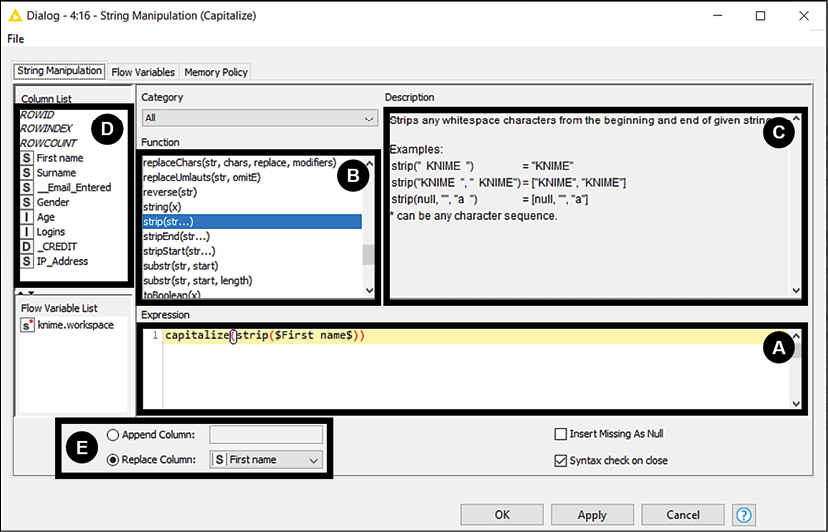
Figure 2.17: String Manipulation: build your text transformation selecting functions and columns to use
The configuration window provides several panels:
- The Expression box is used to specify the overall formula that implements the desired transformation. In most cases, you can build the expression by just using your mouse, clicking on the functions to use and on the columns upon which to apply them.
- The Function list includes all available transformations. For instance, the function
upperCase()will convert a string in all-capital letters. When you double-click on a function here, it will get added to your expression. - The Description box is a handy source of help, showing a description and some examples for each available function as soon as you select it from the list.
- The Column List will show you all available columns in the table. By double-clicking on them, you add them to the expression: they will show with a dollar sign character (
$) on either side to indicate a column. - At the bottom, you find a radio button to decide where to store your result. You can either Append it as a new column or Replace an existing one.
Table 2.1 summarizes the most useful functions available within this node.
|
Function |
Description |
Example |
Result |
|
strip(x) |
Removes any whitespace from the beginning and the end of a string. |
|
|
|
upperCase(x), lowerCase(x) |
Converts all characters to upper or lower case. |
|
|
|
capitalize(x) |
Converts first letters of all words in a string to upper case. |
|
|
|
compare(x,y) |
Compares two strings and returns 0 if they are equal and -1 or 1 if they differ, depending on their alphabetical sorting. |
|
|
|
replace(x,y,z) |
Replaces all occurrences of substring y within x with z. |
|
|
|
removeChars(x,y) |
Removes from string x all characters included in y. |
|
|
|
join(x,y,...) |
Concatenates any number of strings in a single string. |
|
|
|
length(x) |
Counts the number of characters in a string. |
|
|
Table 2.1: Useful functions within String Manipulation
This node is perfect for our needs as we have a few strings to manipulate. We need to fix the capitalization of names and surnames, remove those bad-looking whitespaces, and create a new column with the full name:
- Let's implement the String Manipulation node, dragging it from the repository and connecting the output of the previous node with the input of this new one. Double-click on the node and its configuration dialog appears. Let's start with the column
First name. We want to see a nice upper-case character at the beginning of every word and we also require whitespaces to be stripped from both ends of the string. Let's build the expression by double-clicking first oncapitalize()andstrip()from the Function box and then onFirst namefrom the Column list. By clicking in this order, we should have obtained the expressioncapitalize(strip($First name$)), which is exactly what we wanted. In this case, we want to substitute the raw version of the first name with the result of this expression, so we need to select Replace column and thenFirst name. We are all set so we can click on OK and close the window. - Now we want to repeat the same for the surname. We'll use another String Manipulation node for it. To make it faster we can also copy and paste the icon of the node from the Workflow Editor, with the usual Ctrl + C and Ctrl + V key combinations. We need to repeat the configuration described in the previous step: the only difference is that now we apply it to column
Surnameinstead ofFirst name. Just make sure that both the expression and the Replace column setting refer toSurnamethis time. - Both parts of the name look fine now as they show no extra spaces and boast good-looking capitalization. As required by our business case, we need to create a new column carrying the full name of each user, combining first name and surname. Once again, we can use the String Manipulation node for this: let's get one more node of these in the Workflow Editor, make the connection, and open the configuration page. This time, we need to concatenate two strings so we can leverage the
join()function. Let's double-click first onjoin()from the Function box and then onFirst namefrom the Column list. Since we want names and surnames to be separated by a blank space, we need to add this character on the expression, by typing the sequence," ",in the expression box just after$First name$. We complete the expression by double-clicking on the columnSurnameand we are done. The overall expression should be:join($First name$," ",$Surname$). Before closing, we need to decide where to store the result. This time we want to create a new column so we select Append and then type the name of the new column, which could be Full name. Click on OK and check the results.Since in the end, we are going to keep only the
Full namecolumn, we could have combined the last three nodes in a single one. In fact,Full namecan be created at once with the expression:join(capitalize(strip($First name$))," ",capitalize(strip($Surname$))).We took the longer route to get some practice with the node. It's up to you to decide which version to keep in your workflow.
With all names fixed, we can move on to the next hurdle and remove the ill-formatted email addresses. It's time to introduce a new node that will be ubiquitous in our future KNIME workflows: Row Filter.
 Row Filter
This node (Manipulation > Row > Filter) applies filters on rows according to the criteria you specify. Such criteria can either be based on values of a specific column to test (like all strings starting with A or all numbers greater than 5.2) or on the position of the row in the table (for instance only the top 20 rows). To configure the node, you need to first specify the type of criteria you would like to apply using the selector on the left. You also need to specify if those rows that match your criteria should be kept in your workflow (Include rows...) or should be dropped, keeping all others (Exclude rows...). You have multiple ways to specify the criteria behind your filtering:
- Filter by attribute value: In this case, you will be presented on the right with the full list of columns available so that you can pick the one to consider for the filtering (Column to test). Once you pick the column, you need to describe the logic for the selection in the box below (Matching criteria). You have three options:
- The first one (use pattern matching) will check if the value (considered as a string) adheres to the pattern you specify in the textbox. You can enter a specific value like
maria: this will match rows like "MARIA" or "Maria," unless you check the case sensitive match option, which would consider the lower and upper cases as different. Another option is to use wild cards in your search pattern (remember to tick contains wild cards): in this case, the star character"*"will stand for any sequence of characters (so"M*"selects all names starting with"M"like "Mary" and "Mario") while the question mark"?"will match any single character ("H?"refers to any string of two characters starting with "H," so it will include "Hi" and exclude "Hello"). If you want to implement more complex searches, you could also use the powerful Regular Expressions (RegEx), which offer great flexibility in setting criteria. - The second one (use range checking) is great with numbers as it lets you set any kind of interval: you can specify a lower bound (including all numbers that are greater or equal than that) or an upper bound (lower or equal) or both (making it a closed interval).
Remember that bounds are always considered as included in the interval. If you want to exclude the endpoint of an interval, you need to reverse the logic of your filtering. For instance, if you want to include all non-zero, positive numbers you need to select the option Exclude rows by attribute value and set 0 as the upper bound.
- The third option is to match only the rows that have a missing value in the column under test.
- Filter by row number: This way you can specify which is the first and the last row to match, considering the current sorting order in the table. So if you put
1in the First row number selector and then1in Last row number, you will match only the top 10 rows of the table. If you want to match only the rows after a certain position, like from the 100th onwards, you can set the threshold in the first selector (100) and tick the check box below (to the end of the table). - Filter by row ID: You could test row IDs against some regular expressions as well, although this route is rarely used:

Figure 2.18: Configuration dialog for Row Filter: specify which rows to keep or remove from your table
If your filtering criteria require several columns to be tested, you can use multiple instances of this node in a series, each time looking at a different column. An alternative is to use a different node called Rule-based Row Filter, which lets you define several rules for filtering at once. Other nodes, such as Row Filter (Labs) and Rule-based Row Filter (Dictionary), can do more sophisticated filtering if needed. Check them out if you need to.
Let's see our new node in action straight away as we filter out all the email addresses that do not look valid:
- Implement the Row Filter node, connect it downstream, and open its configuration dialog by double-clicking on it. Since we want to keep only the rows matching certain column criteria, let's select the first option from the radio button on the left (Include rows by attribute value) and, on the right, pick the column with the email address
__Email_Entered. One simple pattern we can use for checking the validity of an email address is the wild card expression*@*.*. This will check for all strings that have at least an@symbol followed by a dot . with some text in between. This is not going to be the most thorough validity check for email addresses, but it will certainly spot the ones that are clearly irregular and is good enough for us at this stage. Remember to tick the contains wild cards checkbox and click OK to move on. - We have yet more filtering to be done. We want to remove all rows displaying a negative credit: those users are inactive and should not be added to our mailing list. Let's implement an additional Row Filter node and put it next to the previous one, creating the right connections across the ports. We will again use the Include rows by attribute value option but the matching criteria will be set as range checking (second radio button on the right). By setting
0as Lower bound, we are good to go since all negative values will be filtered out. We can click OK and move on to the next challenge.At this point, we want to manage the little red question marks appearing here and there in the table, signaling that some values are missing. Also, in this case, KNIME offers a powerful node to manage this situation quickly, with a couple of clicks.
 Missing Value
The node (Manipulation > Column > Transform) handles missing values (NULLs) in a table, offering multiple methods for imputing the best available replacement. In the first tab of the configuration window (Default), you can define a default treatment option for all columns of a certain data type (strings, integer, and double) by selecting it in the dropdown menus. The second tab (Column settings) allows you to set a specific strategy for each individual column by double-clicking on the name of the column from the list on the left and setting the strategy through the menu that will appear.
Unless you have a large number of columns that you want to treat with the same missing value strategy, it's best to be explicit and use the second tab. That way you only impute missing values for the precise columns specified.
You have a vast list of possible methods to treat your missing values. The most useful ones are:
- Remove Row: Gets rid of the row altogether if the value is missing.
- Fix Value: Replaces the NULL with a specific value you have to enter in the box that will appear below. All rows with missing values will get the same fix replacement.
- Minimum/Maximum/Mean/Median/Most Frequent Value: Calculates a summary statistic on the distribution over all existing values in the column and uses it as a fixed replacement value.
If you substitute missing values with the median of a numeric column, your imputed values are going to stick "in the middle" of the existing distribution, making your inference less disruptive and more robust. Of course, this will depend on your business cases and on the actual distribution of data, but it's worth giving this approach a try.
- Previous/Next: Replaces the missing value with the previous or the next non-missing value in the column, using the current order of rows in the table.
- Linear Interpolation: Substitutes missing values with the linear interpolation between the previous and the next non-missing values in the column. If your column represents values changing over time (we call them time series), this handler might offer a smooth way to fill the gaps.
- Moving Average: Substitutes the missing values with a moving average calculated over a certain number of non-missing values appearing in the table just before the missing value (lookbehind window) or after it (lookahead window). For instance, if you have for a column a sequence of values such as [2, 3, 4, NULL] and you apply a lookbehind window of size 2, the NULL value will be substituted for 3.5, which is the average of 3 and 4. For this and the previous handlers, you want to make sure your table is properly sorted (like, in a time series, by increasing time).

Figure 2.19: Configuration of Missing Value: decide how to manage the empty spots of your table
Going back to our case, we noticed that we have two columns displaying some question marks. Let's manage them appropriately by leveraging the Missing Value node:
- Drag the Missing Value node on your workflow and connect it properly. Let's jump straight to the second tab of its configuration window (Column settings), as we want to keep control of which handling strategy we shall adopt for each column in need. For column
Age(double-click on it from the list on the left), we can select Median: by doing so, we will assign an age to those users missing one that is not "far off" the age that most users tend to have in our table. When it comes to the number of times users have logged in (Loginscolumn) we assume that the lack of a value means that they haven't logged in yet. So the best strategy to select will be Fix Value, keeping 0 as a default value for all. We can click on OK and close this dialog. - Let's check how our chain of transformations is looking at the minute. If we click on the last node, execute it (F7), and check its output port view (Shift + F6), we can breathe a sigh of relief: no missing values, no negative credits, and both names and email addresses look reasonably formatted.
The only steps left ahead of us are of an aesthetic nature: we want to drop the columns we don't need, sort the ones remaining, and give them a more intuitive name, before finally saving the output file. We are going to need a few more nodes to complete this last bit.
 Column Filter
This node (Manipulation > Column > Filter) drops unneeded columns in a table. The only required step for its configuration is to select which columns to keep at the output port (the green box on the right) and which ones to filter out (the red box on the left):
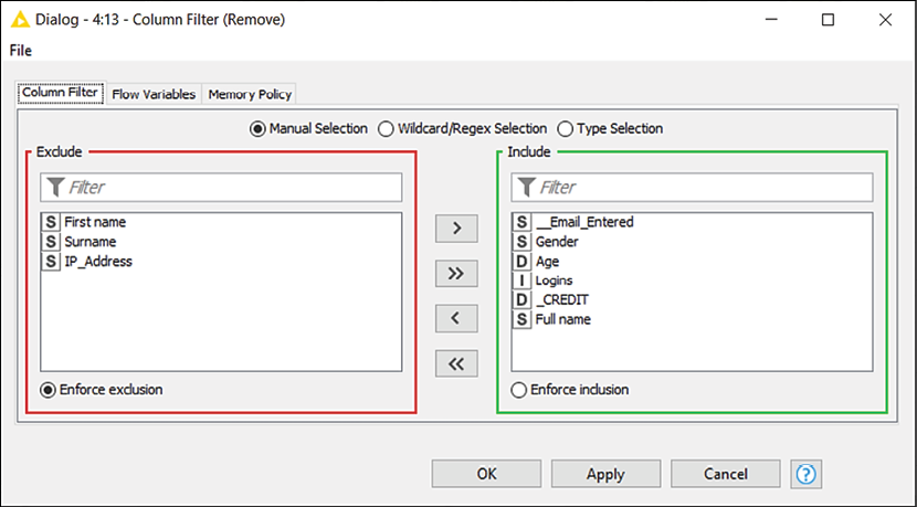
Figure 2.20: Configuration of Column Filter: which columns would you like to keep?
- Add the Column Filter node to the workflow and exclude the columns we no longer need (
First Name,Surname, andIP_Address) by moving them onto the left panel.
 Column Rename
The node lets you change the names and the data types of columns. To configure it, double-click on the columns you would like to edit (you'll find a list on the left) and tick the Change box: you will then be able to enter the new names in the box beside. To change the data type of a column and convert all its values, you can use the drop-down menu on the right. The menu will be prepopulated with a list of possible data types each column can be safely converted into:
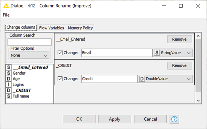
Figure 2.21: Configuration of Column Rename: pick the best names for your columns
- We can now use the Column Rename node to change the headers in our table. The only ones that need some makeup are
__Email_Entered, which can become simplyEmail, and_Credit, which can be renamed toCredit.
 Column Resorter
This node (available in Manipulation > Column > Transform) changes the order of columns in a table. In the configuration window, you will find, on the left, all columns available at the input port, and on the right, a series of buttons to move them around. Select the column you wish to move across and then click on the different buttons to move columns up or down, place columns first or last in the table, or sort them in alphabetical order. If different columns appear at the input port (imagine the case where your source file is coming in with some new columns), they will be placed where the <any unknown new column> placeholder lies:
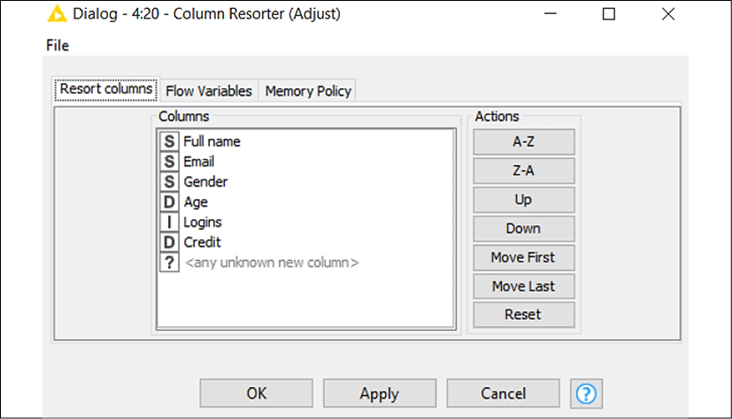
Figure 2.22: Configuration of Column Resorter: shuffle your columns to the desired order
- The last transformation required is to slightly change the order of columns in the table. In fact, the Full name column was added earlier in the process and ended up appearing as the last column while we would like it to be the first. Just select the column and click on Move First to fix it as needed.
 CSV Writer
This node (IO > Write) saves the input data table into a CSV file on the local disk or to a remote location. The only required configuration step is to specify the full path of the file to create: you can click on the Browse... button to select the desired folder. The other configuration steps (not required) let you: change the format of the resulting CSV file like column delimiters (Format section), keep or remove headers as the first row (Write column header), and compress the newly generated file in .gzip format to save space on disk (go to the Advanced Settings tab for this):
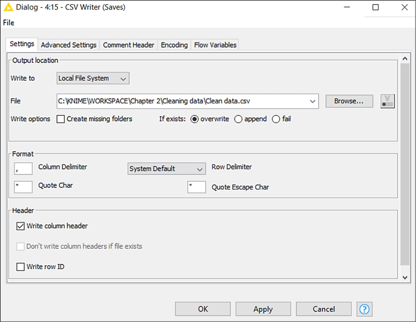
Figure 2.23: Configuration of CSV Writer: save your table as a text file
- The very last step of our process is to save our good-looking table as a CSV file. We implement the CSV Writer node, connect it, and do the only piece of required configuration, which is to specify where to save the new file and how to name it. Click OK to close the window and execute the node to finally write the file on your disk.
Well done for completing your second data workflow! The routine required for building a clean mailing list out of a messy raw dataset required a dozen nodes and some of our time, but the effort was certainly worth it. Now we can clean up any number of records whenever we like by just re-running the same workflow, making sure that the name of the input file and its path stay the same. To do so, you will just need to: reset the workflow (right-click on the name of the workflow in the Explorer on the left and then click on Reset or just reset the first node pressing F8 after having selected it), and execute it again (the simplest way is to just press Shift + F7 on your keyboard or execute the last node with a right-click and select Execute):
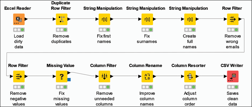
Figure 2.24: The full data cleaning workflow: twelve nodes to make our user data spotless
Summary
This chapter introduced us to KNIME, the new addition to our data analytics toolbox. We learned what KNIME is in a nutshell and got started with its user interface, which enables us to combine simple computation units (nodes) into more complex analytical routines (workflows) with speed and agility, without having to write extensive code. We got started with the ever-present preliminary steps of any data work: loading and cleaning up data to make it usable for doing analytics. We got acquainted with twelve basic nodes in KNIME that empowered us to create repeatable routines, which include: opening files in different formats, sorting and filtering data following some logic, manipulating strings, and managing missing values and duplicate rows. Not bad for being just on the second chapter!
Having the basics clearly explained, we can now dare to go further with KNIME. In the next chapter, Chapter 3, Transforming Data, we will learn how to work on multiple data tables and to build more complex data workflows for analyzing real-world data feeds.

