Download code from GitHub
In this chapter, we will cover:
Creating a bar chart
Creating a stacked bar chart
Creating a line chart
Creating a scatter plot
Creating a heat map
Creating a text table (crosstab)
Creating a highlight table
Creating an area chart
Creating a pie chart
Creating a bubble chart
Creating a word cloud
Creating a tree map
You are about to embark on a wonderful journey with Tableau! We will classify charts that are easily created in Tableau without much customization as basic. Charts that might be less commonly used, or ones that require more steps and configurations, will be tackled in the next chapter as advanced charts.
In this chapter, we will start with the basic charts that you can create with Tableau. Each recipe will demonstrate the steps required to create different graphs. You will also find nuggets of formatting and annotation options in select recipes that will enhance the charts.
Although the recipes are presented in a specific sequence of steps, more often than not, you can re-create the same visualization even if the steps are in a different order. You can start experimenting with these once you are more comfortable with Tableau.
Ready to start your Tableau adventure? If so, proceed with gusto!
Bar charts represent numeric values as bars, split across clear categories. Bar charts are very effective charts for comparing magnitudes, and spotting highs and lows in the data.
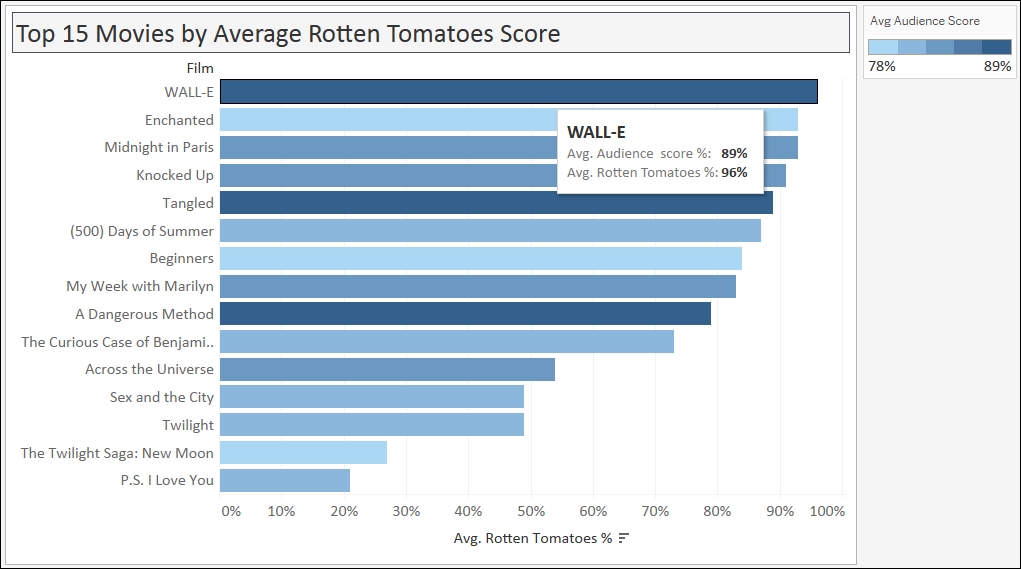
In this recipe, we will create a bar chart that shows the top 15 movies in 2007-2011 by Average Rotten Tomatoes Score.
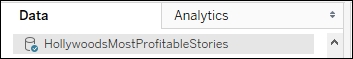
To follow this recipe, open B05527_01 – STARTER.twbx file. Use the worksheet called Bar, and connect to the HollywoodMostProfitableStories data source.
The following are the steps to create the top 15 movies bar chart:
From Dimensions, drag Film to Rows.
From Measures, drag Rotten Tomatoes % to Columns.
Change the aggregation of Rotten Tomatoes % from Sum to Average. You can do this by clicking on the drop-down icon in the Rotten Tomatoes % pill, or by right-clicking it:

Hover your mouse pointer over the Avg. Rotten Tomatoes % axis and click on the sort icon that appears. This will sort the bars in descending order:

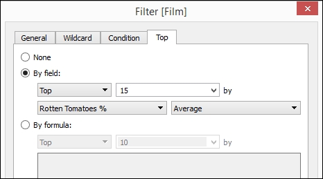
From Dimensions, drag Film to the Filters shelf. This will open a menu for filters:

Select the Top tab. Choose By field: and specify Top,
15, Rotten Tomatoes %, and Average as shown next. Click OK when done:
Adjust the width and height of the film titles. You can do this by moving your mouse pointer to the column or row edge of a film until you see a double-headed arrow. The left-right double-headed arrow allows you to adjust the width, and the up-down double-headed arrow allows you to adjust the height.
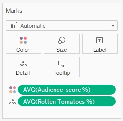
From Measures, drag Audience Score % to the Color in the Marks card. Change the Aggregation from Sum to Average:

Click on the drop-down arrow beside the color legend and choose Edit title…. Change the title to
Avg Audience Score. You can get to this option by clicking on the drop-down arrow on the color legend's top-right corner.
Click on the drop-down arrow beside the color legend again. This time choose Edit colors….
Choose the Blue 10.0 palette. Select the Stepped Color, and specify
5steps:
Click on Tooltip in the Marks cards, and add the following tooltip:
Note
Note that only fields you have used in the sheet can be added in the tooltip via the Insert dropdown. You can also add some predefined values such as Data Source Name, Sheet Name, or Page Count.

Bar charts are probably one of the most common, if not the most common, type of chart that is used to visualize data. Bar charts are best used when you are comparing numeric data that is clearly split between different items or categories. These charts are an easy favorite among the chart types because it allows us to easily look at the edges, and see approximately how much longer one bar is than another, even if the difference is very slight. Bars are also often sorted to make it easy to spot top or bottom items.
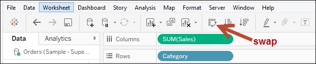
Bar charts can be presented either vertically or horizontally. The decision sometimes depends on the number of items being represented. If you have many items, labels can become less readable with vertical bar charts. In Tableau, there is an easy way to switch between vertical and horizontal bar charts. There is a swap icon in the Tableau toolbar that swaps the pills from Rows to Columns and vice versa.
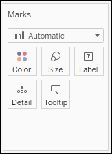
In this recipe, we simply dragged the Film dimension to Columns and the Avg. Rotten Tomatoes % measure to Rows, and Tableau already knew what to do. When you check out your Marks card, you will see that the selection is still set to Automatic, but the actual icon beside it is bars:
To help the reader understand the bar chart better, we can also sort the bars in either ascending or descending fashion. A quick way to sort items in Tableau is by hovering over a column header or an axis, until you see a sort icon appear. In an axis, the first click on the icon sorts the marks in descending fashion. The second click sorts ascending, and the third click sorts it back to data source order. With a column header, which is produced by discrete fields, the fields will be sorted alphabetically in ascending order on the first click, descending on the second click, and then back to data source order on the third click.
Note
Discrete and continuous fields are discussed in more detail in Appendix C, Working with Tableau 10. This book comes with a supplementary chapter – Appendix C, Working with Tableau 10, which aims to help the novice navigate their way and get up to speed with Tableau. This supplementary chapter can be downloaded from the following link:
https://www.packtpub.com/sites/default/files/downloads/AppendixCWorkingwithTableau10.pdf
In our recipe, we also picked the top 15 highest rated films from our data source. We are setting the expectation that as the reader sees the movies from top to bottom, the ratings also are lower. Tableau makes it easy to pick the top n items on some measure. You can simply right-click on the dimension you want to filter, and select Filter… to open the filter window for more options. Tableau provides a tab called Top, which allows you to keep only the top or bottom n items, based on a measure you specify.
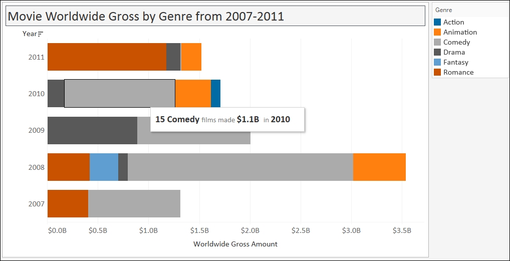
One enhancement we can do with bar charts that Tableau allows us to do very easily is to overlay another measure. In this recipe, we used color to show the Avg Audience Score %. You will notice that although the length of the bars are in descending fashion, the color density doesn't follow the same pattern. This indicates that the audience may not necessarily agree with the Rotten Tomatoes % ratings.
Bar charts can also be created using Tableau's Show Me tool, which by default appears in the top-right corner of your Tableau design area. You simply need to select the fields from your side bar that you wish to visualize, and the possible charts from this combination are enabled in the Show Me tool. The Show Me tool is introduced and discussed in more detail in Appendix C, Working with Tableau 10.
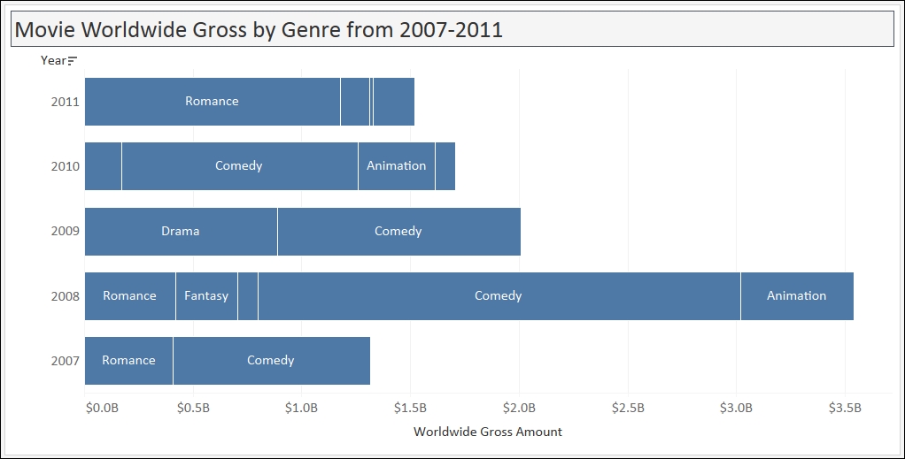
Stacked bar charts, like regular bar charts, represent numeric values as segmented bars, and each bar is a specific, distinct category. The segments in the bar that are stacked on top of each other represent related values, and the total length of the bar represents the cumulative total of the related values for that category.
In this recipe, we will create a stacked bar chart that represents the top movies by year, further segmented by genre.
To follow this recipe, open B05527_01 – STARTER.twbx. Use the worksheet called Stacked Bar, and connect to the HollywoodMostProfitableStories data source.

The following are the steps to create the stacked bar chart:
From Dimensions, drag Year to Rows.
From Measures, drag Worldwide Gross Amount to Columns.
Right-click on the Worldwide Gross Amount axis and select Format…. The original data side bar will now be replaced by the format side bar for the axis.

Under the Scale section, change the Numbers format to Currency (Custom), with
1decimal place, and unit in Billions (B).
Hover your mouse pointer over the Year column header, and click twice on the sort icon that appears. The first click sorts the years in ascending order. The second click will sort the years in descending order, with the latest year at the top and earliest year at the bottom.

Right-click on the Worldwide Gross Amount axis and select Edit Axis.
Under the Tick Marks tab in the Major tick marks section, select Fixed and set it for every 500,000,000 units.

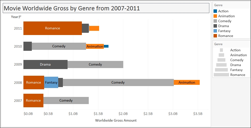
From Dimensions, drag Genre to Color in the Marks card. This will create the stacked bar.
Click on the drop-down arrow beside the color legend and choose Edit Colors….
Choose the Color Blind 10 palette and click on Assign Palette. Click on OK when done.
Adjust the width and height of the bars. You can do this by moving your mouse pointer to the column or row edge of a year until you see a double-headed arrow. The left-right double-headed arrow allows you to adjust the width, and the up-down double-headed arrow allows you to adjust the height.
From Dimensions, right-click and drag Film to Detail in the Marks card. This will open a window providing options on what exact detail needs to be added to the card.
Choose CNTD(Film), which means the number of unique films. CNTD is the Count Distinct function.

Click on Tooltip in the Marks cards, and add the following tooltip. Note that data points that you have already used in your worksheet (or viz) can be inserted into the tooltip.

A stacked bar chart is simply a bar chart that has bars that are further segmented or split based on some criteria. Stacked bar charts have related values stacked on top of each other, and are best used when we want to see cumulative totals instead of individual values.
To create a stacked bar chart, you simply need to drop a discrete field onto a formatting card in your Marks card.
Note
Discrete and continuous fields are discussed in more detail in Appendix C, Working with Tableau 10.
The Marks card contains additional properties, and depending on the type of mark, there may be a sixth property that appears. To create segments in a bar, we can add the discrete field in any of the following: Color, Size, Label, and Detail.
The Color tool is often used in stacked bar charts as this splits the bar into different, discernible colors. In this recipe, we started by using a bar chart that represents the top grossing films in 2007-2011. We placed the dimension Genre onto Color, which created the color partitions in our graph based on Genre.
However, depending on what you're displaying, you may also consider using Size:
You can also segment the bars by Label:
You could also use the combination of Color, Size, and Label:
The Detail property will also work, but this does not make the segmentation obvious. It simply creates the very thin borders around the segment—which can be easily overlooked.
I encourage you to be adventurous—see what's possible! Tableau allows you to explore possibilities with ease, which is one thing I really love about the tool. I may not necessarily use that combination, but seeing the combination might open up possibilities for me, or see data in a different light, or it might help uncover insights that were previously buried when we were analyzing using a single formatting card.
It might be tricky to use Show Me to generate a stacked bar chart because the fields placed in Rows, Columns, and Headers are automatically assigned. After the initial chart is generated from Show Me, you may need to swap axes, or move pills around.
In addition, be careful when using stacked bar charts. Stacked bar charts are great when you still want to see that cumulative number. However if you wanted to see and compare each individual segment, it will make your analysis hard because the not all of the segments have the same starting point.
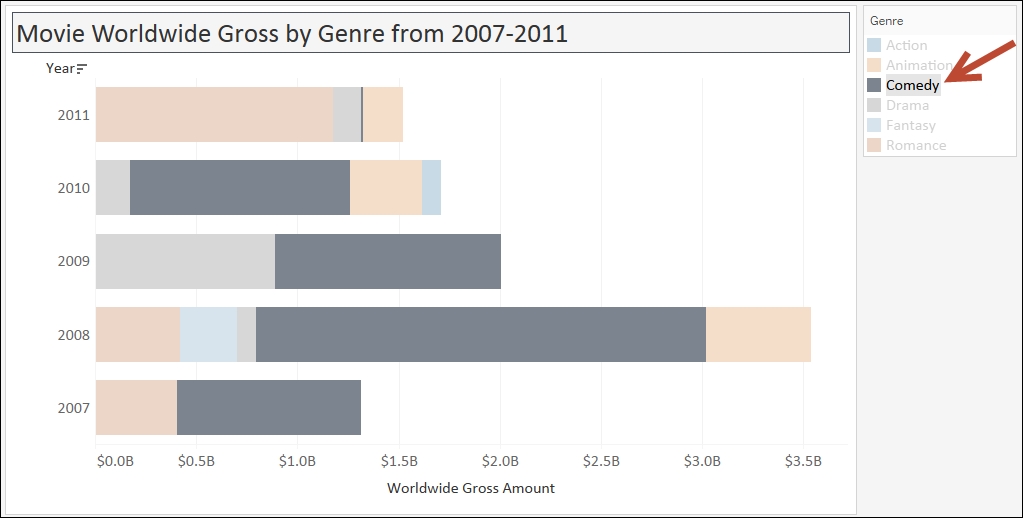
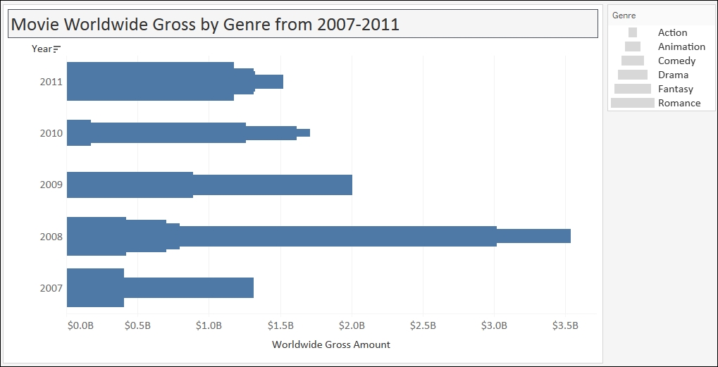
In the previous screenshot, if you highlight just Comedy, you will see that the bars in each year don't start at the same point, therefore it is harder to compare them. For example, can we easily tell that the Worldwide Gross Amount for Comedy is greater for 2010 compared to 2009? It is hard to tell from this graph.
A line chart often represents trend over time, and typically requires numeric values plotted as lines over date-related fields.
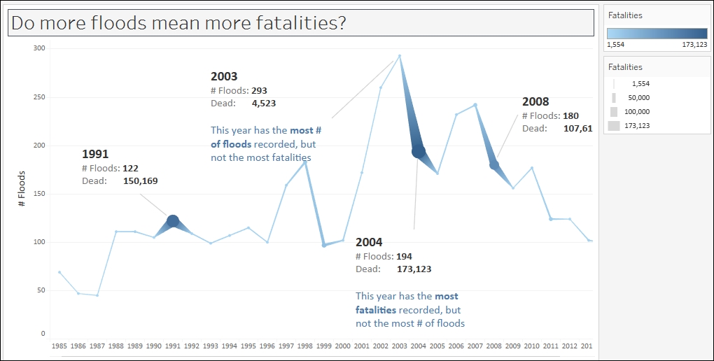
In this recipe, we will create a time series graph (or line chart) that shows the number of floods over time. In addition, we will show the number of fatalities and represent this as the width of the line graph. This will enable us to see more obviously when the most flood-related fatalities occurred.
To follow this recipe, open B05527_01 – STARTER.twbx. Use the worksheet called Line, and connect to the MasterTable (FlooddataMasterListrev) data source.

The following are the steps to create a time series graph in Tableau:
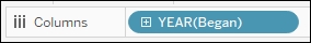
From Dimensions, drag Began to Rows. Tableau will automatically choose the YEAR level for this date field.
Right-click on the Null column heading in YEAR(Began), and select Exclude.

From Measures, drag Number of Records to Columns.
From Measures, drag Dead to Size in the Marks card.
Click on the top-right drop-down arrow of the size legend and choose Edit title….

Edit the title of the size legend to display Fatalities.
From Measures, drag Dead to Color in the Marks card.
Click on the top-right drop-down arrow of the color legend and choose Edit title….

Click on Color in the Marks card. Under the Effects section, select the middle marker.

Click on Size in the Marks card. Drag the size control to the right to make the marks in your chart bigger.

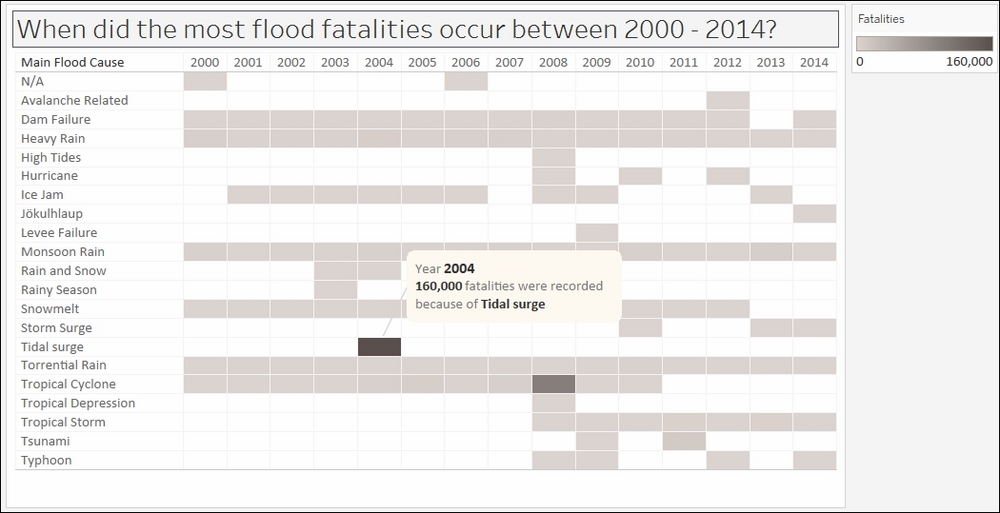
Annotate your marks. In this sample, I have chosen to annotate 2003 (the year with the highest number of floods) and 1991, 2004, and 2008 (the years with the highest numbers of fatalities). To annotate the marks, you can right-click on the mark in your chart and select Annotate, and then Mark.

The annotation for the year 2003 looks like the following:

Hide the Began field label at the top of the chart by right-clicking it, and selecting Hide field label for columns.
Right-click on the Number of Records axis, and change the title to # Floods.
By default, Tableau creates a line chart—also called a time series chart—when a Date (or Date & Time) field is placed in either the Rows or Columns shelf. A Date field is presented in the side bar with a small calendar icon, while a Date & Time field will be a small calendar icon with a clock. Line charts are best used when you want to see patterns over time.
In this recipe, when we dragged the Began field onto Rows, the field showed up as YEAR(Began) instead of just the Began field.
Date fields in Tableau have a natural hierarchy—meaning you can roll up to a higher date level like YEAR, or drill down to a lower level like DAY. In this case, we see a blue YEAR(Began) pill, which indicates Tableau presented the years as a series of discrete headers.
Note
Discrete and continuous fields are discussed in more detail in Appendix C, Working with Tableau 10.
When the year field was rendered, the first column value that appeared was Null. A Null means there is no value, that is, this data is missing for some records. One way to remove it is to right-click the column header and select Exclude. Exclude creates a filter, but it is a negation filter. Whatever is checked will be excluded. When you investigate the settings for this filter, you will find that Null is checked, but the bottom checkbox for Exclude is checked.
In this recipe, we also used SUM(Dead) to be presented both in Color and Size. The darker the color and the thicker the line indicates the more fatalities. Adding this visual cue in the line graph allows us to easily identify when the most fatalities occurred, without having to hover over each point in the graph and look at the details.
Tableau is a great visualization tool that gives us a lot of flexibility over how we want to display our graphs. However, it can also be a double-edged sword. Nothing stops us from creating all kinds of chart just because we can. However, we shouldn't. Just because we can does not mean we should. We should identify first our data points, and evaluate the best (or most effective) way to represent them.
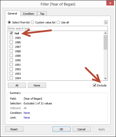
Take, for example, the following line chart. The line chart has a vertical sales axis. At the bottom of the graph, we can find the discrete categories.
Is the line chart the best way to represent this information? No. In fact, this is incorrect and grossly misleading. When your audience first looks at this graph, the initial perception is that we are showing the fluctuations of sales over time. There is also a notion of relatedness, that is, that the category headers are somehow related. This isn't true. Categories are nominal. There is no inherent order in these classifications. When we move the category labels around, it shouldn't affect the message that is being relayed by the graph. This particular graph can be best represented as a bar chart.
A scatter plot is technically a collection of scattered points. Scatter plots require measures (numeric values) on both the vertical and horizontal axes. Scatter plots allow us to see the relationship between two variables, and are great for visualizing clusters, showing possible correlations, and spotting outliers.
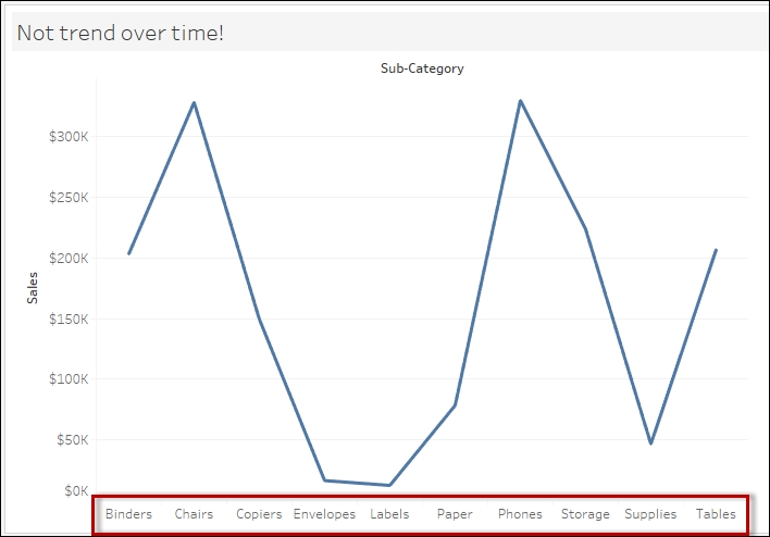
In this recipe, we will use a data source that compiled the highest-paid players in 2014. We will create a scatter plot to see whether there is a general correlation between the earnings of a top player, and the value of their endorsement deals.
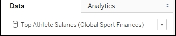
To follow this recipe, open B05527_01 – STARTER.twbx. Use the worksheet called Scatter Plot, and connect to the Top Athlete Salaries (Global Sport Finances) data source.
The following are the steps to create the scatter plot presented in this recipe:
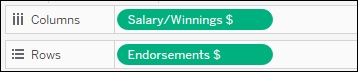
From Measures, drag Salary/Winnings $ to Columns.
From Measures, drag Endorsements $ to Rows.
Change Mark to Circle.

From Dimensions, drag Sport to Color in the Marks card.
From Dimensions, drag Athlete to Label in the Marks card.
Change the default number format of Endorsements $. You can do this by right-clicking the Endorsements $ field in the Measures section of the side bar, selecting Default properties and then Number Format…. In the window that shows up, set the following:
Currency (Custom)
Decimal places:
0Prefix $
Suffix M

Click on the drop-down arrow beside the color legend and choose Edit colors….
Choose the Superfishel Stone palette and click on Assign Palette. Click on OK when done.
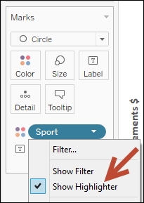
Right-click on the Sport pill in the Marks card, and select Show highlighter. This will show the data highlighter control, a new feature in Tableau 10 that allows you to search and highlight all points on hover.

Right-click on an empty area in your chart and select Annotate, and then Area.
Add the following text in your area annotation:

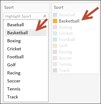
Test the data highlighter. Hover each of the options and notice that as you hover over a sports name, only the players (represented by circles) who belong to that sport are highlighted. Note that in this data set, it seems only soccer has a positive correlation between Salary/Winnings $ and Endorsements $.

Scatter plots are great for determining clusters, correlations, and outliers. Scatter plots require a continuous field in Rows (which produces the vertical or Y axis) and another continuous field in Columns (which produces the horizontal or X axis).
Note
Discrete and continuous fields are discussed in more detail in Appendix C, Working with Tableau 10.
When you first plot the continuous measure fields in the Rows and Columns, you will see a single mark on your canvas.
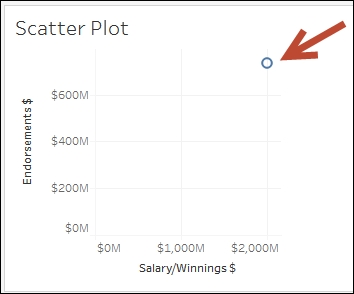
You may be scratching your head and thinking this is not a scatter plot. You are correct, it is not, because it is missing the scatter. However, at this point, Tableau is simply following your instructions, which is to display the aggregate of one measure in Rows and the aggregate of another measure in Columns. In our recipe, it is the SUM(Salary/Winnings $) and the SUM(Endorsement $). This is really just an X and Y coordinate.
To create the scatter plot, this one point needs to be scattered. This can be done by adding dimensions in the Marks card that can force the scatter. For example, adding the Player field to Detail in the Marks card will make Tableau represent one mark per player, and each mark is the SUM(Salary/Winnings $) and SUM(Endorsements $) for that player.
If you want each record from the data source to be presented as a mark in your graph, you can drag the unique identifier for that row into Detail, and that will force the scatter. Alternatively, you can go to the Analysis menu and uncheck Aggregate Measures.
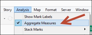
Notice that when you uncheck Aggregate Measures, the measure pills in your Rows and Columns will now be in disaggregated format, that is, Salary/Winnings $ instead of SUM(Salary/Winnings $).
In this recipe, we also added Sport to Color in the Marks card, so that we can visually identify which points belong to which Sport. Tableau 10 also introduces the data highlighter, which you can activate by right-clicking on a pill you have used in your view and selecting Show Highlighter.
In previous versions, the color legend allows you to highlight the points in the view, based on the color you select from the legend. The data highlighter is an improvement to this, and allows you to highlight the points interactively on hover, based on values you specify, or values that match a pattern, on the highlighter card.
For example, when you click on the Highlight Sport field, the list of values will appear. As you hover over the values, the corresponding Sport in the Color property is highlighted, as well as all the points in the scatter plot that belong to that sport.
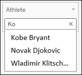
The highlighter, however, can also work with the other dimensions you have used in your canvas, not just the pill that is in Color. For example, you can show the highlighter for player. This allows you to search for players, and highlight them in the scatter plot.
Heat maps are graphs that display information using a matrix of colors. Often the density of color in the matrix represents the concentration of information, or the relative magnitude of the values. Heat maps are great for spotting patterns based on the concentration or density of information.
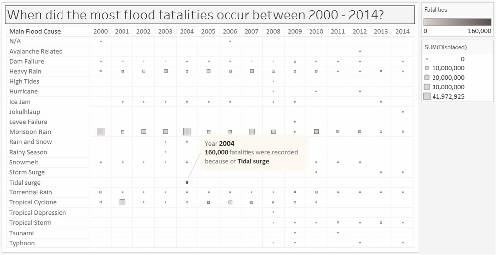
In this recipe, we will create a heat map that can easily show which flood caused the most fatalities, and in which year it occurred.
To follow this recipe, open B05527_01 – STARTER.twbx. Use the worksheet called Heat Map, and connect to the MasterTable (FlooddataMasterListrev) data source.
The following are the steps to create the heat map:
From Dimensions, drag Began to Rows. Tableau will automatically choose the YEAR level for this date field.
Right-click on the Null column heading produced by the YEAR(Began) pill in Rows, and select Exclude.

From Dimensions, drag Main Flood Cause to Columns.
From Measures, drag Dead to Color in the Marks card.
Click on the top-right drop-down arrow of the color legend and choose Edit title….
Edit the title of the color legend to display Fatalities.
Click on the drop-down arrow beside the color legend and choose Edit colors….
Choose the Gray Warm 10.0 palette and click on Assign Palette. Click on OK when done.
Adjust the width and height of the columns. You can do this by moving your mouse pointer to the column or row edge of a film until you see a double-headed arrow. The left-right double-headed arrow allows you to adjust the width, and the up-down double-headed arrow allows you to adjust the height.
Add the grid borders. You can do this by selecting the Format menu item, and selecting Borders…. The format sidebar will replace the original data sidebar. In this Format borders side bar, under the Sheet tab Default section, add borders to the Cell, Pane, and Header.

Right-click on the column with the darkest color—the column that represents the year 2004 and the main cause of Tidal Surge. Select Annotate and then Mark. Add the following annotation:

Heat maps allow us to easily see values that stand out based on the color density. In our recipe, we created a grid of colors based on the number of fatalities caused by floods. Where the color is darkest is when the number of fatalities was the highest.
To create a heat map in Tableau, we simply need to identify the dimensions we want and place them into our Rows and/or Columns. We also need to place a measure onto the Color in the Marks card, and this determines the density of the color for that intersection or column.
By default, measures, when dropped onto Color in the Marks card, will produce a gradient of colors. While pretty, sometimes the color differences are not so discernible. To make the colors more easily identifiable, we can elect to step the colors.
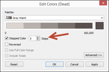
Stepping the color means there will be a finite number of colors used, instead of a gradient of colors that has all the color progression from the palette. The challenge with gradient is it is not easy to see how different one light blue is from another light blue, for example.
Another common variation for heat maps is adding another measure to Size in the Marks card. When you do this, the heat map will now have a series of different sized squares, instead of having a uniform size grid. For example, the following chart is what we will get if we place the measure Displaced onto Size.
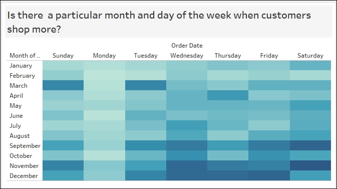
What other use cases can benefit from a heat map? Heat maps can be used to spot trends in different verticals—to spot when students register, promotions are redeemed, profit increases, traffic is light/heavy and so on. The following screenshot can help identify shopper behavior—whether there is any particular month and day combination that seems to be most popular to shoppers.
A text table is also often referred to as a crosstab, a shortened term for cross tabulation. Another common term that can be used to describe text tables is a spreadsheet. A text table is a series of rows and columns that have headers and numeric values. Text tables are great when the audience requires to see the individual values. A limitation of text tables is that it requires attentive processing—whoever is using the text table needs to focus on reading and comparing the numbers because any patterns or insights are not very easy to spot.
In this recipe, we will create a text table that shows the top 20 movies from 2007-2011, based on the worldwide gross amount.
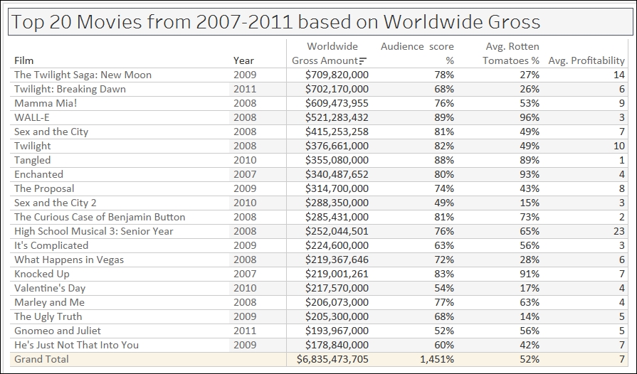
To follow this recipe, open B05527_01 – STARTER.twbx. Use the worksheet called Text Table, and connect to the HollywoodMostProfitableStories data source.

The following are the steps to create the crosstab:
Change the default number format of Audience score %. You can do this by right-clicking the field Audience score % in the Measures section of the side bar, selecting Default properties and then Number Format…. In the window that shows up, set the following:
Number (Custom)
Decimal places:
0Suffix %
From Dimensions, drag Film to Rows.
From Dimensions, drag Year to Rows.
From Dimensions, drag Film to Filters. This will open a window with several options for filtering the Film field.
Select the Top tab. Choose By field: and specify Top 20 by Average Rotten Tomatoes %, as shown here:

From Measures, drag Worldwide Gross Amount to Text in the Marks card.
Right-click on the Worldwide Gross Amount pill in the Marks card, and choose Format.
Format the Pane tab to use:
Currency (Custom)
Decimal places:
0Prefix:
$

Double-click on Audience score % in the Measures pane. This adds this measure to the text table. This also introduces a new Measure Values shelf in your canvas.
From Measures, double-click on Rotten Tomatoes % to add this to the text table.
Change the Rotten Tomatoes % aggregation to Average. You can do this by right-clicking on this pill in the Measure Values shelf, going to Measure (Sum), and changing this to Average.
From Measures, double-click on Audience Score % to add this to the text table.
Change the aggregation of Audience Score % to Average.
From Measures, double-click on Profitability to add this to the text table.
Rearrange the pills in the Measure Values shelf by dragging them manually to have the following order:

Right-click the Film pill in Rows, and click on Sort….
In the Sort window, select:
Sort order Descending
Sort by field Worldwide Gross Amount using Aggregation of Sum
A text table is simply a series of text values and numbers in a grid. This is a pretty common request for organizations that are very numbers-oriented, and have just started transitioning to a more visual culture.
To create a text table in Tableau, usually you identify the dimensions you want to place in your Rows and/or Columns. There are a couple ways to create the text table:
Drag the measures onto the middle canvas until you see the Show Me icon, and then let go of the mouse
Drag the first measure onto Text in the Marks card, and double-click on the rest of the measures you want to add
Both of these actions introduce the Measure Names and Measure Values pills in your visualization.
Note
Measure Names and Measure Values are discussed in more detail in Appendix C, Working with Tableau 10.
Measure Names, which is discrete, gets placed in your Rows or Columns as a header, and Measure Values gets placed onto the Text property in your Marks card:
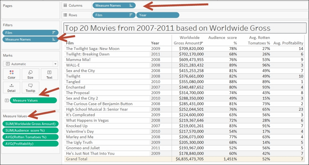
Tableau places limitations on creating text tables. By default, for example, only six columns will display properly. If you have more than six columns, the leftmost columns get concatenated.
To adjust this, you need to go to the Analysis menu, then Table Layout, then Advanced. There you can adjust the number of rows and column labels.
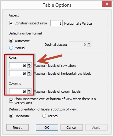
Tableau still, however, restricts this number. The maximum you can use is sixteen (16). Ultimately, if you need more columns and want to display all the numbers in the table, but not necessarily support visual analysis, then perhaps Tableau isn't the tool that is meant to do that job. Tableau is a great tool for visual analysis and exploration, so it is best to use it as such.
Highlight tables represent tabular information in a color-coded grid. The background color of the individual cells corresponds to the relative magnitude of the value it represents. Highlight tables are great when displaying the actual numeric values are important, but you also want the visual emphasis by adding the background colors on the cells.
In this recipe, we will modify the text table created in the Creating a text table (crosstab) recipe to create a text table with colored background, based on a film's worldwide gross amount:

To follow this recipe, open B05527_01 – STARTER.twbx. Use the worksheet called Highlight Table, and connect to the HollywoodMostProfitableStories data source.

In addition, this recipe requires the text table in the Creating a text table (Crosstab) recipe to be created. This text table is the starting point of this recipe.
The following are the steps to creating a highlight table:
If you haven't already done so, follow the steps in the recipe Creating a text table (crosstab) to create the starting text table.
From Measures, drag Worldwide Gross Amount to Color in the Marks card.
Change the mark in the Marks card to Square.
Click on the drop-down arrow beside the color legend and choose Edit colors….
Choose the Orange-Blue Light Diverging palette. Select the Stepped Color, and specify
5steps.
Click on the drop-down arrow beside the color legend and choose Edit title….
Edit the title of the color legend to display Worldwide Gross.
You might like the heat map because it emphasizes the items that have the darkest or lightest colors, but don't like the fact that it doesn't have the numbers.

You might like text tables, but it requires that you look at the numbers closely and focus before you can make sense of it.

You're in luck, you can create a hybrid table. You can have the text table, and color the grids according to your selected measure. This hybrid table is called the highlight table.
There is a trick to creating highlight tables in Tableau. The first is to create a text table. See the Creating a text table recipe in this chapter for the steps. Once you have the text table, you can drop a measure onto Colors in the Marks card. This colors your text table with a gradient of colors, which honestly will make your text table very hard to read.

Once your table already has the gradient-colored text, the final step is to change the mark to a Square. This is the magic sauce that creates your highlight table.
An area chart is very similar to a line chart (time series graph) with the area between the axis and the line shaded. A stacked area chart segregates the area, based on related categories. Area charts may allow trends to be more easily spotted because the eye focuses on a bigger area rather than comparing lines.
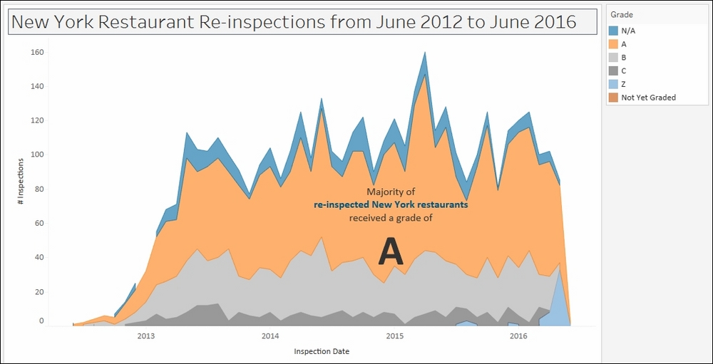
In this recipe, we will create an area chart that will show the results of restaurant re-inspections in New York City from June 2012 to June 2016.
To follow this recipe, open B05527_01 – STARTER.twbx. Use the worksheet called Area, and connect to the DOHMH New York City Restaurant data source.
The following are the steps to create the area chart for re-inspections:
Change the mark type to Area in the Marks card.
From Measures, drag Number of Records to Rows.
From Dimensions, right-click and drag Inspection Date to Columns. This will open a window asking for the specific value to place.
Choose continuous month. This is the MONTH(Inspection Date) option in the fourth section, with a green calendar icon to its left.

From Dimensions, right-click drag Inspection Date to Filter. This will open a window that shows the possible variation of values that can be used.
Choose to filter by discrete year, which is the third option called Years with a blue # beside it, and then click Next >.

Under the General tab, choose all years except for 1900.

Under the Wildcard tab:

From Dimensions, right-click and drag Grade to Color in the Marks card.
Click on the drop-down arrow beside the color legend and choose Edit colors….
Choose the Color Blind 10 palette and click on Assign Palette. Click on OK when done.
Right-click on an empty area in your chart and select Annotate, and then Area.
Add the following annotation, and place it on top of the area that represents the A grades.

Area charts look like line charts (or time series graphs) that have shaded areas. Area charts are also similar to stacked bar charts, where the areas are cumulative. It is best used when you want to show the cumulative value of the measures you are using. Area charts, however, bear the same risks as the stacked bar chart. Because individual areas are stacked, it is hard to compare the different areas because they don't all start in the same level.
Creating an area chart is similar to creating your line chart and your stacked bar chart. You create a time series graph first. By default, Tableau will create a time series graph (or line graph) first when you put a Date or Date & Time field in either Rows or Columns, and a Measure in the other.
Once you have the time series graph, you can change the mark to Area, and drop a dimension in Color in the Marks card to create the different colored areas.
I've often asked students in my training classes when they would usually use area charts, and majority of the time students mention budgeting. With budgeting, they care about what proportion over time goes to which categories, but they also care about the cumulative value of the budget.
A pie chart is a circle—or pie—that is sliced. Each slice is identified using a different color and/or label. The size or angle of the slice represents that item or category's proportion to the whole. Pie charts are best at showing part-to-whole relationships when there aren't too many slices. Bar charts are great and popular alternatives to pie charts.
In this recipe, we will create a pie chart that shows the top five endorsements in 2014, sliced by sport.

To follow this recipe, open B05527_01 – STARTER.twbx. Use the worksheet called Pie, and connect to the Top Athlete Salaries (Global Sport Finances) data source.

The following are the steps to create a pie chart:
Change the mark type to Pie in the Marks card.
From Measures, drag Endorsements $ to Angle in the Marks card.
From Dimensions, drag Sport to Color in the Marks card.
Right-click on Sport pill in the Color property in the Marks card and select Filter….
In the Top tab, select By field: Top and
5by Sum of Endorsement $.
Right-click on Sport pill in the Color in the Marks card and select Sort.
Filter Ascending by Sum of Endorsement $.

From Measures, drag Endorsements $ to Label in the Marks card.
Right-click on SUM(Endorsements $) pill in the Label property in the Marks card. Select Quick table calculation, and then Percent of total.

From Measures, drag Endorsements $ again to the Label in the Marks card.
Click on Label in the Marks card, and select the ellipsis button under Label Appearance to modify the style of the text.

Change the format of the label to show the following, and click OK when done.

Tableau comes with a built-in mark called Pie. When you switch the mark to a Pie, a new property appears under the Marks card called Angle.

To create a pie chart, simply change the mark to a Pie. Drag a measure to Angle, and a discrete field to Color.
Often a pie chart is accompanied by a label containing what the pie is, and what percentage of the pie that slice is. Percent of Total is a readily available Quick Table Calculation.

To add this as a label, you need to add a measure to the Label in Marks card first. This will initially display the actual values of that measure. Once added, you can right-click on this measure and select Quick Table Calculation. This should expand the readily available quick table calculations, which would include Percent of Total.
Pie charts often get a bad reputation in the visual analytics world. One reason is because humans can't naturally compare angles (or pie slices) easily, especially if the pie slices are pretty close in size. Bar charts are often more effective in showing the difference in magnitudes, because all we need to look at are the edges.
Note
If you are interested, you can check out the world's most accurate pie chart. Word of warning however, you have to have humor to continue (credit to Damien Foley's blog site): http://bit.ly/accuratepiechart.
I think part of the issue is also abuse. Sometimes there is a tendency to overuse pie charts in presentations—especially the 3D tilted, exploded ones. Comparing angles is hard enough, tilting and exploding the pies do not help clarify the numbers.
Note
Word of wisdom: the slices of the pie in a pie chart must sum up to 100%. Wisdom is learning from other's mistakes http://bit.ly/best-pie-chart-ever.
However, pie charts can be effective in showing what proportion of the whole is allocated to something. I think pie charts have their place in the visual analytics and reporting world. Just like any other tools in your toolset, we just need to use them in the right place, right time.
Bubble charts present data using circles of different sizes and colors. The sizes and colors of circles, or bubbles, vary based on the values they represent. A larger and/or darker circle often represents items or categories with higher values.
In this recipe, we will create a bubble chart that shows the countries with the highest populations in 2015.

To follow this recipe, open B05527_01 – STARTER.twbx. Use the worksheet called Bubble, and connect to the Data (Modified Gapminder Population) data source.

The following are the steps to create a bubble chart:
Change the mark type to Circle in the Marks card.
From Dimensions, drag Year to the Filter shelf. This will open a new window for the filtering options.
Under the General tab, while Select from list radio button option is selected, type in 2015 in the search text box to find this value from the list of years, and check it.

From Measures, drag Population to Size in the Marks card.
From Dimensions, drag Region to Color in the Marks card.
From Dimensions, drag Country to Label in the Marks card.
From Measures, drag Population to Label in the Marks card.
Right-click on the SUM(Population) pill in the Label card, and select Format. This will open a format pane that temporarily replaces your data side bar.
In the Format side pane, under the Pane tab in Defaults section, choose Number (Custom) with 1 decimal place, and Millions (M) as unit.

Right-click on the Country pill in the Label card and select Sort.
Choose an Ascending sort order by Sum of Population.
Click on Label in the Marks card, and select the ellipsis button under Label Appearance to modify the style of the text.

Adjust the label so
Countryis shown with a larger font, and population appears underneath it with a smaller font.
Click on the drop-down arrow beside the color legend again. This time choose Edit colors….
Choose the Color Blind 10 palette.
A bubble chart typically shows information in circles of varying colors and sizes. Creating a bubble chart in Tableau requires changing the mark type to Circle. A measure is typically placed in Size, as well as another dimension in either Color, Label, or Detail (or any combination thereof).
In this recipe, we placed the Population measure onto Size, created different bubbles for every country by placing Country in Label, and color the circles by Region.

If the pie chart gets a bad reputation, bubbles charts do too (maybe more). If we humans cannot compare angles with ease, we are also generally not very good at comparing diameter and circumference. Is that circle 15% bigger than the previous circle?
Most would argue that bar charts would be more effective than bubble charts, and I mostly agree. However, as with the pie chart, I think bubble charts can be effective—depending on the intent and audience.
In my courses, I ask students to present their work to the rest of the class. The goals of the presentation are to present their findings, as well as to engage the audience. One of the charts that frequently captures the attention of the audience is the bubble chart. Sometimes this chart also garners the most questions—therefore more engagement.
I would also argue that typically a single chart is not a be-all and end-all—typically we complement this with other charts, dashboards, and storytelling. There is nothing that stops us from starting our story with a bubble chart to get the audience's initial attention, and once we have their attention, proceed to more details using dependable bar and line charts.
The storytelling piece is also key. We have to be effective storytellers—our charts are simply our props. With effective storytelling, any chart can be effective and exciting.
Note
If you haven't seen Hans Rosling's TED talk on The best stats you've ever seen yet, you are missing out. He is using bubbles that move—aka dancing bubbles!
https://www.ted.com/talks/hans_rosling_shows_the_best_stats_you_ve_ever_seen?language=en
However, it's not the chart that makes the presentation, it's the storyteller that makes this presentation impactful and unforgettable.
A word cloud, also called a tag cloud, is typically a collection of keywords or text data visualized using size and color. Often, the goal of a word cloud is to represent the relative importance or prevalence of the keywords. Word clouds are not meant to allow the audience to clearly and accurately compare the underlying values of each keyword.
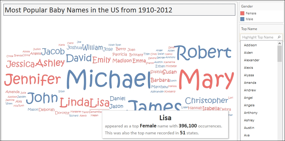
In this recipe, we will create a viz that shows the most popular baby names from 1910-2012. Note that viz is a slang word for visualization.
To follow this recipe, open
B05527_01 – STARTER.twbx. Use the worksheet called Word Cloud, and connect to the TopBabyNamesByState data source.
The following are the steps to create a word cloud:
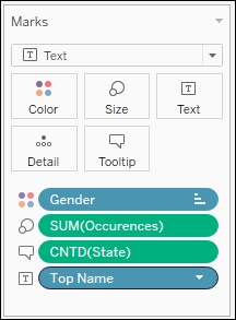
Change the mark type to Text in the Marks card.
From Measures, drag Occurences to Size in the Marks card.
From Dimensions, drag Gender to Color in the Marks card.
From Dimensions, drag Top Name to Text in the Marks card.
From Dimensions, right-click and drag State to Text in the Marks card.
Select CNTD(State) .
Click on Tooltip in the Marks card to format the tooltip with the following information:

Click on the drop-down arrow beside the color legend and choose Edit colors….
Choose the Superfishel Stone palette and click on Assign Palette. Click on OK when done.
Right-click on the Top Name pill in the Marks card, and select Show highlighter. This will show the data highlighter control, a new feature in Tableau 10, which allows you to search and highlight all points on hover.
Change the font style of the names to a font style of your choice. To do this, click on Label in the Marks card, and select the ellipsis button under Label Appearance to modify the style of the text.
A word cloud can be created in Tableau if you have a field that contains the keywords or values you want displayed in the word cloud, as well as a measure that determines the size of that keyword.
In this recipe, we change the mark to Text, and display the Top Name in Text.
In addition, we vary the Size of the names based on the number of occurrences it has in our data source. We also color the names differently based on Gender which is recorded from our data source.
In our tooltip, we also display in how many states this name was recorded as a Top Name. Since we don't use State anywhere in the visualization, but want to use it in our tooltip, we can make this data field available either by dragging it to Tooltip or Detail.
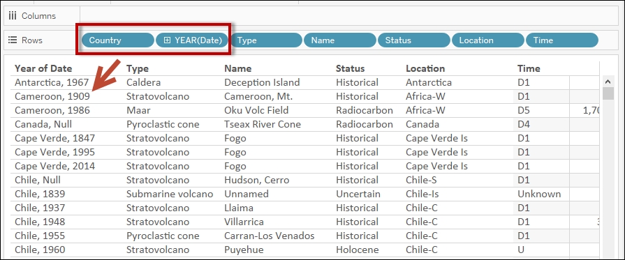
When you right-click and drag a data field onto Rows, Columns, or any of the other shelves, a window with different options for values comes up. When you right-click and drag State, you are going to be prompted with exactly what about State you want to display.
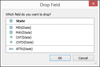
In our recipe, we chose CNTD(State), which is the numeric value for the unique number of states related to the Top Name.
You have probably seen some word clouds in some of the websites or blog sites you visit. Although it is hard to measure just by looking at the word cloud how many more times a keyword occurs compared to another keyword, this may be an effective chart depending on the context, intent, and audience. Arguably, bar charts would be more effective if you want to clearly state the difference in magnitude. However, in some cases, the intent is to simply illustrate and highlight which keywords are often used or mentioned. Sometimes, the relative comparison may be sufficient.
Tree maps represent part-to-whole and hierarchical relationships using a series of rectangles. The sizes and colors of rectangles will vary based on the values they represent. Typically, the larger rectangles, or rectangles with most concentrated colors, depict the highest values.
In this recipe, we will represent the 2015 world population as a tree map.

To follow this recipe, open B05527_01 – STARTER.twbx. Use the worksheet called Tree Map, and connect to the Data (Modified Gapminder Population) data source.

The following are the steps to create the population tree map:
From Dimensions, drag Year to the Filter shelf. This will open a new window for the filtering options.
Under the General tab, while Select from list radio button option is selected, type 2015 in the search text box to find this value from the list of years, and check it.

From Measures, drag Population to Size in the Marks card.
From Dimensions, drag Region to Color in the Marks card.
From Dimensions, drag Country to Text in the Marks card.
From Measures, drag Population to Text in the Marks card.
Click on the drop-down arrow beside the color legend card and choose Edit colors….
Choose the Color Blind 10 palette and click on Assign Palette. Click on OK when done.
Click on Label in the Marks card, and select the ellipsis button under Label Appearance to modify the style of the text.
Adjust the label so Country is shown with a larger font, and population appears underneath it with a smaller font.
A tree map allows us to present a part-to-whole relationship, just like a pie chart, but by subdividing a rectangle into smaller areas rather than subdividing a circle into different angled slices.
In Tableau, when you place a measure onto Size and a dimension onto either Color, Label, or Detail—or any combination thereof—the rectangle is broken down into smaller rectangles.

In this scenario, Tableau actually automatically assigns the Square mark. Although under Marks you will see Automatic, the icon refers to a Square. If you leave this as Automatic, or change the Mark explicitly to Square, you will get the same tree map.
Pie charts get a bad reputation because angles and slices are not easy to compare. Bubble charts are also hard to compare, because it is also hard to compare diameters and circumferences. Guess what, tree maps also fall into this same category. It is also not easy nor natural for us humans to discern and compare one area to another. Can we tell how much bigger or smaller one rectangle is compared to another? However, as with the other charts, with the right intent, audience, and story, this could be an effective chart—either by itself, or as a complementary chart to another.