The goal of this chapter is to give you a comprehensive introduction to base graphics in R. By base graphics, I mean graphics created in R without the use of any additional software or contributed packages. In other words, for the time being, we are using only the default packages in R. After reading this chapter, you should be able to create some nice graphs. Therefore, in this chapter I will introduce you to the basic syntax and techniques used to create and save scatterplots and line plots, though many of the techniques here will be useful for other kinds of graph. We will begin with some basic graphs and then work our way to more complex graphs that include several lines and have axes and axis labels of your choice.
In this chapter, we will cover the following topics:
Basic graphics methods and syntax
Creating scatterplots and line plots
Creating special axes
Adding text—legends, titles, and axis labels
Adding lines—interpolation lines, regression lines, and curves
Graphing several variables, multiple plots, and multiple axes
Saving your graphs as PDF, PostScript, JPG files, and so on
Including mathematical expressions in your graphs
In R, we create graphs in steps, where each line of syntax introduces new attributes to our graph. In R, we have high-level plotting functions that create a complete graph such as a bar chart, pie chart, or histogram. We also have low-level plotting functions that add some attributes such as a title, an axis label, or a regression line. We begin with the plot() command (a high-level function), which allows us to customize our graphs through a series of arguments that you include within the parentheses. In the first example, we start by setting up a sequence of x values for the horizontal axis, running from -4 to +4, in steps of 0.2. Then, we create a quadratic function (y) which we will plot against the sequence of x values.
Enter the following syntax on the R command line by copying and pasting into R. Note the use of the assigns operator, which consists of the less than sign followed by a minus sign. In R, we tend to use this operator in preference to the equals sign, which we tend to reserve for logical equality.
x <- seq(-4, 4, 0.2)

y <- 2*x^2 + 4*x - 7
Tip
Downloading the example code
You can download the example code files for all Packt books you have purchased from your account at http://www.packtpub.com. If you purchased this book elsewhere, you can visit http://www.packtpub.com/support and register to have the files e-mailed directly to you.
You can enter x and y at the command line to see the values that R has created for us.
Now use the plot() command. This command is very powerful and provides a range of arguments that we can use to control our plot. Using this command, we can control symbol type and size, line type and thickness, color, and other attributes.
Now enter the following command:
plot(x, y)
You will get the following graph:

This is a very basic plot, but we can do much better. Let's start again and build a nice plot in steps. Enter the following command, which consists of the plot() command and two arguments:
plot(x, y, pch = 16, col = "red")
The argument pch controls symbol type. The symbol type 16 gives solid dots. A very wide range of colors is available in R and are discussed later in this chapter. The list of available options for symbol type is given in many online sources, but the Quick-R website (http://www.statmethods.net/advgraphs/parameters.html) is particularly helpful. Using the previous command, you will get the following graph:

Now we use the arguments xlim, ylim, xlab, and ylab. Enter the following plotting syntax on the command line:
plot(x, y, pch = 16, col = "red", xlim = c(-8, 8), ylim = c(-20, 50),
main = "MY PLOT", xlab = "X VARIABLE" , ylab = "Y VARIABLE")
This command will produce the following graph:

The arguments xlim and ylim control the axis limits. They are used with the c operator to set up the minimum and maximum values for the axes. The arguments xlab and ylab let you create labels, but you must include your labels within quotation marks.
Now, create line segments between the points using the following command:
lines(x, y)
Note that the lines() command is used after the plot() command. It will run provided that the graph produced by the plot() command remains open. Next, we will use the
abline() command, where abline(a, b) draws a line of intercept a and slope b. The commands abline(h = k) and abline(v = k) draw a horizontal line at the value k and a vertical line at the value k.
We enter each of these commands on a new line as shown:
abline(h = 0)

abline(v = 0)

abline(-10, 2)      # Draws a line of intercept -10 and slope 2.

text(4, 20, "TEXT")

legend(-8,36,"This is my Legend")
Your legend begins at the point (-8, 36) and is now centered on the point (-4, 36). The text() command will be discussed in more detail in Chapter 2, Advanced Functions in Base Graphics. The legend() command is very powerful and provides many options for creating and placing legends; it is also discussed in Chapter 2, Advanced Functions in Base Graphics. For now, it is enough to know that you specify the position of your legend by entering relevant coordinates as the first two arguments, and then enter your text inside quotation marks.
Consider the following command:
rug(x)
The rug() command indicates the location of points on the horizontal axis. Here is the resulting graph:

In just a few lines of syntax, you have learned how to make a fairly complex graph and you can now use the same techniques to draw your own graphs.
Now, let's look at graphing individual points and creating lines that join them. We start off with a simple plot that has four points. We use the plot() command and group the x coordinates together and the y coordinates together. To do this job, we use the c operator to combine the x values and y values independently. Both groups of coordinates are written within parentheses, inside the plot() command. Enter the following syntax on the command line to create a graph with four points:
plot(c(1, 2, 3, 6), c(1, 2.5, 3.8, 9.2), pch = 16)
This command gives the following plot:

Note how the elements of the first vector gave the horizontal axis values, while the elements of the second vector gave the vertical axis values. Now, we join the four points using the lines() command, again grouping the horizontal axis values together and the vertical axis values together:
lines(c(1, 2, 3, 6), c(1, 2.5, 3.8, 9.2))
The following is the resulting graph, in which the points are now connected by line segments:

When you encounter plotting commands and arguments and want to know more about them, on the R command line, enter a question mark followed immediately by the command name (for example, ?plot()) and you will be taken directly to an online help page. You can also try several online resources. One of the best is the Quick-R website (http://statmethods.net/), which I mentioned earlier. Go straight to the Basic Graphs and Advanced Graphs pages. These pages give you a very helpful summary of the main plotting parameters (symbol types, line types, and parameters that control axes, titles, labels, and legends).
Alternatively, you can use a sensible web search (for example, enter R graphs in Google) and you will find several options.
We have just created a basic graph, but we need more practice. Let's create another plot using the plot() command. First we set up a vector of horizontal axis values called X, and then a vector of vertical axis values called Y. Enter the following syntax on the command line:
X <- c(1, 2, 3, 4, 5, 6, 7, 8)

Y <- c(2, 6, 7, 10, 17, 19, 23, 29)
Now let's graph Y against X.
plot(X, Y, pch = 16)
You'll get the following graph:

That was simple! However, our graph is very basic. Note that R has decided to create axis ticks every five units on the Y axis. Also, note that if you don't provide horizontal axis values (an x axis), by default R will plot your values against a running index.
Let's start again and enhance the graph. Now, we will plot Y using red points using the following command:
plot(X, Y, type = "o", col = "red", xlab = "MY X LABEL", ylab = "MY Y LABEL")
The argument type="o" produces symbols joined by straight lines. Now, let's create a title using the title() command and the arguments font.main and col.main to control the title font and colors.
title(main = "PLOT 3", font.main = 2, col.main = "blue")
Let's look at our graph.

As expected, we have created a title in blue and joined each point with a red line segment.
The font number is an integer between 1 and 5, where 1 is plain, 2 is bold, 3 is italic, 4 is bold italic, and 5 is symbol.
Notice how to create a title. The following are the main font options for graphs:
To see the range of colors that are available in R, enter the following command:
colors()
You will see a set (a vector) of 657 colors arranged in alphabetical order. Let's see what we have at various indices in the vector of colors. Enter the following code. It contains square brackets, which allow us to identify and include elements of a vector that has the desired indices.
colors()[c(443,109,635, 548, 201)]
The output you will get is as follows:
1] "lightyellow" "darkslategray1" "turquoise" "purple1" "gray48"
Note
For more details on the available colors in R, refer to http://research.stowers-institute.org/efg/R/Color/Chart/.
However, you can control colors very easily using the codes given in the Hexadecimal Color Chart (reproduced from http://html-color-codes.com/).
These codes are given as combinations of numerals and alphabetic characters, always starting with the hash symbol (for example, #FF9966, which is a light orange color, or #669933, which is a light olive color). I recommend that you keep a copy of this chart and use the codes to create your own color schemes. You can download it from several sources simply by searching for Hexadecimal Color Chart. By referring to this chart, you always know the exact color or hue you are going to get.

In the next example, we pass parameter values to the title and the axis labels and create the labels using the paste() command. This technique can be useful for creating titles and labelling automatically from within an R program (usually called a script). Let's create a set of values first using the following commands:
k <- 9
min <- 3
max <- 25
name <- "Mary"
Before we start, try the following code:
paste(name, "'s Mark", sep = "")
You will get the following output:
[1] "Mary's Mark"
The content of the variable name (Mary) was pasted together with the text 's Mark. Each element of the text is separated by commas, while the argument sep = "" ensures that there are no breaks between the variable and the text. That's the way the paste() function works.
Let's start again and enhance the plot. Let's create our plot using colors taken from the Hexadecimal Color Chart. The commands to be used are as follows:
plot(X, Y, type="o", col="#669966", xlab = paste(name, "'s Mark", sep = ""), ylab = paste("Marks from ", min, " to ", max, sep = ""))
Now let's create a title:
title(main = paste("Plot ", k, " for ", name, sep = ""), font.main = 2, col.main = "#CC6600")
The following is our graph, with the appropriate labels and title:

The title() command is one way of creating a title. However, by using the main argument, you can also create a title within the plot() command (as shown in the next example). In the following example, we pass the same parameter values to the title and the axis labels. Enter the following syntax on the command line:
plot(X, Y, type = "o", col = "red", main = paste("Plot ", k, " for ", name, sep = ""), pch = 16, cex = 1.4, font.main = 2, col.main = "blue", xlab = paste(name, "'s Mark", sep = ""), ylab = paste("Marks from ", min, " to ", max, sep = ""))
As in the previous example, the cex parameter controls the symbol size (the default value is 1). The resulting graph is as follows:

Indeed, we have the correct axis labels and title. You can check out the parameters pch and lty for yourselves.
In Chapter 2, Advanced Functions in Base Graphics, we will cover Ordinary Least Squares (OLS) regressions and plotting regression lines. However, if you are curious as to how to include a regression line, this is how it is done. Use the abline() command (which draws lines) in conjunction with the lm() command, which performs a regression.
The syntax for performing a regression on the two variables is lm(Y ~ X), where the tilde sign instructs R to perform the regression, with Y as the dependent variable and X as the independent variable. Now include the following syntax on the command line:
abline(lm(Y ~ X))
The following is your plot with a regression line:

Sometimes, you may wish to plot a mathematical function. We have already seen how to do that, but the
curve() command provides a nice alternative. Let's plot a cubic curve using the curve() command. To use curve(), you must specify a function within the parentheses. Enter the following syntax:
curve(5*x**3 + 6*x**2 - 5, -2, 2 , col = "blue", main = "CUBIC CURVE")
The following is our graph:

We have a smooth cubic curve and the axis limits we specified within the code. The curve() command allows you to specify a function as the first argument, the range of values over which you wish to create your graph, and add your graph to an already existing graph. See the R help function for the curve() command by entering ?curve() on the command line.
Often, R provides several ways to achieve what you want. Let's set up 50 values from -pi to +pi and graph a sine function. We use the seq() command to set up this sequence. Note that R understands the constant Pi, whose value can be obtained using the following command:
pi
The following output is obtained:
[1] 3.141593
Now, we create horizontal and vertical axis points for plotting:
x <- seq(-pi, pi, length = 50)
y <- sin(x)

plot(x, y, pch = 17, cex = 0.7, col = "darkgreen")
Then, we add a line that connects the points:
lines(x, y, col = "darkgreen")
Let's take a look at the resulting graph:

Now try the following approach, using 1000 axis values in order to create a smooth-looking graph:
x <- seq(-pi, pi, length = 1000)
y <- sin(x)

plot(x, y, type = "l")
The output is as follows:

The argument type = "l" produces connecting lines, but here we have so many points that the graph appears smooth. Other options include the argument type = "o", which produces symbols joined by straight lines, and type = "p", which produces points.
Let's take an example with two dependent variables and create a nice graph. Enter the following code:
X  <- c(1, 2, 3, 4, 5, 6, 7)
Y1 <- c(2, 4, 5, 7, 12, 14, 16)
Y2 <- c(3, 6, 7, 8, 9, 11, 12)
Now, we graph Y1 using a vertical axis from 0 to 20 as follows:
plot(X, Y1, type="o", pch = 17, cex=1.2, col="darkgreen", ylim=c(0, 20))
Now superpose Y2 using the following command:
lines(Y2, type="o", pch=16, lty=2, col="blue")
Notice how we plotted the first curve and then added the second using the lines() command. Let's create a title using the title() command:
title(main="A PLOT OF TWO VARIABLES", col.main="red", font.main=2)
Our graph contains two curves, each with the specified line type and symbols:

Note the default labels for the horizontal and vertical axes.
In R, you can create your own designer axes. The following is another example in which we create designer axes and calculate the vertical axis limits. Let's define three vectors:
Y1 <- c(2, 4, 5, 7, 12, 14, 16)
Y2 <- c(3, 6, 7, 8, 9, 11, 12)
Y3 <- c(1, 7, 3, 2, 2, 7, 9)
Now, we calculate the maximum value of Y1, Y2, and Y3. Performing this calculation helps us to set the axis limits before we start. Otherwise, the first vector you plot will set the default axis limits, but any other data you read may exceed those limits. The syntax to find the maximum value from the three vectors is as follows:
yaxismax <- max(Y1, Y2, Y3)
Let's see what the maximum value really is using the following command:
yaxismax
The output is as follows:
[1] 16
We want to plot on a vertical axis from 0 to yaxismax. First, we disable the default axes and their annotations, using the arguments axes = FALSE and ann=FALSE, so that we can create our own axes. The approach of disabling the default axes is very important when creating graphs in R.
The argument axes=FALSE suppresses both x and y axes. The arguments xaxt="n" and yaxt="n" suppress the x and y axes individually. The argument ann = FALSE suppresses the axis labels. Now enter the following code:
plot(Y1, pch = 15, type="o", col="blue", ylim=c(0, yaxismax),
axes=FALSE, ann=FALSE)

axis(1, at=1:7, lab=c("A","B","C","D","E","F","G"))
What does our graph look like at this stage? It looks like this:
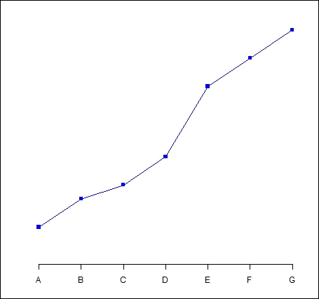
Clearly, we still have work to do to complete the graph by including a vertical axis and title. In the following sections, we will learn how to complete our graph.
The first argument in the
axis() command (the number 1) specifies the horizontal axis. The at argument allows you to specify where to place the axis labels. The vector called lab stores the actual labels. Now we create a y axis with horizontal labels, and ticks every four units, using the syntax at=4*0: yaxismax as shown:
axis(2, las=1, at=4*0: yaxismax)
Now what does our graph look like?

Now we have included a vertical axis. The argument las controls the orientation of the axis labels. Your labels can be either parallel (las=0) or perpendicular (las=2) to your axis. Using las=1 ensures horizontal labels, while las=3 ensures vertical labels.
Now we create a box around the plot and then we add in the two new curves using the lines() command, using two different symbol types.
box()

lines(Y2, pch = 16, type="o", lty=2, col="red")

lines(Y3, pch = 17, type="o", lty=3, col="darkgreen")
Let's create a title using the following command:
title(main="SEVERAL LINE PLOTS", col.main="darkgreen", font.main=2)
Now we label the x and y axes using title(), along with xlab and ylab.
title(xlab=toupper("Letters"), col.lab="purple")

title(ylab="Values", col.lab="brown")
Note the toupper() command, which always ensures that text within parentheses is uppercase. The tolower() command ensures that your text is lowercase.
Finally, we create a legend at the location (1, yaxismax), though the legend() command allows us to position the legend anywhere on the graph (see Chapter 2, Advanced Functions in Base Graphics, for more detail). We include the legend keys using the c operator. We control the colors using col and ensure that the symbol types match those of the graph using pch. To do this job, we include the legend colors in the same logical order in which we created the curves:
legend(1, yaxismax, c("Y1","Y2", "Y3"), cex=0.7, col=c("blue", "red", "darkgreen"), pch=c(15, 16, 17), lty=1:3)
The following is our final plot:

You can create multiple plots on the same page (plotting environment) using the command par(mfrow=(m, n)), where m is the number of rows and n is the number of columns. Enter the following four vectors:
X  <- c(1, 2, 3, 4, 5, 6, 7)
Y1 <- c(2, 4, 5, 7, 12, 14, 16)
Y2 <- c(3, 6, 7, 8, 9, 11, 12)
Y3 <- c(1, 7, 3, 2, 2, 7, 9)
In this example, we set the plotting environment at two rows and two columns in order to produce four graphs together:
par(mfrow=c(2,2))

plot(X,Y1, pch = 1)
plot(X,Y2, pch = 2)
plot(X,Y2, pch = 15)
plot(X,Y3, pch = 16)
Here is the resulting graph:

As expected, we have four graphs arranged in two rows and two columns.
Of course, you can vary the number of graphs by setting different numbers of rows and columns.
Of course, you will need to save many of the graphs that you create. The simplest method is to click inside the graph and then copy as a metafile or copy as a bitmap. You can then save your graph in a Word document or within a PowerPoint presentation. However, you may wish to save your graphs as JPEGS, PDFs, or in other formats.
Now we shall create a PDF of a graph (a histogram that we will create using the
hist() command, which you will come across later in this book). First we get ready to create a PDF (in R, we refer to this procedure as opening the PDF device driver) using the command pdf(), and then we plot. Finally, we complete the job (closing the device driver) using the command dev.off().
You may wish to save your plot to a particular directory or folder. To do so, navigate to File | Change Dir in R and select the directory or folder that you wish to use as your R working directory. For example, I selected a directory called BOOK, which is located within the following filepath on my computer:
C:\Users\David\Documents\BOOK
To confirm that this folder is now my current working folder, I entered the following command:
getwd()
The output obtained is as follows:
[1] "C:/Users/David/Documents/BOOK"
R has confirmed that its working folder is the one that I wanted. Note that R uses forward slashes for filepaths. Now, we create a vector of data and create our histogram as follows:
  y <- c(7, 18, 5, 13, 6, 17, 7, 18, 28, 7,17,28)

 pdf("My_Histogram.pdf")
 hist(y, col = "darkgreen")
 dev.off()
A PDF of your histogram should be saved in your R working directory. It is called My_Histogram.pdf and it looks like the following:

The graphing options available in R include
postscript(), pdf(), bitmap(), and
jpeg(). For a complete list of options, navigate to Help | Search help and enter the word devices. The list you need is labelled List of graphical devices.
For example, to create a postscript plot of the histogram, you can use the following syntax:
postscript(file="myplot.ps")
hist(y, col = "darkgreen")
dev.off()
To create and save a JPEG image from the current graph, use the
dev.copy()command:
dev.copy(device=jpeg,file="picture.jpg")
dev.off()
Your image is saved in the R working directory.
You can save and recall a plot that is currently displayed on your screen. If you have a plot on your screen, then try the following commands:
x = recordPlot()
x
You can delete your plot but get it back again later in your session using the following command:
replayPlot(x)
Mathematical expressions on graphs are made possible through a combination of two commands, expression() and paste(), and also through the
substitute() command.
By itself, the expression() command allows you to include mathematical symbols. For example, consider the following syntax:
plot(c(1,2,3), c(2,4,9), xlab = expression(phi))
This will create a small plot with the Greek symbol phi as the horizontal axis label.
The combination of expression() and paste() allows you to include mathematical symbols on your graph, along with letters, text, or numerals. Its syntax is expression(paste()). Where necessary (that is, where you need mathematical expressions as axis labels), you can switch off the default axes and include Greek symbols by writing them out in English. You can create fractions through the frac() command. Note the plus or minus sign, which is achieved though the syntax %+-%.
The following is an example based on a similar example in the excellent book Statistics: An Introduction using R, Michael J. Crawley, Wiley-Blackwell. I recommend this book to everyone who uses R—both students and professional researchers alike.
We first create a set of values from –7 to +7 for the horizontal axis. We have 71 such values.
x <- seq(-7, 7, len = 71)
Now we create interesting x and y axes labels. We will disable the x axis in order to create our own axis.
plot(x, cos(x),type="l",xaxt="n", xlab=expression(paste("Angle",theta)), ylab=expression("sin "*beta))

axis(1, at = c(-pi, -pi/2, 0, pi/2, pi),
lab = expression(-alpha, -alpha/2, 0, alpha/2, alpha))
We insert mathematical text at appropriate places on the graph:
text(-pi,0.5,substitute(sigma^2=="37.8"))
text(-pi/16, -0.5, expression(paste(frac(gamma*omega, sigma*phi*sqrt(3*pi)), " ",
    e^{frac(-(3*x-2*mu)^2, 5*sigma^2)})))

text(pi,0,expression(hat(y) %+-% frac(se, alpha)))
The resulting graph is as follows:

By comparing your own code with that used to produce this graph, you should be able to work out how to create your own mathematical expressions.
In this chapter, we covered the basic syntax and techniques to produce graphs in R. We covered the essential details for creating scatterplots and line plots, and discussed a range of syntax and techniques that are useful for other kinds of graph. I hope that you found this chapter a useful start on graphing in R.
In the next chapter, we will cover a range of topics that you will need if you want to create professional-level graphs for your own research and analysis. It contains very useful material, so please continue to work through this book by making a start on the next chapter as quickly as possible. For example, in this chapter, though we saw how to draw a regression line, in the next chapter we will go a little further on the topic of graphing regression lines. However, the further chapters have many other interesting techniques for you to learn.