


In the last few decades, the quick growth in the volume of information we produce and the capacity of digital information storage have opened a new door for data analytics. We have moved on from the age of terabytes to that of petabytes and exabytes. Traditional data analysis is now augmented with the term big data analysis, and computer scientists are pushing the bounds for analyzing this huge sea of data using statistical, computational, and algorithmic techniques.
Along with the size, the types and categories of data have also evolved. Along with the typical and popular data domain in Computer Science (text, image, and video), graphs and various categorical data that arise from Internet interactions have become increasingly interesting to analyze. With the advances in computational methods and computing speed, scientists nowadays produce an enormous amount of numerical simulation data that has opened up new challenges in the field of Computer Science.
Simulation data tends to be structured and clean, whereas data collected or scraped from websites can be quite unstructured and hard to make sense of. For example, let's say we want to analyze some blog entries in order to find out which blogger gets more follows and referrals from other bloggers. This is not as straightforward as getting some friends' information from social networking sites. Blog entries consist of text and HTML tags; thus, a combination of text analytics and tag parsing, coupled with a careful observation of the results would give us our desired outcome.
Regardless of whether the data is simulated or empirical, the key word here is observation. In order to make intelligent observations, data scientists tend to follow a certain pipeline. The data needs to be acquired and cleaned to make sure that it is ready to be analyzed using existing tools. Analysis may take the route of visualization, statistics, and algorithms, or a combination of any of the three. Inference and refining the analysis methods based on the inference is an iterative process that needs to be carried out several times until we think that a set of hypotheses is formed, or a clear question is asked for further analysis, or a question is answered with enough evidence.
Visualization is a very effective and perceptive method to make sense of our data. While statistics and algorithmic techniques provide good insights about data, an effective visualization makes it easy for anyone with little training to gain beautiful insights about their datasets. The power of visualization resides not only in the ease of interpretation, but it also reveals visual trends and patterns in data, which are often hard to find using statistical or algorithmic techniques. It can be used during any step of the data analysis pipeline—validation, verification, analysis, and inference—to aid the data scientist.
How have you visualized your data recently? If you still have not, it is okay, as this book will teach you exactly that. However, if you had the opportunity to play with any kind of data already, I want you to take a moment and think about the techniques you used to visualize your data so far. Make a list of them.
Done? Do you have 2D and 3D plots, histograms, bar charts, and pie charts in the list? If yes, excellent! We will learn how to style your plots and make them more interactive using Mathematica. Do you have chord diagrams, graph layouts, word cloud, parallel coordinates, isosurfaces, and maps somewhere in that list? If yes, then you are already familiar with some modern visualization techniques, but if you have not had the chance to use Mathematica as a data visualization language before, we will explore how visualization prototypes can be built seamlessly in this software using very little code.
The aim of this book is to teach a Mathematica beginner the data-analysis and visualization powerhouse built into Mathematica, and at the same time, familiarize the reader with some of the modern visualization techniques that can be easily built with Mathematica. We will learn how to load, clean, and dissect different types of data, visualize the data using Mathematica's built-in tools, and then use the Mathematica graphics language and interactivity functions to build prototypes of a modern visualization.
In this chapter, we will look at a few simple examples that demonstrate the importance of data visualization. We will then discuss the types of datasets that we will encounter over the course of this book, and learn about the Mathematica interface to get ourselves warmed up for coding.
Visualization has a broad definition, and so does data. The cave paintings drawn by our ancestors can be argued as visualizations as they convey historical data through a visual medium. Map visualizations were commonly used in wars since ancient times to discuss the past, present, and future states of a war, and to come up with new strategies. Astronomers in the 17th century were believed to have built the first visualization of their statistical data. In the 18th century, William Playfair invented many of the popular graphs we use today (line, bar, circle, and pie charts). Therefore, it appears as if many, since ancient times, have recognized the importance of visualization in giving some meaning to data.
To demonstrate the importance of visualization in a simple mathematical setting, consider fitting a line to a given set of points. Without looking at the data points, it would be unwise to try to fit them with a model that seemingly lowers the error bound. It should also be noted that sometimes, the data needs to be changed or transformed to the correct form that allows us to use a particular tool. Visualizing the data points ensures that we do not fall into any trap. The following screenshot shows the visualization of a polynomial as a circle:
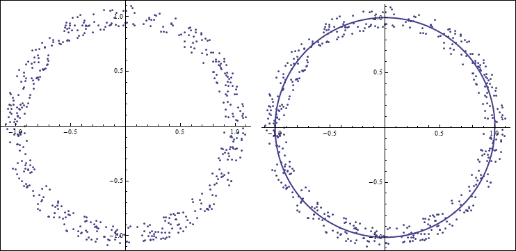
Figure 1.1 Fitting a polynomial
In figure 1.1, the points are distributed around a circle. Imagine we are given these points in a Cartesian space (orthogonal x and y coordinates), and we are asked to fit a simple linear model. There is not much benefit if we try to fit these points to any polynomial in a Cartesian space; what we really need to do is change the parameter space to polar coordinates. A 1-degree polynomial in polar coordinate space (essentially a circle) would nicely fit these points when they are converted to polar coordinates, as shown in figure 1.1. Visualizing the data points in more complicated but similar situations can save us a lot of trouble. The following is a screenshot of Anscombe's quartet:
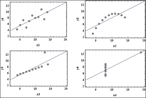
Figure 1.2 Anscombe's quartet, generated using Mathematica
Tip
Downloading the color images of this book
We also provide you a PDF file that has color images of the screenshots/diagrams used in this book. The color images will help you better understand the changes in the output. You can download this file from: https://www.packtpub.com/sites/default/files/downloads/2999OT_coloredimages.PDF.
Anscombe's quartet (figure 1.2), named after the statistician Francis Anscombe, is a classic example of how simple data visualization like plotting can save us from making wrong statistical inferences. The quartet consists of four datasets that have nearly identical statistical properties (such as mean, variance, and correlation), and gives rise to the same linear model when a regression routine is run on these datasets. However, the second dataset does not really constitute a linear relationship; a spline would fit the points better. The third dataset (at the bottom-left corner of figure 1.2) actually has a different regression line, but the outlier exerts enough influence to force the same regression line on the data. The fourth dataset is not even a linear relationship, but the outlier enforces the same regression line again.
These two examples demonstrate the importance of "seeing" our data before we blindly run algorithms and statistics. Fortunately, for visualization scientists like us, the world of data types is quite vast. Every now and then, this gives us the opportunity to create new visual tools other than the traditional graphs, plots, and histograms. These visual signatures and tools serve the same purpose that the graph plotting examples previously just did—spy and investigate data to infer valuable insights—but on different types of datasets other than just point clouds.
Another important use of visualization is to enable the data scientist to interactively explore the data. Two features make today's visualization tools very attractive—the ability to view data from different perspectives (viewing angles) and at different resolutions. These features facilitate the investigator in understanding both the micro- and macro-level behavior of their dataset.
There are many different types of datasets that a visualization scientist encounters in their work. This book's aim is to prepare an enthusiastic beginner to delve into the world of data visualization. Certainly, we will not comprehensively cover each and every visualization technique out there. Our aim is to learn to use Mathematica as a tool to create interactive visualizations. To achieve that, we will focus on a general classification of datasets that will determine which Mathematica functions and programming constructs we should learn in order to visualize the broad class of data covered in this book.
The table is one of the most common data structures in Computer Science. You might have already encountered this in a computer science, database, or even statistics course, but for the sake of completeness, we will describe the ways in which one could use this structure to represent different kinds of data. Consider the following table as an example:
|
Attribute 1 |
Attribute 2 |
… | |
|---|---|---|---|
|
Item 1 | |||
|
Item 2 | |||
|
Item 3 |
When storing datasets in tables, each row in the table represents an instance of the dataset, and each column represents an attribute of that data point. For example, a set of two-dimensional Cartesian vectors can be represented as a table with two attributes, where each row represents a vector, and the attributes are the x and y coordinates relative to an origin. For three-dimensional vectors or more, we could just increase the number of attributes accordingly.
Tables can be used to store more advanced forms of scientific, time series, and graph data. We will cover some of these datasets over the course of this book, so it is a good idea for us to get introduced to them now. Although we will describe them in depth in the upcoming chapters, here we explain the general concepts.
There are many kinds of scientific dataset out there. In order to aid their investigations, scientists have created their own data formats and mathematical tools to analyze the data. Engineers have also developed their own visualization language in order to convey ideas in their community. In this book, we will cover a few typical datasets that are widely used by scientists and engineers. We will eventually learn how to create molecular visualizations and biomedical dataset exploration tools when we feel comfortable manipulating these datasets.
In practice, multidimensional data (just like vectors in the previous example) is usually augmented with one or more characteristic variable values. As an example, let's think about how a physicist or an engineer would keep track of the temperature of a room. In order to tackle the problem, they would begin by measuring the geometry and the shape of the room, and put temperature sensors at certain places to measure the temperature. They will note the exact positions of those sensors relative to the room's coordinate system, and then, they will be all set to start measuring the temperature.
Thus, the temperature of a room can be represented, in a discrete sense, by using a set of points that represent the temperature sensor locations and the actual temperature at those points. We immediately notice that the data is multidimensional in nature (the location of a sensor can be considered as a vector), and each data point has a scalar value associated with it (temperature). Such a discrete representation of multidimensional data is quite widely used in the scientific community. It is called a scalar field. The following screenshot shows the representation of a scalar field in 2D and 3D:
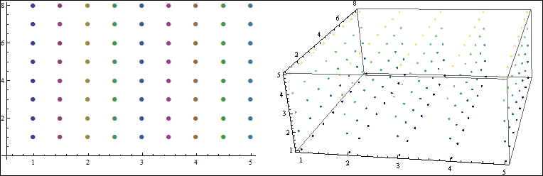
Figure 1.3 In practice, scalar fields are discrete and ordered
Figure 1.3 depicts how one would represent an ordered scalar field in 2D or 3D. Each point in the 2D field has a well-defined x and y location, and a single temperature value gets associated with it. To represent a 3D scalar field, we can think of it as a set of 2D scalar field slices placed at a regular interval along the third dimension. Each point in the 3D field is a point that has {x, y, z} values, along with a temperature value.
A scalar field can be represented using a table. We will denote each {x, y} point (for 2D) or {x, y, z} point values (for 3D) as a row, but this time, an additional attribute for the scalar value will be created in the table. Thus, a row will have the attributes {x, y, z, T}, where T is the temperature associated with the point defined by the x, y, and z coordinates. This is the most common representation of scalar fields.
A widely used visualization technique to analyze scalar fields is to find out the isocontours or isosurfaces of interest. We will cover this in detail in Chapter 3, Time Series and Scientific Visualization. However, for now, let's take a look at the kind of application areas such analysis will enable one to pursue. Instead of temperature, one could think of associating regularly spaced points with any relevant scalar value to form problem-specific scalar fields. In an electrochemical simulation, it is important to keep track of the charge density in the simulation space. Thus, the chemist would create a scalar field with charge values at specific points.
For an aerospace engineer, it is quite important to understand how air pressure varies across airplane wings; they would keep track of the pressure by forming a scalar field of pressure values. Scalar field visualization is very important in many other significant areas, ranging from from biomedical analysis to particle physics. In this book, we will cover how to visualize this type of data using Mathematica.
Another widely used data type is the time series. A time series is a sequence of data points that are measured usually over a uniform interval of time. Time series arise in many fields, but in today's world, they are mostly known for their applications in Economics and Finance. Other than these, they are frequently used in statistics, weather prediction, signal processing, astronomy, and so on. It is not the purpose of this book to describe the theory and mathematics of time series data. However, we will cover some of Mathematica's excellent capabilities for visualizing time series, and in the course of this book, we will construct our own visualization tool to view time series data.
Time series can be easily represented using tables. Each row of the time series table will represent one point in the series, with one attribute denoting the time stamp—the time at which the data point was recorded, and the other attribute storing the actual data value. If the starting time and the time interval are known, then we can get rid of the time attribute and simply store the data value in each row. The actual timestamp of each value can be calculated using the initial time and time interval.
Nowadays, graphs arise in all contexts of computer science and social science. This particular data structure provides a way to convert real-world problems into a set of entities and relationships. Once we have a graph, we can use a plethora of graph algorithms to find beautiful insights about the dataset. Technically, a graph can be stored as a table. However, Mathematica has its own graph data structure, so we will stick to its norm.
Sometimes, visualizing the graph structure reveals quite a lot of hidden information. As we will see in Chapter 4, Statistical and Information Visualization, graph visualization itself is a challenging problem, and is an active research area in computer science. A proper visualization layout, along with proper color maps and size distribution, can produce very useful outputs. In Chapter 4, Statistical and Information Visualization, we will demonstrate how to convert a dataset into a graph structure, how to create the graph in Mathematica, and how to visualize it with different layouts interactively.
The most common form of data that we encounter everywhere is text. Mathematica does not provide any specific visualization package for state-of-the-art text visualization methods, but we will create a small and effective tool in Chapter 4, Statistical and Information Visualization, which shows the evolution and frequency of words in a document.
As mentioned before, map visualization is one of the ancient forms of visualization known to us. Nowadays, with the advent of GPS, smartphones, and publicly available country-based data repositories, maps are providing an excellent way to contrast and compare different countries, cities, or even communities.
Cartographic data comes in various forms. A common form of a single data item is one that includes latitude, longitude, location name, and an attribute (usually numerical) that records a relevant quantity. However, instead of a latitude and longitude coordinate, we may be given a set of polygons that describe the geographical shape of the place. The attributable quantity may not be numerical, but rather something qualitative, like text. Thus, there is really no standard form that one can expect when dealing with cartographic data. Fortunately, Mathematica provides us with excellent data-mining and dissecting capabilities to build custom formats out of the data available to us. We will cover maps in Chapter 5, Maps and Aesthetics.
At this point, you might be wondering why Mathematica is suited for visualizing all the kinds of datasets that we have mentioned in the preceding examples. There are many excellent tools and packages out there to visualize data. Mathematica is quite different from other languages and packages because of the unique set of capabilities it presents to its user.
Mathematica has its own graphics language, with which graphics primitives can be interactively rendered inside the worksheet. This makes Mathematica's capability similar to many widely used visualization languages. Mathematica provides a plethora of functions to combine these primitives and make them interactive.
Speaking of interactivity, Mathematica provides a suite of functions to interactively display any of its process. Not only visualization, but any function or code evaluation can be interactively visualized. This is particularly helpful when managing and visualizing big datasets.
Mathematica provides many packages and functions to visualize the kinds of datasets we have mentioned so far. We will learn to use the built-in functions to visualize structured and unstructured data. These functions include point, line, and surface plots; histograms; standard statistical charts; and so on. Other than these, we will learn to use the advanced functions that will let us build our own visualization tools. Another interesting feature is the built-in datasets that this software provides to its users. This feature provides a nice playground for the user to experiment with different datasets and visualization functions.
From our discussion so far, we have learned that visualization tools are used to analyze very large datasets. While Mathematica is not really suited for dealing with petabytes or exabytes of data (and many other popularly used visualization tools are not suited for that either), often, one needs to build quick prototypes of such visualization tools using smaller sample datasets. Mathematica is very well suited to prototype such tools because of its efficient and fast data-handling capabilities, along with its loads of convenient functions and user-friendly interface. It also supports GPU and other high-performance computing platforms. Although it is not within the scope of this book, a user who knows how to harness the computing power of Mathematica can couple that knowledge with visualization techniques to build custom big data visualization solutions.
Another feature that Mathematica presents to a data scientist is the ability to keep the workflow within one worksheet. In practice, many data scientists tend to do their data analysis with one package, visualize their data with another, and export and present their findings using something else. Mathematica provides a complete suite of a core language, mathematical and statistical functions, a visualization platform, and versatile data import and export features inside a single worksheet. This helps the user focus on the data instead of irrelevant details.
By now, I hope you are convinced that Mathematica is worth learning for your data-visualization needs. If you still do not believe me, I hope I will be able to convince you again at the end of the book, when we will be done developing several visualization prototypes, each requiring only few lines of code!
We will need to know a few basic Mathematica notebook essentials. Assuming you already have Mathematica installed on your computer, let's open a new notebook by navigating to File | New | Notebook, and do the following experiments.
In Mathematica, a chunk of code or any number of mathematical expressions can be written within a cell. Each cell in the notebook can be evaluated to see the output immediately below it. To start a new cell, simply start typing at the position of the blinking cursor. Each cell can be selected by clicking on the respective rightmost bracket. To select multiple cells, press Ctrl + right-mouse button in Windows or Linux (or cmd + right-mouse button on a Mac) on each of the cells. The following screenshot shows several cells selected together, along with the output from each cell:
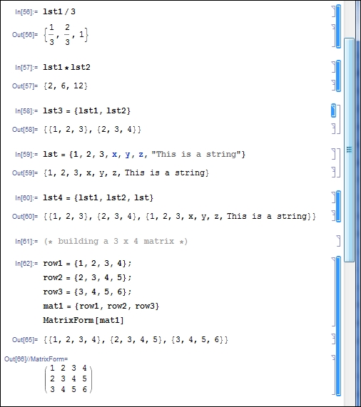
Figure 1.4 Selecting and evaluating cells in Mathematica
We can place a new cell in between any set of cells in order to change the sequence of instruction execution. Use the mouse to place the cursor in between two cells, and start typing your commands to create a new cell. We can also cut, copy, and paste cells by selecting them and applying the usual shortcuts (for example, Ctrl + C, Ctrl + X, and Ctrl + V in Windows/Linux, or cmd + C, cmd + X, and cmd + V in Mac) or using the Edit menu bar. In order to delete cell(s), select the cell(s) and press the Delete key.
A cell can be evaluated by pressing Shift + Enter. Multiple cells can be selected and evaluated in the same way. To evaluate the full notebook, press Ctrl + A (to select all the cells) and then press Shift + Enter. In this case, the cells will be evaluated one after the other in the sequence in which they appear in the notebook. To see examples of notebooks filled with commands, code, and mathematical expressions, you can open the notebooks supplied with this chapter, which are the polar coordinates fitting and Anscombe's quartet examples, and select each cell (or all of them) and evaluate them.
If we evaluate a cell that uses variables declared in a previous cell, and the previous cell was not already evaluated, then we may get errors. It is possible that Mathematica will treat the unevaluated variables as a symbolic expression; in that case, no error will be displayed, but the results will not be numeric anymore.
If we don't wish to see the intermediate output as we load data or assign values to variables, we can add a semicolon (;) at the end of each line that we want to leave out from the output.
Mathematica input cells treat everything inside them as mathematical and/or symbolic expressions. By default, every new cell you create by typing at the horizontal cursor will be an input expression cell. However, you can convert the cell to other formats for convenient typesetting. In order to change the format of cell(s), select the cell(s) and navigate to Format | Style from the menu bar, and choose a text format style from the available options. You can add mathematical symbols to your text by selecting Palettes | Basic Math Assistant. Note that evaluating a text cell will have no effect/output.
We can write any comment in a text cell as it will be ignored during the evaluation of our code. However, if we would like to write a comment inside an input cell, we use the (* operator to open a comment and the *) operator to close it, as shown in the following code snippet:
(* This is a comment *)
The shortcut Ctrl + / (cmd + / in Mac) is used to comment/uncomment a chunk of code too. This operation is also available in the menu bar.
Tip
Downloading the example code
You can download the example code files for all Packt books you have purchased from your account at http://www.packtpub.com. If you purchased this book elsewhere, you can visit http://www.packtpub.com/support and register to have the files e-mailed directly to you.
We can abort the currently running evaluation of a cell by navigating to Evaluation | Abort Evaluation in the menu bar, or simply by pressing Alt + . (period). This is useful when you want to end a time-consuming process that you suddenly realize will not give you the correct results at the end of the evaluation, or end a process that might use up the available memory and shut down the Mathematica kernel.
The next few chapters are divided according to the kinds of dataset we will tackle in each of them. Chapter 2, Dissecting Data Using Mathematica, will introduce us to data manipulation, cleaning, and fast-accessing techniques in Mathematica. We will also learn how to use some built-in plotting and styling functions in Mathematica. Chapter 3, Time Series and Scientific Visualization, will deal with scalar field visualization, along with some time-series visualization techniques. We will learn how to create a small molecular visualization tool and a time-series explorer. In Chapter 4, Statistical and Information Visualization, we will delve into the world of information visualization. While the types of information and their visualizations are quite varied in nature, we will focus on graph and text visualization in Mathematica. We will also learn some essential statistical visualization techniques.
This chapter will teach us how to build visualization tools such as the graph layout explorer, word frequency visualizer, and interactive chord charts. Chapter 5, Maps and Aesthetics, will focus on using cartographic data to build an interactive map visualization. We will end with a brief discussion on color maps and aesthetics in visualization. My suggestion would be to read each chapter without skipping any, because techniques introduced in each chapter will be used in subsequent chapters.
The history of visualization deserves a separate book, as it is really fascinating how the field has matured over the centuries, and it is still growing very strongly. Michael Friendly, from York University, published a historical development paper that is freely available online, titled Milestones in History of Data Visualization: A Case Study in Statistical Historiography. This is an entertaining compilation of the history of visualization methods.
The book The Visual Display of Quantitative Information by Edward R. Tufte published by Graphics Press USA, is an excellent resource and a must-read for every data visualization practitioner. This is a classic book on the theory and practice of data graphics and visualization. Since we will not have the space to discuss the theory of visualization, the interested reader can consider reading this book for deeper insights.
In this chapter, we discussed the importance of data visualization in different contexts. We also introduced the types of dataset that will be visualized over the course of this book. The flexibility and power of Mathematica as a visualization package was discussed, and we will see the demonstration of these properties throughout the book with beautiful visualizations. Finally, we have taken the first step to writing code in Mathematica. Now we are ready to move onto the next chapter, where we will start writing some actual code to visualize data.