Download code from GitHub
The goal of this book is to empower you to become a Tableau master; in Tableau-speak, the term is Jedi. Yes, that is official Tableau terminology. Attend the yearly Tableau conference and you can sit in on Jedi classes. Of course, simply attending a class will not automatically bestow you with Jedi powers - nor will simply reading this book. Diligent work on real-world problems is absolutely essential. Couple this diligent work with industrious study and you will make it. You will become a Tableau Jedi. My hope is that this book will prove useful to you on your journey to mastery.
If you are a seasoned Tableau author, you may find this initial chapter elementary. (A person who creates Tableau workbooks is referred to as an author, not a developer.) For such persons, I recommend a quick, inspectional read. If after a few minutes you are satisfied you already possess a solid understanding of the concepts discussed, feel free to proceed to subsequent chapters. If, however, you find some of the content unfamiliar, it may be wise to read with greater attention.
Those who are fairly new to Tableau should find this chapter helpful in getting up to speed quickly; however, since this book targets advanced topics, relatively little time is spent considering the basics. For a more thorough consideration of fundamental topics, consider Learning Tableau, written by Joshua Milligan and published by Packt Publishing.
In this chapter, we will discuss the following:
The Tableau universe
Understanding the Tableau interface and basic terminology
Worksheet and dashboard creation
Connecting Tableau to your data
Measure Names and Measure Values
Three essential Tableau concepts
Tableau Software has a focused vision resulting in a small product line. The main product (and hence the center of the Tableau universe) is Tableau Desktop. Assuming you are a Tableau author, that's where almost all your time will be spent when working with Tableau. But of course you must be able to connect to data and output the results. Thus, as shown in the following figure, the Tableau universe encompasses data sources, Tableau Desktop, and output channels, which include the Tableau Server family and Tableau Reader:

|
Data Sources |
Tableau connects to many data sources. Those data sources will be discussed in more detail in the following section. |
|
Tableau Desktop |
Tableau Desktop is where visualizations are created. Although, as of Tableau 8.0, some authoring capabilities were introduced into the Tableau Server environment, that environment is limited. (See Chapter 12, Interacting with Tableau Server to learn more about authoring in the Tableau Server environment.) Thus, the heavy lifting is still done in Tableau Desktop. |
|
Tableau Server Family |
Once completed in Tableau Desktop, a workbook can be uploaded to Tableau Server for end-user access. Tableau Server provides a secure, web-based environment where end users can access visualizations created in Desktop either through a browser or via the Tableau Mobile app for Android and iPhone.
Tableau Online is a cloud-based version of Tableau Server hosted by Tableau Software. It's an ideal solution for smaller organizations that need the security and flexibility of Server without the associated overheads.
Tableau Public is, in reality, split into two products: the Tableau Public client, and a cloud-based, public-facing version of Tableau Server. The client has the capabilities of Desktop, with a few major exceptions:
|
|
Tableau Reader |
The relationship between Tableau Desktop and Tableau Reader is synonymous to that between Adobe Acrobat and Adobe Reader. Desktop is used for authoring; Reader is used for viewing. Desktop has an associated cost; Reader is free.
A few brief notes regarding Reader:
|
To begin our survey of the basics, let's consider the terminology and associated definitions of assets that make up the Tableau workspace. Lingering a little on these terms should prove helpful, since each is used throughout the book:

|
Go to Start |
Click to toggle between the start page and the workspace. |
|
Data Pane |
Provides access to the data source, all fields, sets, and parameters, and displays the underlying data when the View Data icon is clicked. |
|
Data Source |
Lists all data sources and provides access to edit data sources, create data extracts, publish data sources, and more. |
|
Dimensions |
Lists all fields classified as Dimensions. |
|
Measures |
Lists all fields classified as Measures. |
|
Sets |
Lists all sets created by the Tableau author. |
|
Parameters |
Lists all parameters created by the Tableau author. |
|
Data Source Tab |
Provides access to the Data Source page. |
|
Shelves |
Areas where fields are placed to create views. |
|
Legend |
Serves the dual purpose of communicating Color, Size, and Shape information that exists in the view, as well as providing sorting, filtering, and highlighting capabilities. |
|
Status Bar |
Displays information about the current view. |
|
Fit |
Determines how a view is sized on the screen. |
|
View |
That which the end user sees via Tableau Server or Reader. Includes the visualization, legends, displayed filters, parameters, captions, and so on. |
|
Pills |
Fields, sets, or parameters that have been placed on one or more shelves. So named because the shape resembles a pill. |
|
Show Me |
Tool used to automatically create visualizations based on selected fields and any fields already placed on shelves. |
|
Displayed Filter |
A field exposed to the end user providing the ability to display/hide a numeric or date range of the field or display/hide members of the field. In earlier versions of Tableau this was referred to as a Quick Filter. |
At the heart of Tableau are worksheets and dashboards. Worksheets contain individual visualizations and dashboards contain one or more worksheets. Additionally, worksheets and dashboards may be combined into stories to communicate specific insights to the end user via a presentation environment. Lastly, all worksheets, dashboards, and stories are organized in workbooks that can be accessed via Tableau Desktop, Server, or Reader. In this section, we will look at worksheet and dashboard creation with the intent of not only communicating the basics, but also providing some insight that may prove helpful to even more seasoned Tableau authors.
At the most fundamental level, a visualization in Tableau is created by placing one or more fields on one or more shelves. To state this as a pseudo-equation:
Field(s) + shelf(s) = Viz
As an example, note that the visualization created in the following screenshot is generated by placing the Sales field on the Text shelf. Although the results are quite simple - a single number - this does qualify as a view. In other words, a Field (Sales) placed on a shelf (Text) has generated a Viz:

Let's explore the basics of creating a visualization via an exercise:
Navigate to https://public.tableau.com/profile/david.baldwin#!/ to locate and download the workbook associated with this chapter.
In the workbook, find the tab labeled Fundamentals of Visualizations:

Locate Region within the Dimensions portion of the Data pane:

Drag Region to the Color shelf; that is, Region + Color shelf = what is shown in the following screenshot:

Click on the Color shelf and then on Edit Colors... to adjust colors as desired:

Next, move Region to the Size, Label/Text, Detail, Columns, and Rows shelves. After placing Region on each shelf, click on the shelf to access additional options.
Lastly, choose other fields to drop on various shelves to continue exploring Tableau's behavior.
As you continue exploring Tableau's behavior by dragging and dropping different fields onto different shelves, you will notice that Tableau responds with default behaviors. These defaults, however, can be overridden, which we will explore in the following section.
Note that in the previous exercise, the Marks card perpetually reads Automatic. This means that Tableau is providing the default view. The default view can be easily overridden by choosing a different selection from the drop-down menu:

Another type of default behavior can be observed when dragging a field onto a shelf. For example, dragging and dropping a measure onto a shelf will typically result in the aggregation Sum. To override this default behavior, right click and drag a field from the Data pane and drop it onto a shelf. Tableau will respond by opening a dialog box with the possible options. An example of this is shown in the following screenshot, where the field Region has been placed on the Rows shelf via a right-click, drag and drop action:

Let's walk through an exercise overriding the two default behaviors discussed previously:
In the workbook associated with this chapter, navigate to the
Overriding Defaultsworksheet, right-click and drag Order Date to the Columns shelf.Within the resulting dialog box, choose the second instance of MONTH(Order Date):

Place Sales on the Rows shelf and Region on the Details shelf.
Click on the dropdown in the Marks card and select Area:

Show Me allows the Tableau author to create visualizations at the click of a button. To understand how it works, consider the following screenshot:

A: Selected field(s) in the Data pane.
B: Field(s) deployed in the view; that is, Pills.
C: The recommended view.
D: Help text communicating the requirements for creating the recommended view for any selection choice over which the cursor is placed.
Every icon in Show Me that is not grayed out represents a visualization that can be created simply by clicking on it. For example, in the preceding screenshot, the Tableau author may choose to click on the pie chart icon to create a pie chart based on the selected and deployed fields.
Show Me may be effectively used for the following reasons:
Efficiency: The proficient Tableau author already knows how to create the basic visualization types. Show Me automates these basic types and thus may be used for quicker production.
Inspiration: Determining an effective way to visualize a dataset can be challenging. Show Me can help with this challenge by allowing the Tableau author to quickly consider various options.
Education: An inexperienced Tableau author may access Show Me to better understand how various visualizations are created. Much can be learned by reading the help text displayed at the bottom of Show Me and observing the results generated by clicking on various options.
These three reasons communicate the strong value that Show Me provides for worksheet creation; however, there is one reason for which it should not be used: as a crutch. The Tableau author who clicks on the various options without understanding how each visualization is created is not only shortchanging the educational process, but may generate results that are not well understood and could thus lead to detrimental business decisions.
Although, as stated previously, a dashboard contains one or more worksheets, dashboards are much more than static presentations. They are an essential part of Tableau's interactivity. In this section, we will populate a dashboard with worksheets and then deploy actions for interactivity.
In the workbook associated with this chapter, navigate to the tab entitled
Building a Dashboard.Within the Dashboard pane located on the left-hand portion of the screen, double-click on each of the following worksheets (in the order in which they are listed) to add them to the dashboard:
US Sales
Customer Segment
Scatter Plot
Customers
In the lower right-hand corner of the dashboard, click in the blank area below Profit Ratio to select the vertical container:
After clicking in the blank area, you should see a blue border around the filter and the legends. This indicates that the vertical container is selected.
As shown in the following screenshot, select the vertical container handle and drag it to the left-hand side of the Customers worksheet. Note the gray shading, which communicates where the container will be placed:

Format the dashboard as desired. The following tips may prove helpful:
Adjust the sizes of the elements on the screen by hovering over the edges between each element and then clicking and dragging as desired.
Note that the Sales and Profit legends in the following screenshot are floating elements. Make an element float by right-clicking on the element handle and selecting Floating. (See the previous screenshot and note that the handle is located immediately above Region, in the upper-right-hand corner).
Create Horizontal and Vertical containers by dragging those objects from the bottom portion of the Dashboard pane.
Drag the edges of containers to adjust the size of each worksheet.
Display the dashboard title via Dashboard | Show Title...:

One of the primary benefits of Tableau is the interactivity it provides the end user. Dashboards are not simply for viewing; they are meant for interaction. In this exercise, we will add interactivity to the dashboard that was created in the previous exercise:
Starting where the previous exercise ended, click the drop-down menu associated with the Region filter and navigate to Apply to Worksheets | All Using this Data Source:

In order to use the map as a filter for the other worksheets on the dashboard, click the Use as Filter icon located in the top-right-hand corner of the US Sales worksheet:

Similarly, set Customer Segment to Use as Filter.
Navigate to the menu option Dashboard | Actions.
Within the dialog box, navigate to Add Action | Filter and create a filter like the one shown in the following screenshot:

Having completed the preceding dashboard exercise, you should now be able to click on various objects on the dashboard and observe their interactivity. To learn advanced dashboarding techniques, be sure to check out Chapter 10, Visualization Best Practices and Dashboard Design.
At the time of writing, Tableau's Data Connection menu includes 50 different connection types, and that is somewhat of an understatement since some of those types contain multiple options. For example, the selection choice, Other Files, includes 21 options. Of course, we won't cover the details for every connection type, but we will cover the basics.
Upon opening a new instance of Tableau Desktop, you will note a link in the upper left-hand corner of the workspace. Clicking on that link will enable you to connect to data. Alternatively, you can simply click on the New Data Source icon on the toolbar:

Although subsequent chapters will consider connecting to other data sources, here we will limit the discussion to considerations when connecting to Excel and text files.
Upon choosing to connect to an Excel or text file, the Tableau author is presented with two choices. Note that those choices are somewhat hidden. As shown in the following screenshot, you will need to click on the arrow next to the Open button to access them:

The Open option uses a native Tableau driver. The Open with Legacy Connection option accesses the Microsoft JET driver. Let's compare and contrast some of the differences between these two drivers.
|
Native Tableau Driver |
MS Jet Driver |
|
More set capabilities such as in/out and combined sets |
Limited set capabilities |
|
Count Distinct is allowed |
Count Distinct is disallowed |
|
Allows more than 255 columns |
Columns are capped at 255 |
|
Special characters, such as brackets and quotation marks, are allowed in file and field names |
Special characters are disallowed in file and field names |
|
When connecting to Excel, the data type is determined by 95% of the first 10,000 rows |
When connecting to Excel, the data type is determined by the first eight rows |
|
Cannot connect to |
Can connect to |
|
File names can be any length |
File names are limited to 64 characters |
|
Custom SQL is not allowed |
Custom SQL is allowed |
|
Left and inner joins are allowed |
Left, inner, and right joins are allowed |
|
Pivot data from rows to columns |
No pivoting feature |
|
Improved header auto-detection |
Note that the preceding table is not complete. There are many other differences between the functionality of Native Tableau Driver and MS Jet Driver. Most of those, however, are less consequential.
So, when should you use Native Tableau Driver versus MS JET Driver? In short, use the native Tableau driver! In almost every case it will provide better performance and more functionality. One exception is when custom SQL is required. Tableau Software does not recommend using custom SQL in most cases because Tableau-generated SQL will run more efficiently; however, in some cases it may be necessary.
Connecting to Tableau Server is perhaps the single most important server connection type to consider, since it is frequently used to provide better performance than may otherwise be possible. Additionally, connecting to Tableau Server enables the author to receive not only data, but information regarding how that data is to be interpreted, for example, whether a given field should be considered a measure or a dimension. Let's explore this further via two exercises.
As a precursor to connecting to Tableau Server, let's compare and contrast the instance of the Superstore data source represented in the workbook associated with this chapter (that is, the Chapter 1 workbook) with a new connection to the same data.
In a new instance of Tableau, navigate to Data | New Data Source | Excel to connect to the Sample - Superstore dataset that installs with Tableau desktop (it should be located on your hard drive under My Tableau Repository | Datasources).
Double-click on the Orders sheet.
Click on the Sheet 1 tab.
Place Discount on the Text shelf.
Double-click on Profit and Sales.
Compare the results of the new worksheet to that of the worksheet entitled
Observing Metadata Differencesin theChapter 1workbook:
A: The data source name has been altered in the
Chapter 1workbookB: In the
Chapter 1workbook, the default aggregation of Discount is AVG. In the unaltered instance the default is SUMC: Product Hierarchy exists only in the
Chapter 1workbookD: The format of Discount, Profit, and Sales differs between the two instances
E: Profit Ratio exists only in the
Chapter 1workbook
In order to complete this exercise, access to an instance of Tableau Server is necessary. If you do not have access to Tableau Server, consider installing a trial version on your local computer:
In the workbook associated with this chapter, navigate to the
Connecting to Tableau Serverworksheet.Right-click on the Superstore data source and select Publish to Server.
Log in to Tableau Server and follow the prompts to complete the publication of the data source.
After the data source has been published, open a new instance of Tableau Desktop and navigate to Data | New Data Source | Tableau Server to connect to the data source published in the previous step.
Click on Sheet 1 in the new workbook and observe that the changes made in the
Chapter 1workbook have been preserved.Within the Data pane, right-click on Profit Ratio and note that it is not directly editable.
Having completed the previous two exercises, let's discuss the most germane point; that is, metadata. Metadata is often defined as data about the data. In the preceding case, the data source name, default aggregation, default number formatting, and hierarchy are all examples of Tableau remembering changes made to the metadata. This is important because publishing a data connection allows for consistency across multiple Tableau authors. For example, if your company has a policy regarding the use of decimal points when displaying currency, that policy will be easily adhered to if all Tableau authors start building workbooks by pointing to data sources where all formatting has been predefined.
In the last exercise, the fact that the Profit Ratio calculated field was not directly editable when accessed via connecting to Tableau Server as a data source has important implications. Imagine the problems that would ensue if different Tableau authors defined Profit Ratio differently. End users would have no way of understanding what Profit Ratio truly means. However, by creating a workbook based on a published data source, the issue is alleviated. One version of Profit Ratio is defined and it can only be altered by changing the data source. This functionality can greatly improve consistency across the enterprise.
Connecting to a saved data source on a local machine is much like connecting to a data source published on Tableau Server. Metadata definitions associated with the local data source are preserved, just like they are on Tableau Server. Of course, since the data source is local instead of remote, the publication process is different. Let's explore this via an exercise.
In the workbook associated with this chapter, navigate to the tab entitled
Local Data Connection.In the Data pane, right-click on the Superstore data source and select Add to Saved Data Sources.
Using the resulting dialog box, save the data source as Superstore in My Tableau Repository | Datasources, located on your hard drive.
Click on the Go to Start icon located in the top-left corner of your screen and observe the new saved data source:

Tip
Note that you can save a local data source that points to a published data source on Tableau Server. First, connect to a published data source on Tableau Server. Next, right-click on the data source in your workspace and choose Add to Saved Data Sources. Now you can connect to Tableau Server directly from your Start page!
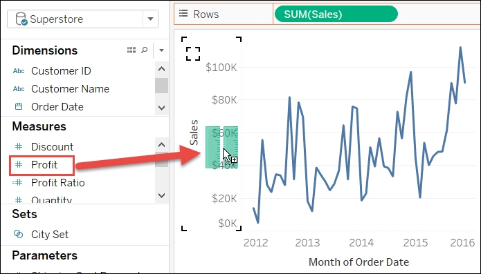
I've observed the following scenario frequently. A new Tableau author creates a worksheet and drags a measure to the Text shelf. They would like to create another row to display a second measure but do not know how. They drag the second measure to various places on the view and get results that seem entirely unpredictable. The experience is very frustrating for the author, since it's so easy to accomplish this in Excel! The good news is that it's also easy to accomplish in Tableau. It just requires a different approach. Let's explore the solution via an exercise.
Measure Names and Measure Values are generated fields in Tableau. They do not exist in the underlying data, but they are indispensable for creating many kinds of views. As may be guessed from its placement in the Data pane and its name, Measure Names is a dimension whose members are made up of the names of each measure in the underlying dataset. Measure Values contains the numbers or values of each measure in the dataset. Watch what happens below when measure names and measure values are used independently. Afterward observe how they work elegantly together to create a view.
In the workbook associated with this chapter, navigate to the worksheet entitled
Measure Names/Values.Drag Measure Values to the Text shelf and observe the results:

Clear the worksheet by clicking on the Clear Sheet icon on the toolbar:

Drag Measure Names to the Rows shelf and observe that the view merely displays No Measure Value.
Drag Measure Values to the Text shelf. Note the list of measures and associated values.
Perhaps the interrelationship between Measure Names and Measure Values is best explained by an analogy. Consider several pairs of socks and a partitioned sock drawer. Step 2 is the equivalent of throwing the socks into a pile. The results are, well, disorganized. Step 4 is the equivalent of an empty sock drawer with partitions. The partitions are all in place but where are the socks? Step 5 is a partitioned drawer full of nicely organized socks. Measure Names is like the partitioned sock drawer. Measure Values is like the socks. Independent of one another they are not of much use. Used together, they can be applied in many different ways.
Tableau provides various shortcuts to quickly create a desired visualization. If you are new to the software, this shortcut behavior may not seem intuitive, but with a little practice and a few pointers, you will quickly gain understanding. Let's use the following exercise to explore how you can use a shortcut to rapidly deploy Measure Names and Measure Values.
In the workbook associated with this chapter, navigate to the worksheet entitled
MeasureNames/Values ShrtCts.Drag Sales directly on top of the Profit number in the view:

Observe the results, including the appearance of the Measure Values shelf, the deployment of Measure Names on the Rows and Filters shelves, and Measure Values on the Text shelf:
Several things happened in step 2. After placing Sales on top of the Profit number in the view, Tableau did the following:
Deployed Measure Names on the Filters shelf:
Open the Measure Names filter and observe that only Profit and Sales are selected. This limits the view to display only those two measures.
Deployed Measure Names on the Rows shelf:
Measure Names is acting like a partitioned container; that is, like the sock drawer in the preceding analogy. Because of the filter, the only rows that are displayed are for Profit and Sales.
Displayed the Measure Values shelf:
The Measure Values shelf is somewhat redundant. Although it clearly shows the measures that are displayed in the view, it essentially acts as an easy way to access the filter. You can simply drag measures on and off the Measure Values shelf to adjust the filter and thus display/hide additional Measure Values. You can also change the order within the Measure Values shelf to change the order of the measures in the view.
Deployed Measure Values on the Text shelf:
Measure Values simply defines the numbers that will be displayed for each row - in this case, the numbers associated with Profit and Sales.
If the visualization has an axis, the shortcut to deploy Measure Names and Measure Values requires the placement of a second measure on top of the axis of an initial measure, as shown in the following screenshot:
The road to the mastery of Tableau begins with three essential concepts. We will consider each of the following in turn:
Dimensions and measures
Row level, aggregate level, and table level
Continuous and discrete
Tableau categorizes every field from an underlying data source as either a dimension or a measure. A dimension is qualitative or, to use another word, categorical. A measure is quantitative or aggregable. A measure is usually a number but may be an aggregated, non-numeric field, such as MAX(Order Date). A dimension is usually a text, Boolean, or date field, but may also be a number, such as Order_ID. Dimensions provide meaning to numbers by slicing those numbers into separate parts/categories. Measures without dimensions are mostly meaningless.
Let's consider an example to better understand this concept.
In the workbook associated with this chapter, navigate to the worksheet entitled
Dimensions and Measures.Drag Sales to the Rows shelf.
Place Order Date and Category on the Columns shelf:

The result of step 2 is mostly meaningless. The measure Sales is about $2.3 million, but without the context supplied by slicing the measure with one or more dimensions, there is no way to understand what it means. Step 2 brings meaning. Placing Order Date and Category on the Columns shelf provides context, which imparts meaning to the visualization.
There are three levels of calculations in Tableau: Row, Aggregate, and Table. To understand how these three levels function, it is important to be familiar with the Tableau process flow:
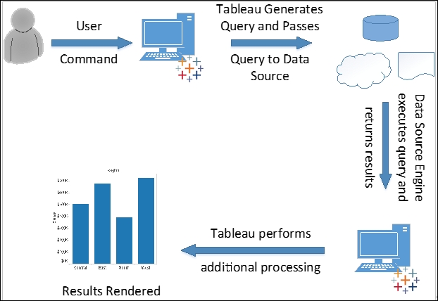
Let's follow the flow of the preceding figure to understand where the three levels of calculations take place. We will do so via an example considering the fields Profit and Sales. Assuming SQL, consider the following calculation types, calculated fields, and queries. Note that the SQL is simplified for the sake of the example:
|
Calculation type |
Calculated field in Tableau |
Query passed to Data Source |
|
Row level |
|
|
|
Aggregate level |
|
|
|
Table level |
|
|
For the row-level calculation, the computation is actually completed by the data-source engine. Tableau merely displays the results. For the aggregate level calculation, Tableau does a little bit more than display the results; it also divides the two numbers that are returned by the data-source engine. For the table-level calculation, Tableau may perform additional computations on the returned results. Let's explore further via an exercise using the similar calculated fields.
In the workbook associated with this chapter, navigate to the worksheet entitled
Row_Agg_Tbl.Navigate to Analysis | Create Calculated Field to create the following calculated fields. Note that each must be created separately; it is not possible in this context to create a single calculated field containing all three calculations:
Name
Calculation
Lev - Row
[Number of Records]/[Quantity]Lev - Agg
SUM([Number of Records])/SUM(Quantity)Lev - Tab
WINDOW_AVG([Lev - Agg])In the Data pane, right-click on the three calculated fields you just created and navigate to Default Properties | Number format.
In the resulting dialog box, select Percentage and click OK.
Place Order Date on the Columns shelf.
Place Measure Names on the Rows shelf and Measure Values on the Text shelf.
Exclude all values except for Lev - Row, Lev - Agg, and Lev - Tab:

Lev - Agg is an aggregate-level calculation. The aggregated results of [Number of Records] and [Quantity] are returned by the data-source engine. Tableau divides those results and displays values for each year.
Lev - Row is a row-level calculation. The computation is completed by the data-source engine. [Number of Records] is divided by [Quantity] for each row of the underlying data. The results are then summed across all rows. Of course, in this case, the row-level calculation does not provide useful results; however, since a new Tableau author may mistakenly create a row-level calculation when an aggregate-level calculation is what is really needed, the example is included here.
Lev - Tab is a table-level calculation. Some of the computation is completed by the data-source engine; that is, the aggregation. Tableau completes additional computation on the results returned from the data-source engine. Specifically, the results of Lev - Agg are summed and then divided by the number of members in the dimension. For the preceding example, this is (26.29% + 26.34% + 26.30% + 26.55%)/4. Once again, the results in this case are not particularly helpful, but they do demonstrate knowledge the budding Tableau author should possess.
Continuous and discrete are not concepts that are unique to Tableau. Indeed, both can be observed in many arenas. Consider the following example:
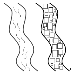
This is an image of two rivers - River-Left and River-Right. Water is flowing in River-Left. River-Right is composed of ice cubes. Could you theoretically sort the ice cubes in River-Right? Yes! Is there any way to sort the water in River-Left? In other words, could you take buckets of water from the bottom of the river, cart those buckets upstream and pour the water back into River-Left and thereby say, I have sorted the water in the river? No. The H2O in River-Left is in continuous form; that is, water. The H2O in River-Right is in discrete form; that is, ice.
Having considered an example of continuous and discrete in natural phenomena, let's turn our attention back to Tableau. Continuous and discrete in Tableau can be more clearly understood via the following seven considerations:
Continuous is green. Discrete is blue. Select any field in the Data pane or place any field on a shelf and you will note that it is either green or blue. Also, the icons associated with fields are either green or blue.
Continuous is always numeric. Discrete may be a string.
Continuous and discrete are not synonymous with dimension and measure. It is common for new Tableau authors to confuse continuous with measure and discrete with dimension. They are not synonymous. A measure may be either discrete or continuous. Also, a dimension, if it is a number, may be discrete or continuous. To prove the point, right-click on any numeric or date field in Tableau and note that you can convert it:

Discrete is sortable. Continuous is not sortable. Sortable/not sortable behavior is most easily observed with dates, as shown in the following screenshot:

Continuous colors are gradients. Discrete colors are distinct. The following example shows Profit as continuous and then as discrete. Note the difference in how colors are rendered. The left portion of the following screenshot demonstrates that continuous results in gradients and the right portion demonstrates that discrete results in distinct colors:

Continuous pills can be placed to the right of discrete pills, but not to the left. In the following screenshot, note that the Tableau author can place Region to the right of Year when Year is discrete. Further note that the Tableau author is unable to place Region to the right of Year when Year is continuous:

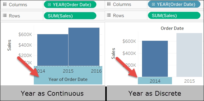
Continuous creates axes. Discrete creates headers. Note that in the left portion of the following screenshot, Year(Order Date) is continuous and the Year of Order Date axis is selected. Since Year of Order Date is an axis, the entire x-plane is selected. In the right portion of the screenshot, Year(Order Date) is discrete and 2014 is selected. Since 2014 is a header, only it is selected and not the entire x-plane:
In this chapter, we looked at the basics of Tableau. We began our survey by considering the Tableau universe, as well as the Tableau interface and some basic terminology. This is important, since definitions given here will be used throughout the book and are prevalent in any discussion concerning Tableau.
Next we considered the basics of creating worksheets and dashboards. We focused on default behavior and how to override that behavior, and we also considered best practices, particularly with regard to the prudent use of Show Me.
Next we reviewed Measure Names and Measure Values. Note that this is often an area where new Tableau authors stumble. If you struggle with proper utilization of Measure Names and Values, consider repeating the exercises and constructing some of your own to ensure clear comprehension.
Finally, we considered three essential Tableau concepts: dimensions and measures; row, aggregate, and table levels; and continuous and discrete. Of particular importance is the understanding that row- and aggregate-level calculations are computed by the data-source engine, while table-level calculations are handled by Tableau. Also, a clear understanding of the seven considerations regarding continuous and discrete should prove helpful.
We will continue our exploration of Tableau with a series of chapters that are all about the data. In these chapters, we will consider how to prepare your data for Tableau; joins, blends, and data structures; and data densification, cubes, and big data.