What is the difference between graphic design and data visualization? What distinguishes our actions when we design a website from when we design an executive dashboard? What separates somebody who creates a meaningful icon from another who creates an insightful bar chart?
While both graphic design and data visualization aim to create effective visual communication, data visualization is principally concerned with data analysis. Even though we, who design dashboards and charts, are motivated to create something aesthetically pleasing, we are more passionate about what the data can tell us about our world. This desire to explore our universe via data, and then, communicate our discoveries is the reason that we dedicate our time to learning how best to visualize it.
In this is book, our mission is to create a data-driven business. We start our journey by defining a series of strategies to create and share knowledge using data visualization. In parallel, we propose how we can effectively organize ourselves, our projects, and the applications we develop so that our whole business starts to use insightful visual analysis as quickly as possible. Also, as we survey the entire perspective of our data visualization strategy, we review how we are going to implement it using, arguably, the best data exploration and discovery tool—QlikView.
Let's take a look at the following topics in this chapter:
Data exploration, visualization, and discovery
Data teams and roles
Agile development
QlikView Deployment Framework
Data visualization is not something that is done at the end of a long, costly Business Intelligence (BI) project. It is not the cute dashboard that we create to justify the investment in a new data warehouse and several Online Analytical Processing (OLAP) cubes. Data visualization is an integral part of a data exploration process that begins on the first day that we start extracting raw data.
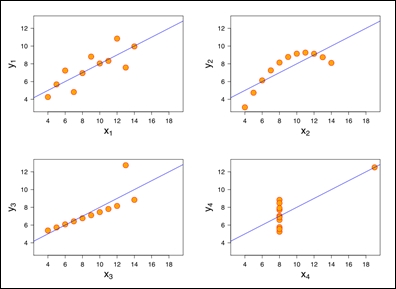
The importance and effectiveness of using data visualization when we are exploring data is highlighted using Anscombe's quartet. Each of the following scatterplots analyzes the correlation between two variables. Correlation can also be explained numerically by means of R-squared. If we were to summarize the correlations of each of the following scatterplots using R-squared, we would discover that the number is be the same for each scatterplot, .816. It is only by visualizing the data in a two-dimensional space do we notice how different each correlation behaves:
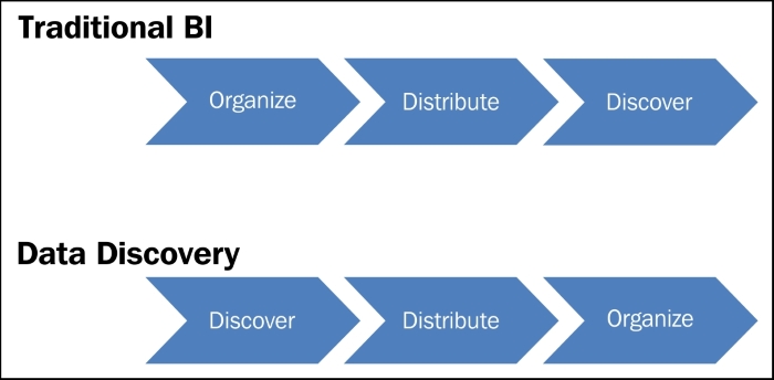
Some tools make it cumbersome to visualize data as soon as it is extracted. Most traditional BI solutions have separate tools for each phase of their implementation process. They have one tool that extracts data, another that creates the OLAP cubes, and yet another that constructs visualizations.
QlikView is a tool that allows us to extract, transform, model, and visualize data within the same tool. Since we can visualize data from the moment it is extracted and throughout the rest of the extraction, transformation, and load (ETL) process, we are more likely to discover data anomalies at an earlier stage in the development process. We can also share our discoveries more quickly with business users, and they in turn can give us important feedback before we invest too much time developing analytical applications that don't provide them with real value. Although QlikView is considered a BI software, it stands out amongst its peers due to its extraordinary ability to explore, visualize, and discover data.
In contrast, the implementation of a traditional BI tool first focuses on organizing data into data warehouses and cubes that are based on business requirements created at the beginning of the project. Once we organize the data and distribute the first reports defined by the business requirements, we start, for the first time, to explore the data using data visualization. However, the first time business users see their new reports, the most important discovery that they make is that we've spent a great amount of time and resources developing something that doesn't fulfill their real requirements.
We can blame the business user or the business requirements process for this failure, but nobody can exactly know what they need if they have nothing tangible to start from. In a data discovery tool like QlikView, we can easily create prototypes, or what we later explain as Minimally Viable Products (MVPs), to allow business users to visualize the data within a matter of days. They use the MVP to better describe their needs, discover data inadequacies, and among other things, confirm the business value of the analysis with their executive sponsors. Only after making and sharing these first discoveries do we invest more of our resources into organizing an iteratively more mature data analysis and visualization.
Note
Data Visualization Strategy 1: Use data visualization as an integral part of data exploration and discovery from the very beginning, and all throughout our project.
We've established a general data visualization strategy to support our data exploration and discovery. Now, let's review the strategies that we assign to the teams who are tasked with not only exploring the data directly, but also making sure everyone else in the business can perform their own data exploration.
Tip
I often come across customers who have data quality issues. They often battle with whether to hold off investing in QlikView until they've cleaned the data or invest in QlikView regardless of the poor data quality. Those who implement QlikView over poor-quality data data quality and make the problem transparent tend to clean their data more quickly and more effectively.
The exact composition of the teams whose principal job is to enable their coworkers to make data-driven decisions will vary as a business's entire data strategy matures. However, many misinterpret what it means to run a mature data-driven business. They believe that at some point all data will and should be governed, and that the team that develops the first QlikView data exploration and discovery projects with will be that governing body.
While a mature data-driven business does count with a large set of governed data and a talented data governance team, it should never be without new, unknown datasets, or without ideas about how to exploit existing datasets in new ways. It is also unrealistic that the same team enforce conformity at the same time that they must strive to innovate. It is for that reason that every mature data-driven business should have both a data research and development (R&D) team, and a data governance team. Each team will have a different data visualization strategy.
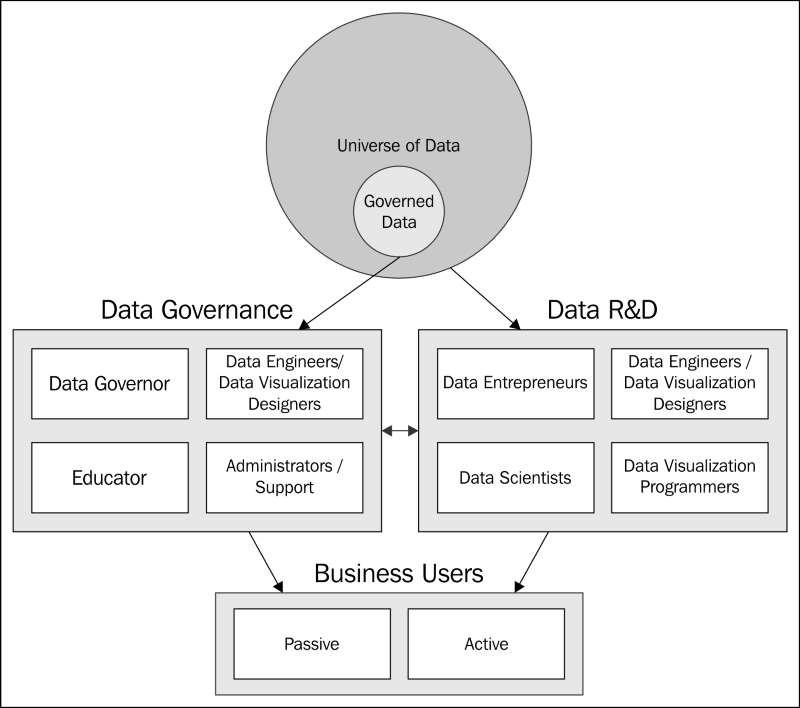
The data R&D team is constantly investigating and creating new solutions to our business problems. When we implement our first data exploration and discovery projects using QlikView, it is common to find out that we are part of a cross-functional, investigative, and proactive team. This team can be the keystone of a more formal data R&D team.
At a minimum, the team should consist of data engineers, data visualization designers, and data entrepreneurs. Data scientists and data visualization programmers may be optional in the beginning, but they become important elements to add as we continue to revolutionize how our business uses data.
It is worth repeating that even though this team will start the data exploration and discovery process, it will not evolve into the data governance team. Instead, this team will continue to look for ever more innovative ways to create business value from data. Once the team develops a stable solution with a long life expectancy, they will migrate that solution and transfer their knowledge to the data governance team.
Our data R&D teams will range in size and capacity, but in general, we aim to cover the following roles within a team that uses QlikView as its primary data exploration tool.
Note
The list of roles is not all-inclusive, and our business may have particular necessities or other tools for which we need to add other roles.
Data entrepreneurs: We look to fill this role with a business analyst who has knowledge of the company, the available datasets, and the business user requirements. We also look for our data entrepreneur to be an early adopter and a cornucopia of ideas to solve the most important problems. They work with all the other team members to develop solutions as the product owner.
Data engineers/data visualization designers: Although this role can be split between two people, QlikView has revolutionized this role. We can now realistically expect that the same person who extracts, transforms, and models data, can also formulate metrics and design insightful data visualization with the data entrepreneur's guidance.
Data visualization programmers: Although this profile is likely not necessary in the beginning, we will eventually need somebody proficient in web development technologies who can create custom data visualizations. For example, we would need this role to create charts that are not native to QlikView like the following cycle plot chart we use for our sales perspective in Chapter 2, Sales Perspective. This role can also be outsourced depending on its importance.

Data scientists: Data science is an ambiguous term. Like many of us who work with data, data scientists are ultimately concerned with extracting knowledge from data. However, they are more focused on using statistics, data mining, and predictive analysis to do so. If they aren't part of the team from the beginning, we should add them later to ensure that the data R&D team continues to innovate.
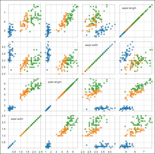
As far as data visualization is concerned, every member of the data R&D team uses it to make sense of the data and communicate their discoveries with their peers. As such, they should be given space to experiment with advanced data visualization techniques, even when those techniques may appear obscure, or even esoteric. For example, the following scatterplot matrix may not be suitable for most business users, but may help a data scientist create a predictive model:
Note
Data Visualization Strategy 2: Encourage the data R&D team to experiment with new data visualization techniques.
When the data R&D team creates a stable, long-term analytical solution that is going to be used by business users to make their own discoveries, then they should migrate that solution to the data governance team. At this point, both teams should work together to make the data visualization as clear and simple as possible for the business user. While we may be able to train them to use some new data visualization techniques, we will also have to translate other advanced data visualizations into the more commonly used sort.
Data governance is a fundamental part of enabling our entire business to be data driven. The data that is used across the whole company to support common business activities, such as employee performance reviews, financial investments, and new product launches, should be held to a set of standards that ensures its trustworthiness. Among the standards that the data governance team defines and enforces are business rules, data accuracy, data security, and data definitions. The data governance team's job is no less challenging than that of the data R&D team, not the least being because they are the face of the data for most of the business users.
Data governance has a responsibility to make sure data is visualized in a way that is accessible to all business users. Data visualizations should use proper colors, adequate labeling, and approved metrics. The data governance team is also responsible for helping the business users understand data visualization standards, and support those who are going to actively use data to create their own analyses.
Just like our data R&D team, the exact size and makeup of the data governance team will vary. The following list contains the roles that we wish to fill in a team that uses QlikView as its primary data exploration tool:
Data governor: We look for somebody with a similar background as the data entrepreneur in the data R&D team to fill this role. However, the data governor's responsibility is to ensure data quality, uniform business rules, security, and accessible data visualization. They can also be referred to as data stewards. Similar to data entrepreneurs, they help the other team members prioritize pending tasks.
Data engineer/data visualization designer: We create this role to receive solutions from the R&D team and bring them up to the data governance's standards. In addition, they develop QlikView applications for internal control. Even though they don't belong to the R&D team, we expect them to develop innovative ways to visualize the data so that they can enforce the company's data standards more effectively. For example, the following process control chart is an example of the visual analysis that would help them detect data anomalies:

Administrator/Support: This role helps us reduce the distractions our data engineers and data visualization designers face when dealing with daily administration and support issues. Since common QlikView support issues include users unable to access their applications and automatic reload failures, we can often assign the same person to both administrator and support.
Educator: This role performs the never-ending and pivotal job of making business users feel comfortable using the analytical solutions that we develop. Along with teaching business users to use QlikView, they also review the application's content. It is important to note that understanding data visualization is not innate. Therefore, our educators have the responsibility to teach business users how to interpret both simple and advanced data visualizations.
The data governance team may experiment with some data visualization techniques to best analyze , for example, data accuracy or QlikView Server log data. However, for the most part, the data governance team is responsible for establishing and enforcing data visualization standards that create trustworthiness, increase accessibility, facilitate maintenance, reduce training time, and promote clear enterprise communication.
Note
Data Visualization Strategy 3: Enable the data governance team to establish and enforce data visualization standards.
Each team has a separate set of tasks and priorities. However, all data teams should take advantage of agile project management. The data governance team should be especially careful not to confuse data governance with the creation of bureaucratic project management methods. Otherwise, any competitive advantage gained by using QlikView for fast, flexible data exploration and discovery will be wasted.
QlikView is software that is best implemented using agile project management methods. This is especially true when we work closely with the business user to deliver data visualization and analysis that provide real value.
The exact agile project management method that we use is not important. The most popular methods are Scrum, Lean, and Extreme Programming (XP). We can find plenty of books and other material that help us decide which method best fits our situation. However, we do take time in this book to review the overall principles that define agile project management:
"Manifesto for Agile Software Development
We are uncovering better ways of developing software by doing it and helping others do it. Through this work we have come to value:
Individuals and interactions over processes and tools
Working software over comprehensive documentation
Customer collaboration over contract negotiation
Responding to change over following a plan
That is, while there is value in the items on the right, we value the items on the left more.
Kent Beck, Mike Beedle, Arie van Bennekum, Alistair Cockburn, Ward Cunningham, Martin Fowler, James Grenning, Jim Highsmith, Andrew Hunt, Ron Jeffries, Jon Kern, Brian Marick, Robert C. Martin, Steve Mellor, Ken Schwaber, Jeff Sutherland, Dave Thomas
© 2001, the above authors, this declaration may be freely copied in any form, but only in its entirety through this notice."
We take the liberty to mix a few key words from the different agile methods throughout the rest of the book. The following is a list of the most important terms that we will use, and the context in which we will use them. We also reference the specific method that uses the term.
In each chapter we will describe a series of business user requirements using user stories. A user story is common to all agile methods, and describes the business user requirements from the user's perspective in their own words. The following is an example user story from the sales department:
"As a salesperson, I would like know who my most important customers are so that I can focus my attention on them."
An epic is a collection of multiple user stories with a common theme.
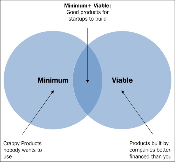
User stories have a way of helping us look through the eyes of the business users as we develop the best ways to visualize data. This user empathy is important when we create a Minimum Viable Product.
Henry Ford famously said, "If I had asked people what they wanted they would have said faster horses." If we always ask the business users what they want, they are likely to say prettier Excel tables. We often have to depend on our data entrepreneur, or ourselves as data visualization designers, to develop new ways of analyzing data in QlikView. Then, we have to sell the idea to the business user. In these cases, we are new product developers more than we are software developers.
In his book Lean Startup, Eric Ries explains how startups use agile methods for new product development. He recommends building a Minimum Viable Product (MVP), measuring how a customer uses the MVP, and then learning how to improve it.
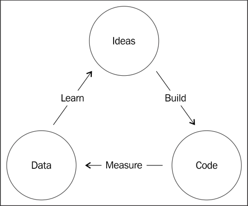
A QlikView prototype might, for example, only show that it is possible to create a bar chart. A QlikView MVP is a working application that may have only a bar chart, but it displays pertinent information to the user. We can then learn from the user's interaction with the MVP and listen to his or her feedback. We go through the following iterative process each time we decide whether or not to build additional functionality into the MVP. We usually continue this loop pictured here until the value we can add to the MVP is less than the cost to develop it:
Note
Even if we have already developed a QlikView application for a department, we should continue to use the MVPs to introduce new functionality.
Whether we realize it or not, we may already follow a process similar to the one in the previous diagram when we develop data visualization and analysis in QlikView. As we begin to master QlikView, we should continue to follow the same iteration, or use a more well-established agile method like Scrum. However, we should avoid using waterfall project management methodologies that don't take advantage of QlikView's flexibility.
In each chapter, we will teach you to create several different visualizations that you can use to create a QlikView MVP using your own business data. Then, you can listen to your business users' feedback and learn how to incrementally improve it based on your business's unique necessities. In this way, we will help you avoid the trap of replicating Excel, or whatever other tool you had previously used, in QlikView.
Note
Data Visualization Strategy 4: Collaborate closely with the business user using agile project management methods.
Data Visualization Strategy 5: Propose our own solutions to business problems using new technologies like QlikView, and avoid only reproducing legacy reporting methods.
Along with collaborating closely with the business users and their needs, we also have to be concerned with the overall technical architecture of our solution. Our first technical architecture requirement is to establish a common framework that will make developing QlikView throughout our whole business easier.
The QlikView Deployment Framework (QDF) allows us to easily reuse resources and separate tasks between different teams and people. A common folder structure, data, color schemes, and expressions are among the resources that we can share between the data governance team, the R&D team, and active business users.
The QDF is built using a resource container architecture. In the same way that a shipping container on board a ship or stacked in a port can easily be moved from one place to another, QDF containers are independent capsules that can easily be moved and stored in different computers and servers.
When we install QDF, we assign it to a folder where we are going to store these containers. How we define a container depends on how we want to organize the QlikView applications in our business. A container may be a project, it may be a department, or it may define a phase in the Extraction, Transform, and Load (ETL) process.
The QDF has two special containers: 0.Administration and 99.Shared_Folders. The 0.Administration container keeps track of the containers that are in the QDF folder. It also contains templates that we can use to create our own containers and a few QlikView applications that monitor QlikView usage and governance. The 99.Shared_Folders container stores all the resources that we want all containers to share.
Tip
We can find out more information about the latest version of the QDF in the QDF group in the Qlik Community (http://community.qlik.com/groups/qlikview-deployment-framework). Magnus Berg and Michael Tarallo have created an excellent repository of written documentation and step-by-step videos to help us implement the QDF in our business.
We will need to install QDF on our computers before we can perform the advanced analysis exercises in Chapter 2, Sales Perspective.
In order to install the QlikView Deployment Framework, we carry out the following steps:
Go to the QlikView Deployment Framework group in Qlik Community (http://community.qlik.com/groups/qlikview-deployment-framework).
Follow the instructions on the group's home page to install the latest version of QDF and learn more about how to use QDF.
Our mission is to create a data-driven business, and data visualization plays a key role in accomplishing can perform the advanced analysis exercises. The data visualization strategies that we defined in this chapter are the following:
Data Visualization Strategy 1: Use data visualization as an integral part of data exploration and discovery from the very beginning and all throughout our project.
Data Visualization Strategy 2: Encourage the data R&D team to experiment with new data visualization techniques.
Data Visualization Strategy 3: Enable the data governance team to establish and enforce data visualization standards.
Data Visualization Strategy 4: Collaborate closely with the business user using agile project management methods.
Data Visualization Strategy 5: Propose our own solutions to business problems using new technologies like QlikView and avoid only reproducing legacy reporting methods.
Now, let's begin to apply these strategies and create advanced data analysis in our sales department's QlikView application.