


 Download code from GitHub
Getting Started with SAP Analytics Cloud
SAP Analytics Cloud is a new generation cloud-based application that helps you explore your data, perform visualization and analysis, create financial plans, and produce predictive forecasting. It is a one-stop-shop solution to cope with your analytic needs and comprises business intelligence, planning, predictive analytics, and governance and risk. The application is built on the SAP Cloud Platform and delivers great performance and scalability. In addition to the on-premise SAP HANA, SAP BW, and S/4HANA sources, you can work with data from a wide range of non-SAP sources, including Google Drive, Salesforce, SQL Server, Concur, and CSV, to name a few. SAP Analytics Cloud allows you to make secure connections to these cloud and on-premise data sources.
This chapter is aimed at providing an overview of SAP Analytics Cloud and covers the following basics of the application:
- Anatomy of SAP Analytics Cloud
- Introduction to the Home screen and the main menu of the application
- A brief overview of data sources and models and ways to connect to different data sources
- A brief overview of visualization, collaboration, presentation, and application administration
- Finally, you will be guided to signing up for a free trial version to execute the exercises provided in this book
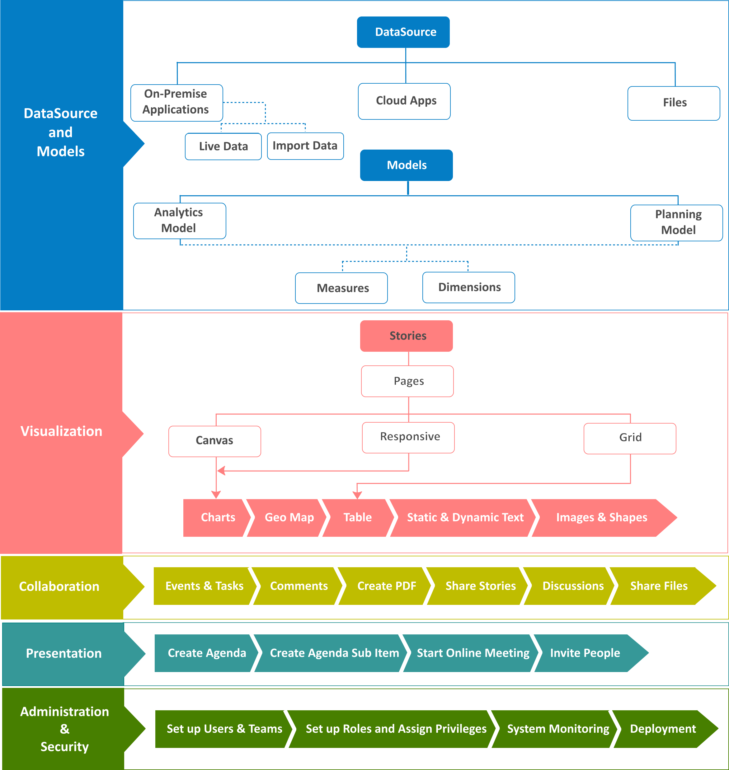
Anatomy of SAP Analytics Cloud
Models are the basis for all of your analysis in SAP Analytics Cloud. You can create planning and analytics models based on the cloud or on-premise data sources. Besides creating a simple analytics model, business analysts and finance professionals can quickly and easily build connected planning models to analyze data and then collaborate with each other to attain better business performance. After creating these models, you can share it with other users in your organization. Before sharing, you can set up model access privileges for users according to their level of authorization and can also enable data auditing. With the help of SAP Analytics Cloud's analytical capabilities, users can discover hidden traits in the data and can predict likely outcomes. It equips them with the ability to uncover potential risks and hidden opportunities.
Once you have created a model and set up appropriate security for it, you can create stories in which the underlying model data can be explored and visualized with the help of different types of charts, geo maps, and tables. There is a wide range of charts you can add to your story pages to address different scenarios. The intelligent charting feature of SAP Analytics Cloud proposes the ideal chart type based on data relationships. On your story pages, you can link dimensions to present data from multiple sources. Adding reference lines and thresholds, applying filters, and drilling down into data can be done on the fly. The ability to interactively drag and drop page objects is the most useful feature of this application.
The collaboration, alert, and notification features of SAP Analytics Cloud keep business users in touch with each other while executing their tasks.
In the past, board meetings were held in which the participants used to deliver their reports through their laptops and a bunch of papers. With different versions of reality, it was very difficult for decision makers to arrive at a good decision. With the advent of the SAP digital boardroom, board meetings have been revolutionized. It is a next-generation presentation platform, which helps you visualize your data and plan ahead in a real-time environment. It runs on multiple screens simultaneously, displaying information from different sources. Due to this capability, more people can work together using a single dataset that consequently creates one version of reality to make the best decision.
With the help of the administration and security features of the application, you can create users and set up teams, create new roles with different system access privileges and assign them to users, monitor the application usage, and use export and import utilities to deploy application content.
The following figure depicts the anatomy of SAP Analytics Cloud:
The Home screen
When you successfully log in to SAP Analytics Cloud, you are greeted with the Home screen. Note that the Home screen is private to every SAP Analytics Cloud user, so it can't be shared. Here are a few pointers to help you get acclimatized to the Home screen:

- To remove the Get Started widget, the Recent Stories tile, or the Welcome message, go to the Home menu, and deselect the item you want to remove.
- The Home screen also allows you to add useful reminders for upcoming events and personal notes.
- Using the Edit Background option, you can customize the display background and add a logo to the Home screen.
- The first tile titled Recent Stories lists the five most recent stories you have accessed.
- Your recent stories and visualizations are displayed as tiles. You can pin additional tiles from your stories to the Home screen.
- Click the ellipsis icon to modify or delete a note.
- The toolbar appears on top of every screen. Using the icons on the toolbar, users can see their own profiles, view notifications, get online help, view the time panel, and collaborate.
The main menu
The following screenshot and bullets will help you understand the main menu better:

- The main menu icon is your gateway to SAP Analytics Cloud. It provides you with all the options to get things done.
- Click on Create to add new Stories, Models, Process, Dimension, Currency, and Point of Interest. Models are discussed in Chapter 2, Models in SAP Analytics Cloud, and Chapter 3, Planning Model, whereas you will create stories in Chapters 4 to 7. The Allocation option under the Process sub-menu is discussed in Chapter 3, Planning Model.
- Select Browse to access existing Stories, Models, Dimensions, Currencies, Point of Interest, and Files. Files are discussed in Chapter 8, Collaboration.
- The Events option opens the Events page, where you can manage your planning and analytic activities and assign tasks to other users. This subject is discussed in Chapter 8, Collaboration.
- The options provided in the Security menu items lets you create and manage application users, teams, roles, requests, and monitor data changes and user activities. These options are discussed in Chapter 10, System Administration.
- Deployment includes creation and management of export and import of application content. This subject is discussed in Chapter 10, System Administration.
- Using the Connections menu item, you can create and maintain connections to remote systems. You can create connections to import data into SAP Analytics Cloud or create live data connections to SAP HANA. You will see some instances of establishing connections later in this chapter.
- The System menu item includes the Monitor, Administration, and Enabling SAML Single Sign-On (SSO) options. Using these options, the system administrator monitors the system, reads system events and errors in the system log, and sets up SAML Single Sign-On (SSO) to work with SAP Analytics Cloud.
Data sources and models
Before commencing your analytical tasks in SAP Analytics Cloud, you need to create models. A model is the foundation of every analysis you create to evaluate the performance of your organization. It is a high-level design that exposes the analytic requirements of end users. Planning and analytics are the two types of models you can create in SAP Analytics Cloud.
Analytics models are simpler and more flexible, while planning models are full-featured models in which you work with planning features. Preconfigured with dimensions for time and categories, planning models support multicurrency and security features at both model and dimension levels. Chapters 2 and 3 of this book are dedicated to these two models.
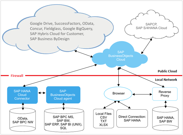
To determine what content to include in your model, you must first identify the columns from the source data on which users need to query. The columns you need in your model reside in some sort of data source. SAP Analytics Cloud supports three types of data sources: files (such as CSV or Excel files) that usually reside on your computer, live data connections from a connected remote system, and cloud apps.
In addition to the files on your computer, you can use on-premise data sources, such as SAP Business Warehouse, SAP ERP, SAP Universe, SQL database, and more, to acquire data for your models. In the cloud, you can get data from apps such as Concur, Google Drive, SAP Business ByDesign, SAP Hybris Cloud, OData Services, and Success Factors. The following figure depicts these data sources. The cloud app data sources you can use with SAP Analytics Cloud are displayed above the firewall mark, while those in your local network are shown under the firewall.
As you can see in the following figure, there are over twenty data sources currently supported by SAP Analytics Cloud. The methods of connecting to these data sources also vary from each other. Due to space constraint, it is not possible to outline every connecting method in this chapter. However, some instances provided in this chapter would give you an idea on how connections are established to acquire data. The connection methods provided here relate to on-premise and cloud app data sources. Considering the audience of this book who may not have access to these data sources, and to keep things simple, Chapter 2, Models in SAP Analytics Cloud, will guide them to create an analytics model in the trial version of SAP Analytics Cloud using an Excel file provided with this book.
Create a direct live connection to SAP HANA
Execute the following steps to connect to the on-premise SAP HANA system to use live data in SAP Analytics Cloud. Live data means that you can get up-to-the-minute data when you open a story in SAP Analytics Cloud. In this case, any changes made to the data in the source system are reflected immediately. Usually, there are two ways to establish a connection to a data source--use the Connection option from the main menu, or specify the data source during the process of creating a model. However, live data connections must be established via the Connection menu option prior to creating the corresponding model. Here are the steps:
- From the main menu, select Connection.
- On the Connections page, click on the Add Connection icon (+), and select Live Data Connection | SAP HANA.
- In the New Live Connection dialog, enter a name for the connection (for example, HANA).
- From the Connection Type drop-down list, select Direct. The Direct option is used when you connect to a data source that resides inside your corporate network. The Path option requires a reverse proxy to the HANA XS server. The SAP Cloud Platform and Cloud options in this list are used when you are connecting to SAP cloud environments. When you select the Direct option, the System Type is set to HANA and the protocol is set to HTTPS.
- Enter the host name and port number in respective text boxes.
- The Authentication Method list contains two options: User Name and Password and SAML Single Sign On. The SAML Single Sign On option requires that the SAP HANA system is already configured to use SAML authentication. If not, choose the User Name and Password option and enter these credentials in relevant boxes.
- Click on OK to finish the process. A new connection will appear on the Connection page, which can now be used as a data source for models. The creation of the model is discussed in the next chapter. However, in order to complete this exercise, we will go through a short demo of this process here.
- From the main menu, go to Create | Model.
- On the New Model page, select Use a datasource.
- From the list that appears on your right side, select Live Data connection.
- In the dialog that is displayed, select the HANA connection you created in the previous steps from the System list.
- From the Data Source list, select the HANA view you want to work with. The list of views may be very long, and a search feature is available to help you locate the source you are looking for.
- Finally, enter the name and the optional description for the new model, and click on OK. The model will be created, and its definitions will appear on another page. Refer to the next two chapters for further details on models.
Connecting remote systems to import data
In addition to creating live connections, you can also create connections that allow you to import data into SAP Analytics Cloud. In these types of connections that you make to access remote systems, data is imported (copied) to SAP Analytics Cloud. Any changes users make in the source data do not affect the imported data.
To establish connections with these remote systems, you need to install some additional components. For example, you must install SAP HANA Cloud connector to access SAP Business Planning and Consolidation (BPC) for Netweaver. Similarly, SAP Analytics Cloud agent should be installed for SAP Business Warehouse (BW), SQL Server, SAP ERP, and others. Take a look at the connection figure illustrated on a previous page.
The following set of steps provide instructions to connect to SAP ERP. You can either connect to this system from the Connection menu or establish the connection while creating a model. In these steps, we will adopt the latter approach.
- From the main menu, go to Create | Model.
- Click on the Use a datasource option on the choose how you'd like to start your model page.
- From the list of available datasources to your right, select SAP ERP.
- From the Connection Name list, select Create New Connection.
- Enter a name for the connection (for example, ERP) in the Connection Name box. You can also provide a description to further elaborate the new connection.
- For Server Type, select Application Server and enter values for System, System Number, Client ID, System ID, Language, User Name, and Password. Click the Create button after providing this information.
- Next, you need to create a query based on the SAP ERP system data. Enter a name for the query, for example, sales.
- In the same dialog, expand the ERP object where the data exists. Locate and select the object, and then choose the data columns you want to include in your model. You are provided with a preview of the data before importing. On the preview window, click on Done to start the import process. The imported data will appear on the Data Integration page, which is the initial screen in the model creation segment and is discussed in subsequent chapters.
Connect Google Drive to import data
You went through two scenarios in which you saw how data can be fetched. In the first scenario, you created a live connection to create a model on live data, while in the second one, you learned how to import data from remote systems. In this section, you will be guided to create a model using a cloud app called Google Drive. Google Drive is a file storage and synchronization service developed by Google. It allows users to store files in the cloud, synchronize files across devices, and share files. Here are the steps to use the data stored on Google Drive:
- From the main menu, go to Create | Model.
- On the choose how you'd like to start your model page, select Get data from an app.
- From the available apps to your right, select Google Drive.
- In the Import Model From Google Drive dialog, click on the Select Data button.
- If you are not already logged into Google Drive, you will be prompted to log in.
- Another dialog appears displaying a list of compatible files. Choose a file, and click on the Select button.
- You are brought back to the Import Model From Google Drive dialog, where you have to enter a model name and an optional description.
- After providing this information, click on the Import button. The import process will start, and after a while, you will see the Data Integration screen populated with the data from the selected Google Drive file.
Refreshing imported data
SAP Analytics Cloud allows you to refresh your imported data. With this option, you can reimport the data on demand to get the latest values. You can perform this refresh operation either manually or create an import schedule to refresh the data at a specific date and time or on a recurring basis. The following data sources support scheduling:
- SAP Business Planning and Consolidation (BPC)
- SAP Business Warehouse (BW)
- Concur
- OData services
- An SAP Analytics BI platform universe (UNX) query
- SAP ERP Central Component (SAP ECC)
- SuccessFactors HCM suite
- Excel and comma-separated values (CSV) files imported from a file server (not imported from your local machine)
- SQL databases
You can adopt the following method to access the schedule settings for a model:
- Select Connection from the main menu. The Connection page appears. The Schedule Status tab on this page lists all updates and import jobs associated with any data source.
- Alternatively, go to main menu | Browse | Models. The Models page appears. The updatable model on the list will have a number of data sources shown in the Datasources column. In the Datasources column, click on the View More link. The update and import jobs associated with this data source will appear. The Update Model and Import Data job are the two types of jobs that are run either immediately or on a schedule.
- To run an Import Data job immediately, choose Import Data in the Action column. If you want to run an Update Model job, select a job to open it.
The following refreshing methods specify how you want existing data to be handled.
The Import Data jobs are listed here:
- Update: Selecting this option updates the existing data and adds new entries to the target model.
-
Clean and Replace: Any existing data is wiped out and new entries are added to the target model.
-
Append: Nothing is done with the existing data. Only new entries are added to the target model.
The Update Model jobs are listed here:
-
Clean and Replace: This deletes the existing data and adds new entries to the target model.
-
Append: This keeps the existing data as is and adds new entries to the target model.
The Schedule Settings option allows you to select one of the following schedule options:
-
None: The import is performed immediately
-
Once: The import is performed only once at a scheduled time
-
Repeating: The import is executed according to a repeating pattern; you can select a start and end date and time as well as a recurrence pattern
- After setting your preferences, click on the Save icon to save your scheduling settings.
If you chose the None option for scheduling, select Update Model or Import Data to run the update or import job now.
Once a scheduled job completes, its result appears on the Schedule Status tab displaying any errors or warnings. If you see such daunting messages, select the job to see the details. Expand an entry in the Refresh Manager panel to get more information about the scary stuff. If the import process rejected any rows in the dataset, you are provided with an option to download the rejected rows as a CSV file for offline examination. Fix the data in the source system, or fix the error in the downloaded CSV file and upload data from it.
After creating your models, you access them via the main menu | Browse | Models path. The Models page, as illustrated in the following figure, is the main interface where you manage your models.
- All existing models are listed under the Models tab. You can open a model by clicking on its name.
- Public dimensions are saved separately from models and appear on the Public Dimensions tab. When you create a new model or modify an existing model, you can add these public dimensions.
- If you are using multiple currencies in your data, the exchange rates are maintained in separate tables. These are saved independently of any model and are listed on the Currency Conversion tab.
- Data for geographic locations, which are displayed and used in your data analysis, is maintained on the Points of Interest tab.
The toolbar provided under the four tabs carries icons to perform common operations for managing models.
- Click on the New Model icon to create a new model.
- Select a model by placing a check mark (A) in front of it. Then click on the Copy Selected Model icon to make an exact copy of the selected model.
- Use the delete icon to remove the selected models.
- The Clear Selected Model option removes all the data from the selected model.
- The list of data import options that are supported is available from a menu beneath the Import Data icon on the toolbar.
- You can export a model to a .csv file once or on a recurring schedule using Export Model As File.

Visualization
Following are the important aspects of Visualization that are important for our discussion:
- Stories: After creating a model, you create stories to explore your model data. A story consists of one or more pages to present model data using objects such as charts, geomaps, tables, text, shapes, and images. To create a new story, you go to Create | Story from the main menu. You are asked to select one option from the provided four options that determine how you want to start your story. Usually, you start by adding a canvas page, where you put objects manually. For further details, see Chapter 4, Creating Stories Using Charts.
- Charts: SAP Analytics Cloud comes with a variety of charts, so choose the best chart type to present your analysis. You can add multiple types of charts to a single story page. You will learn how to add charts to your story pages in Chapter 4 to 6.
- Geomap: The models that include latitude and longitude information can be used in stories to visualize data in geomaps. By adding multiple layers of different types of data in geomaps, we can show different geographic features and points of interest enabling us to perform sophisticated geographic analysis. You will create geomaps in Chapter 6, Analyzing Data Using Geo Maps and Other Objects.
- Table: A table is a spreadsheet-like object that can be used to view and analyze text data. You can add this object to either canvas or grid pages in stories. Tables and grids are discussed in Chapter 7, Working with Tables and Grids.
- Static and dynamic text: You can add static and dynamic text to your story pages. Static text is normally used to display page titles, while dynamic text automatically updates page headings based on the values from the source input control or filter. You will add these two types of texts to your story page in Chapter 5, Extending Stories with KPI, Filters and other Handy Objects.
- Images and shapes: You can add images (such as your company logo) to your story page by uploading them from your computer. In addition to images, you can also add shapes, such as line, square, or circle, to your page. These topics are covered in Chapter 5, Extending Stories with KPI, Filters and other Handy Objects.
When you create a story, a new story with a default name appears on your screen, as illustrated in the following split screenshots:
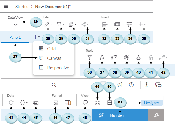
- The Data View option lets you explore your model data. When you click on this option, the canvas hides, and two new panes appear on your screen, where you can see the measures and dimensions of your selected model. For further details, see in Chapter 2, Models in SAP Analytics Cloud, and Chapter 3, Planning Model.
- You can create three types of pages in your stories: grid, canvas, and responsive. A grid is like an Excel sheet. You add a grid page and then add data by typing in numbers or pasting from another application or by adding a table based on an existing model. Grids and tables will be discussed in Chapter 7, Working with Tables and Grids. On canvas pages, you can lay out charts, tables, geomaps, images, and other objects to present your data. You will learn about the use of the canvas page in Chapter 4, Creating Stories Using Charts.
The responsive page allows you to create flexible dashboards that can be presented on any screen size. This responsive page is a new enhancement to the application in which you can arrange your content in up to six lanes. The content is presented in order starting from the leftmost lane and ending at the rightmost lane. You can add or remove lanes using the options provided in the vertical toolbar, which is displayed to the right of every lane. Once you have added objects such as charts or geomaps to the responsive page lanes, click on Device Preview (47) to see how the page will look in different screen sizes. The page that appears lets you choose different screen sizes as follows: small 300 pixel wide displays, medium 768px, laptop 1366px by 768px, HDTV 1920px by 1080px, and 4K UHD 3840px by 2160px.
- The Edit Story menu has two options: Story Details and Preferences. Clicking on the Story Details option presents a dialog where you can change the name of your story and provide a description, which is optional. The name you provide here appears on top of the screen beside the stories breadcrumb. Using the second option, you can change canvas and responsive page sizes and background colors. You can also set Preferences for your charts, geomaps, tables, and other elements in the Story Preferences dialog.
- The Save icon also comes with a number of options. The Save option is generic and is used to save your story. Using the Save As option, you save a story with a different name. The Save As File option lets you save a story as a PDF file. The Save As Template option saves your story as a template, which can be used to create a new story.
- The Copy and Paste icon carries utilities that you have already used in Windows applications. These utilities allow you to copy the selected object(s) to your clipboard, an existing story page, or to a new canvas. You can also duplicate the selected object(s) on the same canvas.
- If you want to share your story with other users, click on the Share icon, and choose whether you want to share the story with all users or only selected users.
- The Chart toolbar option adds a blank chart to the canvas. After adding a chart, use the Designer panel to format and manipulate the data in it.
- This option is similar to the chart option and is used to add a blank table to the canvas. Again, using the Designer panel, you can set properties to show data in the new table.
- Using the Input Controls, you define some values that act as variables in your calculations. By selecting values in an Input Control, a user can influence the result of a calculation without modifying the underlying data or formula. You will use input control in Chapter 4, Creating Stories Using Charts.
- The Add icon lists additional objects, such as geomap, image, shape, text, RSS reader, web page, value driver tree, and symbols that you can add to your story page.
- You can apply two types of filters: story filter and page filter. If you want to apply filters to all charts in a story, use the story filter. The page filter, as the name implies, can be applied to just one page in a story. See this topic in Chapter 5, Extending Stories with KPI, Filters and other Handy Objects.
- Just link an Excel worksheet. You can also add formulas to a table element. The Formula Bar icon is used to see the formula you entered in a table cell. When you click on this icon, a Formula Bar appears under the page tab. You will use the Formula Bar in Chapter 7, Working with Tables and Grids.
- If you use a measure in multiple charts in a story, the measure values are usually scaled differently on these charts, which makes it difficult to compare the values. Using the Chart Scaling option, you can scale these charts so that measures have the same scale across multiple charts.
- The Conditional Formatting option is used when you want to highlight some key information, such as low sales. Thresholds are used to provide visual cues for your information. By defining thresholds on your objects, you can see at a glance what areas are performing well and what areas need improvements. Conditional Formatting will be used in Chapter 4, Creating Stories Using Charts.
- You can add linked analysis to create interaction between charts within a story. When you establish a link and drill through hierarchical data or create filters, multiple charts in your story are updated simultaneously. This topic is discussed in Chapter 5, Extending Stories with KPI, Filters and other Handy Objects.
- Using this icon, you can turn a table cell on or off. For example, if you enter a formula in a table cell and do not want other users to change it, click on the cell and then click on the lock icon. The value in the cell will freeze. To allow modification, click on the lock icon again to unfreeze the value.
- The Cell Reference option creates a link between two cells to show the same value. For example, if you copy a value from a table cell and paste it to a cell in a grid that does not belong to a table, a cell reference is created. Any change you make to one cell is propagated to the other. Use the Show/Hide option to view cell references. To break the link between cells, select the reference cell in the grid, and then select Remove Reference.
- Used to refresh table data.
- When you use variables in a model and then use that model in a table, you are prompted to set values for the variables. The Edit Prompts option allows you to change a variable setting at any other time. When you click on this icon and select a model, you see the Set Variables dialog, where you can modify the values.
- In your stories, you can display data from multiple models in a single chart by linking dimensions in those models. When you click on this icon, the Link Dimensions dialog box appears, where you specify the two models you want to link. This option is used in Chapter 6, Analyzing Data Using Geo Maps and Other Objects.
- With the help of the Layouts option, you can apply formatting to your story by using a template, which provides predefined layouts and placeholders for objects to help you build a story.
- After adding objects to a responsive page lanes, click on Device Preview to see how the page will look in different screen sizes.
- You add comments to a story page to provide some vital information to other users. When you add a comment, other users can see and reply to it. The Comment View icon shows the number of comments to view. Hitting this icon shows the comment number at the top of the relevant page. Clicking on this number displays the comment. You will see Comment View in action in Chapter 6, Analyzing Data Using Geo Maps and Other Objects.
- At any time while designing your story, you can click on the Present icon to see how your story will appear when it's presented or when users with view-only privileges view your story.
- While working on charts in a story, you sometimes want to see the underlying data to evaluate the results being displayed on those charts. Selecting the chart and clicking on the Examine icon opens a table showing values that the chart is based on.
- Use the Designer panel to format and manipulate the data in your canvas elements. The Designer panel consists of two tabs: Builder and Styling. On the Builder tab, you set the data source, measures, dimensions, colors, and more properties for the selected element. On the Styling tab, you specify properties such as background and font colors to change the physical appearance of the selected element.
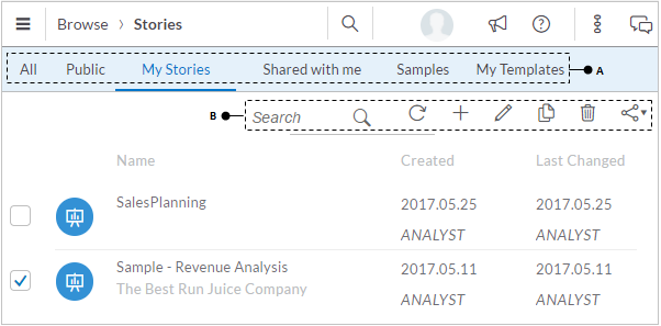
You can access all of your saved stories via main menu | Browse | Stories. When you use this route, the Stories page, as illustrated in the following figure, comes up. The six tabs (A) under the Stories breadcrumb let you see all stories, public stories that are available to everyone, stories you created, other people's stories shared with you, sample stories, and your templates. Using the options provided on the toolbar (B), you can search for stories by name, refresh the stories list, create a new story, modify the name and description of an existing story, copy, delete, or share selected stories:
Collaboration
During the process of creating models and stories, you need input from other people. For example, you might ask a colleague to update a model by providing the first quarter sales data or request Sheela to enter her comments on one of your story pages. In SAP Analytics Cloud, these kinds of discussions come under the collaboration features of the application. Using these features, users can discuss business content and share information that consequently smoothed out the decision-making process. Here is a list of available collaboration features in the application that allow group members to discuss stories and other business content. All these features are discussed in detail in Chapter 8, Collaboration.
- Creating a workflow using events and tasks: The events and tasks features in SAP Analytics Cloud are the two major sources that help you collaborate with other group members and manage your planning and analytic activities. After creating an event and assigning tasks to relevant group members, you can monitor the task progress in the Events interface. Here is the workflow to utilize these two features:
- Create events based on categories and processes within categories
- Create a task, assign it to users, and set a due date for its submission
- Monitor the task progress
- Commenting on a chart's data point: Using this feature, you can add annotations or additional information to individual data points in a chart. To see this feature in action, refer to the Pinning and Commenting on a Data Point section in Chapter 5, Extending Stories with KPI, Filters and other Handy Objects.
- Commenting on a story page: In addition to adding comments to an individual chart, you have the option of adding comments on an entire story page to provide some vital information to other users. When you add a comment, other users can see and reply to it. For further details, refer to the Adding Comments to a Page section in Chapter 6, Analyzing Data Using Geo Maps and Other Objects.
- Produce a story as a PDF: You can save your story in a PDF file to share it with other users and for offline access. You can save all story pages or a specific page as a PDF file. For more details, refer to the Save Story as a PDF section in Chapter 7, Working with Tables and Grids.
- Sharing a story with colleagues: Once you complete a story, you can share it with other members in your organization. You are provided with three options--public, teams, and private--when you save a story. When you save your story in the public folder, it can be accessed by anyone. The teams option lets you select specific teams to share your story with. In the private option, you have to manually select users with whom you want to share your story. See in Chapter 8, Collaboration for further details on sharing stories.
- Collaborate via discussions: You can collaborate with colleagues using the discussions feature of SAP Analytics Cloud. The discussions feature enables you to connect with other members in real time. Refer to the Collaborate via Discussions section in Chapter 8, Collaboration for how to start discussions.
- Sharing files and other objects: The Files option under the Browse menu allows you to access the SAP Analytics Cloud repository, where the stories you created and the files you uploaded are stored. After accessing the Files page, you can share its objects with other users. On the Files page, you can manage files and folders, upload files, share files, and change share settings. This topic is also a part of Chapter 8, Collaboration.
Presentation
The ultimate purpose of creating a story is to present it to the concerned authorities--the higher management of an organization. SAP Analytics Cloud comes with a next-generation presentation tool called Digital Boardroom, which is changing the landscape of traditional board meetings.
SAP Digital Boardroom is a visualization and presentation platform that enormously assists in the decision-making process. It transforms executive meetings by replacing static and stale presentations with interactive discussions based on live data, which allows them to make fact-based decisions to drive their business. Here are the main benefits of the SAP Digital Boardroom:
- Collaborate with others in remote locations and on other devices in an interactive meeting room
- Answer ad hoc questions on the fly
- Visualize, recognize, experiment, and decide by jumping on and off script at any point
- Find answers to the questions that matter to you by exploring directly on live data and focusing on relevant aspects by drilling into details
- Discover opportunities or reveal hidden threats
- Simulate various decisions and project the results
- Weigh and share the pros and cons of your findings
The Digital Boardroom is interactive, so you can retrieve real-time data, make changes to the schedule, and even run through what-if scenarios. It presents a live picture of your organization across three interlinked touch screens to make faster, better executive decisions.
There are two aspects of Digital Boardroom with which you can share existing stories with executives and decision-makers to reveal business performance. First, you have to design your agenda for your boardroom presentation by adding meeting information, agenda items, and linking stories as pages in a navigation structure. Once you have created a digital boardroom agenda, you can schedule a meeting to discuss the agenda. In the Digital Boardroom interface, you can organize a meeting in which members can interact with live data during a boardroom presentation. In Chapter 9, Digital Boardroom, is dedicated to exposing this fascinating feature of SAP Analytics Cloud.
Administration and security
An application that is accessed by multiple users is useless without a proper system administration module. The existence of this module ensures that things are under control and secured. It also includes upkeep, configuration, and reliable operation of the application. This module is usually assigned to a person, who is called the system administrator and whose responsibility is to watch uptime, performance, resources, and security of the application. Being a multiuser application, SAP Analytics Cloud also comes with this vital module that allows a system administrator to take care of the following segments:
- Creating users and setting their passwords
- Importing users from another data source
- Exporting user's profiles for other apps
- Deleting unwanted user accounts from the system
- Creating roles and assigning them to users
- Setting permissions for roles
- Forming teams
- Setting security for models
- Monitoring users activities
- Monitoring data changes
- Monitoring system performance
- System deployment via export and import
Refer to Chapter 10, System Administration, where all these topics are covered in detail.
Signing up for the trial version
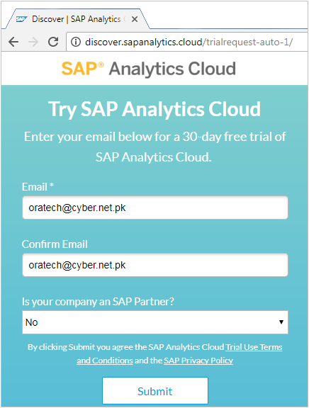
I know that most of you will purchase this book to evaluate SAP Analytics Cloud and will not have access to a live SAP environment. The good news for you is that you can explore the platform using most of the exercises provided in this book by signing up for a free thirty-day trial. Note that the trial version doesn't allow you to access all the features of SAP Analytics Cloud. For example, you cannot create a planning model in the trial version nor can you access its security and administration features. Execute the following steps to get access to the free SAP Analytics Cloud trial:
- Put the following URL in your browser's address bar and press enter: http://discover.sapanalytics.cloud/trialrequest-auto/.
- Enter and confirm your business email address in relevant boxes.
- Select No from the Is your company an SAP Partner? list.
- Click on the Submit button. After a short while, you will get an email with a link to connect to SAP Analytics Cloud.
- Click the Activate Account button in the email. This will open the Activate Your Account page, where you will have to set a strong password. The password must be at least 8 characters long and should also include uppercase and lowercase letters, numbers, and symbols.
- After entering and confirming your password, click on the Save button to complete the activation process. The confirmation page appears telling you that your account is successfully activated. Click on Continue.
- You will be taken to the SAP Analytics Cloud site. The email you receive carries a link under SAP Analytics Cloud System section that you can use to access the application any time. Your username (your email address) is also mentioned in the same email along with a log on button to access the application.
Summary
The chapter provided a brief overview of the next generation cloud-based analytic application, which provides an end-to-end cloud analytics experience. SAP Analytics Cloud can help transform how you discover, plan, predict, collaborate, visualize, and extend all in one solution. In addition to on-premise data sources, you can fetch data from a variety of other cloud apps and even from Excel and text files to build your data models and then create stories based on these models. The ultimate purpose of this amazing and easy-to-use application is to enable you to make the right decision. SAP Analytics Cloud is more than visualization of data; it is an insight into action, it is the realization of success.
Fasten you seat belt and get ready to take a cloud tour. From the next chapter, you will be performing hands-on exercises to explore the exciting world of SAP Analytics Cloud, starting with models.


