


When Microsoft announced the Windows Phone 7, they made a bold move to drop the legacy of Windows CE. By doing this, they decided to leverage Silverlight as the foundation of their mobile user interface. Many people relate Silverlight with applications that have been used for events such as the Olympics to deliver high definition videos. What most people don't realize is that the real power of Silverlight is to develop rich applications that go beyond the traditional Windows Forms type development. With Silverlight, they have built-in rich support for both designers and developers to build applications together in environments that they are both familiar with.
Microsoft also took another bold move in the tooling by providing both Expression Blend 4 and Visual Studio 2010 for Windows Phone for free. This choice was to give developers and designers the easiest way to begin developing for Windows Phone 7. Both of these tools provide a rich atmosphere to spark creativity among designers while giving developers the tools to get the job done.
In this chapter, we will familiarize ourselves with the basic tools of developing a Windows Phone 7 Silverlight Application. These skills will help you throughout the rest of the book by giving you the fundamentals for building any Silverlight Application on Windows Phone 7.
Before you begin to write your first line of code or design your first user interface for Windows Phone 7, you will need to download and install the Visual Studio and Expression Blend. These tools are offered completely free by Microsoft and can be downloaded at http://developer.windowsphone.com. You will also need the latest version of the Zune software if you will test your application on a physical device. The Zune software can be downloaded from http://www.zune.net/en-us/products/software/download/.
There are several pieces to the tools that you will download, and each serve their own role.
Visual Studio 2010 Express provides an environment that is especially designed for the programming side of an application. This doesn't mean that if you are a designer you shouldn't use Visual Studio, but use it to supplement your skills with Blend. There are many areas that Visual Studio offers that Blend does not offer, including:
InteliSense: If you have ever used Visual Studio, then you will be familiar with this feature. This provides you with very rich auto complete features when you are typing in the code behind files.
Debugging: Visual Studio provides many advance debugging features that aren't offered in Blend. This includes the ability to set break points to step through your code while it is running. Visual Studio also provides the ability to debug your application on the phone versus the emulator whereas Blend does not allow breakpoint support for debugging.
Microsoft Expression Blend for Windows Phone offers a tool that is more intended for the designing of user interfaces. While Visual Studio does provide drag-and-drop type design for user interfaces, there are many areas that Visual Studio is not well suited for, including:
Animation: Expression Blend provides a variety of ways to create simple and complex animations. Or if you have been using Adobe Flash or other animation tools, this will be very familiar to you as Blend uses Timeline-based animations as well as other transition types.
Vector-graphics support: Expression Blend also provides a vector-graphics support for creating your UI. Microsoft has also included support for importing existing assets from Adobe Illustrator and Photoshop.
Visual state editing: Blend provides a simple interface for setting visual states on controls that Visual Studio does not.
Template editing: Blend also offers a rich interface for editing templates and creating templates without having to know how to do it in the code.
Sample data: The sample data features of Blend allow you to quickly mock up user interfaces that might be attached to a database and see how the controls look without having the actual database connection in place.
The many features of Expression Blend create an environment for developing rich user experiences on Windows Phone. It is an essential tool for both the developers and designers and comfortable for them to use too.
The Windows Phone Emulator provides you with a virtual machine that emulates the Windows Phone operating system. This is used to provide a test environment that is almost identical to the runtime of the phone devices.
There are several other items included in the download that enable you to run the items above to develop Windows Phone applications; these include:
Silverlight 4 SDK
.NET Framework 4
XNA Game Studio 4.0
The XNA Game Studio is an extensive technology that is created for developing more complex games and will not be covered in this book. The XNA framework is an alternative library for building Windows Phone 7 applications. It doesn't support the layout controls and event-driven input suitable for line-of-business applications, but uses input and graphics methods useful for more complex games. Because of the extent of the XNA framework, it will not be covered in this book but see http://msdn.microsoft.com/en-us/wp7trainingcourse_wp7xna_unit.aspx for some great example on getting started with XNA.
If you are developing a Windows Phone application, the odds are you will have more than one page which you want to show to the user. Luckily for us, Microsoft has provided a basic navigation framework for navigating from one screen to another. This type of navigation is very similar to how you would navigate from one web page to another. It supports query strings similar to websites. This simple navigation example will be used throughout the book as a starting point for many other examples. This is a popular way to build applications that a user can easily navigate.
We will create a business information application that simply displays information about a fictional company called ACME and allows you to navigate from one screen to another easily. We will include the following pages:
Home
About ACME
Contact ACME
Locations
Corporate Office
Satellite Office
Although this application is very simple, it is designed to give you the fundamental building blocks for creating a complex Windows Phone application.
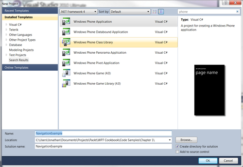
Before we begin, we need to create a new Windows Phone Application after clicking New Project in Visual Studio:
Now that you have created the Navigation Project, in the following example, you will see the basic structure of the application on the right-hand side of Visual Studio:
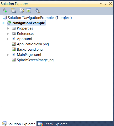
Add some folders to the structure of the application by right-clicking on the NavigationExample project in the Solution Explorer, selecting Add | New Folder, and then renaming the folder as Views.
1. Now, to add the first pages to the application, right-click on the new Views folder, select Add | New Item, then select the Windows Phone Portrait page, enter
About.xamlas the name, and click OK.2. Repeat this step for the Contact page, naming it as
Contact.xaml:
3. We will then repeat steps 1 and 2 for creating a sub folder named Locations under the Views folder and adding two more Windows Phone Portrait pages named
CorporateOffice.xamlandSatelliteOffice.xaml. This will create a project that should look like this:
In the previous steps, we had only spent time in Visual Studio. Now it is time to swap over to Expression Blend. OK, so you may be asking yourself, "Can't I just stay in Visual Studio?". The answer is yes you can, but you will find it much easier to do many of the design-related items like adding controls and setting properties of controls in Blend. The good news is that Blend and Visual Studio both use the same project files, so you can leave both Visual Studio and Blend open with the same project and they will update each other when you save the files:
1. To open this project in Blend, right-click on the
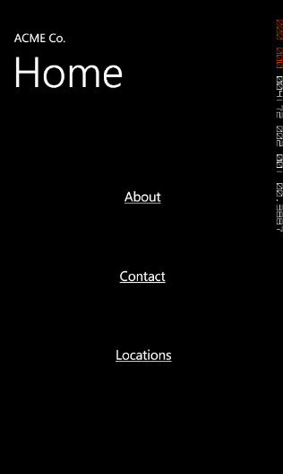
MainPage.xamland select Open in Expression Blend….2. The first things you will want to change are the two TextBlocks at the top of the page. To do this, simply double-click on the text to begin editing the text on the top-most label and enter the text ACME Co.. Then double-click the larger TextBlock and type Home.
3. Now that we have the home page labels renamed, let's do the same thing for the sub pages by double-clicking on them in the solution explorer, double-clicking the TextBlocks, and entering appropriate titles. For the Corporate Office page, enter ACME Co. as the upper title and Corporate Office in the larger TextBlock. Also do this for the Satellite Office page.
4. What we want to do now is provide a basic navigation of the
MainPage.xamlto the About, Contact, and Location Pages by using theHyperlinkButtoncontrol. We do this by clicking the assets button at the bottom of the tool box on the left-hand side of Blend. This will expand and give you a search box where you can search forHyperLinkButton:
After finding the control in the assets window, drag-and-drop them onto your
control.Blend.5. Once you have the hyperlinks on your design surface, double-click on them to edit the text of the first one as About, the second as Contact, and the last one as Locations. This should create a screen that looks like the following:

6. Enable each of these links to navigate to the corresponding pages when a user touches the link on the phone. This is easily done by selecting the hyperlink button, and then on the properties window setting the
NavigationUriproperty to the correspondingpage, as seen in the following screenshot:
7. In this example, we are selecting the
NavigationUrifor the About button. Simply select theAbout.xaml. Repeat this step for the Contact and Locations links.8. Now run the application by hitting F5. You can now see that clicking on the items in the emulator navigates to the corresponding pages in your application. This includes using the back button that is located on the phone.
This simple form of navigation works by utilizing the underlying navigation framework built into the application. In Silverlight, pages are defined in the System.Windows.Controls.Page class. The Windows Phone Portrait Page items you added to the solution are instances of a subclass of the type, Microsoft.Phone.Controls.PhoneApplicationPage. It defines phone-platform-specific events and properties including the BackKeyPress event, which is raised when the phone's hardware back button is pressed.
When you set the NavigationUri property of each link, what is actually happening is that it is setting this property in the XAML, as you can see in the following code:
<Grid x:Name="ContentPanel" Grid.Row="1" Margin="12,0,12,0">
<HyperlinkButton Content="About" Grid.Row="1" NavigateUri="/NavigationExample;component/Views/About.xaml"/>
<HyperlinkButton Content="Contact" Grid.Row="2" NavigateUri="/NavigationExample;component/Views/Contact.xaml"/>
<HyperlinkButton Content="Locations" Grid.Row="3" NavigateUri="/NavigationExample;component/Views/CompanyLocations. xaml"/>
</Grid>
Note
Downloading the example code
You can download the example code files for all Packt books you have purchased from your account at http://www.PacktPub.com. If you purchased this book elsewhere, you can visit http://www.PacktPub.com/support and register to have the files e-mailed directly to you.
As you can see, it doesn't just set the NavigationUri to a simple file path like you might expect if you have done web development before. Instead it is setting it to a path that includes the namespace of the project. In this case, the namespace is NavigationExample. This allows you, in more complex examples, to navigate to controls that are merely referenced in other assemblies.
While this navigation is simple, you usually want to pass some information from one control to another. You can do this with a query string much like you would do in a traditional web application. For example, your NavigateUri may look something more like this:
"/NavigationExample;component/Views/DetailsPage.xaml?selectedItem=2"
Then on your details page, you would need to retrieve the value by handling the query string in the navigation load of your DetailsPage.xaml, as seen in the following code:
protected override void OnNavigatedTo(NavigationEventArgs e)
{
string selectedIndex = "";
if (NavigationContext.QueryString. TryGetValue("selectedItem", out selectedIndex))
{
int index = int.Parse(selectedIndex);
DataContext = App.ViewModel.Items[index];
}
}
This provides you with the basic functionality for passing values from one page to another.
Once you begin developing Windows Phone 7 applications, you will need to be aware of the various basic layout controls. Each of these controls provides different ways to present your data. These controls include the following:
Grid: The Grid control provides a layout system that can use rows and columns as well as margins to place a control. Grids are the most flexible of the layout controls.
Canvas: The canvas control provides a simple coordinate based layout method for child controls.
Stack Panel: The StackPanel control provides a simple horizontal or vertical "stacking" layout. This stacking method will place child controls in order of their declaration in the XAML.
There are also two other layout controls that supplement the three primary controls. These controls differ a little more because they only allow one child control compared to the Grid, Canvas, and Stack Panel that allow unlimited number of child controls. These two controls are as follows:
ScrollViewer: This control is primarily used to add horizontal and vertical scroll bars to a control that is larger than the area provided to present its child control.
Border: This control provides a simple border to a control. While this control is one of the most basic, it does give you the ability to create nice rounded borders for controls that may not have that option.
Now that you have read about the basic options for laying out controls, let's look into how to use them to modify our existing navigation application to add more content.
This example will carry forward some of the key concepts from the Navigation application to provide an improved UI.
Let's start with the home page to give it a more finished look. You should have something that looks similar to the following screenshot:
As you can see, it isn't very exciting, but will give you a few foundation steps that are sometimes assumed that you understand. Hopefully, this will get you familiar with the tool in a new way if you are an experienced developer but if you are new to development, it will help you ease into it.
1. Select the border control from the toolbox on the far-left side. Click and hold the current container control (fourth button from the bottom),which will then pop up the selection of other container controls, as shown below:

2. Now that you have selected the Border control, draw it to fill most of your control. From the property window, select Brushes and set the BorderBrush color to white by clicking on the top-left side of the color picker gradient in the Editor and the Background to blue. Now the border is covering the existing buttons. We need to place the hyperlink controls into the border control, but if you remember, the border control and scrollviewer controls can have only one child.
With that, let's actually add a stack panel inside the Border. This time you will want to add it a little differently than we had added other controls. I want to show you that there is another way to add controls, especially when you want to add controls as a child of another control.
3. Add a stack panel to the border by simply selecting the border on your design surface. Now select the stackpanel control on the toolbox so that it is the default container control and then double-click on it. This will add the stackpanel as the child control of the border.
Now that we have seen how to add a new control as a child of an existing control, let's move the hyperlink buttons as children of the stack panel.
4. To do this, we are actually going to use the Objects and Timelines window. This window gives you a representation of what is going on with the layering and grouping of your control. Currently, this window should look similar to the following screenshot:

5. To move the three HyperlinkButtons, click the top one in the Objects and Timeline window, then press Shift, and select the last one. Now you can move all three HyperlinkButtons at once instead of moving them individually. In this window, drag the buttons to the stack panel. This will change your document outline to look similar to the following screenshot:

6. While we have these three controls selected, lets set their margins. One thing that is nice in both Blend and Visual Studio is that you can set properties of multiple selected controls at the same time. So while you have these properties selected, go to the margins section in the Layout section list and set the margins to look like the following:

As you can see, this gives you a nice evenly spaced menu by using the StackPanel control. This combination of layout controls gives you the flexibility to design almost any UI that you would need.
Through the various layout controls you can see that they each offer their own unique features to layout your controls as needed. You can use various combinations of all of these to create any layout you could possibly dream of.
As you have seen in this recipe, the primary layout controls offer a variety of simple layouts by using things such as Grids, Canvas, and the StackPanel. The Grid offers both relational positioning from margins or offering column and row based layouts. The canvas offers a more exact layout that is not adjusted by the container it is in and finally the StackPanel offers a simple stack of child elements.
As with any application there is usually the need to capture some type of user input. This may be in the form of gathering data like a user name or password or even just capturing a website address. If you have ever done windows application development, these types of items can be captured through two very popular controls, namely, the Textbox and the PasswordBox. While both of these still exists in Windows Phone 7, the Textbox control has a few tricks up its sleeves. One of the biggest tricks is the ability to optimize input on the screen for various types of user input set by input type. In this example, we will take a contact form to take traditional contact information from a user but optimize the keyboard for various inputs like phone, address, e-mail, and a few others.
To get ready for this part of the project, we will be editing the Contact.xaml in our example for this chapter to take some basic contact information for a customer. To begin, let's open the Contact.xaml in Expression Blend.
For the most part, we have the Contact.xaml open in Expression Blend. We will want to begin to layout our control to take the following information:
First Name and Last Name
Phone Number
E-mail Address
Website Address
Address Information (Address, City, State, Zip)
Comments
For the most part, this doesn't seem like anything out of the ordinary for building a form. We will leverage some of the techniques we learned for laying out controls in the layout example to build a very consistent UI:
1. Start by setting the Scrollbars to be Auto on the ContentPanel. This will automatically show the scrollbars once our form has grown past the possible viewable area on the screen, which can be found by expanding the Layout section and setting the
VerticalScrollBarVisiblein the properties window.2. Now let's select the ContentPanel in our
Contact.xamlfile's design surface. Then double-click the Grid control from the toolbox. As you can see, it creates a Grid control that is placed inside the ContentPanel, but one little problem—it doesn't actually fill the ContentPanel. By default, Blend creates a Grid with a few standard settings already set like height, width, and alignment. For our purposes, we actually want to reset those by right-clicking the Grid that you just created and clicking Auto Size | Fill. This will remove the default height, width, and alignment settings, which will cause the new Grid to fill its parent container.3. Now we will need to build our layout for controls. Since this is a very simple control, we will just place the controls on the screen. We will want to place both Textboxes and Textblock controls to identify which inputs are for each textbox. Drag the controls on the screen to look like this:

In this recipe, we discovered many of the basic input controls. These controls use simple input and place them in properties, which you can access from your code behind. This provides the easiest way of getting data input from your users.
Now that you have created your first form for data input, I am sure you can see the simplicity of creating forms. There's more to creating Windows Phone 7 applications than just adding textboxes on a form. We will use this form later for actually sending feedback. So go ahead, run the application, and navigate to the Contact page to find that you can add data using the controls.
As users get savvier with their mobile devices, they also have higher expectations for the application to know more about what they are doing. For example, in the form we just created, users will need to have data input that is more catered to the actual data they are inputting. By this I mean, if you are asking a user to input a phone number, don't show them a keyboard with the alphabet on it so they have to switch to the number and symbol keyboard. Wouldn't it make sense to simply show a numeric input?
So how do you customize these inputs? It is actually very simple. In Blend, select the phone number text box you created before. In the properties window, there is a property called InputScope; change this to TelephoneNumber. Now run the application and navigate to the contact page and try entering a phone number. Notice that instead of the standard keyboard, you get the number pad. This is a simple way to ease user input in your application with no code.
Now let's set a few others to be more optimized for that type of input:
First Name textbox: Set
InputScopetoPersonalGivenNameLast Name textbox: Set
InputScopetoPersonalSurNameEmail textbox: Set
InputScopetoEmailUserNameWeb Site textbox: Set
inputScopetoUriAddress textbox: Set
InputScopetoAddressStreetCity textbox: Set
InputScopetoAddressCityState textbox: Set
InputScopetoAddressStateOrProvince
So you may ask yourself, do I have to do this for every textbox? And the answer is no. But the question is should you do this, and the answer is yes. While this little tweaking doesn't seem to make a huge difference on some input, it is actually highly optimized to give the user the best keyboard for that input, even when it comes to other cultures and languages.
Also, while setting InputScope in Blend gives you a drop-down of a good number of input scopes, there are actually many that aren't displayed that are even more specialized. Here is the list of InputScope instances:
|
|
|
|
|
|
|
|
|
|
|
|
|
|
|
|
|
|
|
|
|
|
|
|
|
|
|
|
|
|
|
|
|
|
|
|
|
|
|
|
|
|
|
|
|
|
|
|
|
|
|
|
|
|
|
|
|
|
|
|
|
|
|
|
|
|
|
|
|
|
|
|
|
|
|
|
|
|
Many of the concepts set in this chapter will help provide you with a foundation to build highly customized controls that are sharp and provide various user feedback. We are all aware of how buttons react when you mouse over them in a standard windows application; most of the time they change color or highlight. This change of state is similar to using the ViewStateManger in a Windows Phone application.
The various controls that are included with Silverlight for Windows Phone have visual states associated with them. These states can be customized easily through the templates, but what if you want to create different states for your custom control? We do this with the Visual State Manager. For our first example, we will customize our current navigation example to build different states when selecting a location on the location screen. This is a way to add visual differences without creating another control for the different content.
We are going to carry our navigation example through to this example. We will be taking the Location.xaml and adding a few custom states to it. We will also introduce the concept of behaviors in this recipe so that we can switch between our custom visual states.
Let's start by opening the CompanyLocations.xaml in Expression Blend. We want to create a simple way to hide and show the location details once they are clicked. Traditionally in other types of development, you might do this by creating code that manually changes the visibility properties of the details and moves the other pieces out of the way. But instead we are going to actually use unique view states for this:
1. Now that we have the
CompanyLocations.xamlopen, let's drag four text block controls onto the design surface, two for the headers and two for the details. Let's lay it out to look something like the following screenshot:
2. As you can see, this isn't very exciting. So let's do a little more to it by adding two more text blocks that are rotated 90 degrees that also say the location name. As well as that, let's move the address information off screen and make the text larger for the headers so it looks more like this:

Now what we want to do is make it so that when you touch the Corporate Office text, the appropriate information displays the corporate office information. Then when you click on the Satellite Office, the information for it displays the satellite office information. And on top of that we are going to pretty much do this with zero code (actually, there is code in the XAML but we will show you that afterwards).
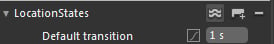
3. To create the states, we have to go to the States window in the top left of Blend to create a new state group. Click on the Add state group button in the top-right side of that window and name the state group as LocationStates. Then add two states, namely, CorporateState and SatelliteState. This will cause your state group to look something like the next screenshot:

4. To make the states, select the CorporateState, which will put this into a recording mode for the state, as seen by the red dot in the top right of the design surface. This does not mean it is recording your every move, but does mean it is recording any changes to the selected state compared to the base state. So let's lay out both the CorporateState and SatelliteState. You can lay them out as shown in the following screenshot:

And the Satellite Office view is shown in the following screenshot:

5. Now that we have the individual states, we need to make it to where you actually touch the text that it switches. First let's switch back to the base state so that any changes we make effect all states.
6. Now let's begin to create the way we want it to change once clicked. To do this, we are going to use a behavior that is included with Blend. So from your assets window, search for GotoStateAction and drag that to both the Corporate Office and Satellite Office text. Now let's set the options for this. As you can see in your objects and timeline window, it adds the child elements to the text. You can select these objects and set the
StateNameproperty to the appropriate state for the text.7. At this time, let's run the application. From what you can see now when you click the individual text on the location, it will swap to the appropriate state.
The concept of visual state manager is actually quite simple and very flexible. The XAML markup it creates is actually very simple, as we can see below:
<VisualStateManager.VisualStateGroups>
<VisualStateGroup x:Name="LocationStates">
<VisualState x:Name="CorporateState">
<Storyboard>
<DoubleAnimation Duration="0" To="-54" Storyboard.TargetProperty="(UIElement.RenderTransform).(CompositeTransform.TranslateY)" Storyboard.TargetName="textBlock" d:IsOptimized="True"/>
<DoubleAnimation Duration="0" To="208" Storyboard.TargetProperty="(UIElement.RenderTransform).(CompositeTransform.TranslateY)" Storyboard.TargetName="textBlock1" d:IsOptimized="True"/>
<DoubleAnimation Duration="0" To="264" Storyboard.TargetProperty="(UIElement.RenderTransform).(CompositeTransform.TranslateX)" Storyboard.TargetName="textBlock2" d:IsOptimized="True"/>
<DoubleAnimation Duration="0" To="-50.219" Storyboard.TargetProperty="(UIElement.RenderTransform).(CompositeTransform.TranslateX)" Storyboard.TargetName="textBlock3" d:IsOptimized="True"/>
<DoubleAnimation Duration="0" To="-69.781" Storyboard.TargetProperty="(UIElement.RenderTransform).(CompositeTransform.TranslateY)" Storyboard.TargetName="textBlock3" d:IsOptimized="True"/>
<DoubleAnimation Duration="0" To="0.4" Storyboard.TargetProperty="(UIElement.Opacity)" Storyboard.TargetName="textBlock1" d:IsOptimized="True"/>
</Storyboard>
</VisualState>
<VisualState x:Name="SatelliteState">
<Storyboard>
<DoubleAnimation Duration="0" To="0.4" Storyboard.TargetProperty="(UIElement.Opacity)" Storyboard.TargetName="textBlock" d:IsOptimized="True"/>
<DoubleAnimation Duration="0" To="-84" Storyboard.TargetProperty="(UIElement.RenderTransform).(CompositeTransform.TranslateY)" Storyboard.TargetName="textBlock" d:IsOptimized="True"/>
<DoubleAnimation Duration="0" To="-28" Storyboard.TargetProperty="(UIElement.RenderTransform).(CompositeTransform.TranslateY)" Storyboard.TargetName="textBlock1" d:IsOptimized="True"/>
<DoubleAnimation Duration="0" To="282" Storyboard.TargetProperty="(UIElement.RenderTransform).(CompositeTransform.TranslateX)" Storyboard.TargetName="textBlock4" d:IsOptimized="True"/>
<DoubleAnimation Duration="0" To="-46.219" Storyboard.TargetProperty="(UIElement.RenderTransform).(CompositeTransform.TranslateX)" Storyboard.TargetName="textBlock5" d:IsOptimized="True"/>
<DoubleAnimation Duration="0" To="-69.781" Storyboard.TargetProperty="(UIElement.RenderTransform).(CompositeTransform.TranslateY)" Storyboard.TargetName="textBlock5" d:IsOptimized="True"/>
</Storyboard>
</VisualState>
</VisualStateGroup>
</VisualStateManager.VisualStateGroups>
What you will notice is that for every element we moved in a state, it is actually creating DoubleAnimation for the movement with the new value in the To property. So, let's take one animation and break it down:
<DoubleAnimation Duration="0" To="-54" Storyboard.TargetProperty="(UIElement.RenderTransform).(CompositeTransform.TranslateY)" Storyboard.TargetName="textBlock" d:IsOptimized="True"/>
It is broken down to these items:
Duration: Currently set to 0, this is the time period that this animation should play for.
To: This is the new value of the property being set in the animation. In this case, we are changing the TranslateY property.
Storyboard.TargetProperty: This gives the dependency property reference that needs to be set.
Storyboard.TargetName: The name of the element being animated.
ViewStateManager is probably one of my favorite things to use in Blend, mostly because it has a nice feature to create simple animations without really having to know how to animate. To do this, you need to do two things, change the EasingFunction on the state group and the duration. We will change the duration to one second and to an exponential easing function, as you can see below:
As with any change in Blend, this also adds the following to your XAML:
<VisualStateGroup.Transitions>
<VisualTransition GeneratedDuration="0:0:1">
<VisualTransition.GeneratedEasingFunction>
<ExponentialEase EasingMode="EaseInOut"/>
</VisualTransition.GeneratedEasingFunction>
</VisualTransition>
</VisualStateGroup.Transitions>
Now when you run your application, you will get a simple animation that adds a nice finishing touch to your locations screen. The two best things to do are play with the timings and change the easing functions. Each easing function will give you a pretty different animation that can be tweaked for your specific desired outcome.
Up to this point, almost everything we have talked about gives you a basic understanding of developing user interfaces in Silverlight regardless of whether it is intended for the phone or for the web. With the introduction of Windows Phone 7, Microsoft introduced two new controls, namely, the panorama and pivot controls. These two controls provide the rich sliding motion that is very common in many of the Windows Phone 7 interfaces.
The panorama control allows you to create content beyond the extent of the physical device.
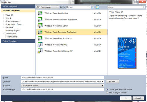
To get started with the panorama control in Visual Studio, create a new project and select the Windows Phone Panorama Application:
This will create a new project which is already setup and ready to go for using the panorama control. You do not have to use this project template to use this control. It is just a good starting point if this is the desired design of your application.
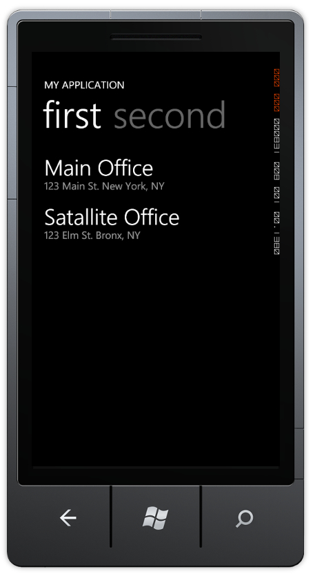
Now let's do a little customization to the current application to give you a feel of how the control works. As you can see when running the application, as you drag the interface to the left or right side the content, header, and background, all move independently as to give it a much more fluid look and feel.
Let's do some simple customization to this project. Let's first change the text that says My application to say ACME Company:
1. To do this, select the panorama control in the design surface in Visual Studio and then set the property of the title to ACME Company in the property window, which is found by right-clicking the panorama control and clicking Properties as follows:

Now let's make the data in the two panes a little more interesting. For the first one, let's mimic what we have done in earlier recipes and give the locations of ACME Company.
2. To do this, navigate to the
SampleData/MainViewModelSampleData.xamland double-click on it. Let's change the data to look more like this:<local:MainViewModel xmlns="http://schemas.microsoft.com/winfx/2006/xaml/ presentation" xmlns:x="http://schemas.microsoft.com/winfx/2006/xaml" xmlns:local="clr-namespace:PanoramaExample" SampleProperty="Sample Text Property Value"> <local:MainViewModel.Items> <local:ItemViewModel LineOne="Main Office" LineTwo="123 Main St. New York, NY" LineThree="(123) 123-1234"/> <local:ItemViewModel LineOne="satellite Office" LineTwo="123 Elm St. Bronx, NY" LineThree="(123) 321-1234"/> </local:MainViewModel.Items> </local:MainViewModel>
3. Rebuild the application by right-clicking the project and selecting the rebuild option. You will see that this updates the design surface. Now let's run the application and see how this looks in the emulator. The first thing you will notice is that the emulator and the design time don't match! Don't worry, this was expected.
4. To change the actual runtime data, let's open up the ViewModels | MainViewModel.cs. Let's delete the lines from the section under the comment about inserting sample data and let's insert it with real sample data. Let's consolidate it to just two lines that look like this:
this.Items.Add(new ItemViewModel() { LineOne = "Main Office", LineTwo = "123 Main St. New York, NY", LineThree = "(123) 123-1234" });
this.Items.Add(new ItemViewModel() { LineOne = "Satallite Office", LineTwo = "123 Elm St. Bronx, NY", LineThree = "(123) 321-1234" });
Now this has also been an extremely simple overview of not only the Panorama control but also some basic data binding techniques and architecture that is called MVVM (Model-View-View Model), which we will cover in much greater depth in a later chapter.
As far as the actual Panorama control, it is actually very simple. The panorama control is made up of the control that can only contain Panorama Item controls, those which can hold other controls. This is very similar to how the other controls we have used in the chapter work, except it renders differently and offers a more specialized interface.
You can see the extent of the XAML here:
<!--Panorama control-->
<controls:Panorama Title="ACME Company">
<controls:Panorama.Background>
<ImageBrush ImageSource="PanoramaBackground.png"/>
</controls:Panorama.Background>
<!--Panorama item one-->
<controls:PanoramaItem Header="first item">
<!--Double line list with text wrapping-->
<ListBox Margin="0,0,-12,0" ItemsSource=" {Binding Items}">
<ListBox.ItemTemplate>
<DataTemplate>
<StackPanel Margin="0,0,0,17" Width="432">
<TextBlock Text="{Binding LineOne}" TextWrapping="Wrap" Style="{StaticResource PhoneTextExtraLargeStyle}"/>
<TextBlock Text="{Binding LineTwo}" TextWrapping="Wrap" Margin="12,-6,12,0" Style="{StaticResource PhoneTextSubtleStyle}"/>
</StackPanel>
</DataTemplate>
</ListBox.ItemTemplate>
</ListBox>
</controls:PanoramaItem>
<!--Panorama item two-->
<!--Use 'Orientation="Horizontal"' to enable a panel that lays out horizontally-->
<controls:PanoramaItem Header="second item">
<!--Double line list with image placeholder and text wrapping-->
<ListBox Margin="0,0,-12,0" ItemsSource=" {Binding Items}">
<ListBox.ItemTemplate>
<DataTemplate>
<StackPanel Orientation="Horizontal" Margin="0,0,0,17">
<!--Replace rectangle with image-->
<Rectangle Height="100" Width="100" Fill="#FFE5001b" Margin="12,0,9,0"/>
<StackPanel Width="311">
<TextBlock Text="{Binding LineOne}" TextWrapping="Wrap" Style="{StaticResource PhoneTextExtraLargeStyle}"/>
<TextBlock Text="{Binding LineTwo}" TextWrapping="Wrap" Margin="12,-6,12,0" Style="{StaticResource PhoneTextSubtleStyle}"/>
</StackPanel>
</StackPanel>
</DataTemplate>
</ListBox.ItemTemplate>
</ListBox>
</controls:PanoramaItem>
</controls:Panorama>
Now that you have used the panorama control, you will find the pivot control almost identical in usage. Where the panorama control acts almost as one unified control, the pivot control acts almost like a traditional tab control that you would see in any other application.
Similar to the panorama control, there is a project template for creating a pivot control application. Let's start by creating a Pivot Control Application in Visual Studio. Also, because these items are so similar, let's actually repeat the steps of changing the sample data and the view model runtime data in the project that you did in the previous example.
Now that you have updated the application to almost mimic the panorama control, let's actually run it. You should get something that looks like the following screenshot:
Now when you click on the word second, it jumps to the second content and the tab for the first moves to left and off the screen after the second tab. Unlike the pivot control that acts as a tab control, the panorama acts as a single sliding image. The pivot control also does not have the option for the background that moves independently from the content.
If you begin to look at the XAML, you will notice that it is almost identical to the panorama control, as you can see below:
<phone:PhoneApplicationPage
x:Class="PivotExample.MainPage"
xmlns="http://schemas.microsoft.com/winfx/2006/xaml/presentation"
xmlns:x="http://schemas.microsoft.com/winfx/2006/xaml"
xmlns:phone="clr-namespace:Microsoft.Phone. Controls;assembly=Microsoft.Phone"
xmlns:shell="clr-namespace:Microsoft.Phone. Shell;assembly=Microsoft.Phone"
xmlns:controls="clr-namespace:Microsoft.Phone. Controls;assembly=Microsoft.Phone.Controls"
xmlns:d="http://schemas.microsoft.com/expression/blend/2008"
xmlns:mc="http://schemas.openxmlformats.org/ markup-compatibility/2006"
mc:Ignorable="d" d:DesignWidth="480" d:DesignHeight="768"
d:DataContext="{d:DesignData SampleData/MainViewModelSampleData. xaml}"
FontFamily="{StaticResource PhoneFontFamilyNormal}"
FontSize="{StaticResource PhoneFontSizeNormal}"
Foreground="{StaticResource PhoneForegroundBrush}"
SupportedOrientations="Portrait" Orientation="Portrait"
shell:SystemTray.IsVisible="True">
<!--LayoutRoot is the root grid where all page content is placed-->
<Grid x:Name="LayoutRoot" Background="Transparent">
<!--Pivot Control-->
<controls:Pivot Title="MY APPLICATION">
<!--Pivot item one-->
<controls:PivotItem Header="first">
<!--Double line list with text wrapping-->
<ListBox x:Name="FirstListBox" Margin="0,0,-12,0" ItemsSource="{Binding Items}">
<ListBox.ItemTemplate>
<DataTemplate>
<StackPanel Margin="0,0,0,17" Width="432">
<TextBlock Text="{Binding LineOne}" TextWrapping="Wrap" Style="{StaticResource PhoneTextExtraLargeStyle}"/>
<TextBlock Text="{Binding LineTwo}" TextWrapping="Wrap" Margin="12,-6,12,0" Style="{StaticResource PhoneTextSubtleStyle}"/>
</StackPanel>
</DataTemplate>
</ListBox.ItemTemplate>
</ListBox>
</controls:PivotItem>
<!--Pivot item two-->
<controls:PivotItem Header="second">
<!--Triple line list no text wrapping-->
<ListBox x:Name="SecondListBox" Margin="0,0,-12,0" ItemsSource="{Binding Items}">
<ListBox.ItemTemplate>
<DataTemplate>
<StackPanel Margin="0,0,0,17">
<TextBlock Text="{Binding LineOne}" TextWrapping="NoWrap" Margin="12,0,0,0" Style="{StaticResource PhoneTextExtraLargeStyle}"/>
<TextBlock Text="{Binding LineThree}" TextWrapping="NoWrap" Margin="12,-6,0,0" Style="{StaticResource PhoneTextSubtleStyle}"/>
</StackPanel>
</DataTemplate>
</ListBox.ItemTemplate>
</ListBox>
</controls:PivotItem>
</controls:Pivot>
</Grid>
<!--Sample code showing usage of ApplicationBar-->
<!--<phone:PhoneApplicationPage.ApplicationBar>
<shell:ApplicationBar IsVisible="True" IsMenuEnabled="True">
<shell:ApplicationBarIconButton IconUri="/Images/ appbar_button1.png" Text="Button 1"/>
<shell:ApplicationBarIconButton IconUri="/Images/ appbar_button2.png" Text="Button 2"/>
<shell:ApplicationBar.MenuItems>
<shell:ApplicationBarMenuItem Text="MenuItem 1"/>
<shell:ApplicationBarMenuItem Text="MenuItem 2"/>
</shell:ApplicationBar.MenuItems>
</shell:ApplicationBar>
</phone:PhoneApplicationPage.ApplicationBar>-->
</phone:PhoneApplicationPage>
The main thing to note is where it declares the pivot control. It essentially is declared as controls:Pivot instead of controls:Panorama. So now you are probably asking yourself "When should I use which one?". There are a couple of rules to consider:
When you want to use a sliding background image
When you want to have all the child controls to be almost dragable to where you can peek at them from another control
When you need to have the application bar (panorama control cannot have an application bar on the same screen)
You want to create the illusion of a tab control
Other things to keep in mind:
The panorama control can be much more memory intensive to use, especially depending on the number of panorama items and the background used
The pivot control is much more memory optimized for when you want a great number of child pivot items