


 Download code from GitHub
We will be learning to create GUI applications using the Qt toolkit. The Qt toolkit, known simply as Qt, is a cross-platform application and UI framework developed by Trolltech, which is used for developing GUI applications. It runs on several platforms, including Windows, macOS X, Linux, and other UNIX platforms. It is also referred to as a widget toolkit because it provides widgets such as buttons, labels, textboxes, push buttons, and list boxes, which are required for designing a GUI. It includes a cross-platform collection of classes, integrated development tools, and a cross-platform IDE. To create real-time applications, we will be making use of Python bindings for the Qt toolkit called, PyQt5.
PyQt is a set of Python bindings for the cross-platform application framework that combines all the advantages of Qt and Python. With PyQt, you can include Qt libraries in Python code, enabling you to write GUI applications in Python. In other words, PyQt allows you to access all the facilities provided by Qt through Python code. Since PyQt depends on the Qt libraries to run, when you install PyQt, the required version of Qt is also installed automatically on your machine.
A GUI application may consist of a main window with several dialogs or just a single dialog. A small GUI application usually consists of at least one dialog. A dialog application contains buttons. It doesn't contain a menu bar, toolbar, status bar, or central widget, whereas a main window application normally has all of those.
Dialogs are of the following two types:
- Modal: This dialog is one that blocks the user from interacting with other parts of the application. The dialog is the only part of the application that the user can interact with. Until the dialog is closed, no other part of the application can be accessed.
- Modeless: This dialog is the opposite of a modal dialog. When a modeless dialog is active, the user is free to interact with the dialog and with the rest of the application.
There are the following two ways to write a GUI application:
- From scratch, using a simple text editor
- With Qt Designer, a visual design tool with which you can create a user interface quickly using drag and drop
You will be using Qt Designer to develop GUI applications in PyQt, as it is a quick and easy way to design user interfaces without writing a single line of code. So, launch Qt Designer by double-clicking on its icon on desktop.
On opening, Qt Designer asks you to select a template for your new application, as shown in the following screenshot:

Qt Designer provides a number of templates that are suitable for different kinds of applications. You can choose any of these templates and then click the Create button.
Qt Designer provides the following predefined templates for a new application:
Dialog with Buttons Bottom: This template creates a form with theOKandCancelbuttons in the bottom-right corner.Dialog with Buttons Right: This template creates a form with theOKandCancelbuttons in the top-right corner.Dialog without Buttons: This template creates an empty form on which you can place widgets. The superclass for dialogs isQDialog.Main Window: This template provides a main application window with a menu bar and a toolbar that can be removed if not required.Widget: This template creates a form whose superclass isQWidgetrather thanQDialog.
Every GUI application has a top-level widget and the rest of the widgets are called its children. The top-level widget can be QDialog, QWidget, or QMainWindow, depending on the template you require. If you want to create an application based on the dialog template, then the top-level widget or the first class that you inherit will be QDialog. Similarly, to create an application based on the Main Window template, the top-level widget will be QMainWindow, and to create the application based on the Widget template, you need to inherit the QWidget class. As mentioned previously, the rest of the widgets that are used for the user interface are called child widgets of the classes.
Qt Designer displays a menu bar and toolbar at the top. It shows a Widget box on the left that contains a variety of widgets used to develop applications, grouped in sections. All you have to do is drag and drop the widgets you want from the form. You can arrange widgets in layouts, set their appearance, provide initial attributes, and connect their signals to slots.
In this recipe, the user will be prompted to enter his/her name followed by clicking a push button. On clicking the button, a welcome message will appear, "Hello," followed by the name entered by the user. For this recipe, we need to make use of three widgets, Label, Line Edit, and Push Button. Let's understand these widgets one by one.
The Label widget is an instance of theQLabelclass and is used for displaying messages and images. Because the Label widgets simply display results of computations and don't take any input, they are simply used for supplying information on the screen.
The following are the methods provided by the QLabel class:
setText(): This method assigns text to theLabelwidgetsetPixmap(): This method assignspixmap, an instance of theQPixmapclass, to theLabelwidgetsetNum(): This method assigns an integer or double value to theLabelwidgetclear(): This method clears text from theLabelwidget
The default text of QLabel is TextLabel. That is, when you add a QLabel class to a form by dragging a Label widget and dropping it on the form, it will display TextLabel. Besides using setText(), you can also assign text to a selected QLabel object by setting its text property in the Property Editor window.
The Line Edit widget is that is popularly used for entering single-line data. The Line Edit widget is an instance of the QLineEdit class, and you can not only enter, but also edit the data too. Besides entering data, you can undo, redo, cut, and paste data in the Line Edit widget.
The following are the methods provided by the QLineEdit class:
setEchoMode(): It sets the echo mode of theLine Editwidget. That is, it determines how the contents of theLine Editwidget are to be displayed. The available options are as follows:Normal: This is the default mode and it displays characters the way they are enteredNoEcho: It switches off theLine Editecho, that is, it doesn't display anythingPassword: This option is used for password fields, no text will be displayed; instead, asterisks appear for the text entered by the userPasswordEchoOnEdit: It displays the actual text while editing the password fields, otherwise it will display the asterisks for the textmaxLength(): This method is used to specify the maximum length of text that can be entered in theLine Editwidget.setText(): This method is used for assigning text to theLine Editwidget.text(): This method accesses the text entered in theLine Editwidget.clear(): This method clears or deletes the complete content of theLine Editwidget.setReadOnly(): When the Boolean value true is passed to this method, it will make theLine Editwidget read-only, that is, non-editable. The user cannot make any changes to the contents displayed through theLine Editwidget, but can only copy.isReadOnly(): This method returns the Boolean value true if theLine Editwidget is in read-only mode, otherwise it returns false.setEnabled(): By default, theLine Editwidget is enabled, that is, the user can make changes to it. But if the Boolean value false is passed to this method, it will disable theLine Editwidget so the user cannot edit its content, but can only assign text via thesetText()method.setFocus(): This method positions the cursor on the specifiedLine Editwidget.
To display a push button in an application, you need to create an instance of the QPushButton class. When assigning text to buttons, you can create shortcut keys by preceding any character in the text with an ampersand. For example, if the text assigned to a push button is Click Me, the character C will be underlined to indicate that it is a shortcut key, and the user can select the button by pressing Alt + C. The button emits the clicked() signal if it is activated. Besides text, an icon can also be displayed in the push button. The methods for displaying text and an icon in a push button are as follows:
setText(): This method is used to assign text to the push buttonsetIcon(): This method is used to assign an icon to the push button
Let's create a new application based on the Dialog without Buttons template. As said earlier, this application will prompt the user to enter a name and, on clicking the push button after entering a name, the application with display a hello message along with the entered name. Here are the steps to create this application:
- Drag a
Labelwidget from theDisplay Widgetscategory and drop it on the form. Set itstextproperty toEnter your name. Set theobjectNameproperty of theLabelwidget tolabelResponse. - Drag one more
Labelwidget from theDisplay Widgetscategory and drop it on the form. Do not change thetextproperty of thisLabelwidget and leave itstextproperty to its default value,TextLabel. This is because thetextproperty of thisLabelwidget will be set through code, that is, it will be used to display the hello message to the user. - Drag one
Line Editfrom theInput Widgetscategory and drop it on the form. Set itsobjectNamepropertytolineEditName. - Drag one
Push Buttonwidget from theButtonscategory and drop it onto the form. Set itstextproperty toClick. You can change thetextproperty of thePush Buttonwidget through any of three ways: by double-clicking thePush Buttonwidget and overwriting the default text, by right-clicking thePush Buttonwidget and selecting theChange text...option from the context menu that pops up, or by selecting thetextproperty from theProperty Editorwindow and overwriting the default text. - Set the
objectNameproperty of thePush Buttonwidget toButtonClickMe.
- Save the application with the name
demoLineEdit.ui. Now the form will appear, as shown in the following screenshot:

The user interface that you create with Qt Designer is stored in a .ui file that includes all the form's information: its widgets, layout, and so on. The .ui file is an XML file, and you need to convert it to Python code. That way, you can maintain a clear separation between the visual interface and the behavior implemented in code.
- To use the
.uifile, you first need to convert it into a Python script. The command utility that you will use for converting a.uifile into a Python script ispyuic5. In Windows, thepyuic5utility is bundled with PyQt. To do the conversion, you need to open a Command Prompt window and navigate to the folder where the file is saved and issue the following command:
C:\Pythonbook\PyQt5>pyuic5 demoLineEdit.ui -o demoLineEdit.pyLet's assume that we saved the form at this location: C:\Pythonbook\PyQt5>. The preceding command shows the conversion of the demoLineEdit.ui file into a Python script, demoLineEdit.py.
Note
The Python code generated by this method should not be modified manually, as any changes will be overwritten the next time you run the pyuic5 command.
The code of the generated Python script file, demoLineEdit.py, can be seen in the source code bundle of this book.
- Treat the code in the
demoLineEdit.pyfile as a header file, and import it to the file from which you will invoke its user interface design.
Note
The header file is a term referred to those files which are imported into the current file. The command to import such files is usually written at the top in the script, hence named as header files.
import sys
from PyQt5.QtWidgets import QDialog, QApplication
from demoLineEdit import *
class MyForm(QDialog):
    def __init__(self):
        super().__init__()
        self.ui = Ui_Dialog()
        self.ui.setupUi(self)
        self.ui.ButtonClickMe.clicked.connect(self.dispmessage)
        self.show()
    def dispmessage(self):
        self.ui.labelResponse.setText("Hello "
        +self.ui.lineEditName.text())
if __name__=="__main__":
    app = QApplication(sys.argv)
    w = MyForm()
    w.show()
sys.exit(app.exec_())The demoLineEdit.py file is very easy to understand. A class with the name of the top-level object is created, with Ui_ prepended. Since the top-level object used in our application is Dialog, the Ui_Dialog class is created and stores the interface elements of our widget. That class has two methods, setupUi() and retranslateUi(). The setupUi() method sets up the widgets; it creates the widgets that you use while defining the user interface in Qt Designer. The method creates the widgets one by one and also sets their properties. The setupUi() method takes a single argument, which is the top-level widget in which the user interface (child widgets) is created. In our application, it is an instance of QDialog. The retranslateUi() method translates the interface.
Let's understand what callLineEdit.py does statement-wise:
- It imports the necessary modules.
QWidgetis the base class of all user interface objects in PyQt5. - It creates a new
MyFormclass that inherits from the base class,QDialog. - It provides the default constructor for
QDialog. The default constructor has no parent, and a widget with no parent is known as a window. - Event handling in PyQt5 uses signals and slots. A signal is an event, and a slot is a method that is executed on the occurrence of a signal. For example, when you click a push button, a
clicked()event, also known as a signal, occurs. Theconnect()method connects signals with slots. In this case, the slot is a method:dispmessage(). That is, when the user clicks the push button, thedispmessage()method will be invoked.clicked()is an event here and an event handling loop waits for an event to occur and then dispatches it to perform some task. The event handling loop continues to work until either theexit()method is called or the main widget is destroyed. - It creates an application object with the name
appthrough theQApplication()method. Every PyQt5 application must createsys.argvapplication object which contains a list of arguments from the command line, and it is passed to the method while creating the application object. Thesys.argvparameter helps in passing and controlling the startup attributes of a script.
- An instance of the
MyFormclass is created with the namew. - The
show()method will display the widget on the screen. - The
dispmessage()method performs event handling for the push button. It displays theHellotext, along with the name entered in theLine Editwidget. - The
sys.exit()method ensures a clean exit, releasing memory resources.
On executing the preceding program, you get a window with the Line Edit and Push Button widgets, as shown in the following screenshot. When the push button is selected, the displmessage() method will be executed, displaying the Hello message along with the user's name that is entered in the Line Edit widget:

This recipe displays certain flight types via Radio Button and when the user selects the radio button, the price associated with that flight will be displayed. We need to first understand the workings of Radio Button.
The Radio Button widgets are very popular when you want the user to select only one option out of the available options. Such options are known as mutually exclusive options. When the user selects an option, the previously selected option is automatically deselected. The Radio Button widgets are instances of the QRadioButton class. Every radio button has an associated text label. The radio button can be either in selected (checked) or unselected (unchecked) states. If you want two or more sets of radio buttons, where each set allows the exclusive selection of a radio button, put them into different button groups (instances of QButtonGroup). The methods provided by QRadioButton are shown next.
The QRadioButton class provides the following methods:
isChecked(): This method returns the Boolean value true if the button is in the selected state.setIcon(): This method displays an icon with the radio button.setText(): This method assigns the text to the radio button. If you want to specify a shortcut key for the radio button, precede the preferred character in the text with an ampersand (&). The shortcut character will be underlined.setChecked(): To make any radio button appear selected by default, pass the Boolean value true to this method.
Signals emitted by QRadioButton are as follows:
toggled(): This signal is emitted whenever the button changes its state from checked to unchecked or vice versaclicked(): This signal is emitted when a button is activated (that is, pressed and released) or when its shortcut key is pressedstateChanged(): This signal is emitted when a radio button changes its state from checked to unchecked or vice versa
To understand the concept of radio buttons, let's create an application that asks the user to select the flight type and displays three options, First Class, Business Class, and Economy Class, in the form of radio buttons. On selecting an option through the radio button, the price for that flight will be displayed.
Let's create a new application based on the Dialog without Buttons template. This application will display different flight types along with their respective prices. When a user selects a flight type, its price will be displayed on the screen:
- Drag and drop two
Labelwidgets and threeRadio Buttonwidgets onto the form. - Set the
textproperty of the firstLabelwidget toChoose the flight typeand delete thetextproperty of the secondLabelwidget. Thetextproperty of the secondLabelwidget will be set through code; it will be used to display the price of the selected flight type. - Set the
textproperty of the threeRadio Buttonwidgets toFirst Class $150,Business Class $125, andEconomy Class $100. - Set the
objectNameproperty of the secondLabelwidget tolabelFare. The default object names of the three radio buttons areradioButton,radioButton_2, andradioButton_3. Change theobjectNameproperty of these three radio buttons toradioButtonFirstClass,radioButtonBusinessClass, andradioButtonEconomyClass. - Save the application with name
demoRadioButton1.ui.
Take a look at the following screenshot:
The demoRadioButton1.ui application is an XML file and needs to be converted into Python code through thepyuic5command utility. The generated Python code, demoRadioButton1.py, can be seen in the source code bundle of this book.
- Import the
demoRadioButton1.pyfile as a header file in the Python script that you are going to create next to invoke the user interface design. - In the Python script, write the code to display the flight type on the basis of the radio button selected by the user. Name the source file
callRadioButton1.py; its code is shown here:
import sys
from PyQt5.QtWidgets import QDialog, QApplication
from demoRadioButton1 import *
class MyForm(QDialog):
    def __init__(self):
        super().__init__()
        self.ui = Ui_Dialog()
        self.ui.setupUi(self)
        self.ui.radioButtonFirstClass.toggled.connect(self.
        dispFare)
        self.ui.radioButtonBusinessClass.toggled.connect(self.
        dispFare)
        self.ui.radioButtonEconomyClass.toggled.connect(self.
        dispFare)
        self.show()
    def dispFare(self):
        fare=0
        if self.ui.radioButtonFirstClass.isChecked()==True:
            fare=150
        if self.ui.radioButtonBusinessClass.isChecked()==True:
            fare=125
        if self.ui.radioButtonEconomyClass.isChecked()==True:
            fare=100
        self.ui.labelFare.setText("Air Fare is "+str(fare))
if __name__=="__main__":
    app = QApplication(sys.argv)
    w = MyForm()
    w.show()
sys.exit(app.exec_())The toggled() event of Radio Button is connected to the dispFare() function, which will display the price of the selected flight type. In the dispFare() function, you check the state of the radio buttons. Hence, if radioButtonFirstClass is selected, the value 50 is assigned to the fare variable. Similarly, if radioButtonBusinessClass is selected, the value 125 is assigned to the fare variable. Similarly, the value 100 is assigned to the fare variable when radioButtonEconomyClass is selected. Finally, the value in the fare variable is displayed via labelFare.
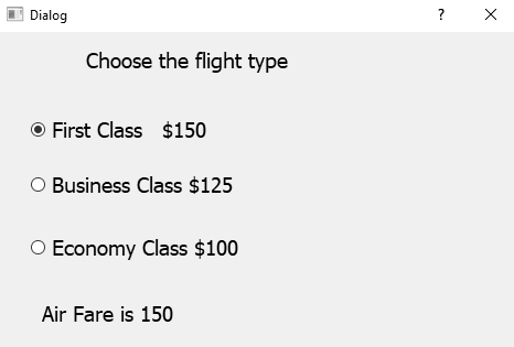
On executing the previous program, you get a dialog that displays three flight types and prompts the user to select the one that he/she wants to use for travel. On selecting a flight type, the price of the selected flight type is displayed, as shown in the following screenshot:
In this application, we will learn to create two groups of radio buttons. The user can select radio buttons from either group and accordingly the result or text will appear on the screen.
We will display a dialog that displays shirts of different sizes and different payment methods. On selecting a shirt size and a payment method, the selected shirt size and payment method will be displayed on the screen. We will create two groups of radio buttons, one of the shirt sizes and other payment methods. The shirt size group displays four radio buttons showing four different types of the size such as M, L, XL, and XXL, where M stands for medium size, L stands for large size, and so on. The payment method group displays three radio buttons, Debit/Credit Card, NetBanking, and Cash On Delivery. The user can select any radio button from either of the groups. When the user selects any of the shirt sizes or payment methods, the selected shirt size and payment method will be displayed.
Let's recreate the preceding application step by step:
- Create a new application based on the
Dialog without Buttonstemplate. - Drag and drop three
Labelwidgets and sevenRadio Buttonwidgets. Out of these seven radio buttons, we will arrange four radio buttons in one vertical layout and the other three radio buttons in the second vertical layout. The two layouts will help in grouping these radio buttons. Radio buttons being mutually exclusive will allow only one radio button to be selected from a layout or group. - Set the
textproperty of the first twoLabelwidgets toChoose your Shirt SizeandChoose your payment methodrespectively. - Delete the
textproperty of the thirdLabelwidget because we will display the selected shirt size and payment method through the code. - In the
Property Editorwindow, increase the font size of all the widgets to increase their visibility in the application. - Set the
textproperty of the first four radio buttons toM,L,XL, andXXL. Arrange these four radio buttons into one vertical layout. - Set the
textproperty of the next three radio buttons toDebit/Credit Card,NetBanking, andCash On Delivery. Arrange these three radio buttons into a second vertical layout. Remember, these vertical layouts help by grouping these radio buttons. - Change the object names of the first four radio buttons to
radioButtonMedium,radioButtonLarge,radioButtonXL, andradioButtonXXL.
- Set the
objectNameproperty of the firstVBoxLayoutlayout toverticalLayout. TheVBoxLayoutlayout will be used for aligning radio buttons vertically. - Change the object names of next three radio buttons to
radioButtonDebitCard,radioButtonNetBanking, andradioButtonCashOnDelivery. - Set the
objectNameproperty of the secondQVBoxLayoutobject toverticalLayout_2. - Set the
objectNameproperty of the thirdLabelwidget tolabelSelected. It is through thisLabelwidget that the selected shirt size and payment method will be displayed. - Save the application with the name
demoRadioButton2.ui. - Now, the form will appear, as shown in the following screenshot:

The .ui (XML) file is then converted into Python code through the pyuic5 command utility. You can find the Python code, demoRadioButton2.py, in the source code bundle for this book.
- Import the
demoRadioButton2.pyfile, as a header file in our program to invoke the user interface design and to write code to display the selected shirt size and payment method through aLabelwidget when the user selects or unselects any of the radio buttons.
- Let's name the program
callRadioButton2.pyw; its code is shown here:
import sys
from PyQt5.QtWidgets import QDialog, QApplication
from demoRadioButton2 import *
class MyForm(QDialog):
    def __init__(self):
        super().__init__()
        self.ui = Ui_Dialog()
        self.ui.setupUi(self)
        self.ui.radioButtonMedium.toggled.connect(self.
        dispSelected)
        self.ui.radioButtonLarge.toggled.connect(self.
        dispSelected)
        self.ui.radioButtonXL.toggled.connect(self.dispSelected)
        self.ui.radioButtonXXL.toggled.connect(self.
        dispSelected)
        self.ui.radioButtonDebitCard.toggled.connect(self.
        dispSelected)
        self.ui.radioButtonNetBanking.toggled.connect(self.
        dispSelected)
        self.ui.radioButtonCashOnDelivery.toggled.connect(self.
        dispSelected)
        self.show()
    def dispSelected(self):
        selected1="";
        selected2=""
        if self.ui.radioButtonMedium.isChecked()==True:
            selected1="Medium"
        if self.ui.radioButtonLarge.isChecked()==True:
            selected1="Large"
        if self.ui.radioButtonXL.isChecked()==True:
            selected1="Extra Large"
        if self.ui.radioButtonXXL.isChecked()==True:
            selected1="Extra Extra Large"
        if self.ui.radioButtonDebitCard.isChecked()==True:
            selected2="Debit/Credit Card"
        if self.ui.radioButtonNetBanking.isChecked()==True:
            selected2="NetBanking"
        if self.ui.radioButtonCashOnDelivery.isChecked()==True:
            selected2="Cash On Delivery"
        self.ui.labelSelected.setText("Chosen shirt size is
        "+selected1+" and payment method as " + selected2)
if __name__=="__main__":
    app = QApplication(sys.argv)
    w = MyForm()
    w.show()
sys.exit(app.exec_())The toggled() event of all the radio buttons is connected to the dispSelected() function, which will display the selected shirt size and payment method. In the dispSelected() function, you check the status of the radio buttons to find out whether they are checked or unchecked. On the basis of the selected radio button in the first vertical layout, the value of the selected1 variable will be set to Medium, Large, Extra Large, or Extra Extra Large. Similarly, from the second vertical layout, depending on the radio button selected, the value of theselected2variable will be initialized toDebit/Credit Card,NetBanking, orCash On Delivery. Finally, the shirt size and payment method assigned to theselected1variable and selected variables will be displayed via the labelSelectedwidget. On running the application, you get a dialog prompting you to select the shirt size and payment method. On selecting a shirt size and payment method, the selected shirt size and payment method are displayed via the Labelwidget, as shown in the following screenshot:

While creating applications, you may come across a situation where you need to provide several options for the user to select from. That is, you want the user to select one or more than one option from a set of options. In such situations, you need to make use of checkboxes. Let's find out more about checkboxes.
Whereas radio buttons allow only one option to be selected in a group, checkboxes allow you to select more than one option. That is, selecting a checkbox will not affect other checkboxes in the application. Checkboxes are displayed with a text label as an instance of the QCheckBox class. A checkbox can be in any of three states: selected (checked), unselected (unchecked), or tristate (unchanged). Tristate is a no change state; the user has neither checked nor unchecked the checkbox.
The following are the methods provided by the QCheckBox class:
isChecked(): This method returns the Boolean value true if the checkbox is checked, and otherwise returns false.setTristate(): If you don't want the user to change the state of the checkbox, you pass the Boolean value true to this method. The user will not be able to check or uncheck the checkbox.setIcon(): This method is used to display an icon with the checkbox.setText(): This method assigns text to the checkbox. To specify a shortcut key for the checkbox, precede the preferred character in the text with an ampersand. The shortcut character will appear as underlined.setChecked(): In order to make a checkbox appear as checked by default, pass the Boolean value true to this method.
The signals emitted by QCheckBox are as follows:
clicked(): This signal is emitted when a checkbox is activated (that is, pressed and released) or when its shortcut key is pressedstateChanged(): This signal is emitted whenever a checkbox changes its state from checked to unchecked or vice versa
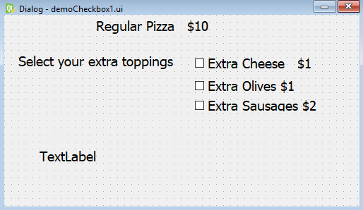
To understand the Check Box widget, let's assume that you run a restaurant where several food items, such as pizzas, are sold. The pizza is sold along with different toppings, such as extra cheese, extra olives, and so on, and the price of each topping is also mentioned with it. The user can select a regular pizza with one or more toppings. What you want is that when a topping is selected, the total price of the pizza, including the selected topping, is displayed.
The focus of this recipe is to understand how an action is initiated when the state of a checkbox changes from checked to unchecked or vice versa. Following is the step-by-step procedure to create such an application:
- Begin by creating a new application based on the
Dialog without Buttonstemplate. - Drag and drop three
Labelwidgets and threeCheck Boxwidgets onto the form. - Set the
textproperty of the first twoLabelwidgets toRegular Pizza $10andSelect your extra toppings. - In the
Property Editorwindow, increase the font size of all three labels and checkboxes to increase their visibility in the application. - Set the
textproperty of the three checkboxes toExtra Cheese $1,Extra Olives $1, andExtra Sausages $2. The default object names of the three checkboxes arecheckBox,checkBox_2, andcheckBox_3. - Change these to
checkBoxCheese,checkBoxOlives, andcheckBoxSausages, respectively. - Set the
objectNameproperty of theLabelwidget tolabelAmount.
- Save the application with the name
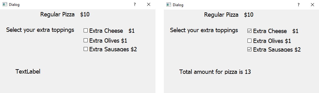
demoCheckBox1.ui. Now, the form will appear as shown in the following screenshot:
The .ui (XML) file is then converted into Python code through the pyuic5 command utility. The Python code generated in thedemoCheckBox1.pyfile can be seen in the source code bundle of this book.
- Import the
demoCheckBox1.pyfile, as a header file in our program to invoke the user interface design and to write code to calculate the total cost of regular pizza, along with the selected toppings, through aLabelwidget when the user selects or unselects any of the checkboxes. - Let's name the program
callCheckBox1.pyw; its code is shown here:
import sys
from PyQt5.QtWidgets import QDialog
from PyQt5.QtWidgets import QApplication, QWidget, QPushButton
from demoCheckBox1 import *
class MyForm(QDialog):
    def __init__(self):
        super().__init__()
        self.ui = Ui_Dialog()
        self.ui.setupUi(self)
        self.ui.checkBoxCheese.stateChanged.connect(self.
        dispAmount)
        self.ui.checkBoxOlives.stateChanged.connect(self.
        dispAmount)
        self.ui.checkBoxSausages.stateChanged.connect(self.
        dispAmount)
        self.show()
    def dispAmount(self):
        amount=10
        if self.ui.checkBoxCheese.isChecked()==True:
            amount=amount+1
        if self.ui.checkBoxOlives.isChecked()==True:
            amount=amount+1
        if self.ui.checkBoxSausages.isChecked()==True:
            amount=amount+2
        self.ui.labelAmount.setText("Total amount for pizza is
        "+str(amount))
if __name__=="__main__":
    app = QApplication(sys.argv)
    w = MyForm()
    w.show()
sys.exit(app.exec_())The stateChanged() event of checkboxes is connected to the dispAmount function, which will calculate the cost of the pizza along with the toppings selected. In the dispAmount function, you check the status of the checkboxes to find out whether they are checked or unchecked. The cost of the toppings whose checkboxes are checked is added and stored in the amount variable. Finally, the addition of the amount stored in the amount variable is displayed via labelAmount. On running the application, you get a dialog prompting you to select the toppings that you want to add to your regular pizza. On selecting any toppings, the amount of the regular pizza along with the selected toppings will be displayed on the screen, as shown in the following screenshot:
In this application, we will learn to make two groups of checkboxes. The user can select any number of checkboxes from either group and, accordingly, the result will appear.
We will try displaying a menu of a restaurant where different types of ice creams and drinks are served. We will create two groups of checkboxes, one of ice creams and the other of drinks. The ice cream group displays four checkboxes showing four different types of ice cream, mint chocolate chip, cookie dough, and so on, along with their prices. The drinks group displays three checkboxes, coffee, soda, and so on, along with their prices. The user can select any number of checkboxes from either of the groups. When the user selects any of the ice creams or drinks, the total price of the selected ice creams and drinks will be displayed.
Here are the steps to create an application, which explain how checkboxes can be arranged into different groups and how to take respective action when the state of any checkbox from any group changes:
- Create a new application based on the
Dialog without Buttonstemplate. - Drag and drop four
Labelwidgets, sevenCheck Boxwidgets, and twoGroup Boxwidgets onto the form. - Set the
textproperty of the first threeLabelwidgets toMenu,Select your IceCream, andSelect your drinkrespectively. - Delete the
textproperty of the fourthLabelwidget because we will display the total amount of the selected ice creams and drinks through the code. - Through
Property Editor, increase the font size of the all the widgets to increase their visibility in the application. - Set the
textproperty of the first four checkboxes toMint Choclate Chips $4,Cookie Dough $2,Choclate Almond $3, andRocky Road $5. Put these four checkboxes into the first group box. - Set the
textproperty of the next three checkboxes toCoffee $2,Soda $3, andTea $1respectively. Put these three checkboxes into the second group box.
- Change the object names of the first four checkboxes to
checkBoxChoclateChips,checkBoxCookieDough,checkBoxChoclateAlmond, andcheckBoxRockyRoad. - Set the
objectNameproperty of the first group box togroupBoxIceCreams. - Change the
objectNameproperty of the next three checkboxes tocheckBoxCoffee,checkBoxSoda, andcheckBoxTea. - Set the
objectNameproperty of the second group box togroupBoxDrinks. - Set the
objectNameproperty of the fourthLabelwidget tolabelAmount. - Save the application with the name
demoCheckBox2.ui. It is through thisLabelwidget that the total amount of the selected ice creams and drinks will be displayed, as shown in the following screenshot:

The .ui (XML) file is then converted into Python code through the pyuic5 command utility. You can find the generated Python code, the demoCheckbox2.py file, in the source code bundle of this book.
- Import the
demoCheckBox2.pyfile as a header file in our program to invoke the user interface design, and to write code to calculate the total cost of ice creams and drinks through aLabelwidget when the user selects or unselects any of the checkboxes. - Let's name the program
callCheckBox2.pyw; its code is shown here:
import sys
from PyQt5.QtWidgets import QDialog
from PyQt5.QtWidgets import QApplication, QWidget, QPushButton
from demoCheckBox2 import *
class MyForm(QDialog):
    def __init__(self):
        super().__init__()
        self.ui = Ui_Dialog()
        self.ui.setupUi(self)
        self.ui.checkBoxChoclateAlmond.stateChanged.connect
        (self.dispAmount)
        self.ui.checkBoxChoclateChips.stateChanged.connect(self.
        dispAmount)
        self.ui.checkBoxCookieDough.stateChanged.connect(self.
        dispAmount)
        self.ui.checkBoxRockyRoad.stateChanged.connect(self.
        dispAmount)
        self.ui.checkBoxCoffee.stateChanged.connect(self.
        dispAmount)
        self.ui.checkBoxSoda.stateChanged.connect(self.
        dispAmount)
        self.ui.checkBoxTea.stateChanged.connect(self.
        dispAmount)
        self.show()
    def dispAmount(self):
        amount=0
        if self.ui.checkBoxChoclateAlmond.isChecked()==True:
            amount=amount+3
        if self.ui.checkBoxChoclateChips.isChecked()==True:
            amount=amount+4
        if self.ui.checkBoxCookieDough.isChecked()==True:
            amount=amount+2
        if self.ui.checkBoxRockyRoad.isChecked()==True:
            amount=amount+5
        if self.ui.checkBoxCoffee.isChecked()==True:
            amount=amount+2
        if self.ui.checkBoxSoda.isChecked()==True:
            amount=amount+3
        if self.ui.checkBoxTea.isChecked()==True:
            amount=amount+1
        self.ui.labelAmount.setText("Total amount is
        $"+str(amount))
if __name__=="__main__":
    app = QApplication(sys.argv)
    w = MyForm()
    w.show()
sys.exit(app.exec_())The stateChanged() event of all the checkboxes is connected to the dispAmount function, which will calculate the cost of the selected ice creams and drinks. In the dispAmount function, you check the status of the checkboxes to find out whether they are checked or unchecked. The cost of the ice creams and drinks whose checkboxes are checked is added and stored in the amount variable. Finally, the addition of the amount stored in the amount variable is displayed via the labelAmount widget. On running the application, you get a dialog prompting you to select the ice creams or drinks that you want to order. On selecting the ice creams or drinks, the total amount of the chosen items will be displayed, as shown in the following screenshot:


